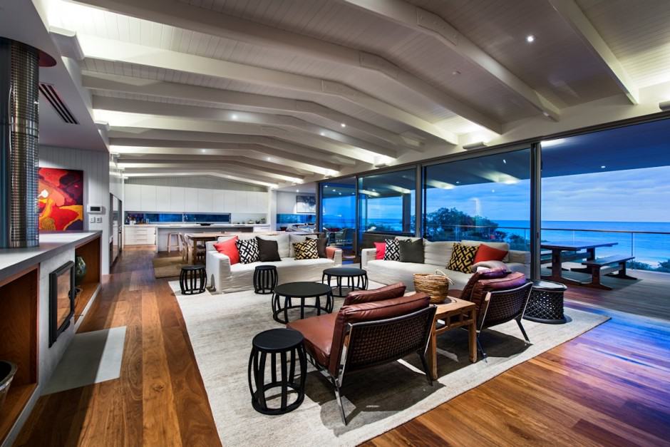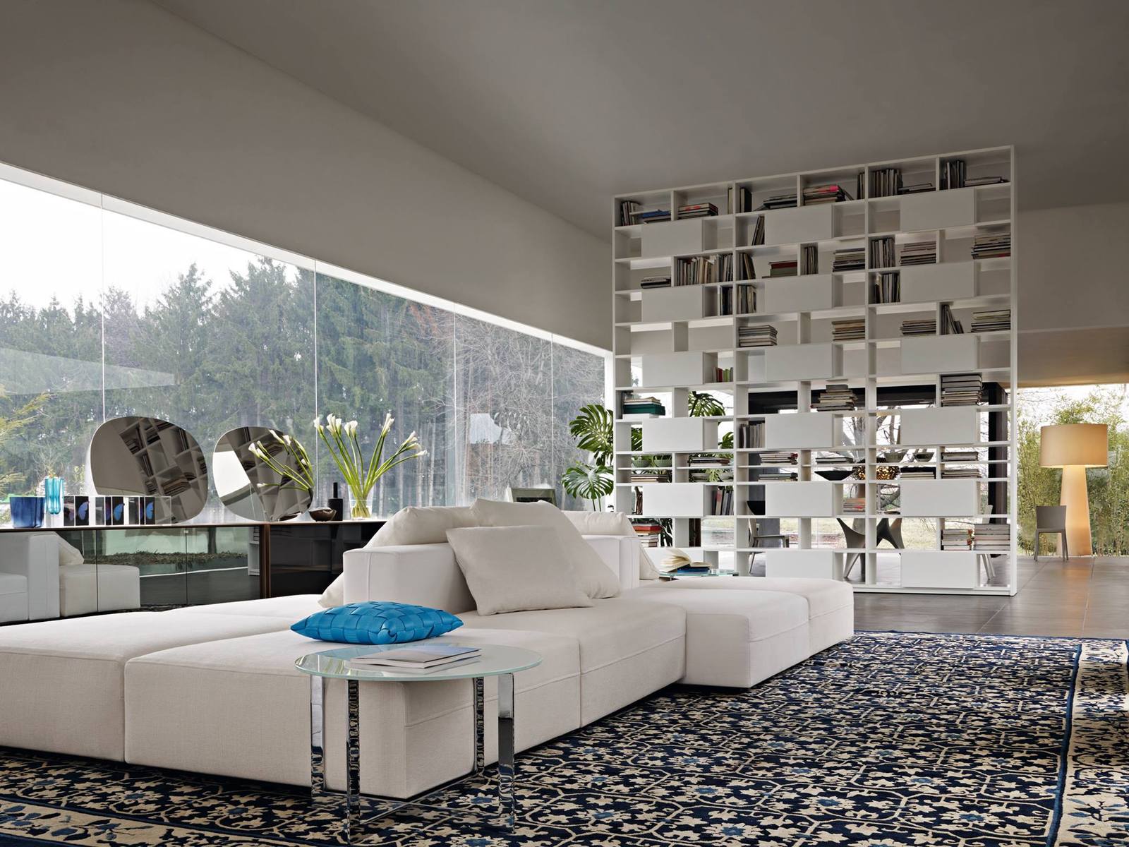
All the home’s a stage and in this case, what a stage it is. Here, the furniture and accessories are the main event with the treed grounds beyond the wide expanses of windows taking the secondary role, as though they where the matte around a contemporary painting. Here, sitting on an oversized traditionally patterned area rug is a large white sectional facing both into and out of the room. One singular Sapphire pillow positioned next to a chrome and glass end table creates a focal point . Just beyond the sectional is a floating bookshelf that is both display and room divider. The pattern created by the closed and open shelving gives a peek-a-boo look in to the space beyond while at the same time saying “look at me, I am as much art as function”.
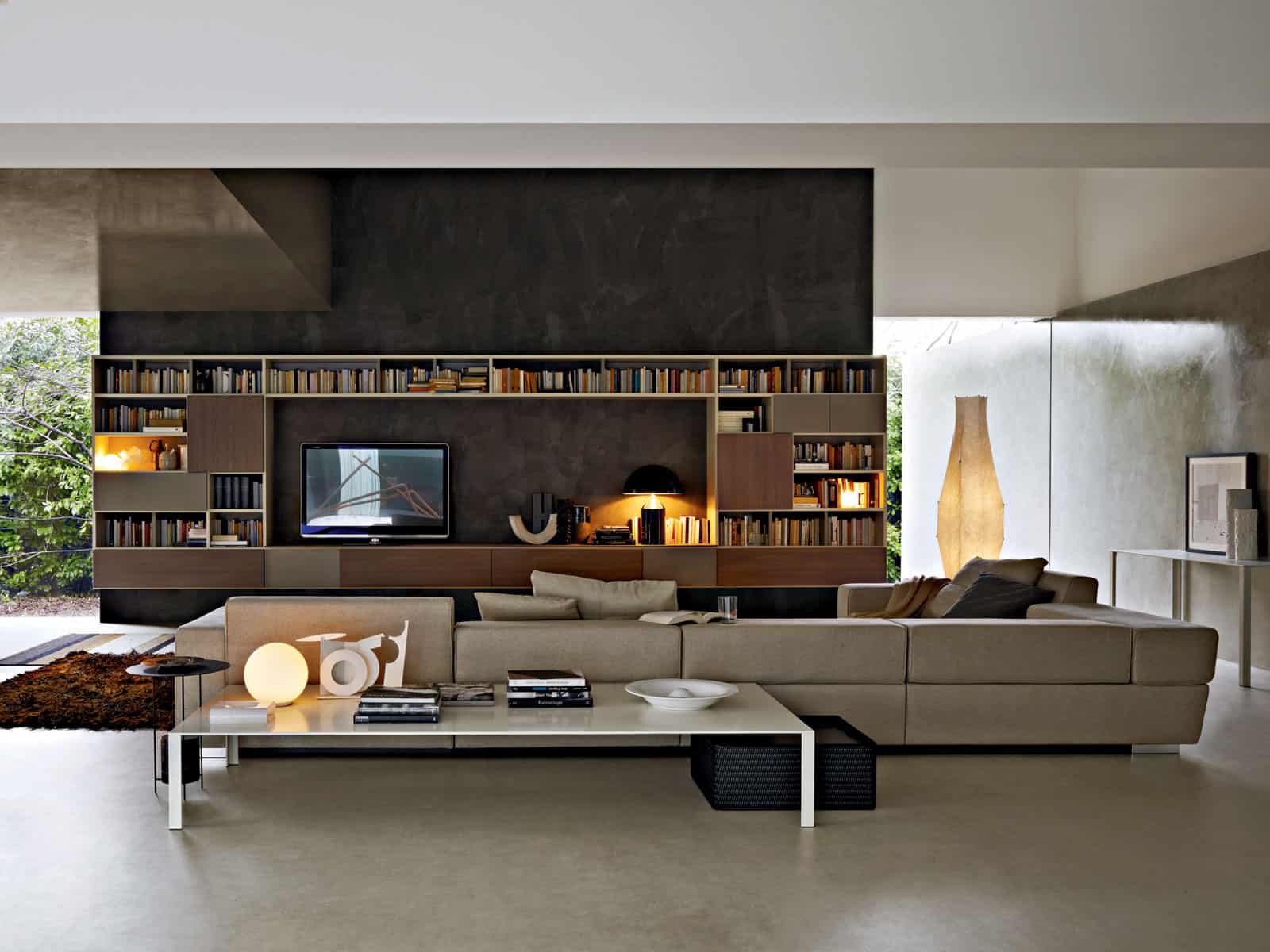
In the Glass House they showcase Media spaces that are all about the TV but this does not mean that they have forgotten the space around the TV. A low media console allows the TV to be at a height that does not create neck strain. A wrap around bookshelf adds the dimension of functionality and visual interest.
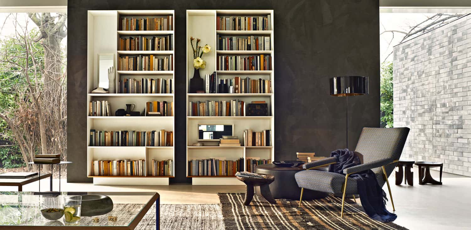
The Glass House also offers more traditional shelving options. What makes these particular units unique is the use of quadruple high vertical shelves that are perfect for a large vase or narrow sculpture. The negative space created by the narrow and tall space breaks up the rigid formation of the horizontal shelving and creates a bit of whimsy in an otherwise basic layout.
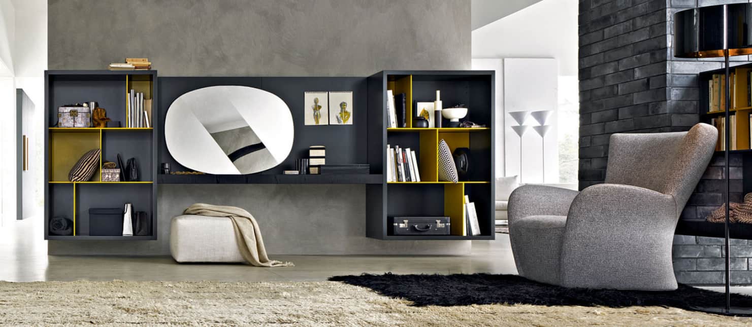
For small floor plans there is also floating options for shelving units. Here a pair of charcoal shelving units flank a floating desk in the same colour. The charcoal back of the desk ties the two shelving units together and the use of primary yellow as the colour story within the units, visually breaks up the expanse of grey while adding in a cheerful statement.
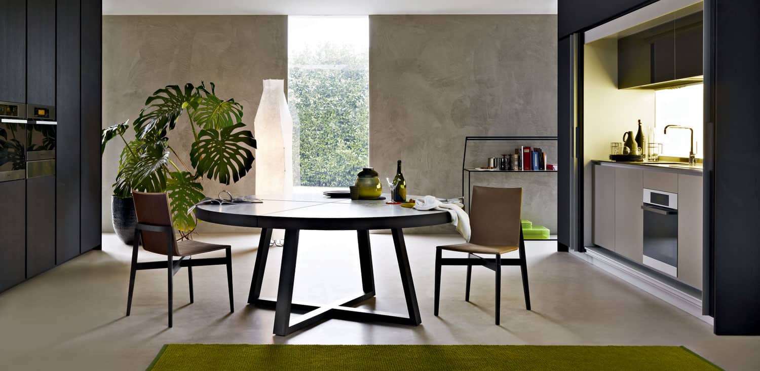
Molteni & Co has a wide array of other furniture options. Here a 60″ round dining table features the X shape both on the tabletop and on the base. Even the chairs have an X support that attaches their legs.
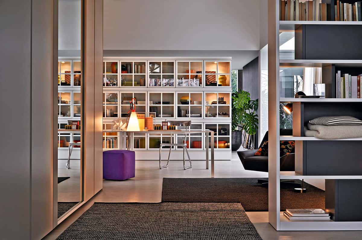
This space showcases an ultra modern table with a stainless steel frame and stainless steel chairs. 1 pop of colour is introduced via a purple ottoman and the shelving unit that stretches across the far wall is a series of square units faced with glass doors that are mullioned with a cross detail to further emphasize the story of the square.
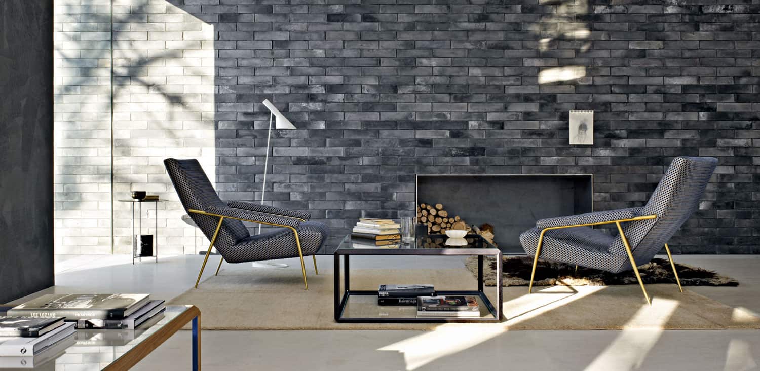
Within the Glass House there is a feature fireplace wall and here the colour story of charcoal continues, both within the subway brick facade as well as within the two occasional chairs that flank the fireplace. The brass detailing on the chairs is both retro and ultra modern at the same time. The added mixed metal use on the fireplace and coffee table is definitely modern and the floor lamp is definitely retro. The combination of the two styles work in perfect harmony offering a cozy place to sit back and relax.
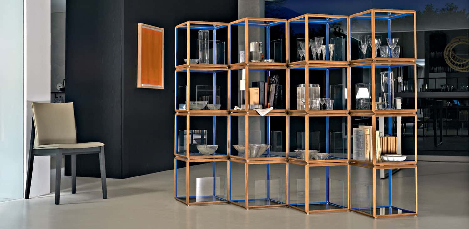
The shelving unit featured here would look awesome in both a residential and commercial application. Here, it’s all about displaying beautiful items within a graphically appealing format. The diamond shape to the open cube shelving gives it a staggered effect that creates a sense of undulating movement further enhanced by the use of ultra marine blue on the interior of the wood framework. The multi level diamond profile makes the shelving unit a perfect candidate to be used as a room divider.
9-shelving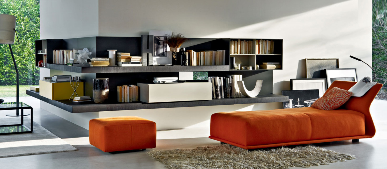
And that’s a wrap. As in wrapping the corner. Thick shelves mounted onto a solid back wrapping a corner is a unique and creative way to define flow within a space. The added touch of a tangerine chaise creates a visual stopping point both with the bold choice of colour, and with the positioning of the chaise. A small stack of framed prints casually leaning against the wall softens the abrupt end to the shelving.
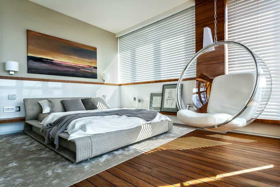
Every bedroom needs a great place to sit, curl up and read a book or ipad. What better way to do that then in a bubble chair. The soft swaying of the suspended seat is a perfect way to relax and unwind after a hard day at the office.
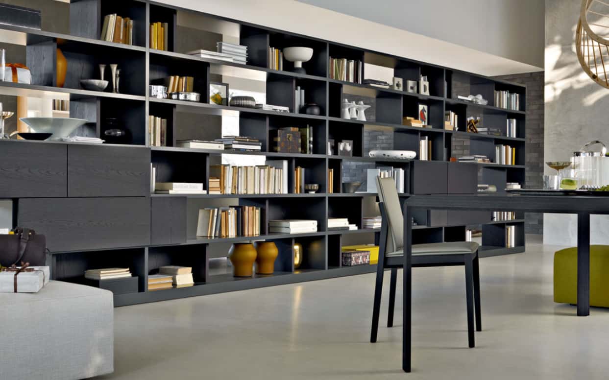
If your day at work is your own home office, this shelving system is just the thing to store all the necessary paperwork and books you need. Leaving plenty of space to personalize the shelves. Staggering the books in groups of vertical and horizontal collections, separated by momentos and decorative items create a beautiful abstract pattern against the deep charcoal unit.
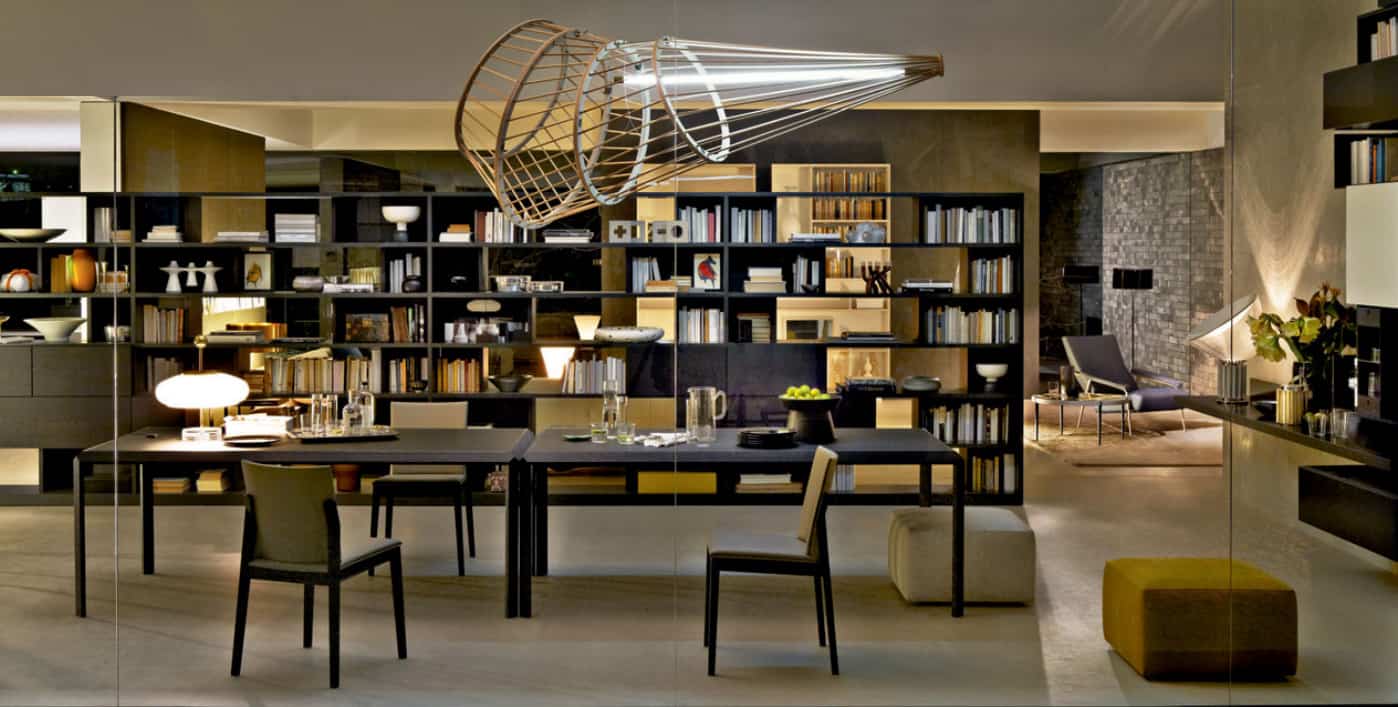
If your office is a place for more then one person to work at, a central work space of one or more tables grouped together creates the perfect place for ideas to flow. Add into the mix a light fixture that is as much a piece of art as it is a pendant and those ideas will be coming fast and furious. The pendant featured here is such a piece. The fluorescent tube appears to be the jet stream of a racing asteroid with rings of smoke getting ever larger behind it.
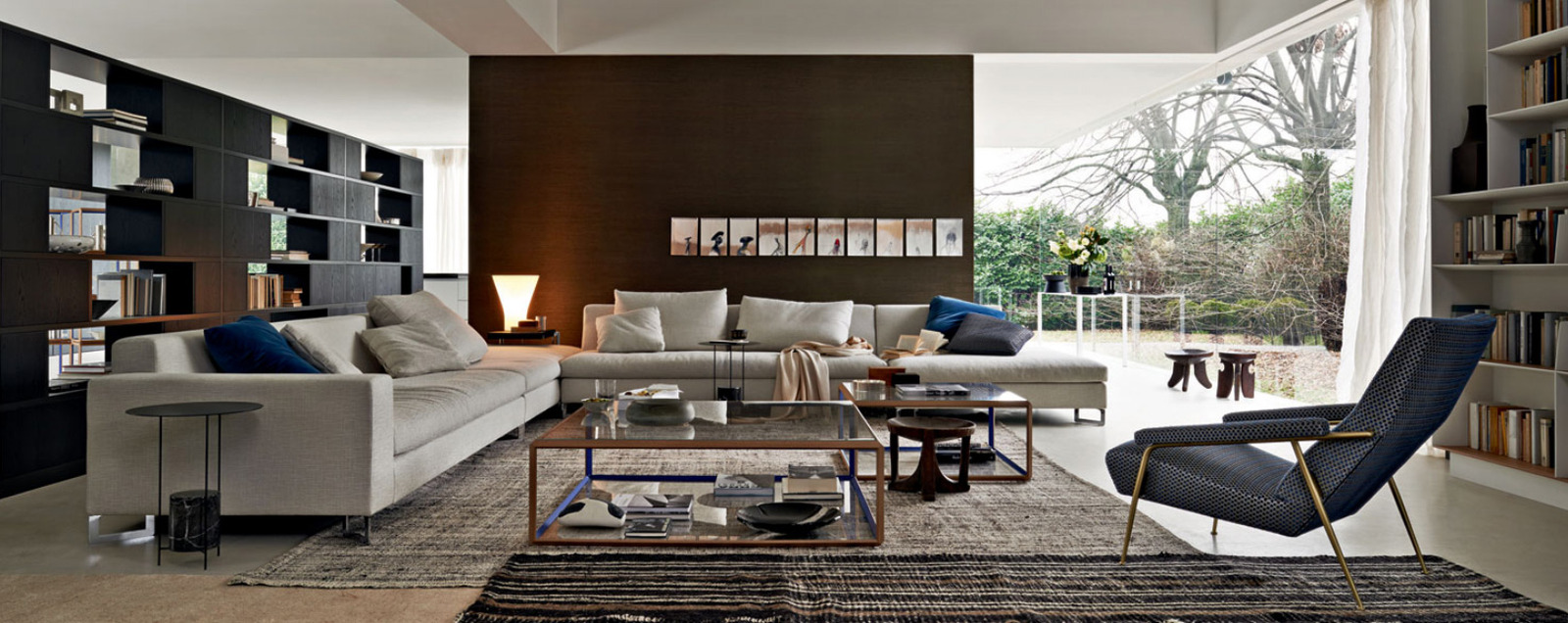
Large groups of guests can really get comfortable in this entertaining area. The oversized and deep sofas are positioned in a standard seating arrangement with an accent chair opposite. What makes this space really work is the use of two coffee tables instead of the usual one. Two large 48″ square tables with a glass top and bottom offer display on the lower shelf and plenty of room for drinks on top. The row of 10 prints lined up behind the sofa breaks up the expanse of the room, and also keeps the focal point within the seating arrangement.
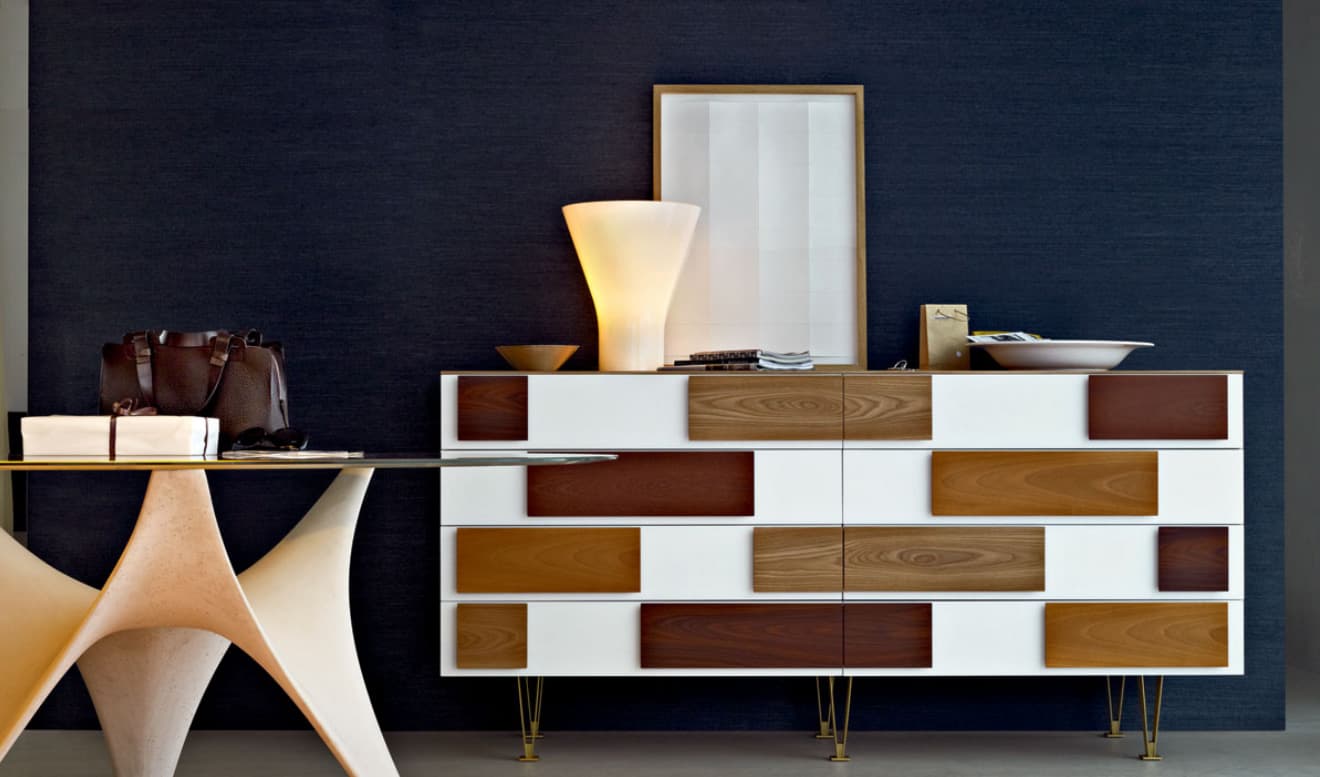
Dining spaces all do better with a buffet for storage, but storage does not have to be boring, this modern reinterpretation of a mid century buffet creates a statement of functional fun. The use of 3 different wood veneers n the drawer fronts are exacerbated by the pristine white cabinet surround. The clever use of spindle legs in outline only makes the buffet appear to float. Added to this scene is a glass top dining table that uses negative space to create a base of graphic undulation. The only thing missing is good food and good times.
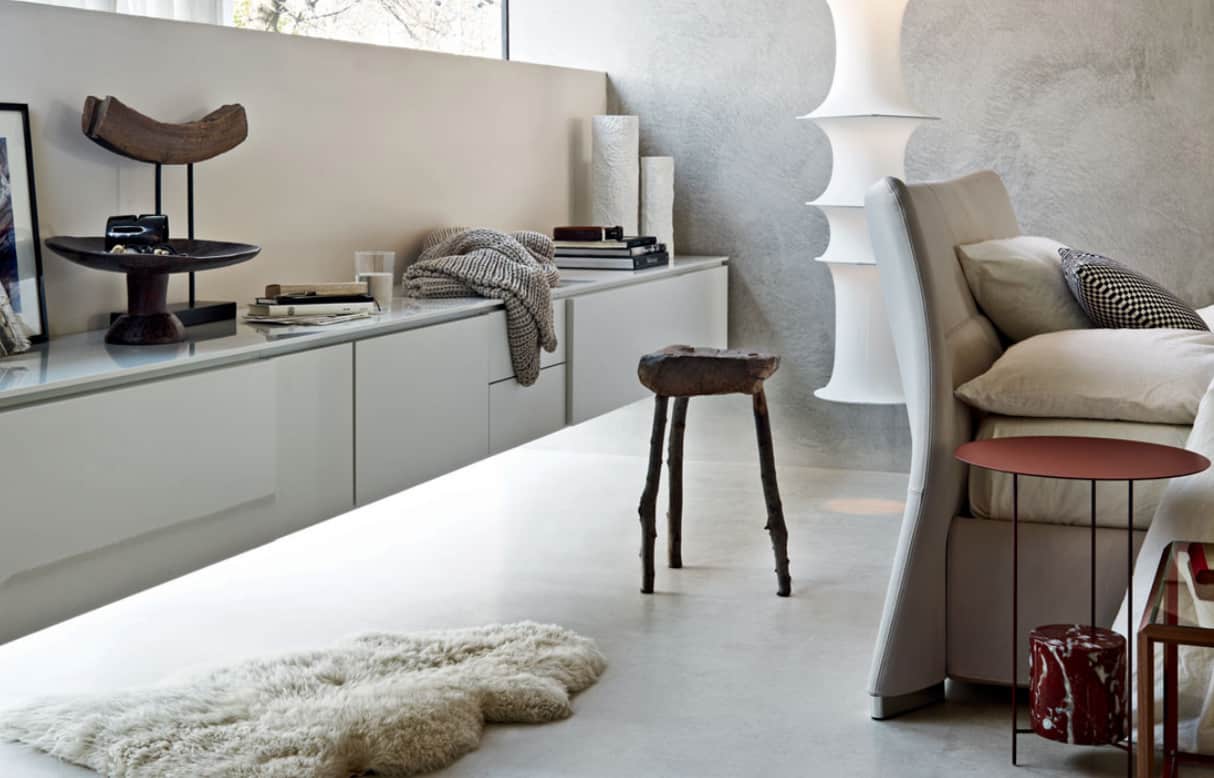
Small spaces often use floating pieces to help keep the area feeling larger then it really is. Here a bank of cabinets floats 12″ off of the floor and a light fixture is suspended from the ceiling down the same level. The ability to see the floor line expand beyond these two pieces is what makes the space feel large, even though there is only 48″ between the cabinet and the back of the chair.
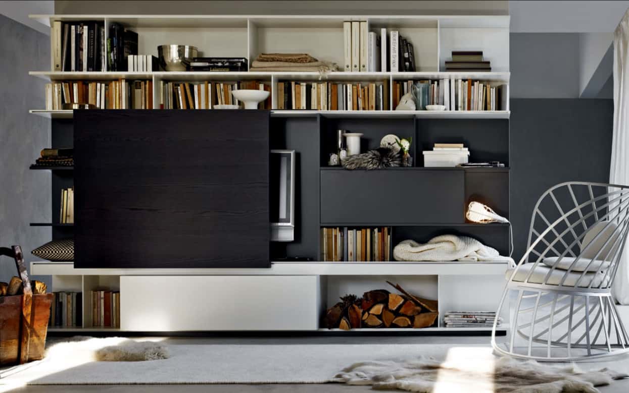
If you like your living space to double both as a TV viewing area, and as a place to entertain is style, this media cabinet is the perfect choice. Colour blocked in pale grey and matte black; a panel slides either in front of, or to the side of the flat screen TV. The graphic detailing of the colour blocking makes the hidden TV part of the overall design feature. All that’s needed is a large photo or piece of art mounted on the panel and no one would know a TV even existed.
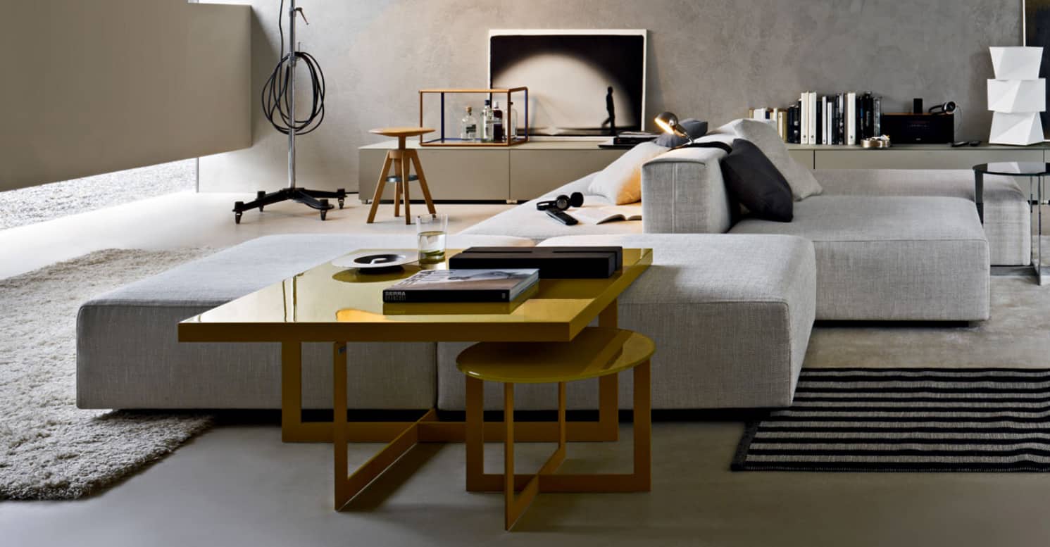
Family rooms usually have multiple uses and it can be hard to arrange your furniture to accommodate both your need to relax, and your kids need to play. The perfect solution could be this sectional with a large chaise end that doubles as extra seating for a small table. The table’s base allows stools to be tucked underneath for even more seating.
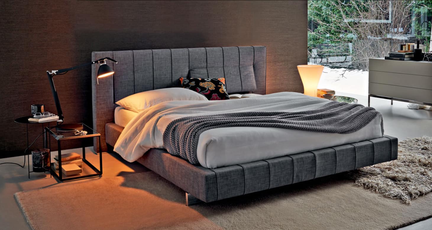
If a bedroom is small and doesn’t allow for an extra comfy chair, the next best thing is a comfy headboard to lean against. Sitting up in bed, leaning against a the headboard reading a book, ipad, or laptop requires light and this oversized desk lamp with pivoting arm is the perfect solution.
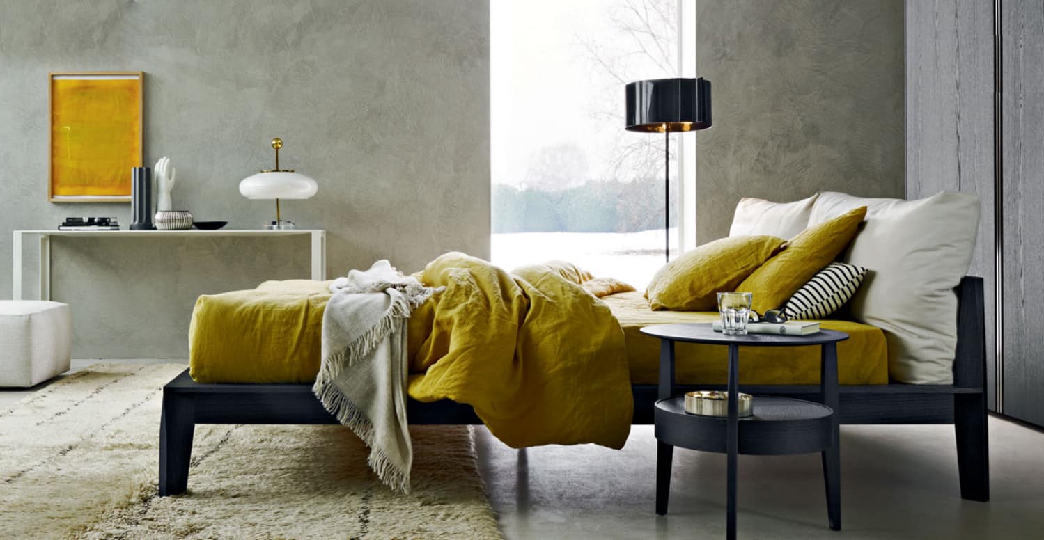
While many people like their bedrooms to be spaces of neutral shades, pops of bright colours can really add personality. The easiest way to do this is with bed linens and wall art. Today it’s a pop of yellow – tomorrow who knows. The grey bed frame and night stand allow any colour to be the feature.
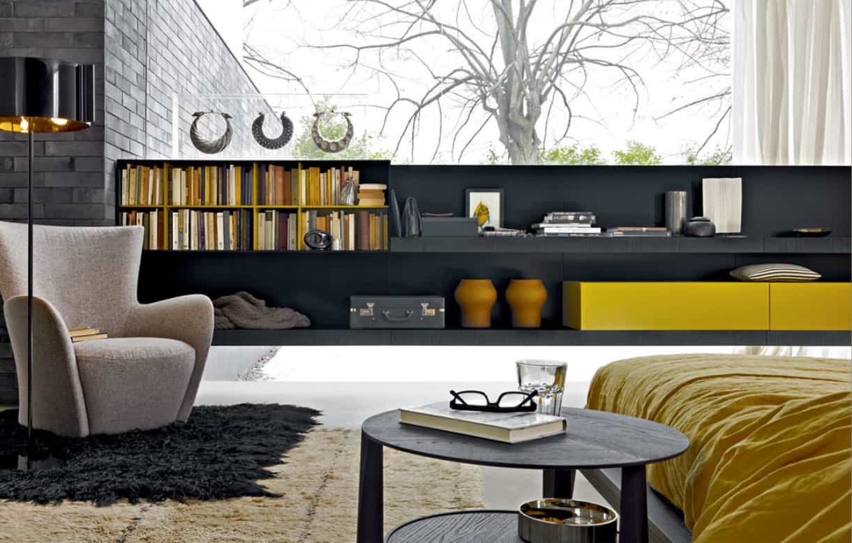
Many apartments come with floor to ceiling glass, but not everyone wants to be exposed to the world. An easy solution is to run a bank of low shelving in front of the windows, creating a low privacy screen that includes both display and storage capabilities.
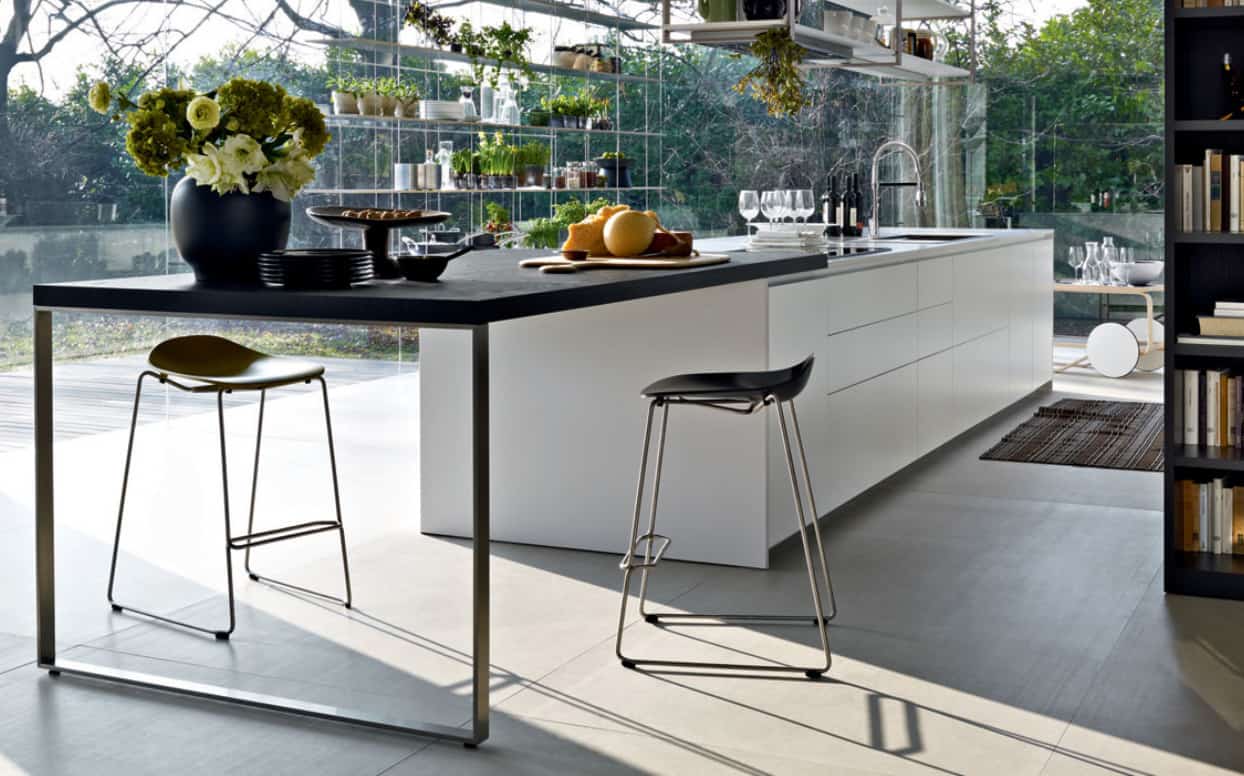
If you have a galley kitchen with a peninsula or island, bar seating is a given but not every peninsula or island has space for a bar behind it. Another option is to extend the counter off of the end of the counter and keep it open below. This allows for bar stools to be tucked in on both sides as well as the end, while at the same time creating extra prep space.
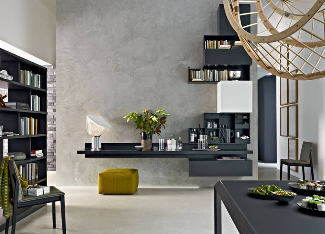
The same concept of extending a counter without storage below can be used in a narrow office nook. Vertical shelving keeps the storage space above the work station, allowing a stool, bench or ottoman to be tucked underneath and out of the way.
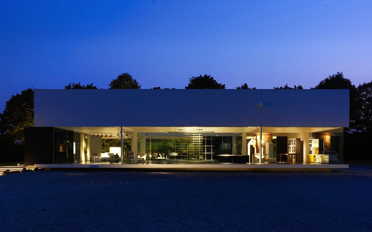
All the inspirational spaces within Molteni & Co’s Glass House tell a story of complimentary and harmonious design brought together for quality living.
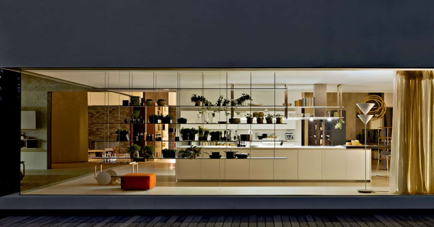
The Glass House is able to showcase a variety of different shelving options for homes that have wall to ceiling windows. Here the open shelving system is suspended from the ceiling and the profile of the shelves are kept as thin as possible, so that the areas where the shelves are kept bare offer a glimpse into the world within.
Molteni & Co.
