Grey is a relaxing tone that’s fit for any and all rooms of the house. From the bedroom to the hallways, it’s an easy neutral to work with and a shade that’s easy to decorate around. And we’ve found 40 romantic and welcoming grey kitchens that will suit your home with ease. This color is approachable but also coincides with all kinds of visions – from farmhouse to modern edges. Let’s take a peek.
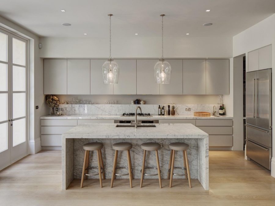
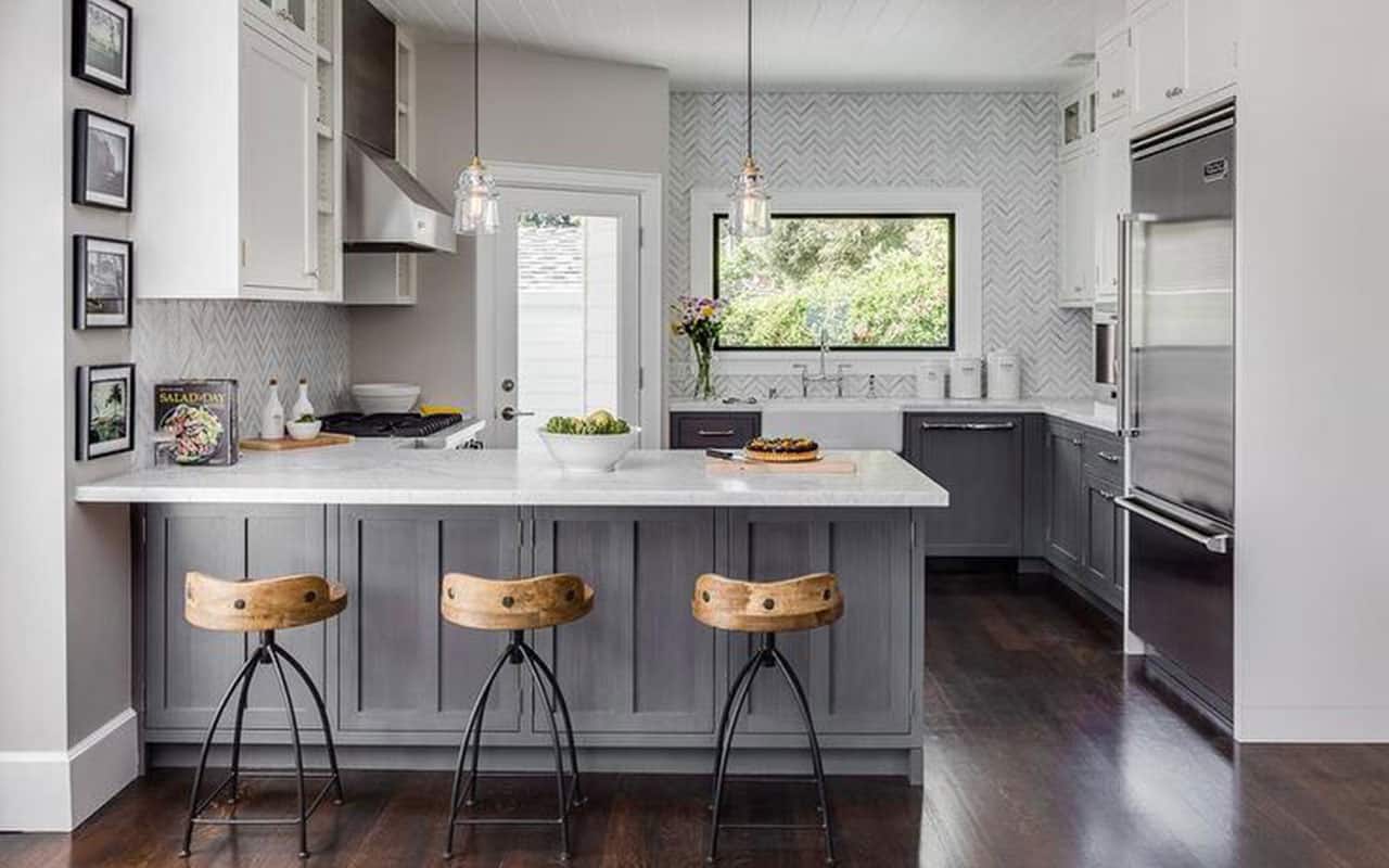
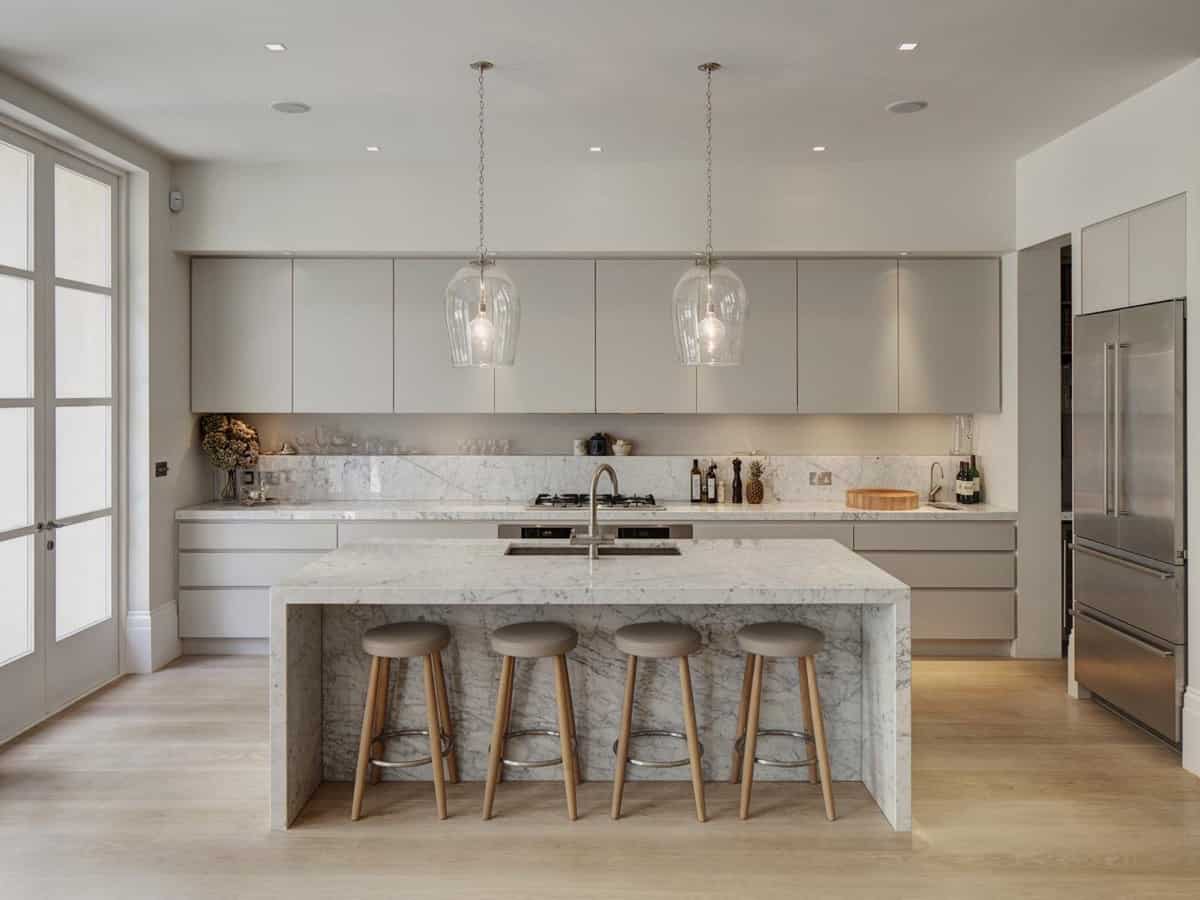
The first on our list of romantic and subdued kitchen designs comes from Interior Design Ideas. The marble island here is a standout amount the taupe and gray tones and it’s sleek, modern air. The glass hanging lights also play well with the stainless steel appliances and the bout of natural wood accents.
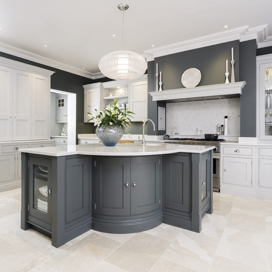
This is a more traditional kitchen design that we found from Ideal Home. The charcoal cabinetry and walls contrast well next to the white foundation. The stainless steel appliances and hardware was a no-brainer in terms of choices as well. It’s got everything a family kitchen could want or need included.
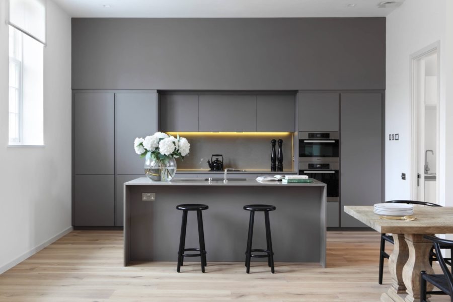
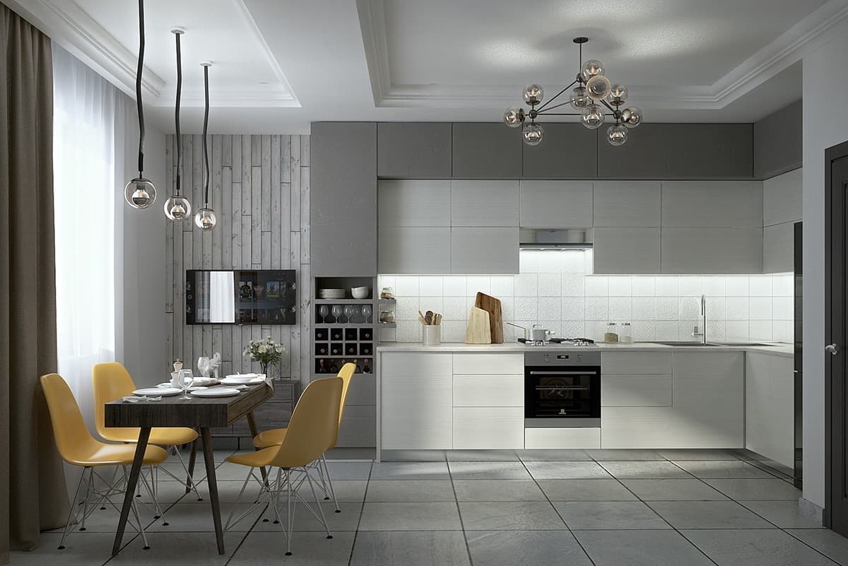
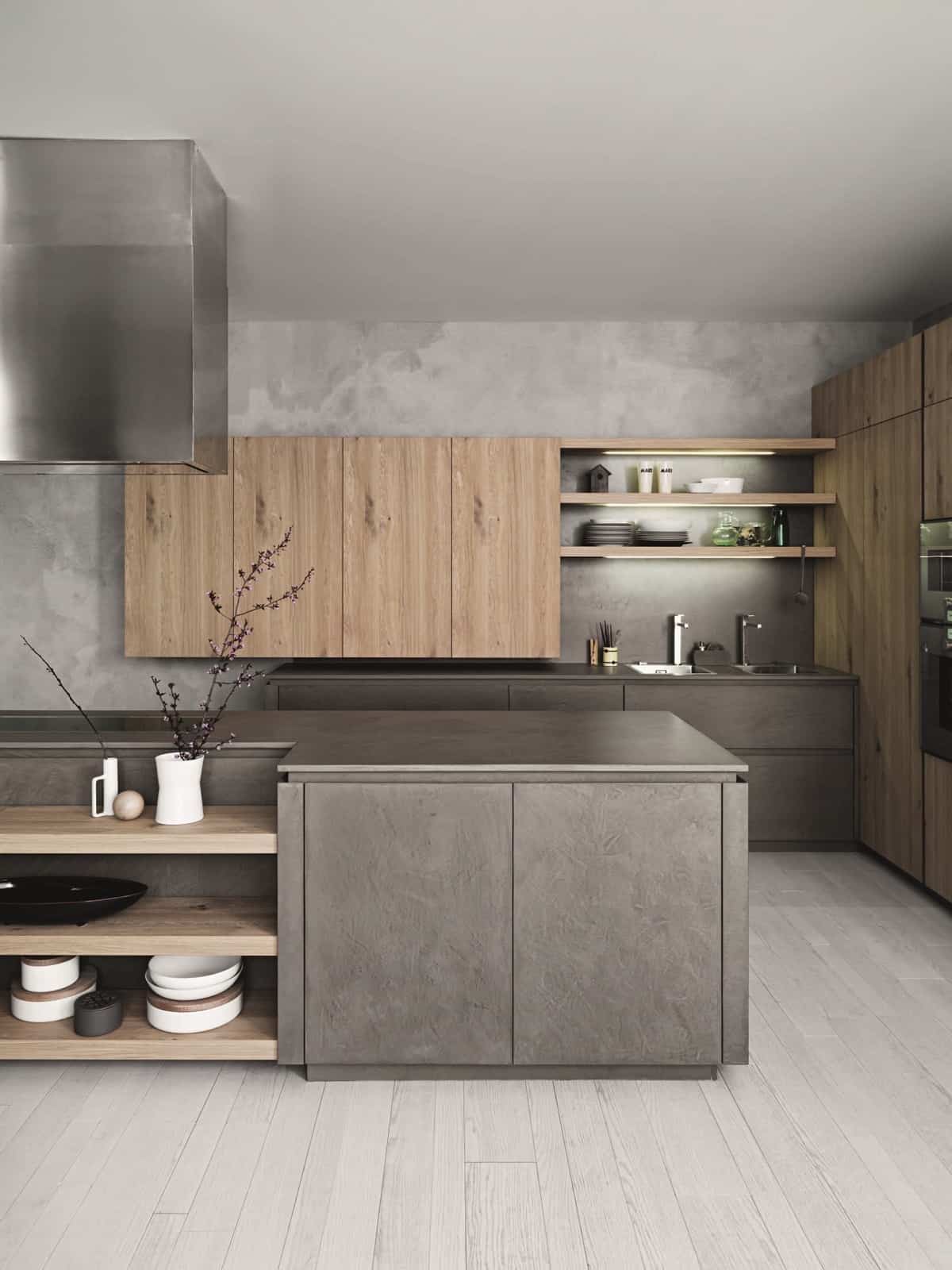
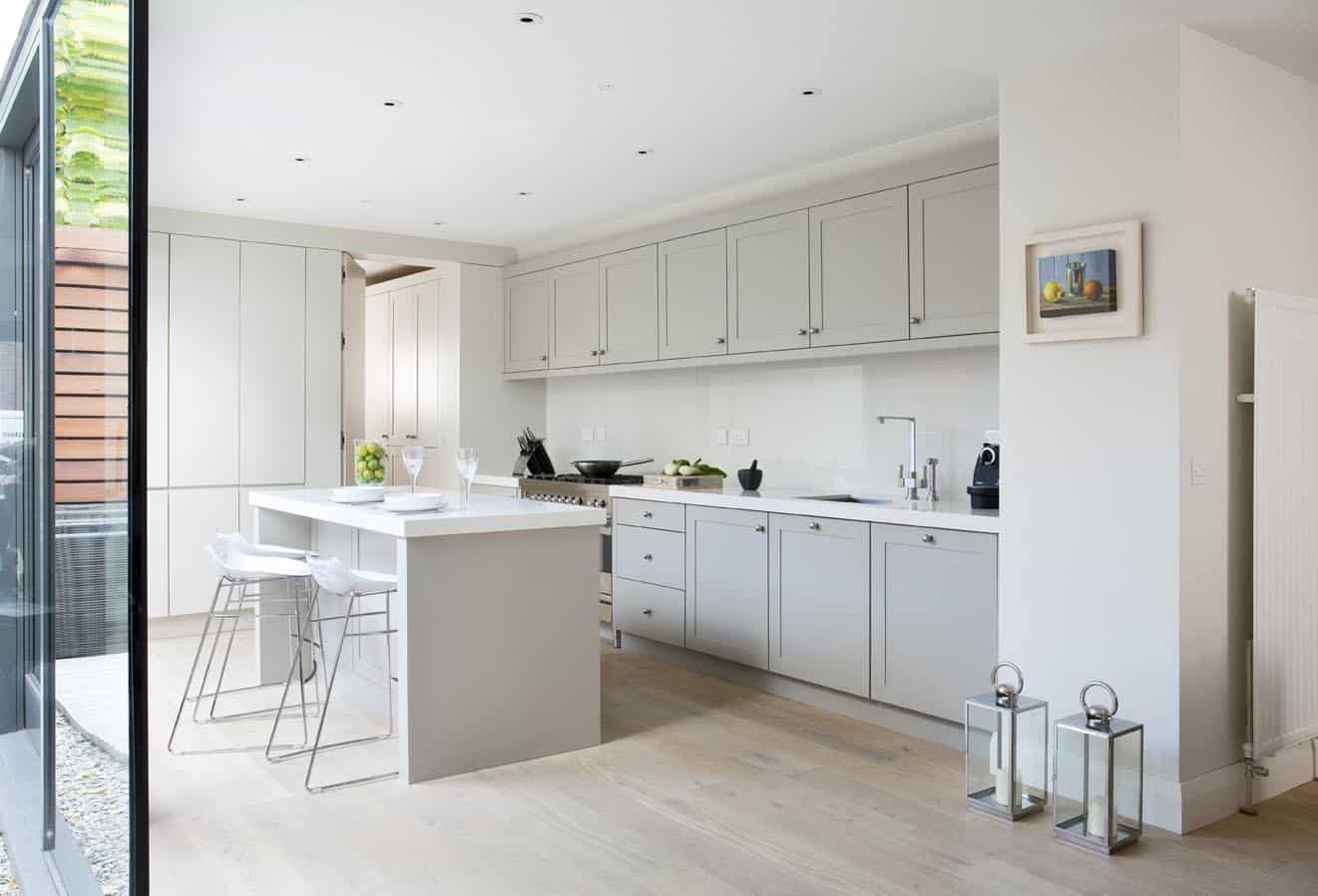
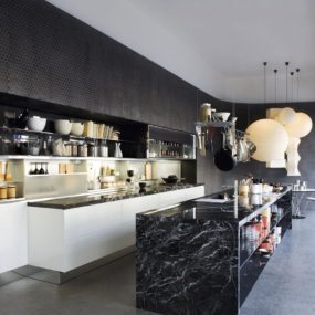
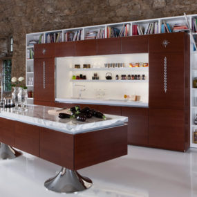
Interior Design Ideas had this ultra modern design up their sleeves as well. Hidden, charcoal cabinets with a light, golden glow and black accents, it’s definitely got a more minimal vibe than the others. But it’s grey foundation creates a more welcoming and romantic vibe than if it was stark white or midnight black.
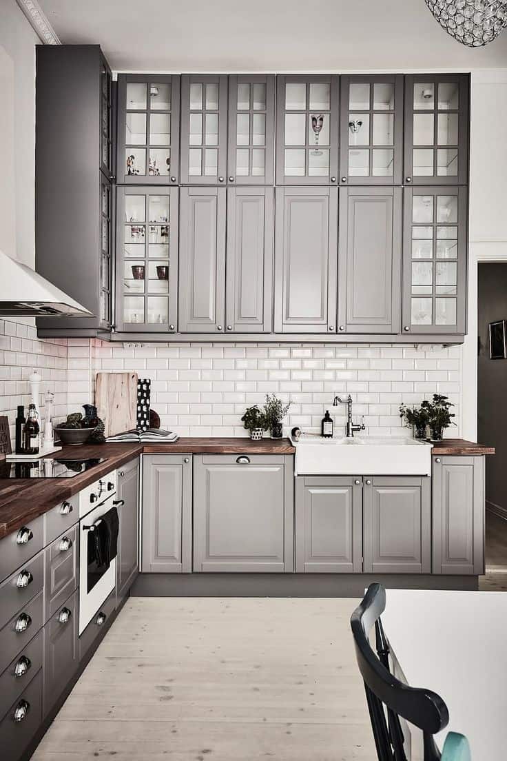
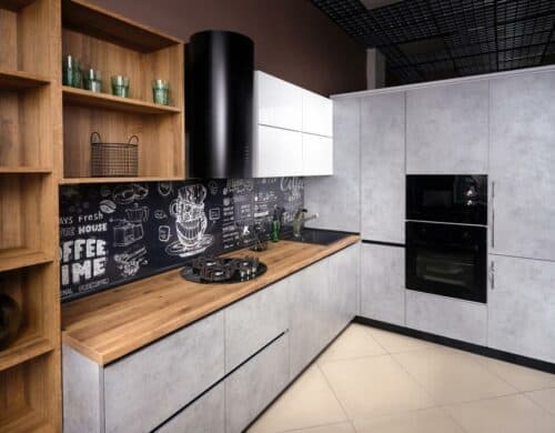
We’re loving this trendy setup found on Pinterest as well. The grey cabinets and industrial hardware make for an edgy and fun design theme. Pair that with the hardwood floors and wooden countertops and you have a lot of mixing and matching that works!
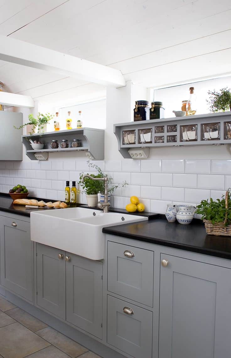
These chic, grey cabinets pair nicely with the farmhouse styled sink and subway tile backsplash. And the subtle pops of yellow, done purposefully, add a bit of vivacious energy that we appreciate. Sola Kitchens has a lot of beautiful inspiration and this one was a favorite.
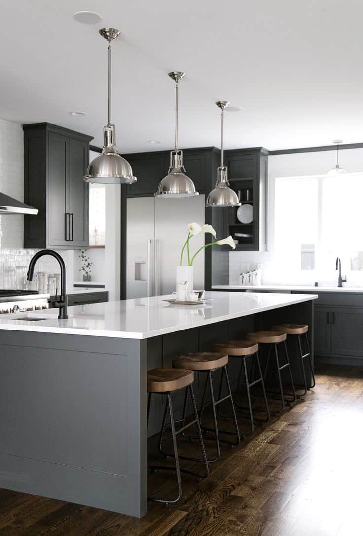
Anne Sage provides us with a gorgeous kitchen that has a lot of similar elements from its predecessors. Pairing industrial vibes with some farmhouse accents, it’s a trendy way to go about decorating your kitchen. The wood, the masculine pieces and dark gray foundation come together nicely and very “in the now.”

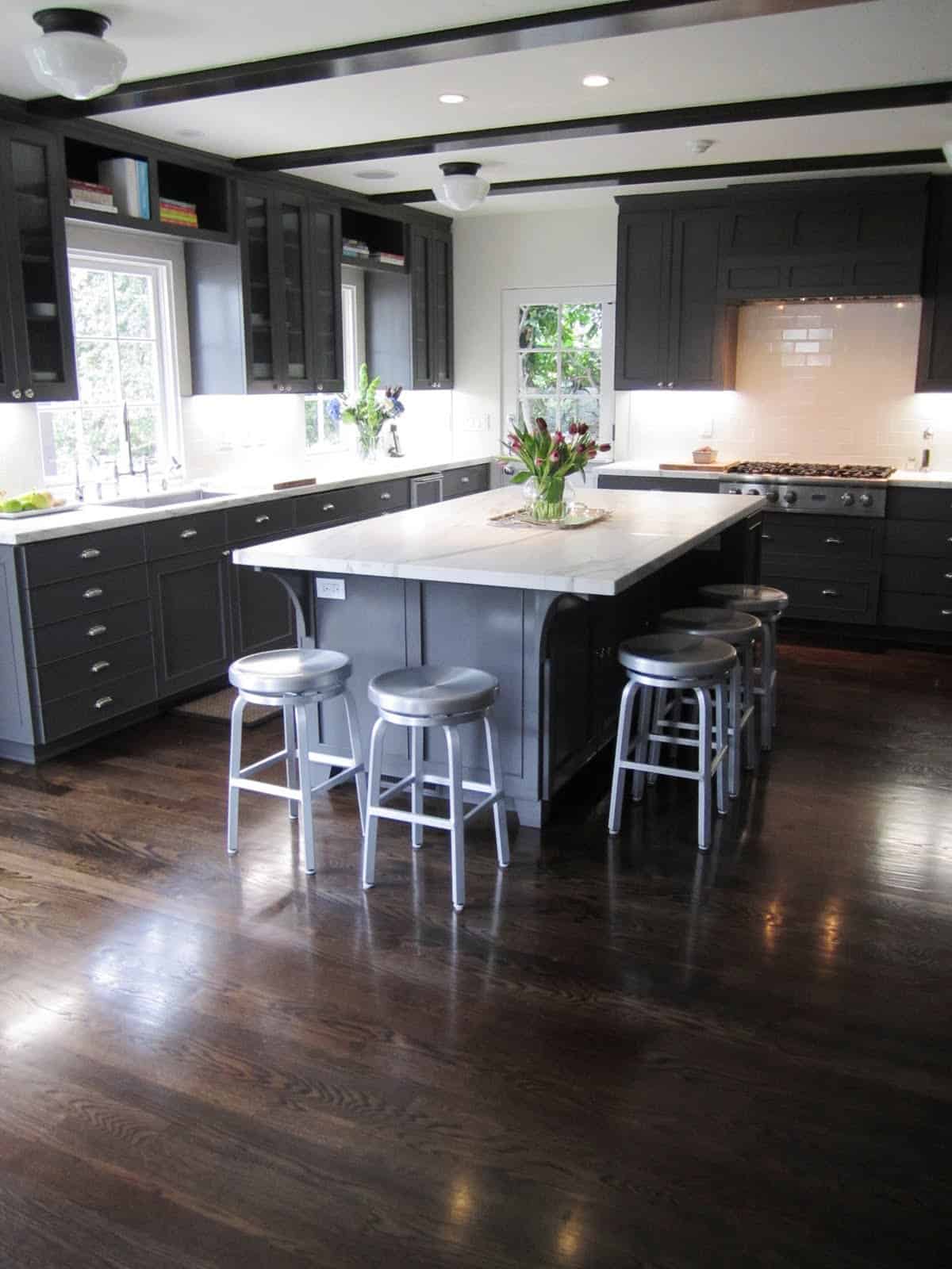
The window cabinets in this space really open up the top of the room and plays well with the natural light that’s pouring in from the windows. Lighting up the dark cabinets and contrasting nicely with the distressed, hardwood floors, there’s a lot of elements to love inside this Elle Decoration kitchen.
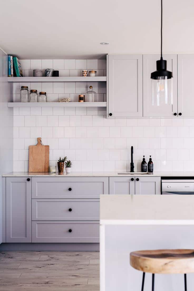
Pinterest also had this French grey kitchen floating around its inspiration boards. We love the simplicity seen here, it pairs nicely with whites and creams as well as the modern vision. Black was the perfect way to go about deciding on hardware for a crisp contrast.
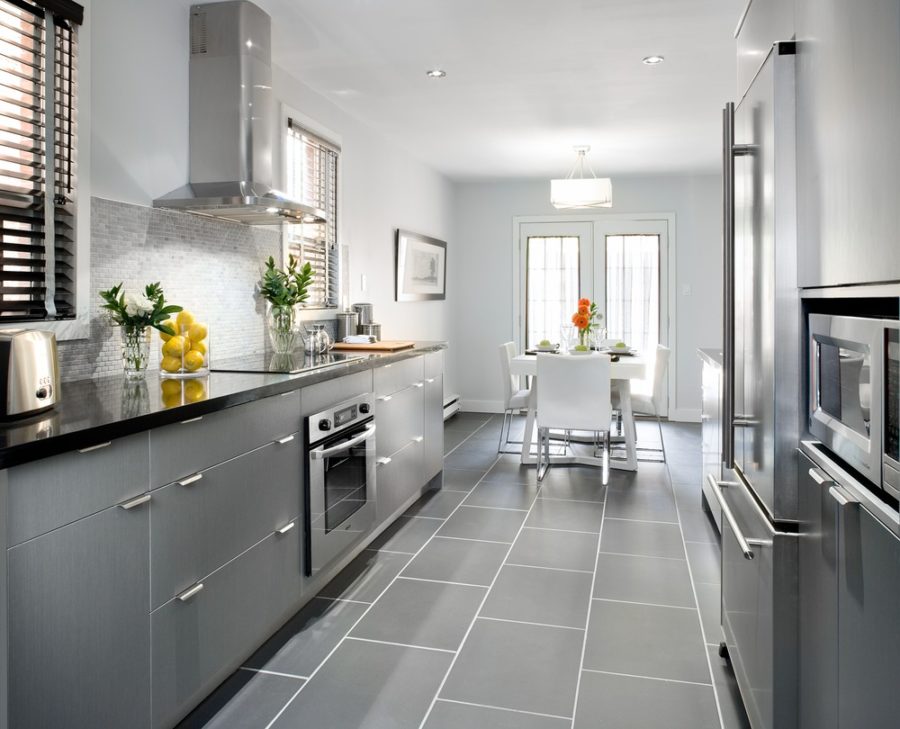
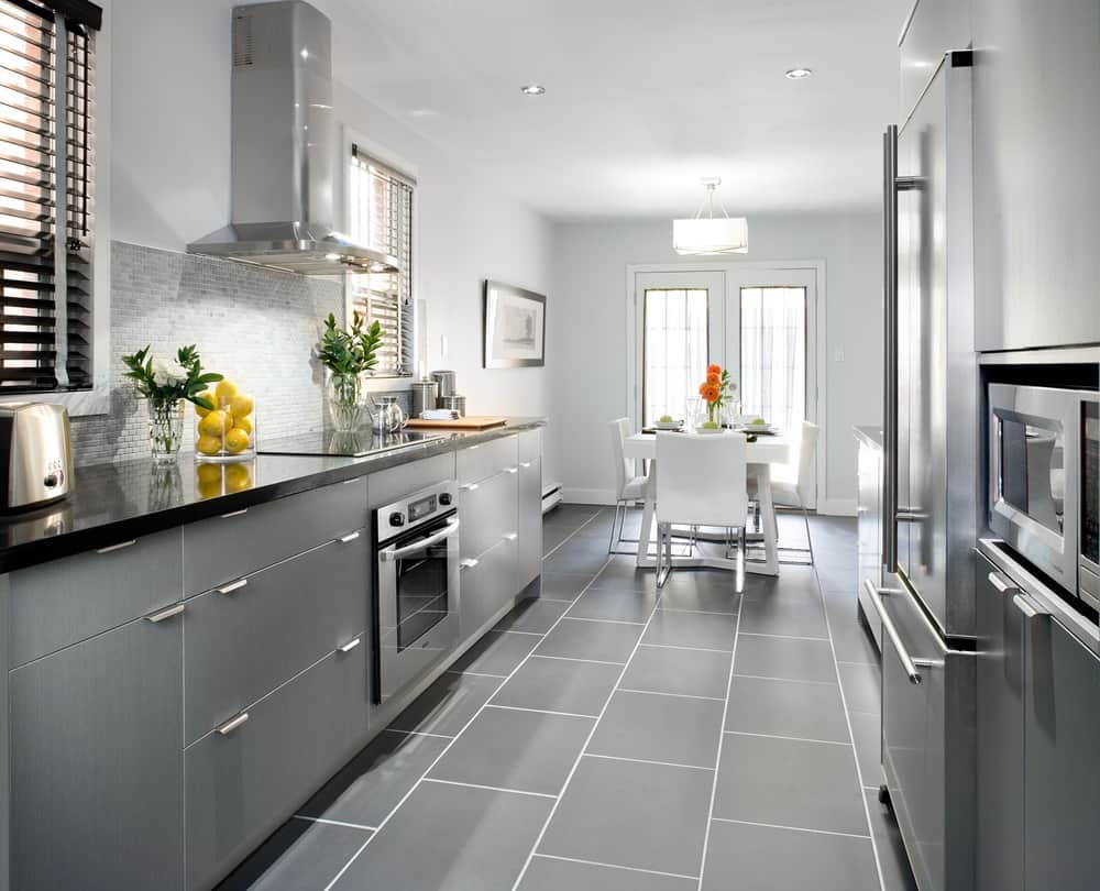
Here’s a galley kitchen that took on grey as its main tone. From the floor to the ceiling, each part of this kitchen has been dressed in a shade of romantic, grey. But its outcome is more contemporary than anything else. With varying textures and a clean vision in mind, we’re thinking no one would complain if gifted this space.

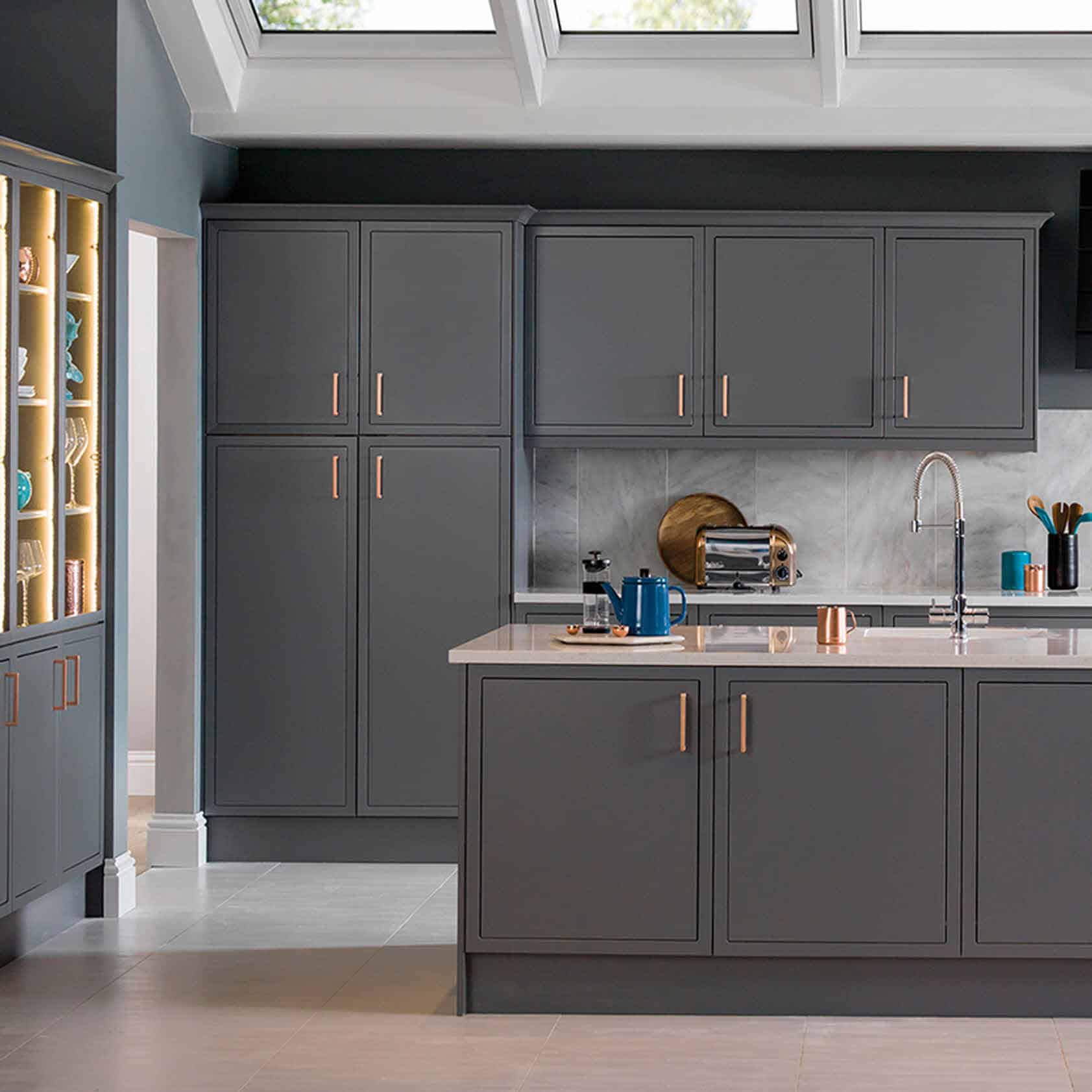
Copper hardware looks quite posh on some modern, charcoal cabinets. Creating a foundation that’s both bold and unique, we’re loving this kitchen design from Magnet. If you’re looking for something original with bouts of femininity, then this is the example to follow.
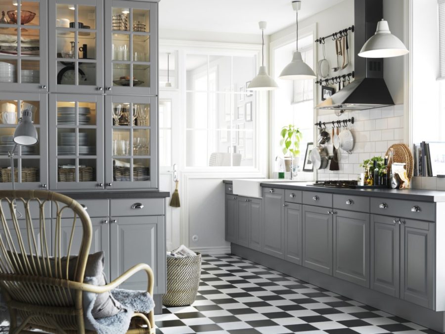
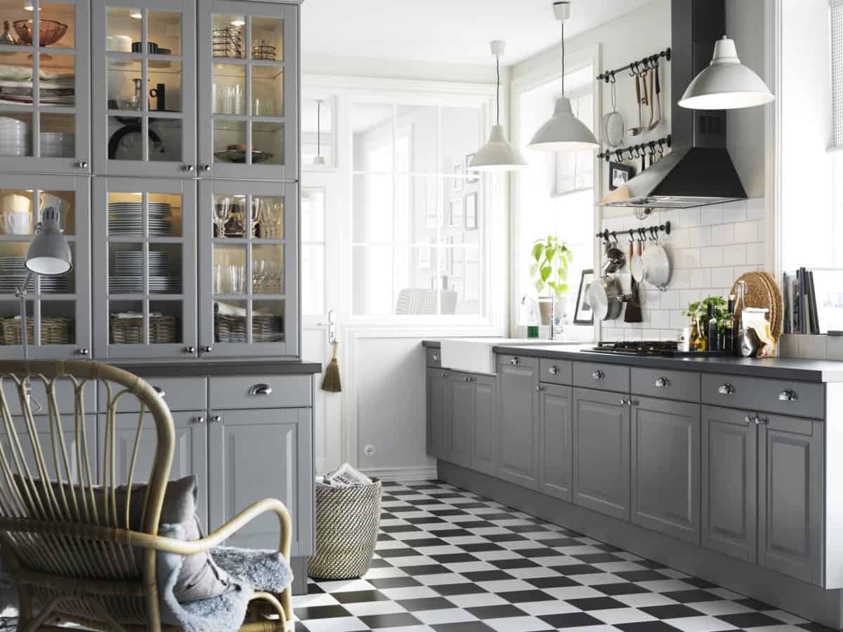
Builders Surplus featured this farmhouse-inspired kitchen. It’s definitely got a retro vibe with its checkerboard floor and white metal light fixtures, but we’re loving that blend. And the gray cabinets add a contemporary touch to the blending of style genres.
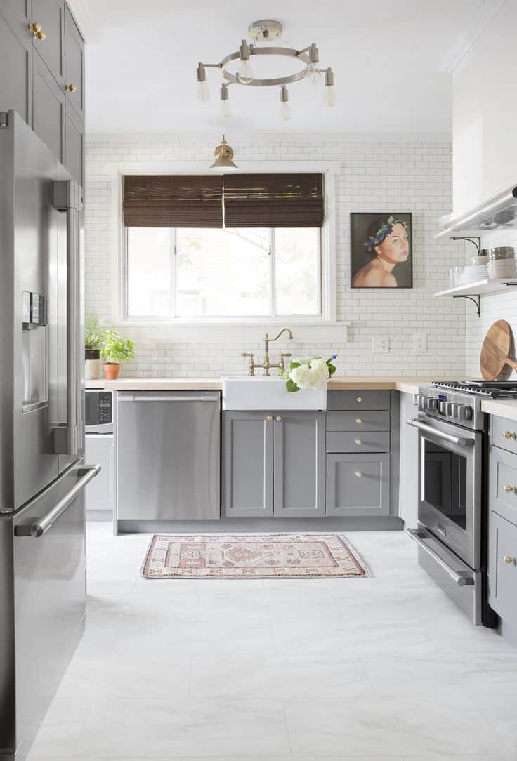
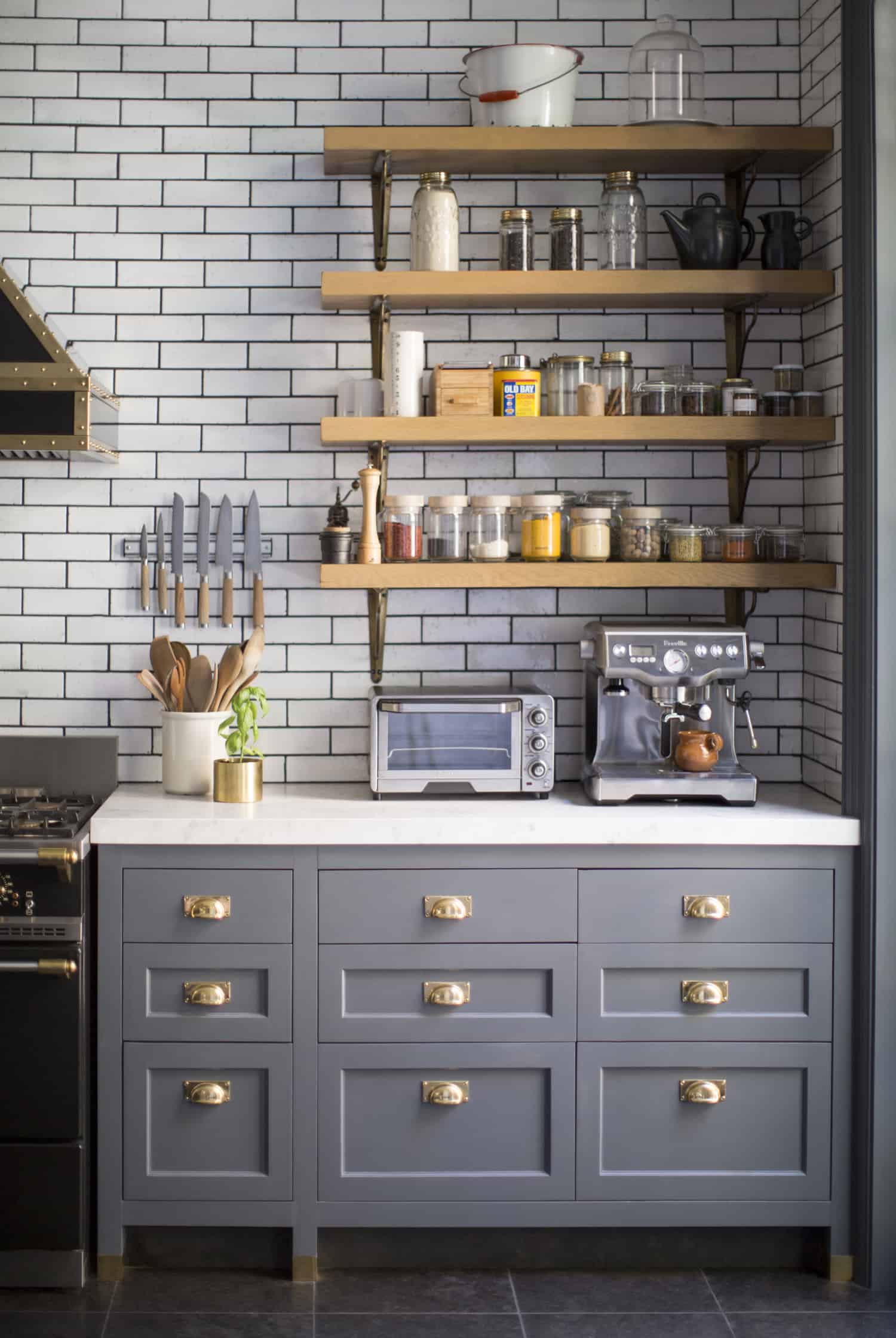
Here’s a look into a kitchen that’s been stabilized by grey tones but also has all the elements of a trendy kitchen. The golden hardware, the Aztec throw rug and the subway tile are all bits and pieces we’re seeing on the rise. And this design we found on Pinterest meshes them so nicely.
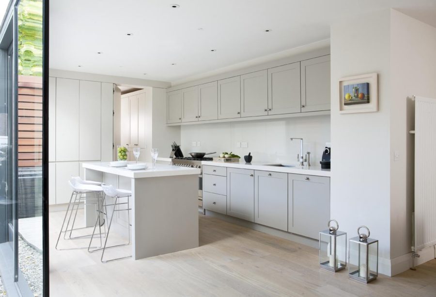
Another contemporary kitchen that decided to soften its edges with bouts of French grey, we love the clean lines of this space. The grey tone really does give it a more welcoming and delicate presence while keeping within the confined of a modern vision for the home.

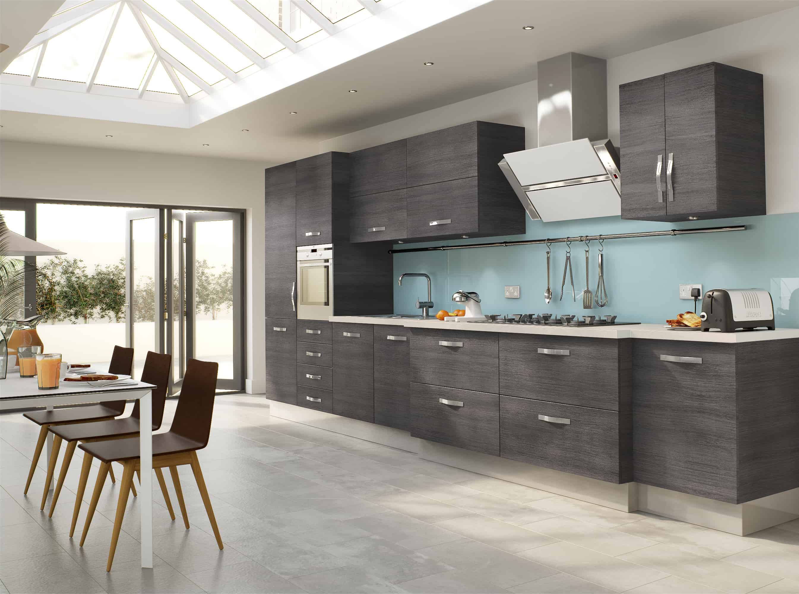
More unique and blended than others on the list, check out this design from Hecale. A blue backsplash, textural charcoal cabinets and some dark, wooden chairs too, there’s a lot going on here. But it’s done in a way that works and without becoming too messy.
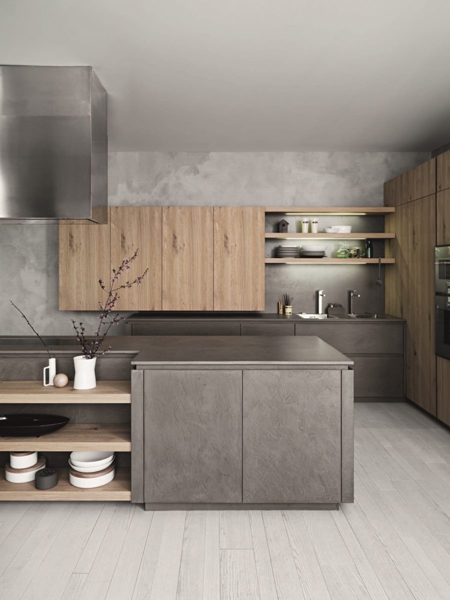
Grey on the walls, slate on the cabinets and a lot of natural wood elements as well, this space is all about organic texture and we love it. Paired with modern lines, this two is a seamless blend of style genres that tug at our heartstrings. This unique setup was taken from Home Designing.
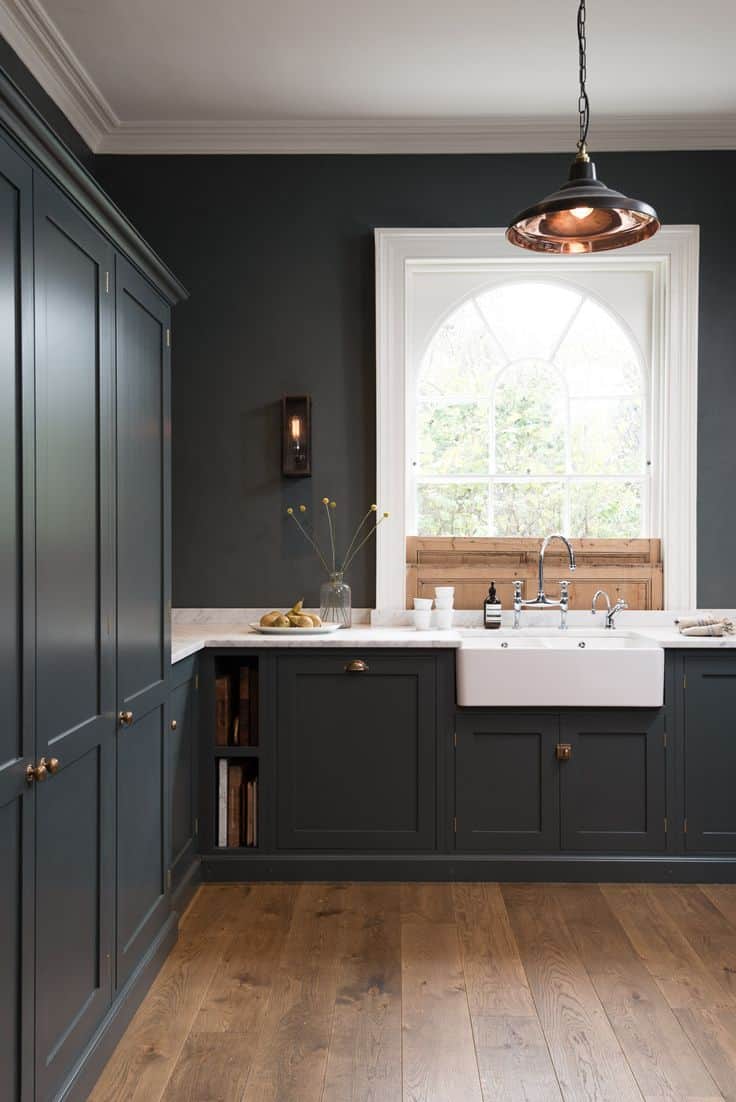
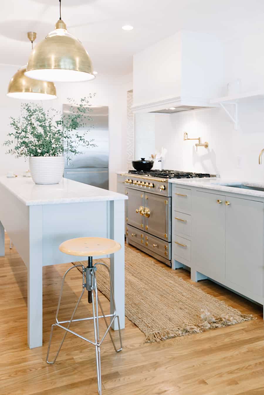
deVOL Kitchens had us swooning for this kitchen too. Those deep, charcoal cabinets pair so nicely with the light wooden floors and the marble countertops. The contrast is crisp but there’s still enough light in the room to keep it bright and functional.
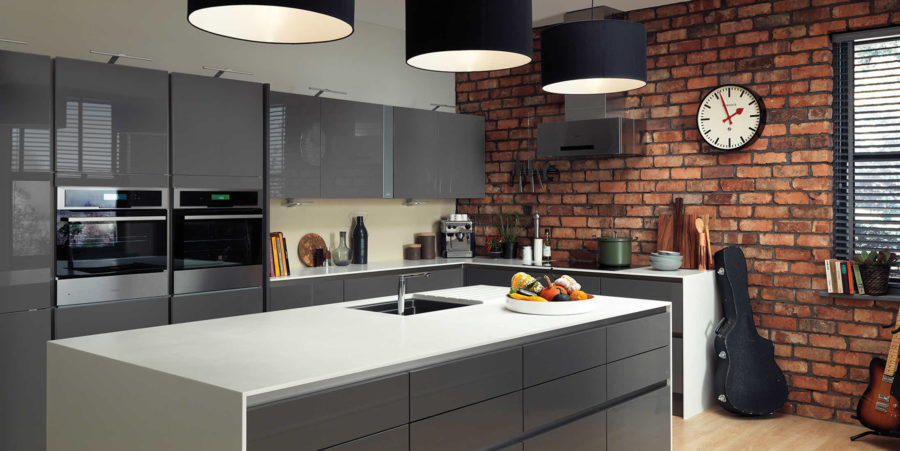
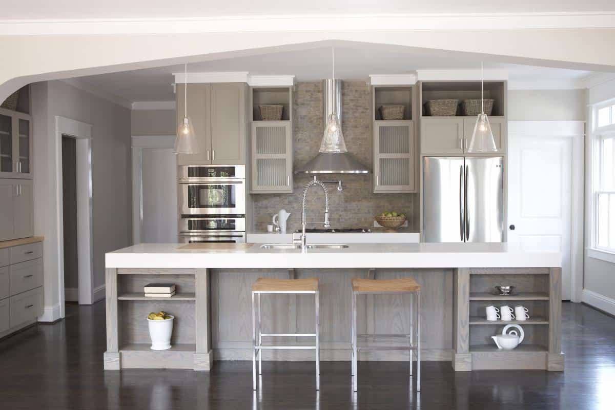
Another trendy spot to grab inspiration from. These grey, glass cabinets give a solid foundation to the exposed, brick accent wall and the drum light fixtures. There’s a lot of different textures that went into this kitchen design but we love that the grey creates a relaxed mood before anything is over exaggerated.
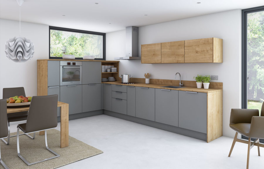
Natural wood, white and grey are a trio made in heavy, especially for those with a minimalistic or Scandinavian vision in mind. It doesn’t have to be an extra large room either to make a big, beautiful impact. Just use this find from Pinterest as your example!
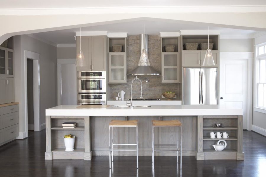
Winters Texas has a lot of beautiful kitchen designs to take a peek at as well. This quaint design caught our eye because the grey wood add something different to the space than what we’re used to. And it’s a more compact room as well, making it more accessible for a lot of family homes.
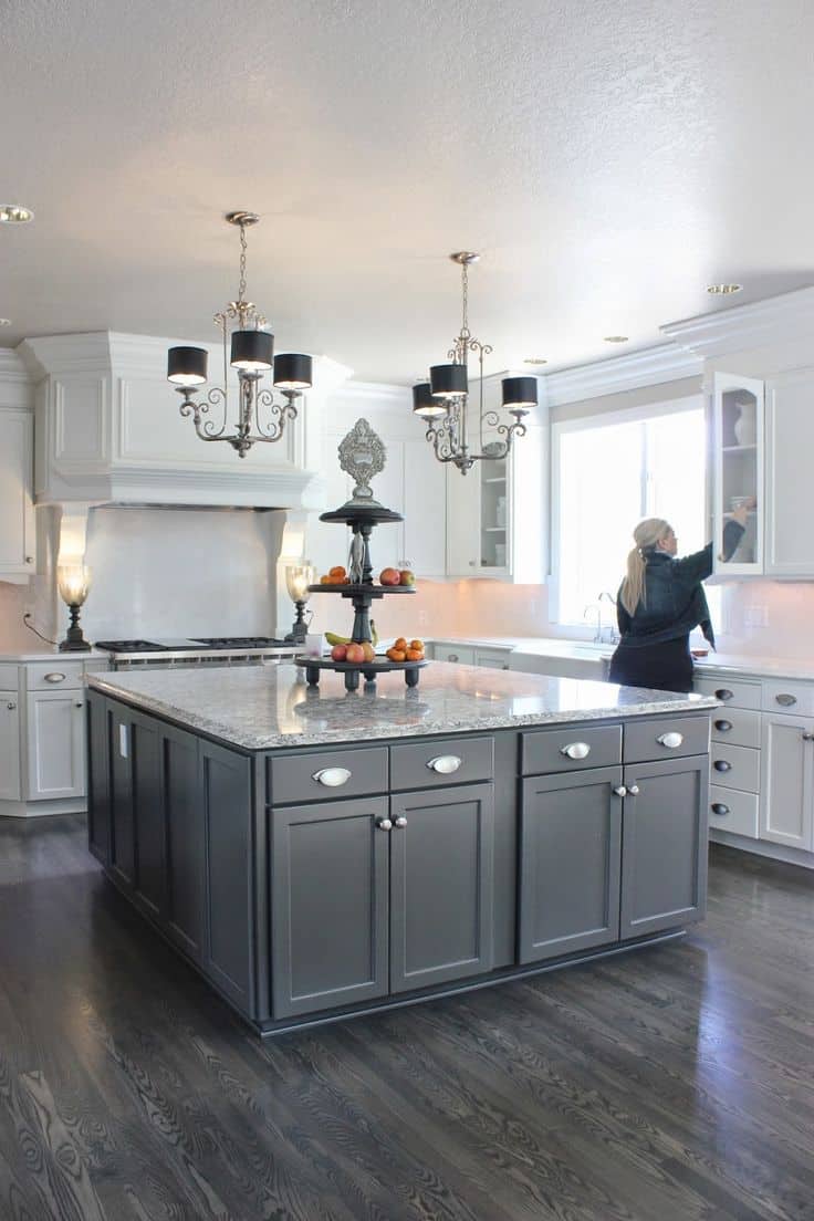
Your entire kitchen doesn’t have top be dressed in grey to get the same effects. This large, charcoal island helps to bring in the delicacy and romantic that this tone natural has. And the hardwood floors help to blend everything together with ease.
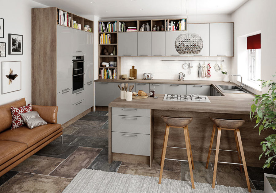
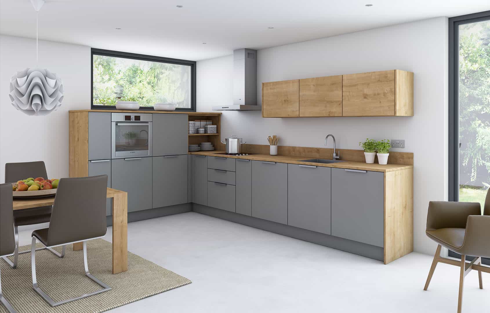
Over at Magnet, we found another quaint kitchen design. A bit more compact and smaller, wood is the main focus in the design but it’s those chic gray cabinet fronts that make our hearts sing. Mixing those natural elements with more modern details is right on trend.
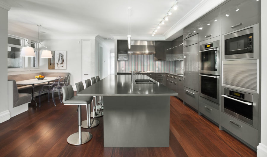
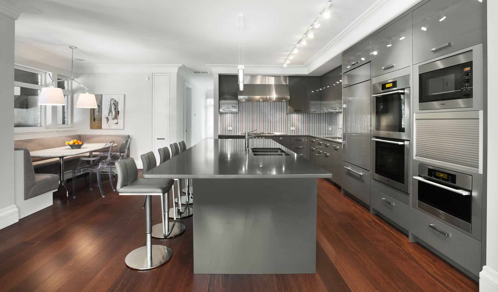
Stainless steel everywhere could be fun. If you’re into more industrial looks and want a more “professional” feel to your kitchen, think about heading in this direction. You’ll still get hat cozy, grey vibe but with an industrial twist!

If you really love darker, grey tones like charcoal or slate, then this family-friendly kitchen from Builders Surplus is right up your alley. Its’ definitely a more traditional design with all the necessities you need to get the job done throughout the week. Fortunately, there’s more room though, for a larger family and entertaining.
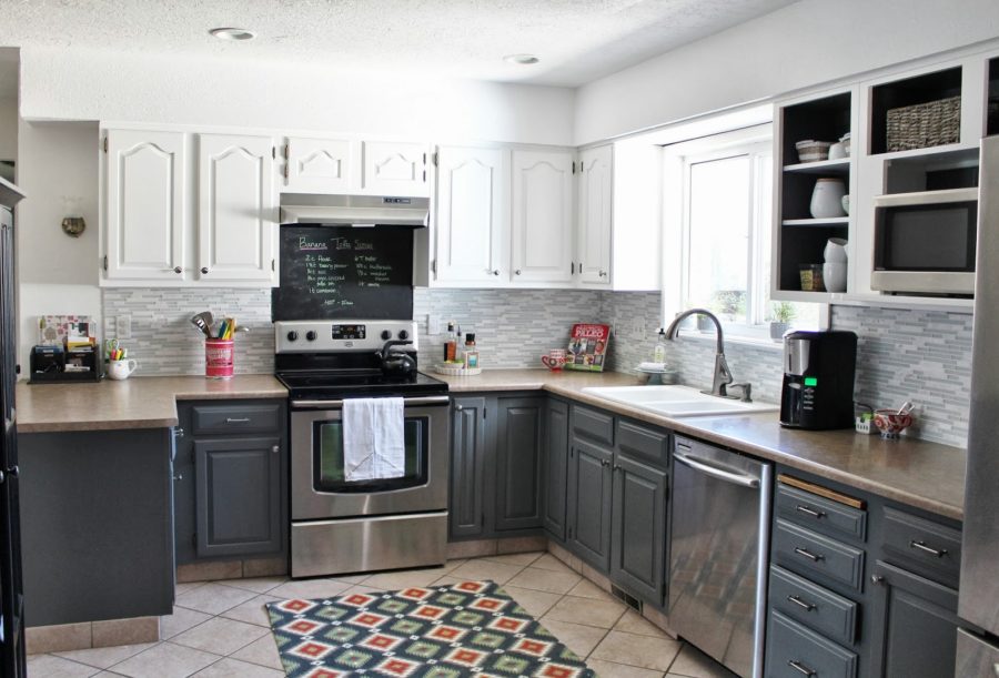
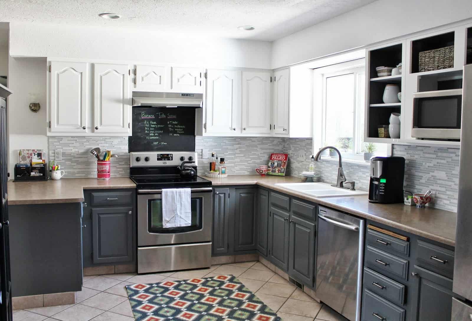
This kitchen is all about function but it’s definitely got a bout of chic style thrown in too. With a combination of neutrals, this design from Remodelaholic is a versatile one for family comes. White cabinets, charcoal cabinets and a taupe countertop combine all the right shades of working tones.
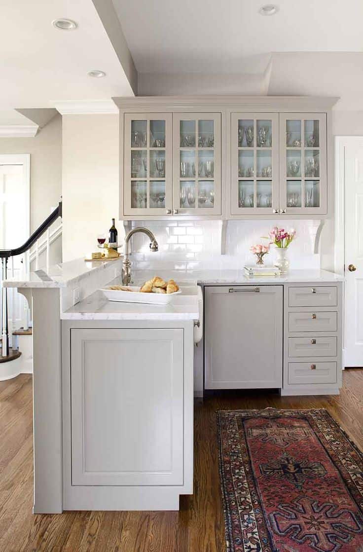
Liz Marie captured our hearts with this peek into a kitchen that blends beige and French grey so well. The splash of color in this crisp foundation softens the look and makes it a more romantic and delicate place to spend time in. And that colorful throw rug only adds in a top, trendy accent we’re loving too.

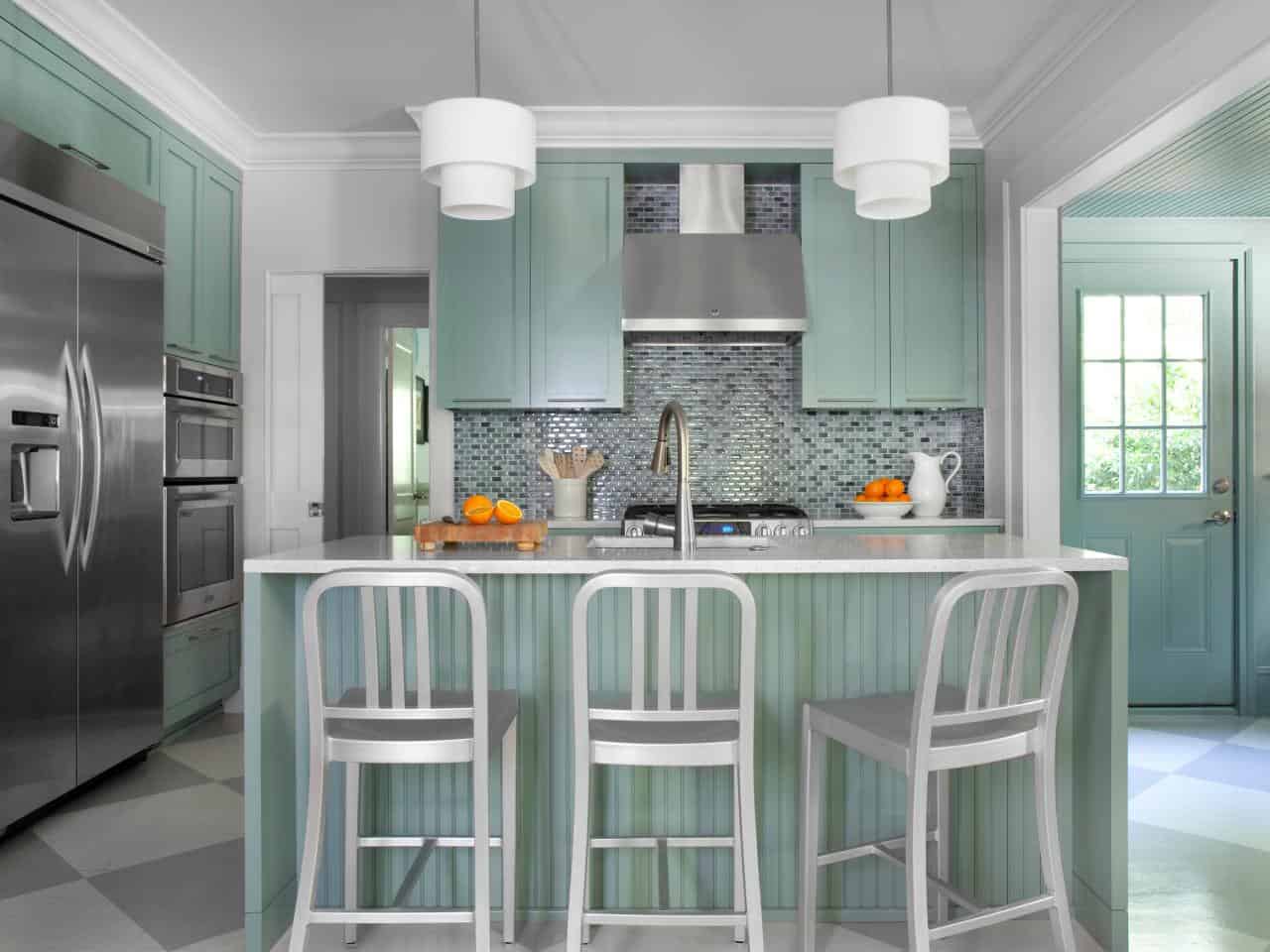
You could pair your grey tones with some color in the kitchen as well. Just look at this minty, seafoam shade that we’re loving. It evokes a cottage feel but with all the stainless steel accents it creates a more modern, unique vision instead.

Winters Texas provided us with this luxurious peek as well. There’s so many textures to get excited about. We not only love these cabinet designs but we love the hardware choice up against the charcoal color.
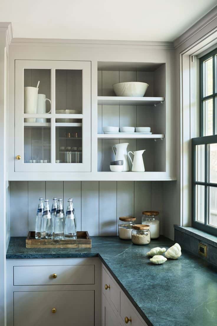
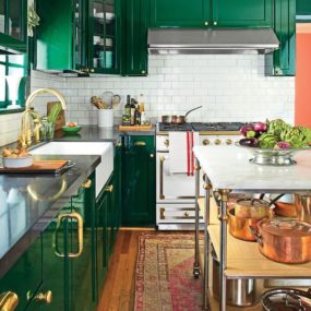
Grey kitchens are so versatile that you can really personalize nicely. Green countertops and funky knobs, they come together seamlessly when paired with such a subtle, relaxing foundation. Just look at this kitchen design from Pinterest, we fell in love with all its unique elements.
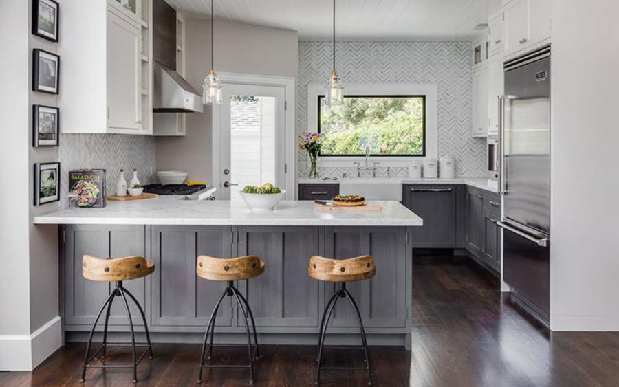
Another kitchen without a lot of open spacing, it’s a great example of how a lot of our kitchens already look and how we can spruce them up a bit. New, hanging light fixtures, funky stools and a bout of grey paint or textured cabinets, this design from Tocci is really inspiring.
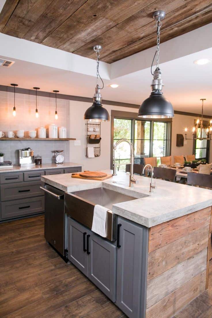
Here’s another way to blend textures that you love together. Wood, stainless steel and countertop of your choice, you can create interest just by mixing these kinds of elements. We even love the addition of the accented ceiling and industrial-styled lighting throughout.
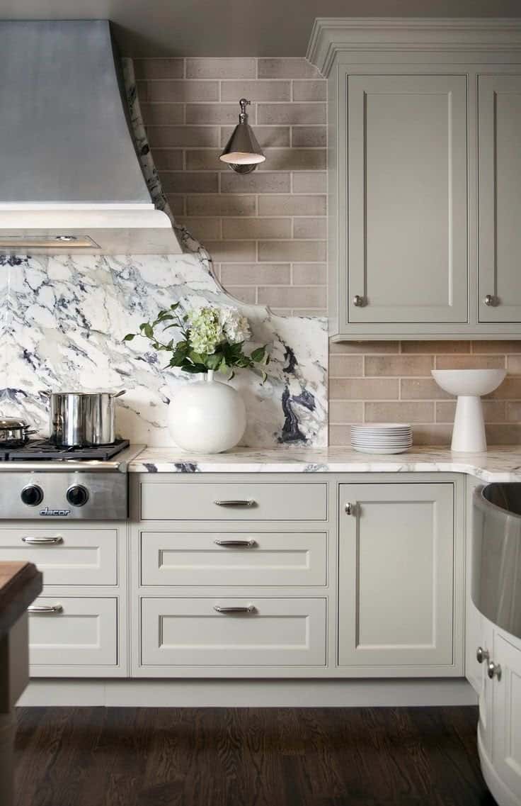
Here are more light grey cabinets that we’re loving. This time featured by The Kitchn, check out how beautiful marble plays with this nook. Adding in a bout of taupe for a more traditional spirit, there’s luxury and function involved in this one.
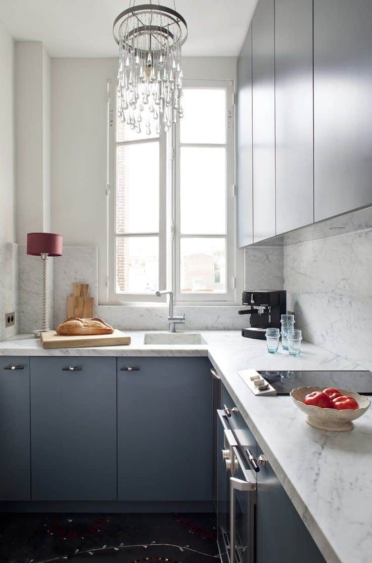
You can even create amore glamorous vibe in your kitchen if you add in the right touches. Modern, charcoal cabinets, marble here and there and then a chandelier on top, it’s so unique! We found this beauty on Pinterest and just had to feature its originality and obvious personalization.

A lot of people don’t expect – or believe – gold pairs well with gold but, in fact, it’s quite on trend right now. Mixing metallics and neutrals is always a great idea. And this kitchen design from SMP is filled with feminine beauty and charm.
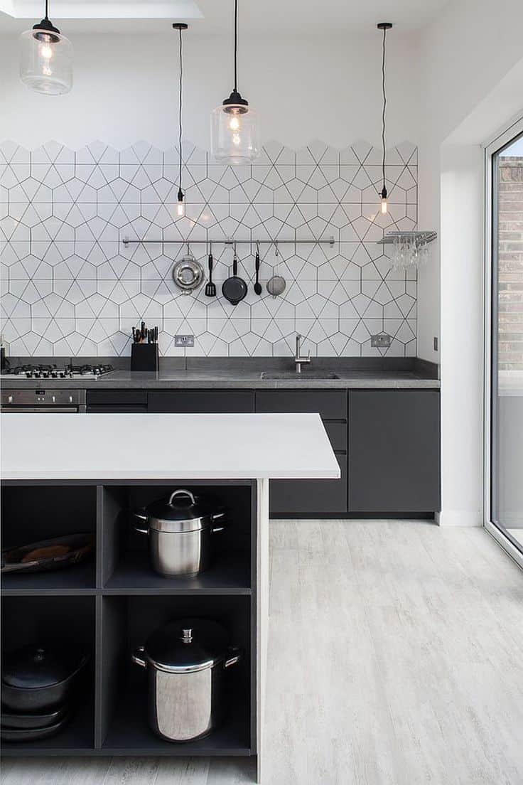
Then again, you may be mostly inspired by kitchen that are purely functional and minimalistic. For those with contemporary hearts and looking for clean lines, check out this Pinterest find. Filled with geometric details and open cabinets, it’s another bout of inspiration that could help your kitchen revamp!
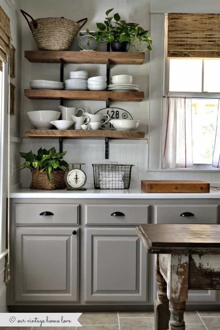
Style Me Pretty had this cottage-inspired beauty featured as well. We love the open shelving and farmhouse elements, but its that perfect shade of grey that brings in the delicate charm that we love. Grey is such a functional and versatile neutral, this is just another design that showcases those benefits.
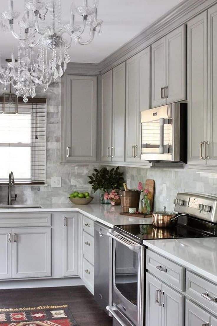
For those with Victorian eyes, check out how this Pinterest design made it happen. A crystal chandeliers tops off the shining kitchen with effortlessness. Shining hardware is what take this great space to the next level.
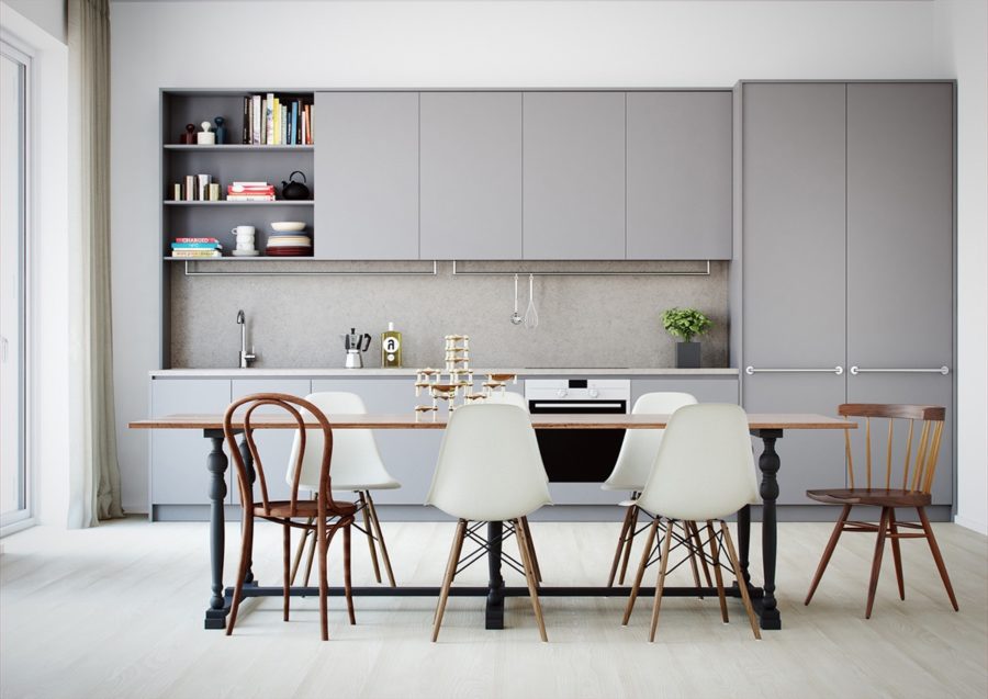
But, again, if you really love that minimal, modern feel, then these are the examples you need to follow. With a bout of Scandinavian beauty and clean goals, this kitchen is right up your alley. We love the varying chairs though creating a more welcoming presence.
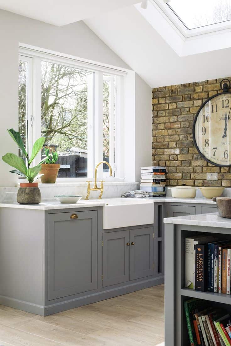
Another peek inside a kitchen that should excite you. It all starts with grey cabinets and gold hardware. That exposed brick adds a youthful elements and plays nicely off the natural sunlight filling the room and creating a more breathable space. The marble countertops are always a beautiful addition as well – to truly any kitchen.
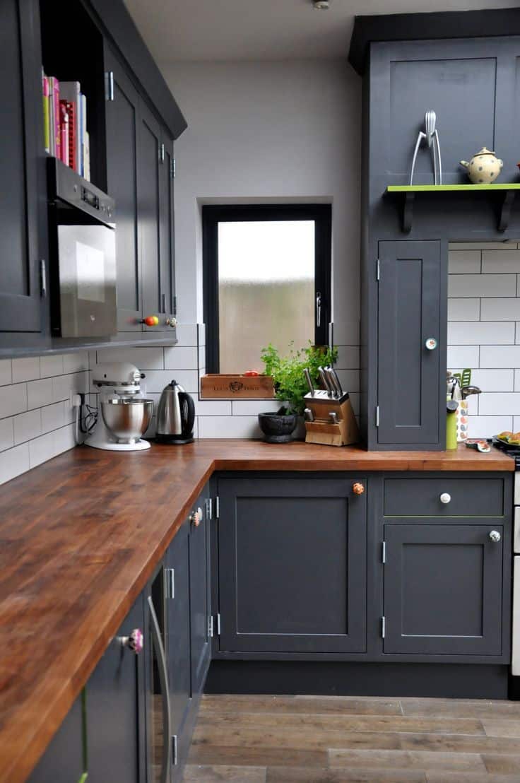
Check out all of the funky knobs showcased in this kitchen design. That’s where you can easily fit in personalization without going overboard. Also, the wooden countertops and charcoal cabinets really make a gorgeous pairing, don’t you think? This bold design was found through Pinterest and it’s one of our personal favorites from the list.
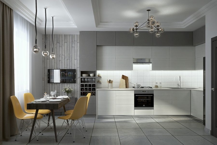
And finally, if you visit Interior Design Ideas just one more time, you’ll find this beauty showcases. Yellow is a gorgeous counterpart to grey, but it’s really the design of the room that we’re inspired by. Ultra modern and compact, sometimes those flat-front cabinets help get your to your contemporary vision without any fuss.
