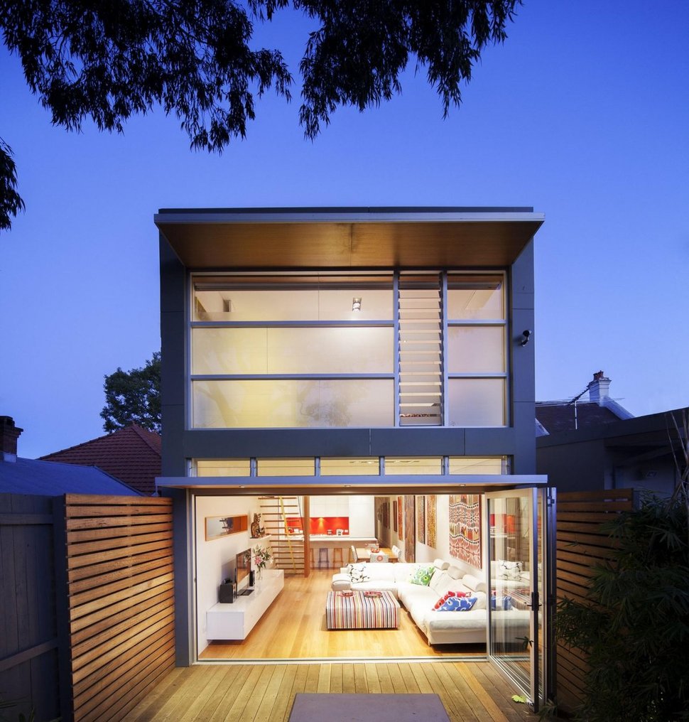
Located in a protected conservation area in West Sydney the facade of this home had to stay true to its original design. Since it was only 100 square meters in size the family that owned this home had to (successfully) lobby council to add a second floor. During the renovations the original lower level of the back of the home was opened up and fitted with a large quad fold glass door. From this vantage point none of the traditional details are visible.
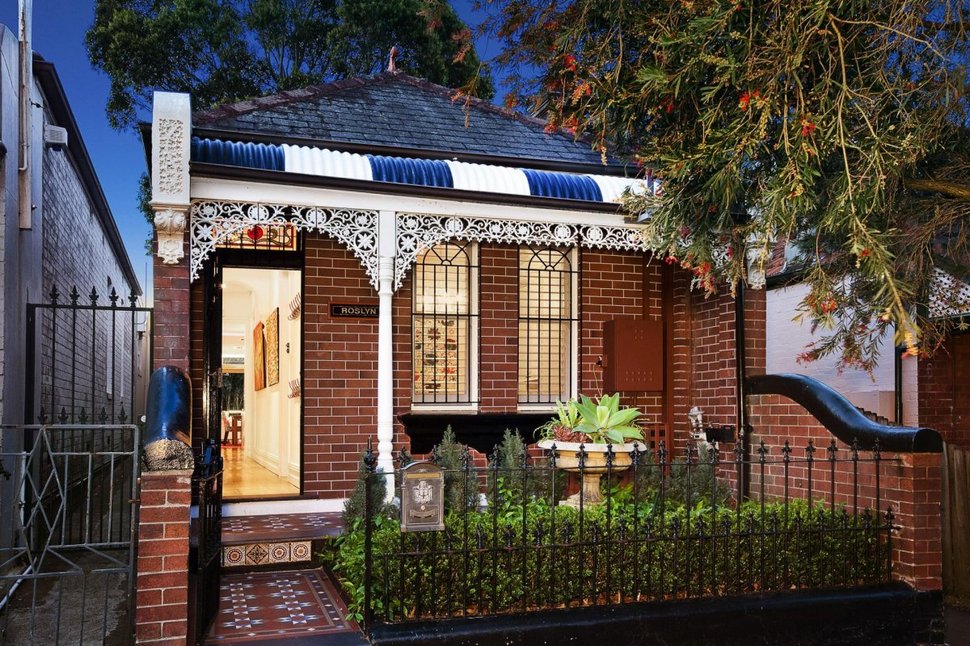
Showing off its split personality the front façade kept true to its authentic details with absolutely no reference to the recent modern addition. The home looks untouched right down to the small garden and wrought iron picket fence. The ginger bread detailing, brick wall and tiled porch are quaint and rustic and in complete contrast to the modern and clean lined space that hides beyond the front door.
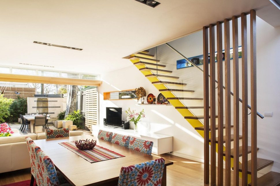
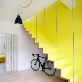
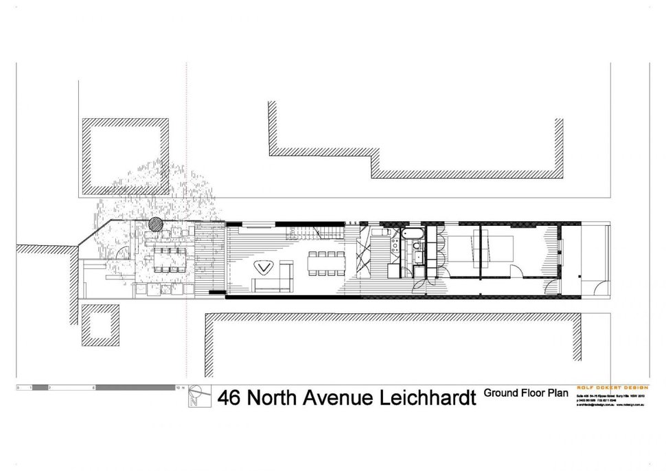
Inside the home the living space has been located at the back of the home to take advantage of the long wall of glass that opens up to the back deck. Clear glass panels have been used on the open tread stairwell to stop the long and narrow home from feeling too contained. The stringer is finished in a bold yellow and is situated at the 2/3 point. Just in front of the living space is the dining area.
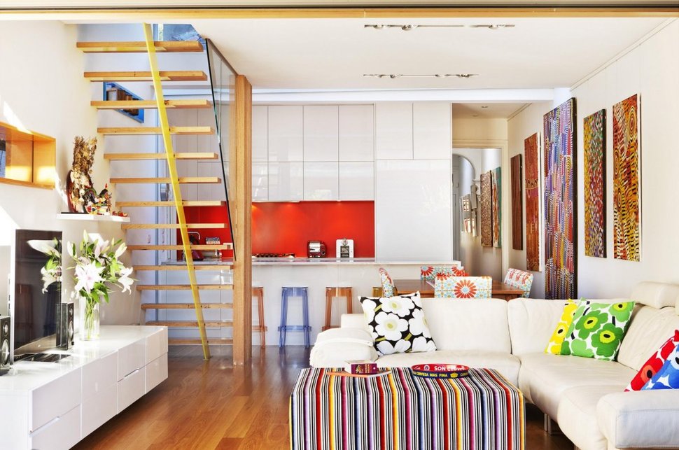
Located in the centre of the home and just before the dining area is the kitchen. Clad in a bright white flat panel finish with a bold scarlet red backsplash it plays off of the row of large and colourful canvasses that line the length of the homes wall. An upholstered ottoman/coffee table harmonizes with all the colours as does the bold large floral pillows. The dining room chairs are also upholstered in a large pattern, but a slightly more subdued one.
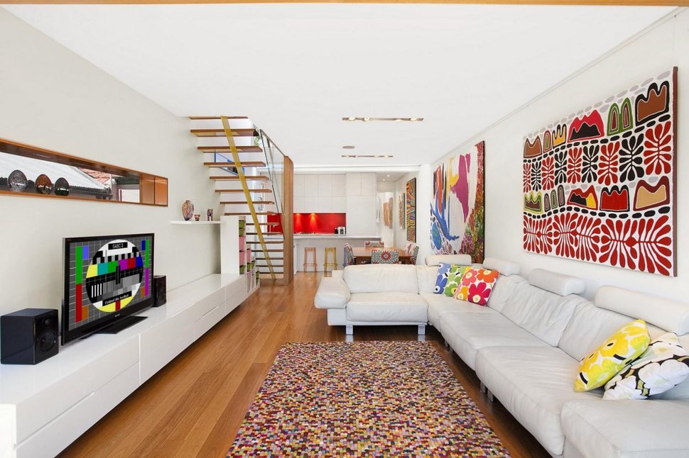
Viewing all 3 areas at once, the bold patterns that wrap the walls and floor create a dynamic story of energy and fun. The streamlined ceiling with its inset lighting keeps the eye on the run of canvasses and multi-toned rug. The mid-tone wide plank flooring grounds the room without being dark.
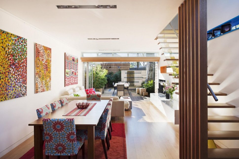
Past the living space and through the large glass wall is the outdoor dining space. An almost identical layout to the dining area it almost seems like it is a sepia toned reflection rather then an outdoor area.
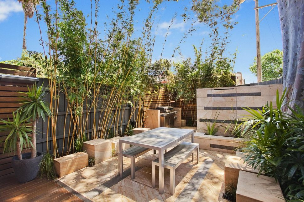
The backyard is hardscaped for additional living space. Greenery is only used on the surrounding edges of the lot. A small BBQ station is on the far side of the courtyard and varying heights of wood blocks create visual interest and extra seating. The seating at the table in this view has been switched out from chairs to benches.
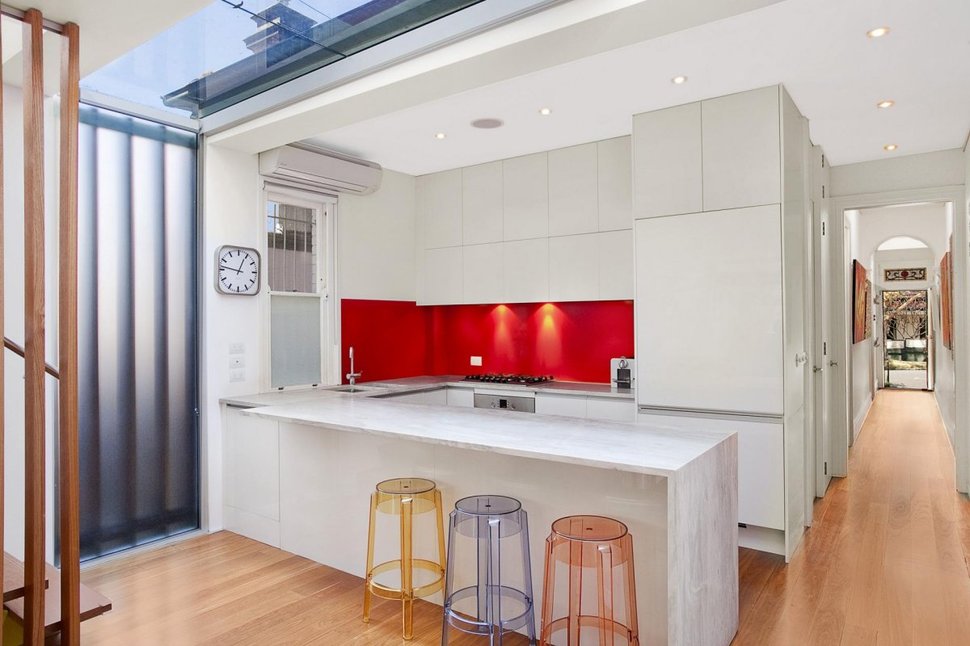
Back in the house and below the kitchen counter are 3 acrylic bar stools. In keeping with the rest of the space they are each a different translucent primary colour, above the stools a skylight brings additional light into the space.
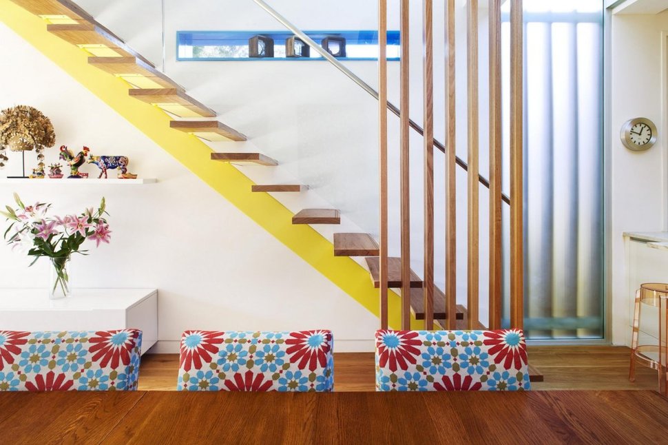
The media cabinet runs the length of the living space and stops at the midpoint below the stairs. A narrow white shelf fills the vertical void between the cabinet and the stair treads. Here colour is also used in a rooster and a dog figurine. The figurines are small and delicate and don’t compete with the bolder dining room chair fabric. The large yellow band on the stringer is an even larger graphic pattern that plays nicely off of the blue trim on the horizontal stairwell window. The vertical 2x2s create a visual separation between the stairwell and the dining space – and also strategically offer support to the handrail.
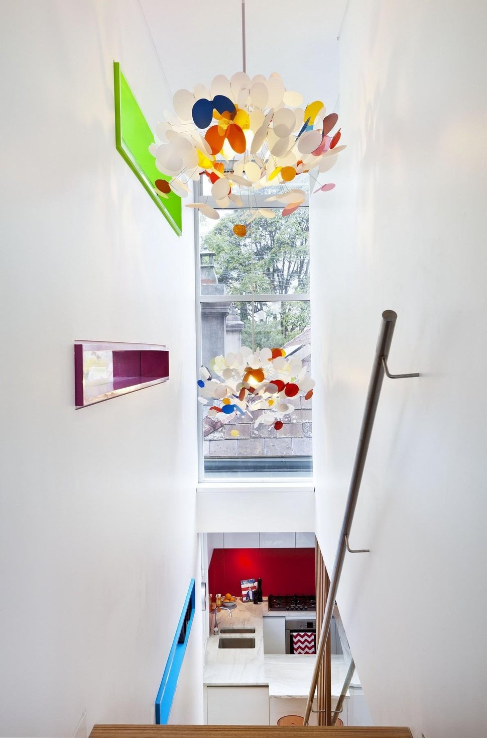
As you travel up the stairs there are two more horizontal windows, each with a different bold trim colour. Playing off of these is a contemporary light fixture that continues the theme of white with pops of bright colour. A large narrow window brings in more light and fills the space on the end wall.
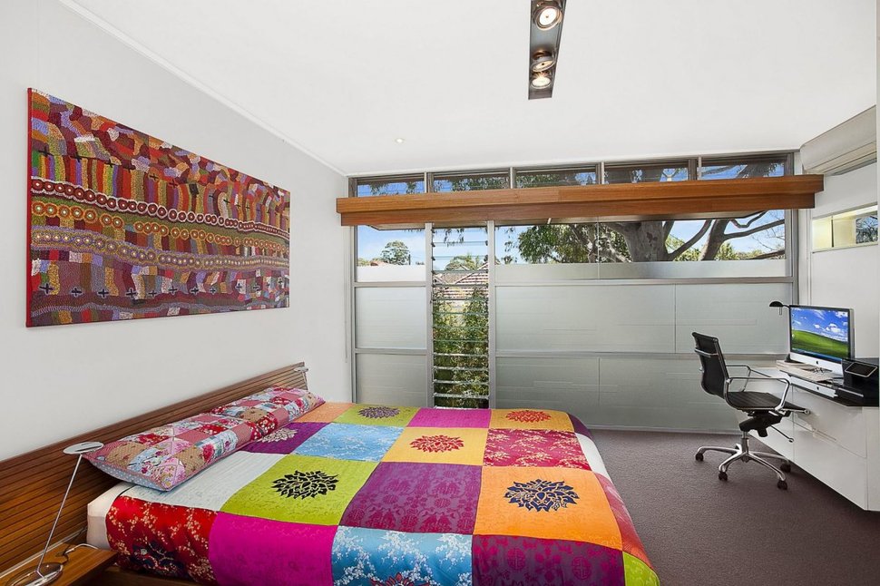
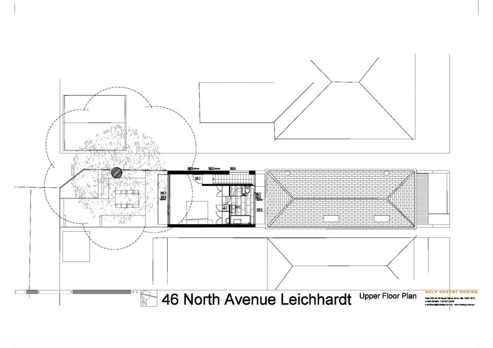
Upstairs is where the Master Suite is located. Bold patterns continue but instead of on large canvasses they are on large quilts. One quilt is on the bed and one is above the bed. The window wall is frosted on the bottom 2/3s so that the homeowners have complete privacy while still taking advantage of all the natural light. A small laptop station is set up on the far wall.
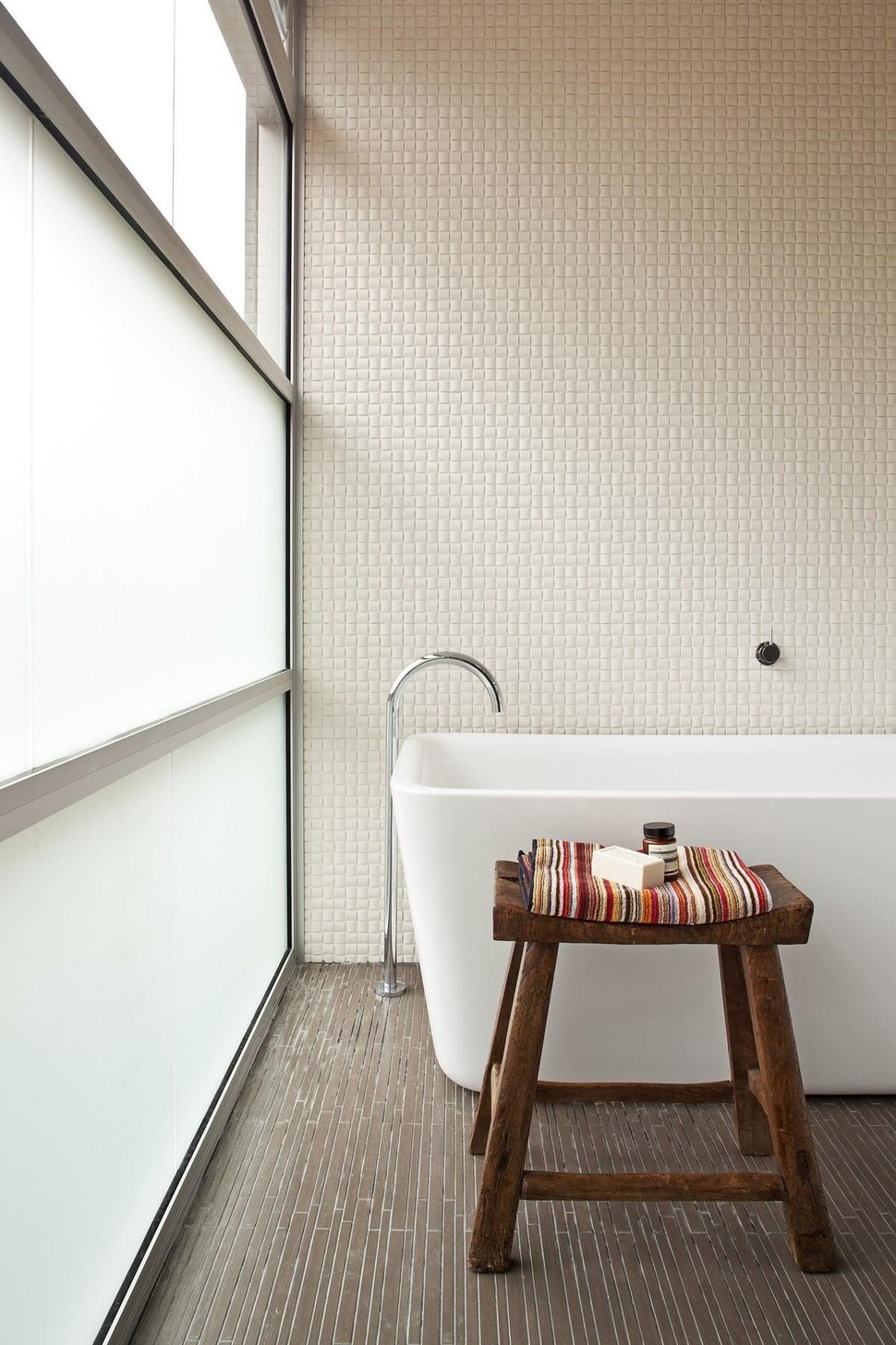
The Master Bathroom is located in the inner wall of the Master suite but a small exterior gap separates it from the original building. This allowed the architect to create the same floor to ceiling window treatment that the bedroom has. The walls are kept to a small white mosaic and the colour is left to the accessories.
Architect: Rolf Ockert Design
