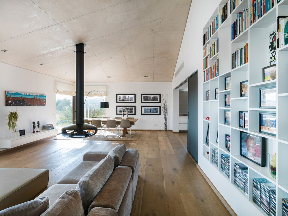
Interior Designer Marga Rotger was given a brief by her clients to create a family home in Mallorca, Spain that denoted simplicity of open spaces within a warm atmosphere. The home itself incorporated a modern design aesthetic with its concrete ceilings and wide plank flooring and Marga took her muse from these materials to expand on the textural story through a neutral and earthy colour palette. The earth tones are present in ever room but break out into a few bold colour moments within the children’s areas. Aside from the pops of colour within the children’s zone, feature items such as the floating fireplace separating the living and dining area as well as the built in bookshelves, create the perfect amount of detail to personalize each space while staying true to the minimalist uncluttered look the clients preferred.
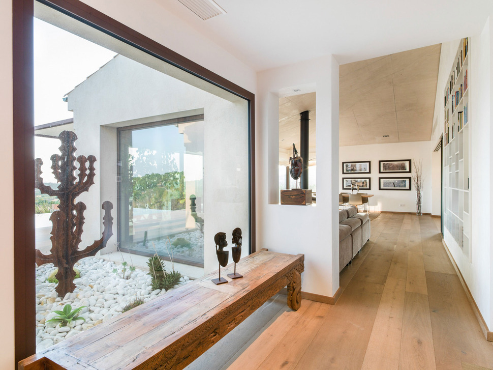
From the moment you enter the residence, the tone is set for a calm and comfortable environment that showcases featured items in a controlled and uncluttered manner. A rustic bench runs the length of the foyer window and the short wall at the end of the bench has a cut out that seems to frame the flu to the floating fireplace beyond. A couple of small sculptures sit casually on the bench while a third is framed in the wall cut out and just past the hall, the built in bookshelf showcases a variety of family photos, books, cds and momentos.
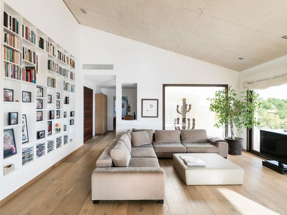
The living room is a study of comfortable elegance. The built in bookshelf keeps the passageway visually interesting while the sectional offers a deep and relaxing place to enjoy either the views, or the TV.

Acting as a separation to the living and dining zones is the floating fireplace. With openings on both sides, the fire can be enjoyed from either area. Just outside the living room is a second dining space and this one is poolside.
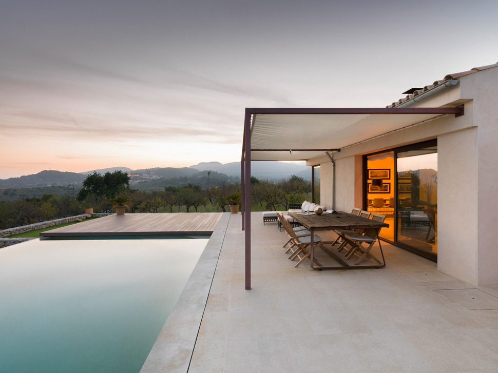
The outdoor dining area is covered with a cloth arbour, creating a relaxing place to enjoy the views or watching the children in the pool.
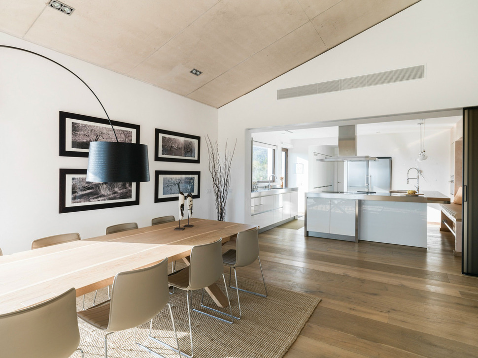
The indoor dining area picks up on the black features of the TV and fireplace within the black shade of the lighting fixture and the black frames on the wall mounted photographs. This connection of the blacks creates a balanced continuum of colour from one side of the open floor plant to the other. The Kitchen just past the dining area is where the open floor plan ends. Here, no black moments are featured, instead the room is wrapped in white and stainless steel.
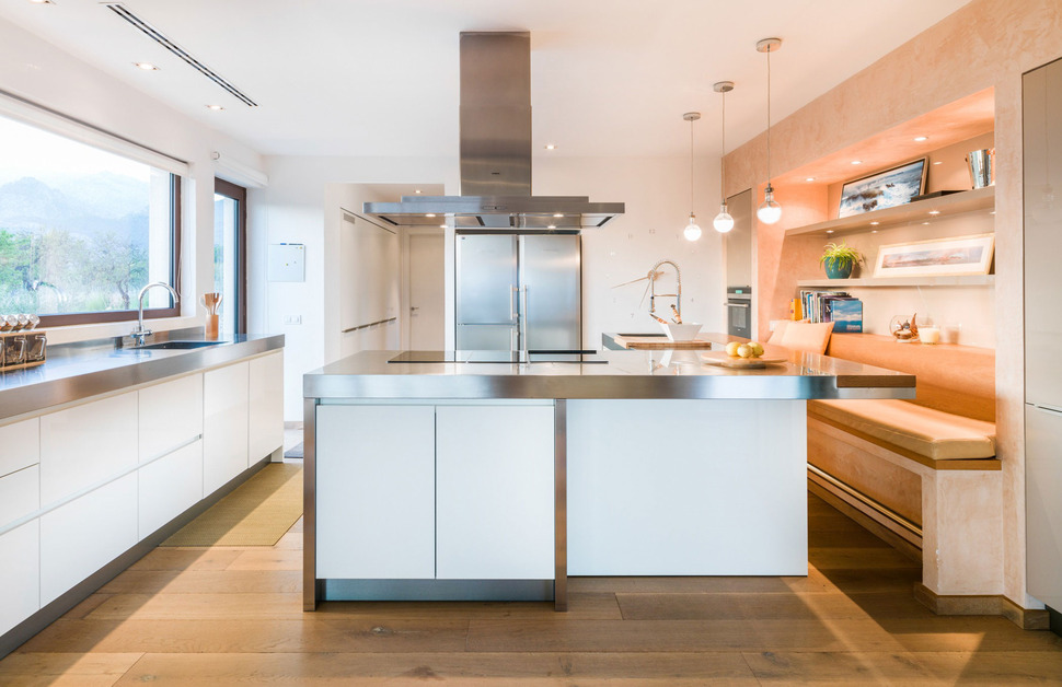
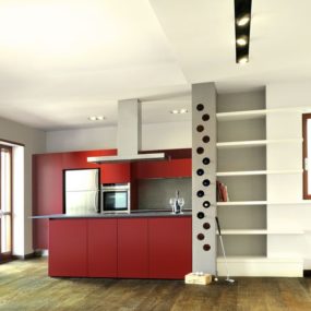
The kitchen incorporates an unusual floor plan that consists of an “L:” shaped island with bench seating on one side and prep space on the other. The cook top is also on the inside of the “L” to keep the young children away from it, giving peace of mind to the homeowners that their kids won’t run past and knock hot pots onto the floor – or worse, onto themselves.
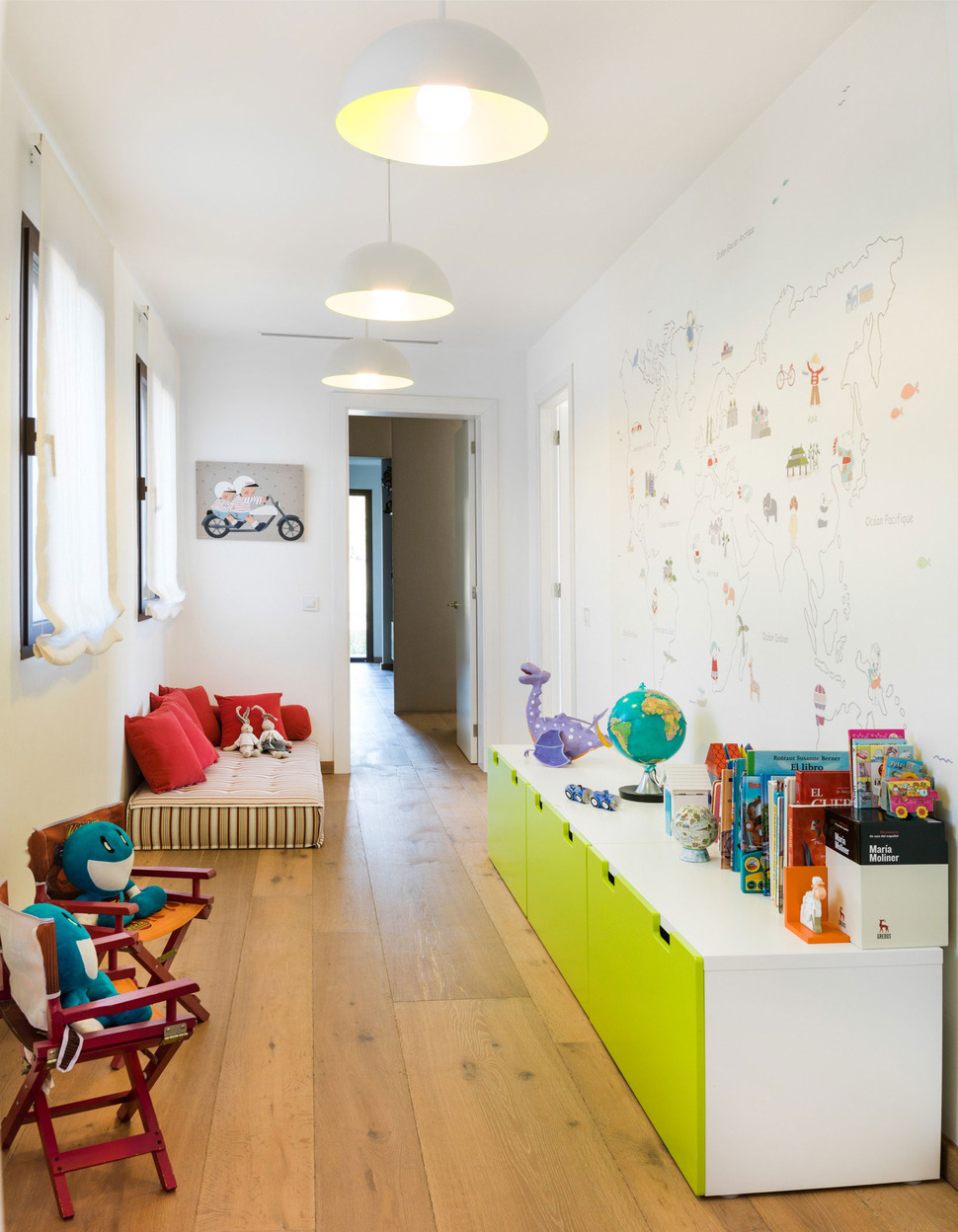
The kids have their own play area located in a section of the hallway that is extra wide. Here a long bench acts as seating, storage and display. The lime green drawers are a fun way to say “kid zone”, and the stylized map on the wall continues the “young at heart” theme.
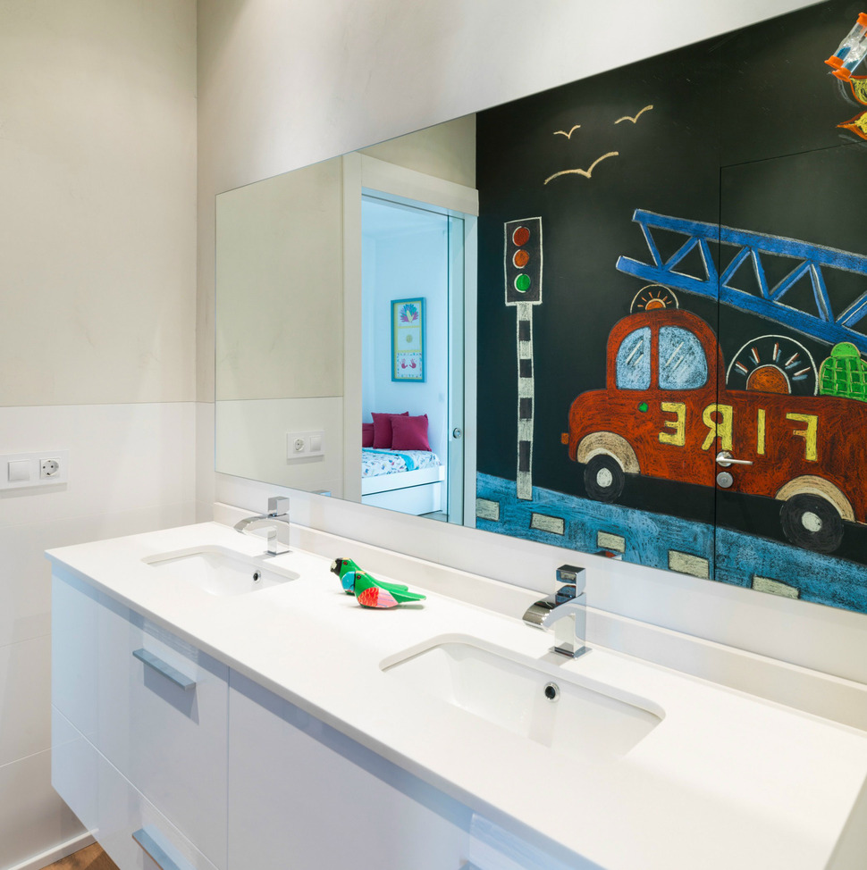
The children’s bathroom is also designed with kids in mind. I love the blackboard wall opposite the vanity with bold chalkboard drawings of a fire truck and streetlight. The drawings have a youthful looseness about them and feature the same colours used within the bedding of the attached bedroom (also seen in the reflection).
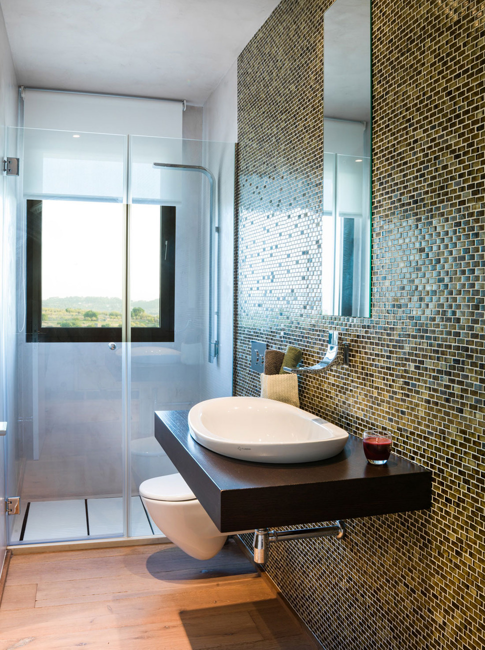
The guest bathroom is far more subdued but just as interesting. The full wall of mini subway tiles undulating from deep espresso tones to soft amber shades is a stunning backdrop to the clean lines of the floating vanity and toilet. The colours chosen for the tiles come directly from the view outside the shower window.
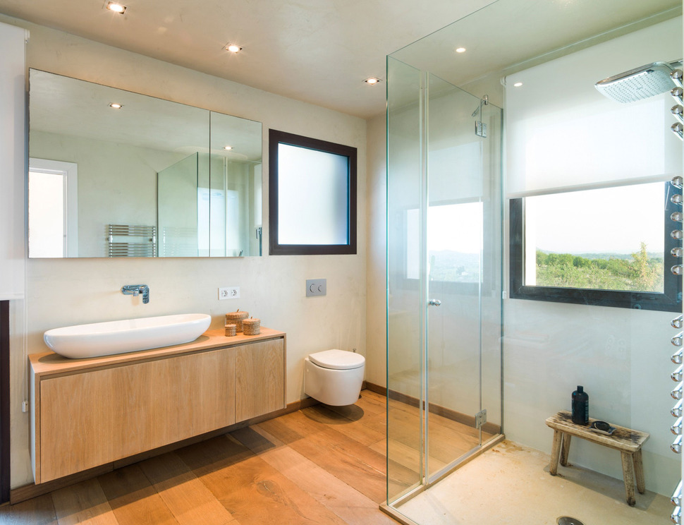
The ensuite within the Master Suite has a more “zen” atmosphere with its midtone wood and neutral walls. Even the rustic bench within the shower offers a quiet moment.
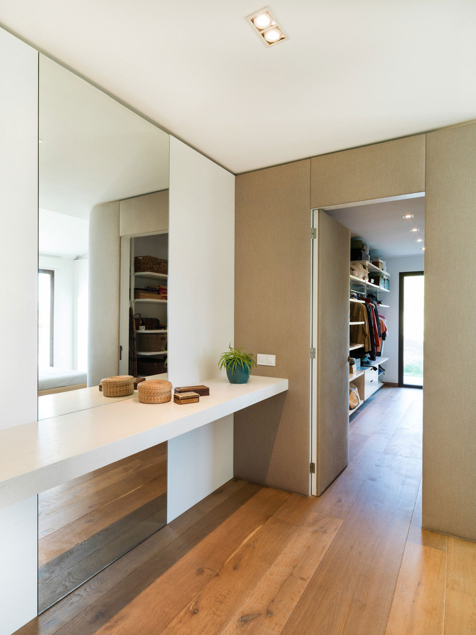
The master closet is as relaxing as the ensuite. Divided into two areas, one for clothes and one for dressing, the two zones can be closed off from each other via a door.
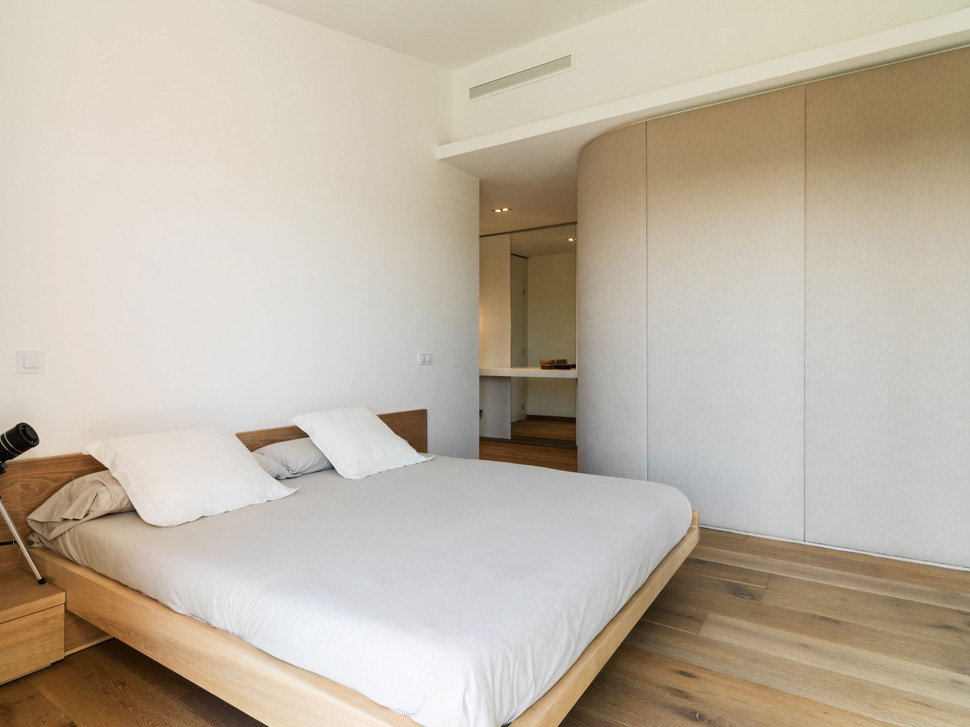
The two dressing zones are located just beside the bedroom with the closet area just behind the curved wall.
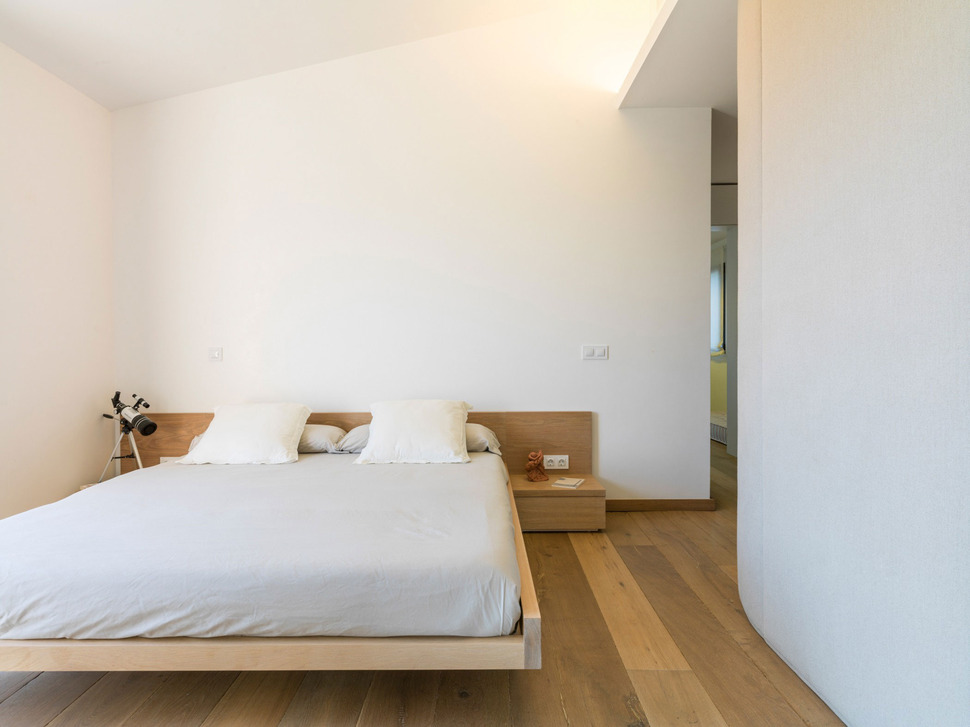
The Master Bedroom is a study in simplicity. The bed platform and night tables are all combined within one piece of furniture and aside from the mattress and linens that’s it. This is definitely not a multi-functional bedroom, it is a room that functions only as a bedroom – nothing more, nothing less.
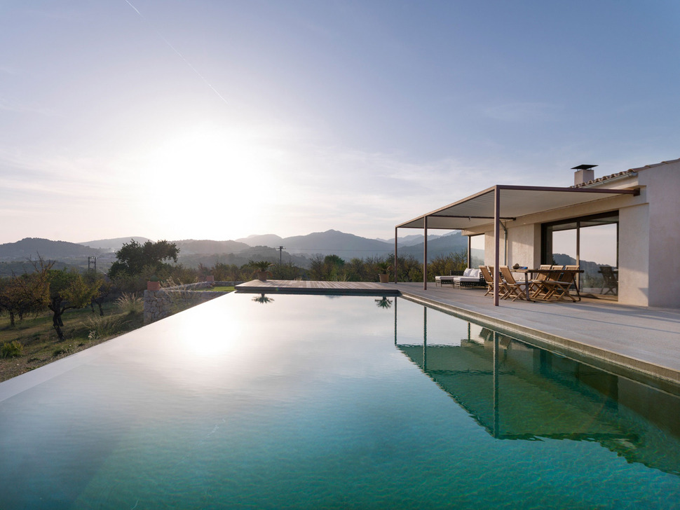
Of course, if you prefer to sleep poolside, who could blame you.
Marga Rotger Interiorisme
Photography by Gori Salva
