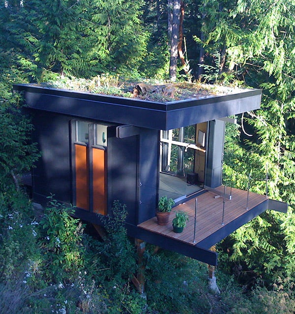
What started out as an old, un-heated and uninteresting cabin was transformed into a vibrant year-round retreat that we’d never want to leave! The redesign and revival by Reader & Swartz Architects infused this slope-side forest home with a bright blue facade and interiors that marry modern white and natural, punctuated by pops of bright color. On a modest budget, the architects opened up the cabin, both inside and out, removing walls and adding windows that invite the free flow of natural light. From the ground up, the fresh new vibe reads youthful with sophisticated tastes. The original steeply pitched roof was replaced by a butterfly shaped cover, which both sets the tone for the modern exterior and interesting interior architectural details. Scroll on for more photos, and for additional details visit Reader & Swartz Architects.
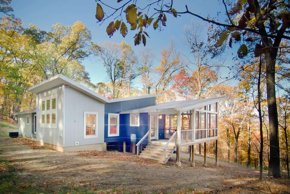
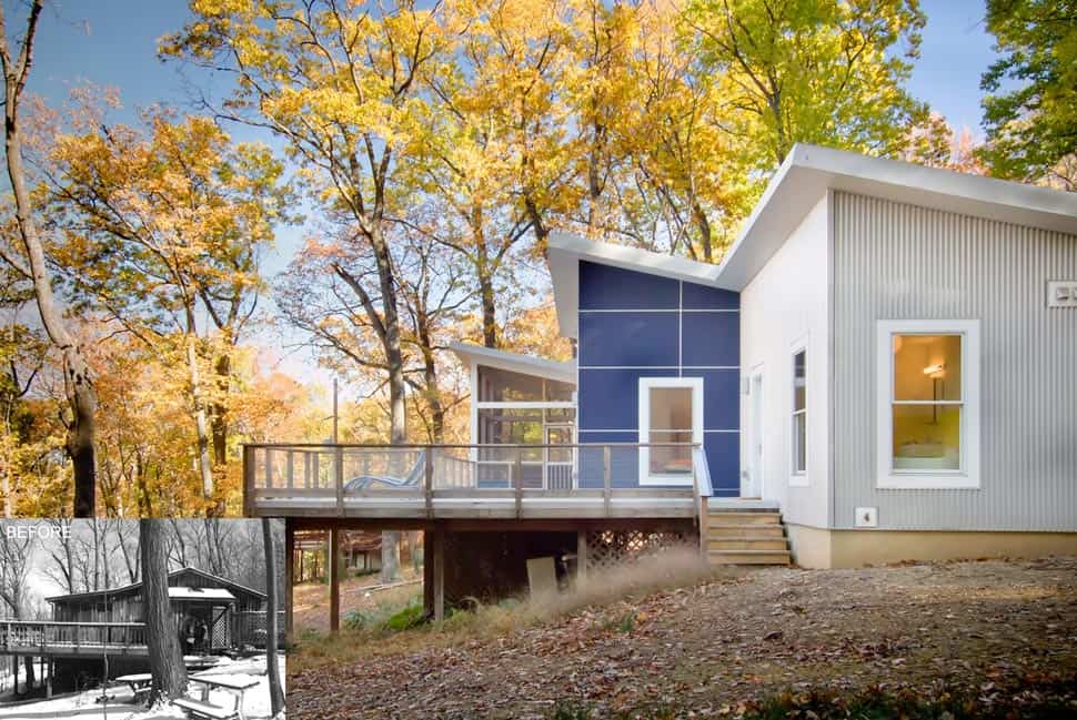
The blue and white exterior is almost alien in these surroundings, and certainly a far cry from the timber number that once stood in its place.
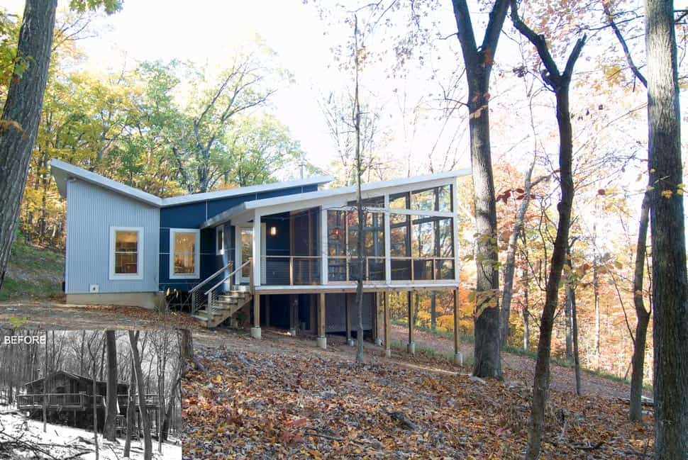
While the original wood cabin literally reflected its rural surroundings, the redesigned forest home embraces nature through the use of large windows and glass facades, as opposed to aesthetics. Although the wood posts supporting the raised deck echo the slim lines of the trees dotting the hillside.
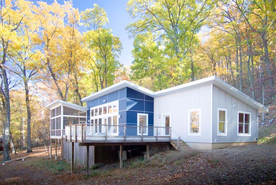
The deck is one thing that remained from the original design – re-done, but with these views, an outdoor living space was a essential. At the far end of the home, a screened-in porch offers alfresco entertaining – mosquito-free.
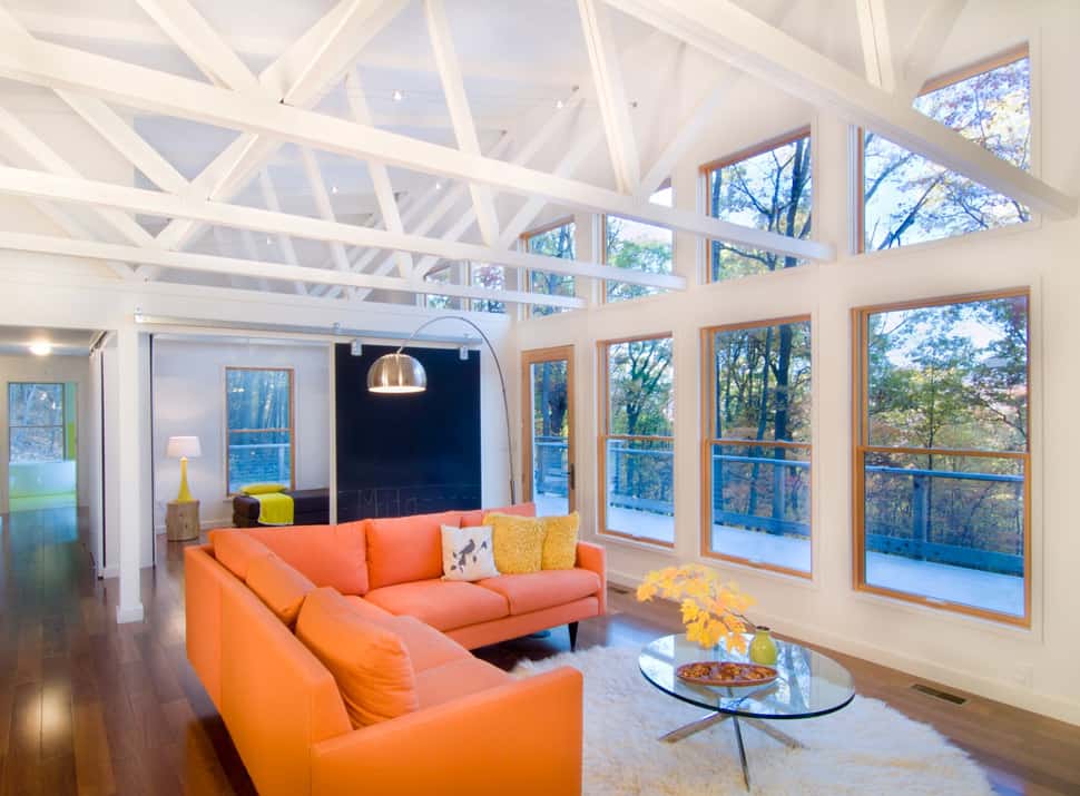
Interiors make the most of the unusual butterfly-shaped roof, with an open vaulted ceiling revealing open trusses overhead. The feature open up interiors while maximizing the mountain views. Awesome.
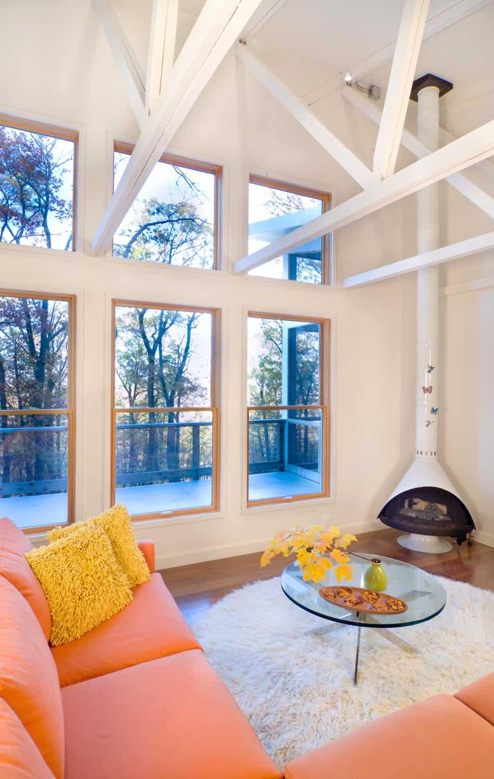
We love the modern suspended fireplace tucked into the corner, finished in white for a contemporary twist on a traditional favorite.
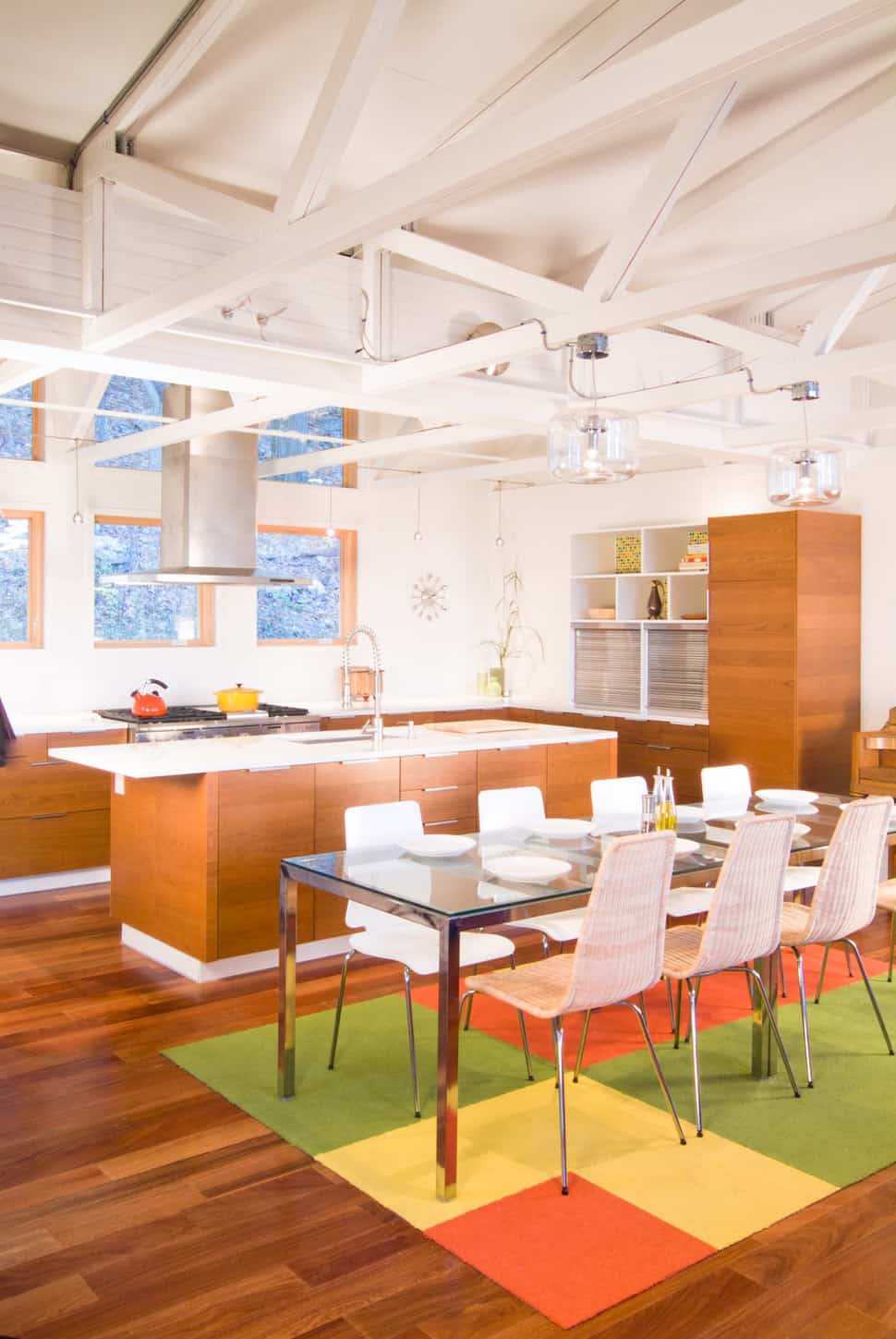
The kitchen really takes the modern interior back to nature, wrapped in natural wood from floor to cabinets, overlooked by windows framing forest views. It’s a lovely, warm contrast to the bright white backdrop characterizing the rest of the home.
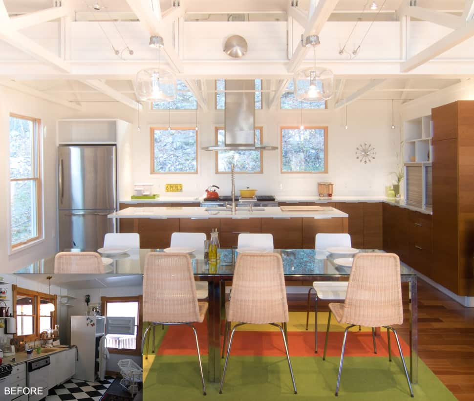
The before/after view really highlights the dramatic transformation of the cottage, from checkerboard floors and blah white cabinets, to a modern kitchen that is vibrant and alive. The new heightened ceilings really enhance the home’s sense of space, light and air.
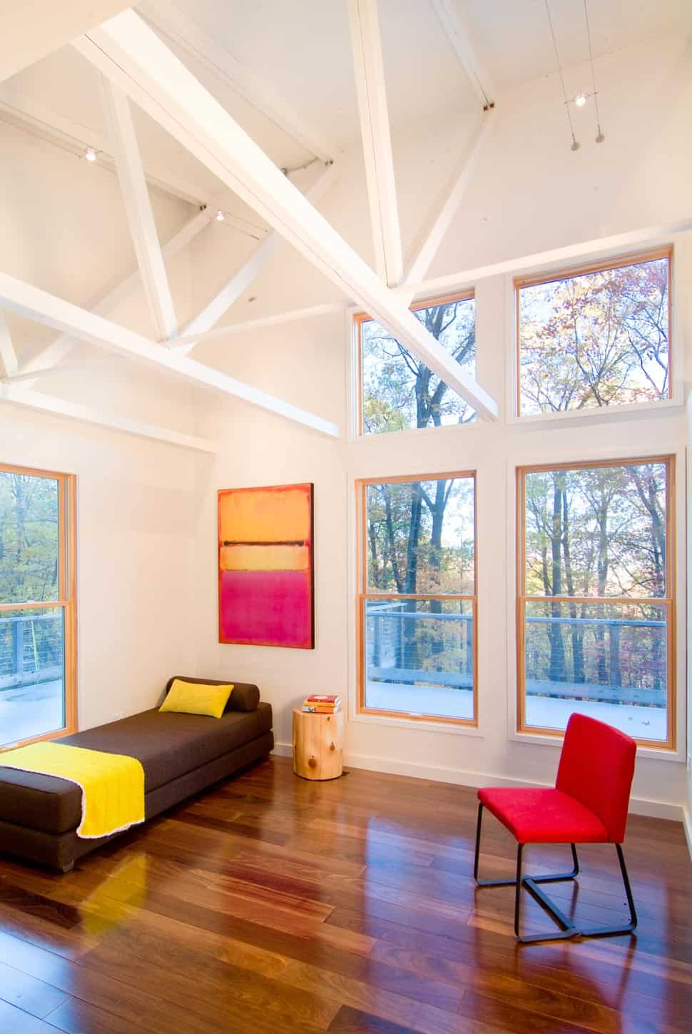
Vibrant artwork and furnishings add color, so to speak, to the cool, white backdrop.
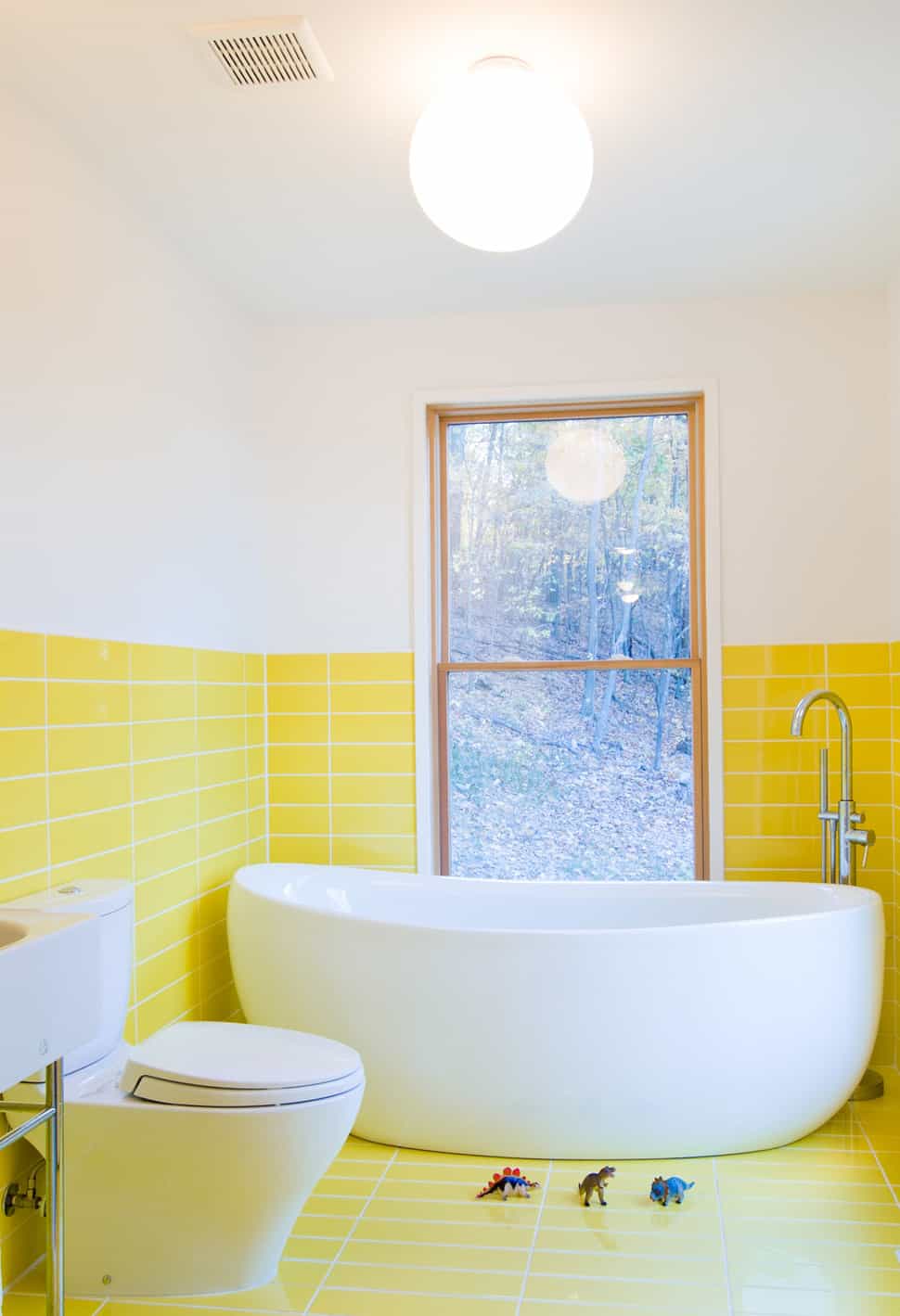
We love this bathroom, which has a retro vibe thanks to the half-wall tile in this delicious lemon yellow shade.
Additional info is available by visiting Reader & Swartz Architects.
