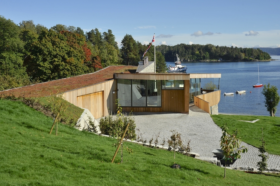
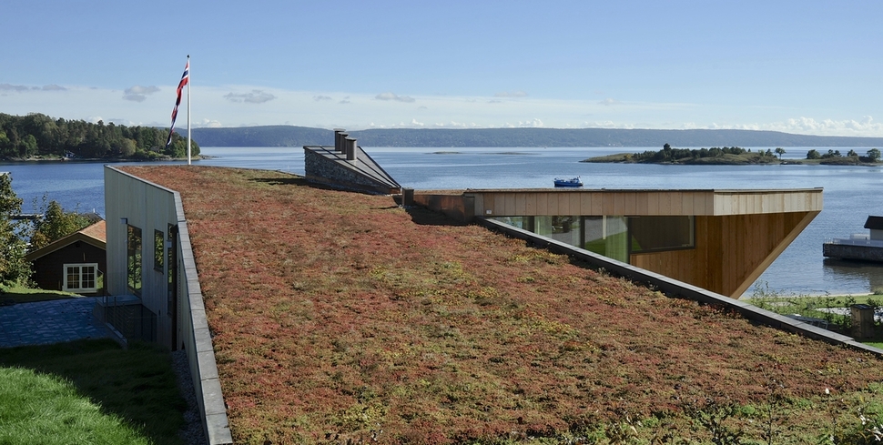
Split House was designed by Einar Jarmund, Hakon Vigsnaes, Alessandra Kosberg, Stian Schjelderup and Claes Cho Heske Ekornas of JVA Architects to merge with its Asker, Norway’s landscape. The architects achieved this by stepping the home down and into the slope and then covering the roof with low maintenance plants. Split House also allows the spectacular views of the Oslo fjord to stay exposed to the neighboring dwellings.
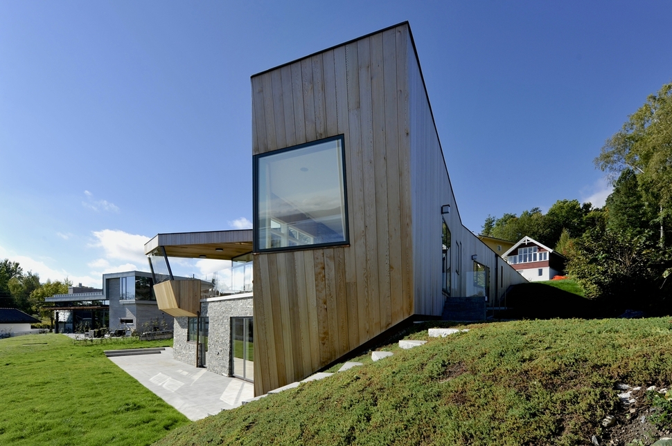
Split House is designed to unfold and in so doing, create a fragmentation of scale that belies the overall size of the structure. This was an important aspect of the design, as the architects did not want the volume of the house to overpower its immediate neighbors.
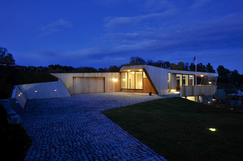
Designed in a ‘T’ shape with a wide leg and only one volume exposed to the driveway, the home appears much smaller then it actually is. The garage is one end of the T and extends into the slope to the left while a door next to it leads to a large storage room. The main entrance is located under the roof overhang next to the angled privacy wall.
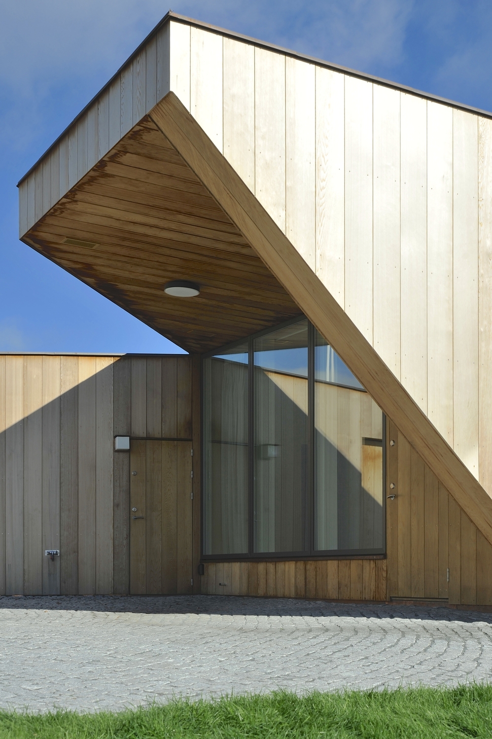
While the exterior entry wall is all glazed, the door itself is wood. The glazings look into a foyer with a stairwell leading downstairs to the left and the living room straight ahead.
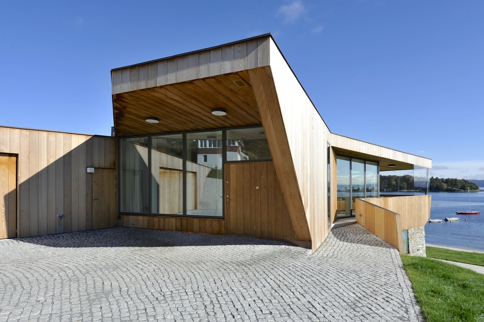
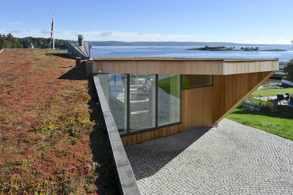
Of course you can always bypass the entry and continue around the side of the structure to the covered outdoor terrace overlooking the view of the fjord – and what a view it is!
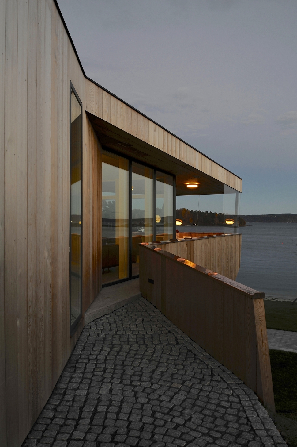
The passageway on the side of the home is covered in the same cobblestones as the driveway to create a continuum of material and aesthetic.
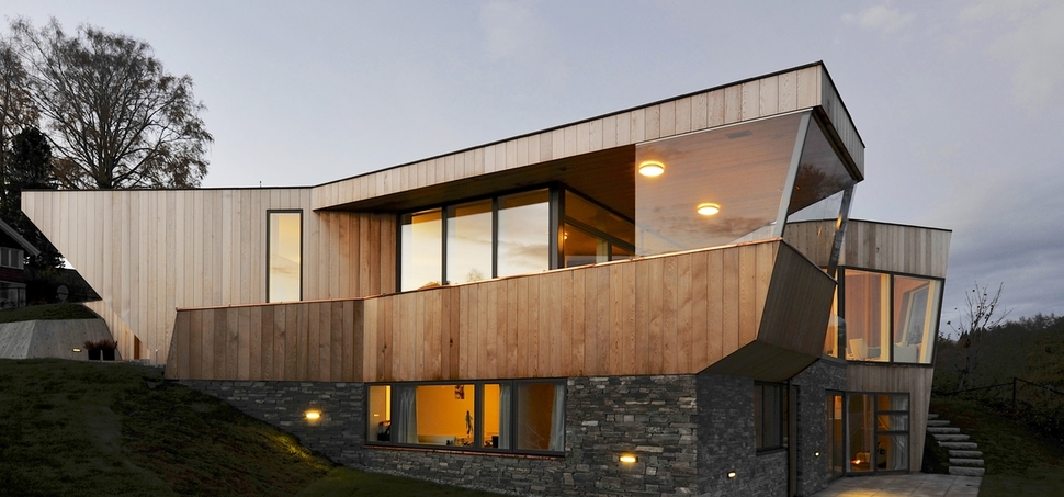
The covered terrace mimics the visuals of the boats in the water with its ship’s bow front – set on top of a stacked stone hull that holds the lower volume.
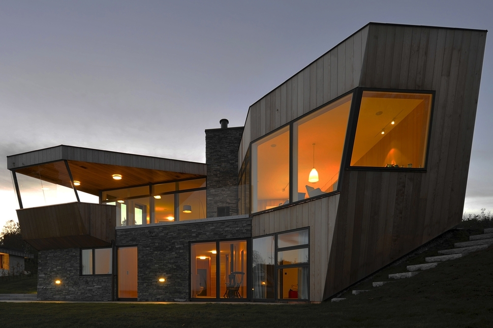
Continuing around the structure, a second two volume section stretches outward at a different angle, this is the other side of the ‘T’ footprint. Where the two sides of the ‘T’ meet is a chimney with a see-through fireplace.
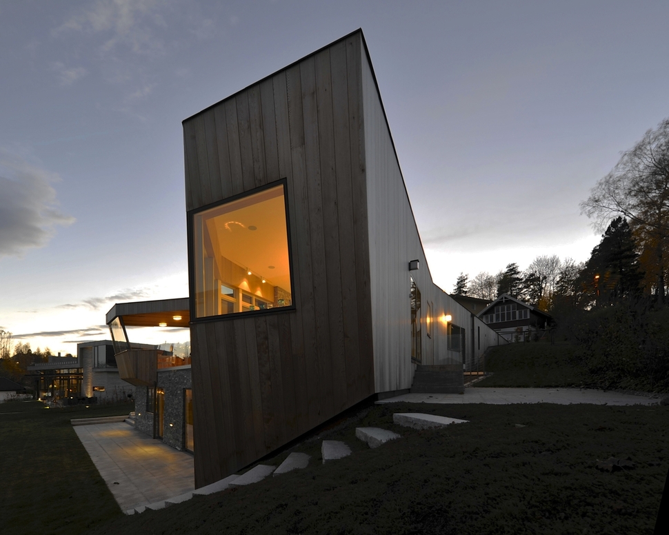
This portion of the ‘T’ holds the kitchen and dining room on the top level and the master suite cut into the slope down below.

The lower level also contains a wine cellar, sauna, gym, media room, family room, three additional bedrooms, washroom, technical room and storage. The upper level is where the kitchen, dining and living rooms are as well as a guest suite.
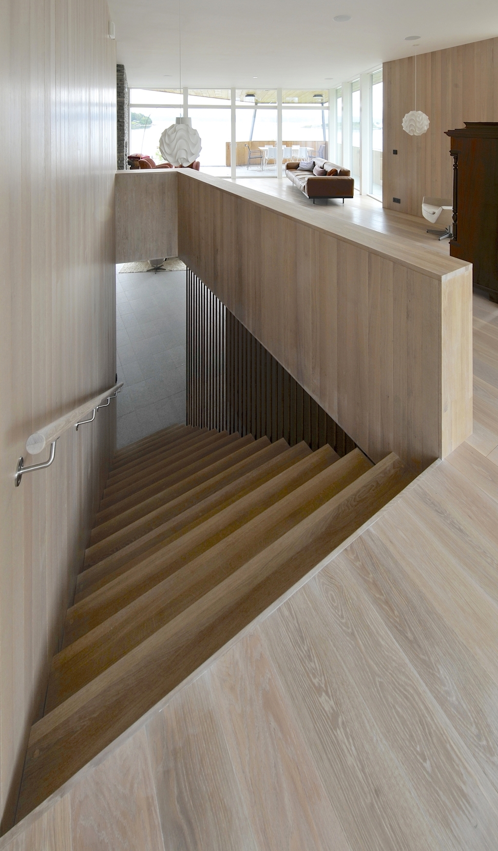
When you enter Split House the first thing you see is the wealth of wood grain used, not just on the floors and walls but also on the stairwell that leads down to the private volume.
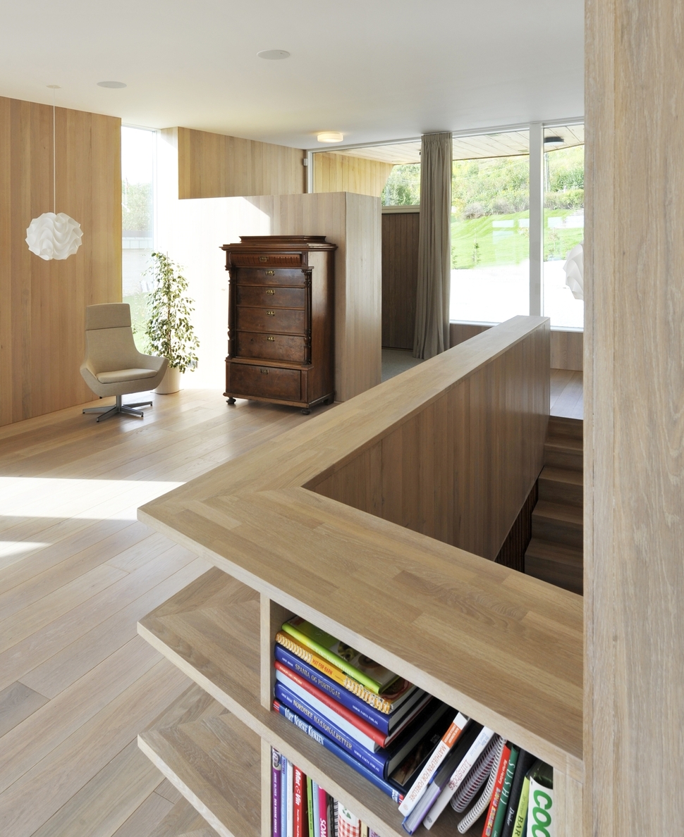
With the stairwell prominently featured in the home, the architects designed the safety rails that surround it to be a functional shelving unit and had it built just deep enough to hold the homeowners book collection.
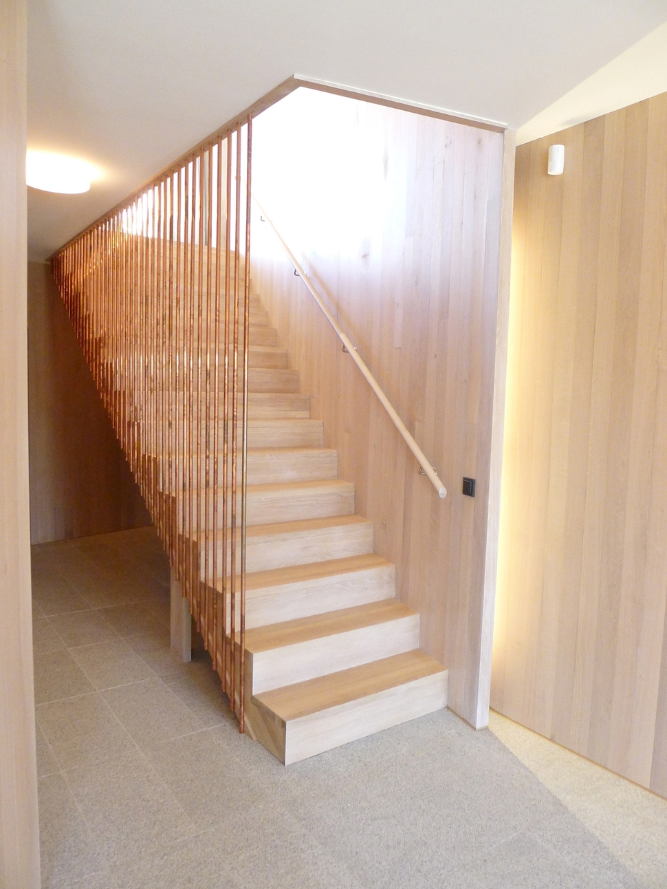
Traveling down the stairs, the balustrade is a contemporary series of vertical copper tubing.
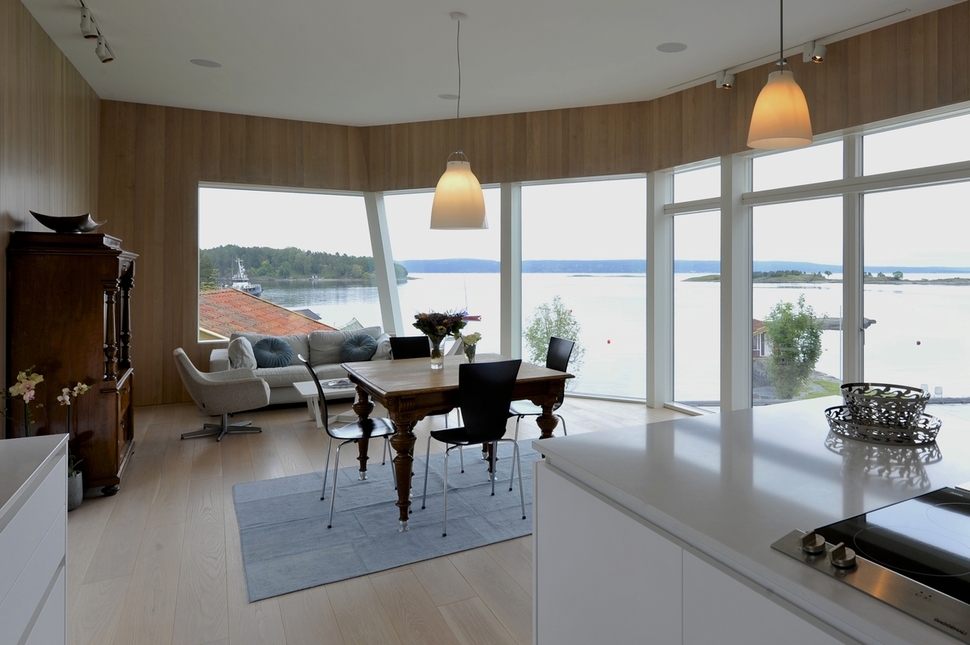
Upstairs the kitchen is a sleek expanse of gleaming white flat panel cabinets, while the dining room is an eclectic mix of mid-century chairs and traditional table. The living room is a contemporary collection of soft furnishings. The mix of styles within the vignettes appear as interior islands, much like the real islands dotting the ocean beyond. It’s a clever connectivity that highlights the panoramic perspective.
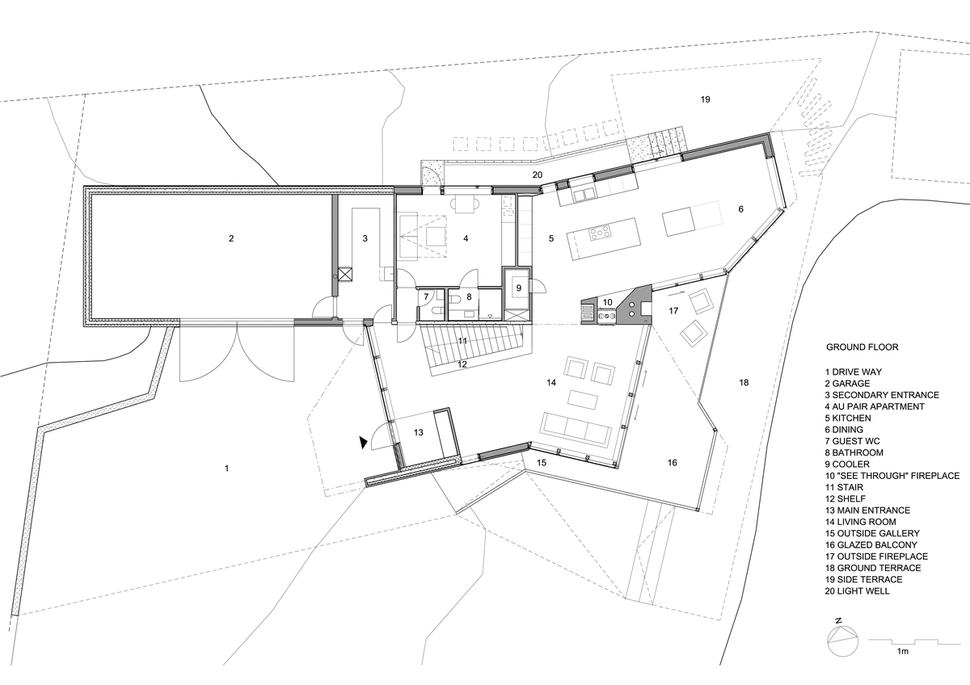
The guest suite is tucked in between the stairwell and the kitchen.
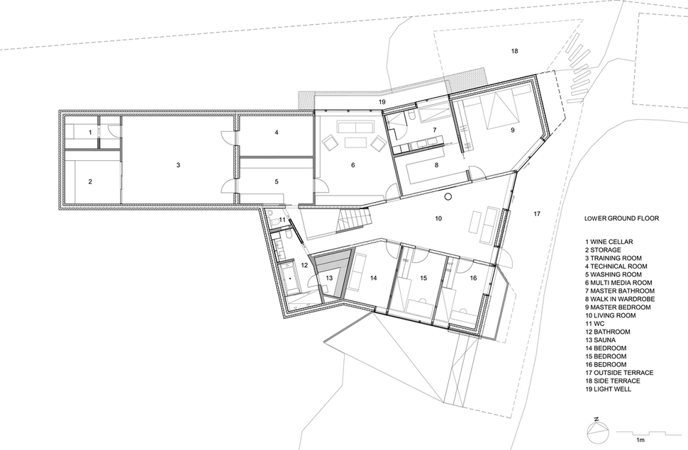
A light well on the slope side of the home allows natural light to enter the master suite and the media room, while outdoor terraces on the back and side of the home offer that sought after outdoor lifestyle.
The light well is barely visible from the outside, only the safety rail that surrounds it gives away its location.
Stunning.
Jarmund / Vigsnaes Architects
Photos: Nils Petter Dale
