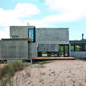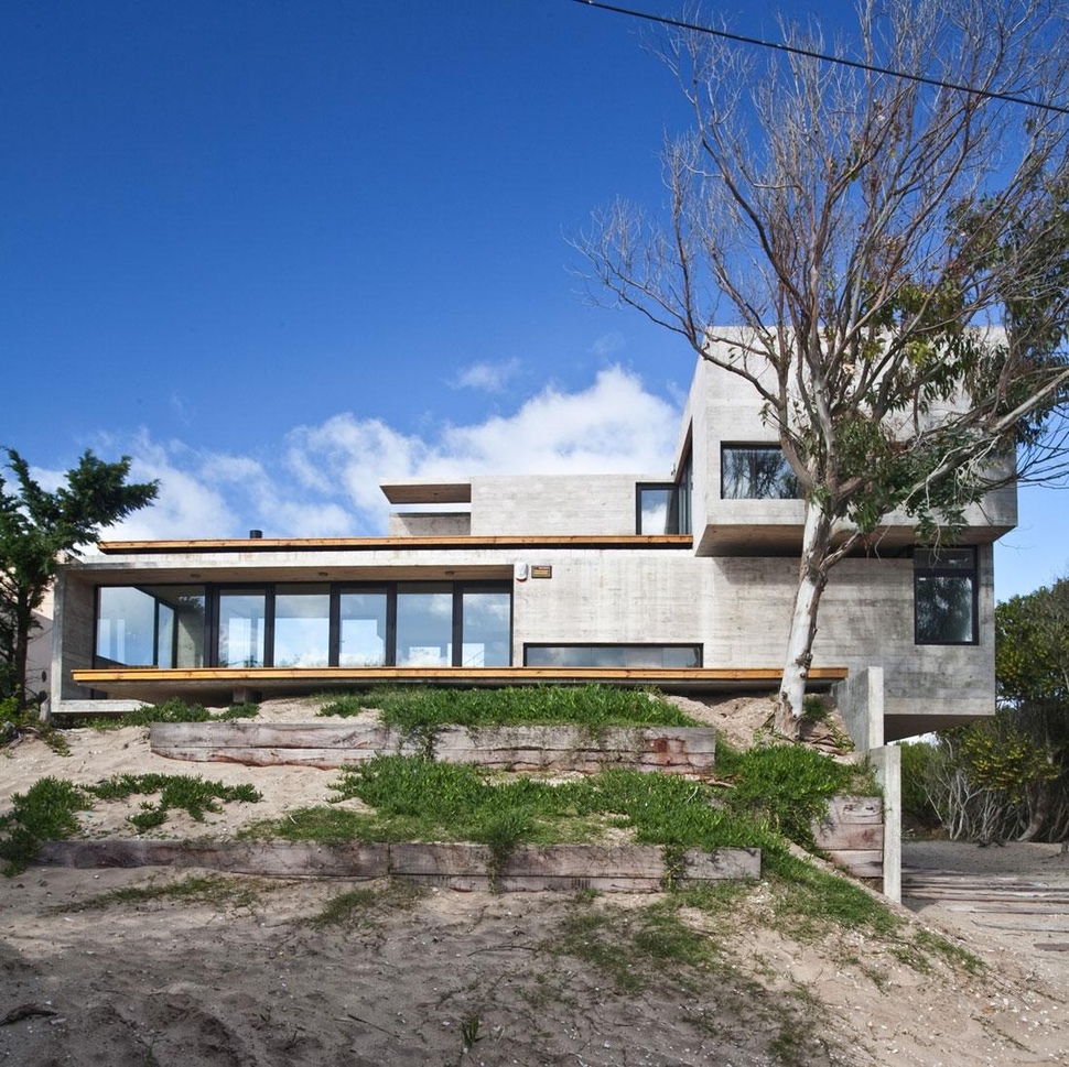
BAK Architects received a brief from their client’s in Villa Gesell, Buenos Aires Province, Argentina, to build a concrete home with 5 or 6 bedrooms for themselves and their 3 children. They also insisted that the new home must take advantage of the sea views both from the main zones and from any expansions that would come afterwards. The site was a plot of land 20mx47m (62ftx155ft) only a few metres away from a dune where the beach ended and although site lines to Acacias and Tamarinds as well as ocean views where in abundance on one side and forest insinuates on the other, a nearby home disrupted the completion of the panorama. Upon site investigation it became clear to the architects that a 3-metre land crest in the centre of the property presented the perfect location for the new home. The client’s wanted their home to be built in two stages to manage the costs so BAK Architects suggested building one main structure now and a second guest suite at a later date.
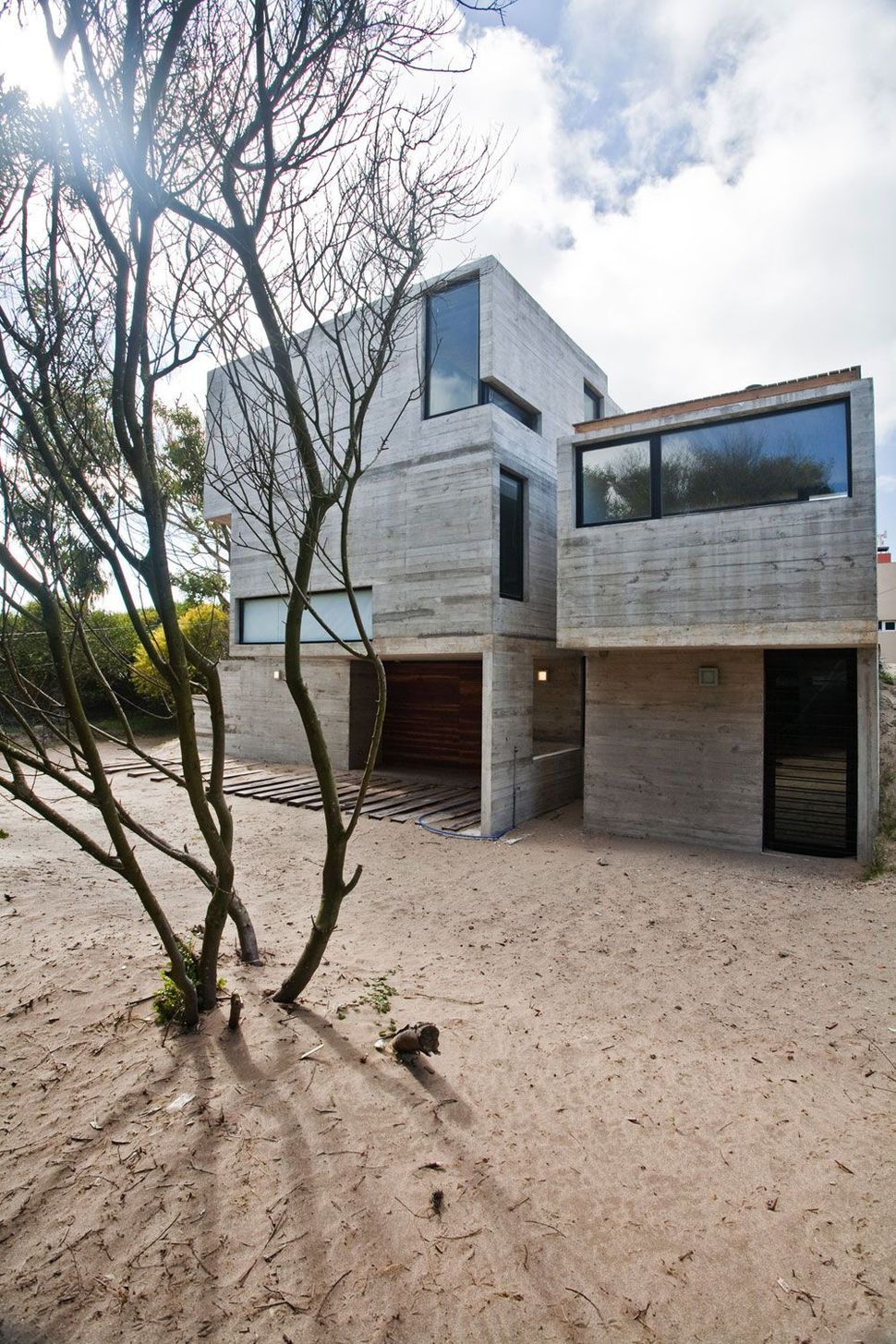
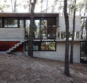
With the client’s approval to build two buildings in two stages, the design and creation of the main home began. Straddling the 3-metre land crest, the home presents a 3-storey facade to the front and a 2-storey facade to the back. The path of the sun and ocean winds where a deciding factor to the exposures and glazings and the architects designed the home to have large glazings towards the South East for views to the sea, while having controlled openings to the South and North East.
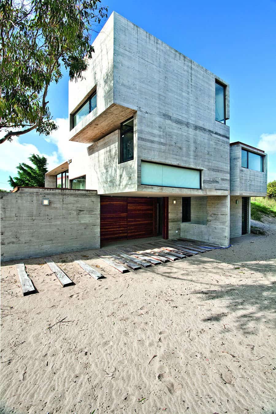
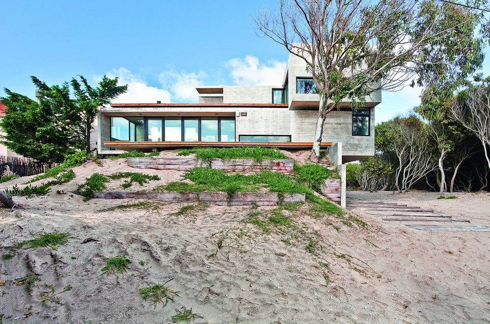
With the land crest dropping towards the street, wood planks where used to help vehicles traverse the sand dune. These planks lead to a semi-covered entryway which can be used as a car port. The overhang is created by the main volume of the home where the social zone of kitchen, dining and living are located. In the back of this level is also two children’s bedrooms, each large enough for an extra bed. A guest bedroom is located on the street level and the Master Suite is on the third floor.
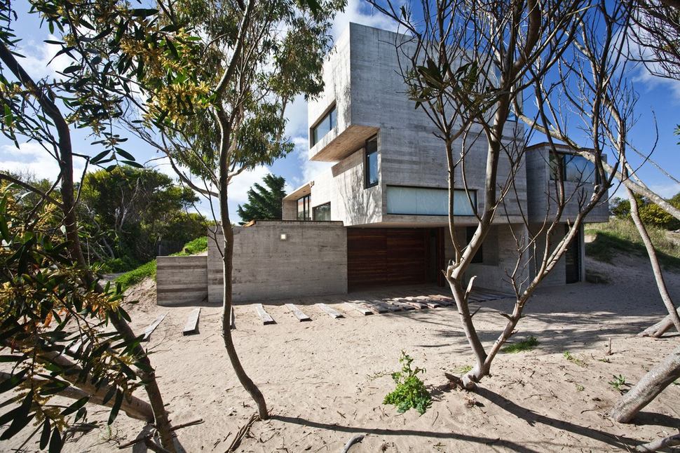
Straddling the dune’s crest, the home was built with minimum disruption to the surrounding land by using cantilevered sections for the home and retaining walls for built with quebracho sleepers for the dune itself. This soft touch will allow the regrowth of natural vegetation in a timelier manner then had the site required massive diggings for pilings and footings.
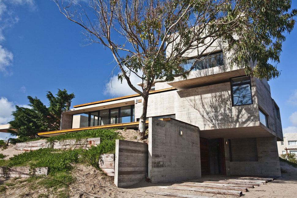
With the main level of the home located on the crest of the dune, the idea was to design it like a prism with one end enjoying views to the sea and the other end serving a more functional purpose of both access to the street and to the Master Suite above. This layout allowed for a terrace off of the Master Suite with panoramic views all around. With the location and exposures of the volumes decided upon the next consideration was the location of the stairwells and it was decided that the most strategic location for these was a central wall position leading both up and down from the social volume.
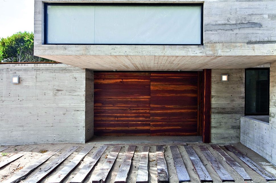
The entry to the home is located at the end of the plank driveway, under the overhang of the social volume. A quebracho tables wall highlights the location of the entry but the wall is itself a gateway to a storage area where the homeowners keep their quadricycle. The doorway is next to it, on the adjacent wall.
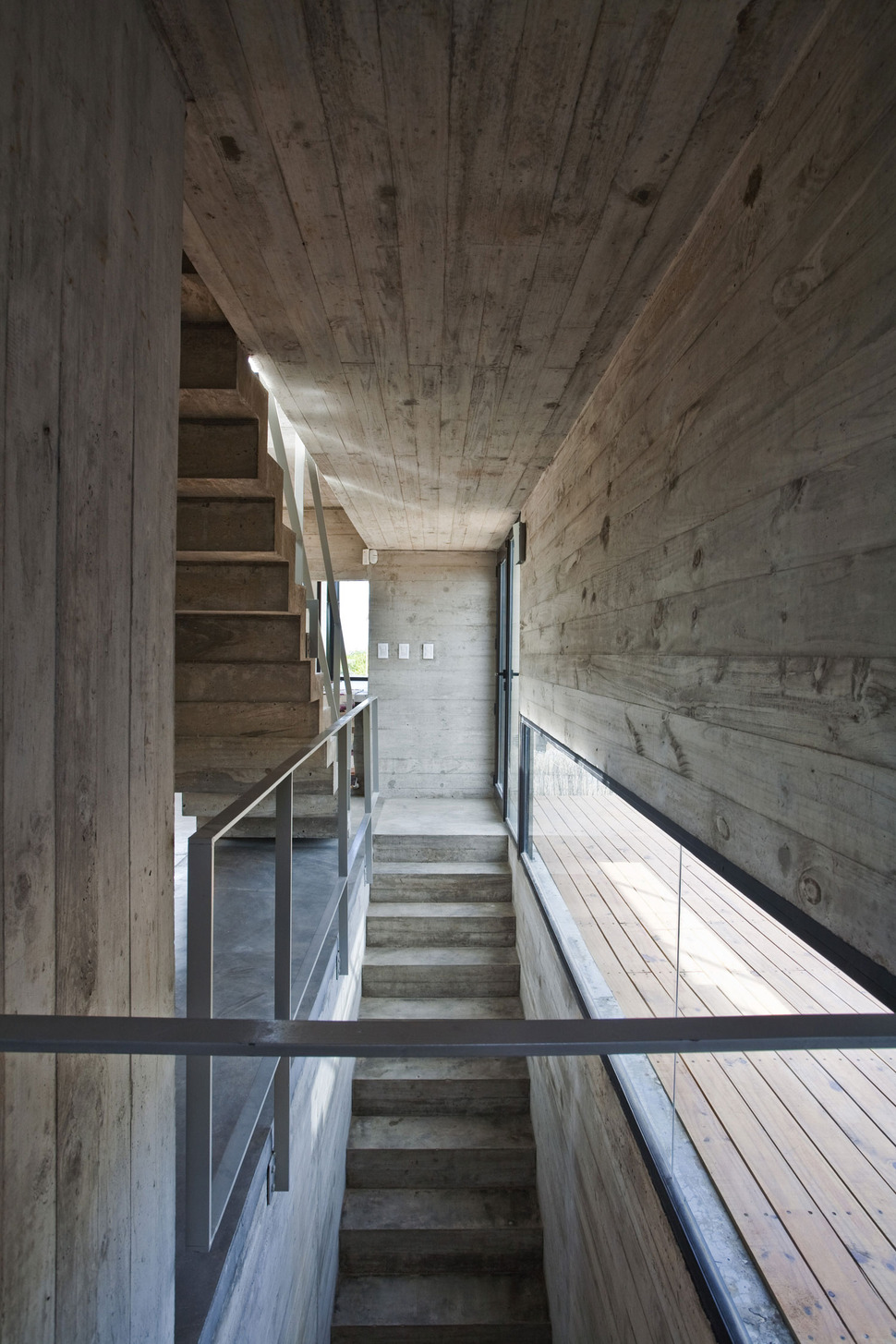
The main entrance to the home leads to a small foyer with a concrete stairwell leading up to the social zone. The street level also leads to a small hall with a guest suite complete with ensuite as well as storage and laundry facilities. The stairwell is kept light by the use of tempered glass on the rail system and the addition of a long, low wall of glazing that runs the length of the stairwell on the 2nd floor.
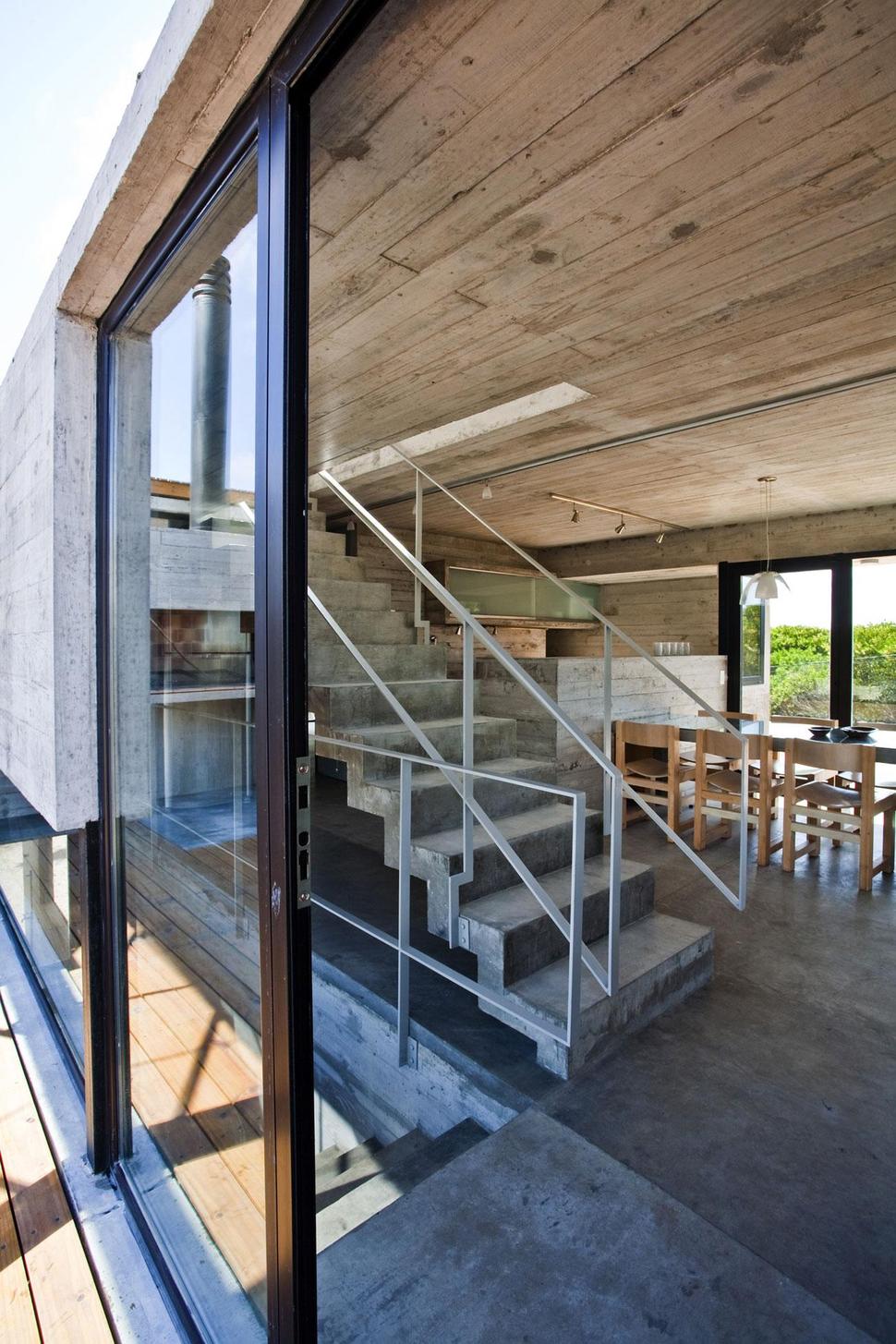
At the top of the stairs, the wall glazings expand into full height windows that open up to the deck just outside. Here too, a second stairwell leads up to the Master Suite, creating a barrier from the lower stairwell and the social zone beyond.
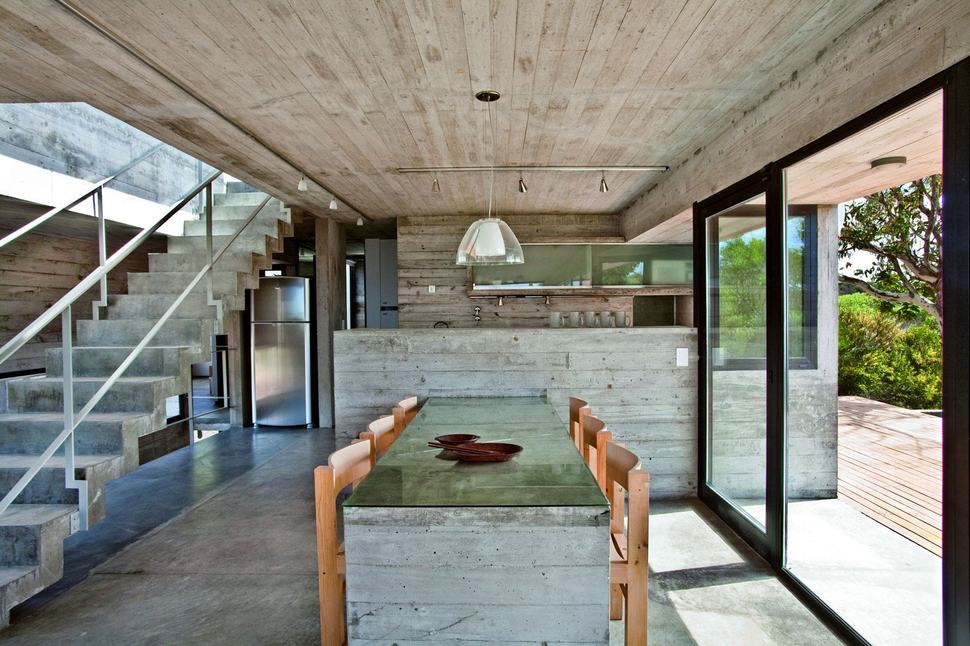
The social zone is a large open floor plan with the kitchen at one end and the living at the other. Both sides of the volume are covered in glazings, creating a connection to the landscapes beyond and to further this connection, material and colour choices are kept to a minimum.
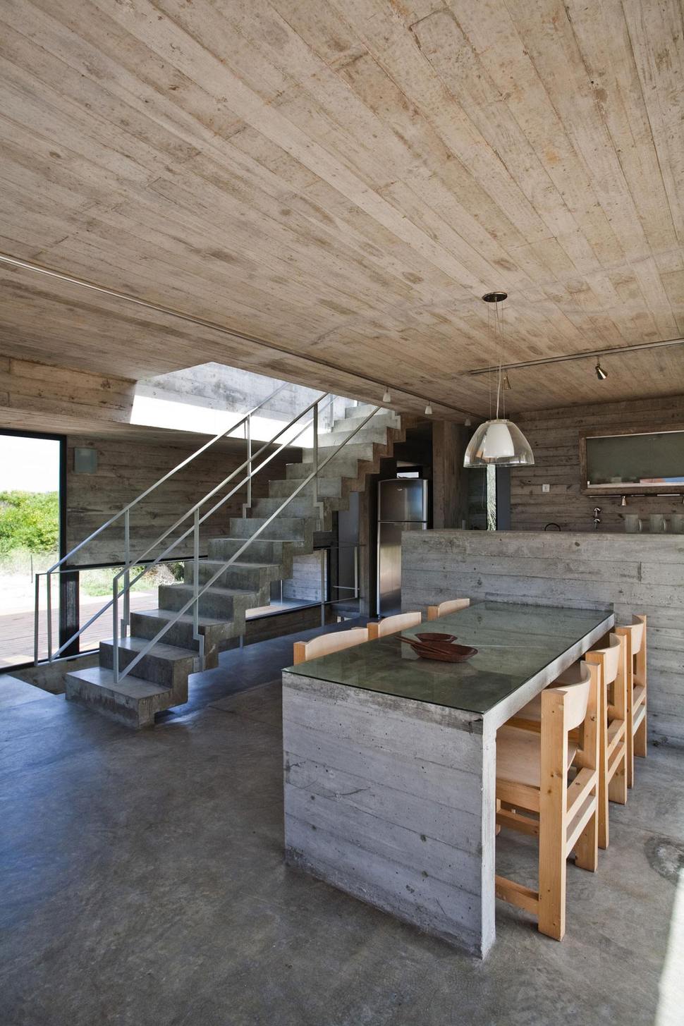
BAK Architects designed much of the wood furniture for the home out of Canadian Pine wood recovered from boxes used in the packaging of engines. The dining table was designed to look like a slab, uniting it to the septum which divides the kitchen and living zones.
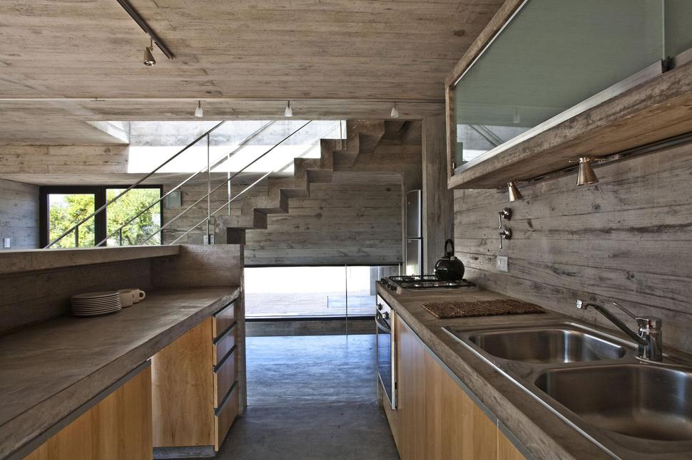
The integrated kitchen is designed as a semi private space, open but contained. It also acts as a divider from the social zone to the two children’s bedrooms accessed through a doorway next to the kitchen, beside the stairwell. The two bedrooms flank the washroom for this level. The long and low window in the entry stairwell is visible to the kitchen, creating a sense of expansion to the zone. There is no natural gas in this locale, so the architects used salamander, bottled gas stoves and electrical resistances for heating.
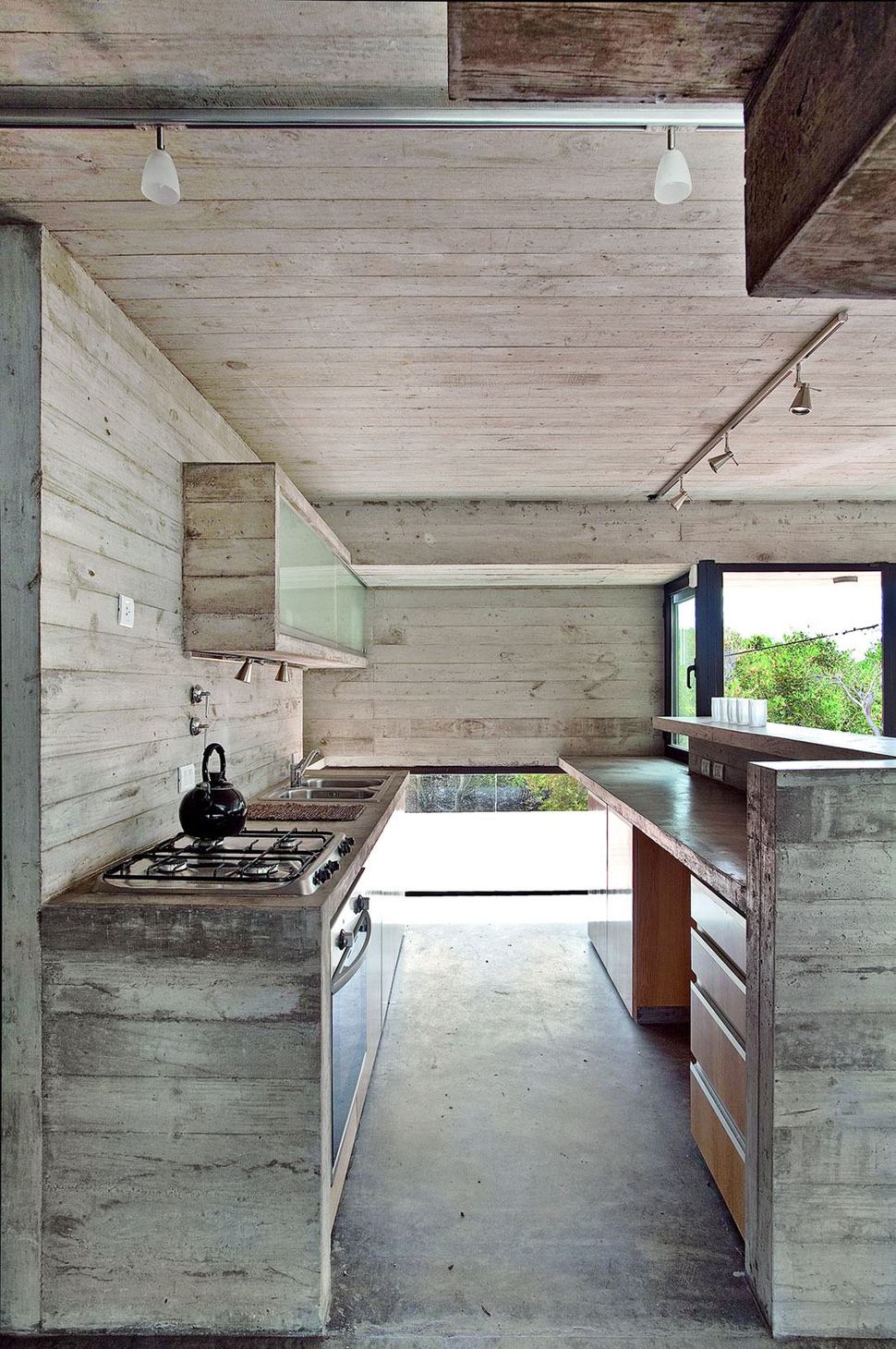
With the stairwell window visible on one side, the architects repeated the long, low profile of the window on the other side of the kitchen as a continuum of detail. Adding to this continuum is the one bank of upper cabinets presented with almuninum framed glass doors and garage door hardware for ease of access. This touch of glass and aluminum, combined with the windows, stops the wood clad cabinetry and walls from feeling too heavy in the small space while the raised wall on the peninsula keeps the “openness” of the area from being too visible to the rest of the social zone.
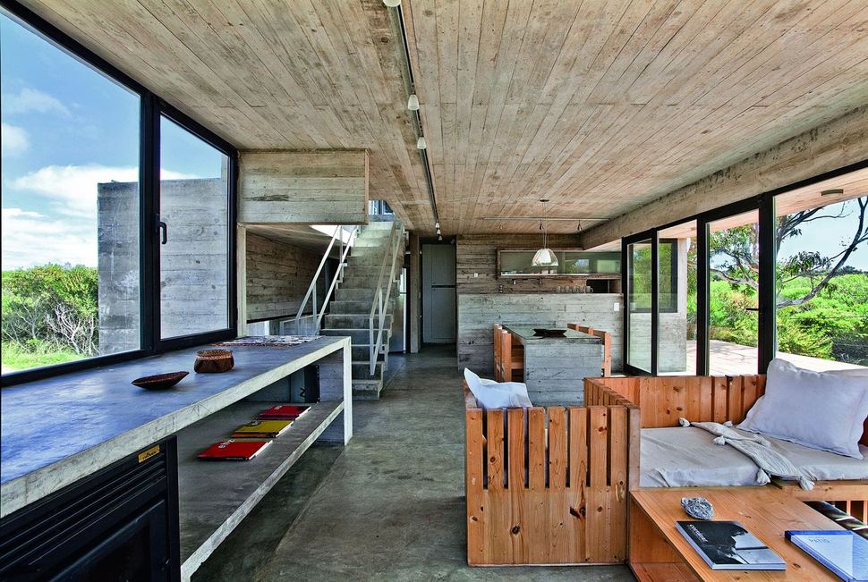
from a distance, the kitchen itself is a continuum of the materials used on the ceilings – and the dining table. Adding to this effect is the one long line of track lighting that disappears into the tiny hallway just before the private zone. This minimal choice of materials is continued with the concrete floors, stairwells and living room storage cabinet / fireplace surround below the windows and the recycled knotty pine furniture creations in the living and dining room.
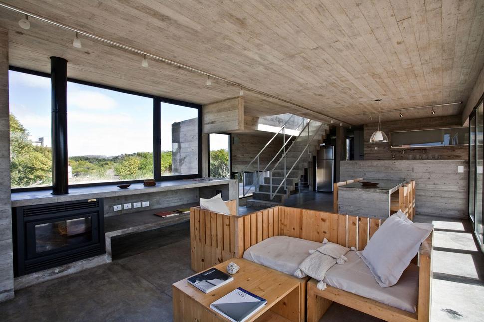
the openable windows within the home are made by powder coated aluminum and instead of sliding, they swing out. This was a choice made to avoid the accumulation of beach sand in guides, which is a common occurrence in beach homes with sliding glazings. All the windows within the home use double glass with an air chamber to optimize thermal insulation.
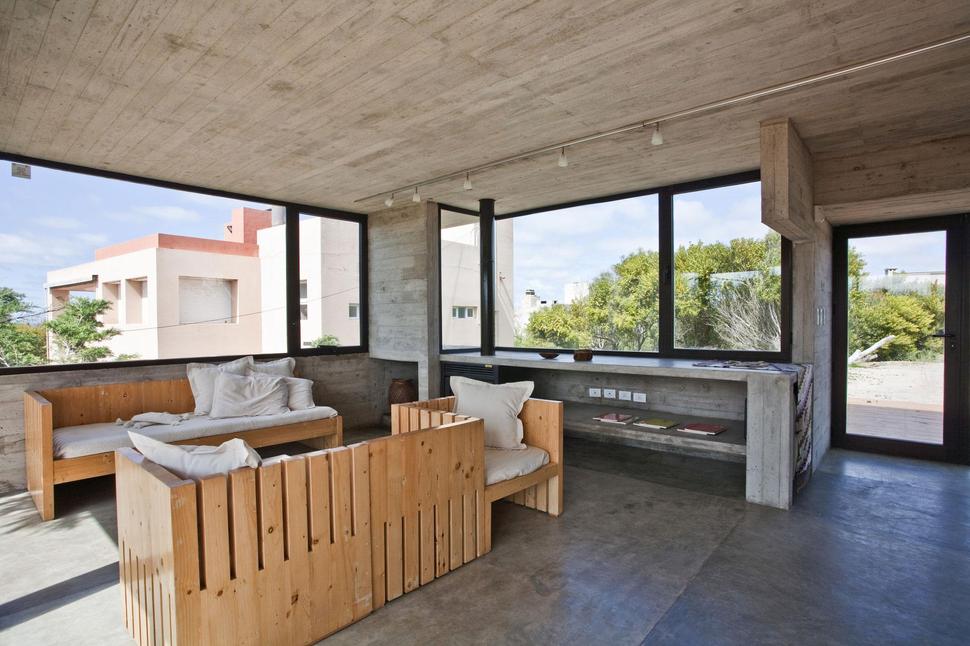
While the views from the home are expansive, the architects did have to contend with one nearby home. Using glazings on all three sides of the social zone minimized the view of this home. The commanding views all around forgive the one section blocked by the neighbour.
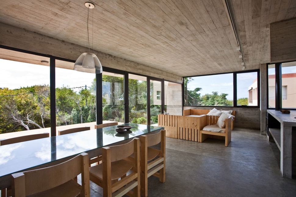
With views in each direction, the architects creative design for living room lounging has seating positions with more then one vantage point.
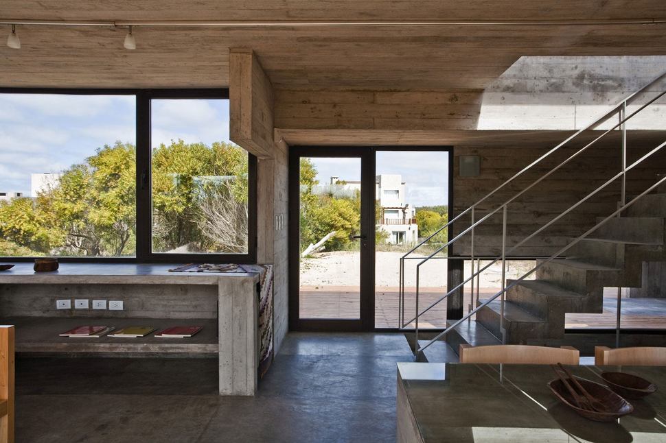
There are also views of neighbors in the distance, but these are minimized by the natural foliage within the landscape.
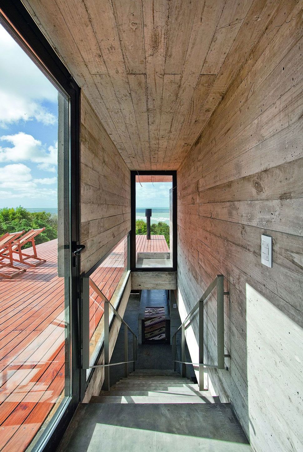
While the views from the social level are pretty incredible, its upstairs where the real commanding vistas take place.
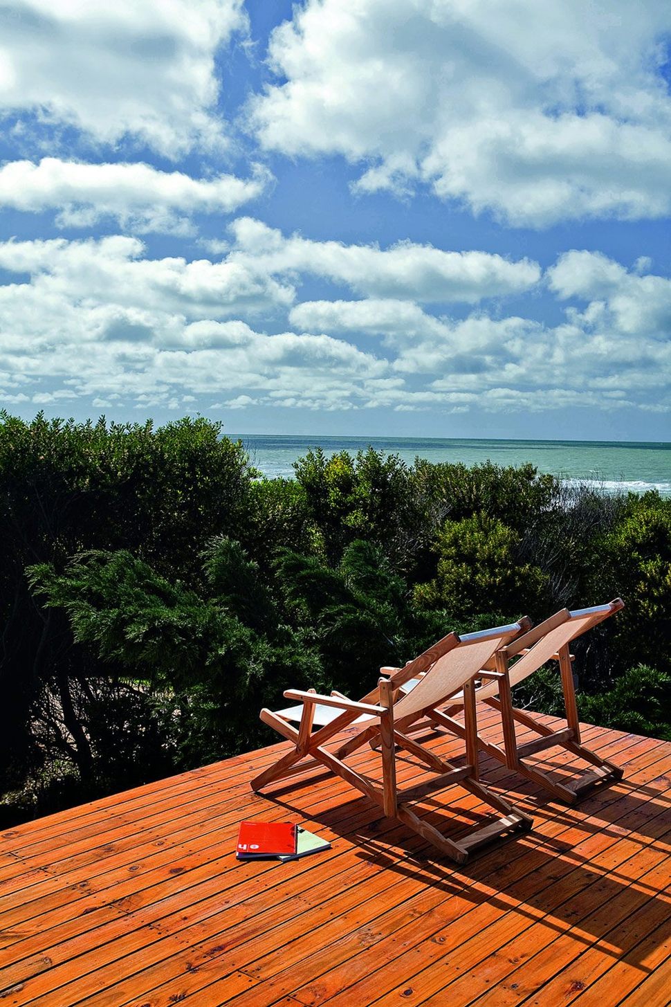
The views from the roof terrace overlook the landscape foliage to the oceanscape beyond. This is why the home is positioned on the crest of the dune, this is what the homeowner’s fantasized about when they initially approached BAK Architects.
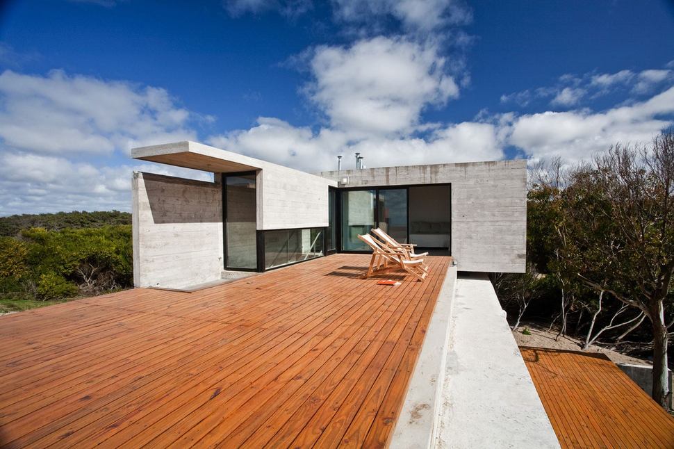
The rooftop terrace has views in every direction except for where the Master Suite itself rises up, but the Master Suite continues the views from inside.
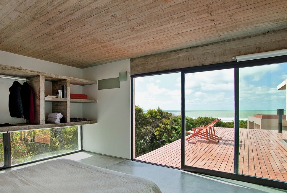
The Master Bedroom is positioned to look out and over the roof terrace and at this level, the homeowner’s have complete privacy from the neighbours home which is not quite as high.
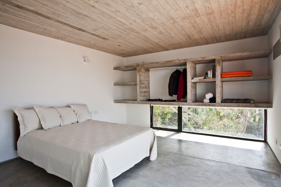
The Master Bedroom also features a low window for ventilation below the wall of storage. Here, walls are painted white and the interior walls are made with airbricks for their insulative quality. The strategic placement of openable windows means the homeowners can forgo using an air conditioning system during the summer months.
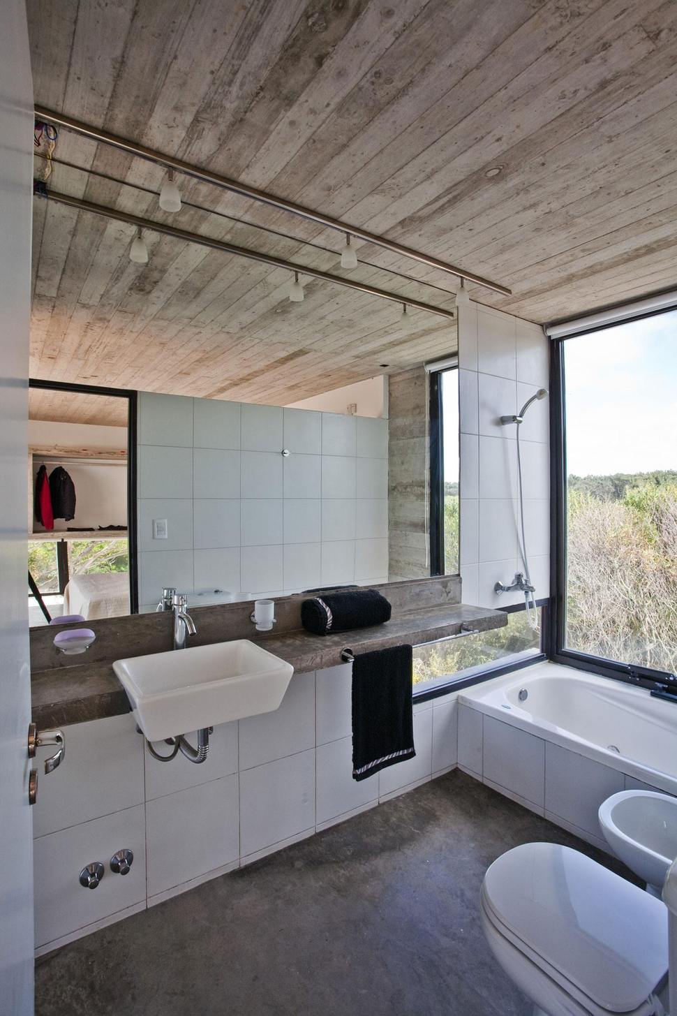
The ensuite, as well as the other bathrooms, have ceramic facings in the interior walls which are not made by reinforced concrete. With private views extending out through the landscape, the homeowners don’t need to worry about window coverings and can enjoy the scenery while soaking in the bath, showering, or just using the other facilities.
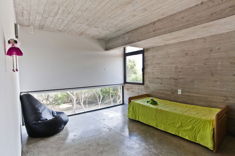
The children’s bedrooms on the main level might not have the panoramic views of their parents, but he views are still nice and the rooms are large enough for lots of indoor playtime when the weather outside is less then perfect.
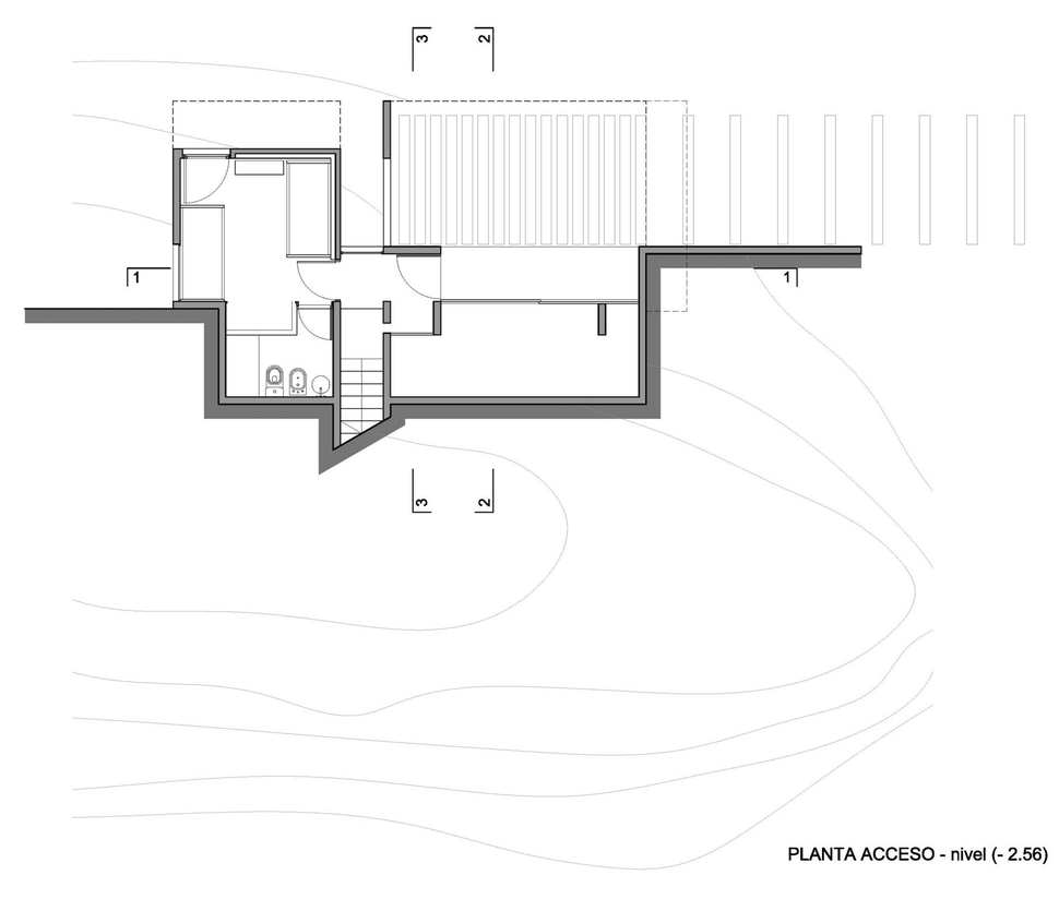
The architects designed the home to enter to a small foyer with a stairwell just in front leading to the social zone above and a doorway to the right leading to a guest suite. When phase two of the building happens, and a separate guest cabin is built, this third bedroom can convert to the oldest of the three children’s bedrooms.
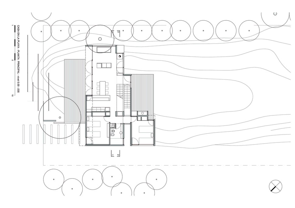
The stairwell leads to the social zone with the two children’s bedrooms located at the back of the home next to this floor’s washroom.
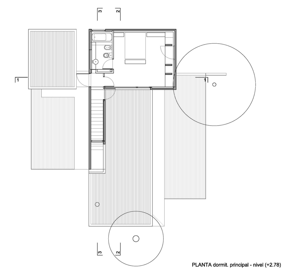
Upstairs is the Master Suite complete with a rooftop terrace that overlooks the deck below.
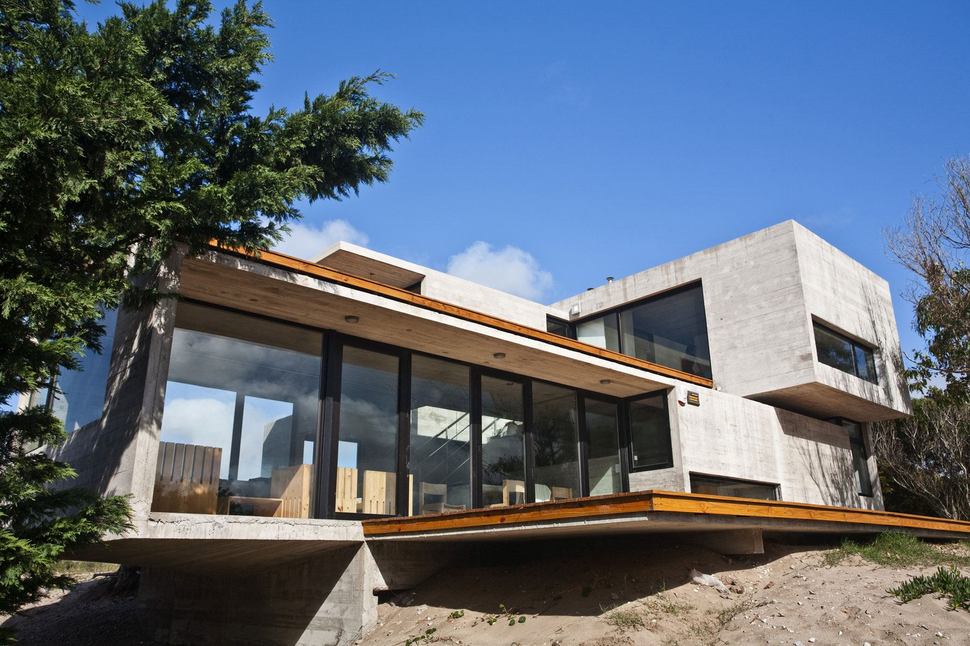
The entire home is built with reinforced concrete partitions and slabs. The versatility of this type of construction allows for cantilevering without support of both the home and the decks. The concrete used within the structure is mar azul (H21 with fluidizer) which is a mixture that uses low amounts of water that when forged creates a compact product. The compactness means there is no necessity to apply a finish to the concrete surface creating minimal need for upkeep. This keeps the costs down, allowing for the budget to be expanded on elsewhere. The decks are made with wood seated to the concrete slabs with a gap for airflow created by the use of aluminum planks. This airflow increases the insulative quality of the concrete construction.
BAK Architects
Photography by Guillerme Morelli
