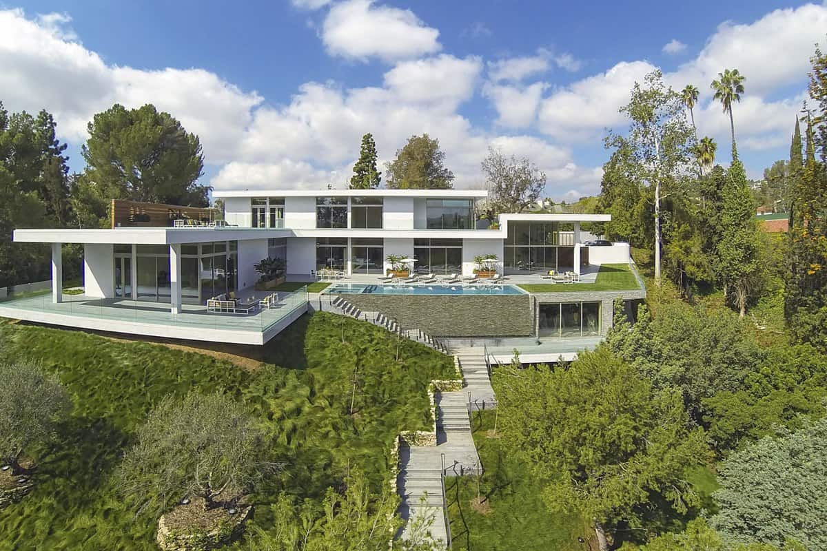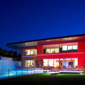
In the famous hills surrounding Los Angeles, long a realm for business barons and famous filmmakers, a new era in competitive homebuilding has begun. According to the Hollywood Reporter, local architecture firms are receiving contract to build larger and larger with ultramodern flair, their clients fueled by a wish to have one of the huge mansions of Hollywood legend without settling for a dated estate. This home, a part of this recent build-it-bigger craze, was designed by Belzberg Architects Group, a firm which is mostly noted for its commercial work on headquarters buildings and museums. With such amenities as an all-glass wine refrigeration room and a spa the size of a New York City apartment, this Sunset Strip mega-home clocks in at over 13,000 square feet of living space. Even with all that room, the homeowners still felt the need to build an additional 2,000-foot guest house, providing VIP guests with a combination of the utmost privacy and luxury.
Even with so much packed into one house, there’s still tons of space left to live and lounge. An uncompromised, cost-is-no-object design directive led to two-story ceilings and excess space in many of the home’s rooms, and there are more living spaces on both floors than one person could possibly use. Even the master bathroom has its own small living room, a touch not found in many other homes. The architects were not afraid of boldness in their choice of colors and materials either, with textured walls of all sorts and daring tones contrasted with dark, exotic woods. Every bit of the house is chosen and shaped for maximum effect, creating distinct personalities for each major room. Glass area and sweeping views are present wherever you look, a benefit of a private lot. Even the outdoor spaces are grand in both scale and luxury, filled with top-class amenities and design.
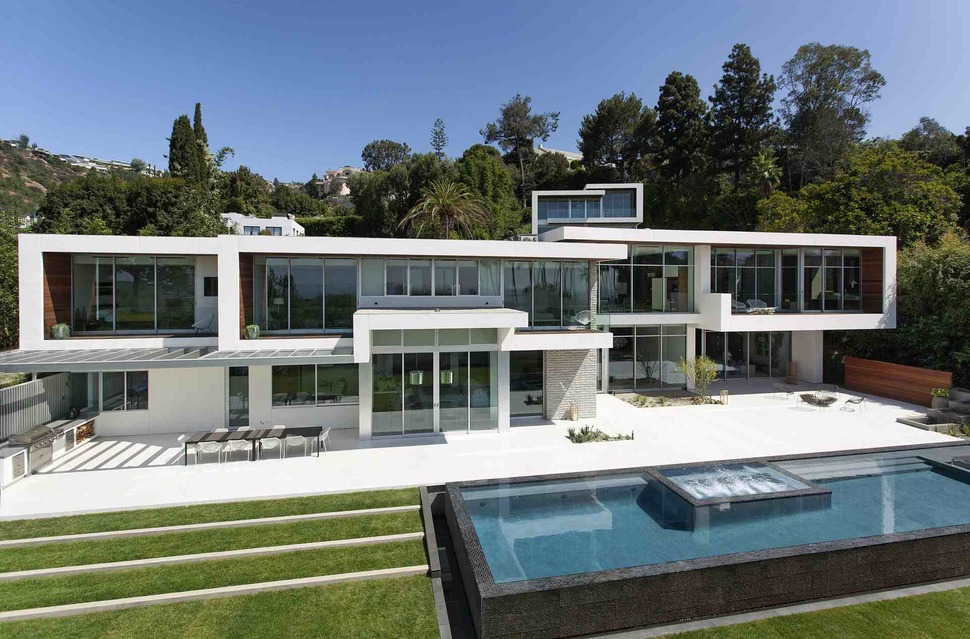
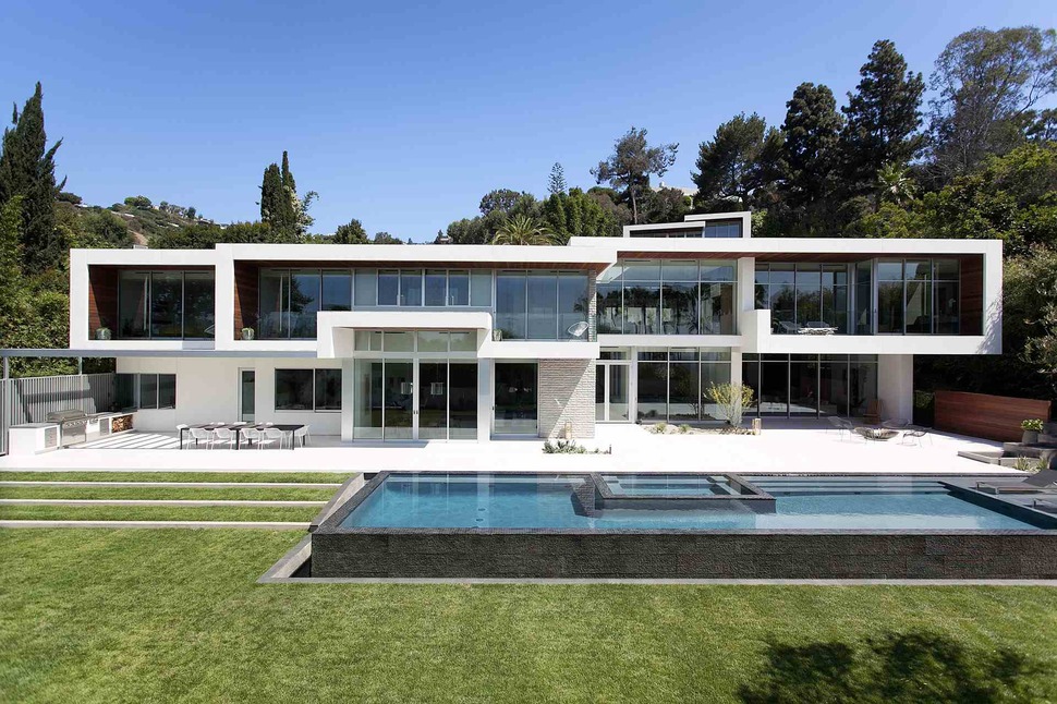
On the private side of the modern-day palace, the colors of the facade are more subdued. Great attention is paid to landscaping here, with a grass area divided into geometric sections along the pool. A built-in outdoor kitchen and dining area complete the wealthy-life rendition of a day grilling in the backyard.
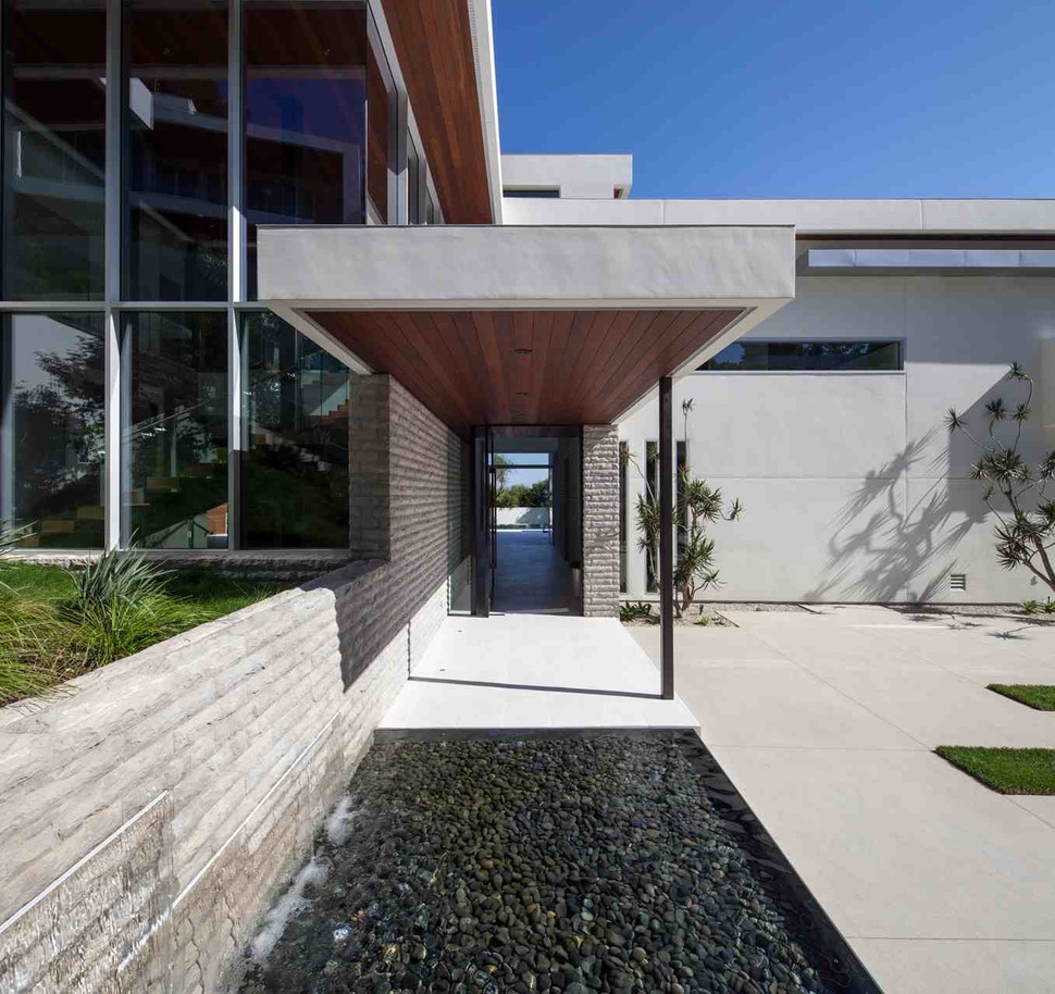
The doors to the house aren’t some gigantic, overdone mess, a smart choice since the sheer size of the home speaks for itself without additional gilding needed on the exterior. Aside from a long awning reminiscent of an office building, the entrance to the house is understated in comparison to its overall architecture.
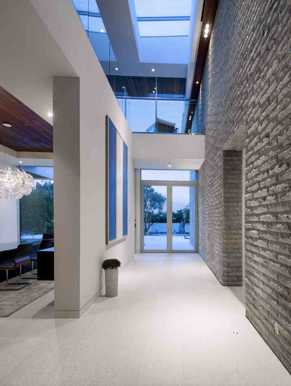
The immense structure’s entry hallway is less of a traditional hall than a passageway defined by a series of parallel walls of all different materials and colors, directing residents and visitors to different sections of the home, all with their own personality.
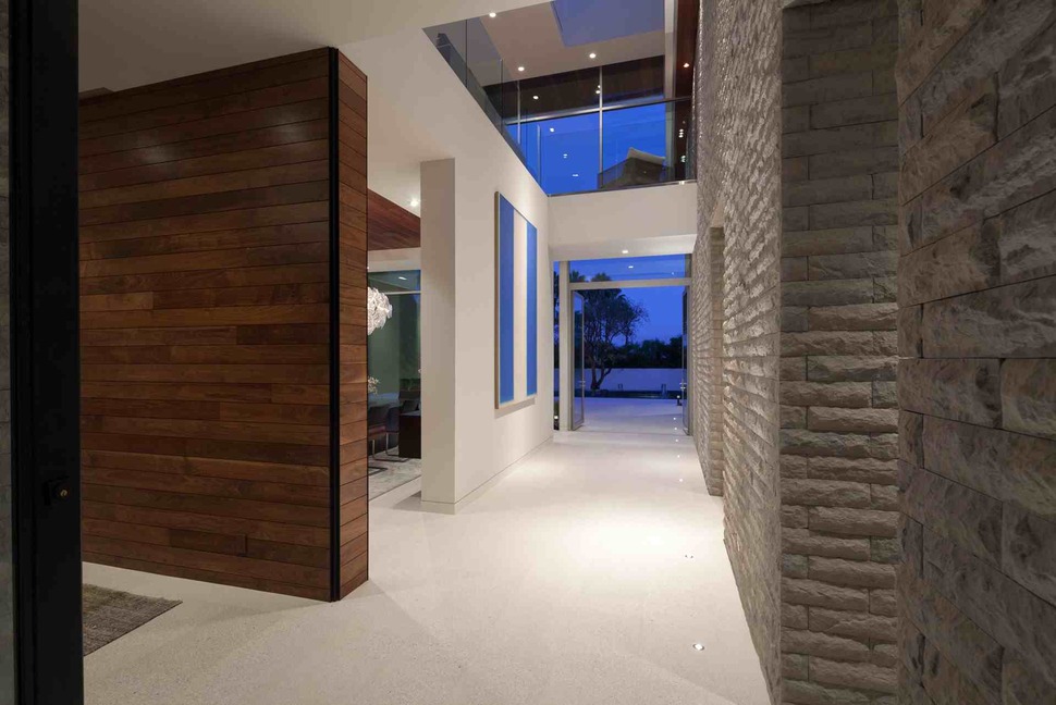
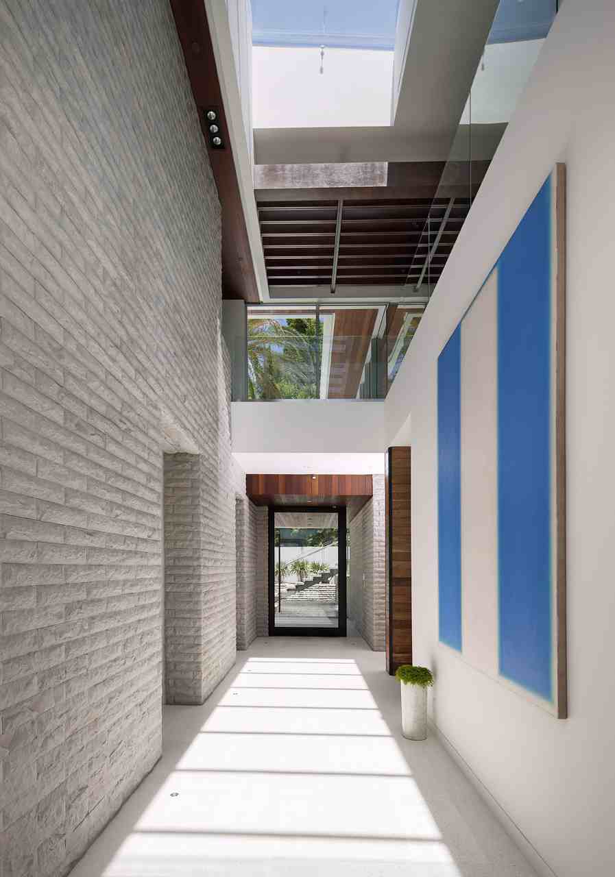
The entry hall carries straight through the home from front to rear, a central station with connecting points to anywhere somebody might want to go inside the mansion.
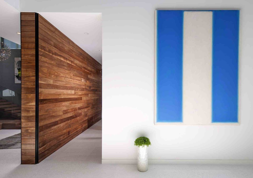
Throughout the Los Angeles home, abstract modern art brings out bright colors and fills wall space that could otherwise become monotonous. Combined with small pieces of supplementary furniture, the artwork is a universal theme everywhere in the colossal house.
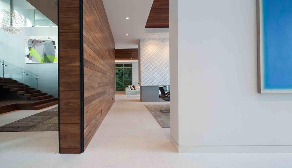
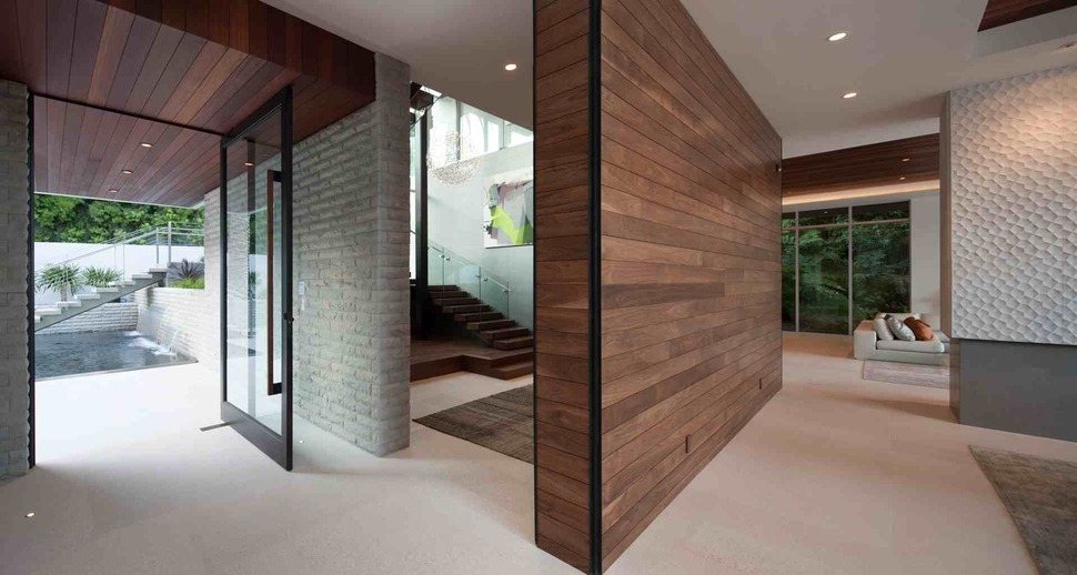
Where the wooden wall divides the home’s entrance rooms from the staircase to the second floor is perhaps where the creativity in material and color choice is best seen in the home. More than just a palette of paint hues, the walls of different areas are textured and shaped to fit the environment of that specific room.
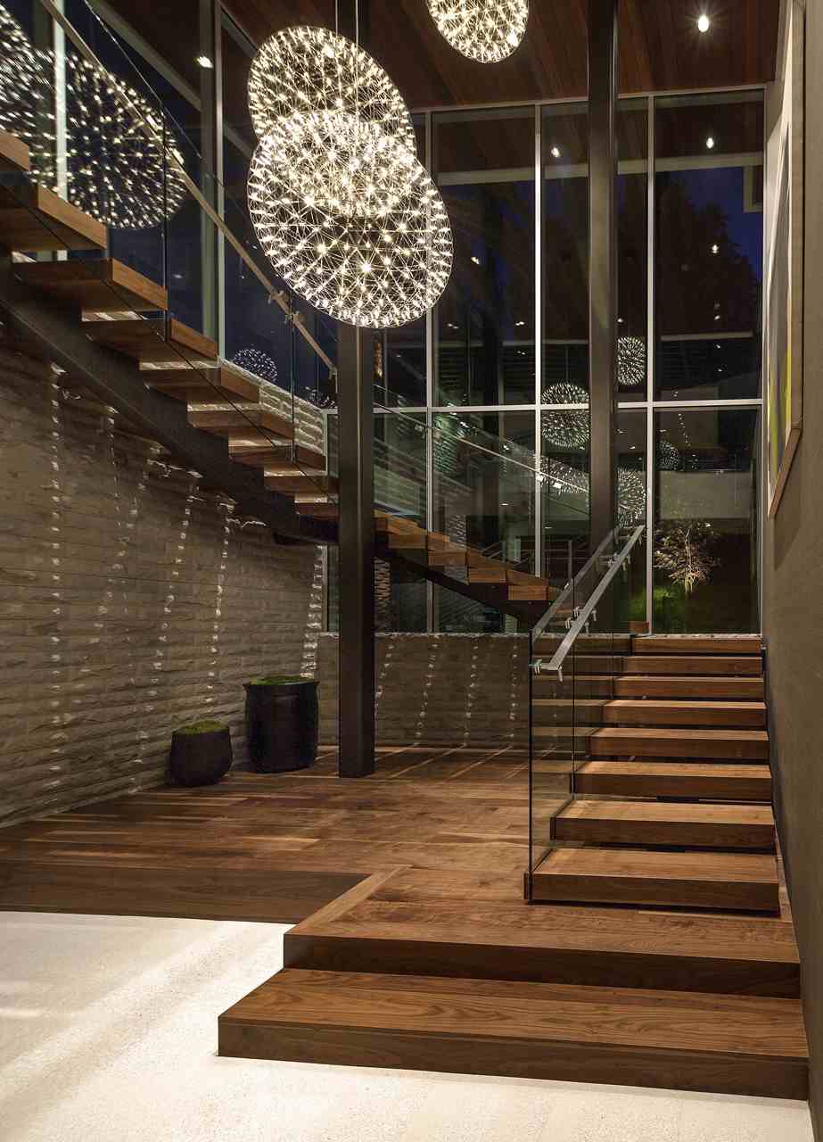
The focal point of the house is this grand, ultramodern wooden staircase, which is the size of some city apartments on its own. The stairway sweeps around up to the second floor in three directions, creating large banks of ceiling-height windows in the process.
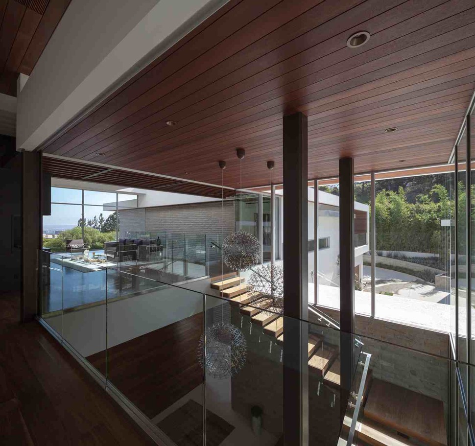
The staircase is fully open from its begging on the ground floor to its exit on the second, creating a square hole in the home’s middle with full interaction between stories. A series of well-places art deco-style orbs fill the empty space in the middle of the stairway’s path.
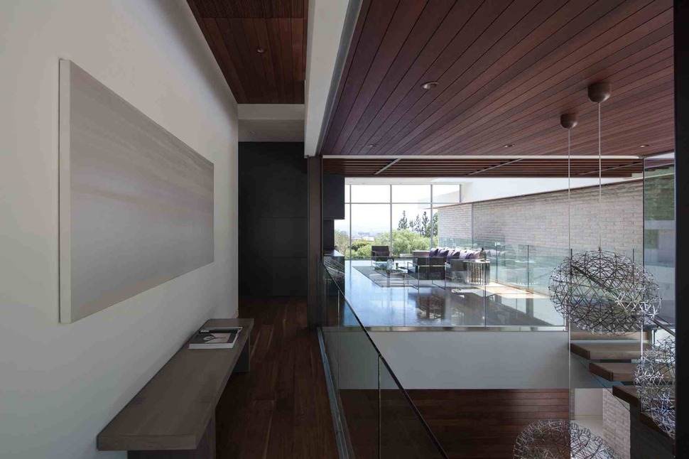
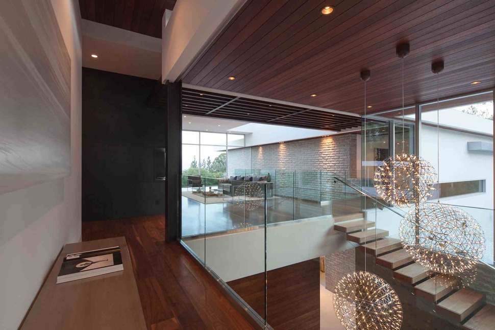
The stairway landing is colored in numerous darker shades, some from natural materials and others painted on. None of these shades appear artificial, however, as careful attention is paid to dulling and varying each color to create more organic tones.
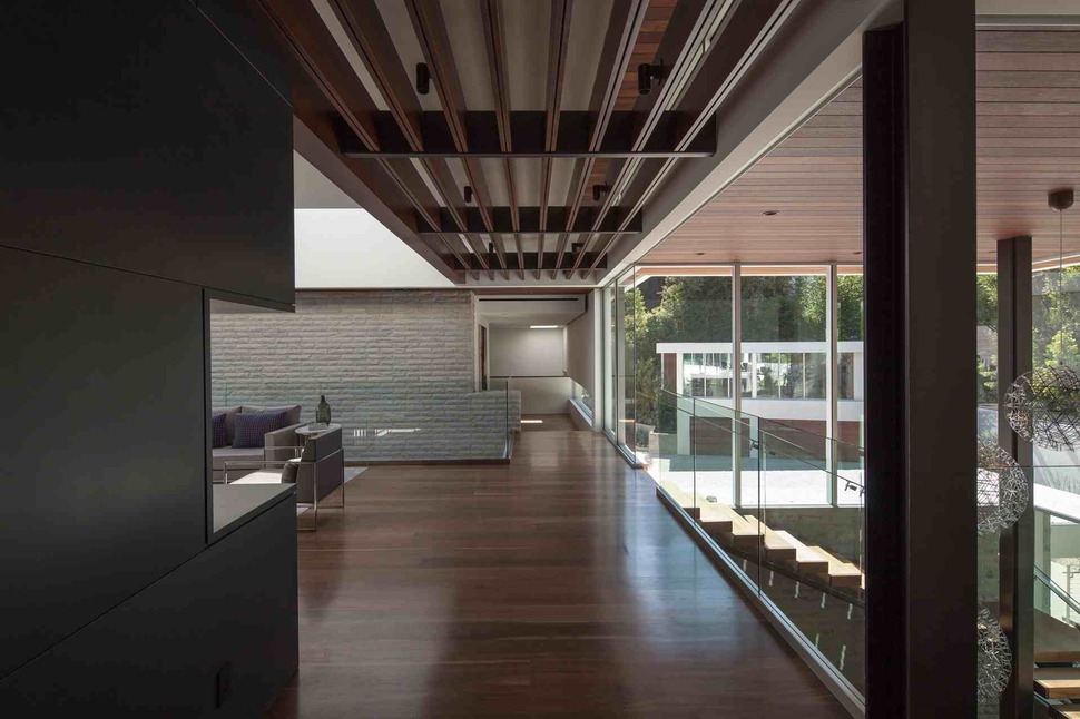
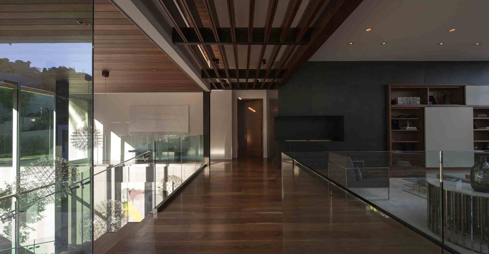
All the railings in the public space of the second floor are made of thick, clear glass, opening the living area and stair landing to unobstructed views of the floor below and vice versa. This small design element helps to keep the whole home open and airy.
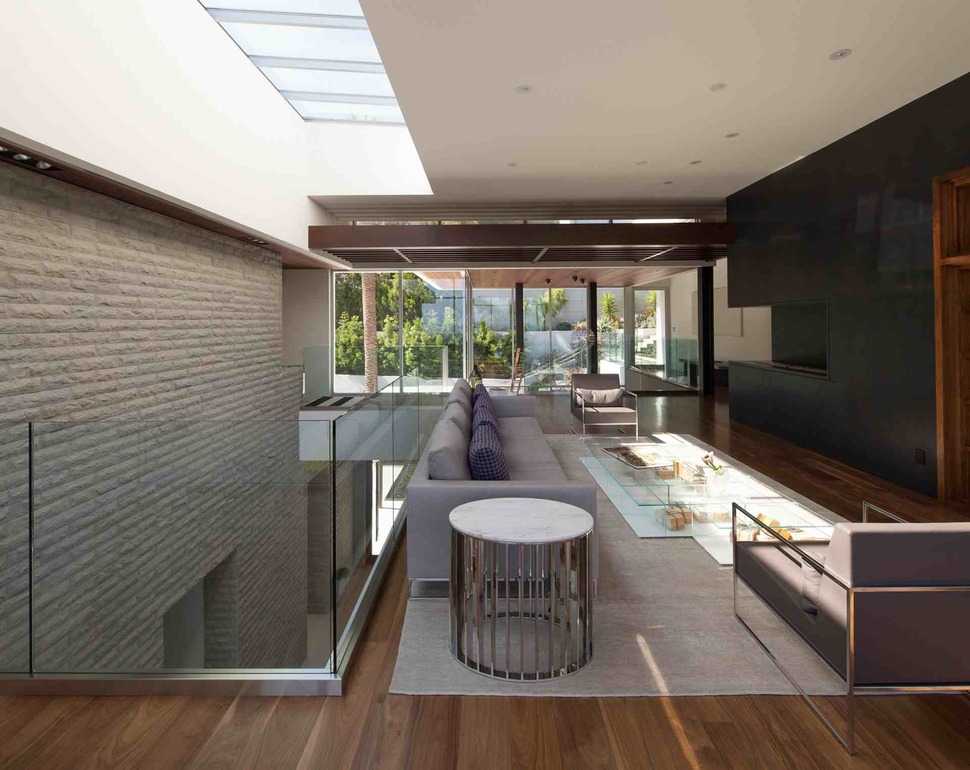
The furnishings of the living room are actually rather understated for such a gaudy home, made up of a just a few comfortably stainless steel-frame chairs and a fairly generic couch. The television wall in front of the furniture, however, is much more imposing, with a black finish that looks almost sinister.
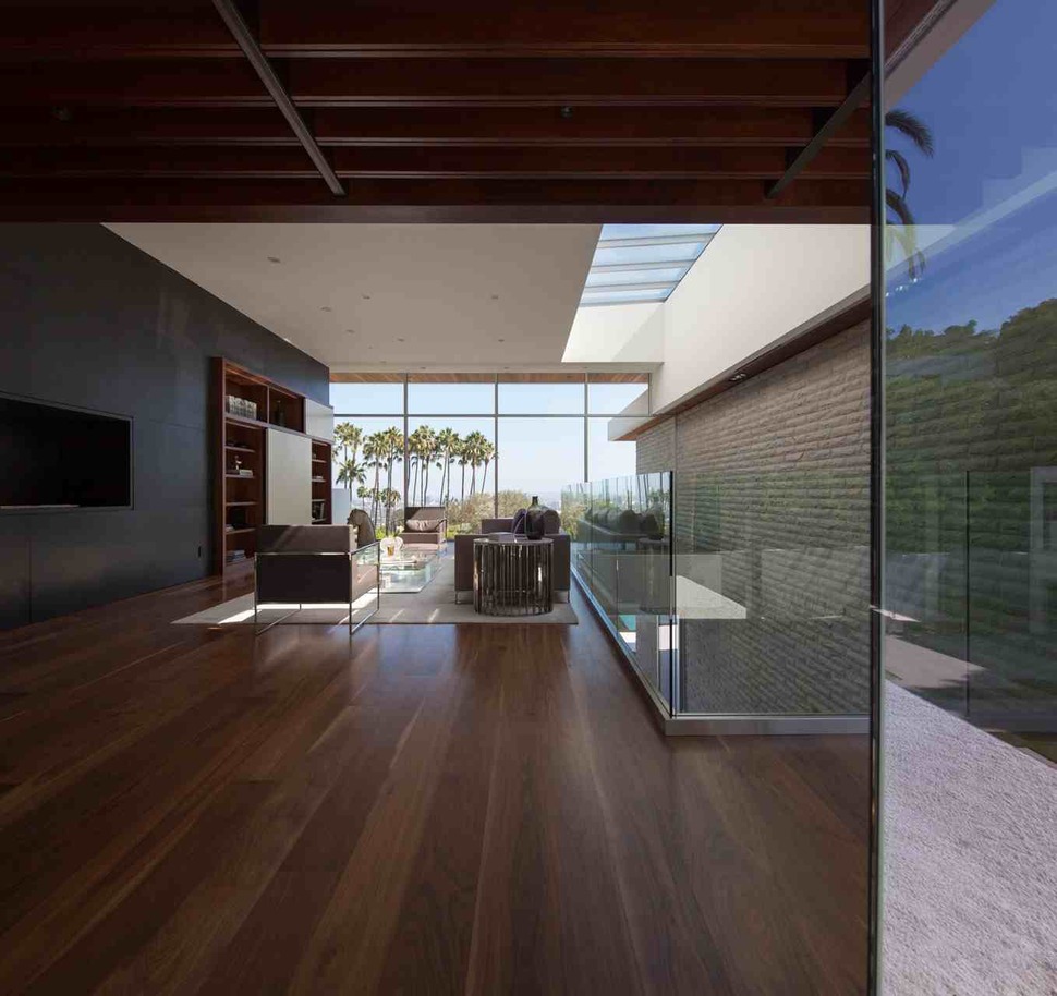

The living area is open not only to the grand staircase, but also to the entrance hallway, giving that hallway two-story ceilings and a visual connection to every public space in the home.
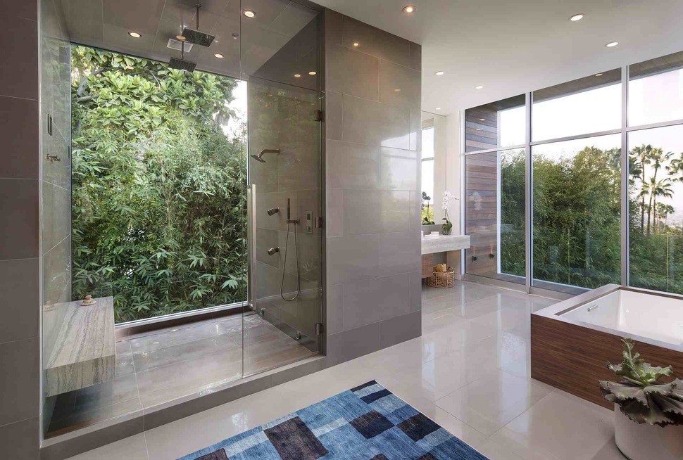
Even the home’s master bathroom, including the shower stall, has commanding views of the property and of Los Angeles, a daring design choice made possible by the heavy mask of greenery all around the home’s lot.
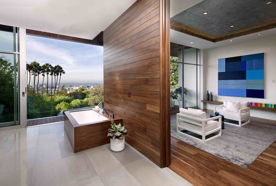
Off the bathroom sits a small, cozy lounge area, made colorful by a blue abstract painting, wooden floors, and an interesting concrete ceiling treatment complete with orange accent lighting.
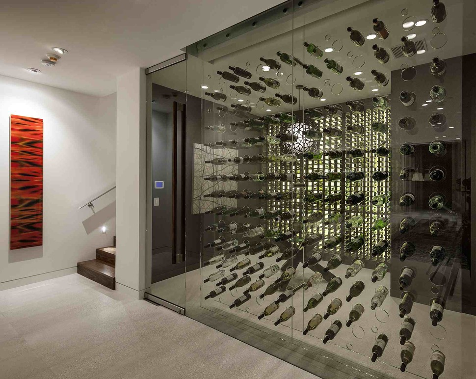
A large wine storage room sits in the bottom of the house, cooling bottles in a glass-lined display perfect for the avid collector.
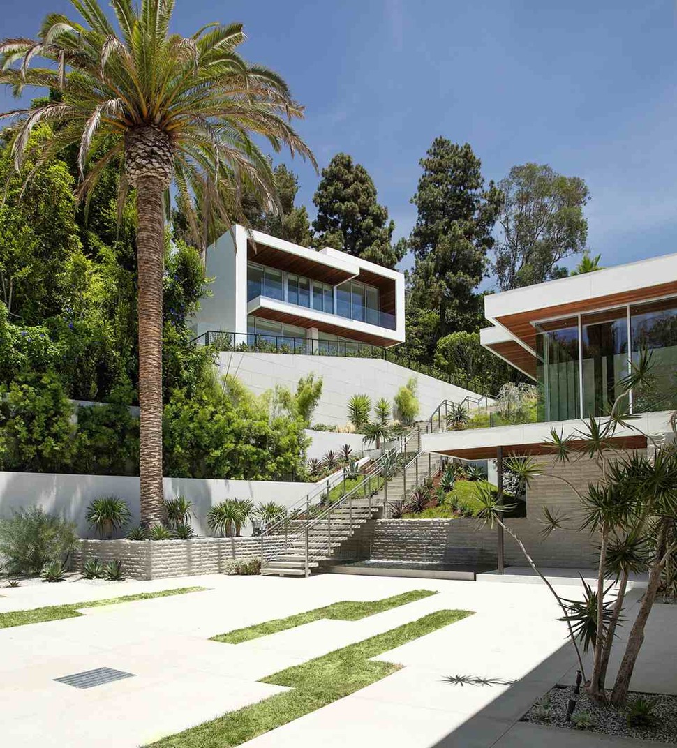
Up a long set of stairs, with its own view of Los Angeles over the main home, sits a guest house. Its style matches that of the main home, but it’s located far enough away to retain the privacy of visitors.
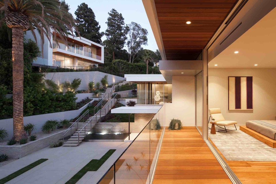
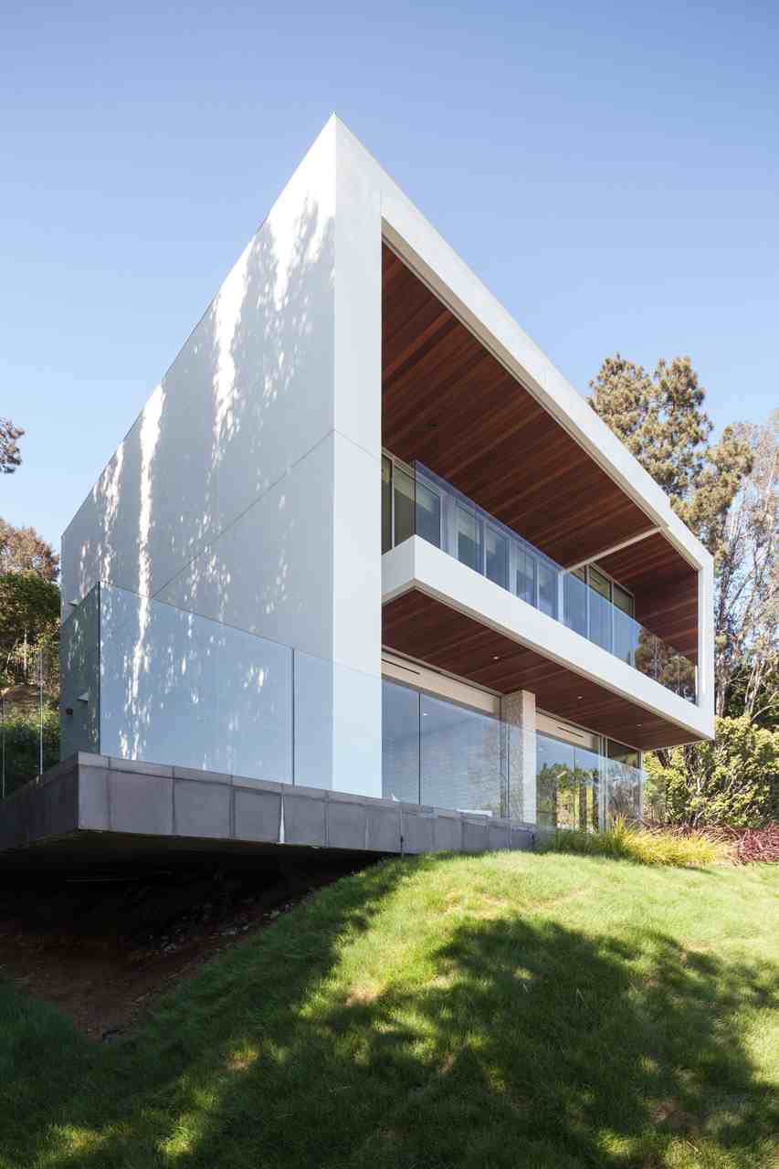
On its own, this guest home would be considered a large and sophisticated modern design. When compared to the house it’s a satellite of, however, it’s almost not worth mentioning at all but for the fact that it exists.
Belzberg Architects Group
