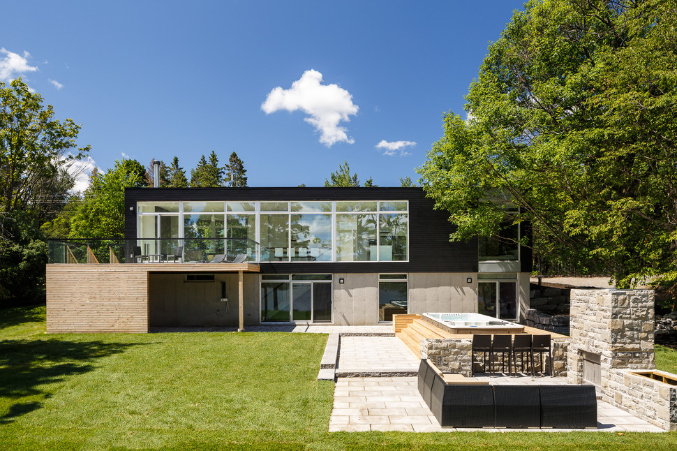
Located in Dubrobin, Ontario, Canada on the shores of Ottawa River, project architect Samantha Schneider of Christopher Simmonds Architect Inc. designed this riverside home to follow the firm’s belief that “Successful buildings must be thoughtful, fitting into their neighborhoods while encouraging human interactions within”, and the result is a structure that embraces both a luxury lifestyle both inside and outdoors without sacrificing the beauty of the surrounding environment. Thanks to the sustainability approach of the architects and the skill of Maple Leaf Homes as contractors, this river home settles so comfortably within its landscape that you would never know the home was only completed in June 2014.
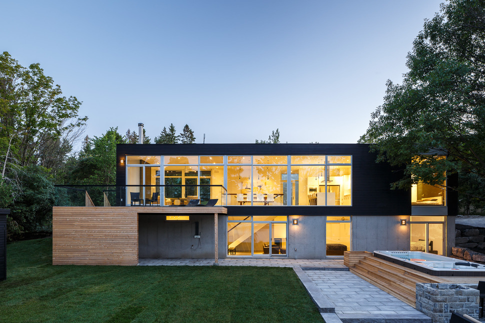
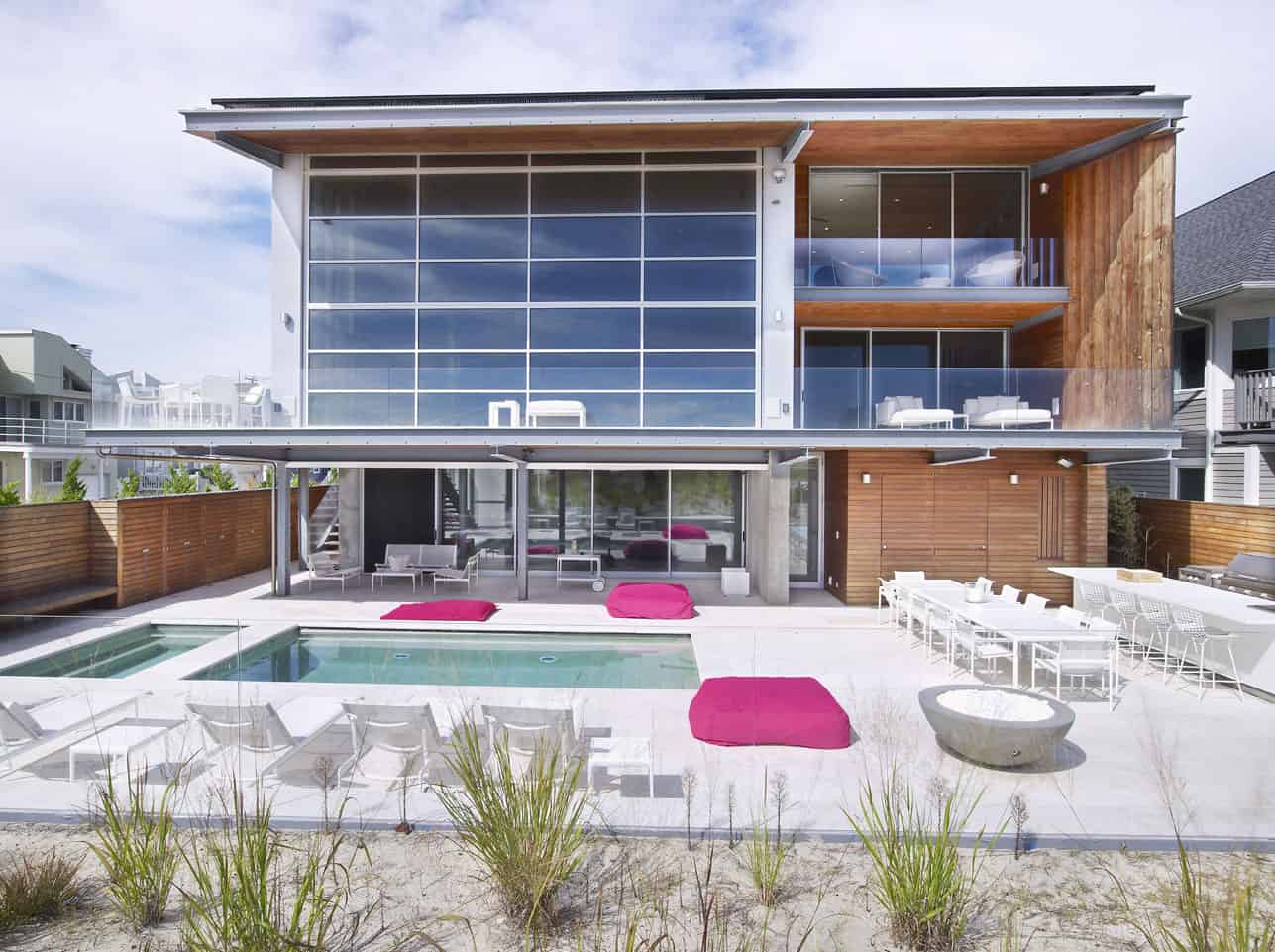
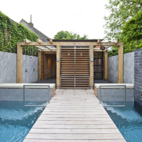
One of the ways Samantha Schneider accomplished this was to design the backyard spa as an above grade element, requiring minimal disturbance to the surrounding land. With concrete pavers connecting the spa to the back terrace and clear finished wood steps that double as extra seating, this outdoor zone is both inviting to guests and respectful of the land.

The addition of an amazing outdoor kitchen just next to the spa means this outdoor zone is not only relaxing and fun but practical too. The lower volume of the home accesses the spa and outdoor kitchen with the main social zone is on the street level 2nd floor.
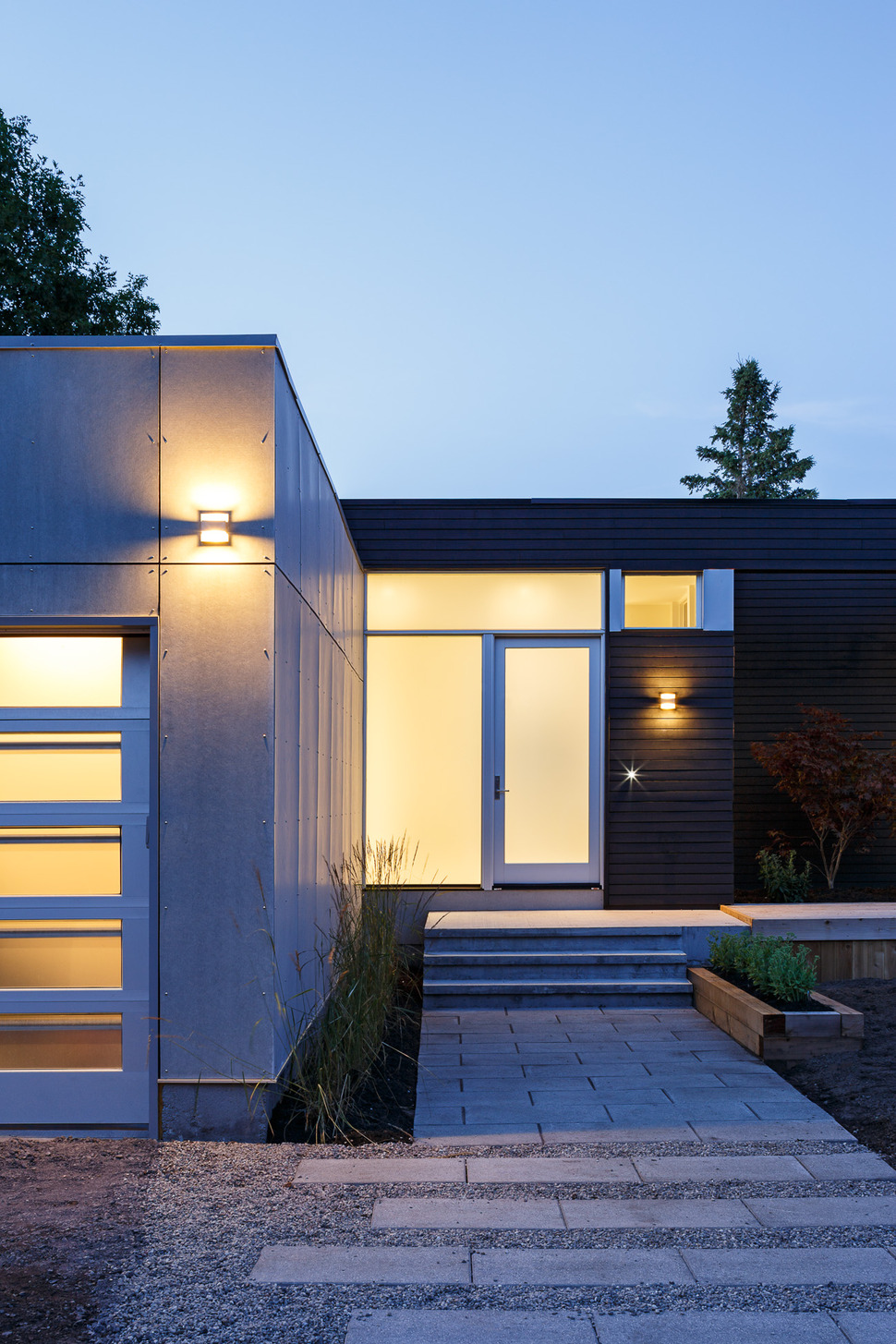
From the street the home appears as a one storey “L” shaped building with the garage creating the foot of the “L”.
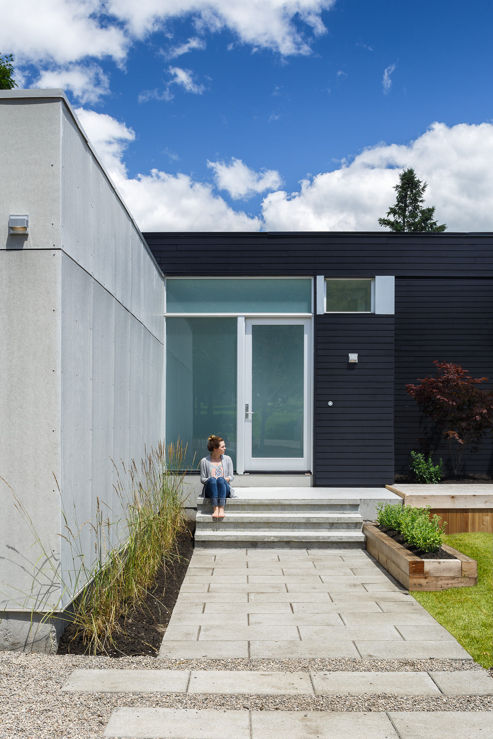
The entry to the home is a minimalist design that incorporates the same pavers used on the back terrace. Flanking the entryway are low maintenance grasses and shrubs that require minimal water in the heat of the summer.
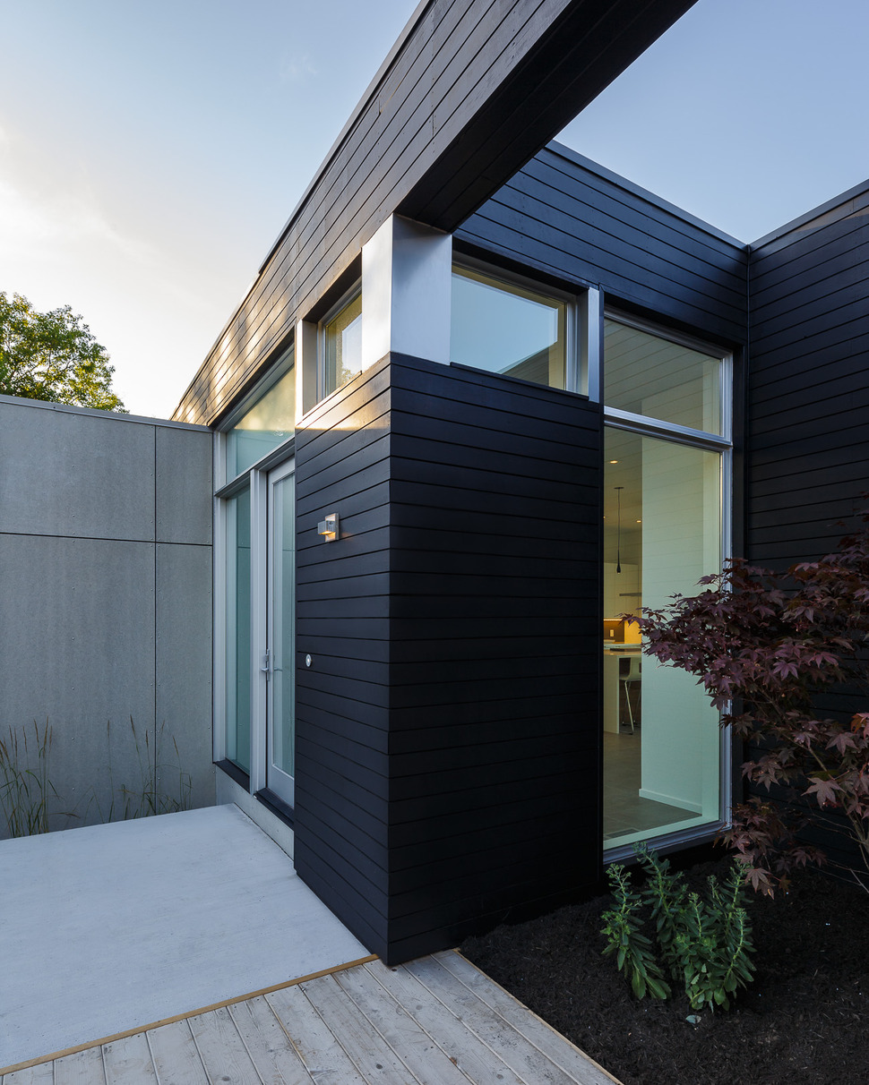
A second planted area featuring an Acer Purpurea is visible from the foyer’s side window and lit by the roof void above. The bold summer purple and fiery autumn red of the maple’s leaves add a flamboyant shade of nature’s palette to the otherwise neutral facade.
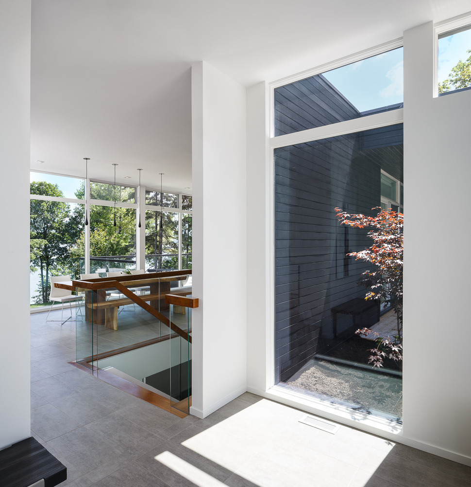
As you step inside the home, the color scheme is much the same as the facade; grey, white and natural wood with white becoming the dominant neutral. This constant in the color scheme creates a continuous visual flow that is kept interesting by the change of emphasize.
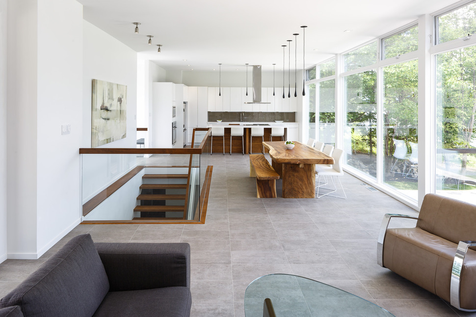
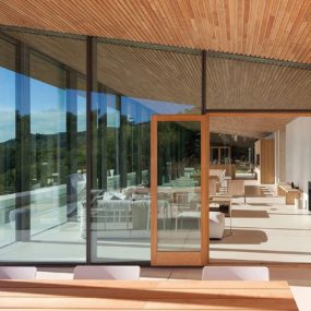
As you pass through the foyer into the open plan social zone, the importance of nature within this minimalist design becomes apparent. Aside from the wall to wall, floor to ceiling views of the yard and spa below, there are also beautiful visuals of the landscape and riverside. Tying this outdoor aesthetic into the interior lifestyle is the amazing living edge dining table and bench as well as the color of the flooring, which matches the tonal value of the concrete pavers used outside.
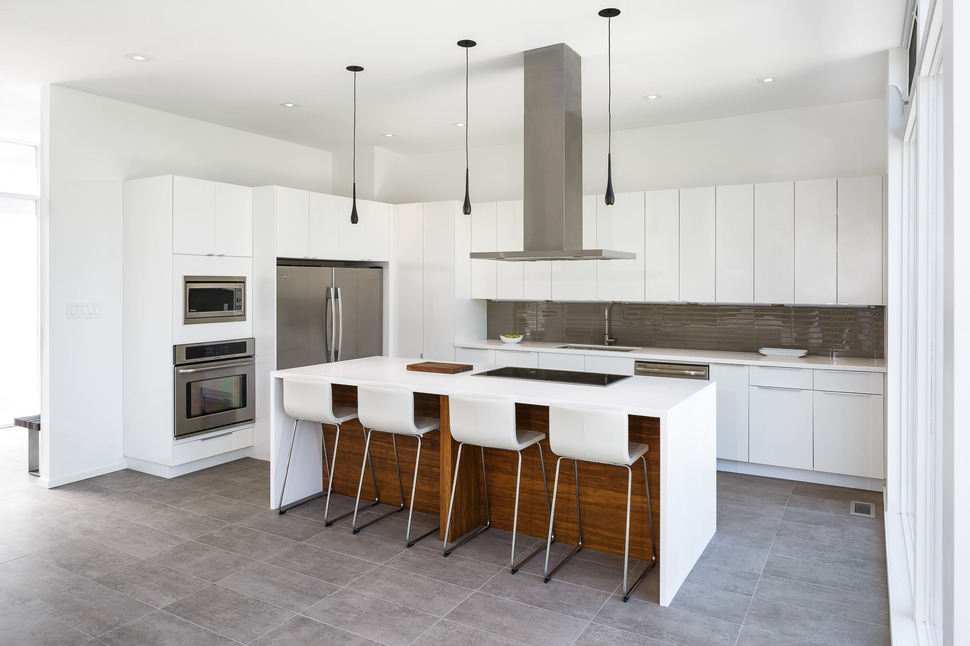
The kitchen is just to the left of the foyer, on the far end of the open plan. The interior wall has no windows and offers a wall of storage and prep space to maximize the functionality of the kitchen. I love the horizontal wood boards used on the back of the island. The space is in shadow and by cladding it in a mid-tone wood it emphasizes the depth of the overhang while at the same time layering in a natural element.

By tiling the backsplash in dark grey glass, the same exaggeration of depth is achieved but the reflective quality of the glass tile also bounces light back onto the counter, passively maximizing light on the work surface.
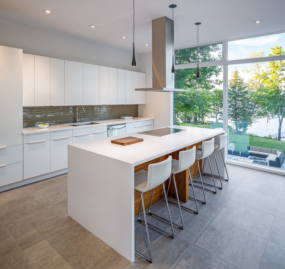
While the stove hood offers all the needed ventilation for the cooktop on the island, the row of operable clerestory windows on the wall of glazings can also be opened to release heat during the summer months for optimum passive temperature control.
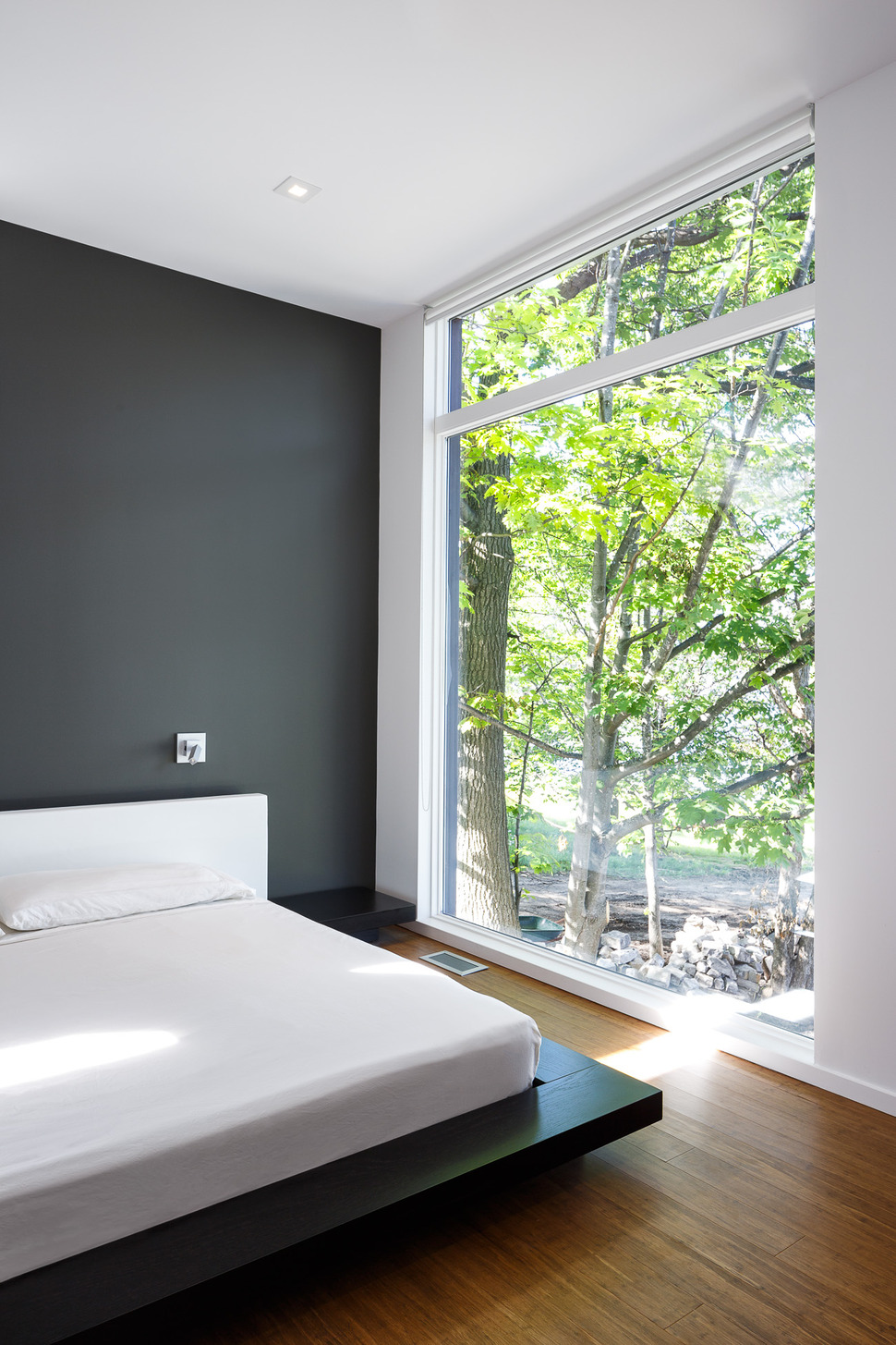
behind the kitchen, on the far side of the home is the master suite. Here, the room brings the dark grey of the facade into focus on the headboard wall and the wood elements onto the flooring. With a tree just outside of the window, this room takes on a slight tree house effect – what a great place to fall asleep.

The ensuite takes the color blocked dark grey off of the wall and puts it onto the floor and takes the wood off of the floor, using it instead in the vanity and storage cabinet. Again, the colors are the same, but the use of them is completely different. Its a simple, effective and smart way to layer excitement into a minimalist design.
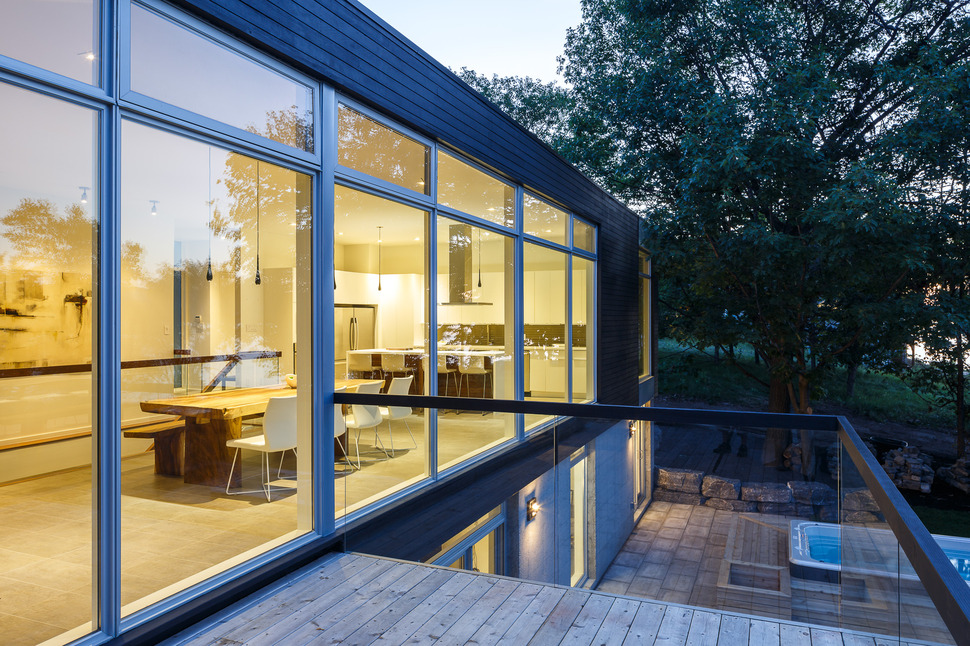
Just to the right of the foyer is the dining area with that awesome living edge table and bench and just beyond that is an outdoor terrace that overlooks the backyard zones and the river beyond.
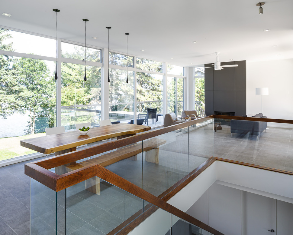
The terrace is accessed via a pair of glass French doors next to the fireplace within the living room and the clear tempered glass safety rails used on the terrace allow the views of the trees and river to flow uninterrupted into the living area as well as the dining room.
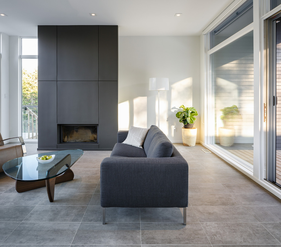
The living room also has glass sliders that open to the front yard and a small wood deck. This means during the summer months the social zone can easily take advantage of the river’s cool breezes by creating airflow through and out of the house.

This front yard deck is just past the Acer Purpurea next to the entry.
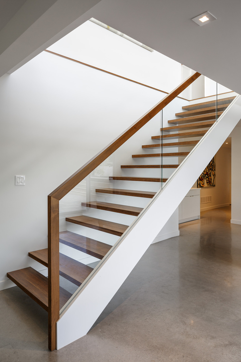
The stairs between the foyer and the dining room lead to the ground floor level and into the family room. Designed with open risers and a clear glass balustrade, the stairwell is flooded with light from every direction as it leads to the family room. The family room opens to the spa and outdoor kitchen zones.

Christopher Simmonds Architect
Project architect: Samantha Schneider
Contractor: Maple Leaf Homes
Photography by Doublespace Photography
