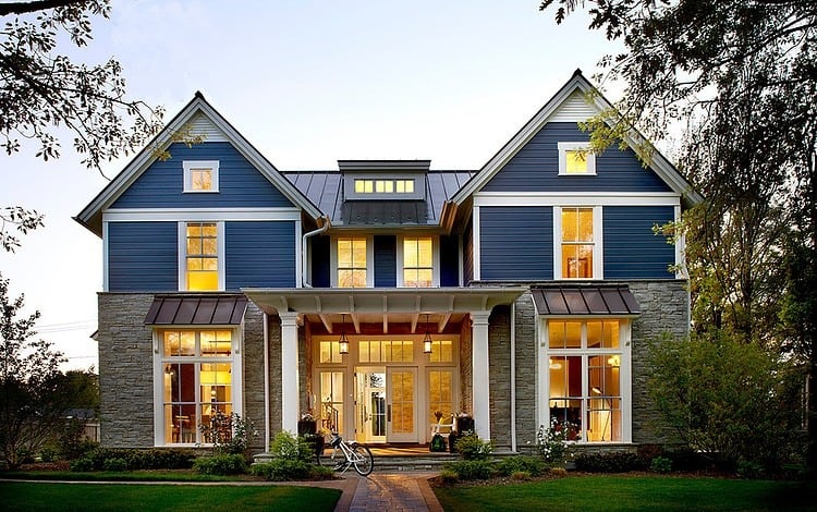
Charles Vincent George Architects designed this updated traditional country home, located in Chicago, Illinois, as a place full of all the modern day comforts while at the same time playing homage to a more traditional layout of a large, contained kitchen, designed to be the heart of the family zone with an equally as large contained dining room accessed by the kitchen through a butler’s pantry, and a family room full of all the modern day requirements, boasting colour, architectural details and a stunning view of a large and spacious backyard. Equally as impressive is the inner staircase leading to the private areas which are themselves large and spacious and full of intricate trim details.
The home is based on a symmetrical layout that from the exterior frames the entryway, beckoning the visitor to the glazed French doors.
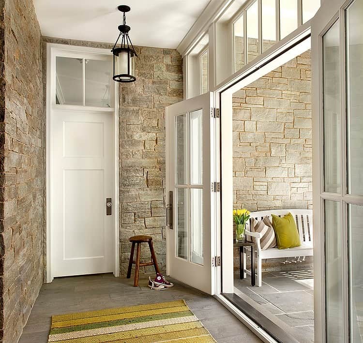
Through the entry doors is a foyer with walls covered in the same stonework used on the lower ½ of the facade. This continuation of material gives the foyer a porch atmosphere and the choice of ceiling pendant continues the outdoor aesthetic. This “mud room” area is a perfect place to leave wet outerwear behind before continuing on into the social zone through the second door.
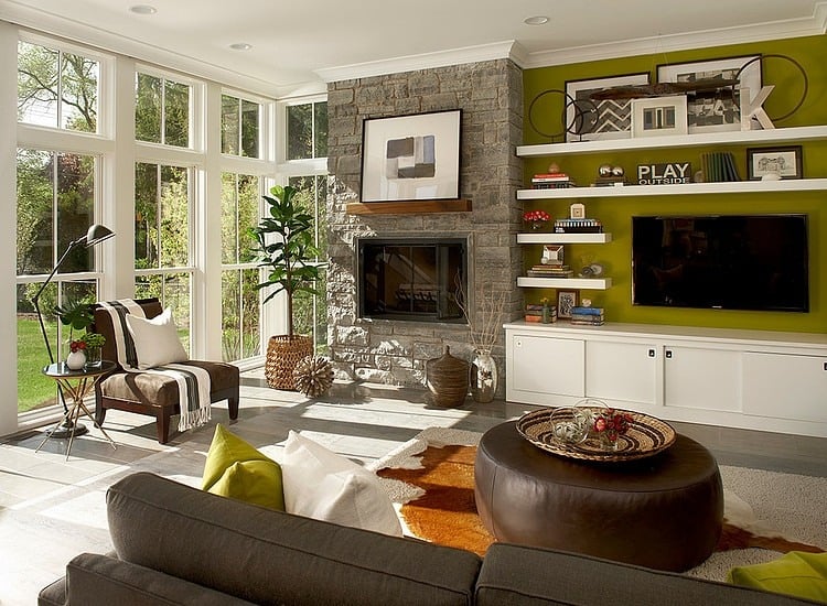
The family room continues the use of the stonework on the fireplace surround, but rather then having a traditional mantel, the architects chose to float a solid wood beam above the fireplace by installing it before the stone was mortared in place. This allows no visible attachments to be seen. Once the stonework was complete a built in media console was installed with asymmetrical shelving, also floating, wrapping the area where the TV is mounted for a visually intriguing display of the homeowners collections. Rather then choosing to do a white on white feature area, the architects instead chose to feature a bold olive green on the wall that flows nicely with the greenery outside while at the same time allowing the display area to “pop”.
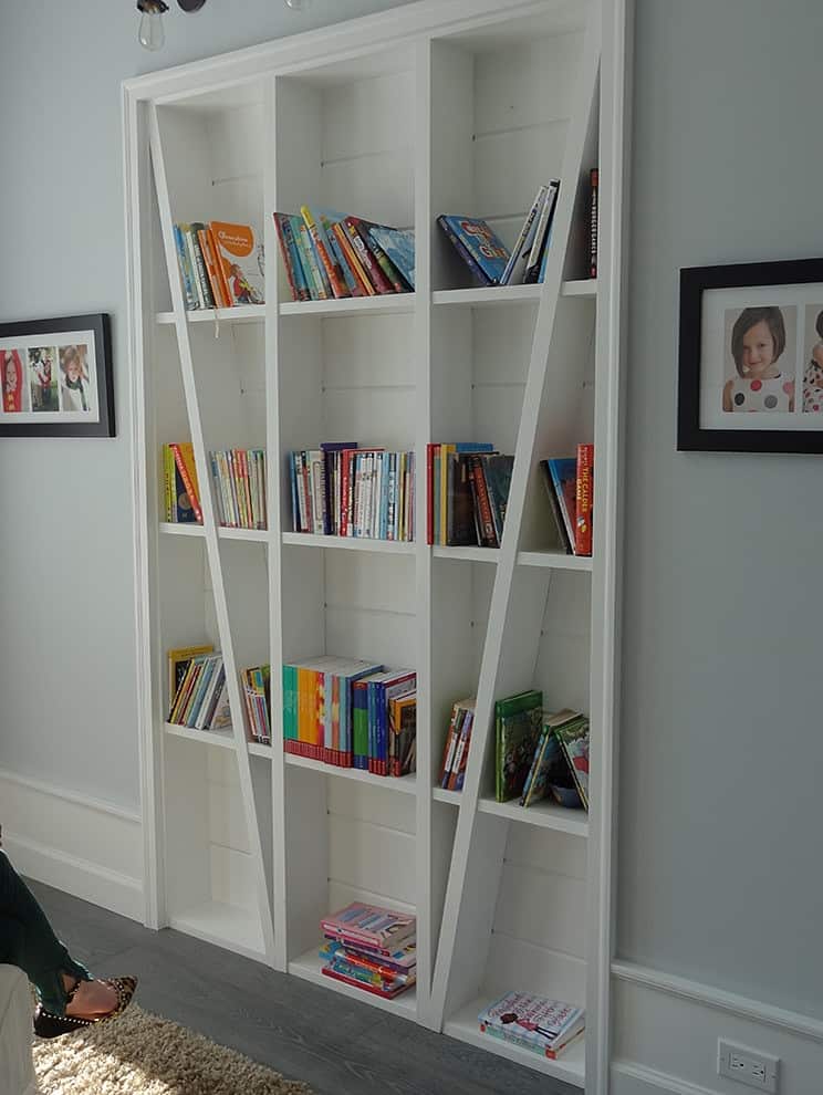
Another just as interesting built in is on another wall within the family room. Here a standard bookshelf of cube shelving 3 rows wide by 4 rows high has been reinvented with two angled vertical supports, slicing through the outer two vertical rows. The concept is so simple, the install not so simple, the final result is simply awesome.
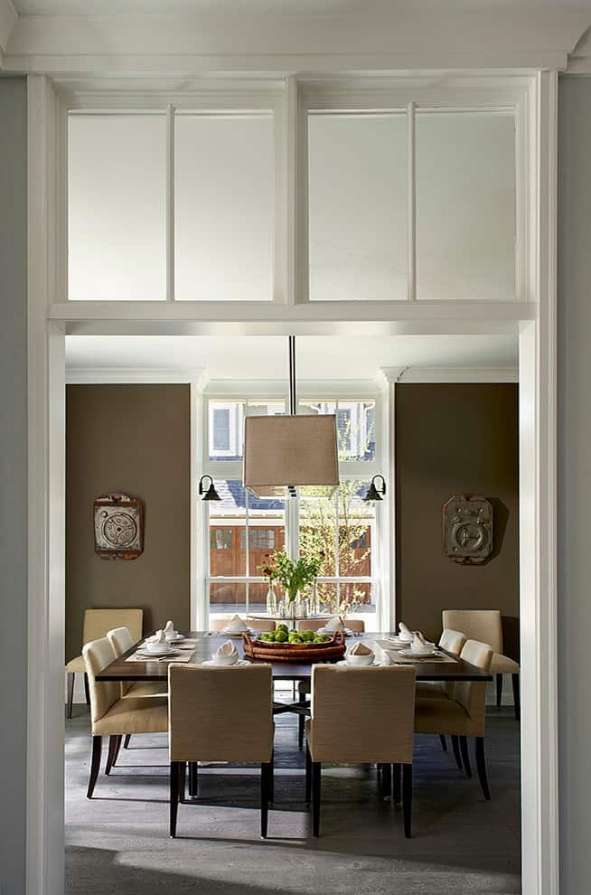
The dining room used the traditional mullioned windows as the muse for the mullioned glazings above the entrance. While his grand statement is dramatic, it does not overpower the simplicity of the room itself. The dining room features a bold hue of umber on the walls to create intimacy for the large table. Displaying art in the same tone and featuring a light pendant and chair upholstery in a pale shade of sand adds a peaceful element to the room for a zen atmosphere, perfect for entertaining a group of friends.
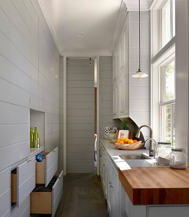
While the main entry to the dining room is grand, the kitchen entry is much more contained. Sliding “barn” doors roll on an outside track along the exposed wall that when open, reveal a butler’s pantry complete with sink and bar, there is even a butcher block on the outside corner that connects with the main kitchen.
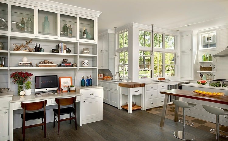
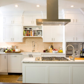
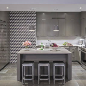
The butler’s pantry opens up to the kitchen on the left and a small home office on the right and while all the cabinetry is the same, the flooring in the kitchen switches from wood to tile. There is not many upper cabinets in this kitchen but that’s OK, the room itself is huge and with the addition of the butler’s pantry there is plenty of under counter storage.
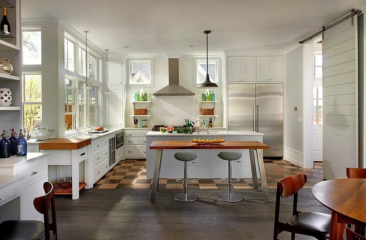
While the kitchen features an island, there is bar overhang, instead there are two choices for seating. A table across from the office area and a table behind the bar. One is completely modern and the other is completely mid-century. Another barn door slides along its exposed tracks, connecting the kitchen to the adjoining room.
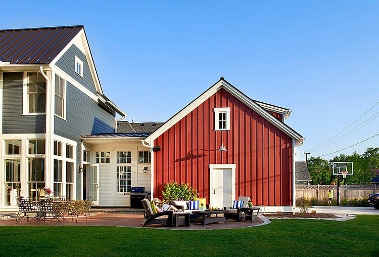
On sunny days a BBQ is tucked under the roof overhang while an outdoor terrace features both a dining and living area.
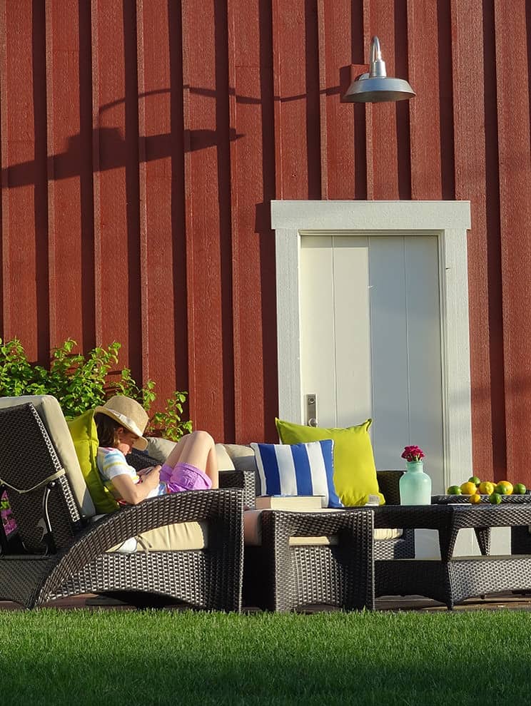
While the main part of the house features horizontal cement board in a deep blue/grey shade, the games room has been given a “barn” look with a board and batten cladding painted a rustic shade of red.
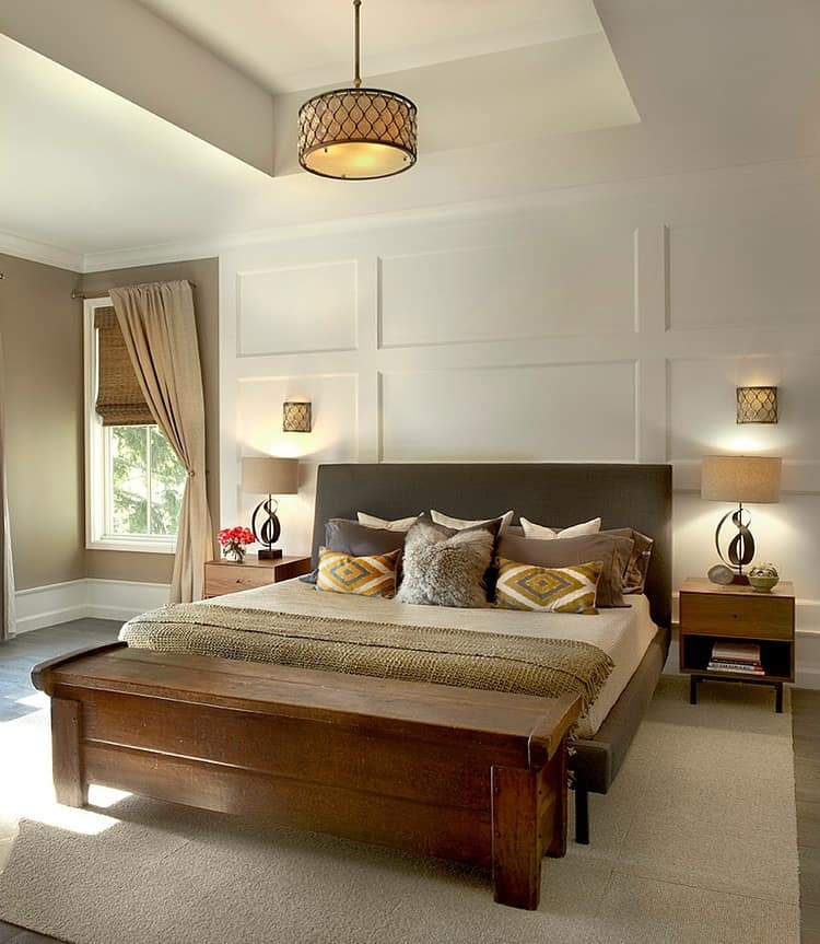
Upstairs, the Master bedroom has a 12′ ceiling with an even higher coffer centred over the bed. This extra high ceiling allowed the architect to suspend a glamorous light pendant above the bed featuring amber glass. The amber tones are picked up on in the pillows, as is the coffee shade on the wall. With such high ceilings the architect was also able to create a feature headboard wall by installing 1x6s in a rectangular grid work pattern.
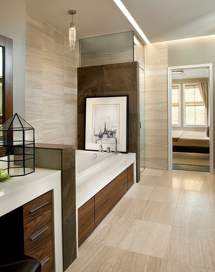
The ensuite continues the neutral palette of the bedroom but in a more modern way with the stacked pattern to the wall and floor tiles. It also turns up the dial on glam with the pendant over the tub.
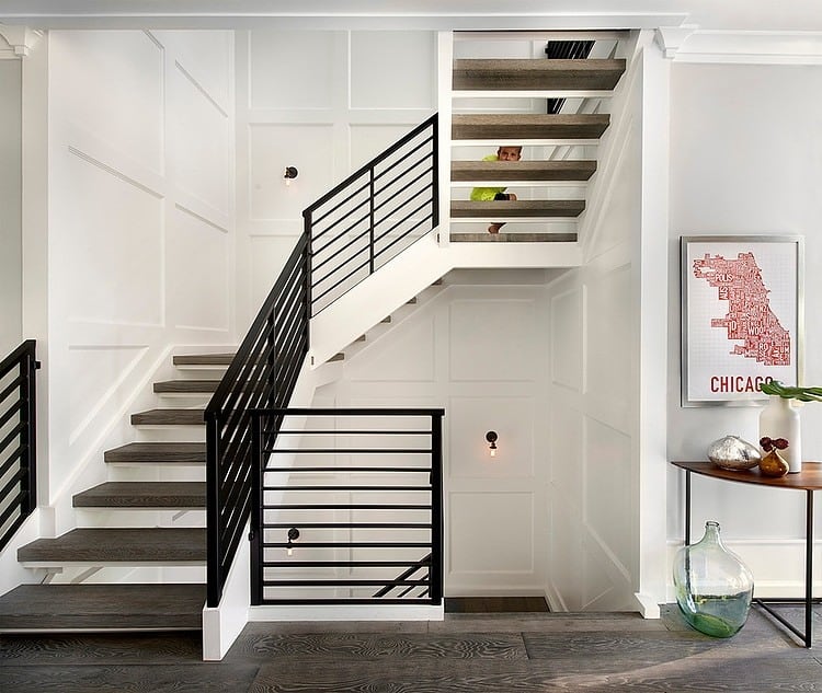
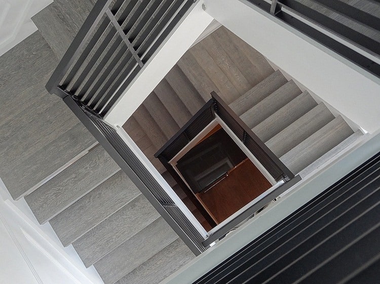
The bedrooms are accessed by an open riser stairwell that features the same 1×6 wall detailing used on the Master bedroom headboard wall. This grid work of rectangles brings scale to an otherwise large expanse of wall.
Charles Vincent George Architects
Photography y Tony Soluri
