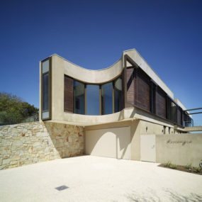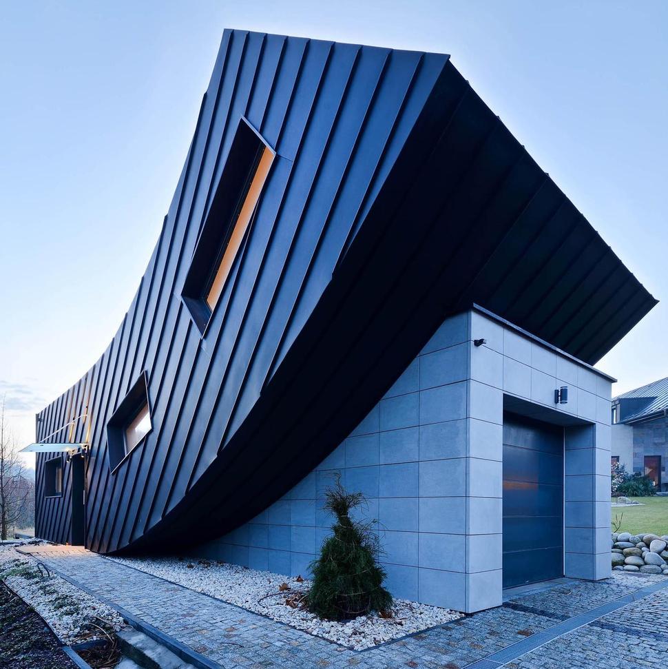
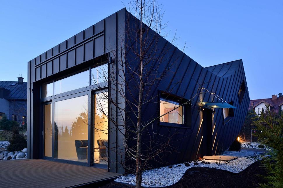
Located in Krakow, Poland, Domo Dom house was built by Arciteckt.Lemanski as a home for a gardener that wanted his interior spaces to be kept simple and functional. The architect designed the home with a combination dining living space in front of the kitchen and overlooking the back deck. The entrance is located just off of the kitchen and a stairwell beside it leads up to the bedroom on the second level over top of the garage. The vertical curve on the bottom of the facade follows the line of the stairwell – as do the angled windows. Supporting the base of the curve is the concrete garage and tucked into the void under the curve is a small stonescaped garden featuring a specimen tree.
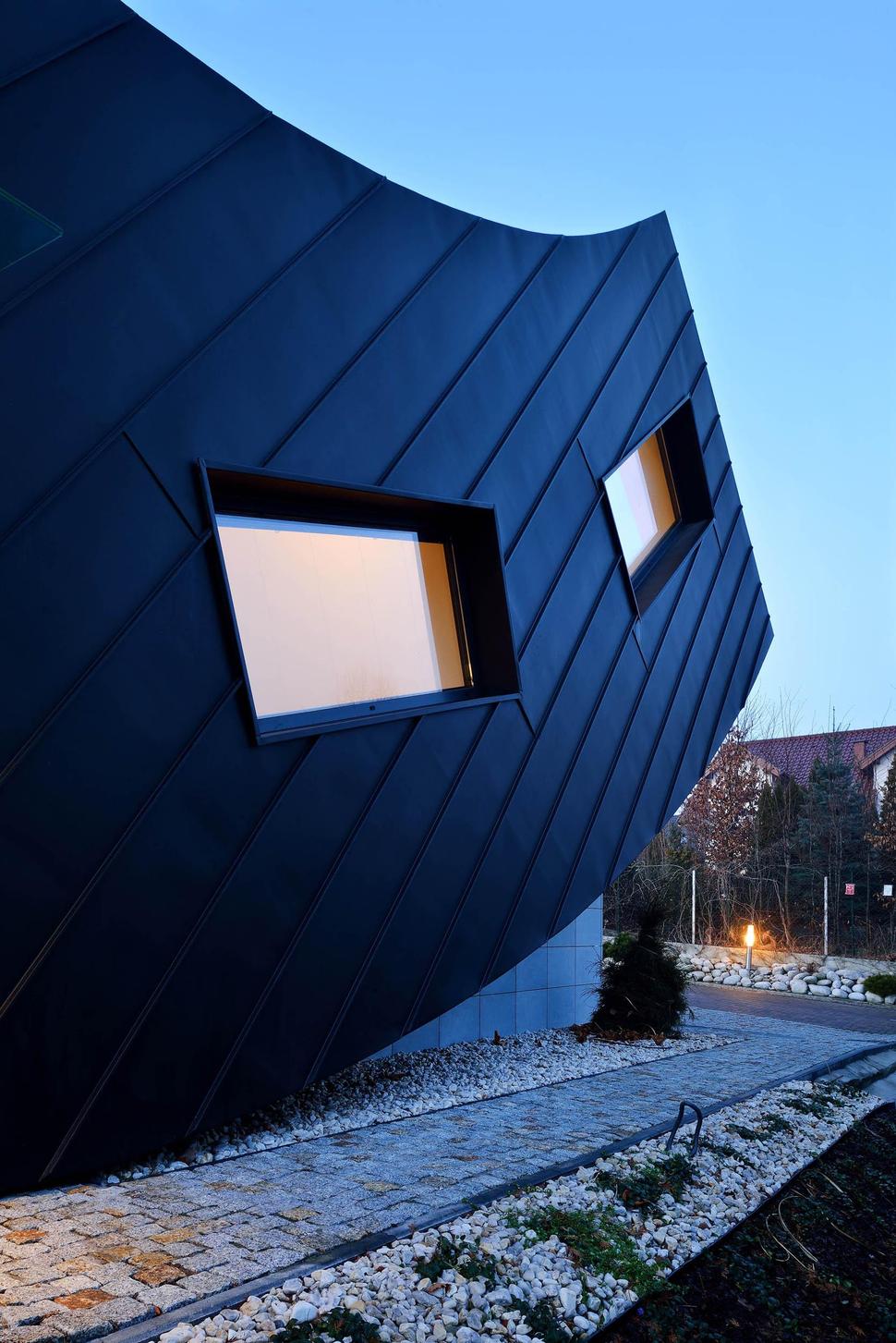
Stonescaping is used on either side of the brick pathway that leads from the garage to the entrance on the side of the home. The stones and bricks create a texture and pattern that, while much smaller in scale, compliments the angled siding used on the home’s facade.

The combinations of form, materials and textures are striking from the front. The curved shape of the home appears to be using the garage to push itself up for a closer look at the sky and the brick path and driveway are surrounding the sculptural composition of the home like a frame on a 3d picture. The larger boulders to the right of the building act as a random foil to the otherwise structured shapes. For such a small home, the architect has created a large impactfull statement on this plot of land.
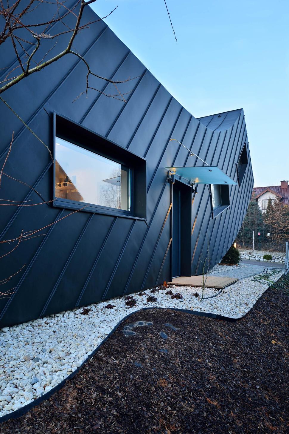
The entrance on the side of the home has a protective overhang that is kept to a simple thin plane so as not to take away from the geometric formation of the building itself, Mirroring the shape of the overhang is the porch below.
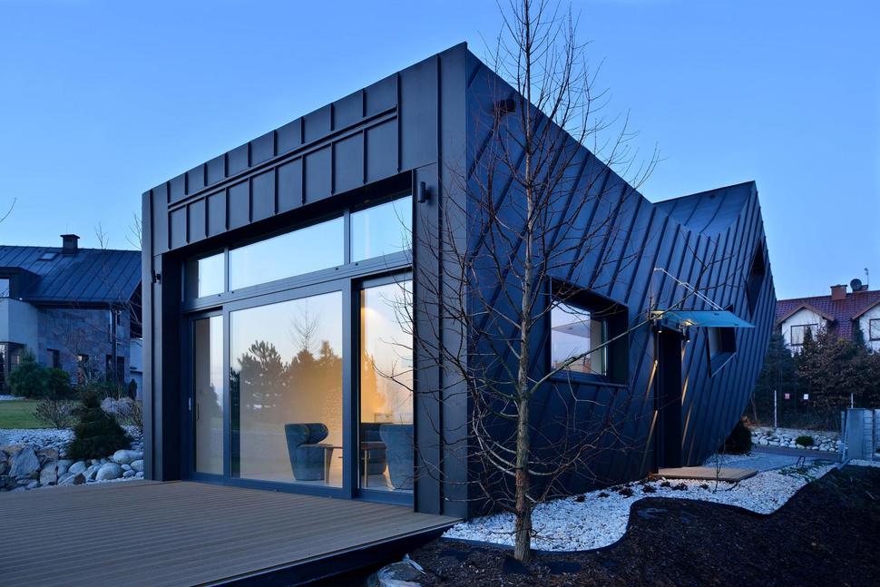
Continuing around the home to the back, a large deck expands the living space and a pair of sliding glass doors on either side of a large window glazing allows for easy passage to and fro.
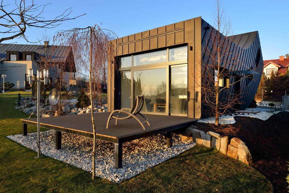
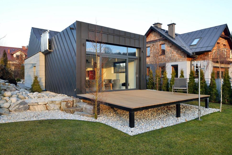
The land drops off just at the back of the home and while the deck is level with the side yard, it is approximately two feet above the backyard. The architect and owner could have just left the underside grass or dirt, but instead the same rockscaping used on the side yard continues under the deck, creating a visual flow that adds an extra layer to the overall design of Domo Dom house
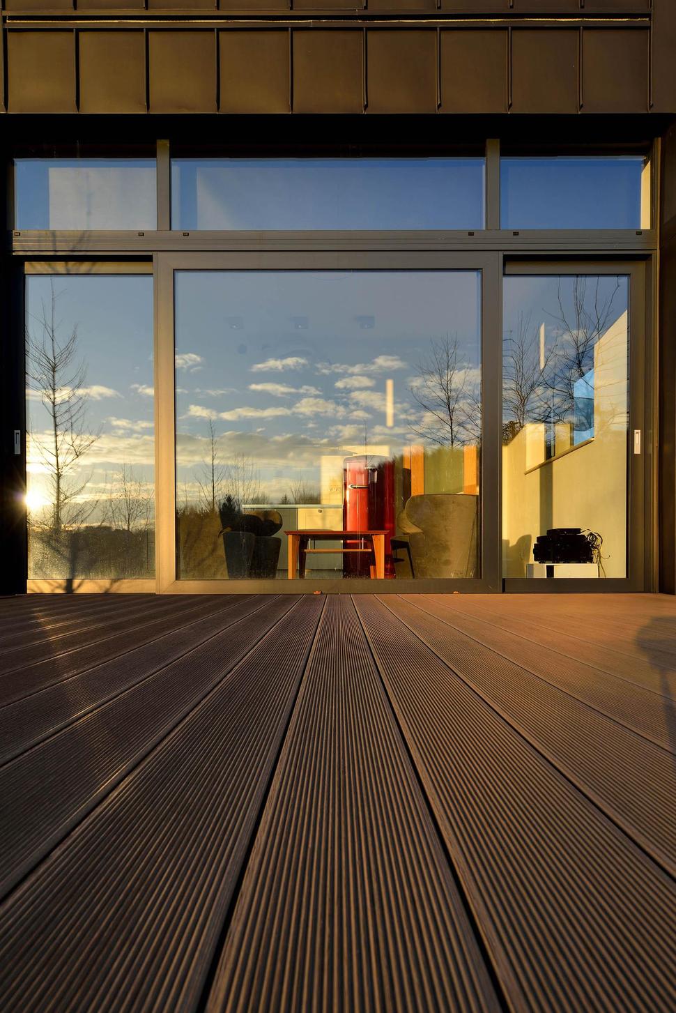
The deck itself continues the geometry of the home with the long, linear channels within its composite. These channels help stop water from pooling on the surface during rainy weather by directing water down the slight and barely perceptible slope of the deck.
Just inside the deck is the social zone which consists of a combination living/dining area and a kitchen on the far wall. The square footage is small meaning that during nice weather, when the deck is opened to the home, the living space literally doubles.
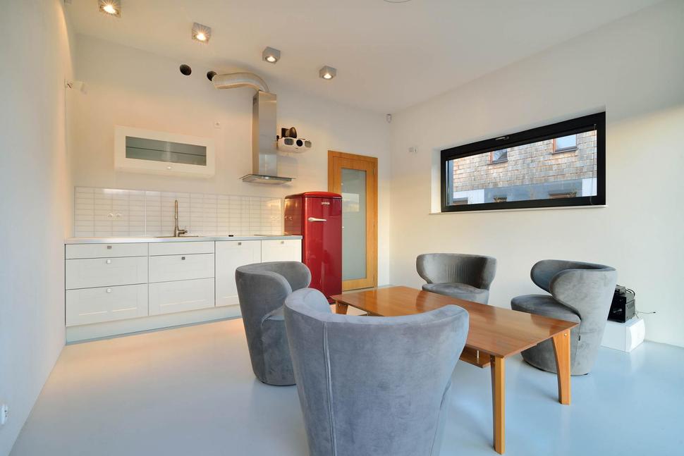
Since the living and dining areas are combined, the seats chosen to wrap the dining table needed to serve double duty and these stunning drum shaped chairs with their curved and elongated head rests are the perfect choice for both comfortable lounging, conversing and eating. Choosing to use a monochromatic colour scheme throughout the volume with the exception of the brilliant red vintage fridge was genius.
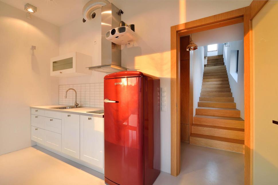
The retro red fridge is a beauty and gives the space just enough whimsy to keep the interior fresh, fun and fabulous. The addition of the wood dining table and stairwell also adds a layer of warmth to the home that would otherwise be missing.
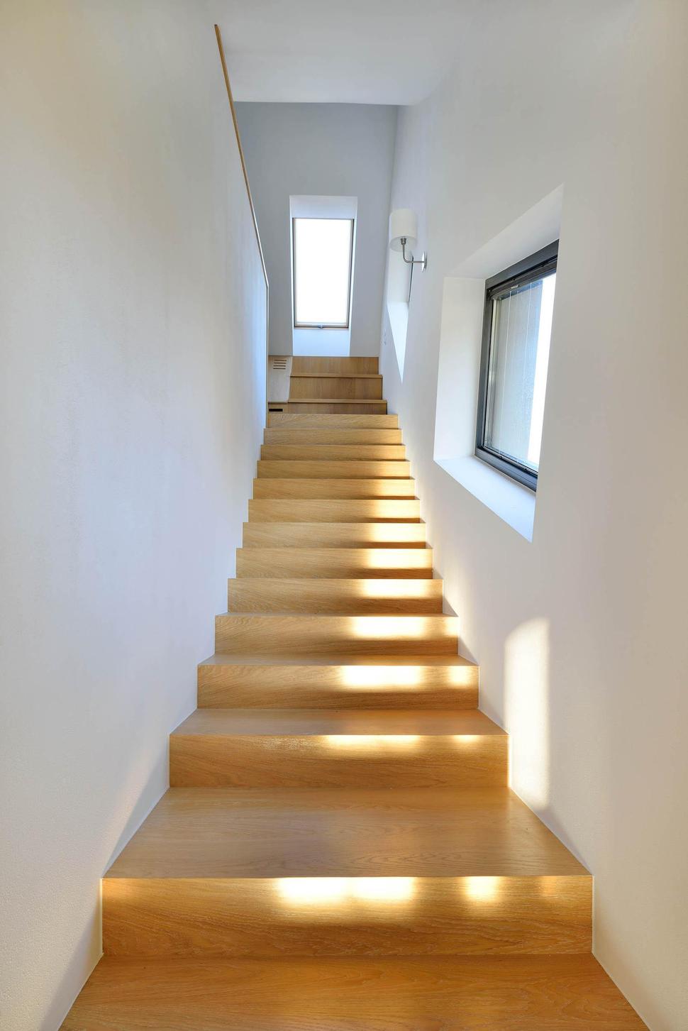
The stairwell from the inside is nothing out of the ordinary and its hard to remember the curved structure below it that gives the facade such an amazing impact.
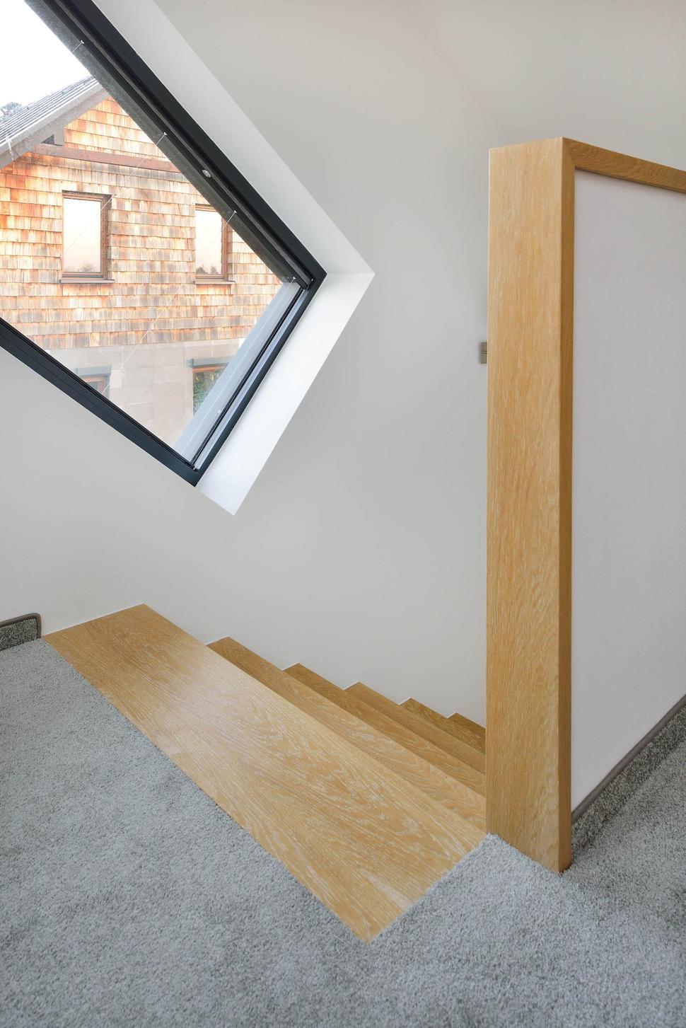
The one angled window follows the line of the stairs and doesn’t seem out of place, and yet from the outside it is just one of the weirdly wonderful compositions to the buildings profile.
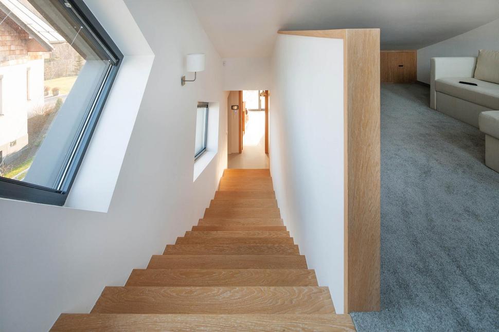
Upstairs is where the architect located the bedroom and with the whole floor dedicated to the bedroom there was enough room for a comfortable and private seating area tucked beneath the curved slope of the ceiling.
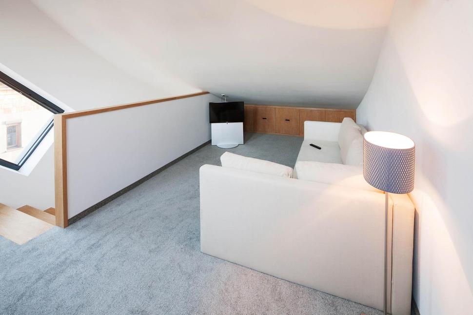
The private seating area is where the homeowner has chosen to place his media centre and the low wall at the back of the space has been fitted with custom cabinetry to hold all the necessary equipment.
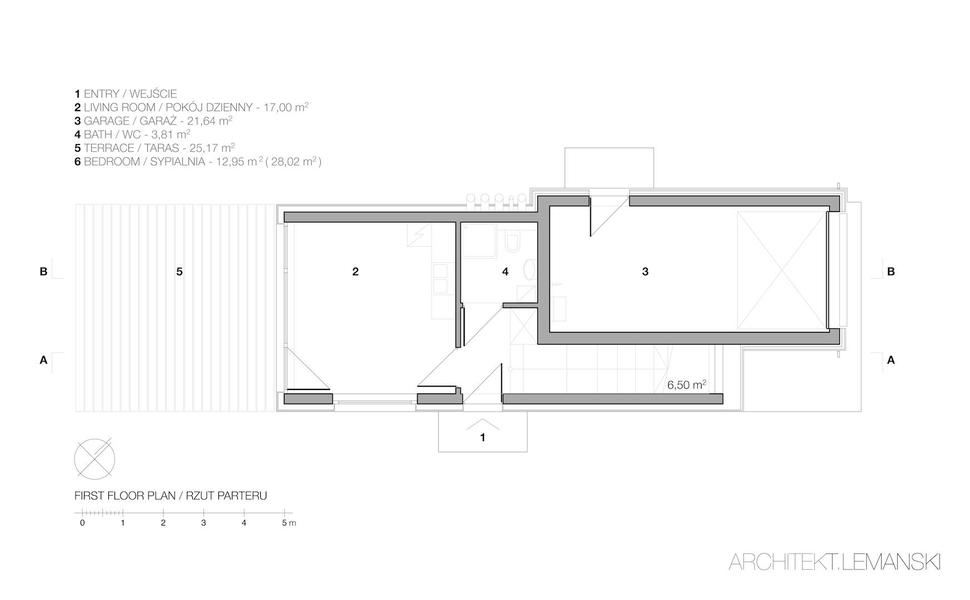
The bathroom is located behind the kitchen wall, across from the entry and beside the stairwell. Aside from the main entry on the side of the building , there is a 2nd door accessing the outdoors within the single car garage.
Arciteckt.Lemanski
Photography by Tomasz Zakrzewski
