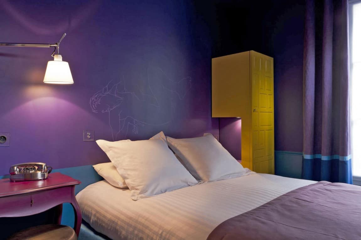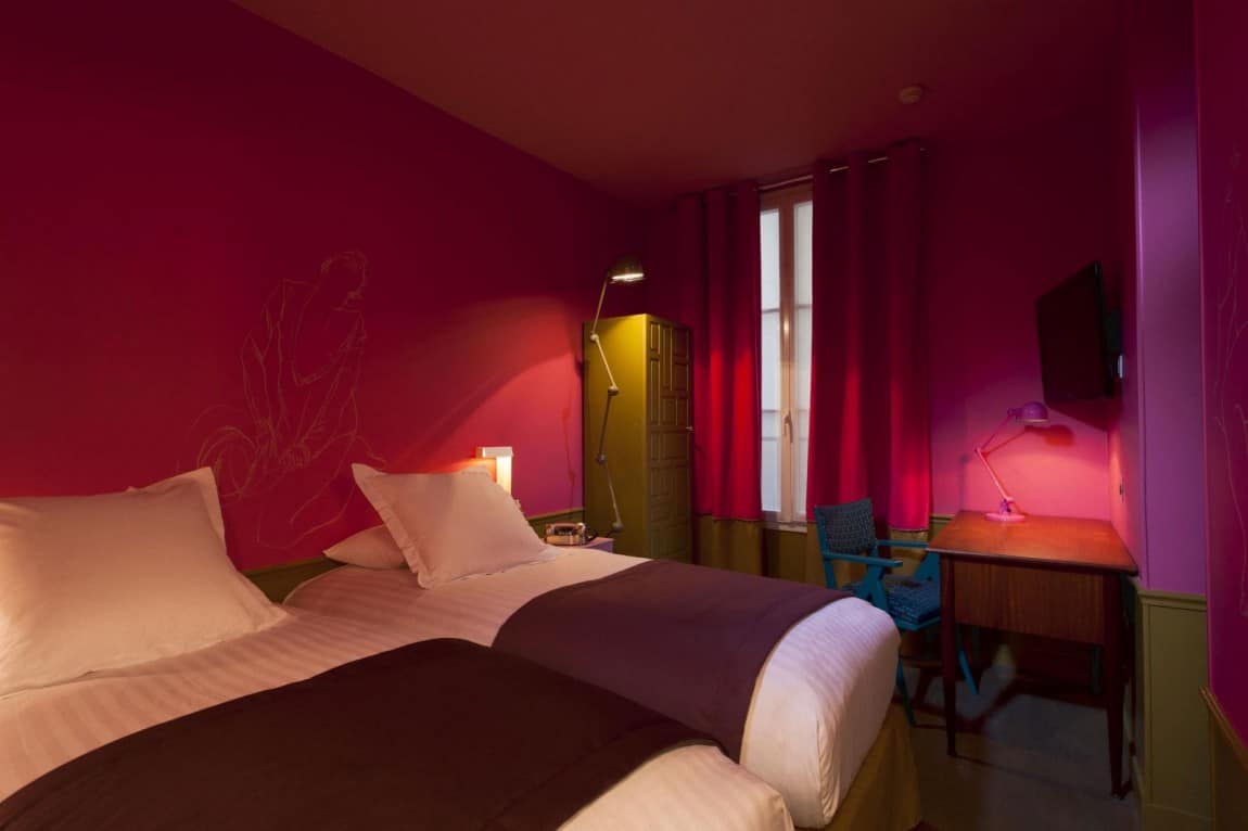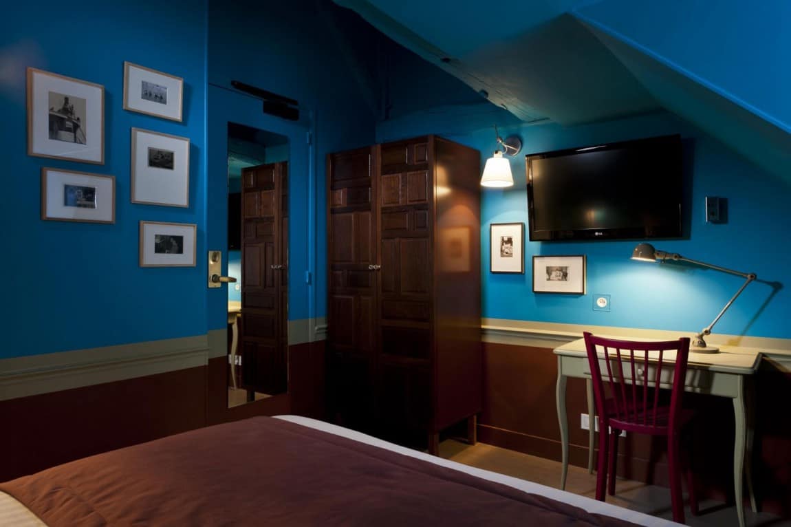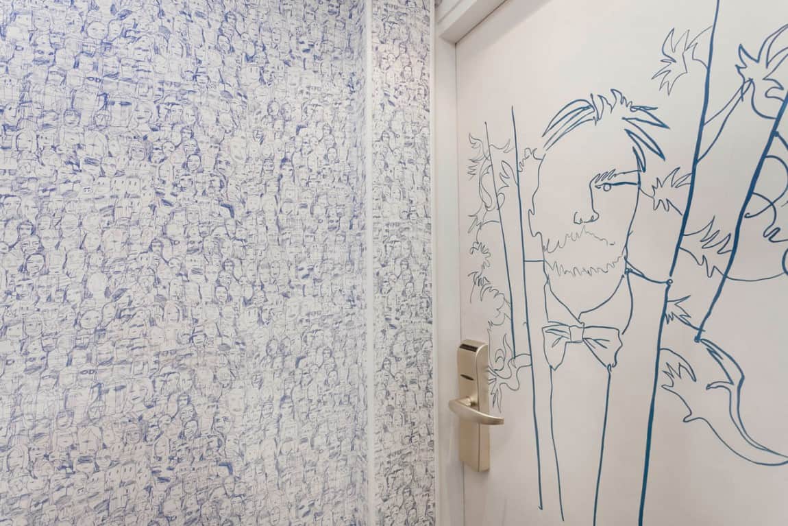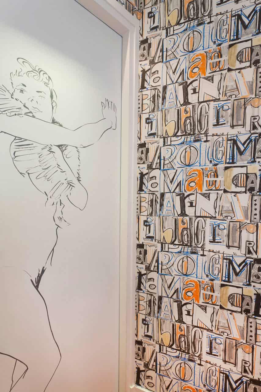
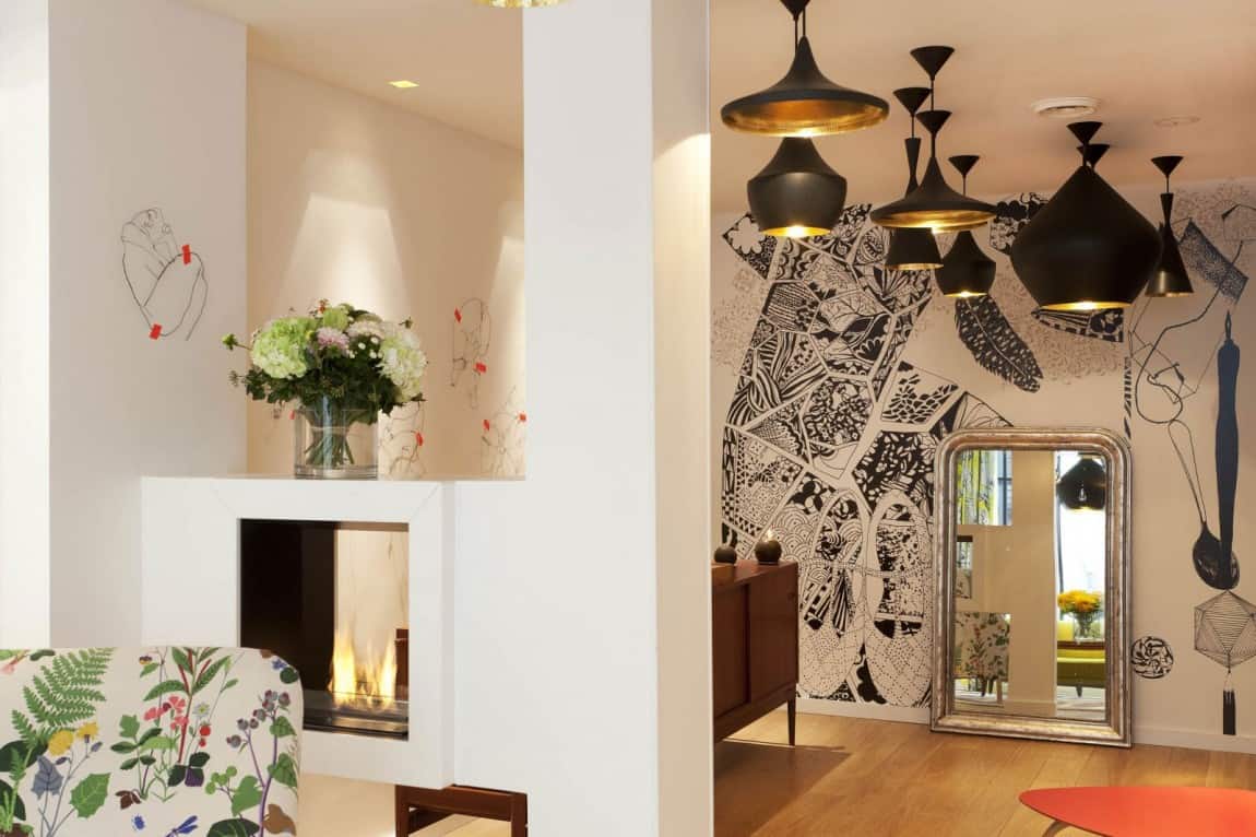
The decoration of this Parisian hotel is colorful and cozy. Contrary to the minimalistic approach some designers have when it comes to hotel design, this one is quite “maximalistic”. It is a nice example of “more is more”. The inspiration is undoubtedly retro, and we accept the bold colors and the mix thereof immediately. The name of the hotel, which translates as The Pencil, is quite suggestive of what we might expect to find inside. The walls of the lobby and of the rooms are decorated with drawings and sketches by French artist Julie Gauthron. The motif of these drawings is human, and they show faces and bodies of men and women in different circumstances. These drawings mix in a very eclectic way with wallpaper with geometrical patterns and strong retro coors. There is an overall richness of detail and decoration that surprises in a pleasant way, without being overwhelming. Each room, hallway or bathroom is highly personalized, creating the comfortable sensation that they where made with a specific person in mind.
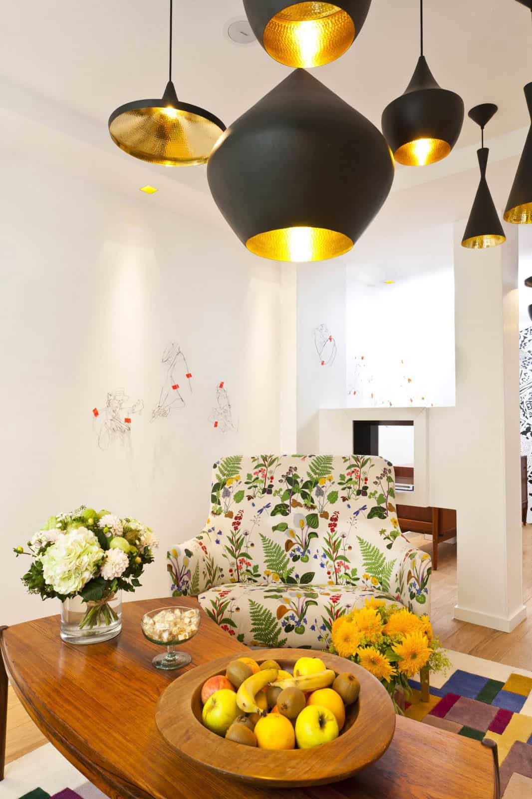
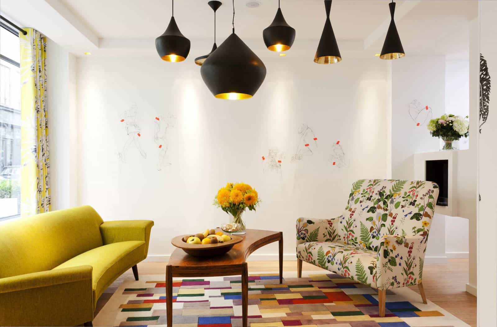
This living/lobby area is very cozy with its mix of floral patterns and bold colors. The vintage furniture with the warmth of the track wood contribute to this welcoming feeling. The ceiling is invaded by a multitude of black pendants with golden interiors, which bring warm light to this space.
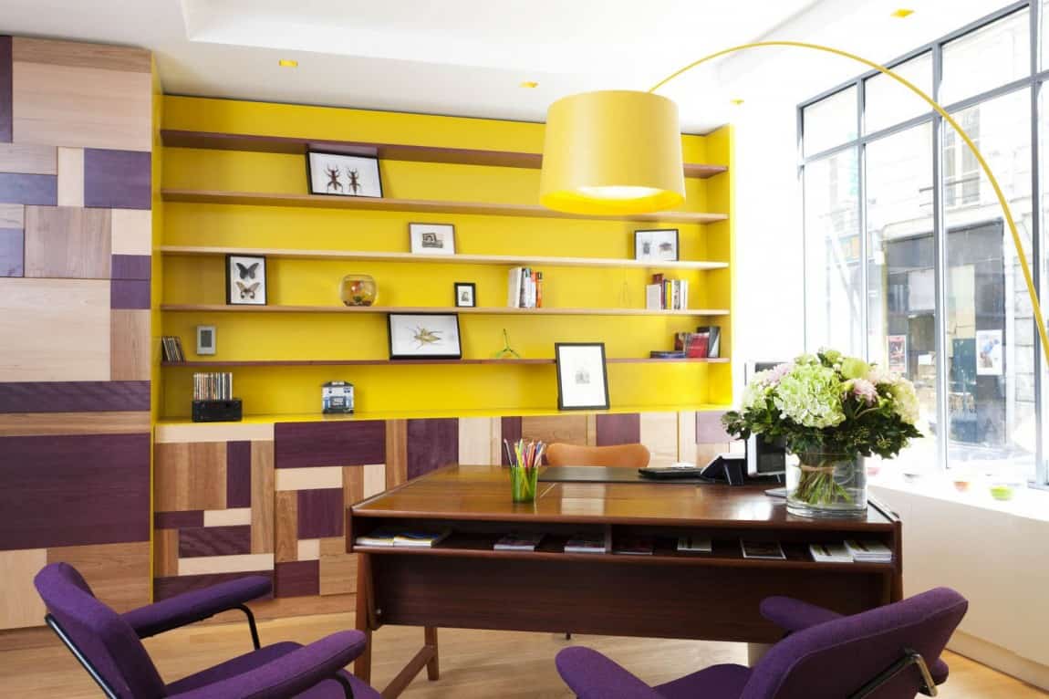
The reception desk looks more like a cozy home office. This room, overlooking the street, has a high glazed facade which brings in a lot of natural light. This light, together with the bright yellow of the shelves behind the desk, create a very sunny atmosphere. A jar of pencils decorates the desk, referring to the name and the identity of the establishment.
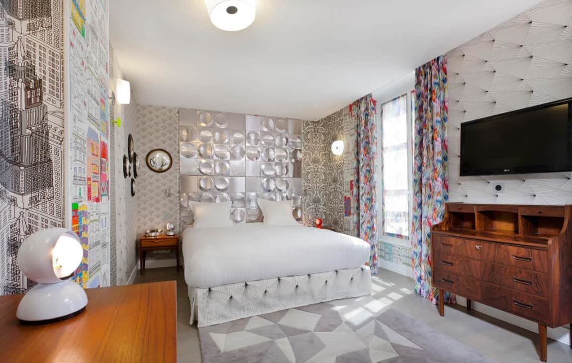
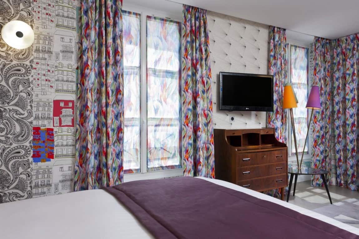
This suite is about a masterful mix of patterns, colors and materials. From the different kinds of wallpaper that cover the walls, to the colorful pattern of the curtains and the geometrical one of the carpet, this room has it all. The skillful mix of all these elements makes this room quite eccentric but totally livable and lovable.
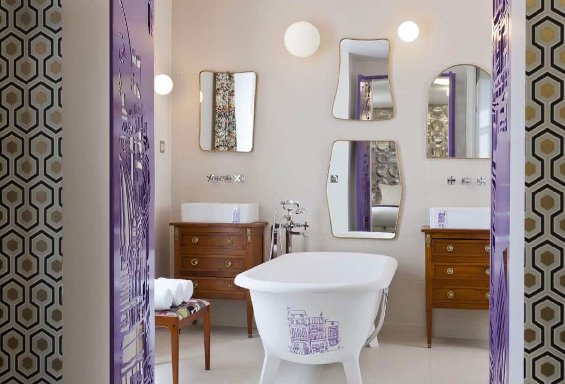
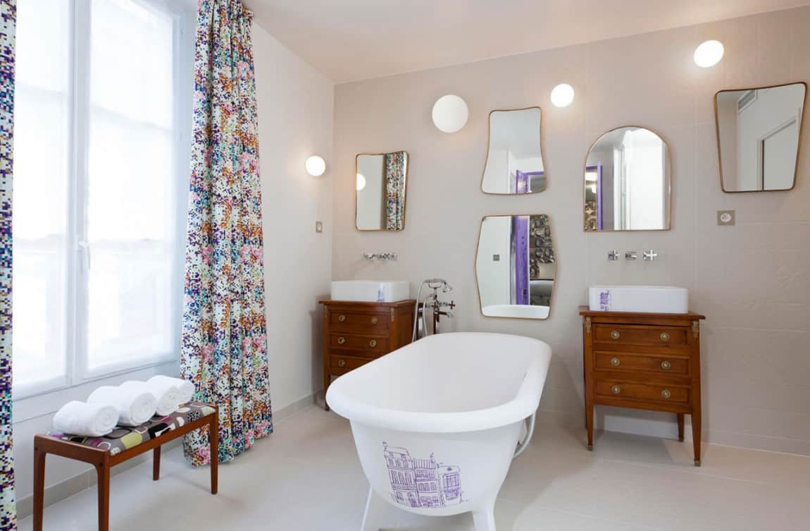
The ensuite bathroom, accessible through purple perforated doors, is totally in sync with the room. There’s a mix of classical elements such as the freestanding tub, the vanities and the mirrors, with modern ones such as the faucets and the glass shower. The purple drawing of a building made on the freestanding bathtub brings a touch of humor that makes this bathroom a vera friendly place.
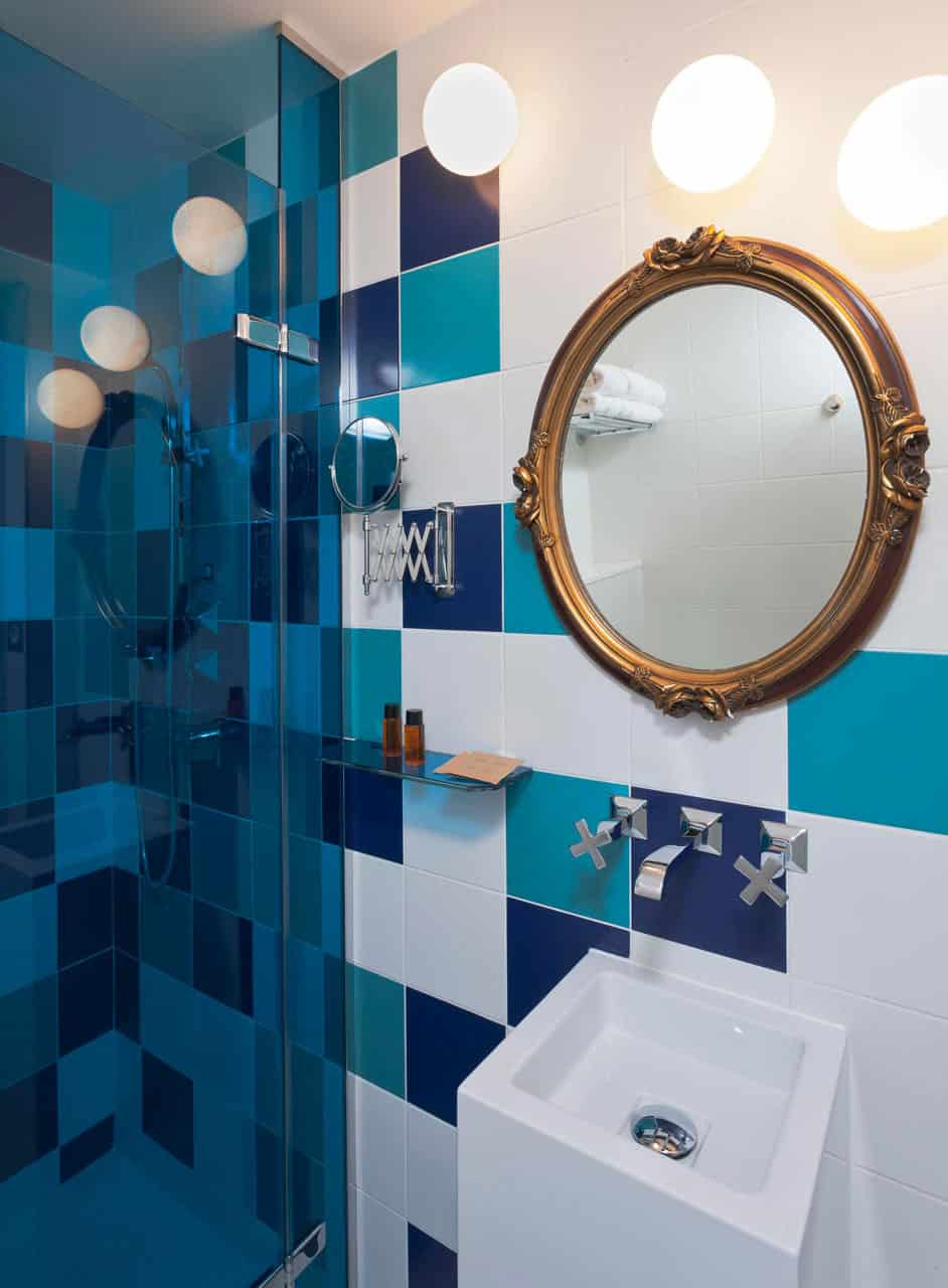
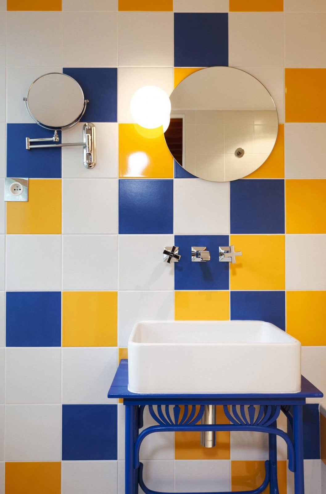
Color, pattern and humor are the three main elements that characterize the design of this unusual hotel. It is well done, original and welcoming, and its charm comes from the fact that it does’t take itself too seriously…
