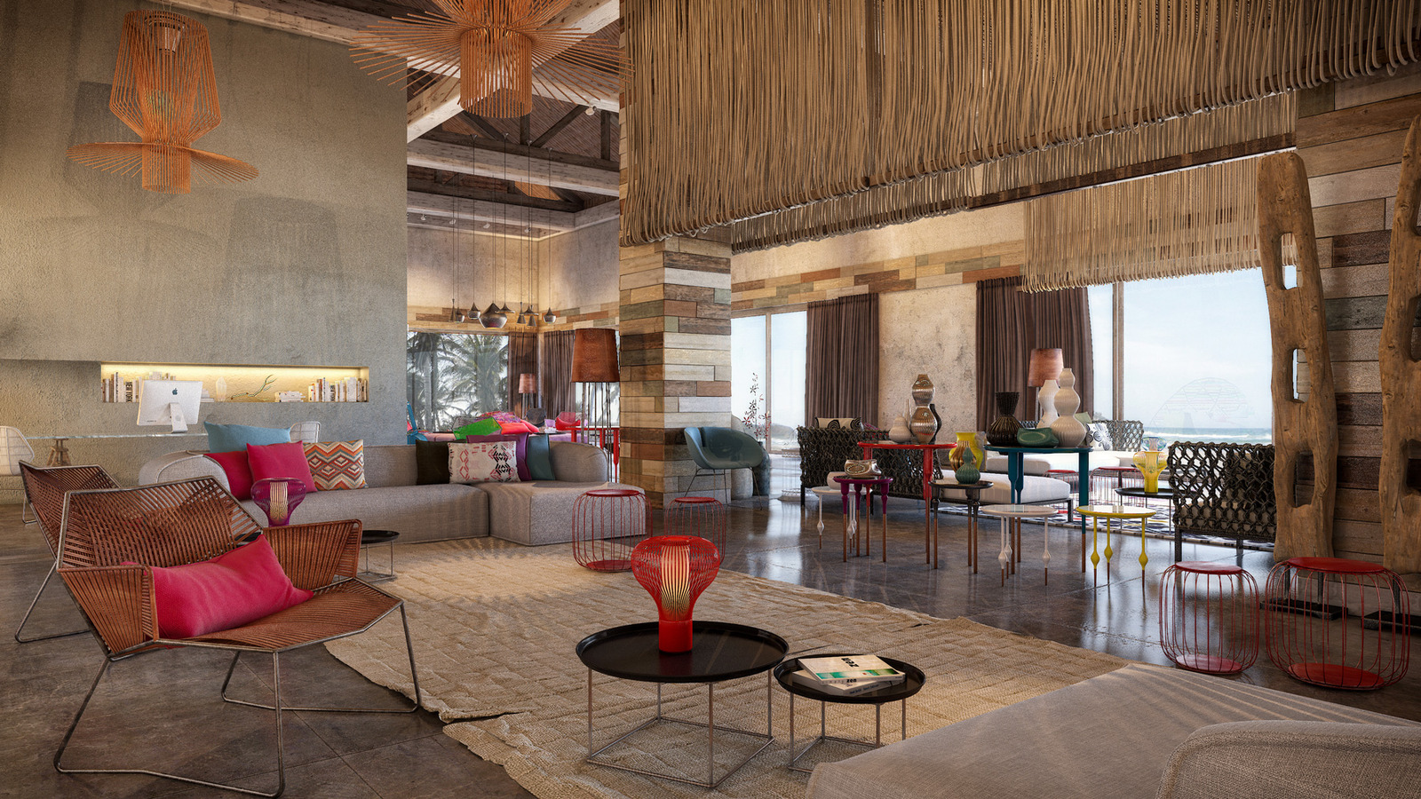
Retreats really know how to create warm, inviting atmosphere’s and Wl Retreat & Spa on Vieques Island, Puerto Rico is a perfect example of how it is done. Designers Patricia Urquiola of Studio Urquiola and Rockwell Group filled the retreat with rustic, global backdrops to act as a balance for the saturated shades of jewel tones and bold patterns incorporated within the more contemporary furniture and accessories used throughout the retreat.
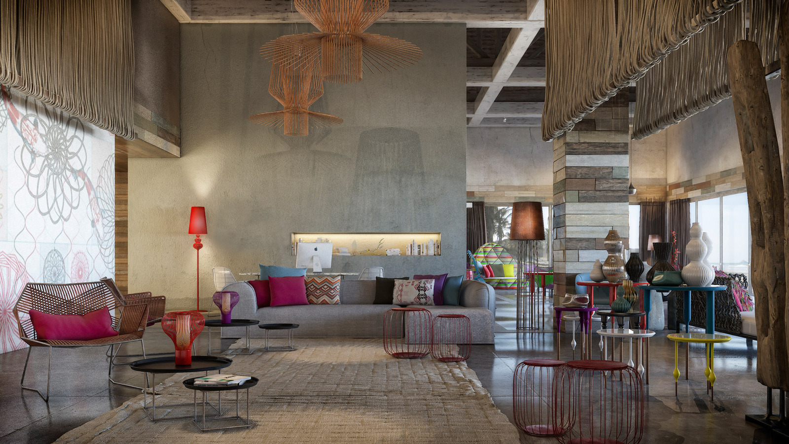
The large, open floor plan lobby appears cozy and intimate due to the layering of vibrant colours and natural textures both horizontally and vertically throughout the space. Even the light fixtures bring in a splash of yellow befitting their Narcissus silhouettes.
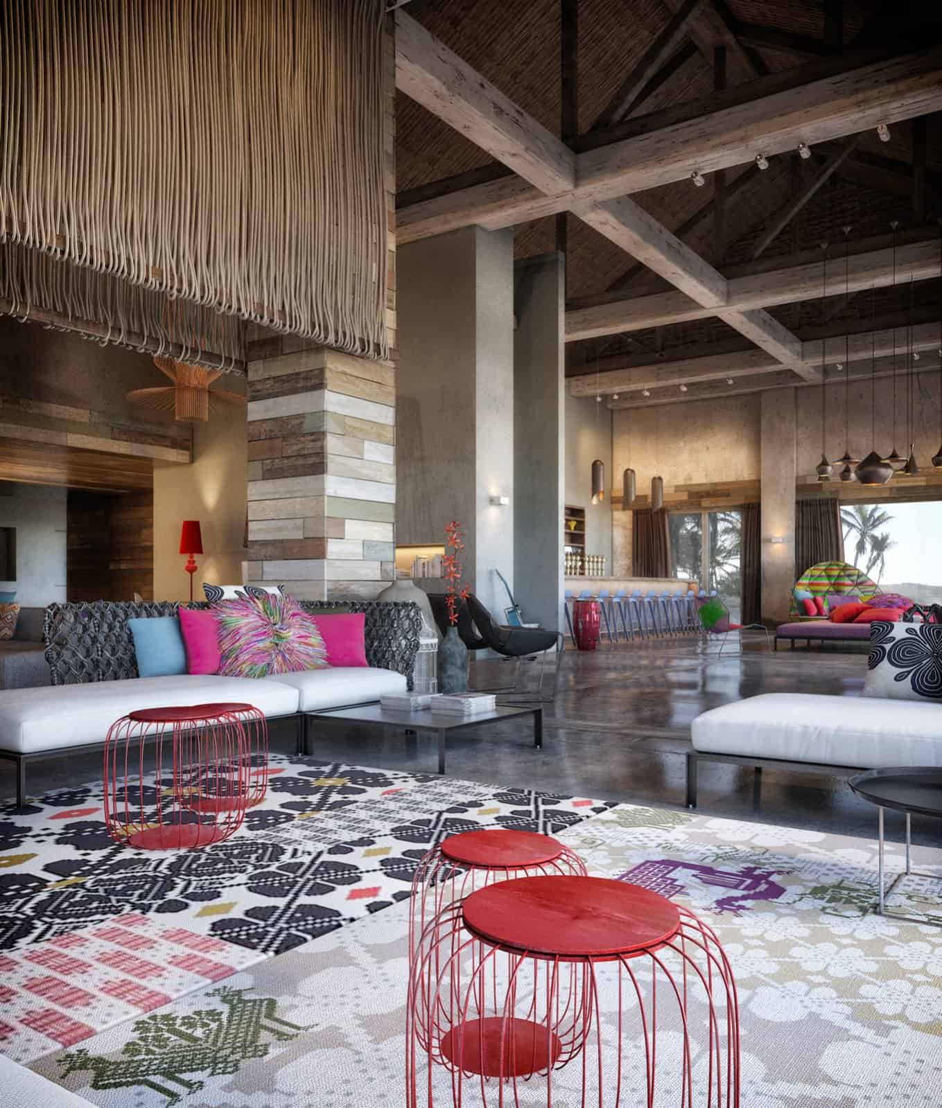
The wire bases within bold red tables blend harmoniously with the organic strips in the ceiling hung panels, merging the natural with the man made.
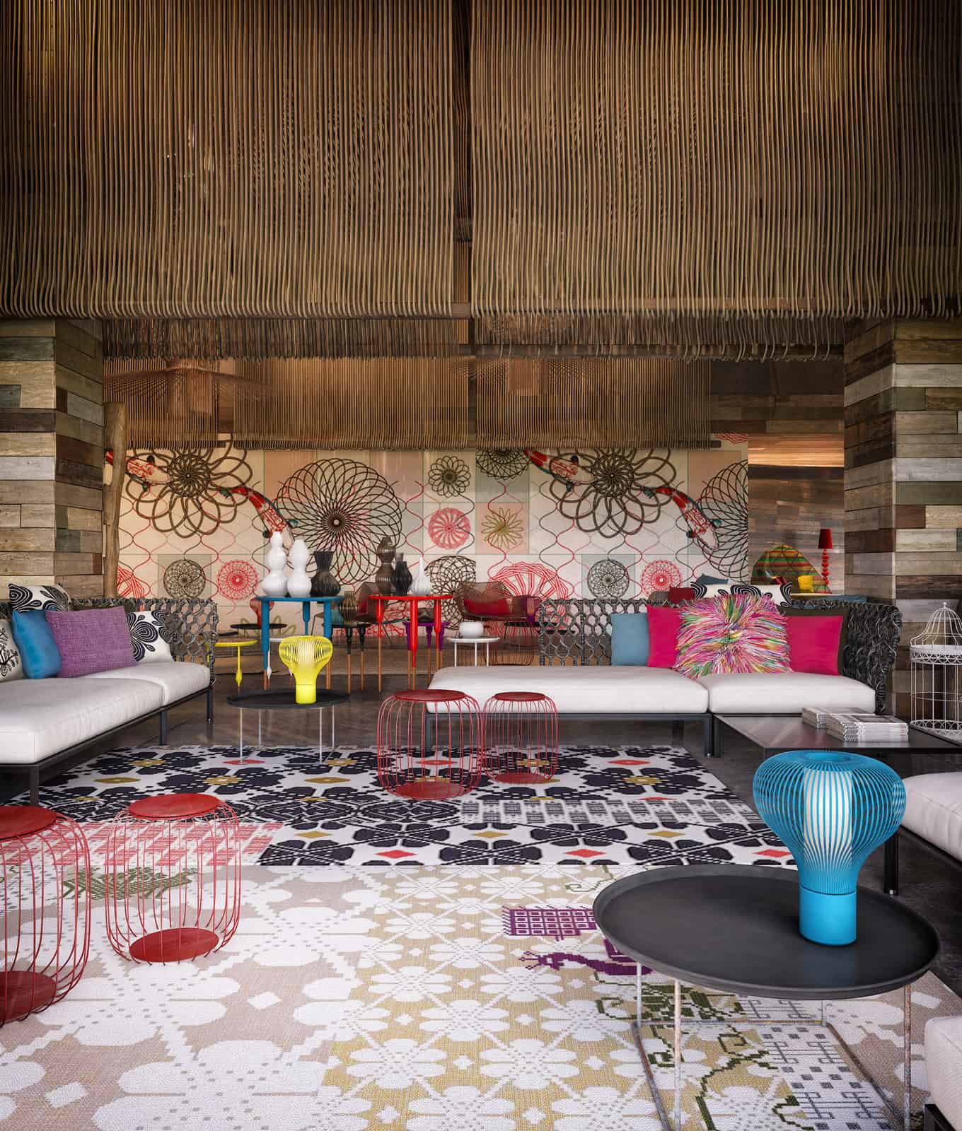
A wall within the lobby features 12 photo realistic visualizations by Barcelona based designer Diego Querol, and the colours within the art is used as the muse for the rest of the lobby, showing up in cushions, vases, furniture and even the area rugs.
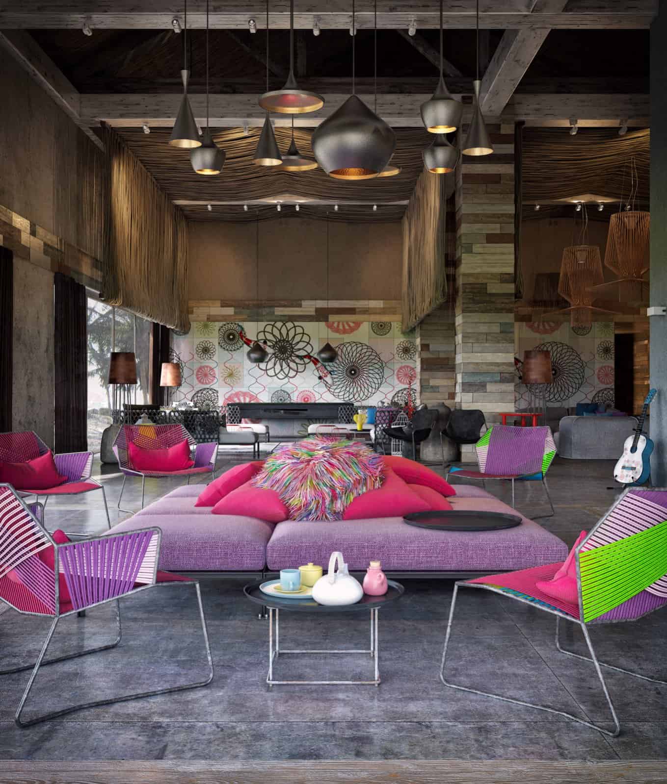
A separate sitting area in the distance pumps up the colour volume with its shades of red and lavender but it is the art on the far wall that commands the attention with its cheerful and dramatic patterns.
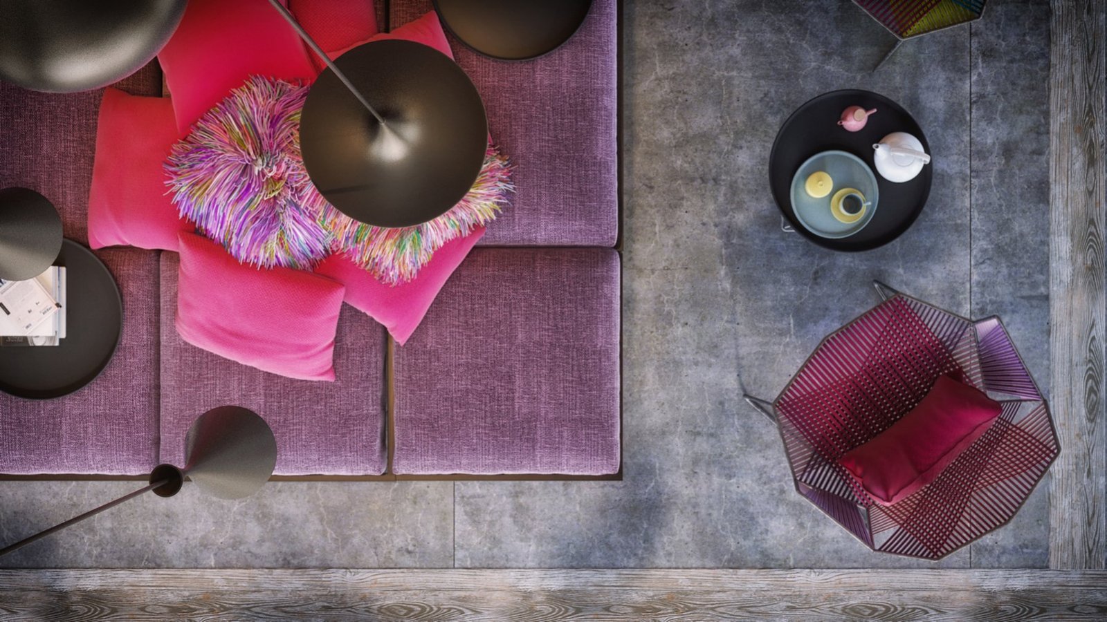
The hot shades of lavender, pink and red are balanced by the cool charcoal grey of the flooring.
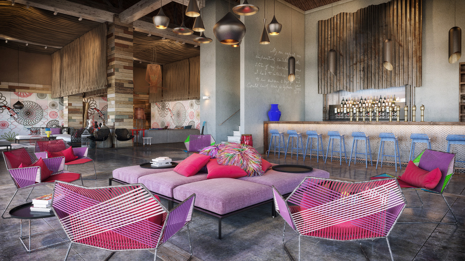
A bar just past the lavender vignette is lined with baby blue bar stools but other then that only a vibrant blue vase brings additional colour to an otherwise neutral decor. Here, it is the textures of the wall treatment and the written words on the wall that layer in the visual interest.
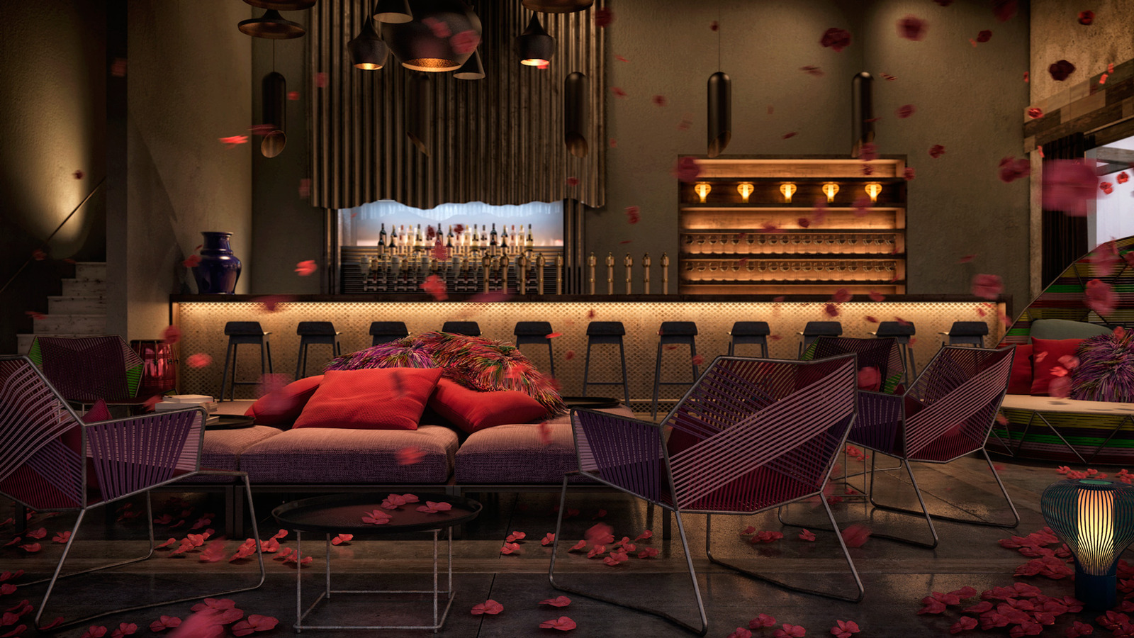
In the evening, with the lights on the baby blue of the bar stools disappears into the shadow and the bold tones of the central seating become muted dusky shades – it never seizes to amaze me how lighting can effect colour.
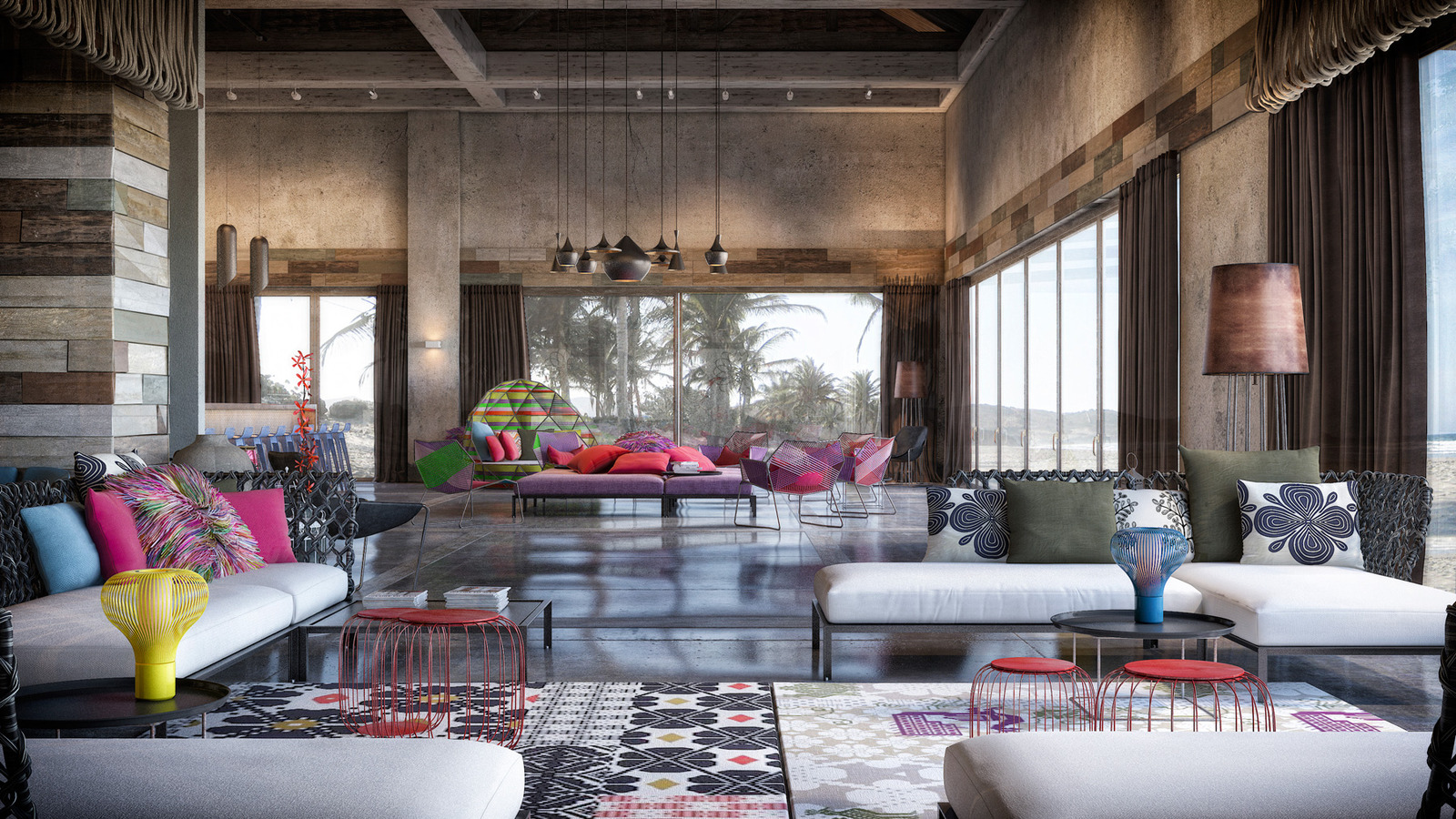
Even during the day light spilling in through the windows creates a continually changing vignette across the floor.
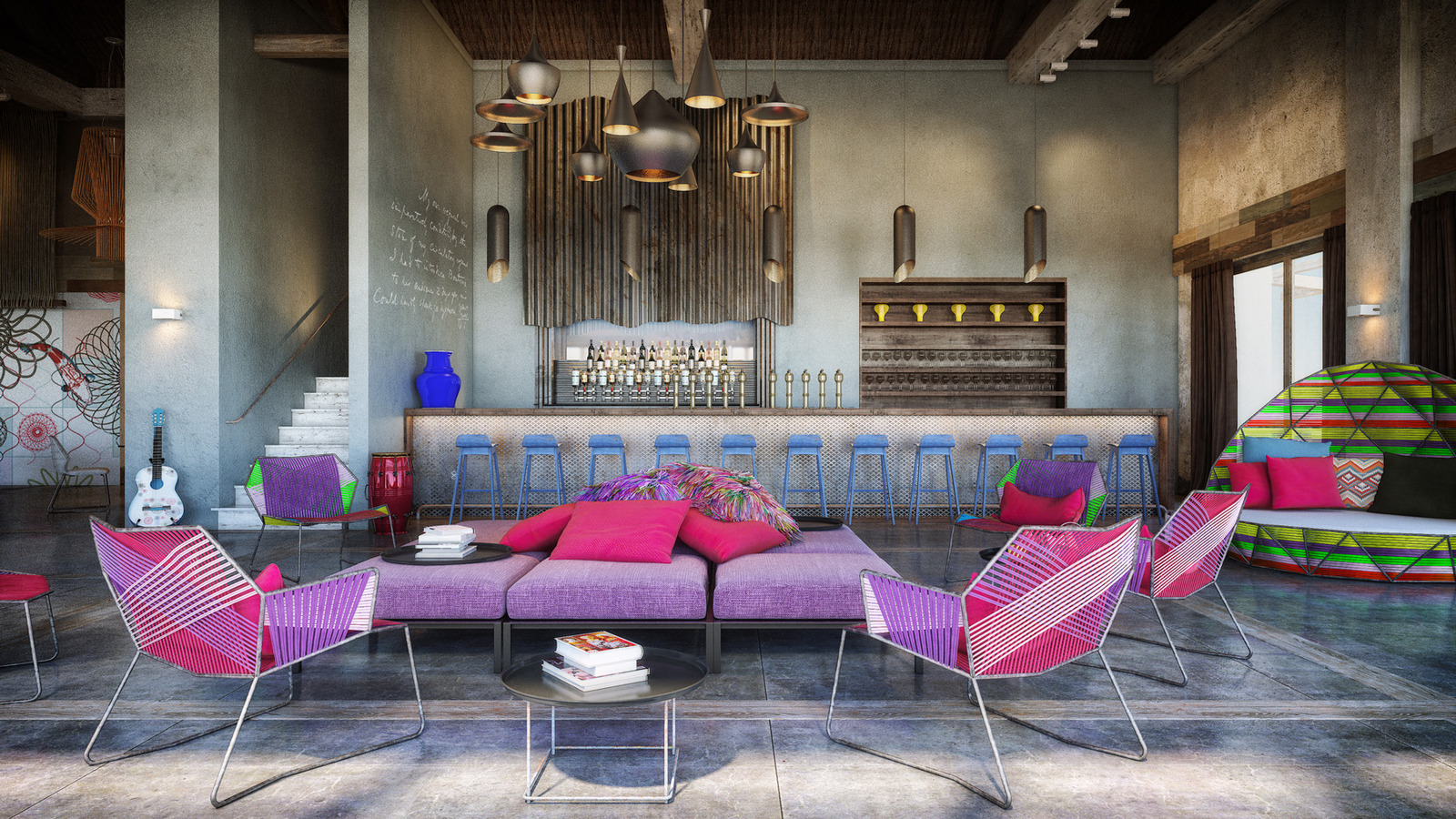
The lights themselves create a vertical excitement within the room whether hung in a row, or grouped in various heights. The two selections here both feature matte black exteriors and shiny brass interiors within a singular shape over the bar and multiple profiles over the seating arrangement.
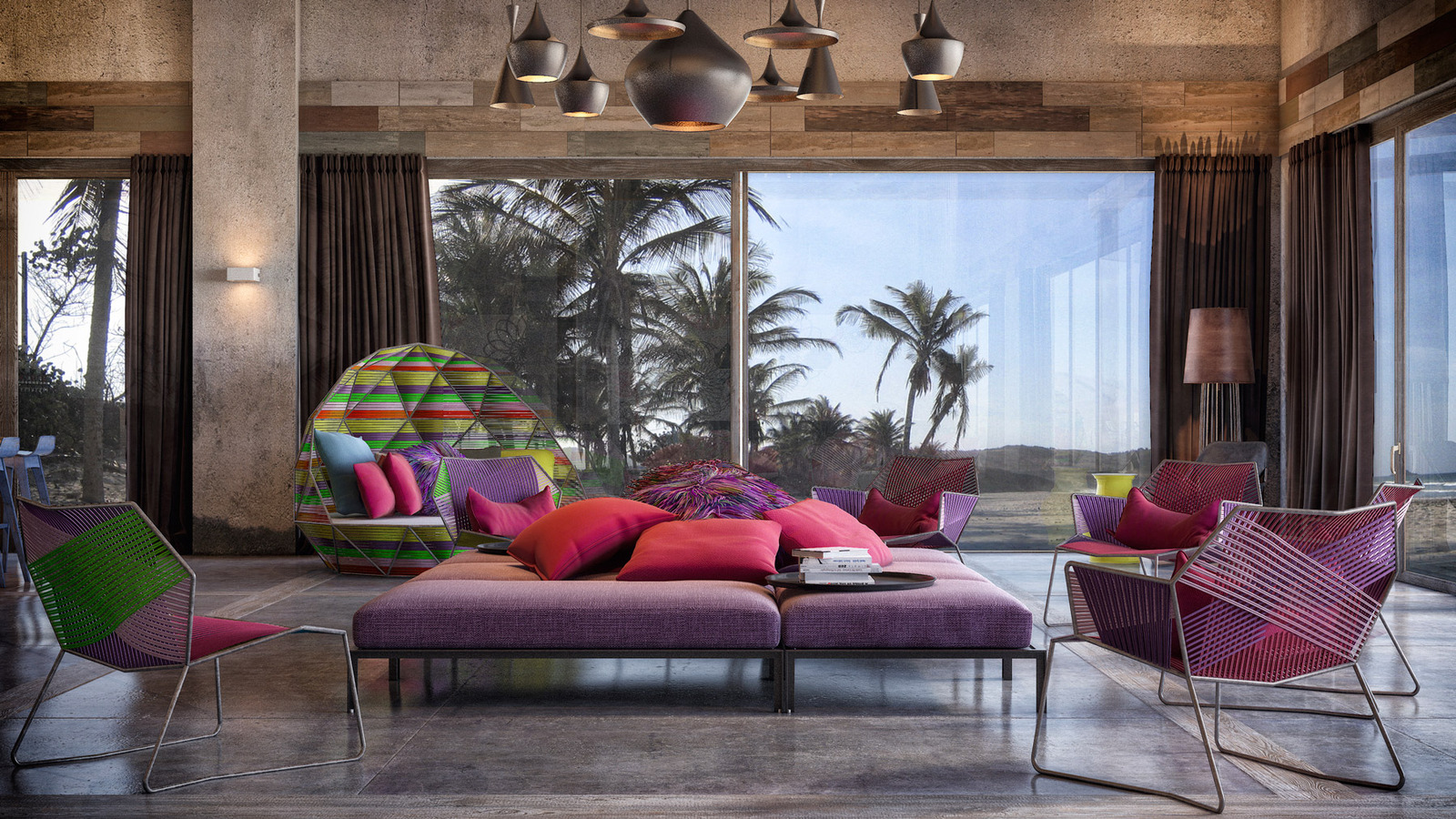
The view to the Caribbean skyline was bridged to the lavender and red seating arrangement by choosing a striped upholstery in green, lime and fuchsia on the lounger nearest the window and then layering it with lavender, pink and blue pillows. The lounger has a real outdoor aesthetic and because of this the room seems to merge with the landscape beyond.
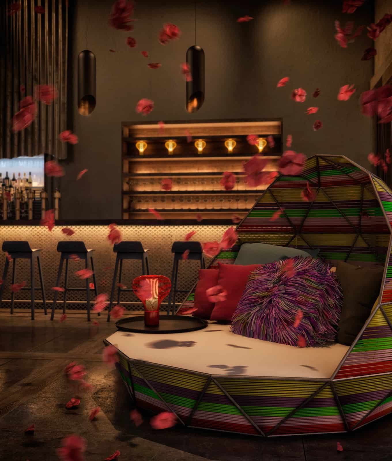
The lounger creates an intimate place for two or more people to sit to sit beneath its cocoon shaped backrest.
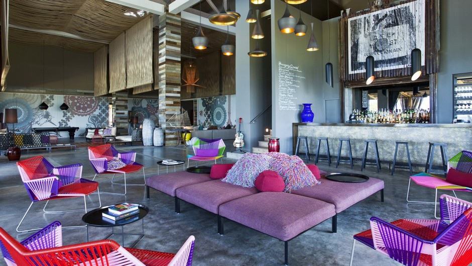
With all the vibrant colours used throughout the lobby, the space could have felt unrelaxing but the clever layering in of natural materials in soft neutral shades creates a visual pause or calmness to counteract the kaleidoscope of saturated colours.
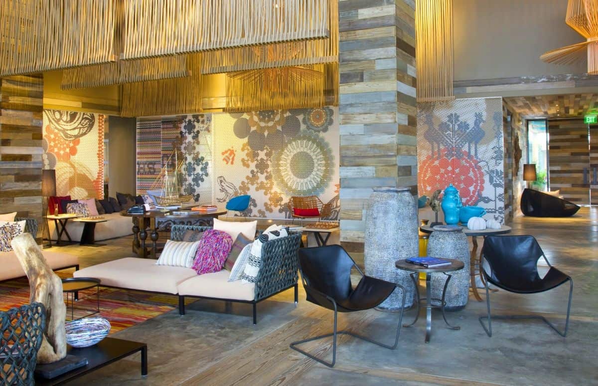
While the weathered wood wrapping the columns and the textured panels suspended from the ceiling create calm moments throughout the space, the wall murals are bold and full of excitement – but they also tie in the various colours used throughout the room, keeping the vignettes flowing smoothly.
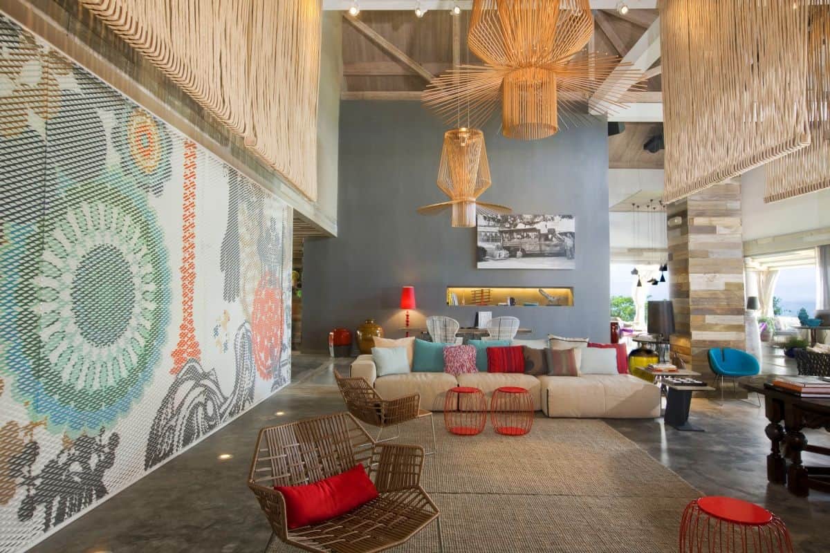
The suspended ceiling panels do more then just offer a place to rest the eyes, they create visual flow that ties in the various lights and ceiling beams as well as bringing in a greater sense of intimacy by defining zones within the lobby while a wall void draws attention to a desk area.
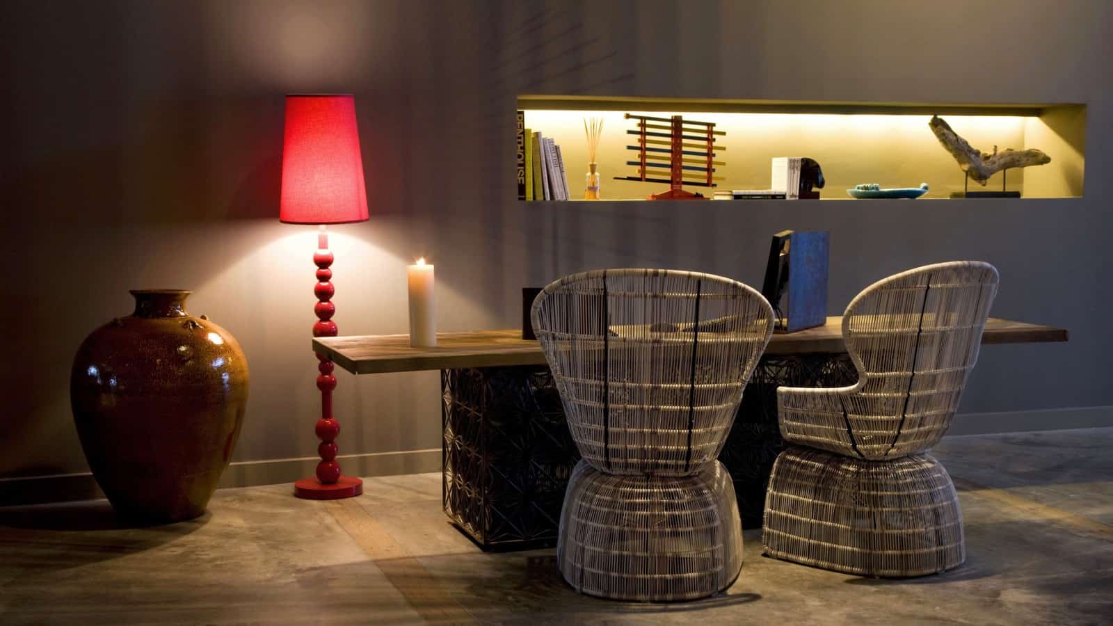
The wall void is lit from within and glows against the deep shade used on the wall. Here, the desk and chairs are not pops of bright colour but feature their naturally weathered shades of wicker; even so, there is a splash of red within the vignette due to the floor lamp.
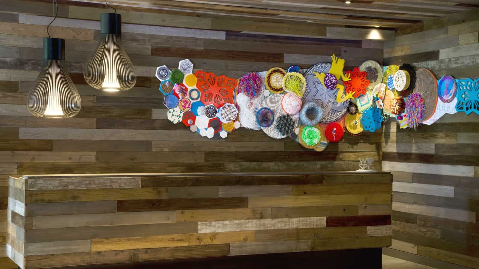
One of the best colour features throughout the lobby is over the front desk. How awesome is this mixed media creation – its even got a jumping yellow frog centred in it!
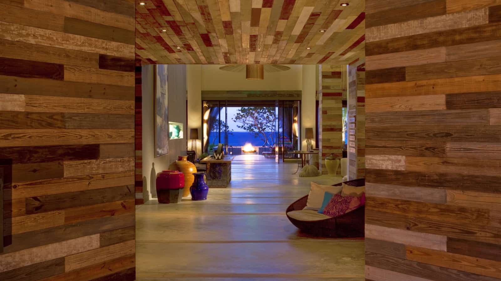
The entry, including the front desk, is completely clad in reclaimed wood and the multitude of weathered wood hues creates a beautiful pattern as it directs people to the seating area beyond the entrance.
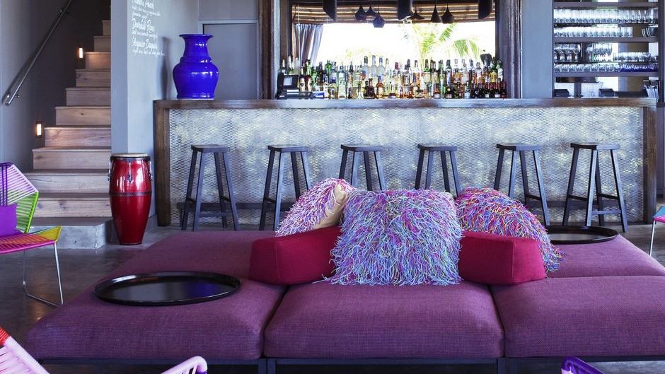
A final zone within the lobby is the stairwell beside the bar that leads up to the guest rooms.
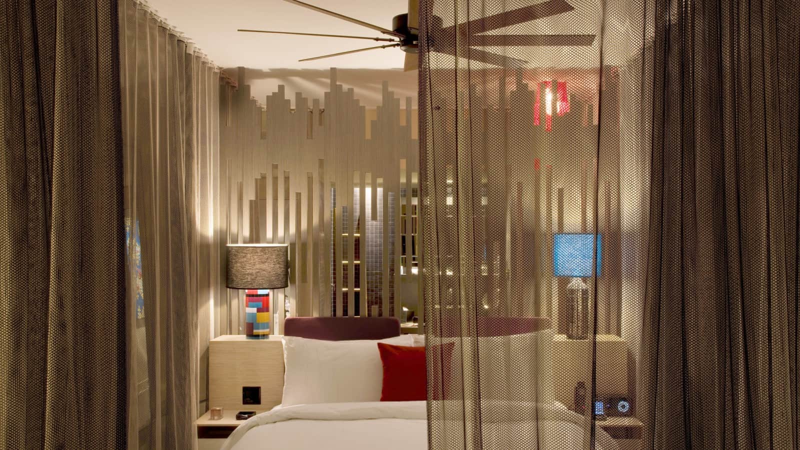
The guest suites have as much flare as the lobby, although the colours are more subdued for a quieter more restful aesthetic.
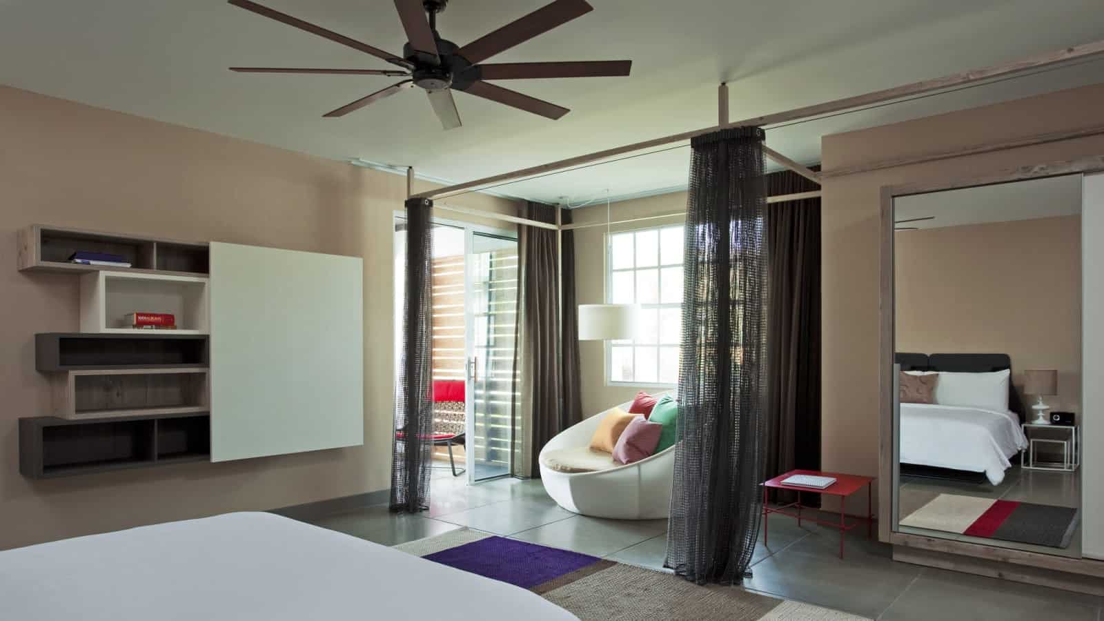
This guest suite creates a curtained lounge area just inside of the terrace and features a collection of storage boxes in various shapes and sizes on the wall.
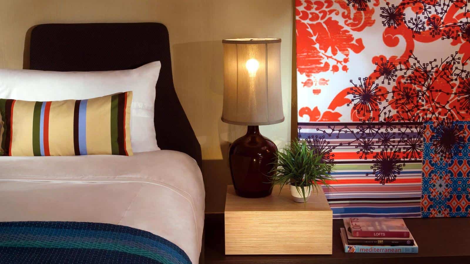
Another bedroom leans colourful prints against the wall – out of sight from the sleepy eyes within the bed at night.
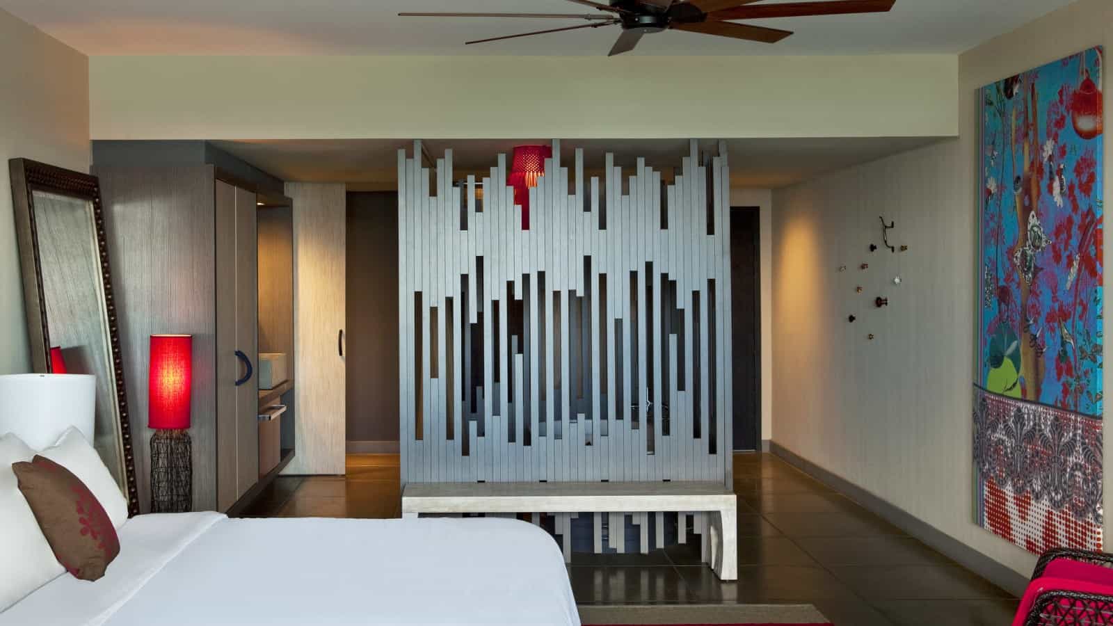
This bedroom displays bold prints opposite the bed and a uniquely voided panel behind a bench, acting as a room divider.
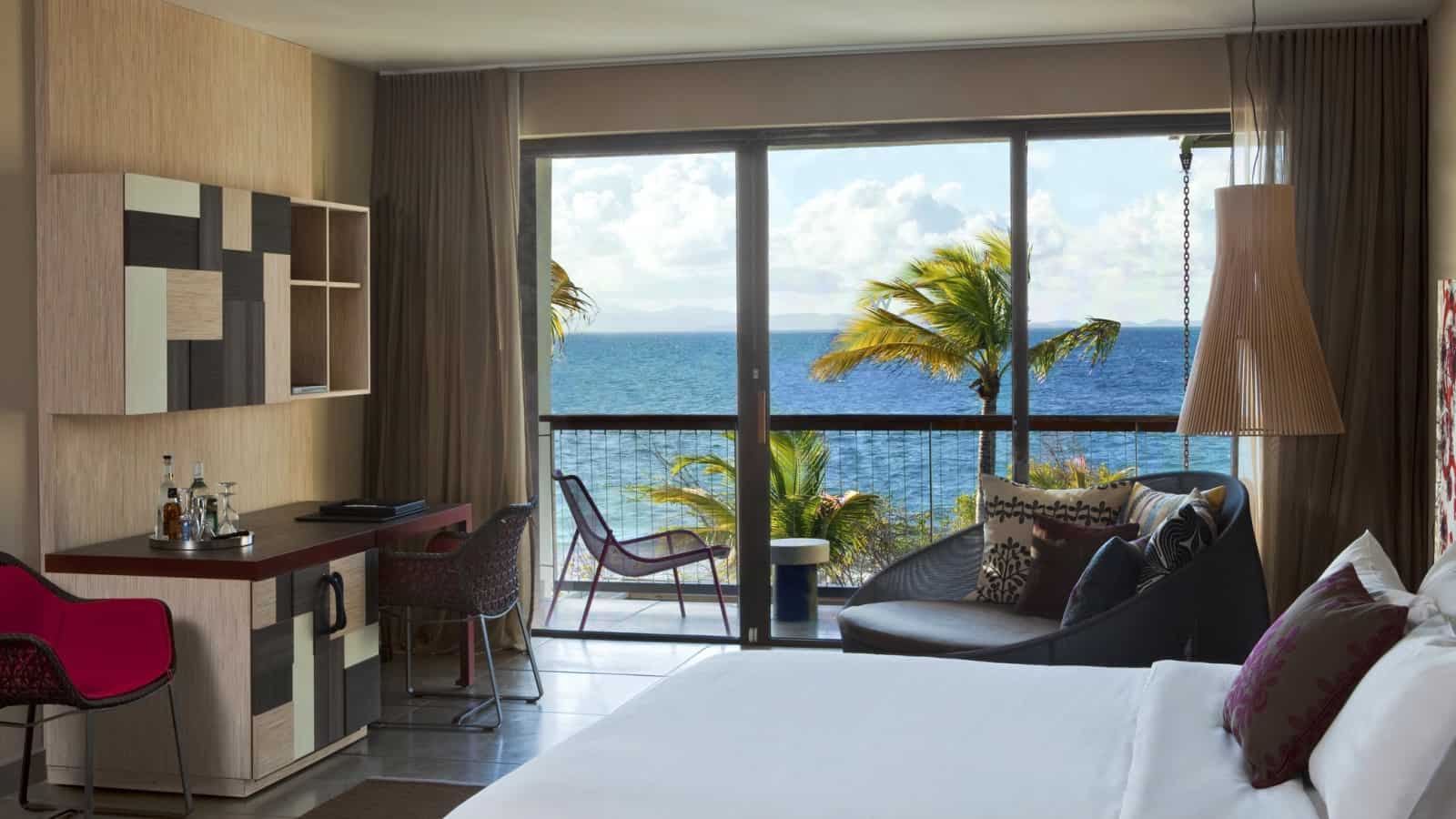
Every bedroom is different, some with bold prints, others more neutral in their décor, but every room has a spectacular view of the ocean beyond.
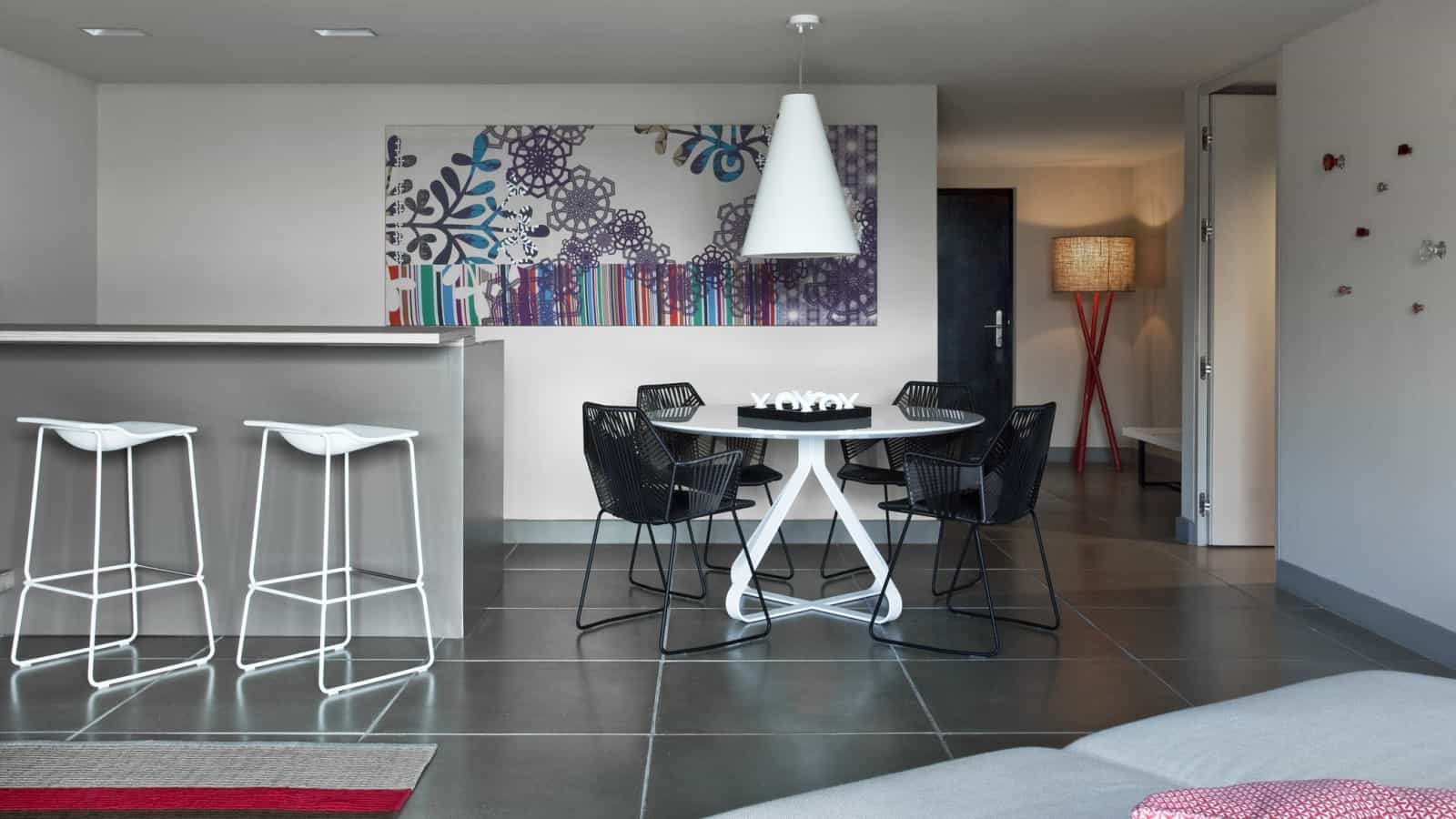
Larger suites have a dining and bar area within the room.
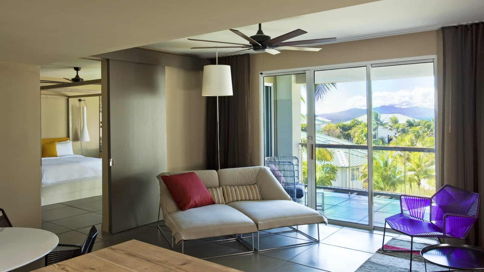
Still larger suites have multiple rooms allowing entertaining away from the sleeping zone.
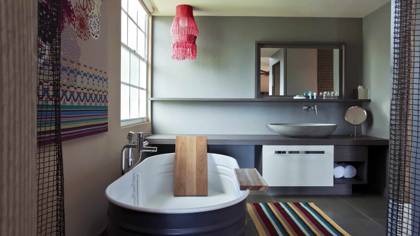
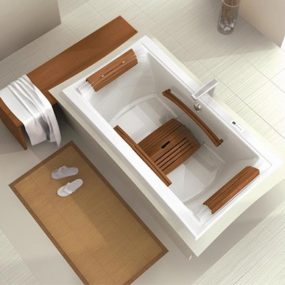
The bathrooms within the suites are filled with modern amenities such as this incredible egg shaped vessel sink. Love both the wood plank casually leaning in the tub as a back rest and the wood plank cantilevering from the bath edge as a table surface.
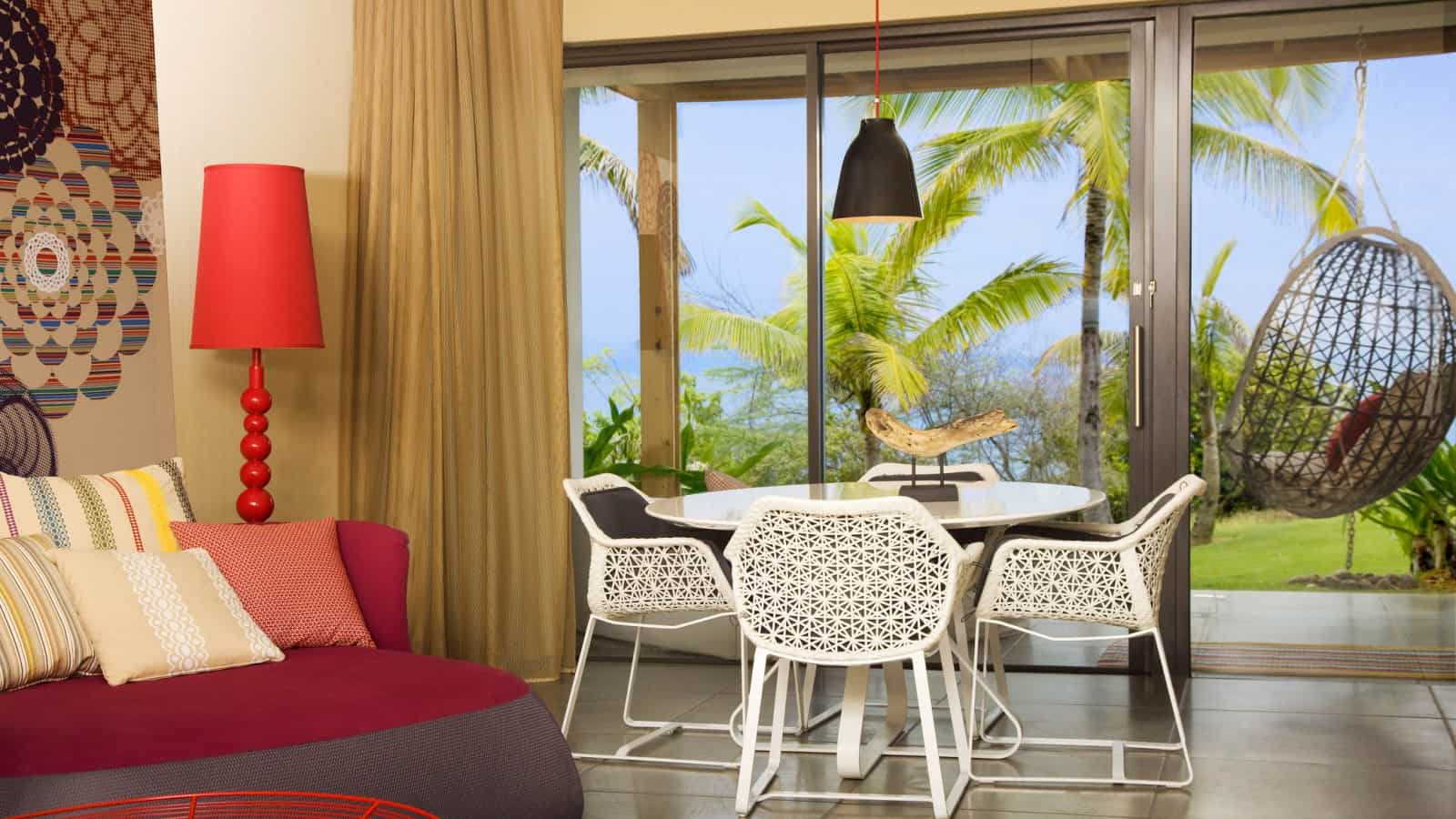
Not all of the rooms open to balconies, some of the rooms are on the main level and open up to the landscape itself.
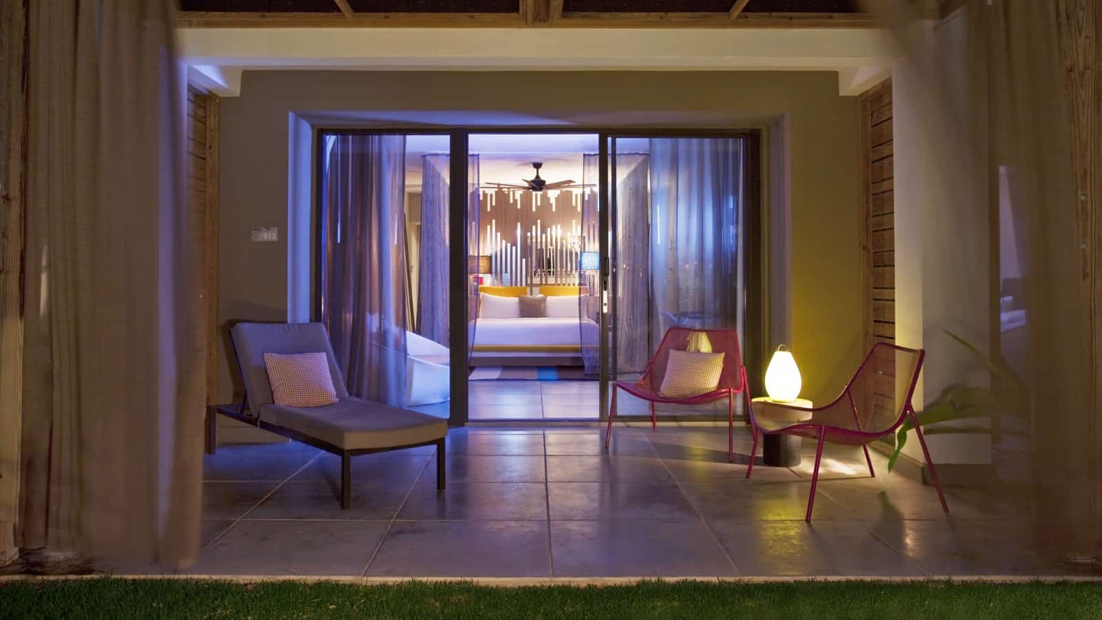
How awesome to have a private deck off of your bedroom, overlooking the ocean!
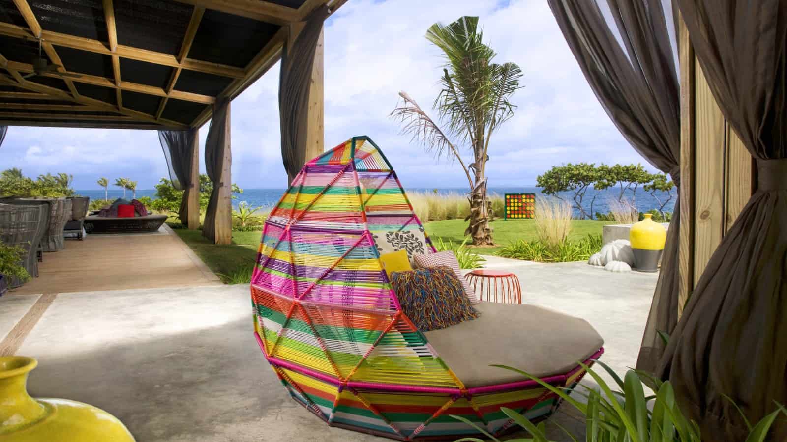
The terrace to Wl Retreat & Spa continues the elements of colour within its outdoor furnishings, pillows and accessories.
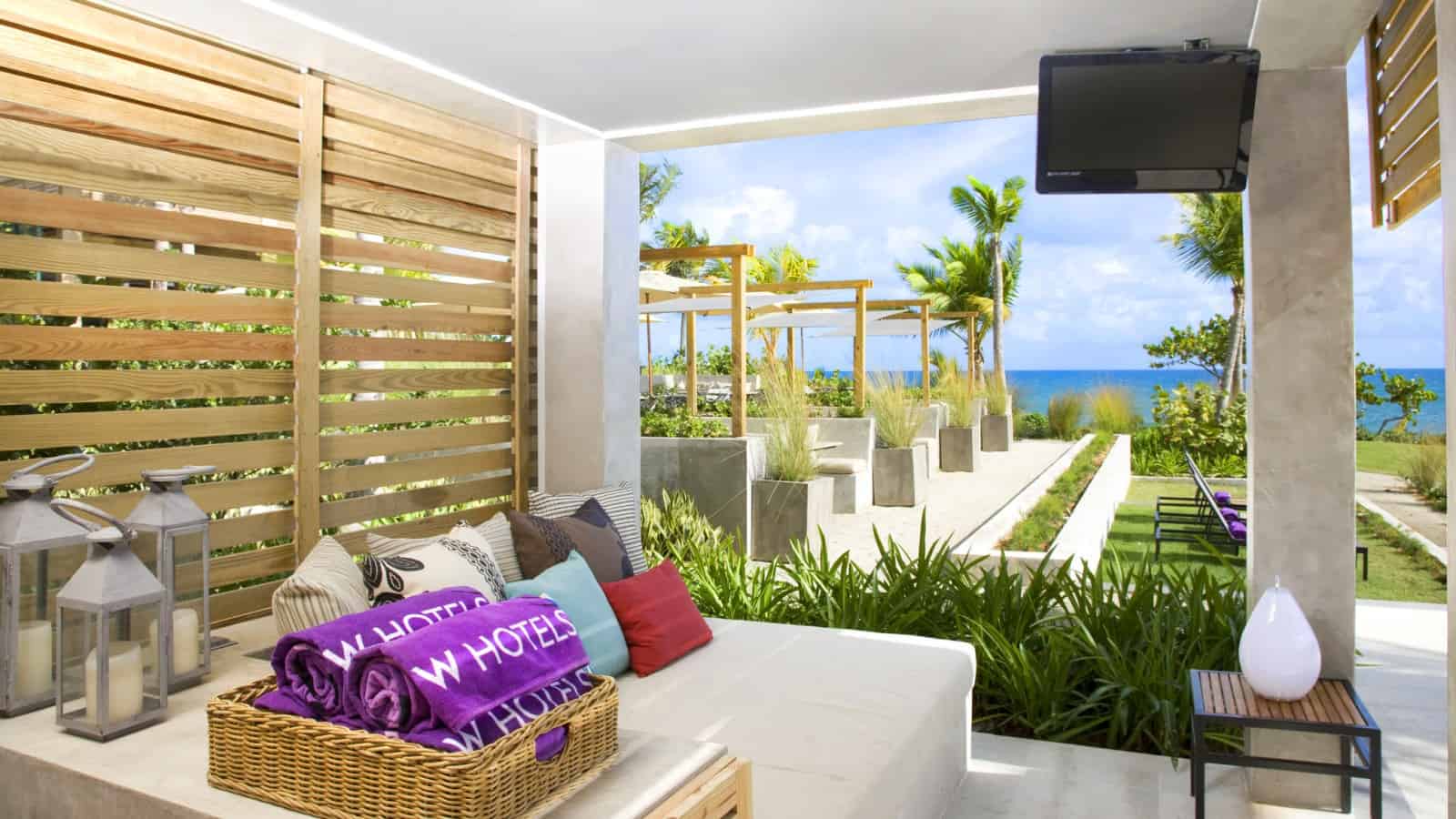
Even the towels come in saturated colours and notice that even though the view is second to none, there is still a TV mounted in the sheltered area for following favourite sports or TV programs.
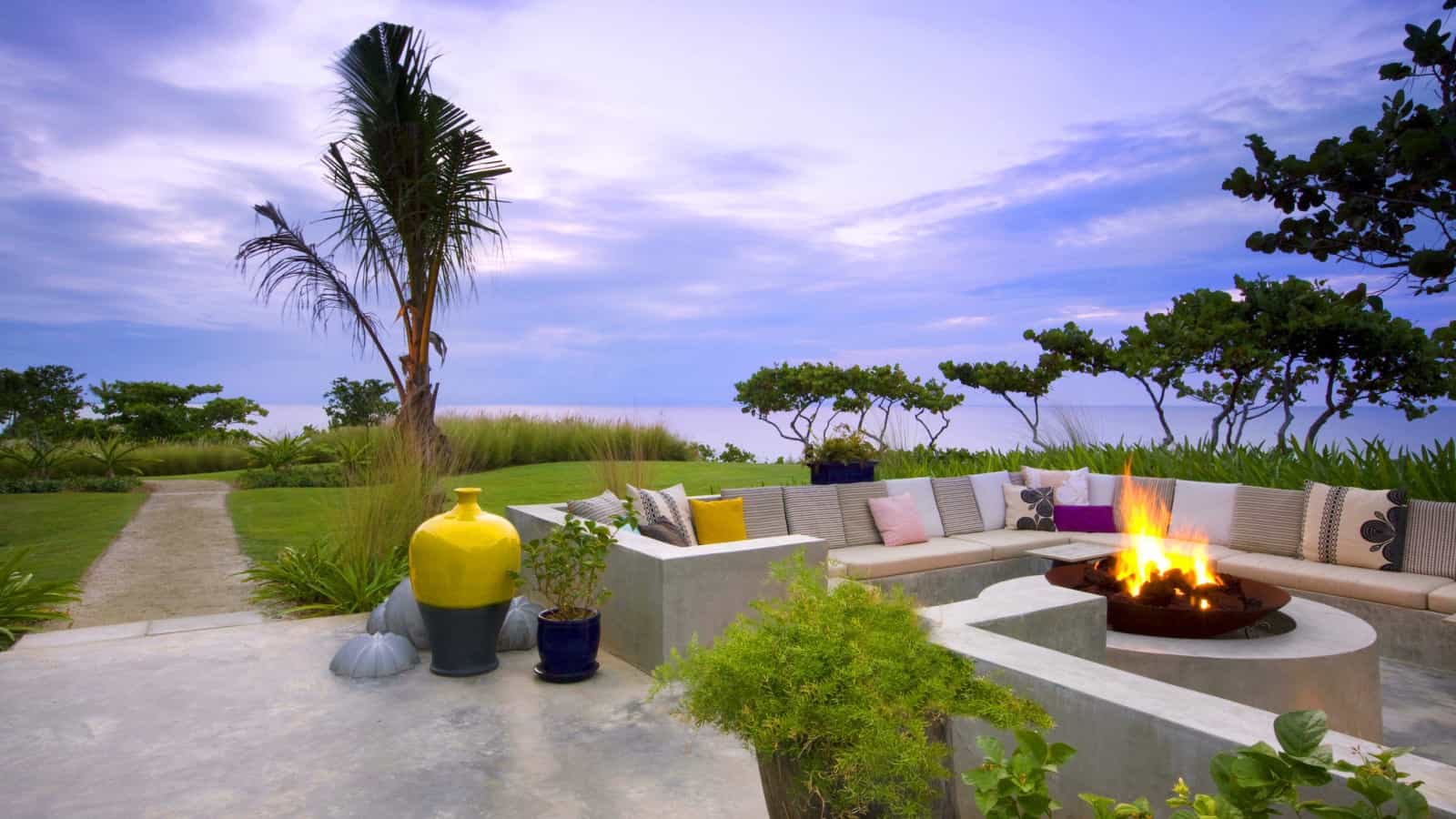
Past the terrace is a large firepit surrounded by a heavily cushioned sitting area. The landscape is void of flowers but colourful ceramic planters and pillows continue the colour story.
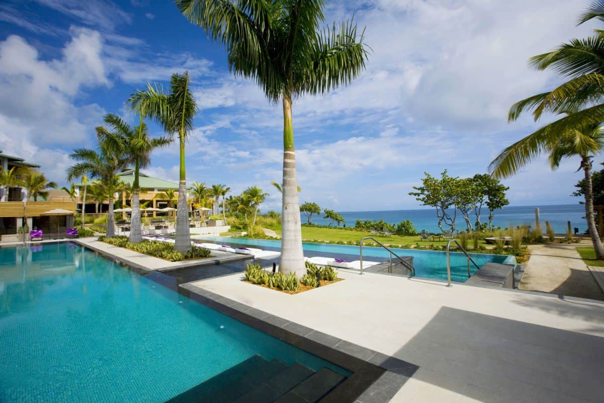
the pool area relies on the blues and greens of the landscape fro colour and the geometry of the trees for pattern.
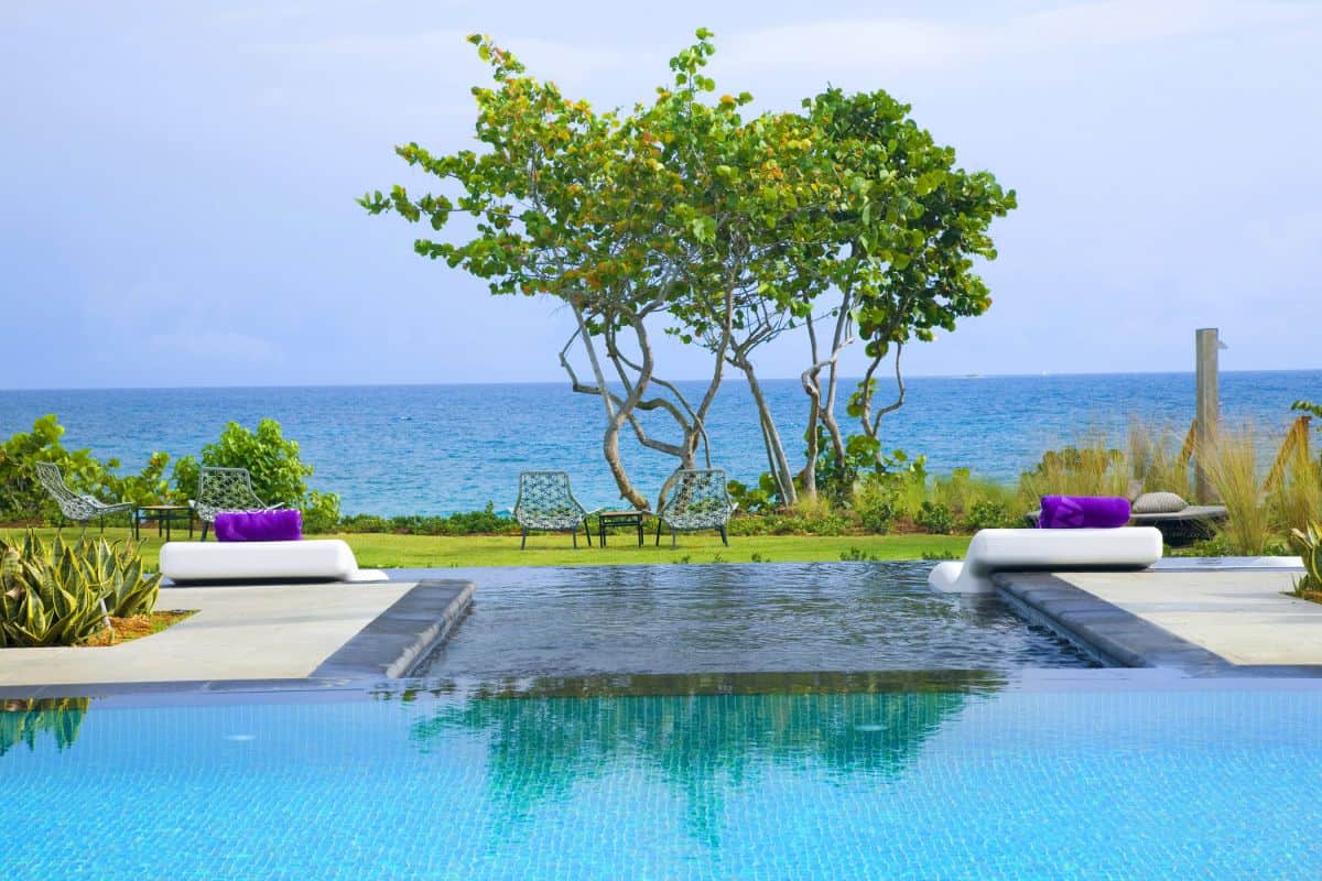
It’s a stunning setting and if the pool mosaics had been any other colour it would simply have been too much of a distraction.
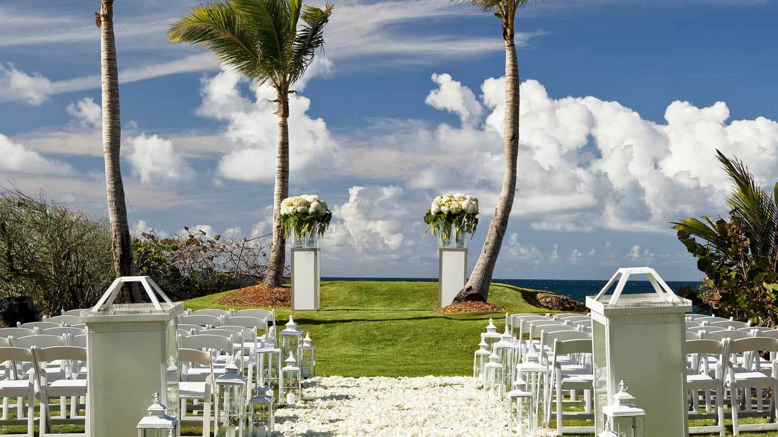
Even the outdoor wedding area is void of all colour except white.
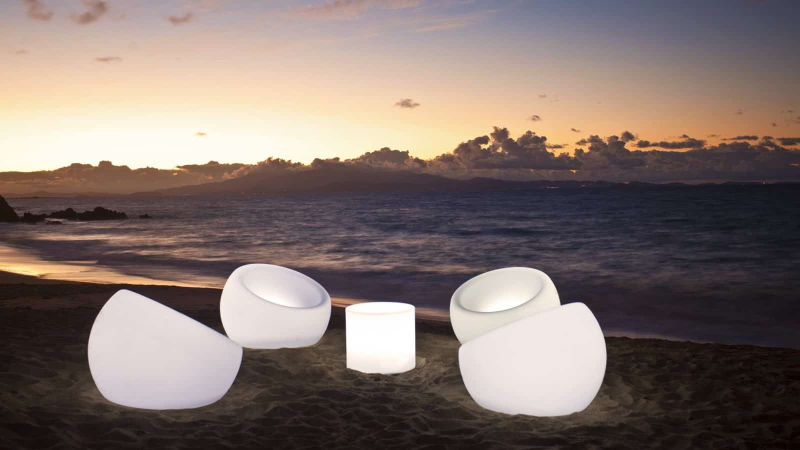
Speaking of white, how awesome is this lit seating arrangement? What a spectacular moon and furniture lit moment!
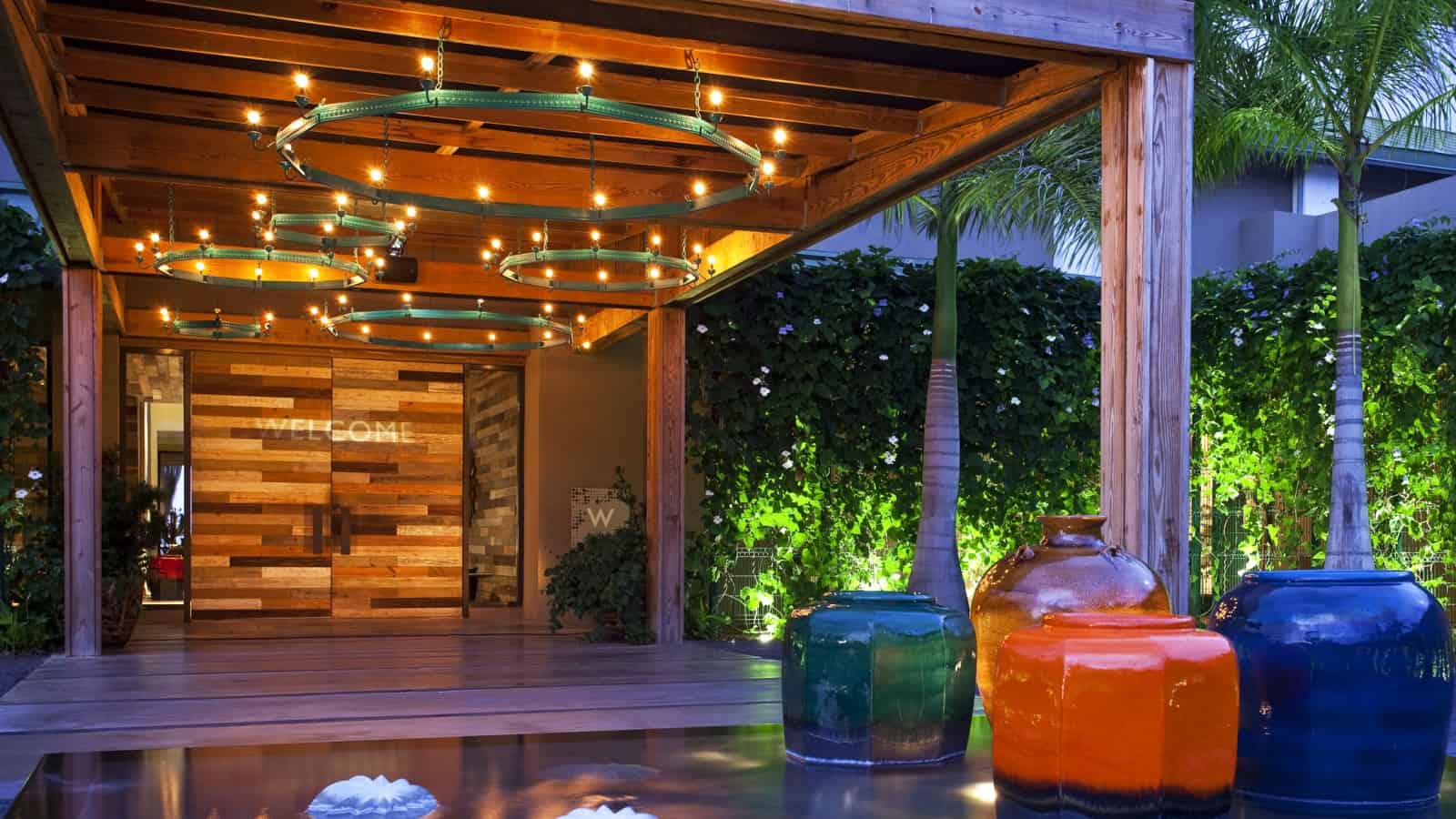
The entry doors say, “Welcome”, they should say, “Get ready to be wowed!”
Patricia Urquiola
Rockwell Group
Photography by W. Retreat and Spa
