The renovation of a private apartment in Barcelona, Spain by Victor Gnozalez Marti of TC-Interiors required demolishing all of the interior walls to allow as much natural light as possible to flood the space. This included stripping the exterior walls back to their original 1938 historic structural fabric and then layering in the modern conveniences over top. The 1938 structure is a meaningful one as it was in that year that the building was bombarded during the Spanish civil war. By removing all the overlaid plaster that had been added in since then, history was uncovered and reconstructed. This process exposed the original brick walls and they where kept as a design feature by placing all the electric installations overtop. This rebirth of an era gone by that was juxtaposed into a modern lifestyle was part of the client brief that also required a united and open plan with natural daylight.
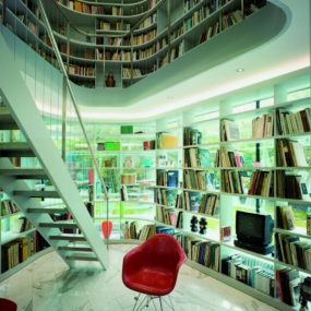
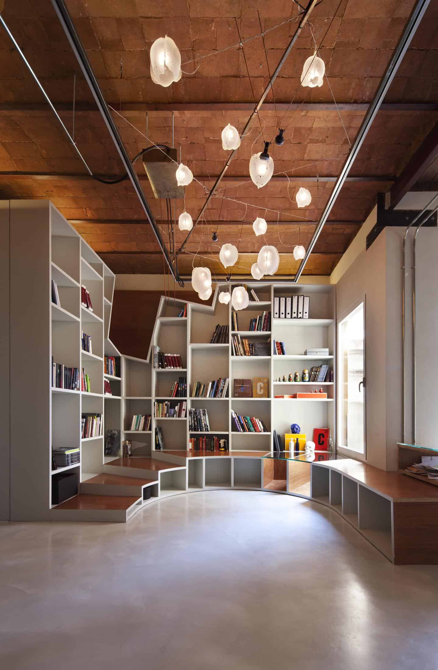
The library is located in the centre of the floor plan and is one of the few areas that is wrapped in white. The walls of white shelving wrap the area in a geometric envelope of books and steps. I love the way the stairs are staggered around the perimeter with open shelving beneath, making this space an awesome place to explore for both adult and child. As an additional fun detail, the wall of books is broken up by an jagged top frame. This multi-angled framework adds in a sense of movement to an otherwise rigid arrangement of shelving.
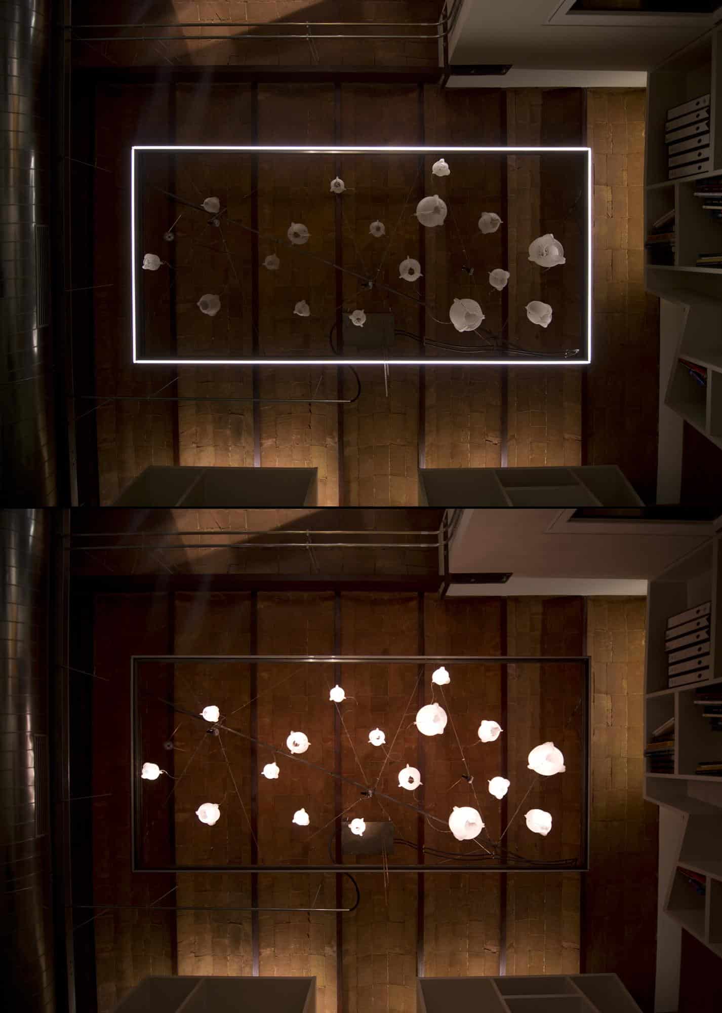
To allow for proper lighting, suspended ceiling frames of LED tubes define each area while additional LED’s are suspended throughout the lighting carpet. This not only created the functionality but also a unique and sculptural ceiling design throughout the home. The lighting in the Rotunda library is a ceiling carpet consisting of a rectangular framework with abstract 3D pendant patterns. This flood of luminescent creates the perfect setting to peruse a favourite book.
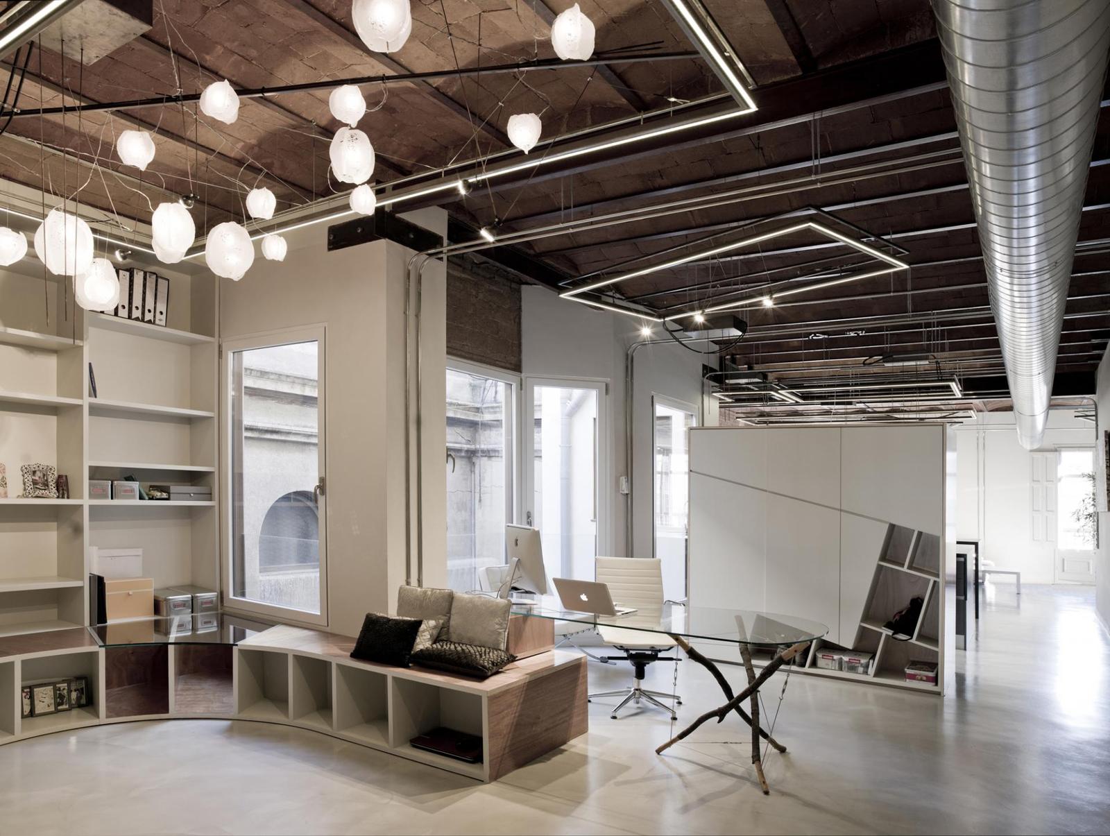
While the Rotunda library itself does not have a view to the outside, it does have a window to the office located in such a way to make use of the views from the window wall next to the desk. Through the window is a view of a 1923 Coliseum Theatre whose rounded reflections have been reinterpreted in the shape of the Rotunda library itself thereby create a dialogue from the view within to the view outside. The office creates a division between these two views and has has a ceiling carpet of lighting not quite so detailed as the library’s and a shelving unit that is also not quite so expansive as the library’s. The dark timbered ceilings create a stunning foil for the lighting carpets while the open ducting adds in a layer of industrial chic in contrast to the view of the coliseum. Just beyond the office on the other side of the shelving unit hides the kitchen work station.
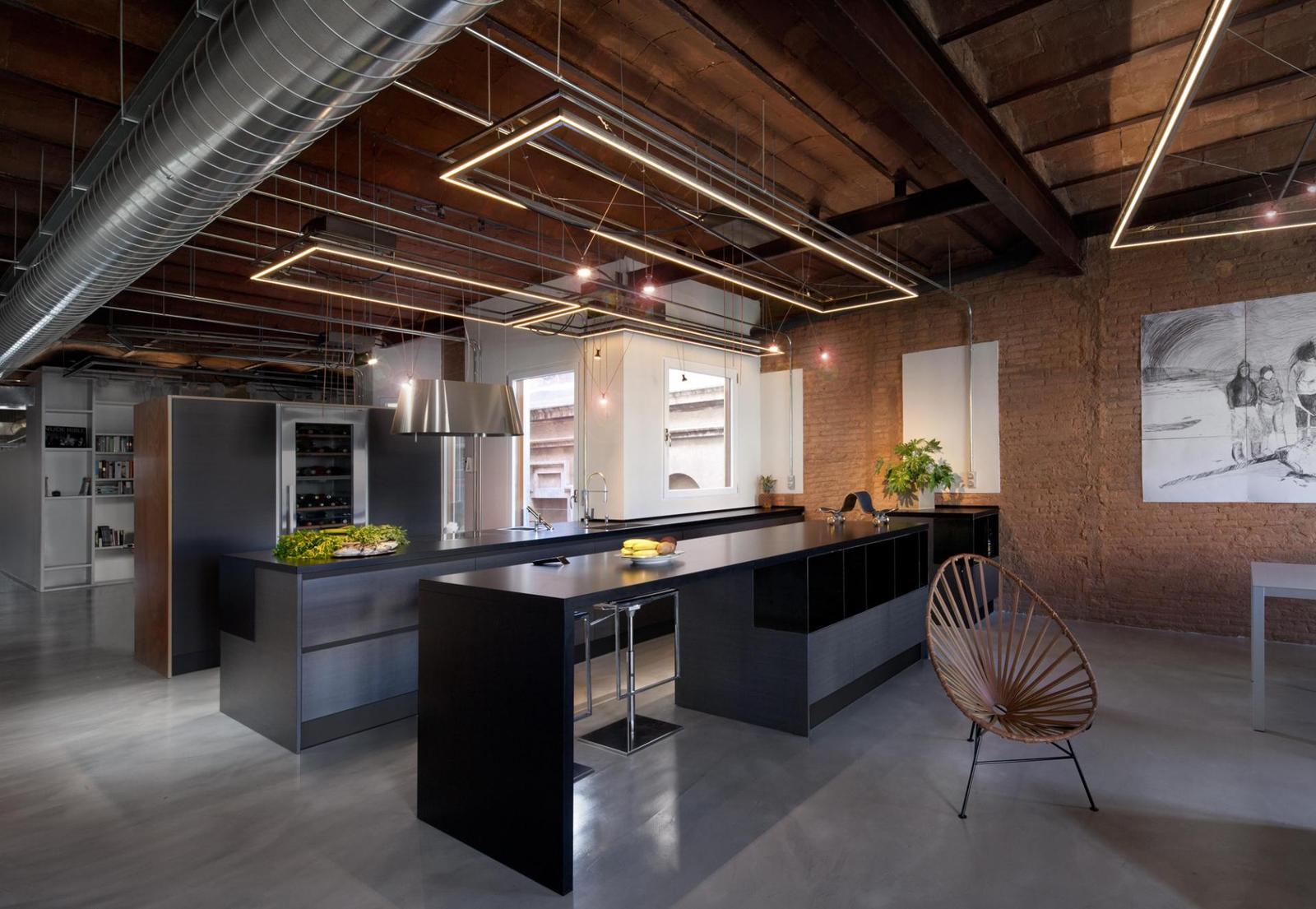
The kitchen is a line of 3 stations with the first being on the other side of the office shelving. Here a full height wine fridge is centrally located. The centre station a privacy screen that is built over the counter complete with a viewing portal that allows as much daylight as possible to continue through and into the third station. The addition of the lighting carpets on the ceilings supplement the sunlight as day transitions to evening. The use of sleek grey tones cools down the warmth of the brick walls and timbered ceilings.
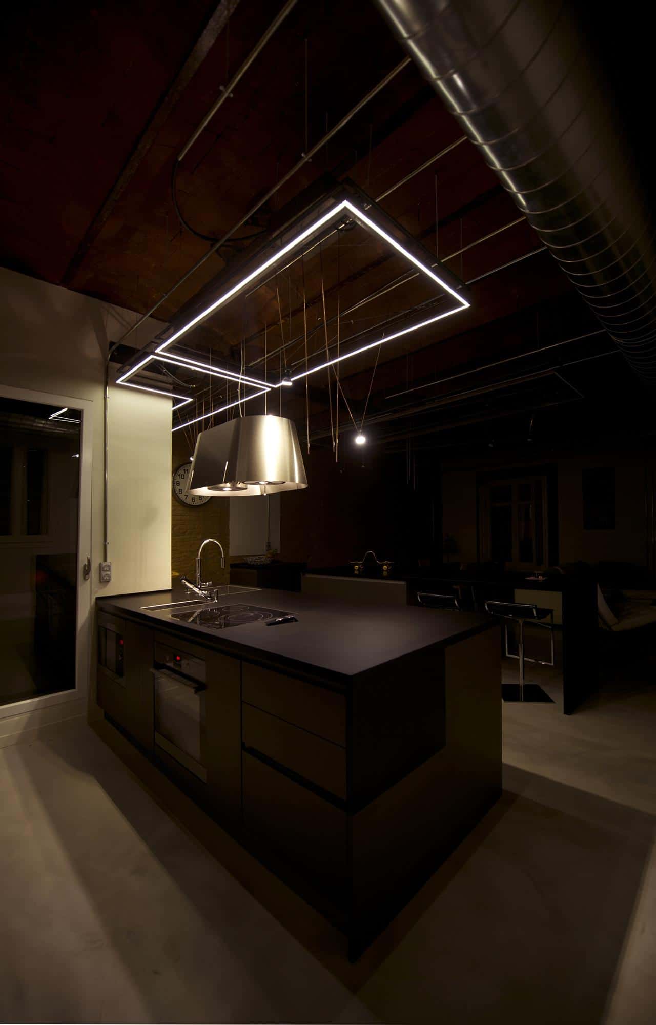
At night the lighting carpet defines the kitchen zone with its LED outline and suspended LED fixtures.
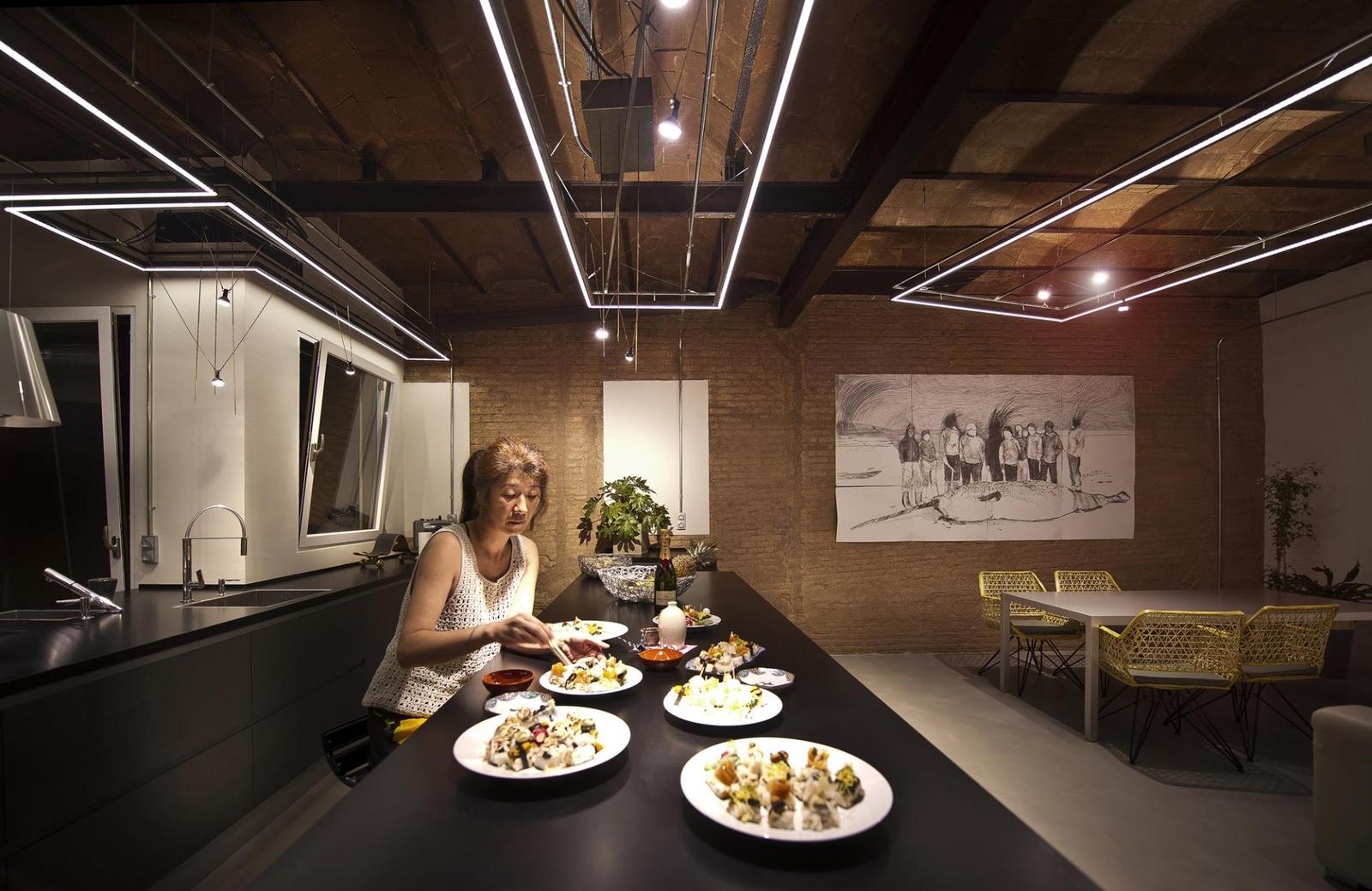
The large expanses of counter offer more then enough prep space to prepare for any sized dinner party, while the extensive use of lighting makes it easy to create masterpiece dishes.
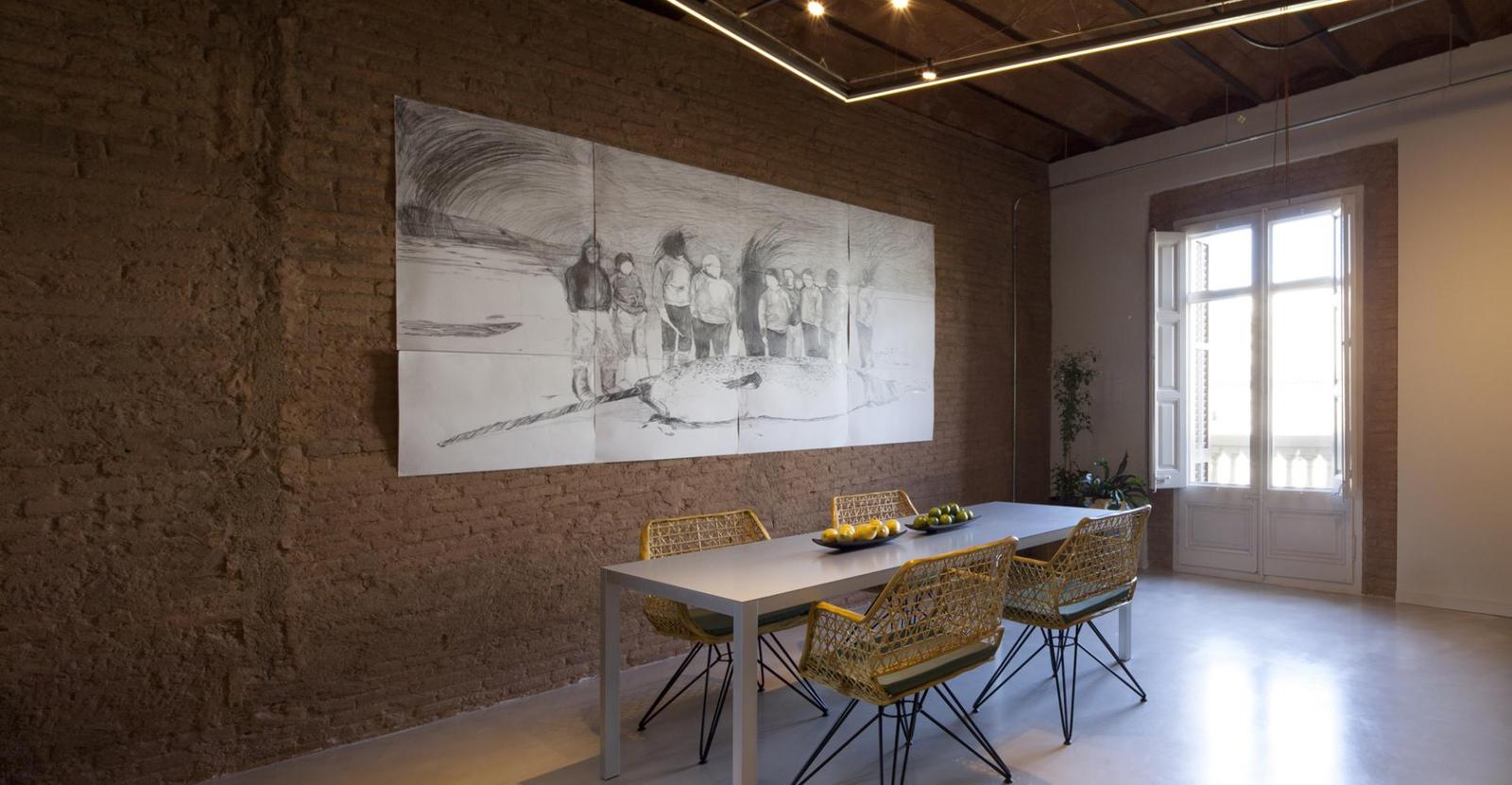
Whether the dinner parties are large or small, the setting is both intimate and expansive. The exposed bricks offer a sense of traditional fare while the large-scale art on the wall brings in a creative dynamic. The use of a modernist table allows the meals to be front and centre – as though the table is the mat in a picture frame of 3D food, and just in case the meal is too serious, the yellow chairs bring in a pop of fun. No one design dominates and nothing takes itself too seriously. This is a place for fabulous food, fun times and awesome conversations.
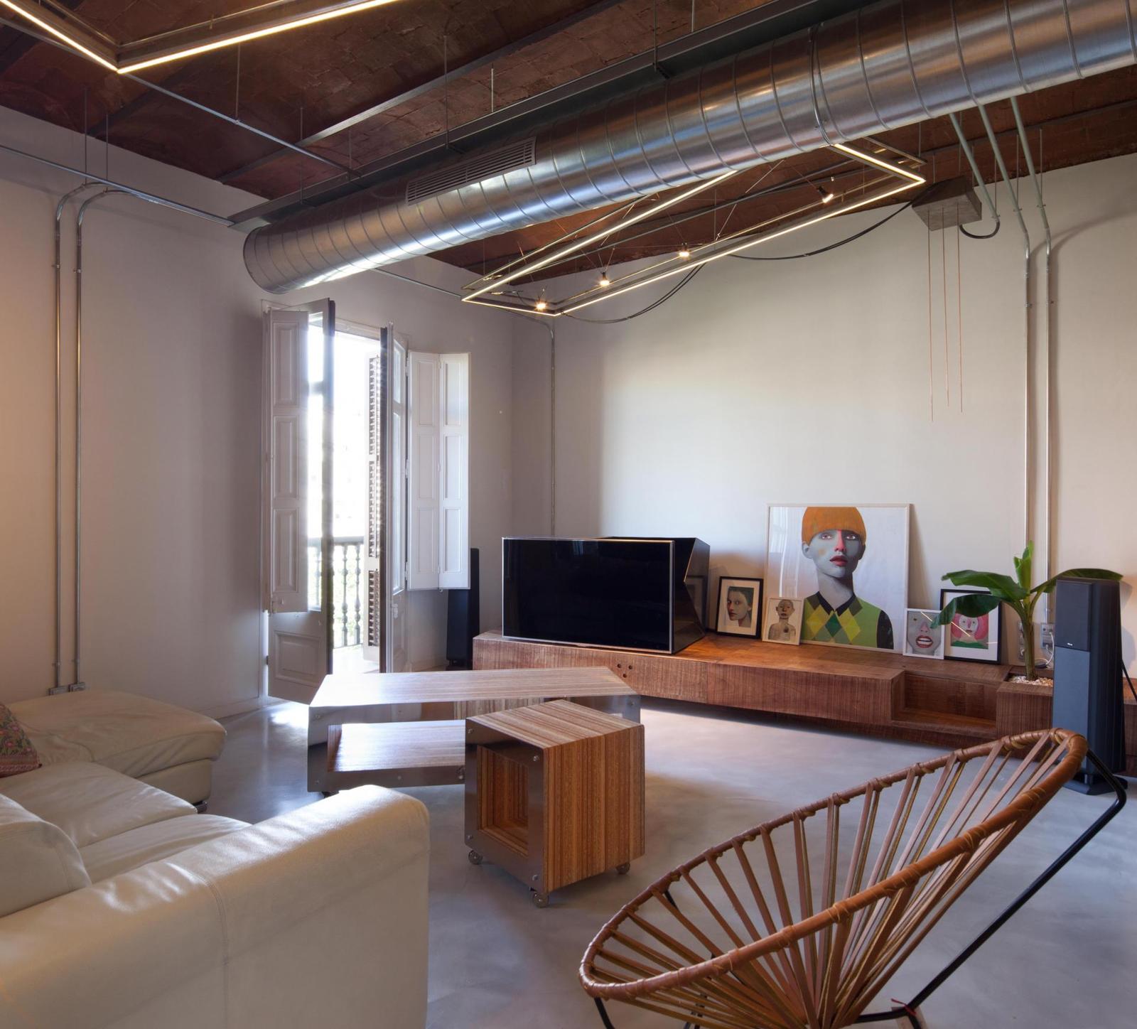
After a good meal there is nothing better then relaxing and what better place to do this then in a space that dedicates itself to comfort. A deep leather couch is positioned to take advantage of the flat screen TV sitting quietly on a long media console with colour manipulated photographs casually leaning up against the wall creating a line of artistic portraits that is inclusive of the TV for a harmonious and interesting vignette. Coffee tables on wheels can be pushed or pulled into any location and lightweight chairs can do the same. The repeating element of Lighting Carpets on the ceiling define the zones while a slice of ducting divides the space.
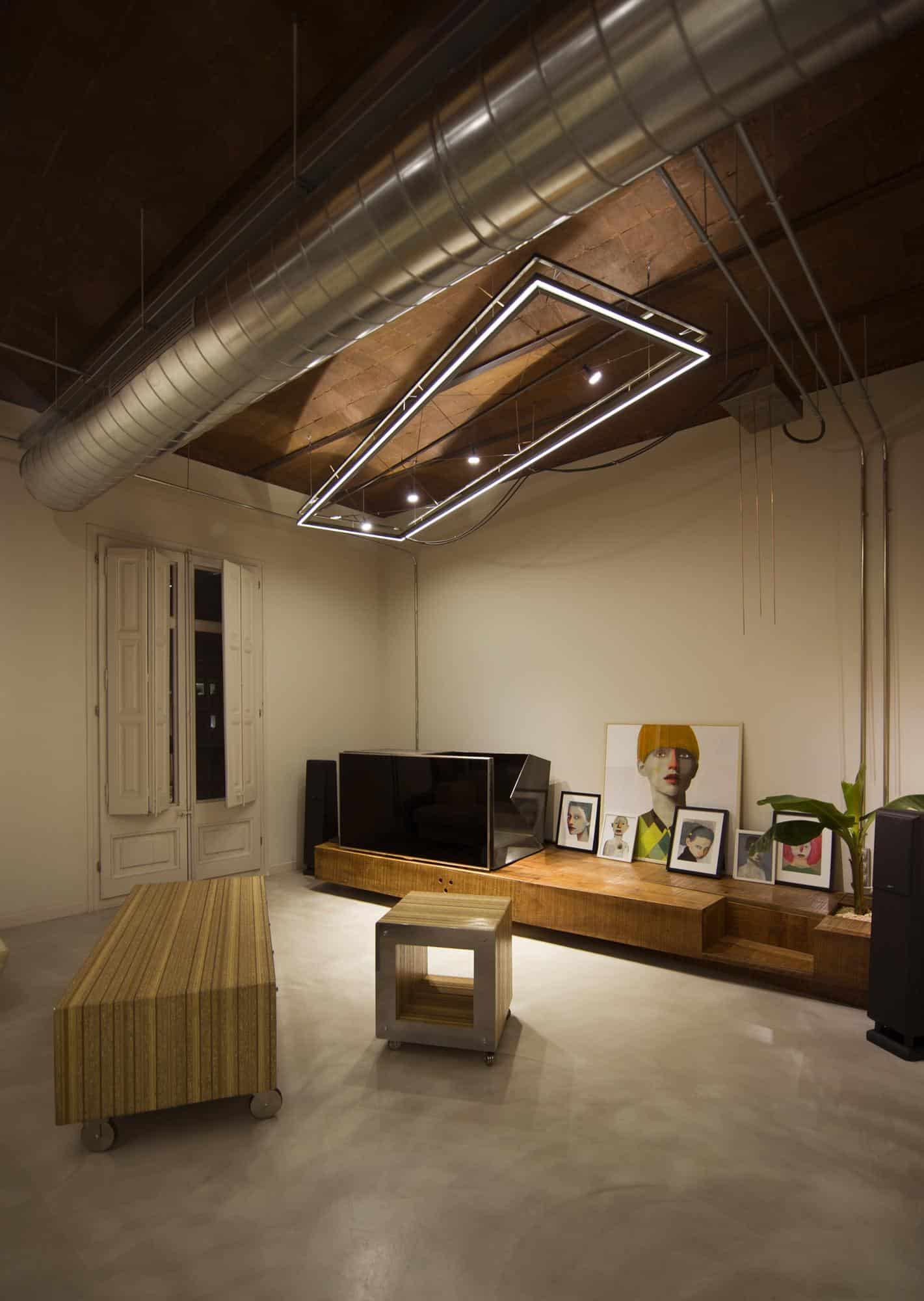
The exposed electric conduits create their own artistic element of industrial geometry. The choice of angling the lighting carpet creates a more fluid 3D picture against the striped pattern of the wiring and the relaxed layout of the furniture and accessories feeds this carefully applied look of accidental arrangement.
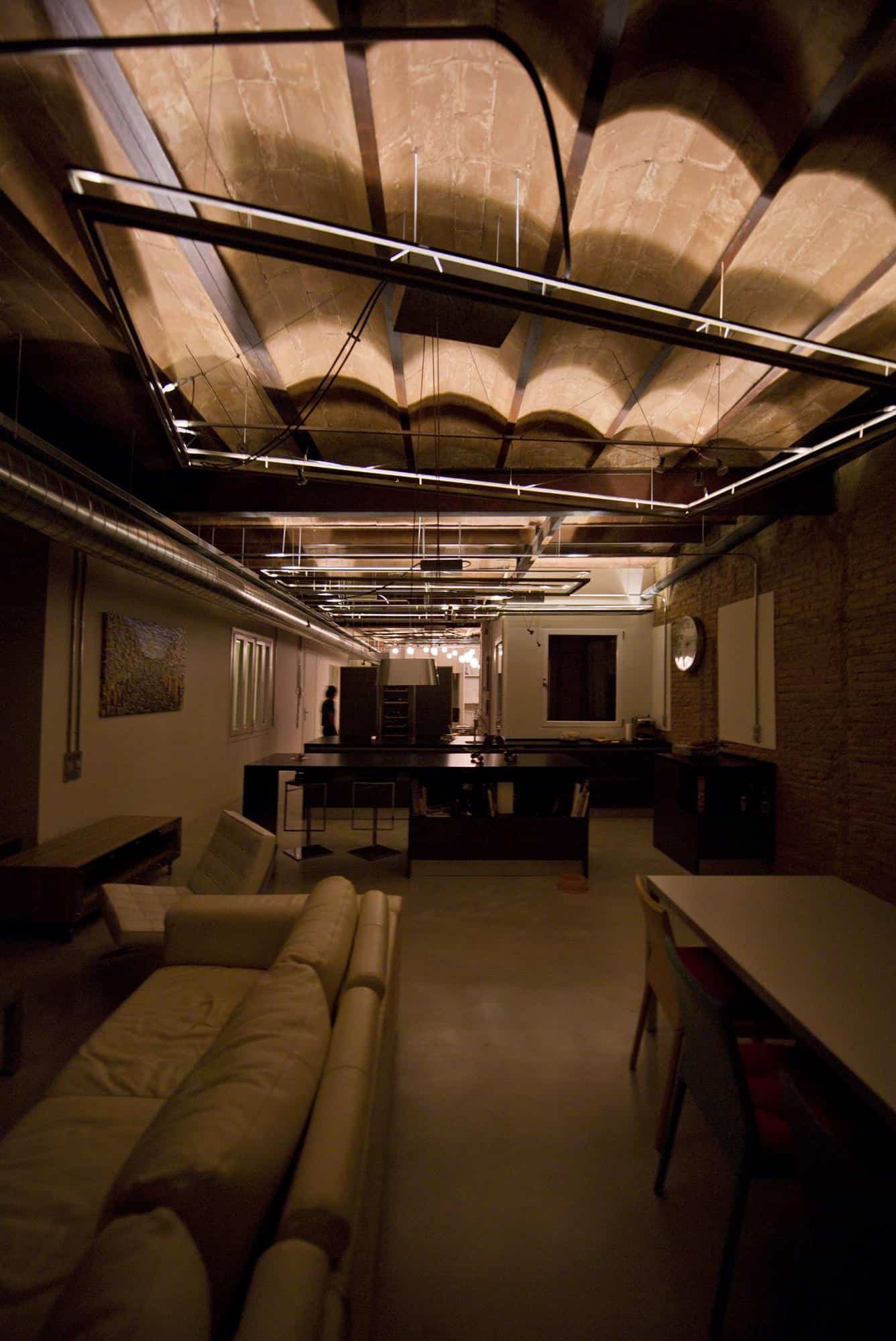
The leather couch and modern table are purposefully chosen in light tones to create tonal balance to the otherwise dark structure of brick and timber.
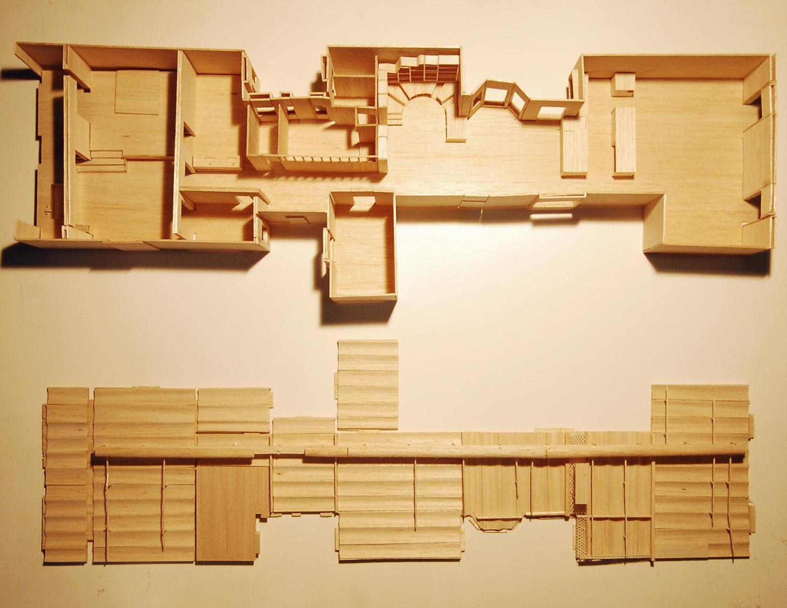
The floor plan is such that the public zone is all on one side of the apartment with the private zone on the other. The Rotunda Library acts as the converging point of the two volumes.
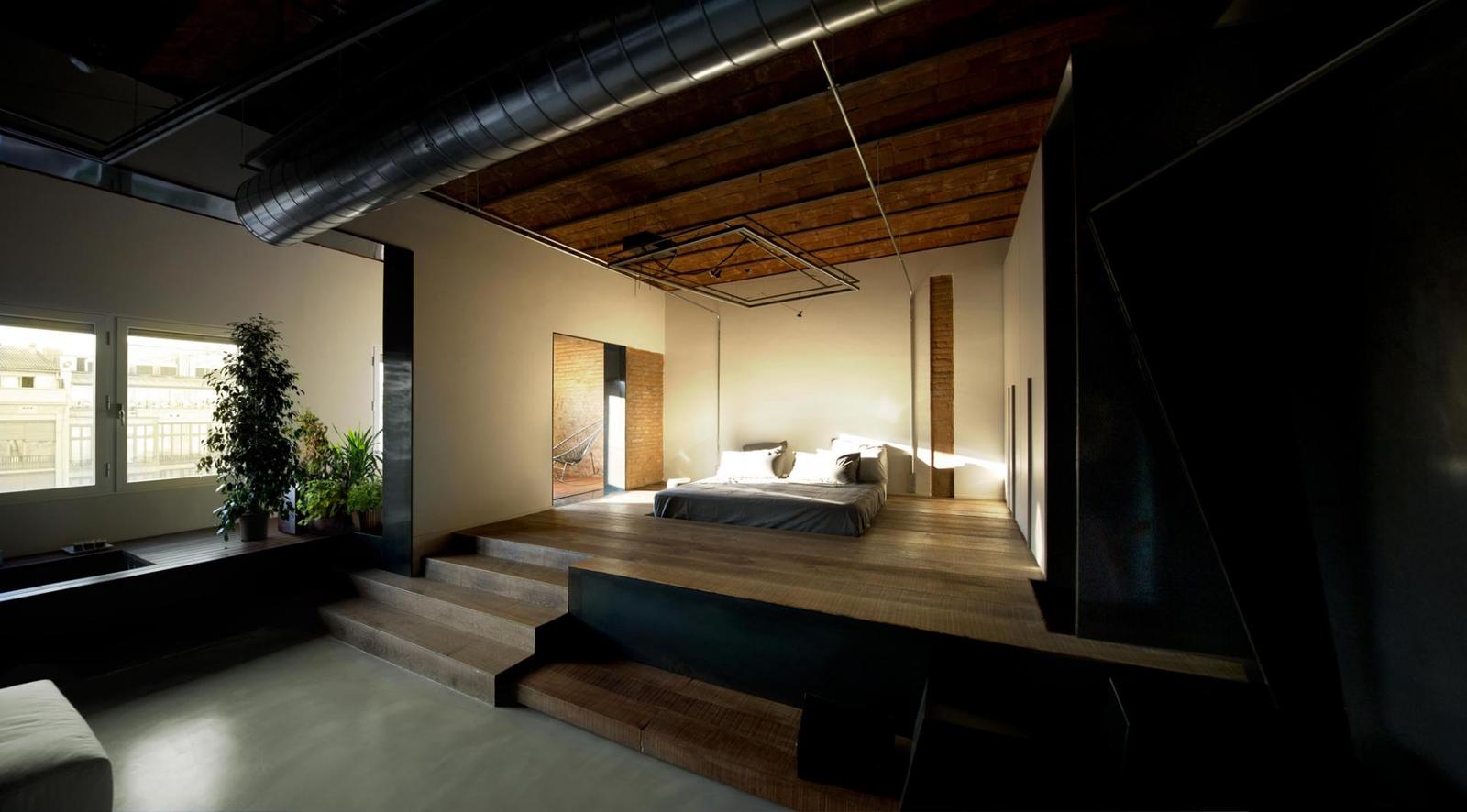
The bedroom continues the use of original dark timbered ceilings layered with ducting and carpet lighting, the walls however have gone from rough exosed brickwork to smooth white surfaces. The flooring is divided into zones with the use of a platform section that holds the bed and wardrobe.
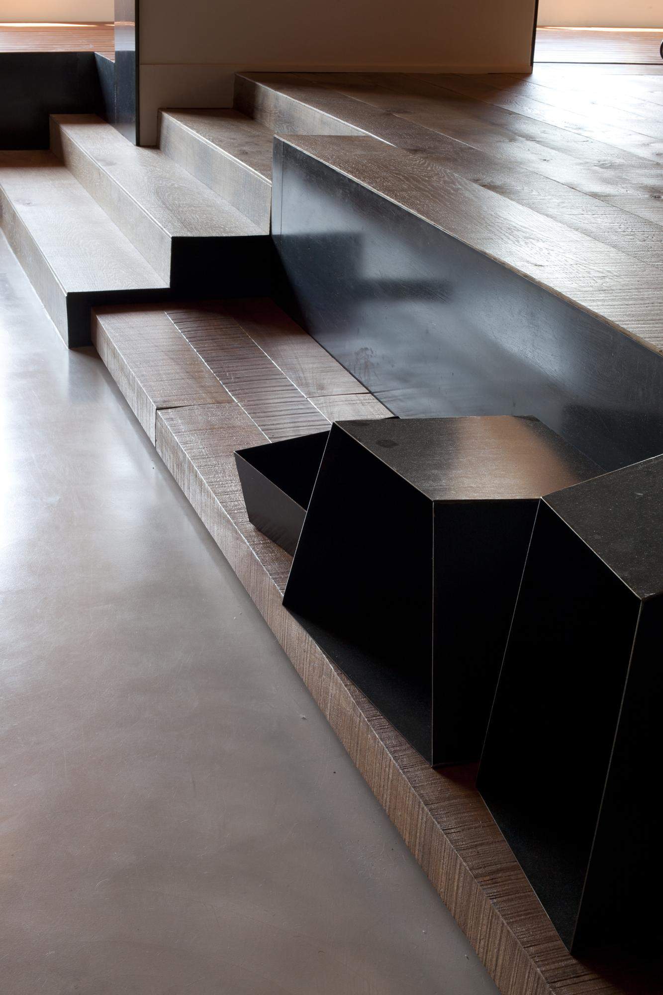
The stairs that lead up to the sleeping area are built with timbers in a two section pattern. The first being a functional flight of 3 treads and the second being a long low run of timbers that supports cuboids for storage. The addition of cuboids continues the theme of straight geometrical lines being juxtaposed next to haphazard angles. This keeps each space flowing with a noncomforming geometry that is both fun and refreshing.
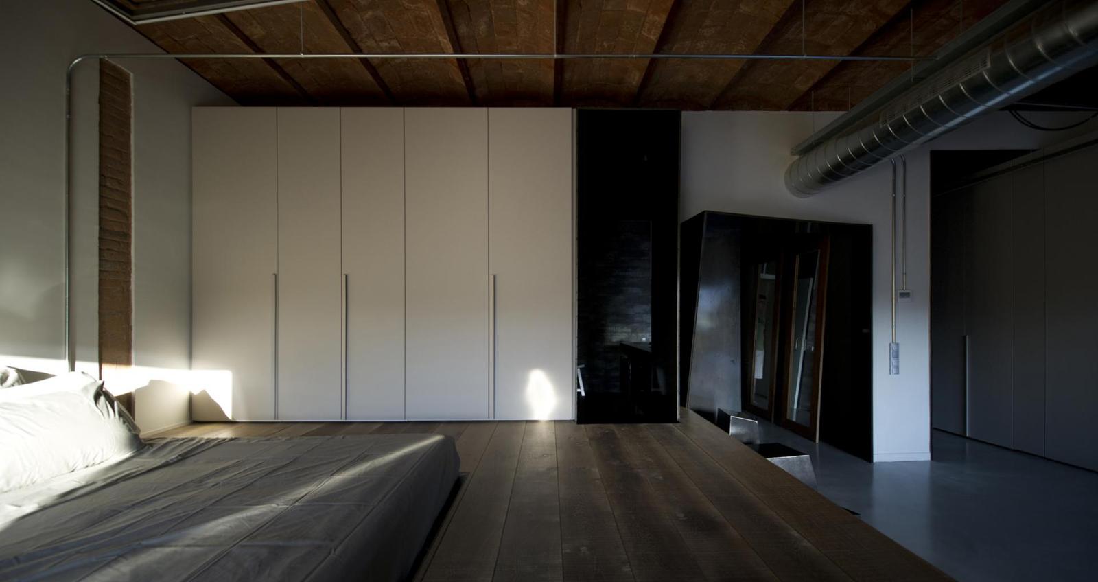
The bed platform defines the sleeping and dressing zone with plenty of floor space allocated to the dressing area. Large and spacious the room is still quiet and composed. This relaxing atmosphere is achieved with the use of natural tones and clean lines. There is nothing busy and cluttered about the space. The large expanses of openness is like a deep breathe of fresh air while the quiet hues offers the slow exhale. Even the mirrors are tucked away so as not to disrupt the peaceful visuals.

Just before the sleeping zone and tucked quietly out of site lines is a jacuzzi with. A wood clad surround. A grouping of plants on either end offers an outdoor appeal with the Jacuzzi is reflective of a small lake.
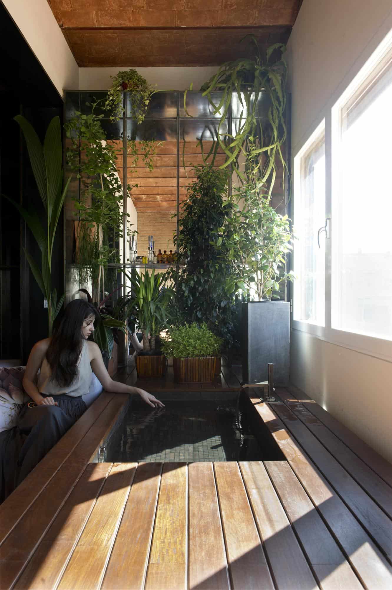
The Jacuzzi brings to mind the image of a deck with a man made pond surrounded by potted plants and a privacy wall that the sun spills through. It feels more like an outdoor space rather then a niche within the Master Bedroom.

The vanity is just a taste of the spa like feel the shower has to offer. A large and open space with two rain heads and multiple niches to hold various items, this space is not closed off from the rest of the bedroom, just tucked around the corner. Here two sinks are located on a vanity opposite the shower wall and the whole area is clad in deep, rich tones for the ultimate experience.
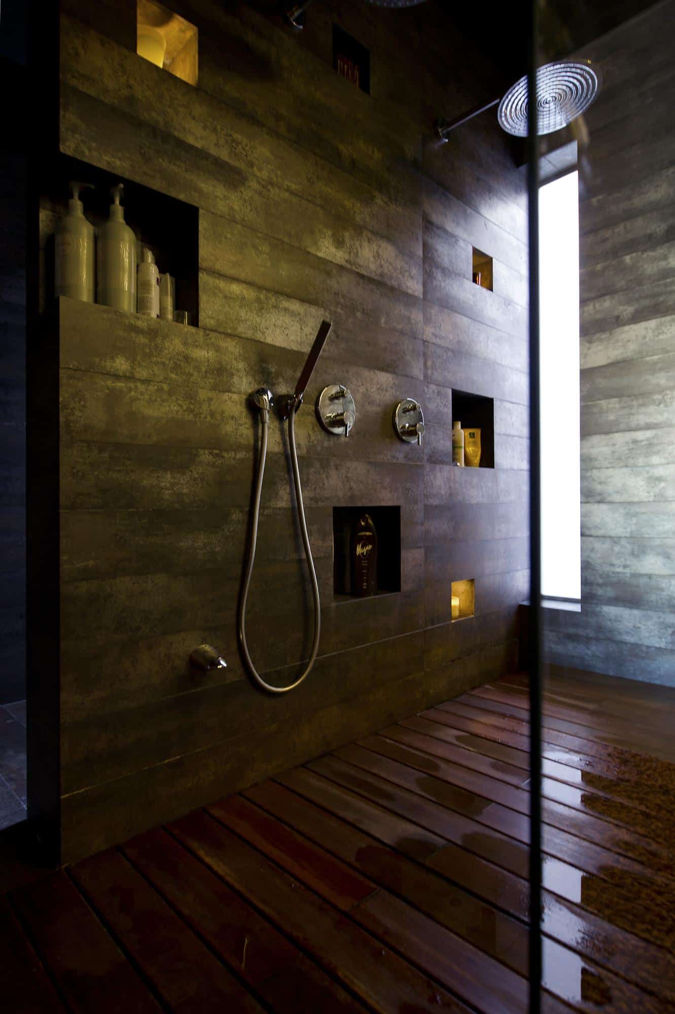
The shower floor is laid out like a deck, allowing the water to seep between the crevices of the wooden boards to a hidden drain below. With the multiple niches – some lit from within – and your choice of hand held or rain shower, the complete experience is customizable.
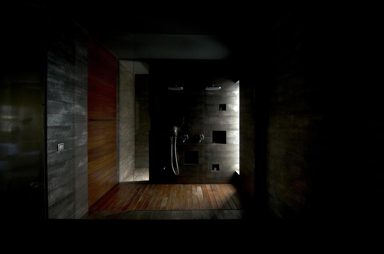
The dark tones of the shower create an interesting halo effect when the sun shines in through the long, thin, vertical window located in the corner.
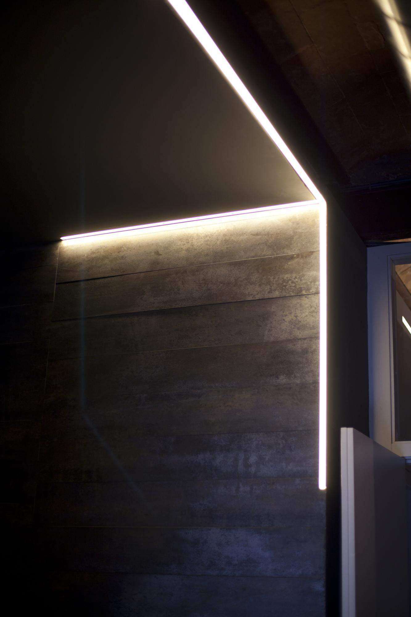
When the sun goes down, the LED lighting takes over and continues the halo effect.
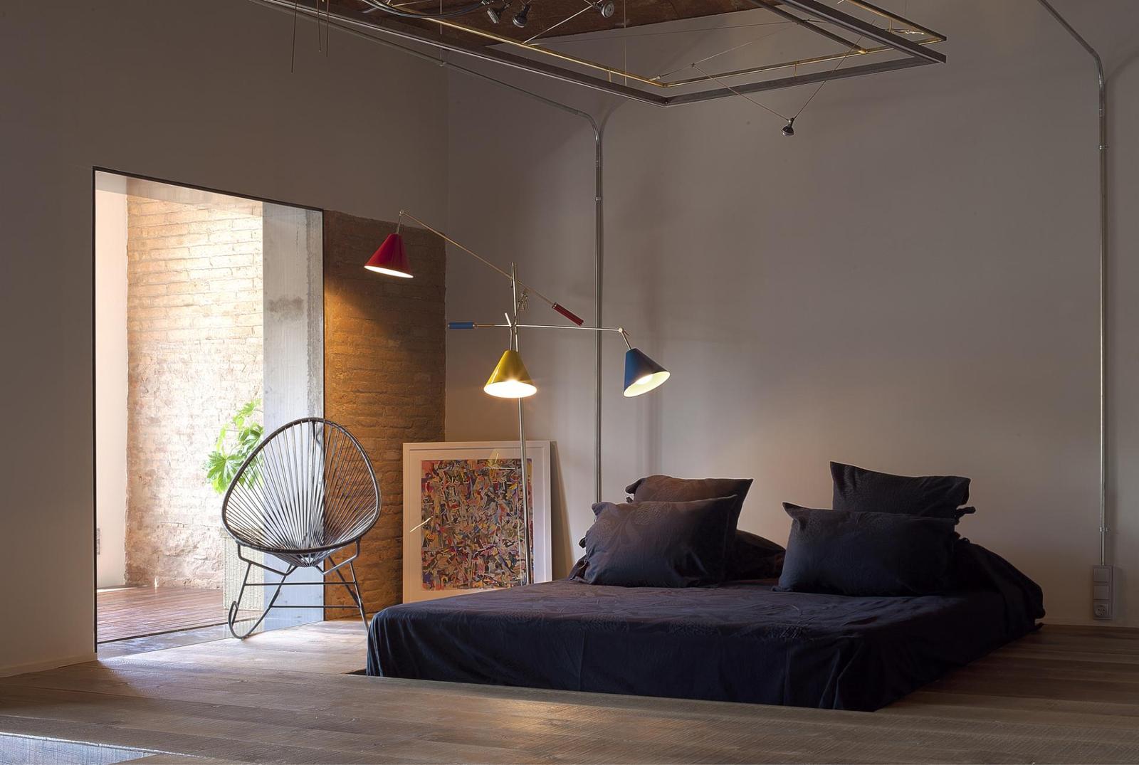
Whether showering or sleeping, the Master Suite is a study of luxurious simplicity.
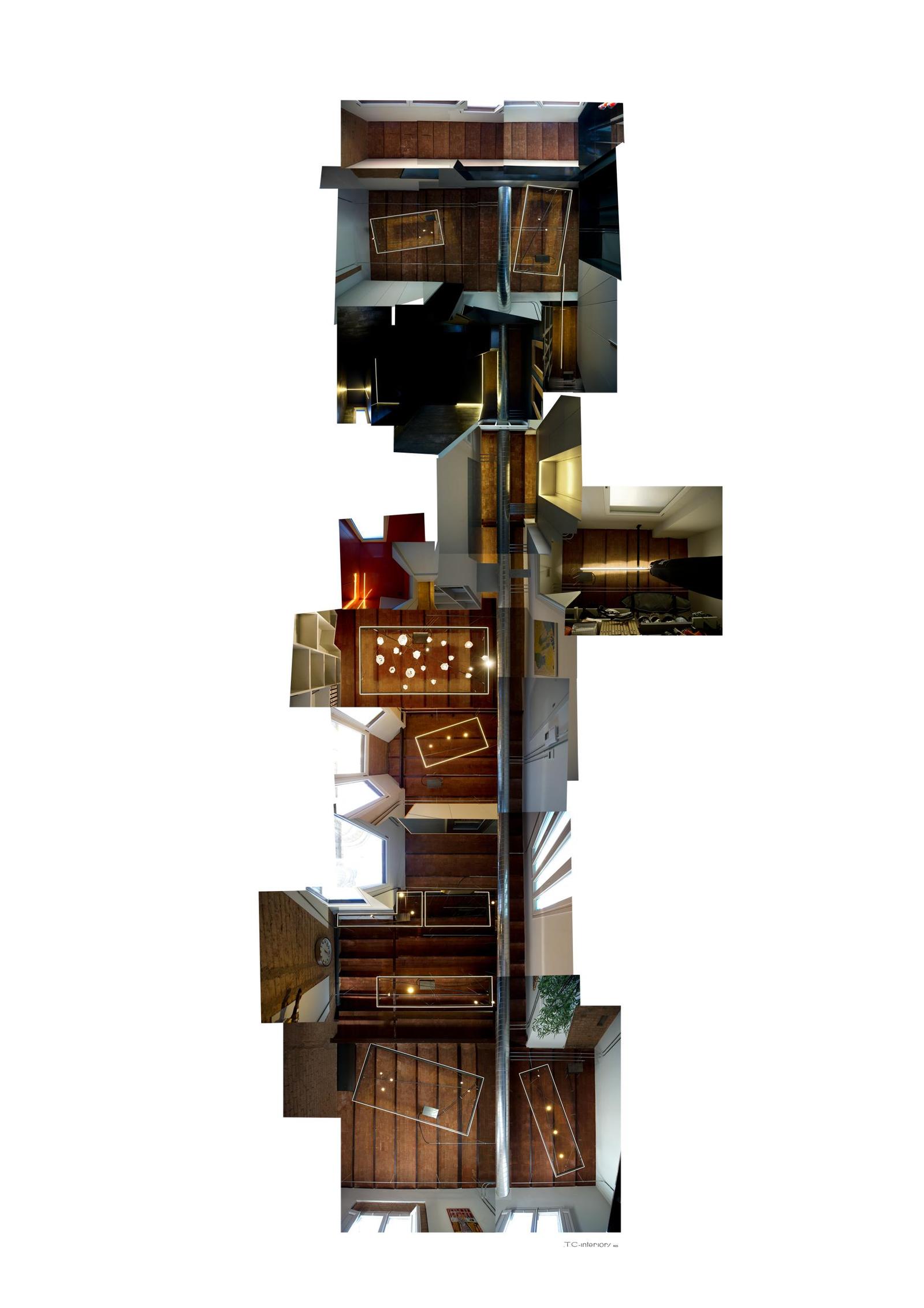
The layout of this home is defines the public and private spaces in such a way that neither imposes on the other. The use of Lighting Carpets on the ceiling creates a visual story that travels throughout the home allowing for both functionality and visual interest. The use of structural details to create interest has meant the homeowner is able to create a clean lined modernist space that is uncluttered yet full of fun and interesting things to look at.
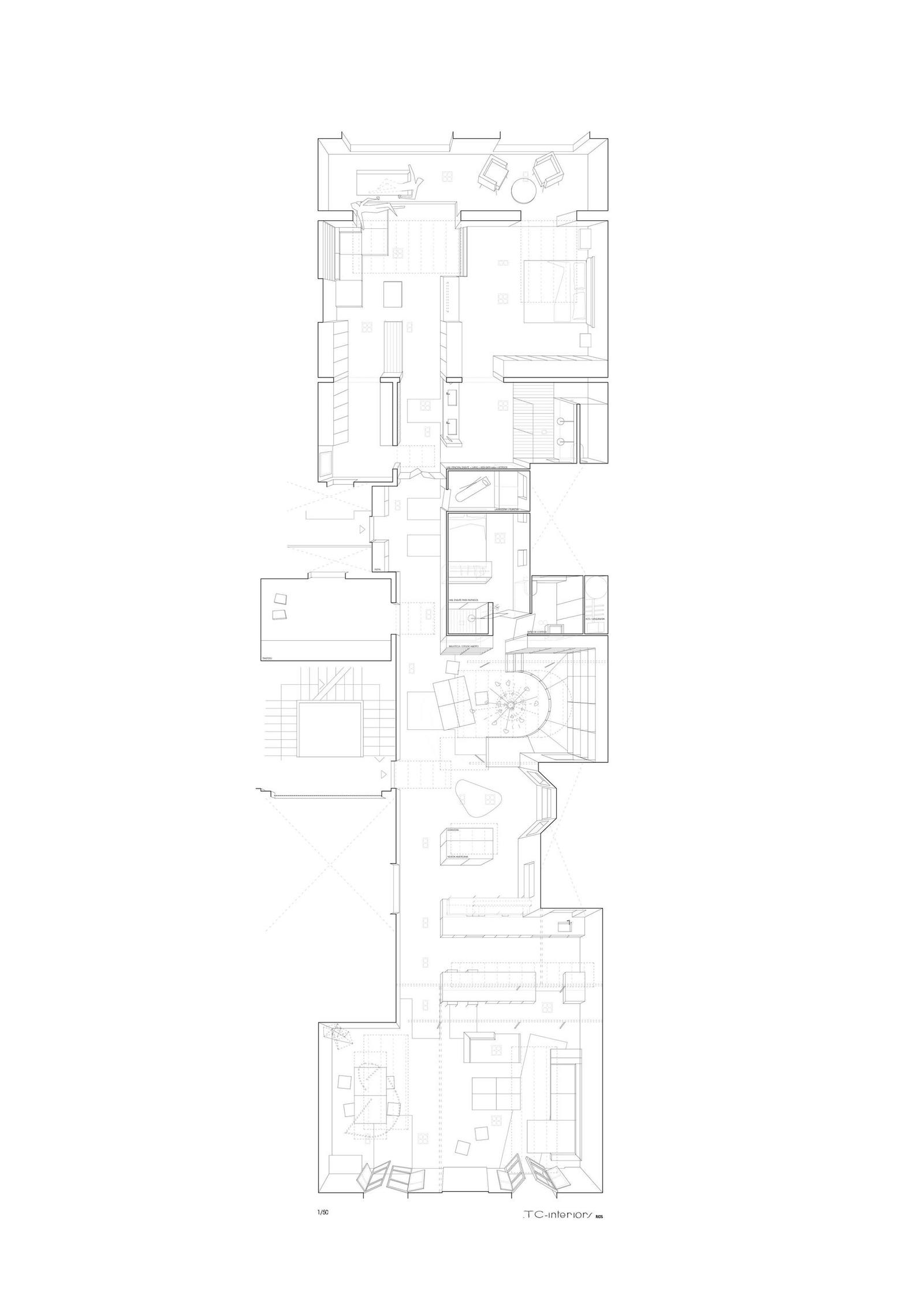
The only enclosed areas within the apartment are those in the Core area, consisting of the guest room and service areas. Beyond the Core, the only doors that can be seen is a pair of double doors that divide the living from the private zones.
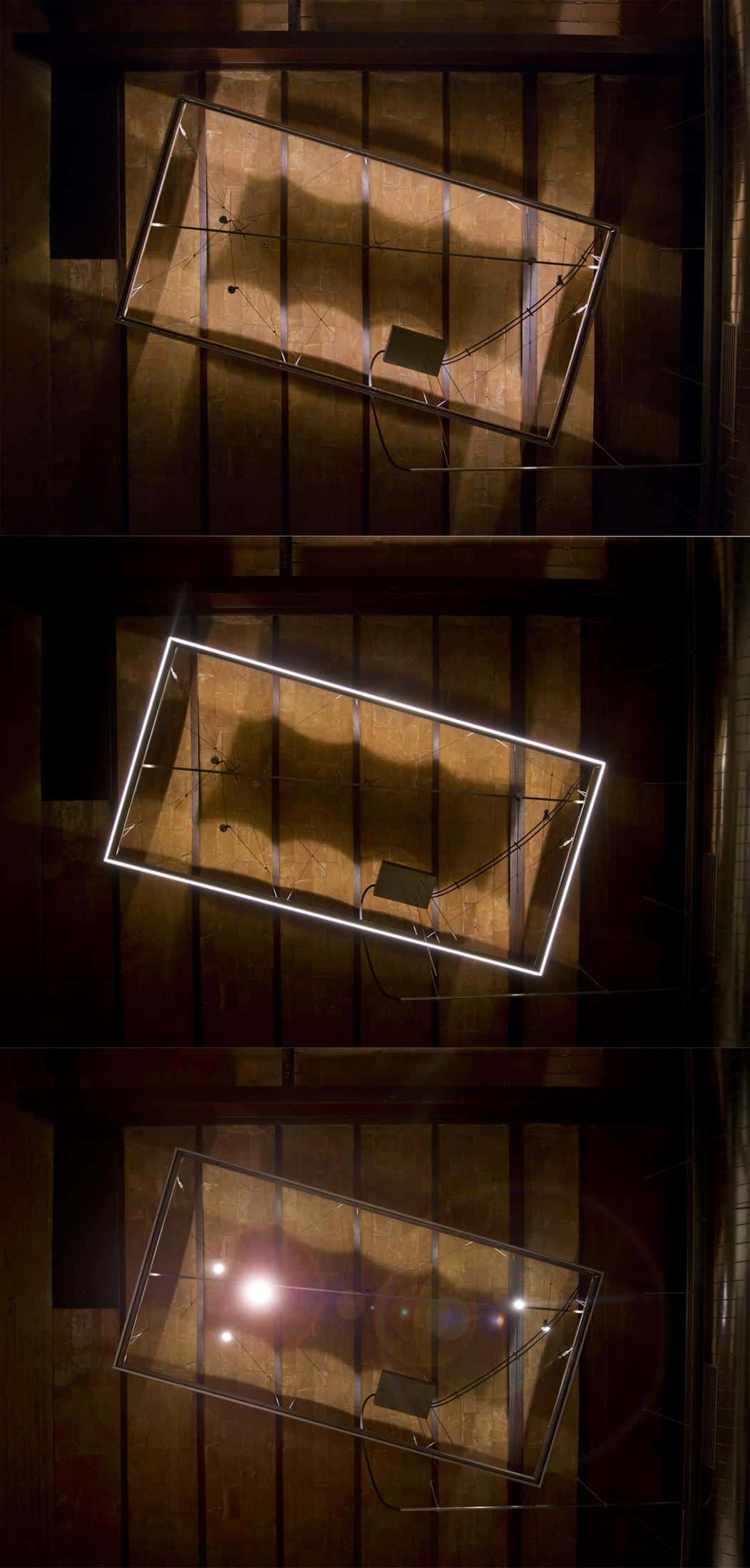
The home is furnished with custom made designs and introduces a system of energy efficient lighting which illuminates the various uses of the home. The lighting zones are referred to as Lighting Carpets and each carpet incorporates 3 different illuminations, the upper LED line that underlines the ceilings, the lower LED line which spreads the light equally and the hanging adjustable LED spots that focus on specific activities. The use of integrated LED lines offer an 85% energy saving. Add to this the fact that all the wood is certified and this apartment not only pays homage to its heritage but it also pays homage to the earth itself.
Source; Archello
Interior Architects; TC Interiors
