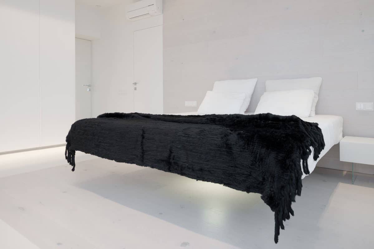
Located in Moscow, Russia, SL*Project designed this apartment to be a space of minimalist aesthetic but full of visual intrigue. Surrounded in a soft neutral palette relieved only by carefully chosen accessories such as the black throw on the Master Bed, the apartment is a study of simple shapes used in a complex manner. While the black throw on the Master Bed is the only divergence from the pale surround, it is the bed frame that draws your attention – where is the support? Is it really cantilevered? How is it suspended? Only the designers know for sure.
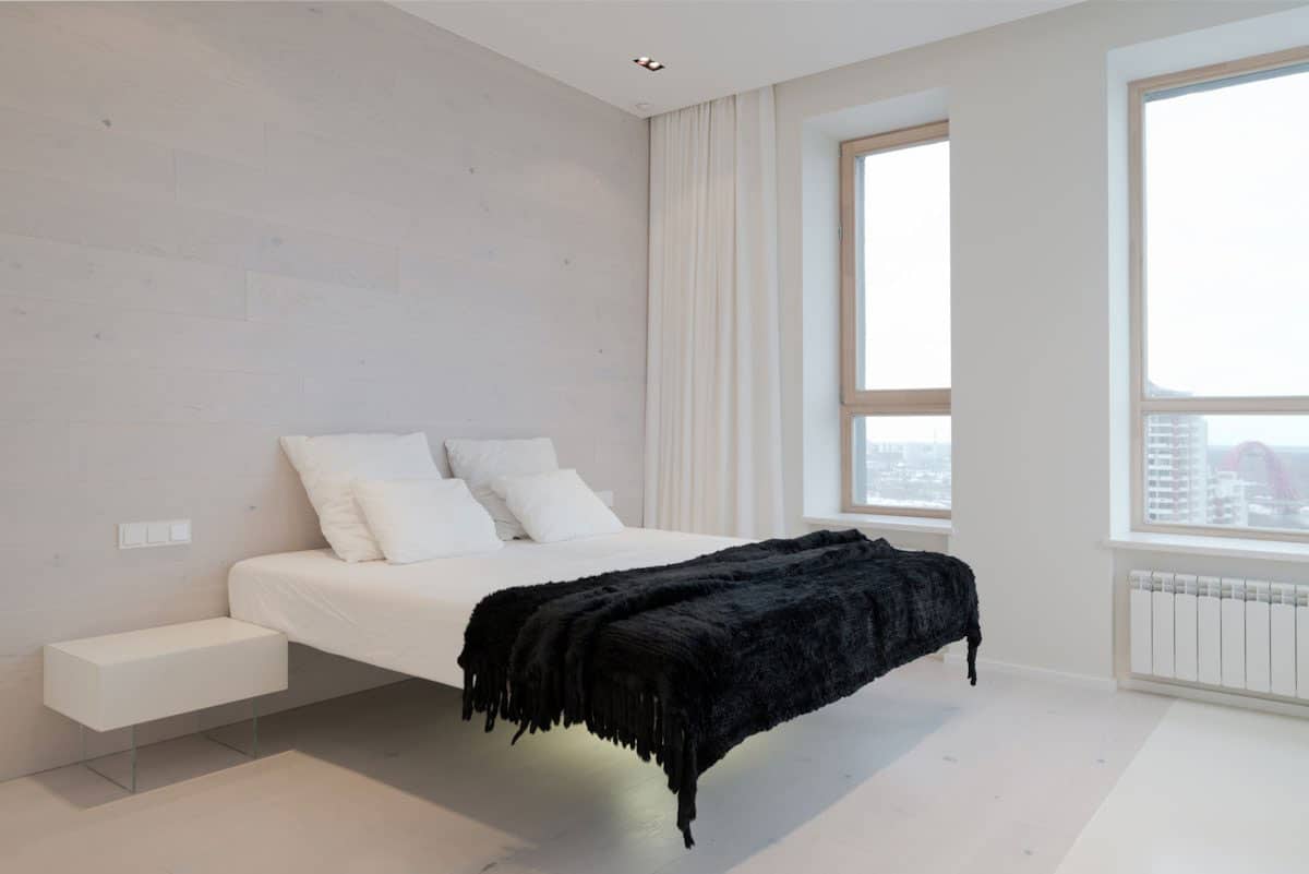
What makes the elevated plane of the bed even more interesting ist he visible supports of the bedside tables, that while designed to look suspended, still show off their tempered glass supports. If the bedside tables are supported on the ground, the bed must be – or is it?
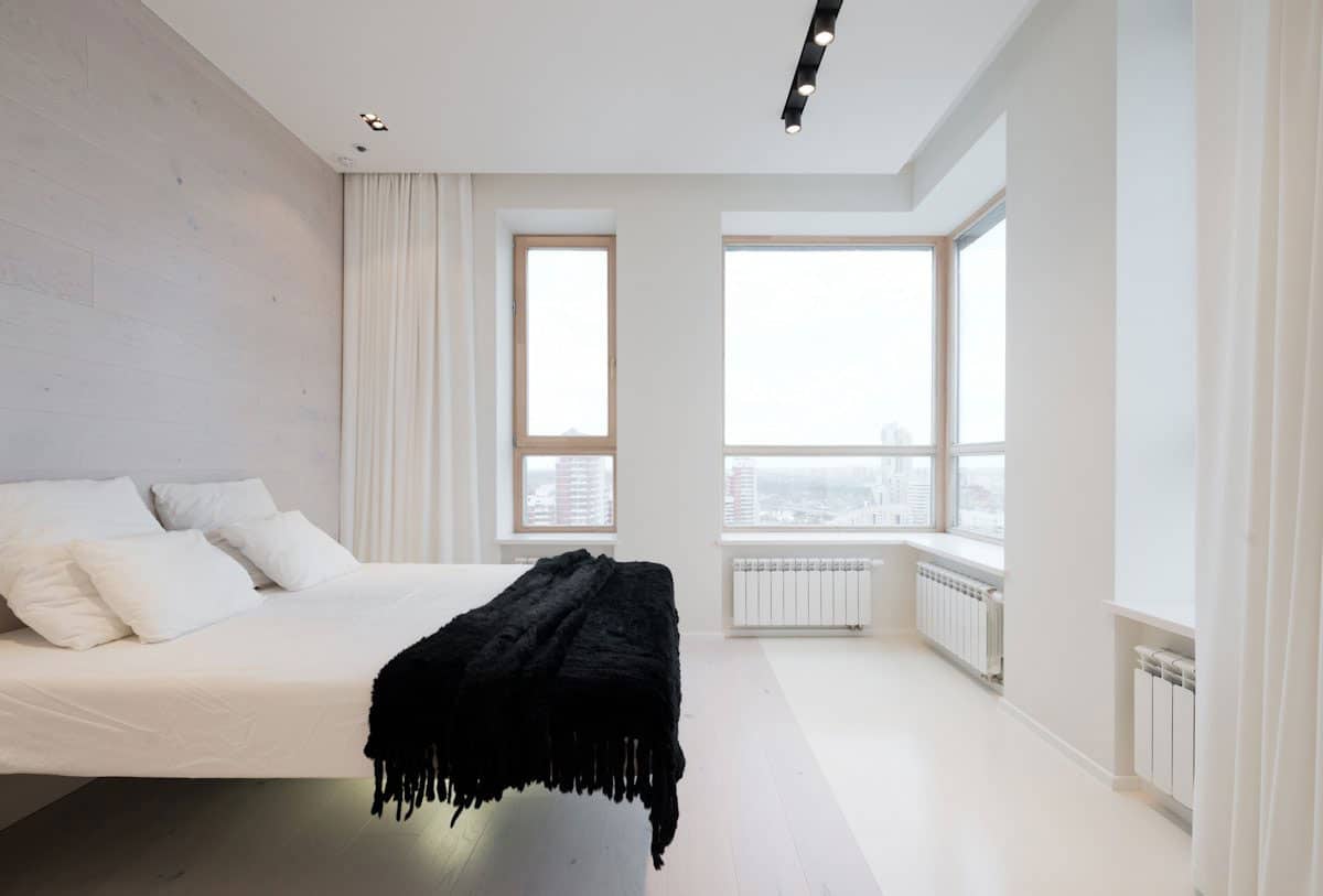
No matter which side of the bed you are on, the bed does not betray its support system and it is this element of the unknown that keeps what would otherwise be a sparse room fascinatingly creative.
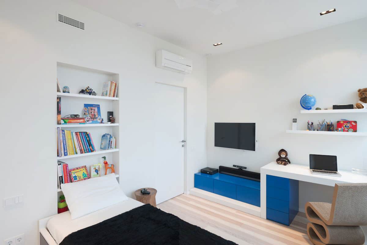
While the Master Bedroom is the epitome of minimalist design, the bedroom for the client’s child takes into account the age of the person spending the most time within the room and therefore embellishes the surroundings with the necessities of childhood – shelves for miscellaneous, a media corner, a desk for studying and a bed for sleeping.
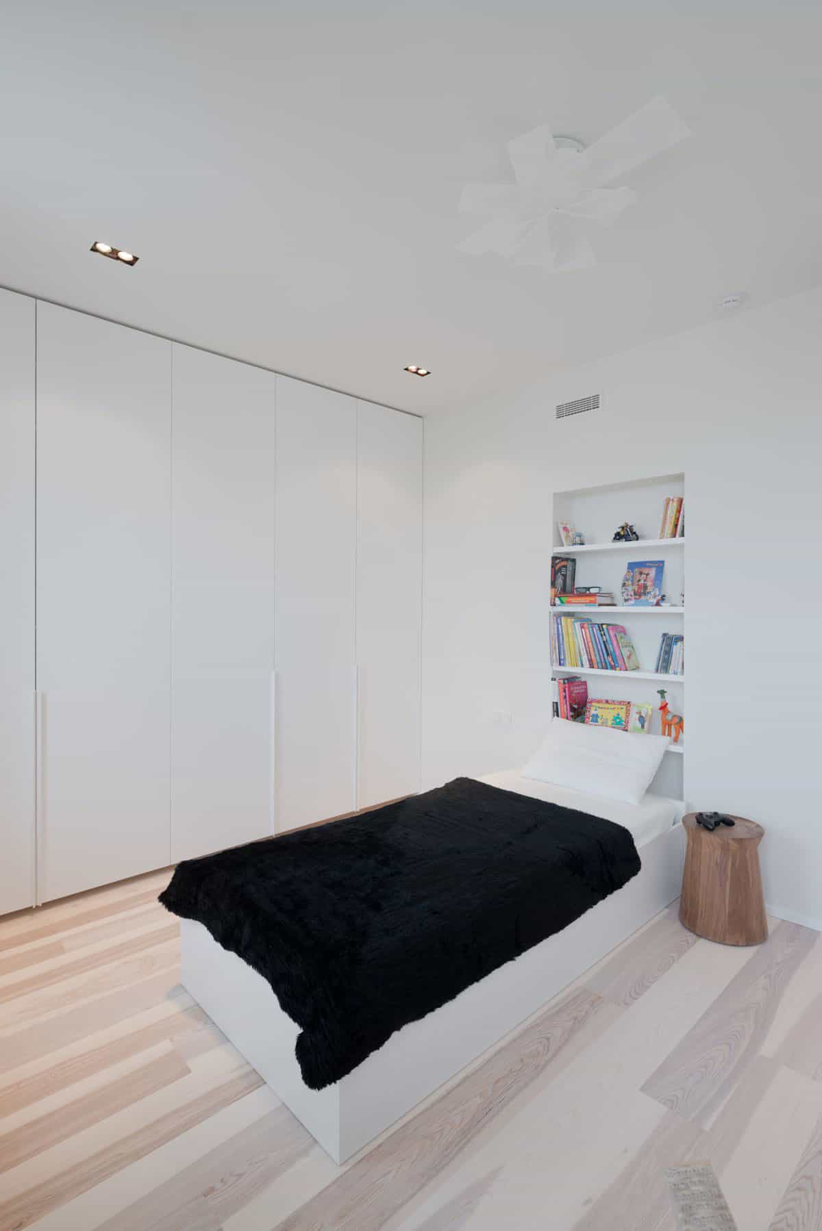
The child’s bedroom still employs a pale pallete and repeats the same type of black throw on the bed, but here the bed is not floating in the air and the headboard is not a clean slate.
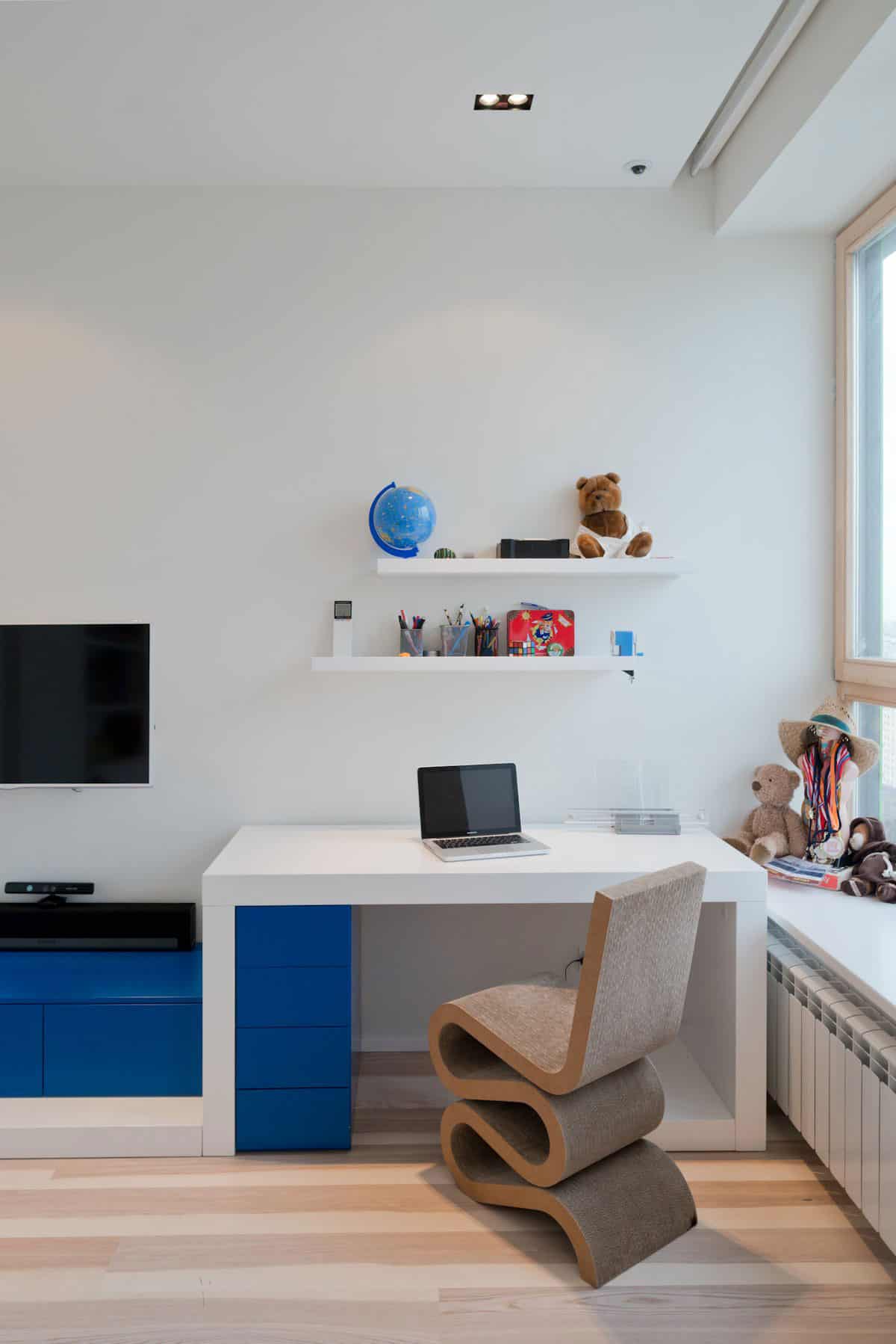
In the child’s bed, the designers have added in a bold royal blue to the otherwise pale palette but they have done so in small blocks of colour rather then large swaths of it. A row of drawers within the desk and the media storage below the TV, that’s it. They have also managed to “contain” the colour by wrapping it in the white base, side supports and tabletop.
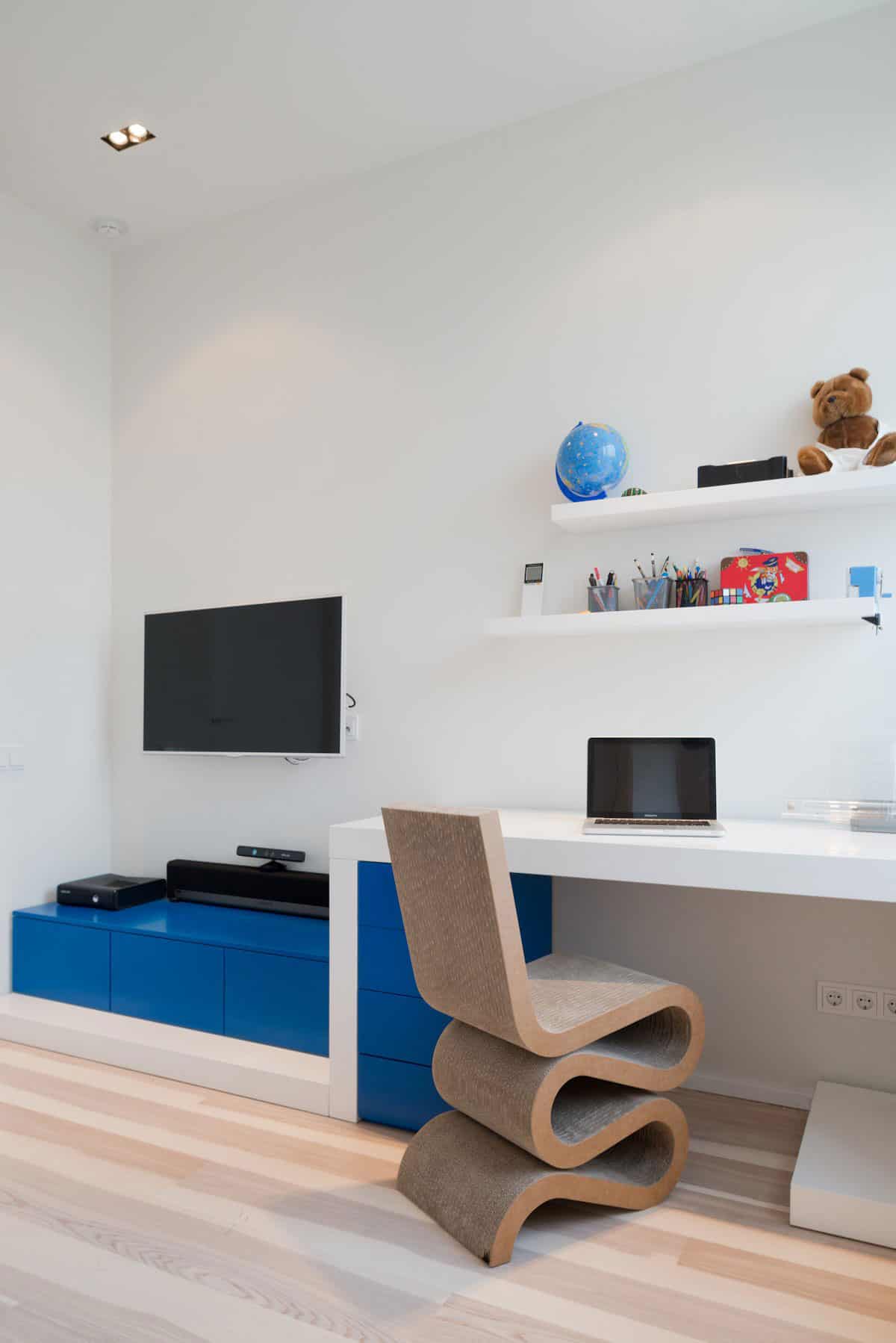
While the child’s bedroom does not have a floating bed to create a visual statement, it does have a very comfortable and visually stunning chair that creates all the shape drama the room needs.
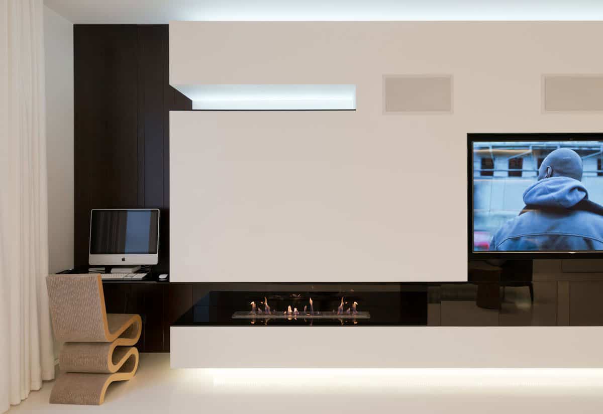
The same style of chair used in the child’s bedroom is also used at a small laptop station to the left of the fireplace in the living room. Here, too, colour is replaced with shape to create the story of the space. The black void within the laptop station continues through a horizontal slit in the wall created by the fireplace only to widen into the media unit. A void above highlights the white of the wall by featuring the hidden light within and this moment of brightness balances the flood of light from below the wall.
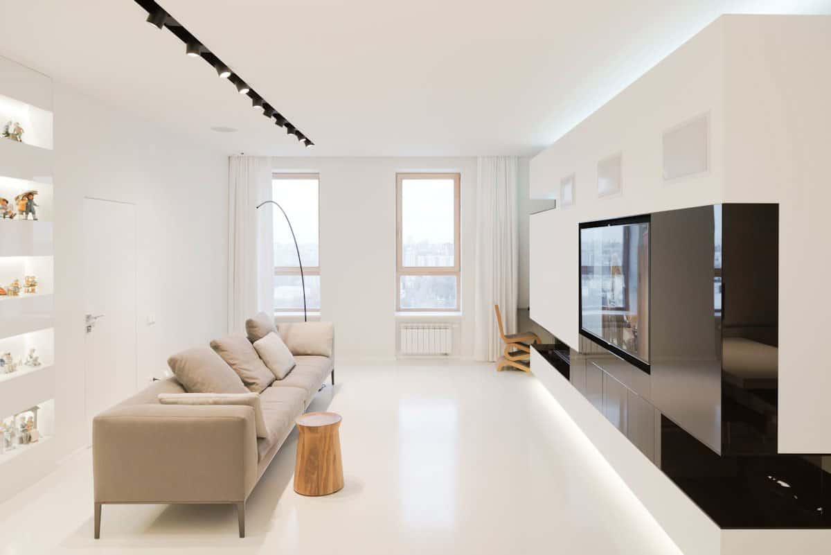
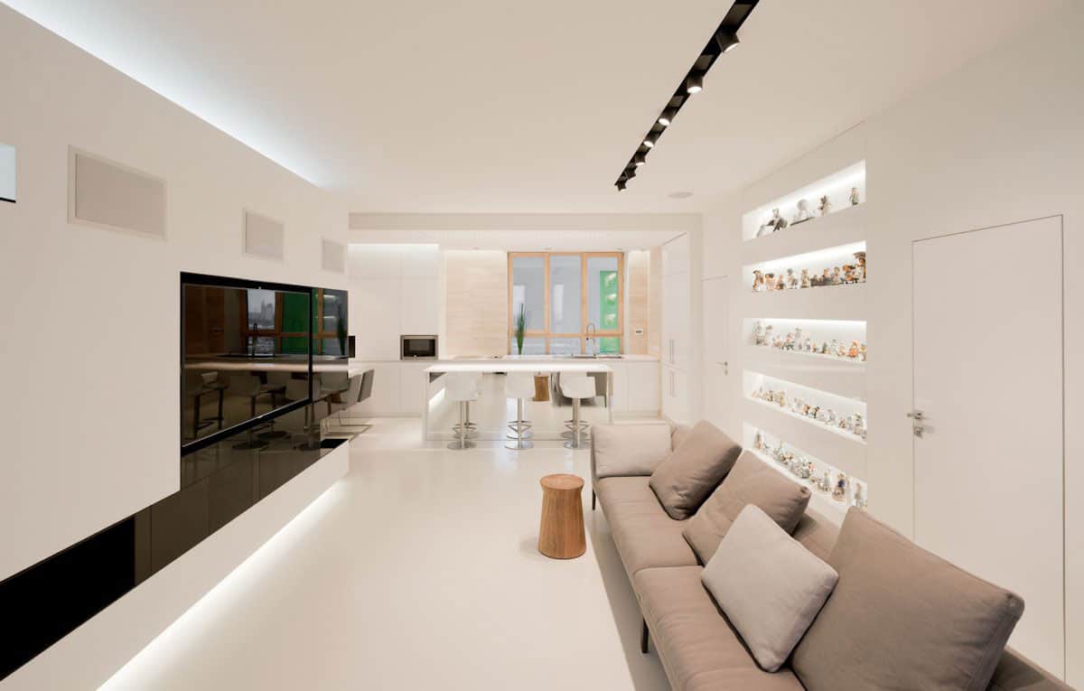
The flowing black shapes within the fireplace wall continue from the media unit around the wall into the hall and the use of voids to create interest within the wall is repeated on the opposite wall in a series of sunken shelving.
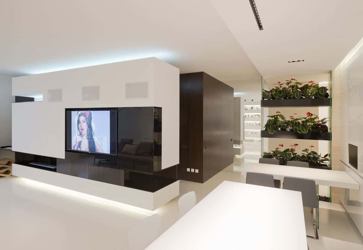
In the hall the black ends at a hall conjunction, only to continue on the other side as the only colour of choice until it hits a wall of mirror and appears to once again meet a conjunction before converting back to white. In reality the mirror is creating this false imagery by reflecting the view back into the living space up to and including the row of 5 lit built-in shelves. Across the hall the kitchen flows from the living room and the dining area flows from the kitchen. Behind the dining zone a series of black planters are vertically encased in a clear shelving unit, creating both a continued storyline and a fantastic way of bringing the outdoors in.
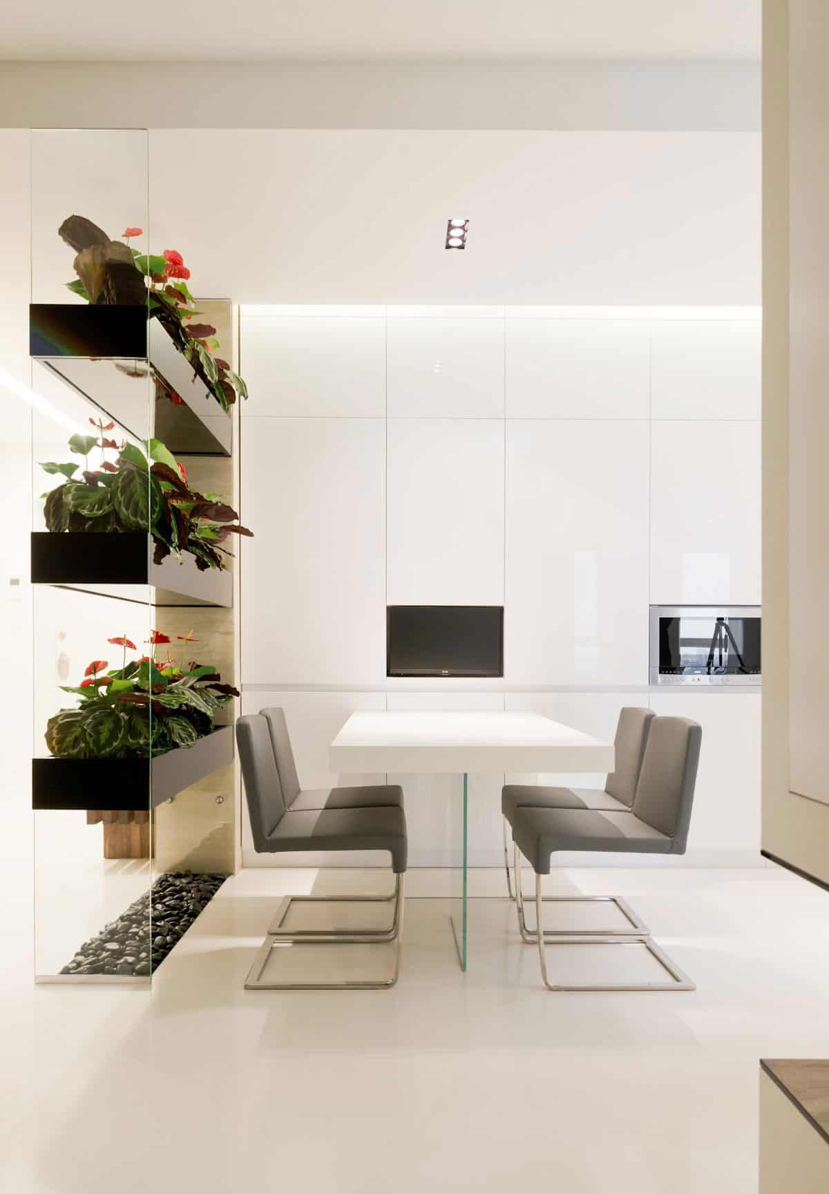
Using a multiple level planter as a room divider is a creatively awesome way of adding an organic touch to an otherwise geometric surround, and filling it with plants that have variegated leaves and red blossoms adds both colour, texture and fun to the space, as does the layer of pebbles in the bottom.
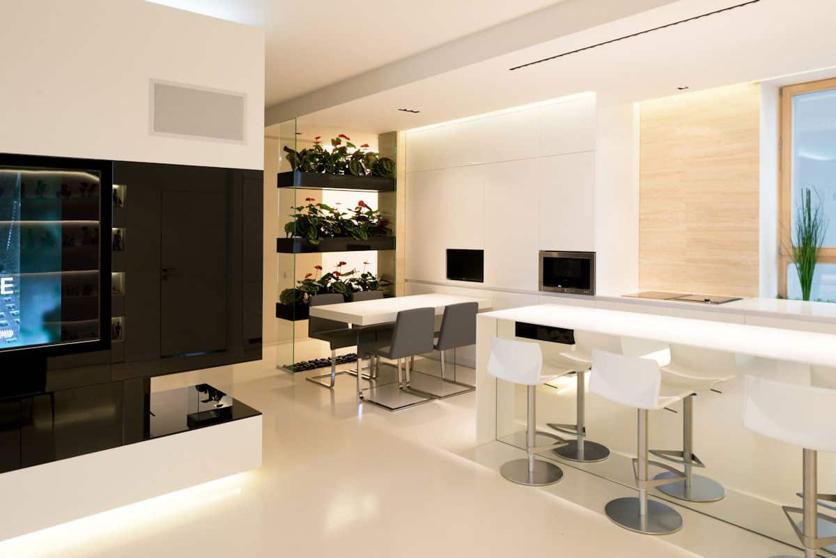
The dining area and the kitchen island protrude into the room in opposing directions, which helps the space from feeling “lined up”. Additionally the dining chairs are black while the bar stools are white to again stop the areas from feeling regimented and confined.
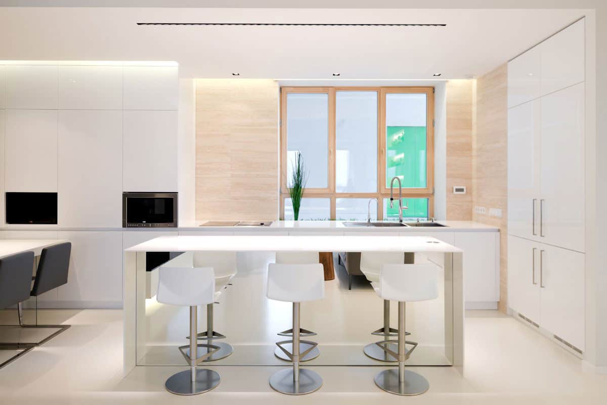
The kitchen island features a another mirror on the side exposed to the living room. By cladding this part of the island in mirror, it feels spacious and light. Had the designers simply continued the white of the cabinetry on the back of the island, a strong shadow would have been present, closing off and confining the area.
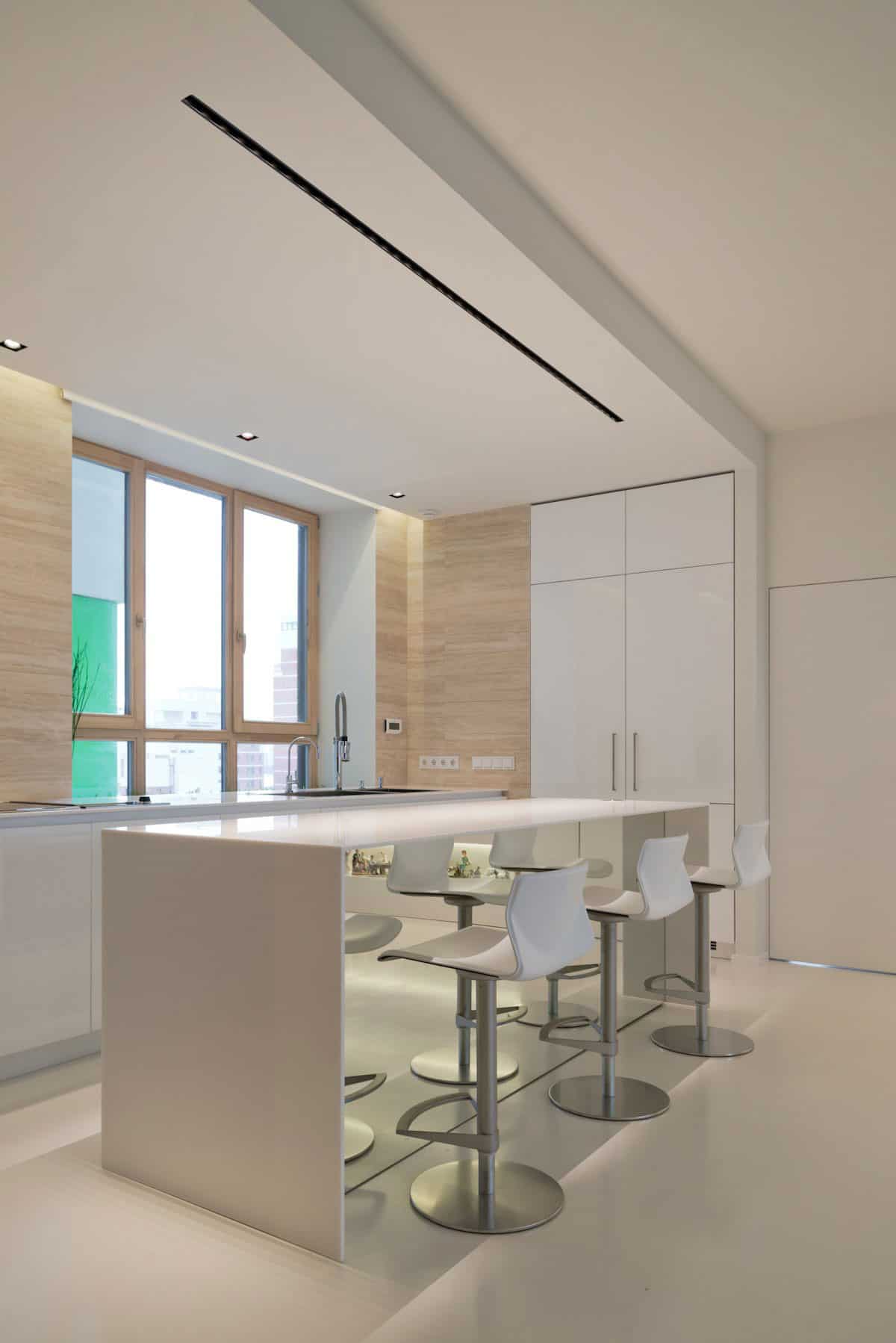
The apartment is lucky enough to have windows that open in both the living room and the kitchen for cross ventilation, and SL*Project allowed the kitchen windows to be a dominant feature by surrounding it with pale wood on both its frames and on the walls themselves.
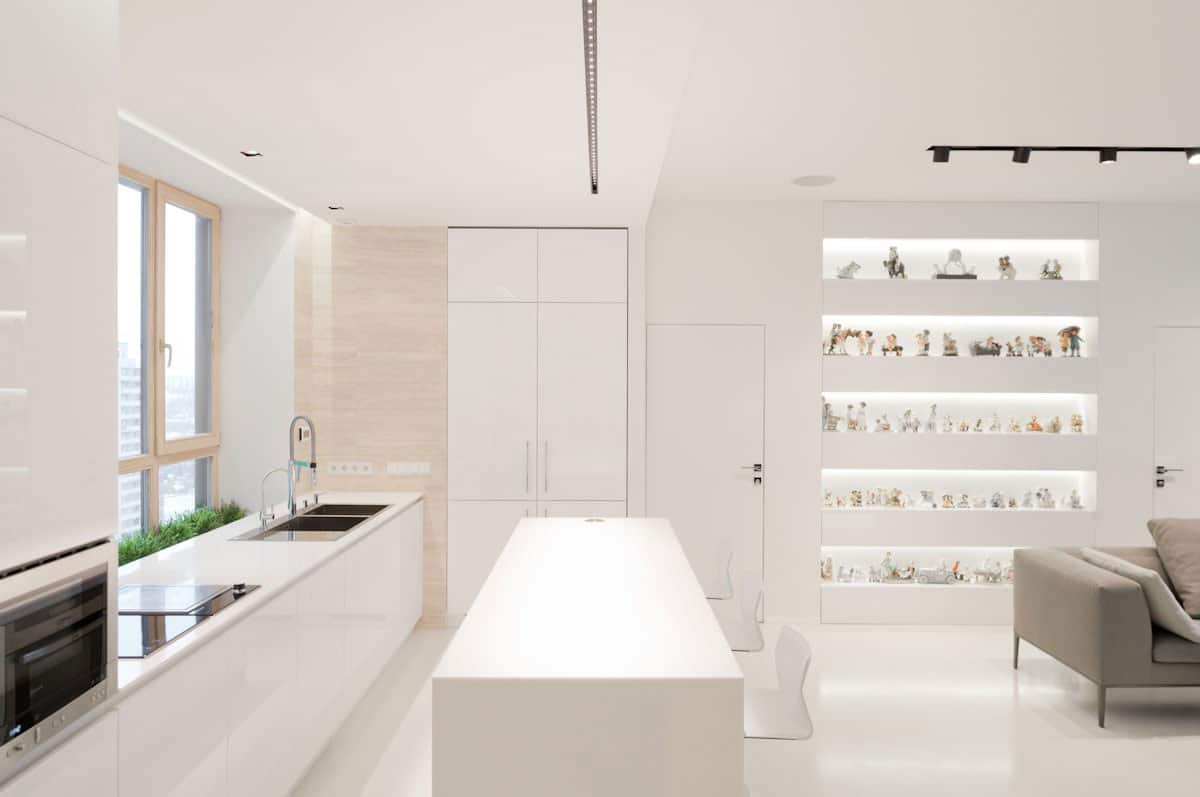
While the kitchen and living room windows bring in natural light, and task lighting is strategically placed in all the necessary ceiling locations, accent lighting is also introduced to highlight the various voids incorporated in the hardscaping of the apartment.
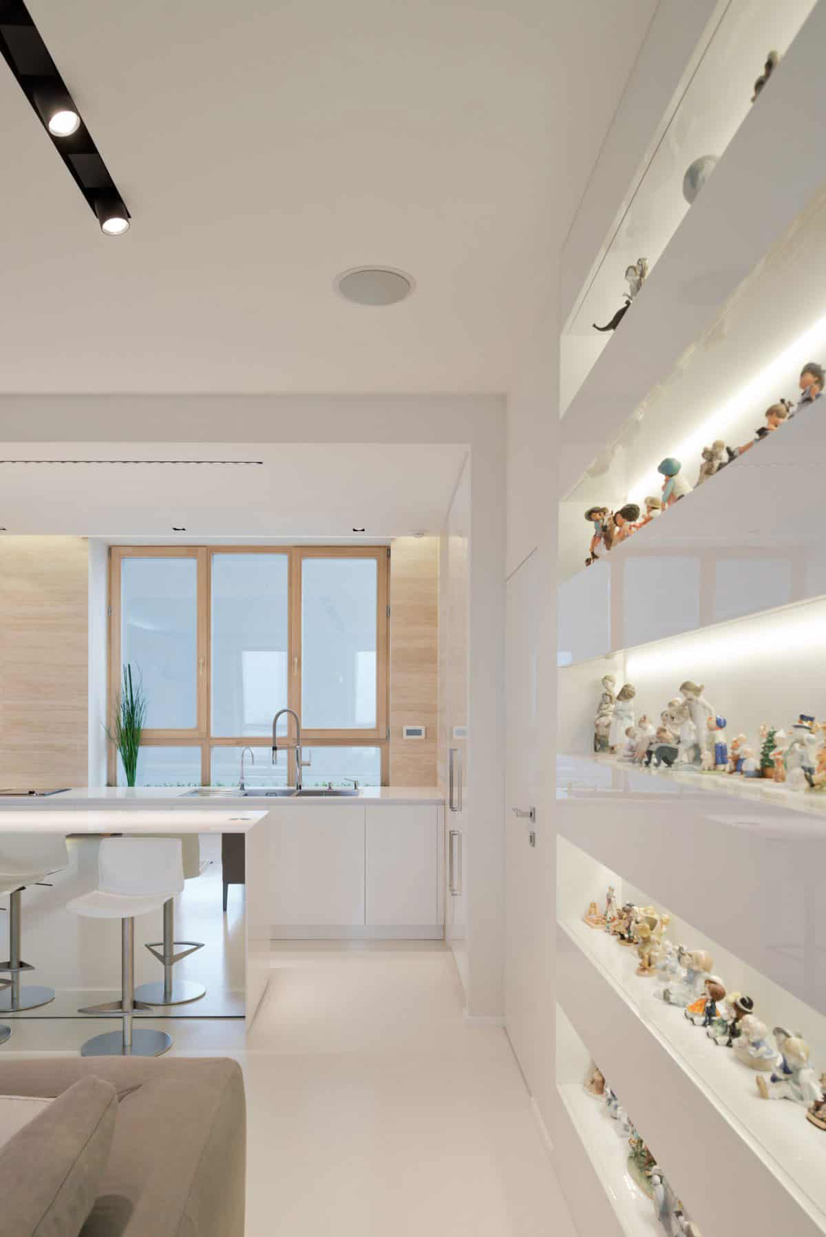
The lights within the sunken shelving not only highlight the voids themselves, but also the apartment owner’s collection of figurines. By displaying all the figurines in linear rows within these 5 voids, they present themselves as one complete visual which is in keeping with the minimalist aesthetic
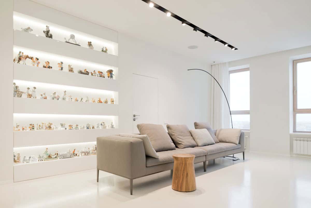
Since the 5 rows of shelves are all built into the wall, they do not infringe on the walkway that leads behind the sofa to the Master bedroom entrance, the other bedroom entrance is on the other side of the shelving.
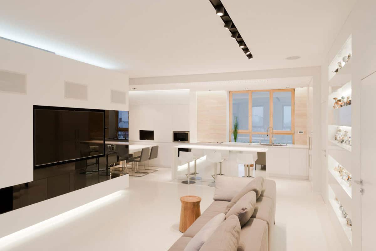
Locating the sofa several feet in front of the bedroom door keeps the view line to both the fireplace and TV uninterrupted and by not pushing the sofa further into the room, the designers have created a large and comfortable living space to kick back and relax.
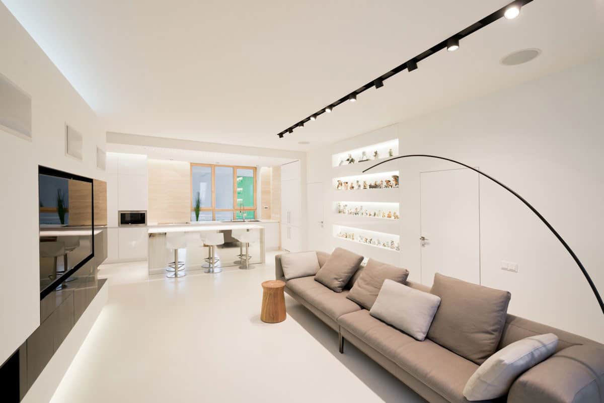
The choice of sofa makes kicking back and relaxing very easy to do. Designed like two daybeds end to end, the pillows can easily be adjusted for sitting or lying down, and with the overall length of the sofa, two can easily nap at the same time.
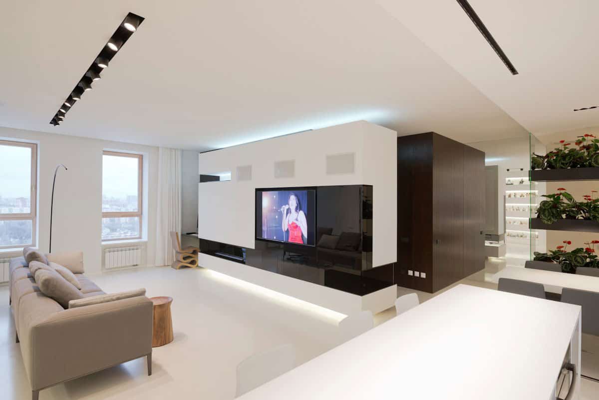
The apartments entry and bathroom are located down the hall.
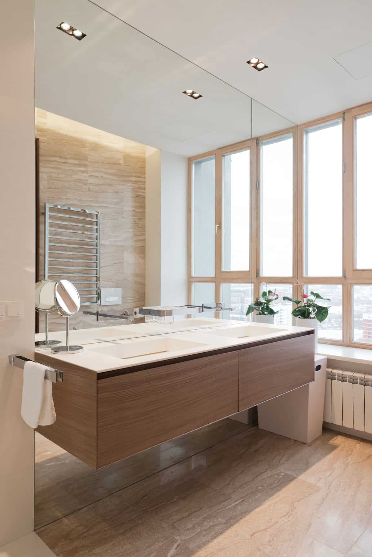
Since the apartment has exterior walls on both sides, even the bathroom has a wall of windows and since the apartment soars above the surrounding buildings, no window treatment is necessary.
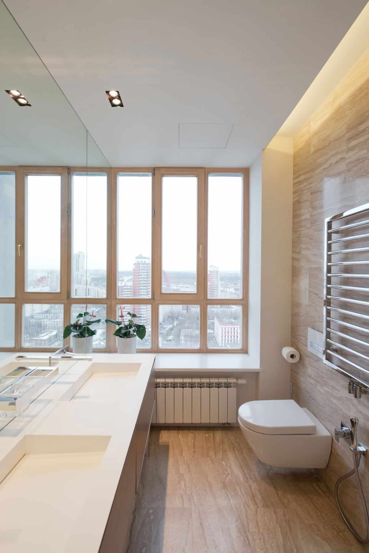
The bathroom is one room where the dominance of white is replaced with a pale umber. The minimalist aesthetic, the uninterrupted view and the soft shades of nature create the perfect Zen moment.
SL*Project
Photos through SL*Project
