Located in Berrocal, Segovia, Spain; the B House is built by Pablow Campoverde and designed by architects Josemaria de Churtichaga and Cayetana de La Quadra-Salcedo of CH+QS Arquitectos in collaboration with Nathanael Lopez. The site belonged to the architects for 15 years before they decided to build their 1502m home away from home and over the course of the years it became apparent to them that the predominant landscape color of yellow needed to take a dominant role in the outcome of the cabin. Yellow is a feature with every season; the spring flowers, summer grains, fall leaves and winter lichens – even the machinery and signage are yellow.
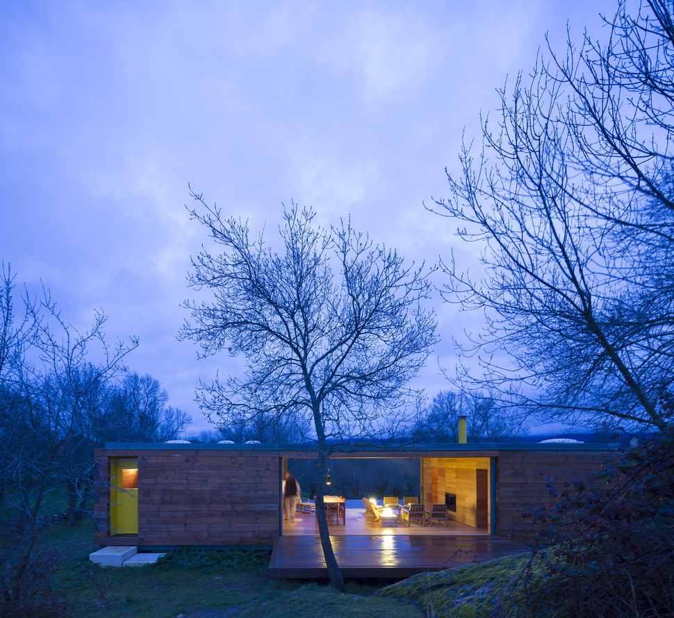
Taking the muse of yellow into their design discussions it was decided that the cabin refuge would be a colourless frame to the landscape’s hues – with the exception of the entry door and roof chimney which would pay homage to the yellow. It was also decided that the landscape would be featured on both the east and west sides of the dwelling via large expanses of glazings.
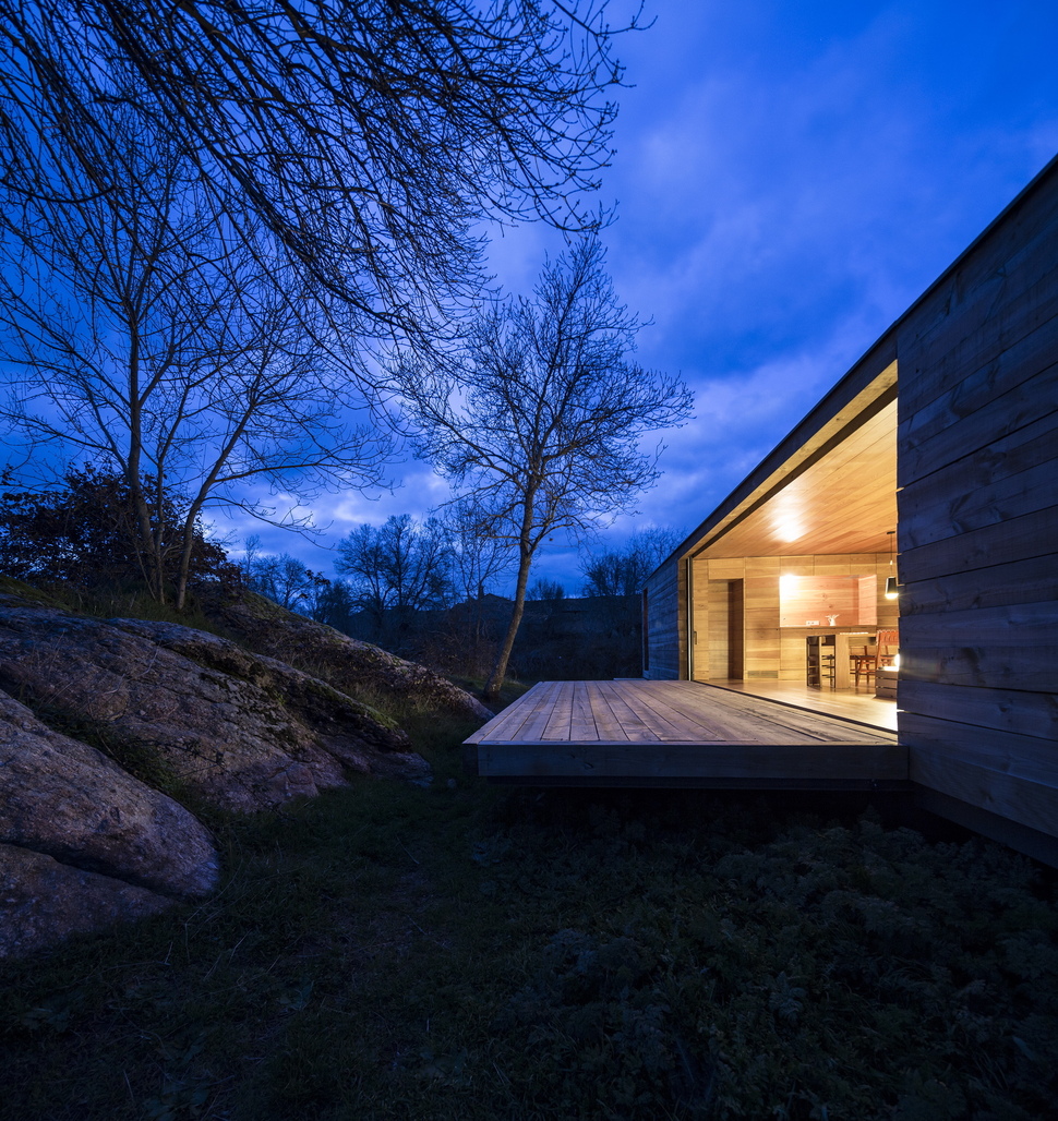
The Western exposure looks out to a nearby outcropping of rocks, moss, brambles and ancient ash trees.
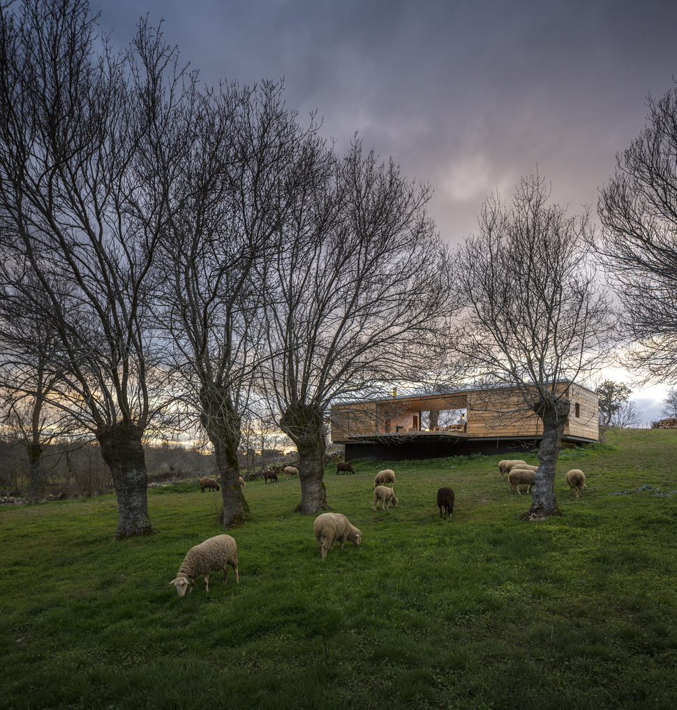
The eastern view travels over pastures – and sometimes grazing sheep – to the yellow mountains in the distance.
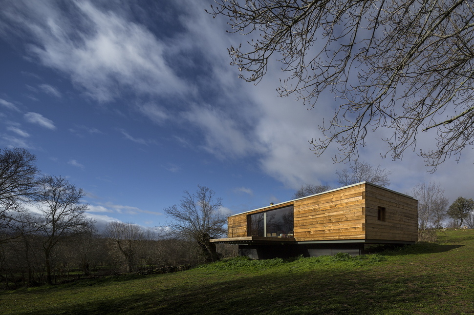
The double view within a neutral surround became the theme for the yellow muse and everything else evolved around these concepts.
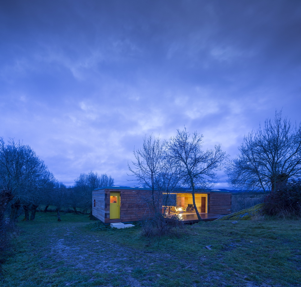
The finished B House stays true to the concept of a neutral building that allows the shades of nature to rule supreme – with the exception of the roof chimney and the entry door. Here, homage has been paid to the colour muse and at the same time the bright yellow door allows the entry to the cabin be a focal point easily seen from a distance.
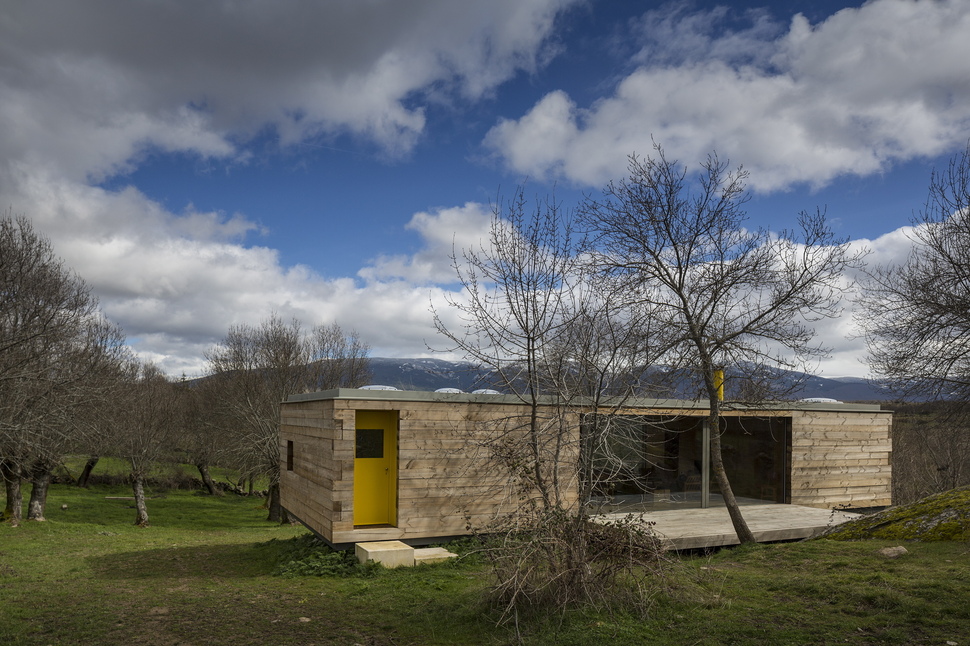
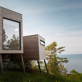
The naturally weathering wood clad exterior creates a soft backdrop to both the landscape and to the bold and bright entry door.
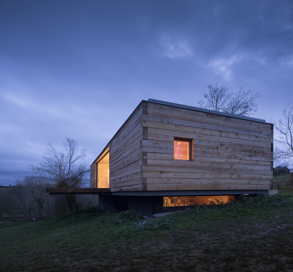
The construction of the wood siding is kept to a simple 4×4 box joint in keeping with the mimimalist silhouette.
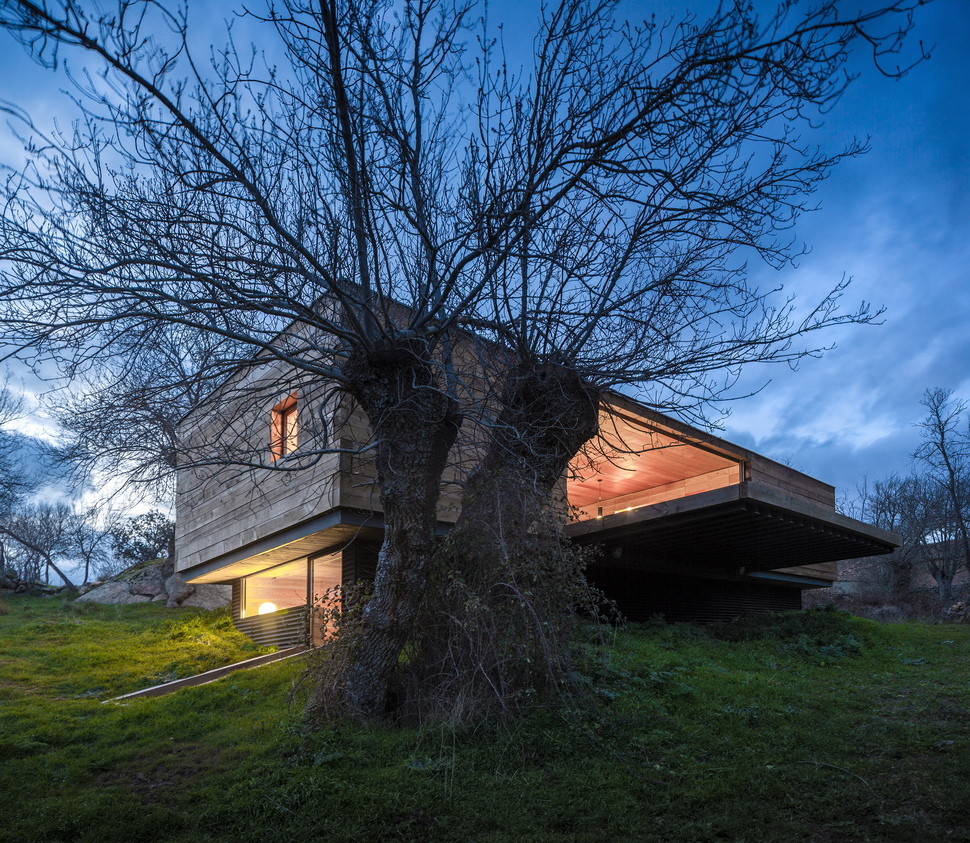
The upper volume of the house expands beyond the footprint of the lower level and in keeping with this profile, both east and west decks also cantilever out.
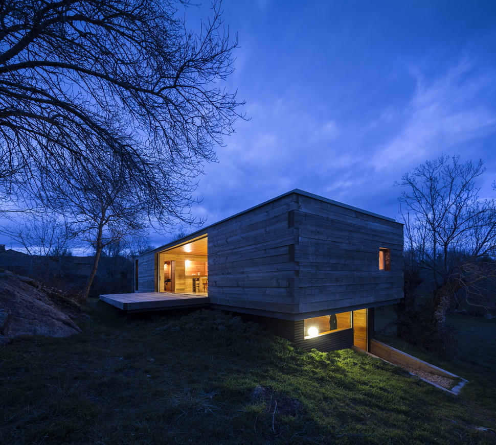
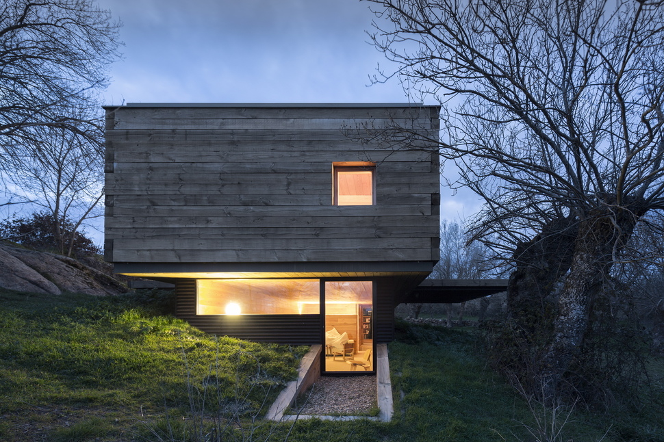
The lower volume has its own entry / exit point cut into the slope.
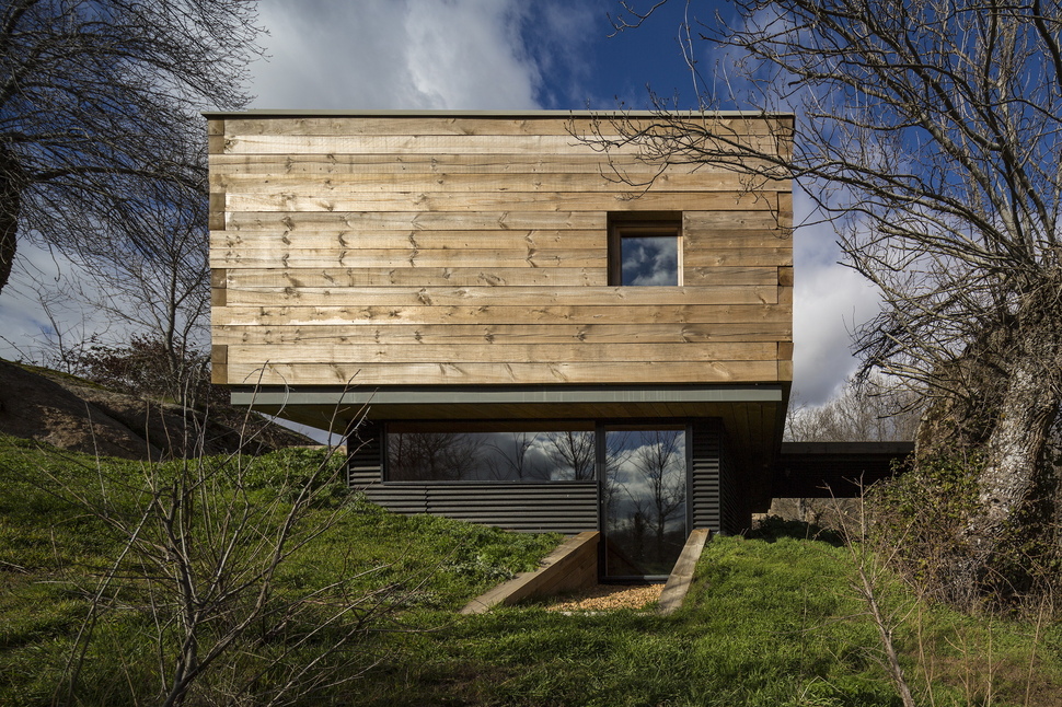
Short retaining walls ensure the slope does not cave into the lower volume entryway.
Inside, the lower volume is divided into two rooms with the first acting as a large family area.
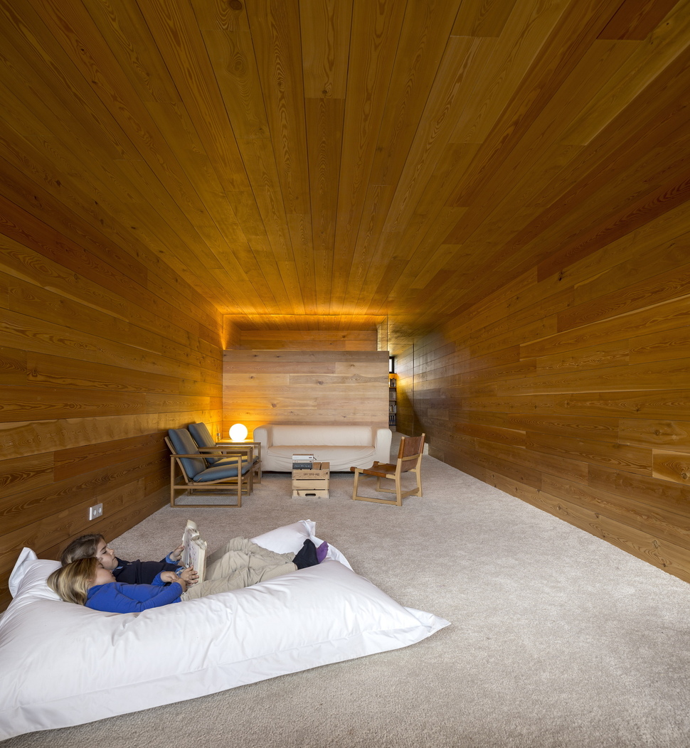
The family room is a place to hang out, read a book or simply relax. There are no views for distraction here.
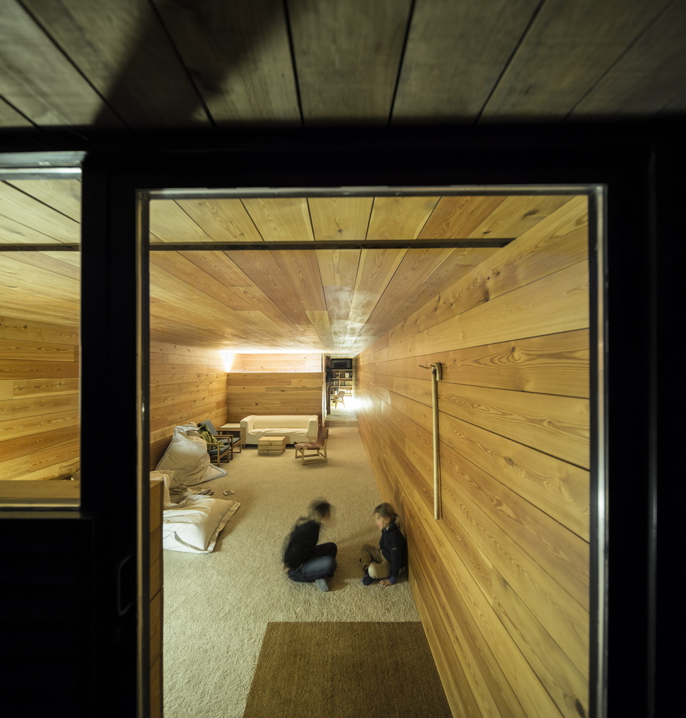
Natural light still permeates the lower level via the entry wall.
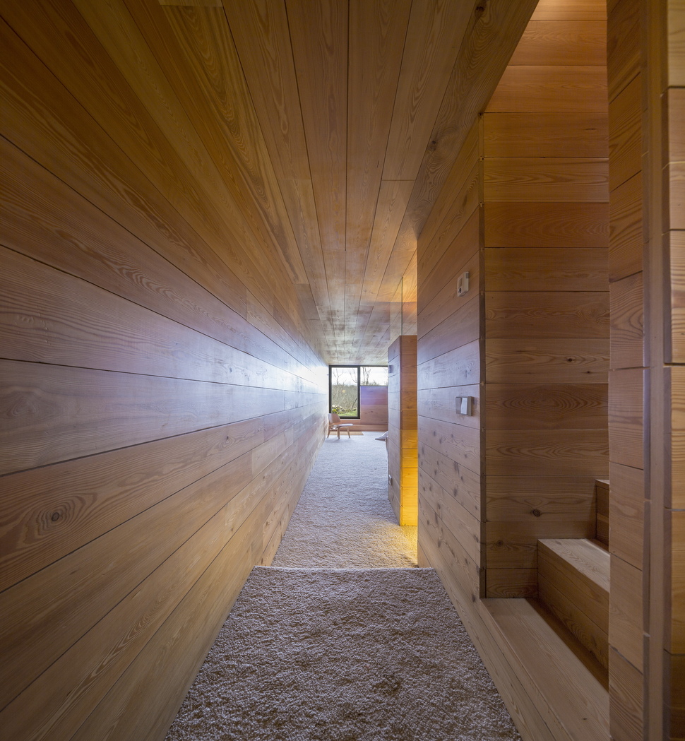
At the far end of the family room a stairwell leads up to the man level of the cabin and beyond the stairwell is the homeowner’s private office retreat.
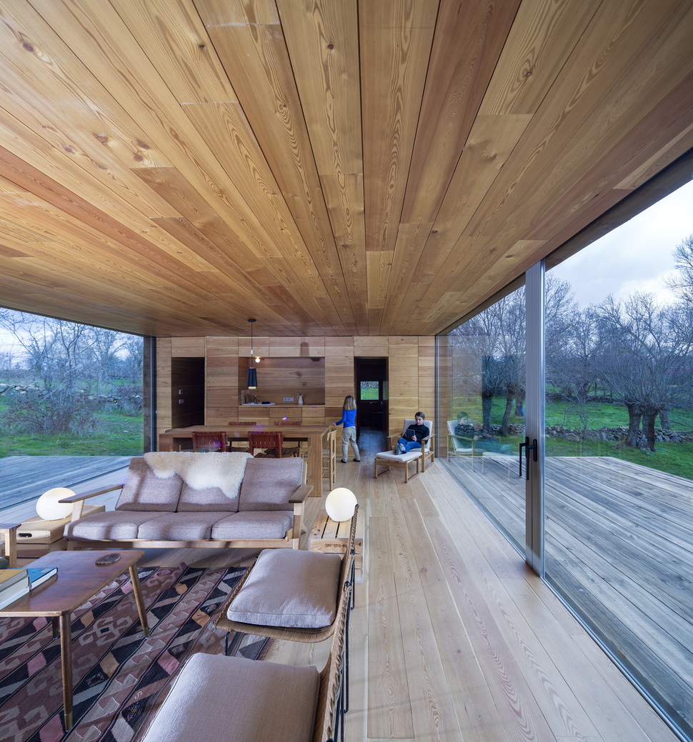
The main level is all about the views. With large expanses on either side of the social zones, it is hard to keep your eyes off the landscape.
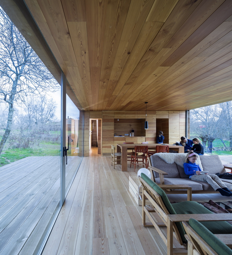
The social zone is laid out in the traditional manner of kitchen to dining to living without any architectural definition between the three areas.
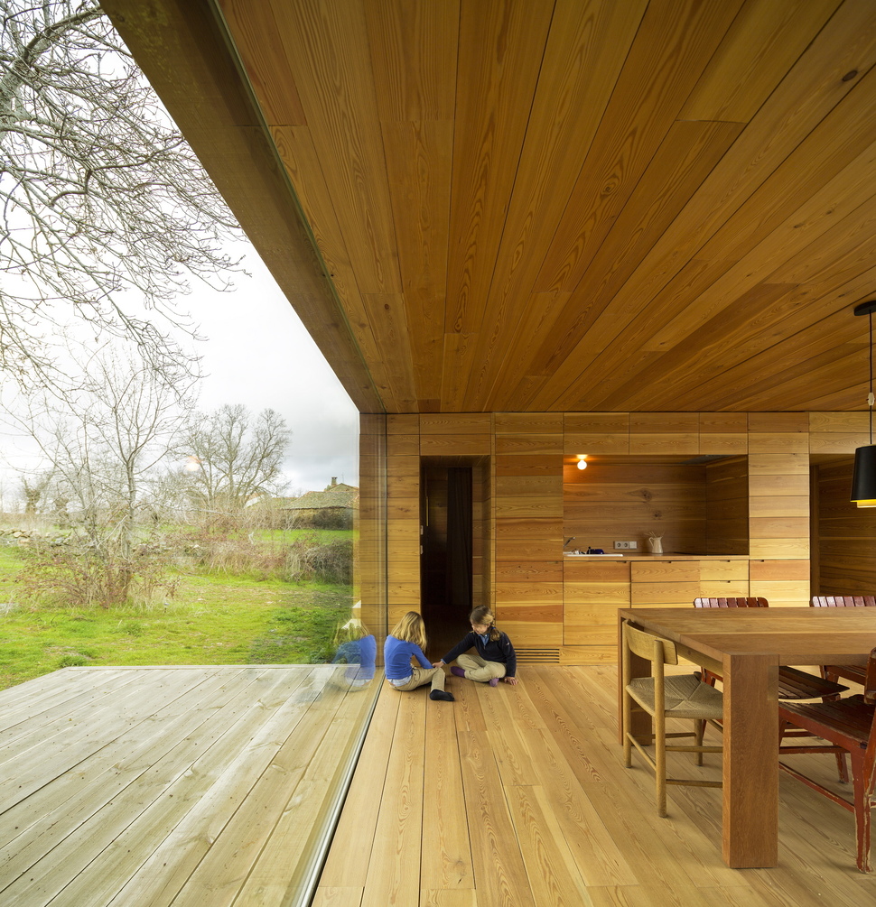
The kitchen and dining area are outfitted with cabinets and furnishings that follow the initial brief of the home being a colourless frame to the landscape beyond.
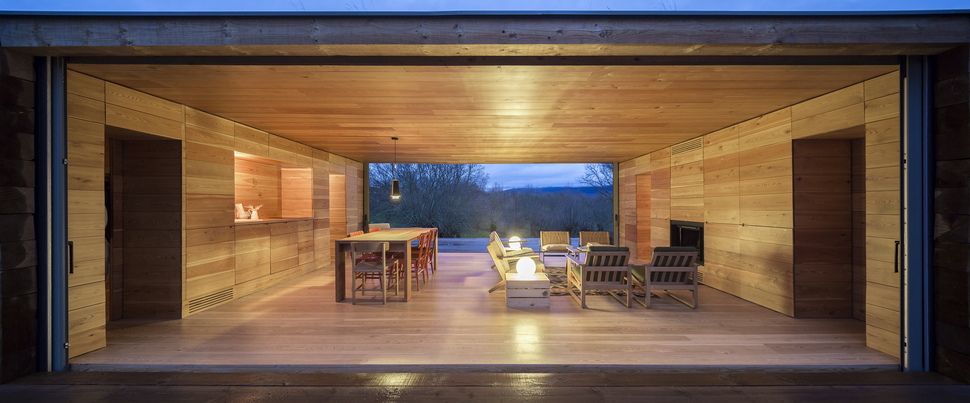
Even the fireplace wall is void of additional detail. Everything features natural wood planks and while the architect homeowners chose a non compete aesthetic, the final composition is stunningly beautiful against the landscape.s
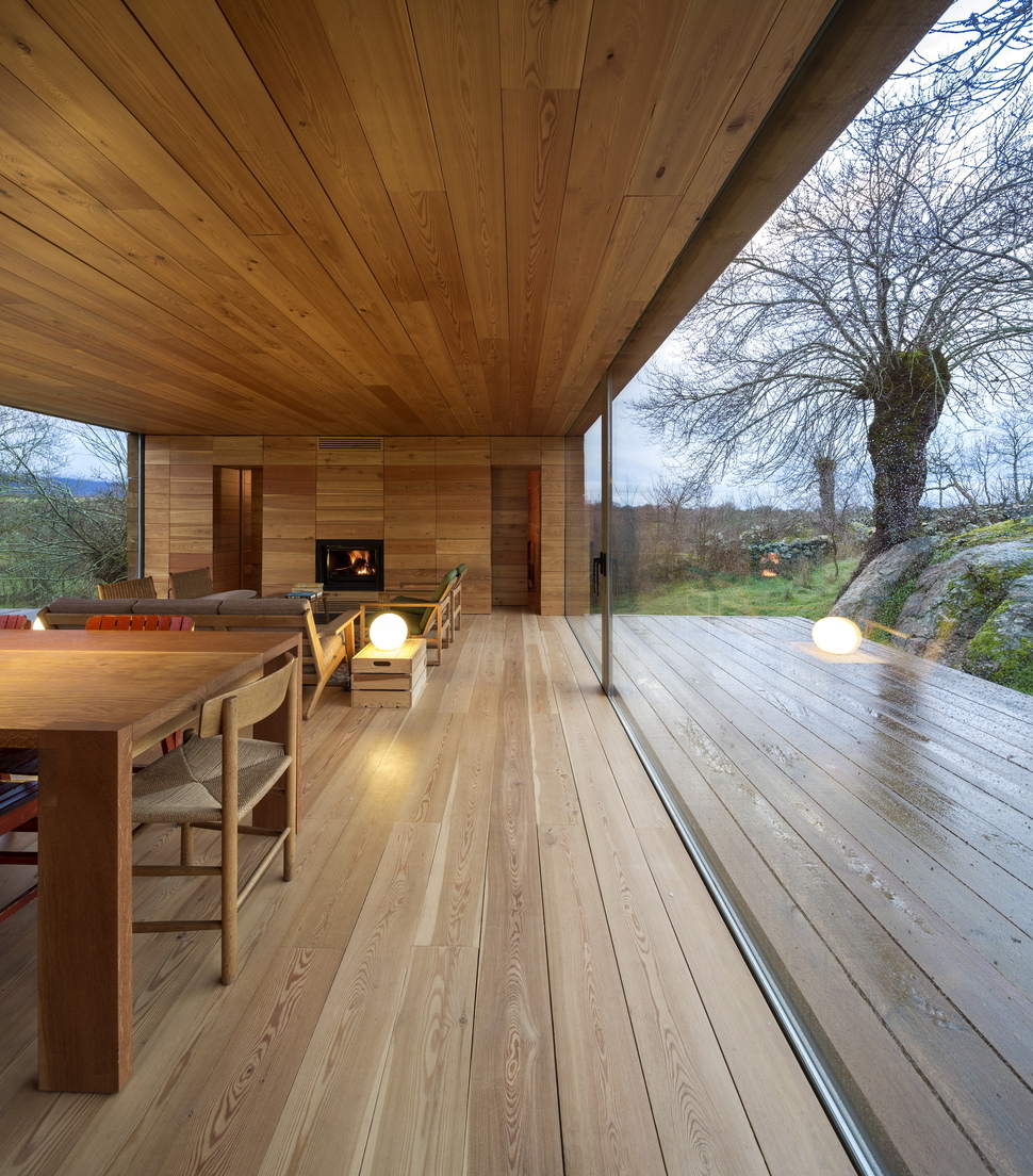
The home appears as though it is an island within the surrounding greens, blues and yellows that Mother Nature provides.
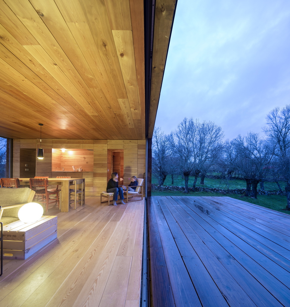
The extended living space via the decks add a functional framework to the interior zones.
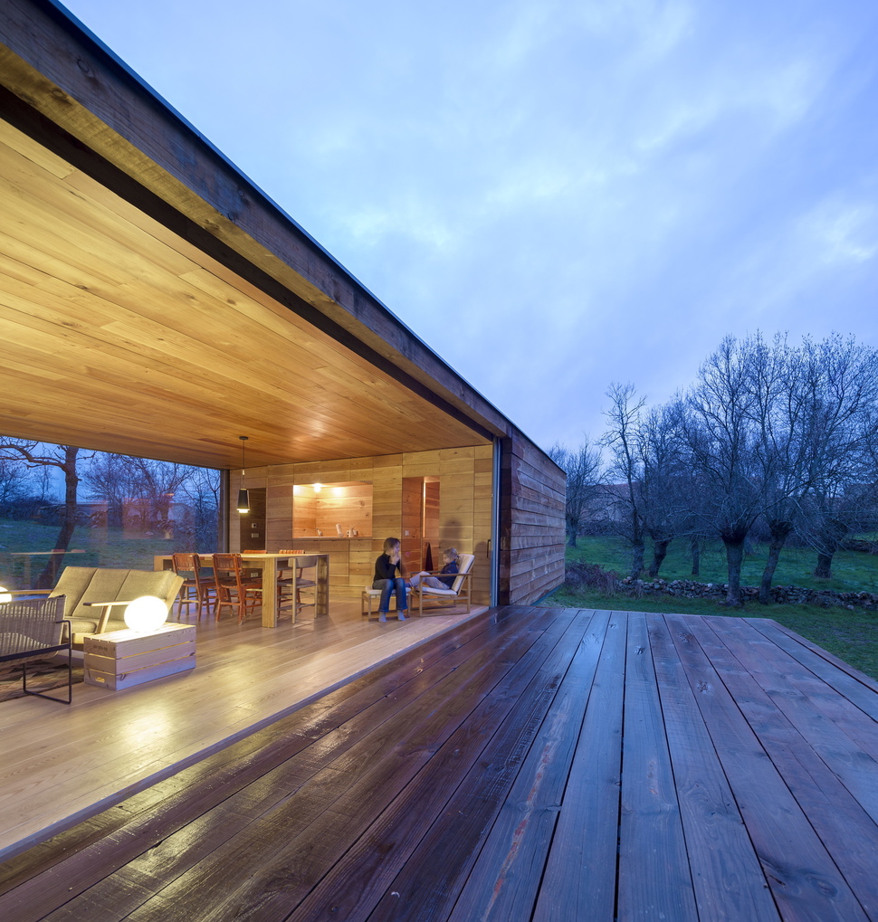
The decks run the length of the social zone without intruding on the bedroom areas.
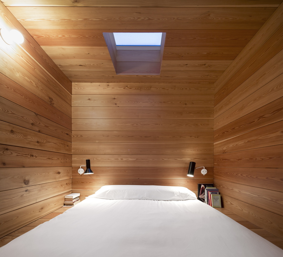
The Master Bedroom is on one end and features a skylight and one small window for natural light.
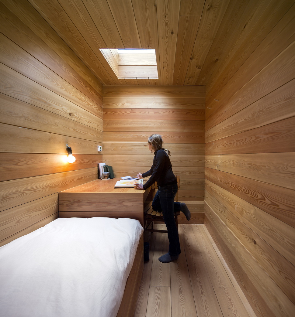
The other end of the cabin features two bedrooms, one with a single bed and desk, the other with bunk beds and desk.
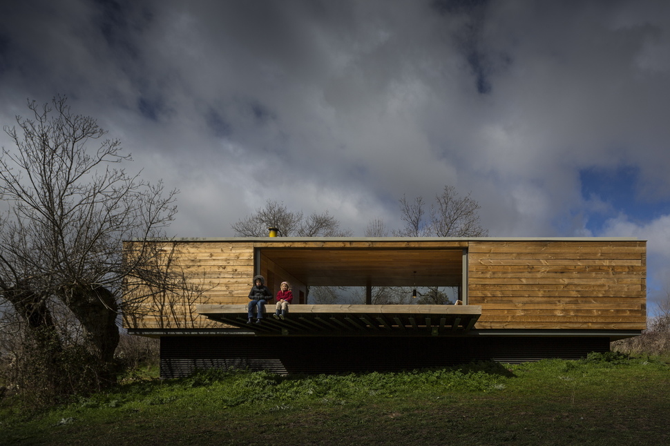
The lack of windows within the bedrooms on the long walls also creates an exterior symmetry of simplicity. The long and low profile with a central viewing corridor balanced by decks is a simplicity hard to achieve without much thought and proper planning.

While the home itself might boast a minimal cubist form, the site it sits on is an ever-changing series of complexities. From season to season the homeowners are continually surprised by the changing landscape.
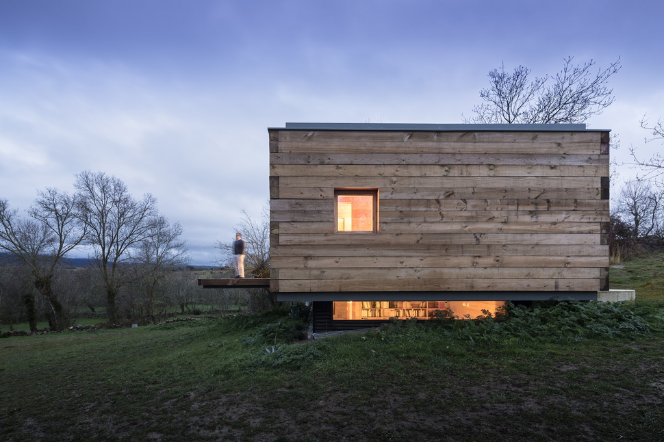
CH+QS Arquitectos
Photography by FG+SG
