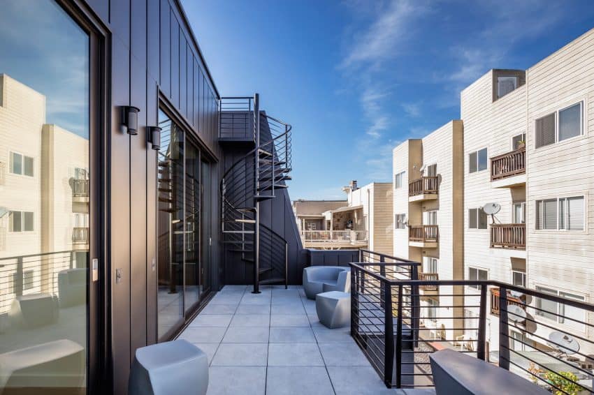
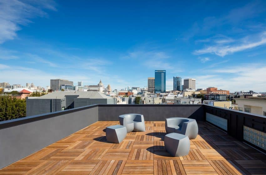
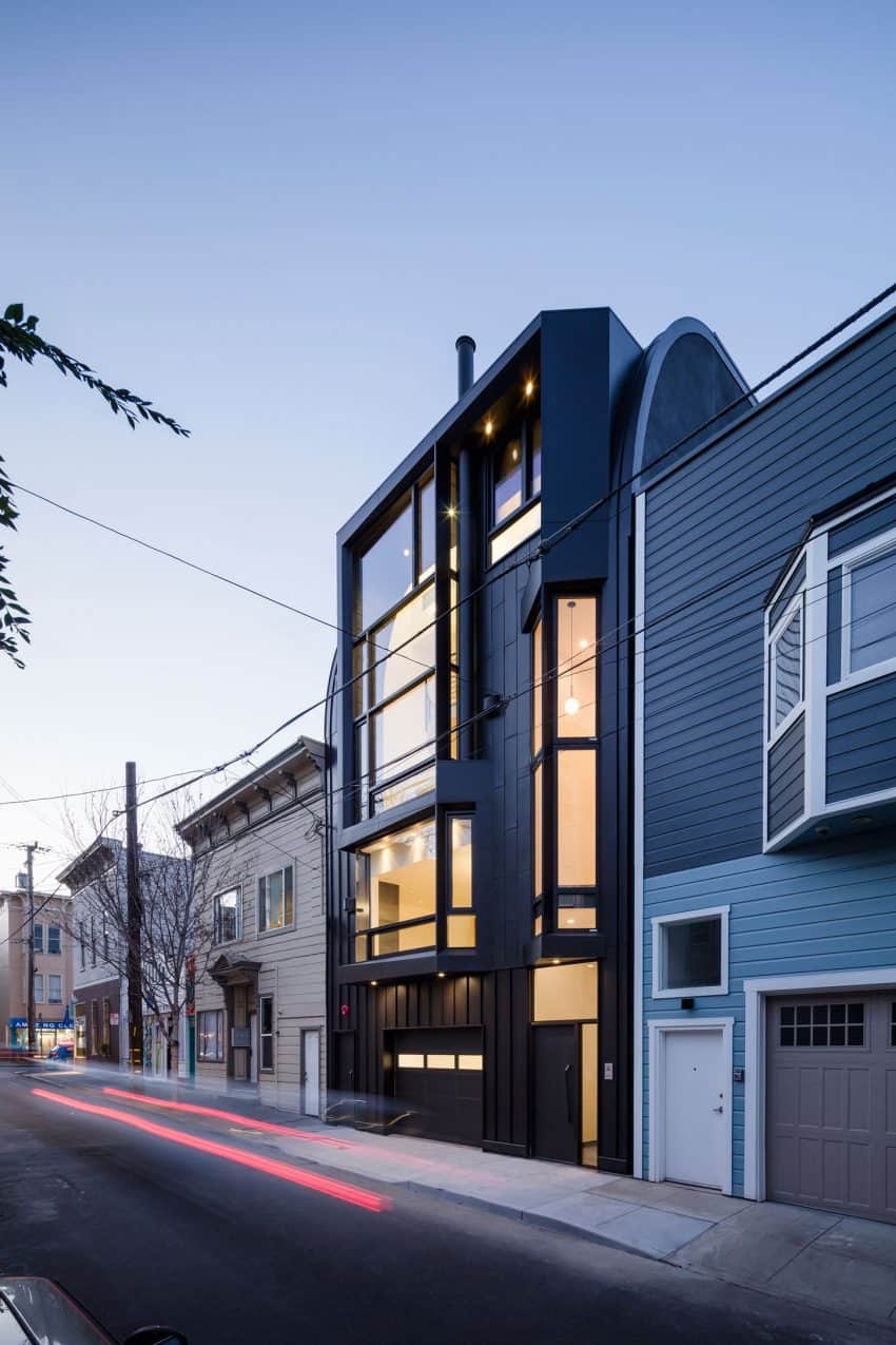
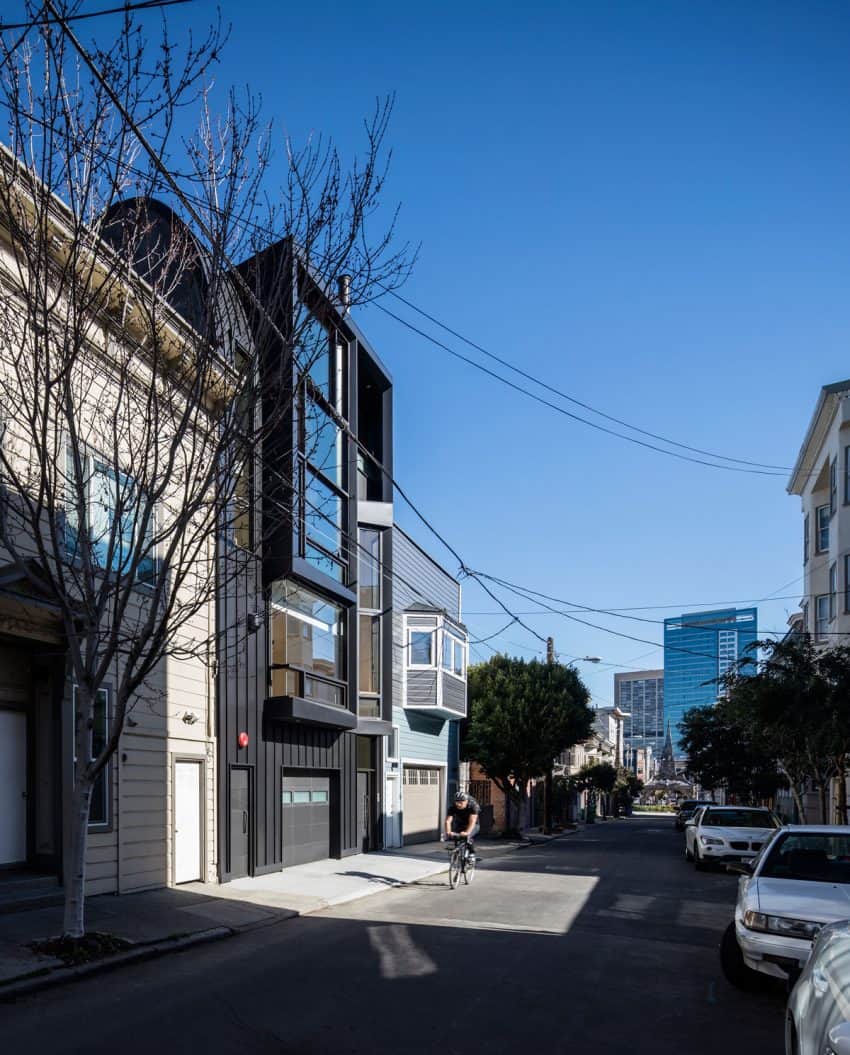
Stephen Phillips Architects break uniformity of the Linden Street architecture in San Francisco with their new complex and stylishly dark apartment building. Sandwiched between Victorian and Edwardian houses, the dark horse of a building appears like a towering stallion, attracting attention with its glossy design.
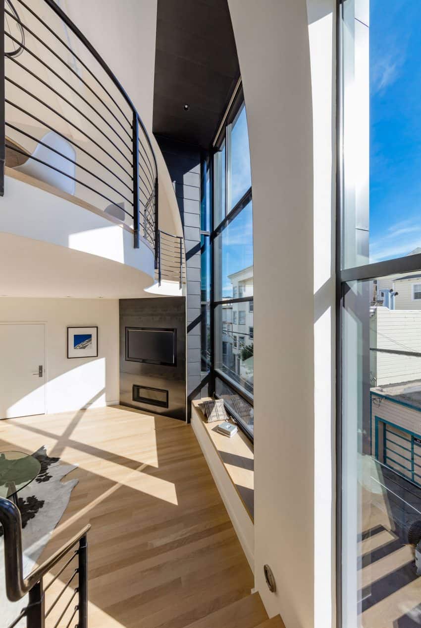
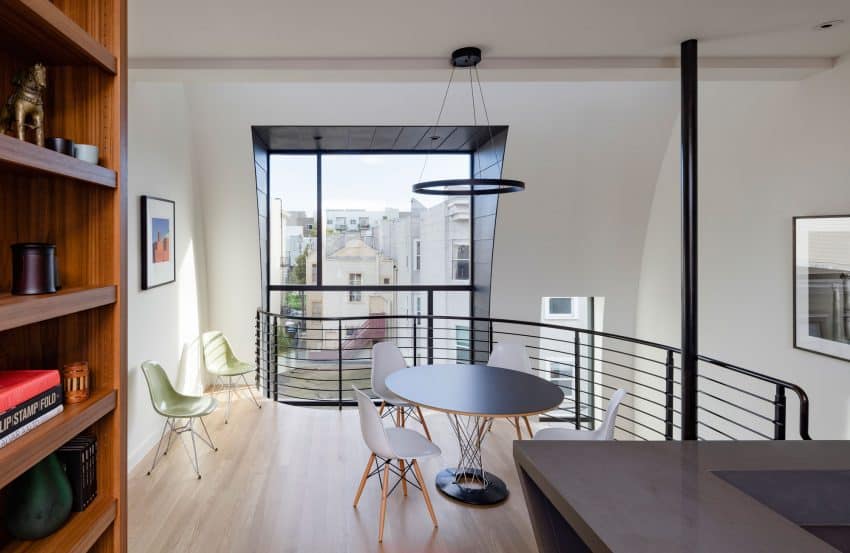
Its highly glazed façade opens up both ways, and allows residents and the city to enjoy their respective looks. For instance, the curvilinear mezzanine in the living room, visible from the top window, looks spectacular in contrast with the straight horizontal frames.
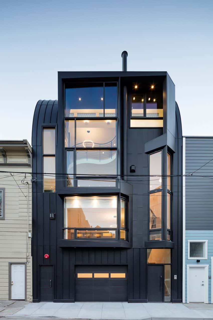
The structure of the façade creates pockets of space, and prevents the typical modern house glass box look. But it doesn’t stop at the cover. On the inside, the house continues with the complex architecture.
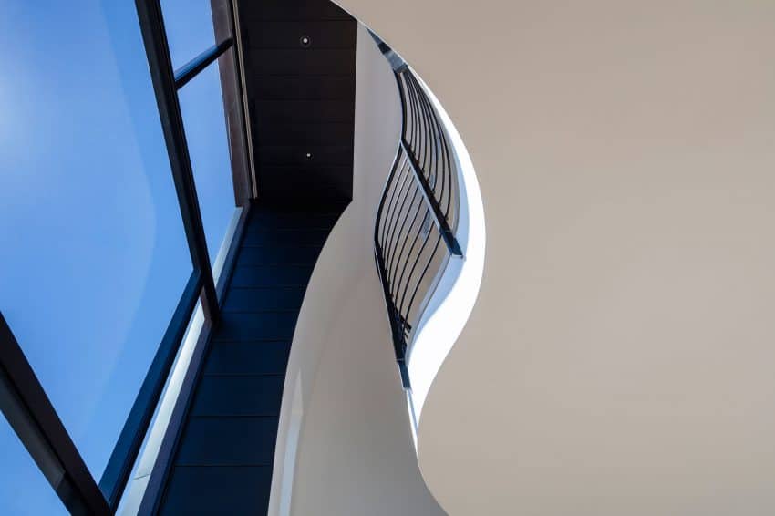
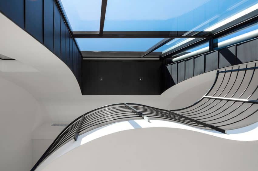
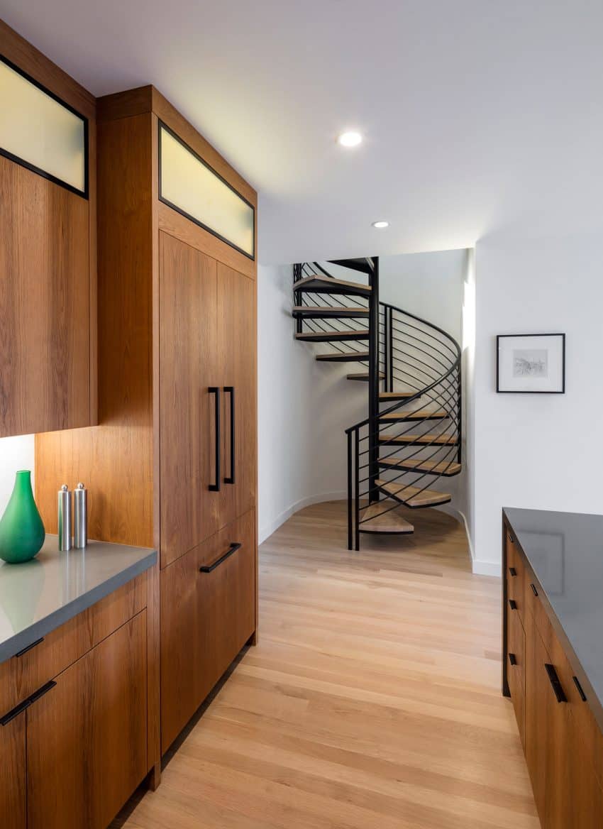
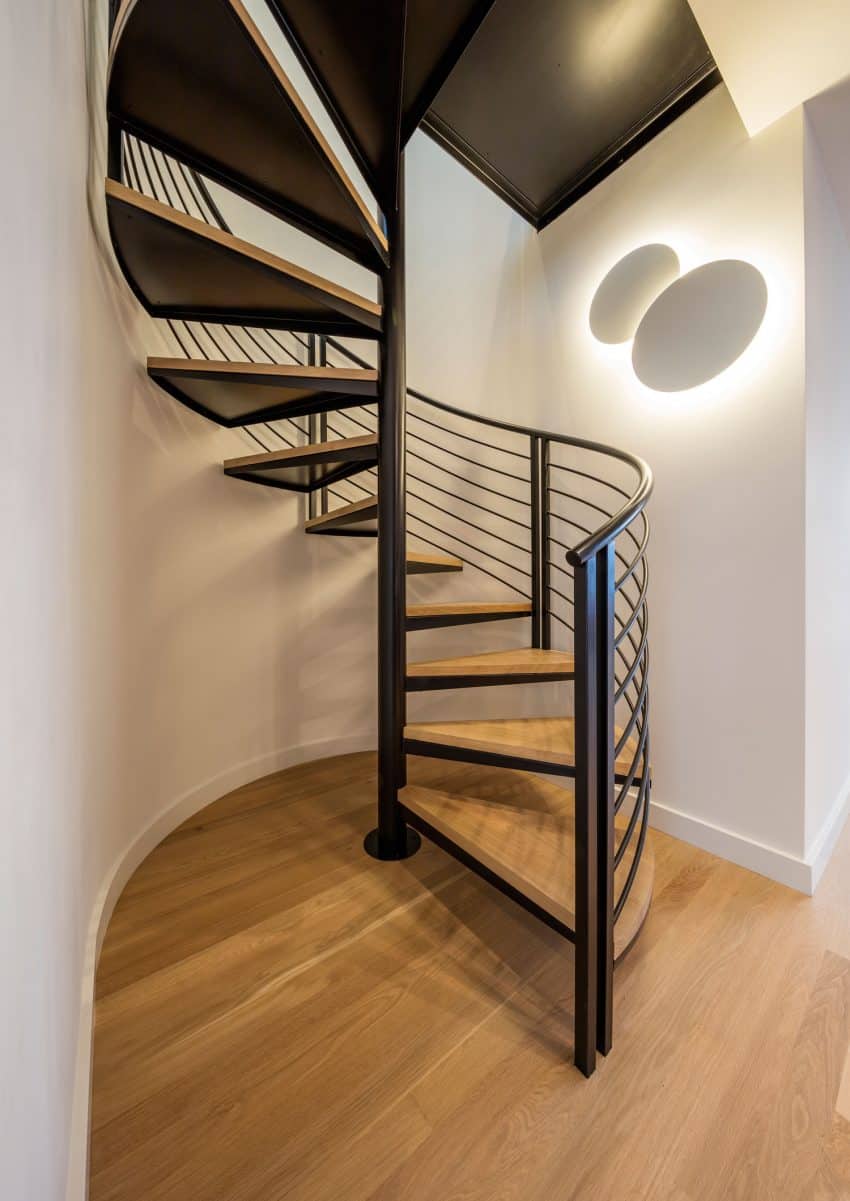
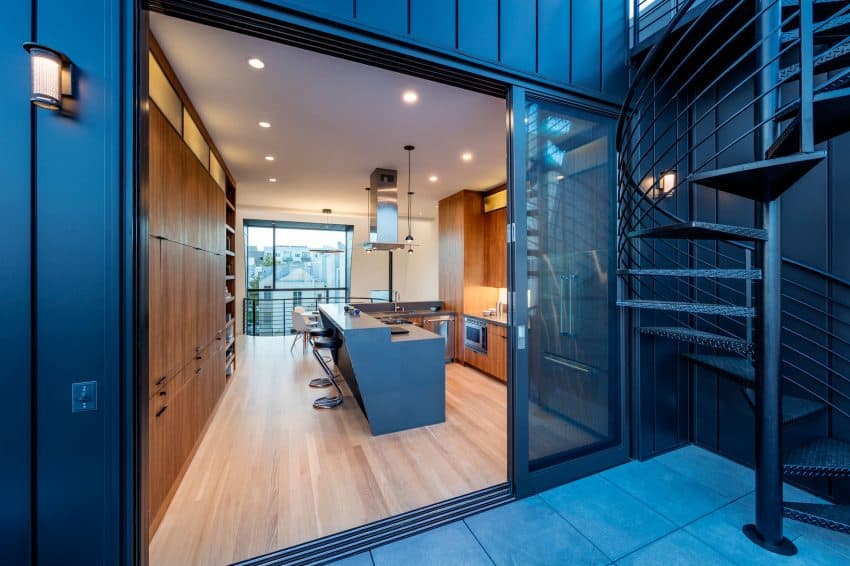
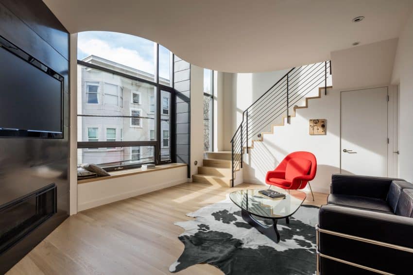
Instead of producing angles, though, it serpentines with a curvilinear mezzanine and spiral staircases. The house’s rounded elements, in turn, impact the internal structure, creating odd rounded corners.
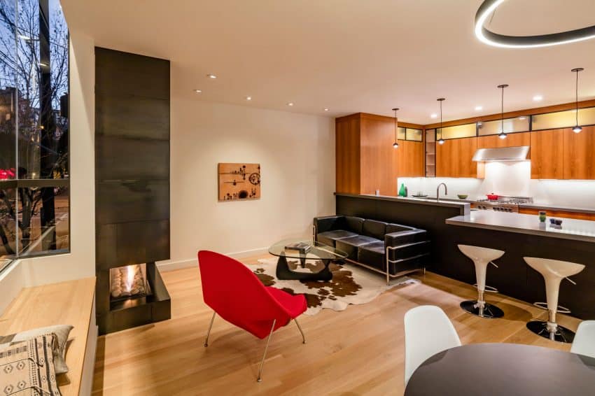
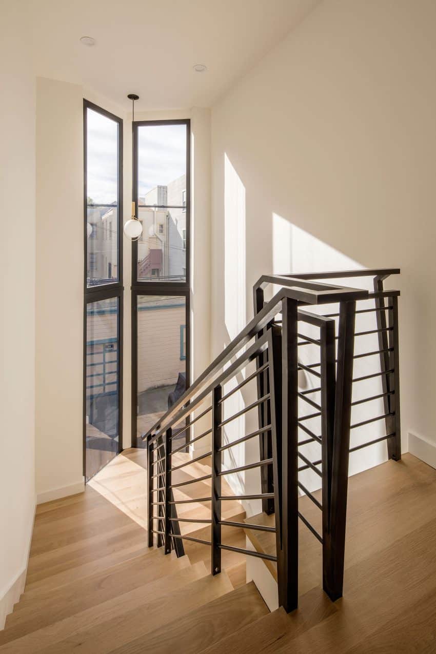
Not to interrupt the panoramic city views and cut off the sky from the first floor, the architects decided to leave some air between the mezzanine and double height windows. This also brings much more natural light into the contemporary living room.
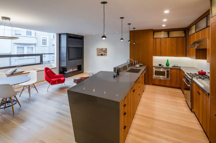
Since the building is totally black, the mostly white insides suit it very well. Even the wooden floors are finished with bleached white oak. The rare pops of color come in smallest details, but the ultimately modernist decor is very well punctuated with a red Womb chair from Knoll.
Thanks to its creative approach the building doesn’t blend with the usual Linden Street scenery. And on the inside it stays true to its looks, all the while appearing more than functional for living.
San Francisco Apartment Building on the Inside
