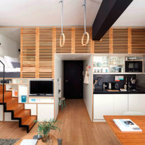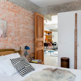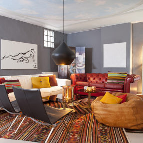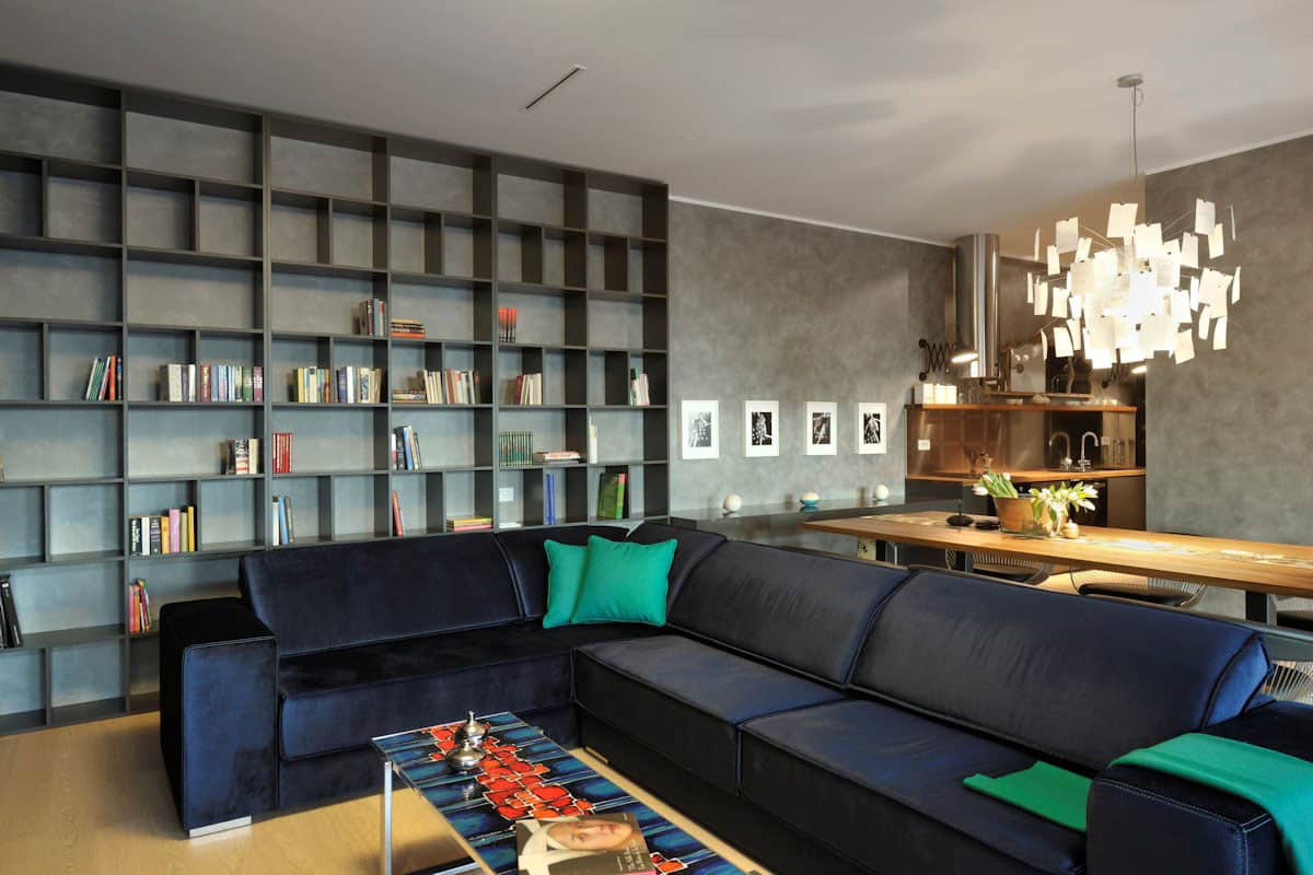
GAO Architects created a model suite within a Ljubljana, Slovenia apartment building and the final result is a fun filled dynamic interior filled with saturated colors, sculptural designs and most importantly – super functional spaces. It’s a great example of how form and function can be bold and beautiful at the same time. The idea was to create an urban, dynamic and creative space within the city and I am going on record as saying they achieved their goals 110%. I mean, just check out that coffee table – WOW.
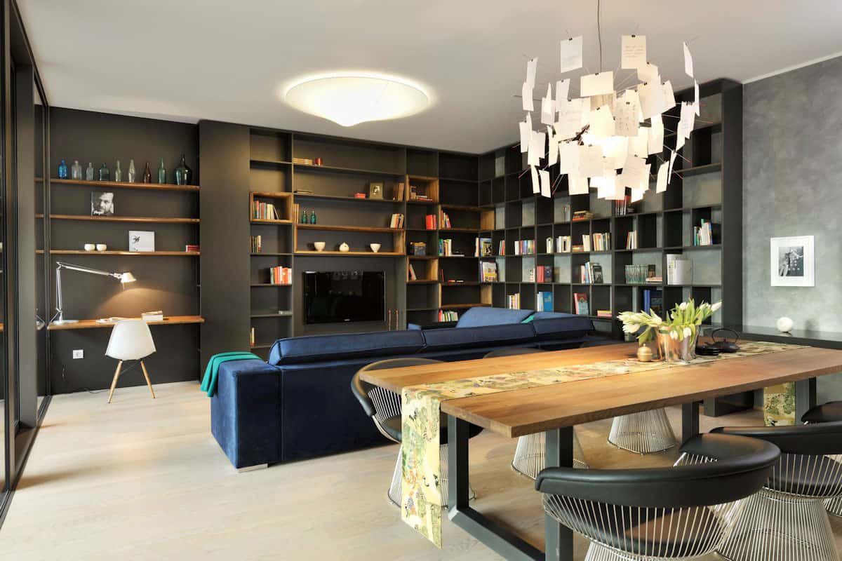
The social zone is the living room, media center and home office with the dining area right behind it. The architects could have played it safe wrapping the rooms in white walls, task specific furniture and basic lighting but instead the room is a deep multi-shade of grey with an even darker grey wall unit that wraps two walls creating tonnes of storage, a media center and a small office area. The shelving has been treated as a geometric art form with its various patterns of open shelving, the sofa is a deep indigo blue with pops of green in its throw and pills and best of all the various light choices are art for the ceiling – especially the dining fixture.
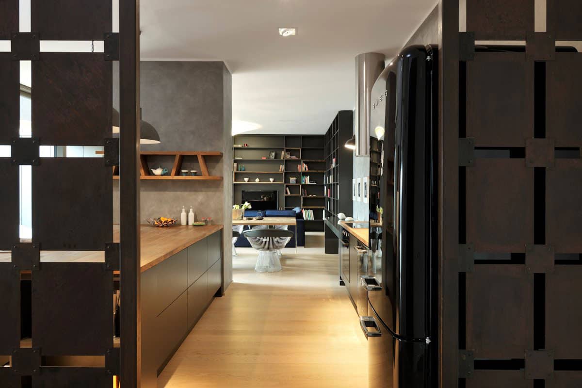
Just behind the dining area the grey shades continue in the kitchen and playing of the various greys, the architects chose to go with a black fridge rather then the standard safe choice of Stainless Steel.

Tying in with the living room decor, the kitchen features a geometric shelving unit – albeit a much smaller version and this one is natural wood rather then dark grey. I love the angular vertical supports within the shelf; they stop the kitchen from feeling too linear as does the curvy mirrors over the wall shelf, but as intriguing as these little details are the crème de la crème within the room is the peninsula and bar with its solid oak wood countertop.
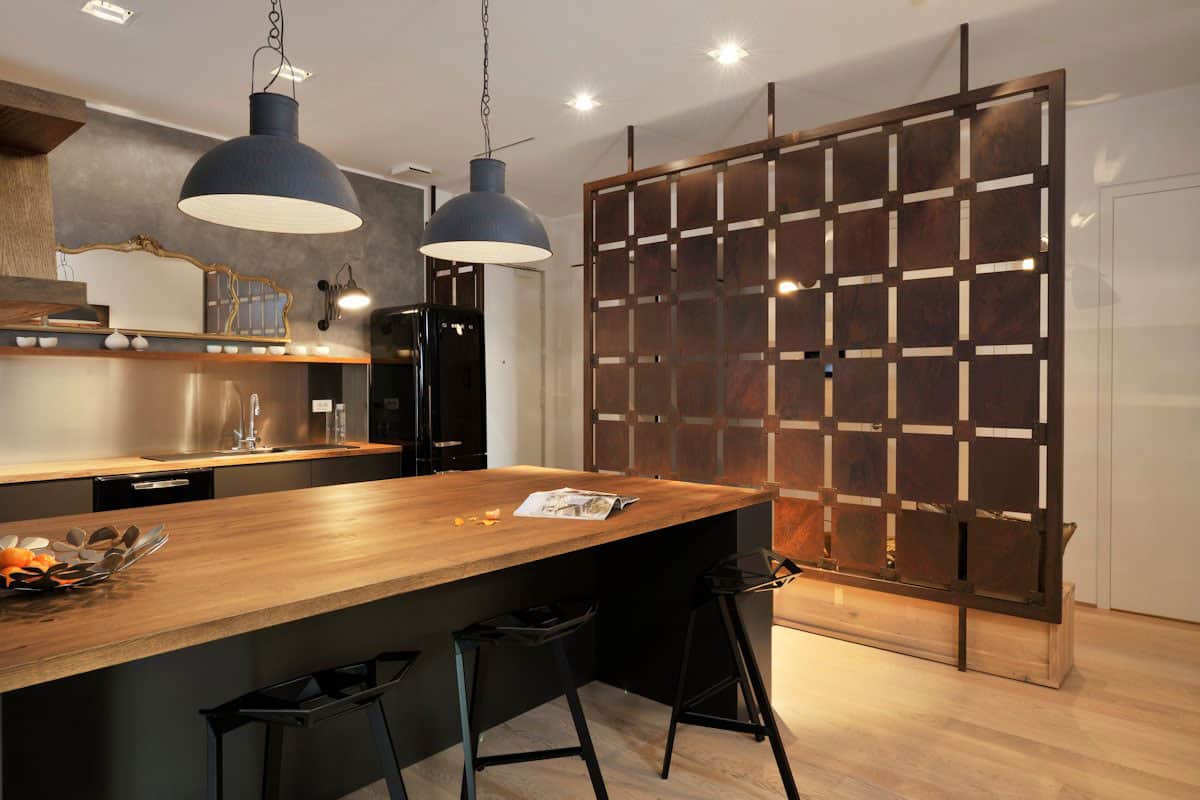
While kitchens are generally not a place to showcase art, that didn’t stop GAO Architects who chose this location to feature a stunning piece of metal artwork that just happens to be a functional room divider for the hallway and by painting the hall white, the voids within the screen pop big time. Did you notice that the wood bench behind the screen? With all the drama it sneakily disappears from sight.
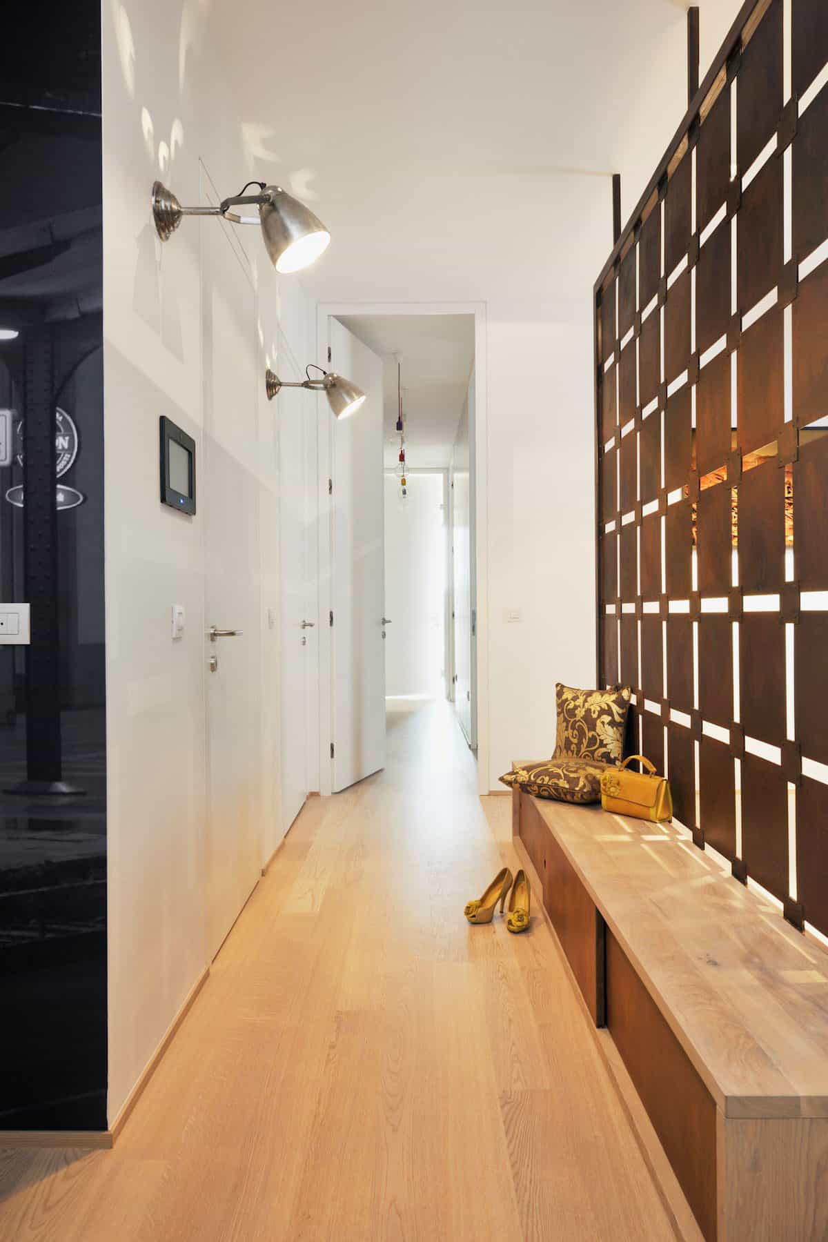
The bench behind the metal screen creates extra storage and a comfy place to sit down when removing or putting on shoes and the architects smartly set the screen back into the kitchen so that the bench lines up with the hallway wall rather then protruding into the hall.
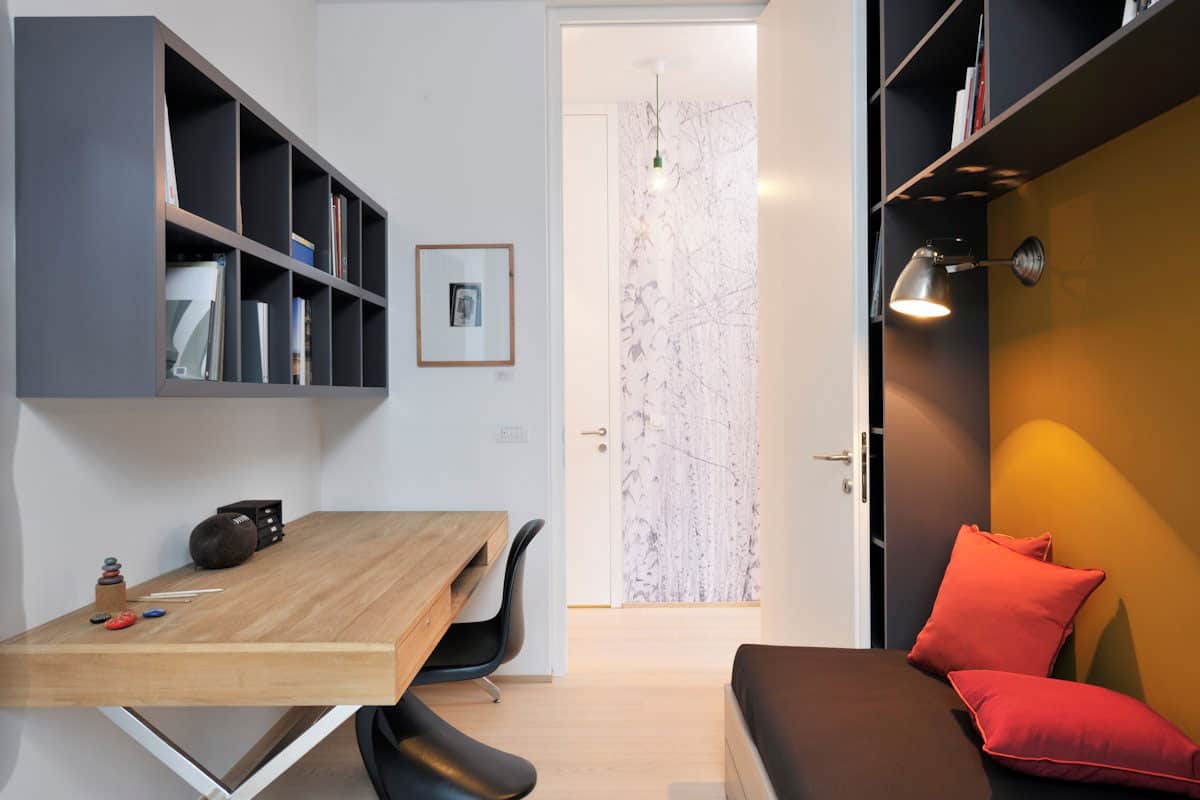
The hall has 4 white doors leading to 2 bedrooms, an office/guest room and a bathroom. The rooms are small but are designed to maximize the available space such as how in the office both the desk and the backless couch are tucked beneath shelving to maximize storage and then the room is livened up with a yellow wall, rose pillows, a beautiful trestle desk, the black Pantone chair, a punching bag just out of sight – and when the door is open the super fun Birch tree wallpaper in the hall.
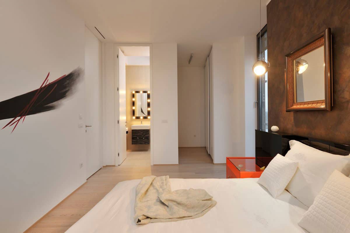
Other then the headboard wall, the master suite showcases a white on white scheme that is then injected with a blast of orange via the bedside table and slashes of red through the wing painting on the wall.
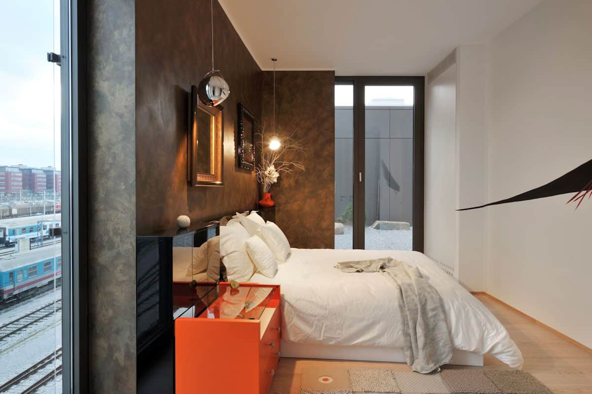
The wing painting is done right on the wall and adds such an interesting dynamic from the vantage point of the bed itself – I love how it tapers down to and around the corner, so simple, so effective.
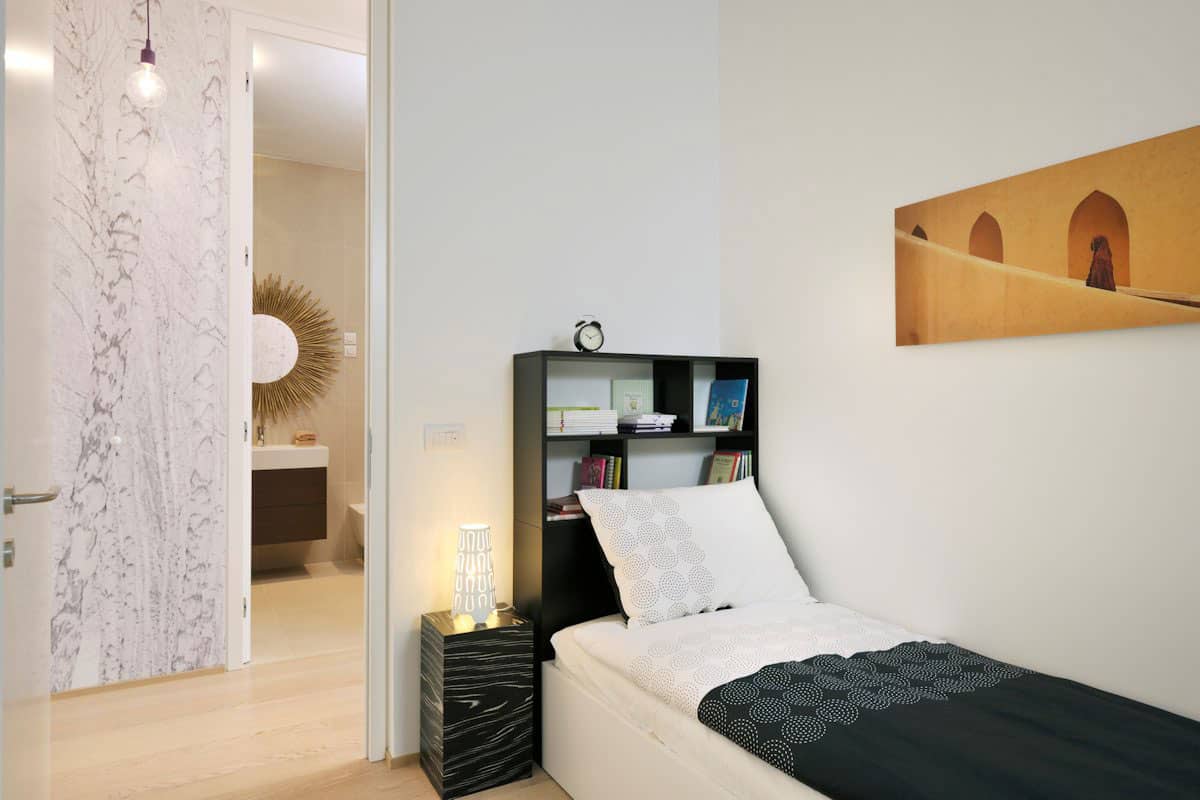
The second bedroom is right across the hall from the main bathroom and although it is small, it is still filled with exciting design features from the black and white wood look side table to the photograph by a Slovene photographer, it also has a small desk area and a suspended chair – both just out of sight.
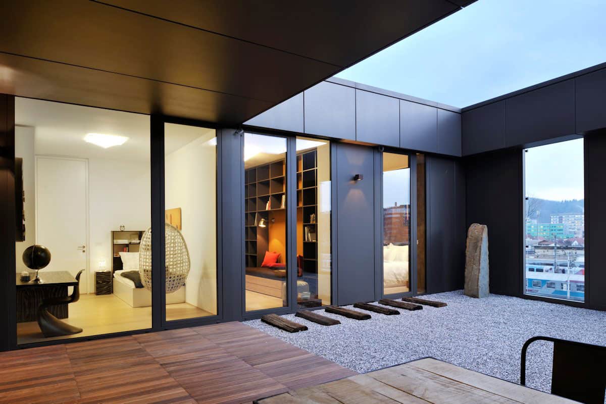
Both bedrooms – as well as the social zone – open up to an atrium complete with a covered outdoor dining area, an open sky area for enjoying a view of the stars at night and windows within the solid surround for enjoying the city skyline as well as the Ljubljana castle in the distance.
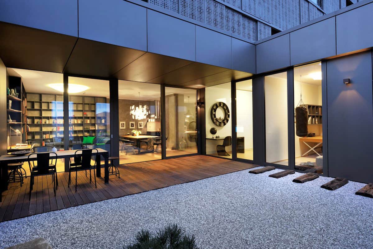
The atrium design was based on minimalist Japanese gardens with a little bit of upcycled rustic chic layered in via the old wood railway tracks. The combination is a perfect compliment to all the classic and contemporary vignettes chosen throughout the interior zones. This is an awesome model suite, it really shows what you can layer in artsy elements while still focusing on the function.
GAO Architects
Photography by Miran Kambic
