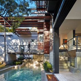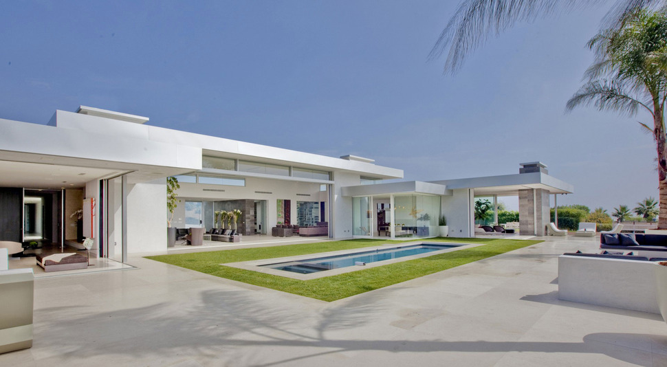
Located in Beverly Hills, California, USA, the Beverly Hills House was a preexisting 70s contemporary home limited in design by the materials of the era. The current homeowners hoped that McClean Design could open their home to the views with large expanses of glazings and at the same, while the home was undergoing its transformation, increase the number of bedrooms within the residence. The architects took on the challenge and the final result is a modern home of stunning modern aesthetics such as the graphic element of wrapping the pool first in a surround of concrete, then in a matte of grass and finally in a frame of more concrete. The simplicity of the design allows the saturated shades of the blue water and the green grass to sing.
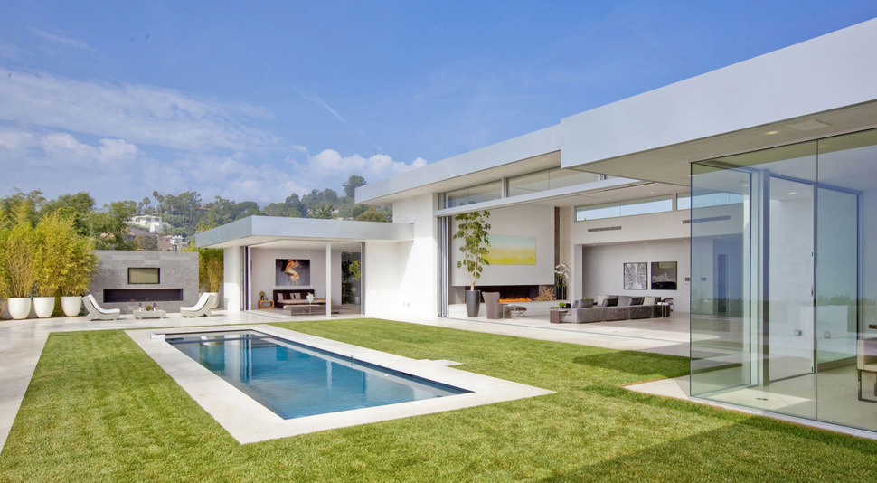
As beautiful as the pool is, the outdoor fireplace and the covered lounge area are just as stunning and all three zones create the perfect backyard retreat – all easily accessible from the newly installed walls of operable glazings. It’s the perfect modern day indoor-outdoor lifestyle seamlessly amalgamated into a home built in the 70s.
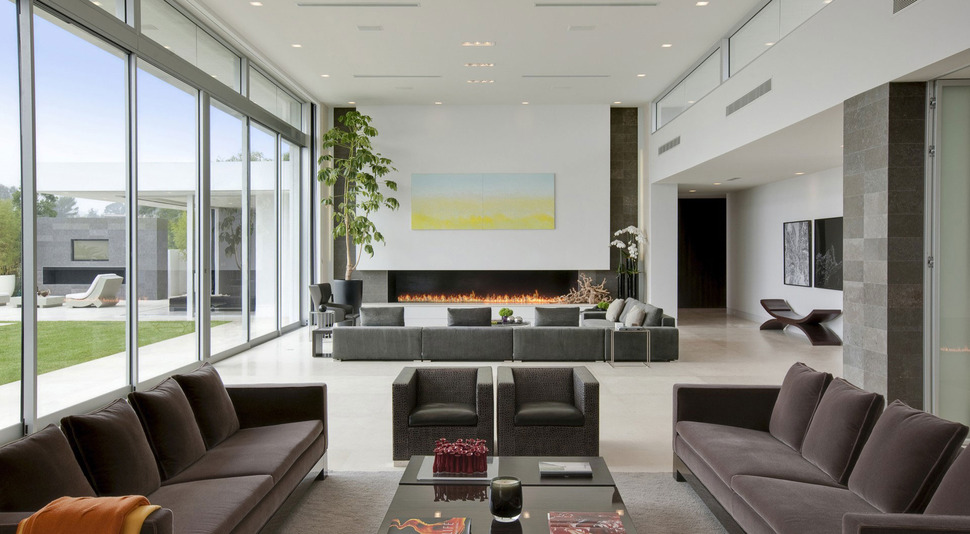
While the glazings can be opened wide for easy access to the pool and outdoor lounging areas, they can also be closed up on those not so hot days, and when the temperatures get chilly, a long, linear flickering of flames within a contemporary fireplace takes centre stage.
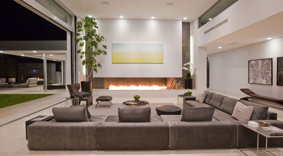
With both the outdoor and indoor fireplace lit, the evenings take on a magical aura further emphasized by the ceiling lights both inside and out and with the glazings opened up the transition to each zone is effortless.
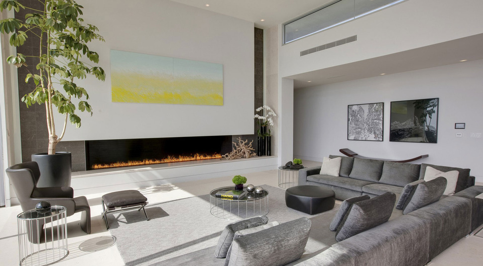
The choice of low and linear fireplaces, and uncluttered walls allows the homeowners to showcase their art collection and by keeping the upholstery to a soft grey hue, the amazing yellow landscape above the fireplace is allowed to triumph over the room.
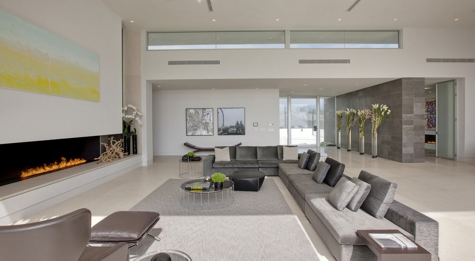
Just past the living room is the main entrance lined with 4 floor vases filled to the brim with flowers backed by a stone tiled wall that travels through the glass entry in the foyer to become part of the porch’s façade. On the other side of the stone wall is the library
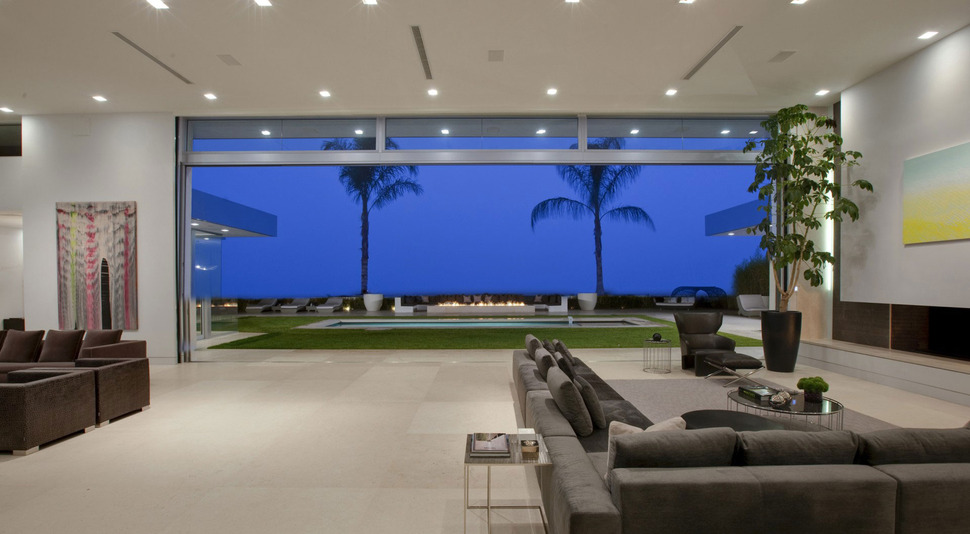
The view from the living room is of two Palm trees framing a fire pit on the far side of the pool – beautiful. The living room itself is divided into two zones one facing the fireplace and the other facing a bar.
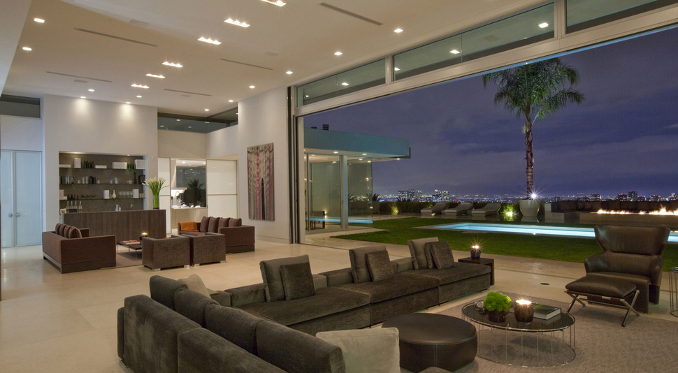
A large pathway to and from the outdoors is left between the two lounging areas, making each zone separate from each other, and yet at the same time connected.
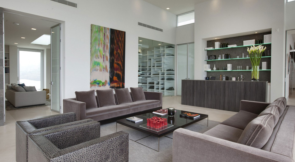
The bar is clad in a weathered look wood that picks up on the grey hues within the various furnishings and additional paintings on either side of the room bring in the wow factor both with their colours and their imagery. Take this one representing day and night; its contrasting sides are so interesting and appealing that I just can’t keep my eyes off of it, however if the architects had not filled the library behind the wall with white shelving, the painting would have been lost in the myriad of lines created by the shelving.
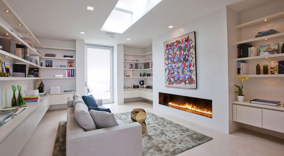
The library features another long and low fireplace with a work of art featured above. Here too, the furnishings within the room are kept neutral, but in a lighter palette then the living room. Lights on the bottom of each shelf highlight the various items displayed while a skylight in the middle of the room, surrounded by pot lights flood the space with ambient lighting. Since the library is located in the front of the house, next to the foyer, it has its own separate entrance.
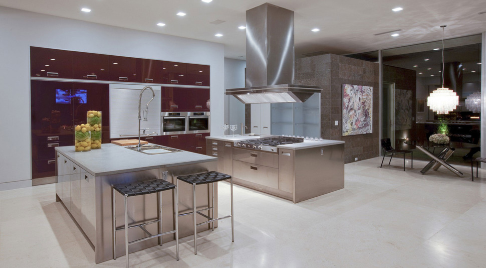
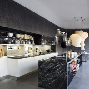
Behind the living room bar is the gourmet kitchen – a chef’s delight with its wall of cabinets, and double islands – one for the cooktop and one for the sink. Stainless Steel cabinetry on the islands and the high gloss lacquer on the wall cabinets sparkle, as does the suspended stove hood. Just past the kitchen, a breakfast nook matches the sparkle with its stunning light pendant.
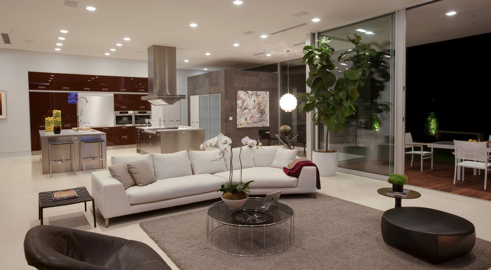
In front of the kitchen is a cozy family area and beside it is the dining room. Just outside is the el fresco dining space.
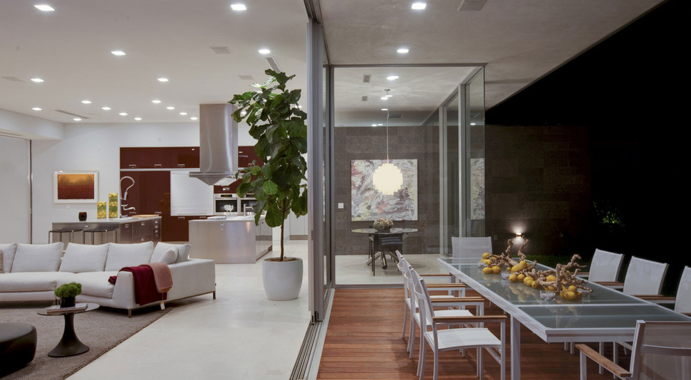
The outdoor dining area is protected by the cantilevered roofline and has a privacy wall created by the wall that backs the kitchen nook and continues on through and past the glazings.
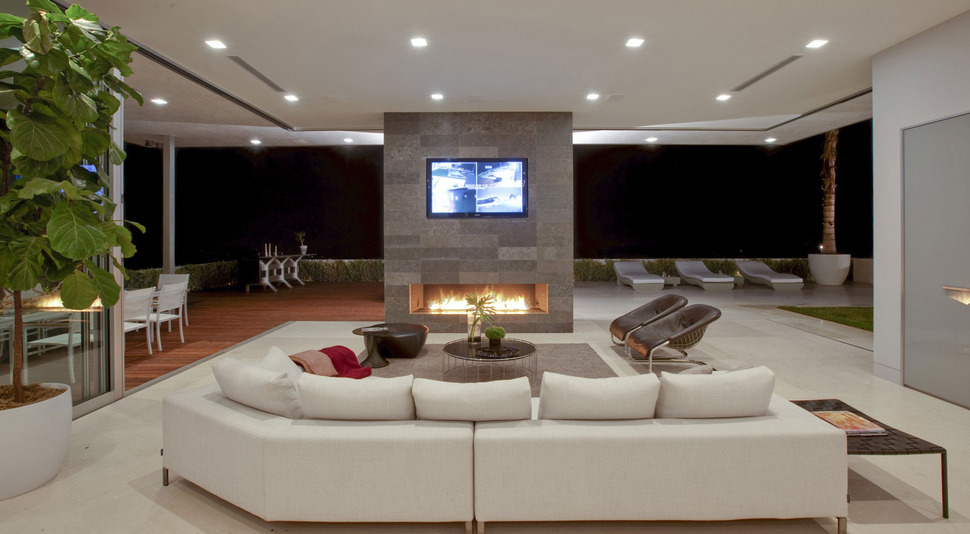
The family room is open on 3 sides to the outdoors, but the main purpose of this room is the TV viewing from above the fireplace. This is one of the few fireplaces that does not feature a work of art above it. Beside the family room in a staggered profile to the house is the dining room.
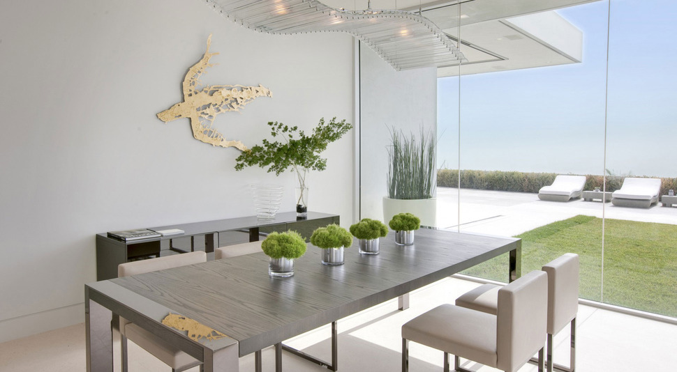
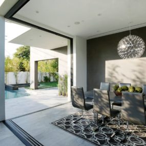
The dining room boasts an industrial aesthetic, even the sea turtle on the wall is created from sheet metal. All the lines are geometric with the only curves created by the rolling wave silhouette of the chandelier. It is as though the light represents the ocean for the sea turtle on the wall.

The staggered profile that holds the dining room on one side of the social zone is repeated on the other with the Master Suite and while the dining room opens up to outdoor day lounging, the bedroom opens up to outdoor evening lounging.
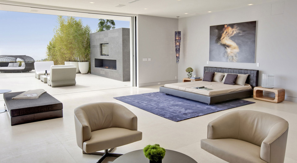
The outdoor fireplace is just beyond the sleeping zone of the Master Suite, and is the perfect place to curl up and enjoy the stars above before turning in for thenight. Of course, if it’s a beautiful night, you could always curl up and go to sleep on the outdoor bed just past the fireplace.
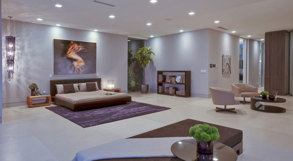
The Master Suite includes a comfortable sitting area as well as a private courtyard just down the hall.
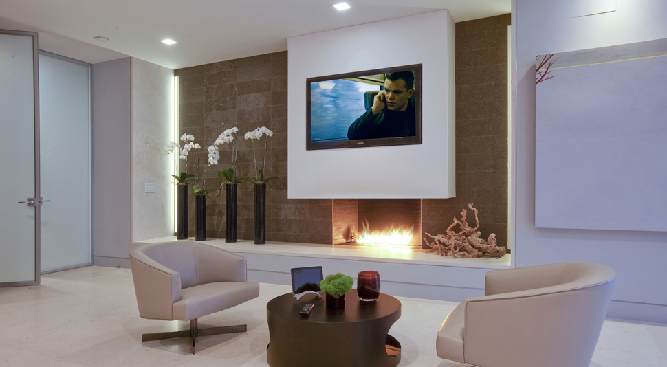
It also has one of the only other fireplaces with a TV mounted above.
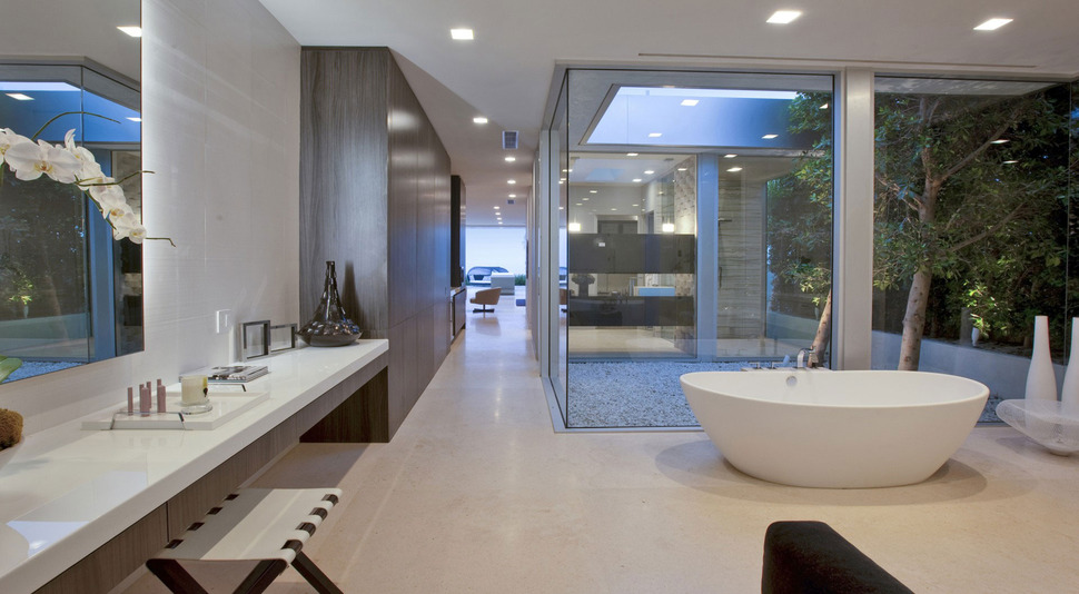
The private courtyard to the Master suite separates the bedroom from the ensuite and the hallway created by it is flanked with closet space and where the closet ends, the vanity begins.
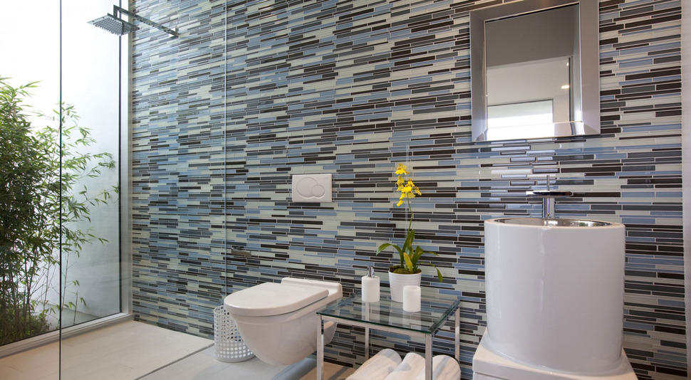
A second washroom is clad in finger tiles of varying shades of grey and the pattern is as bold and contemporary as the selection of art featured throughout the home. This washroom also overlooks a garden through a window in the shower.
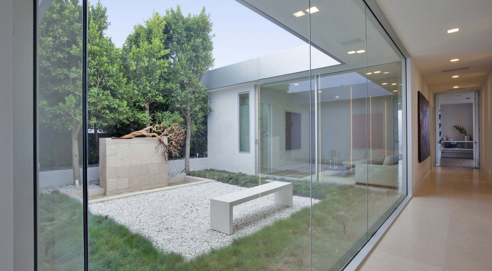
The architects created an incredible update to this 70s home by stripping the house down to its frame and then rebuilding it into a luxuriously modern residence with views overlooking the cities of Los Angeles and Beverly Hills. The homeowners are so happy with the result that they have now commissioned the architects to begin a phase two, which includes a new guesthouse, a wellness spa, elevated walkways as well as further additions to the main house itself.
McClean Design
