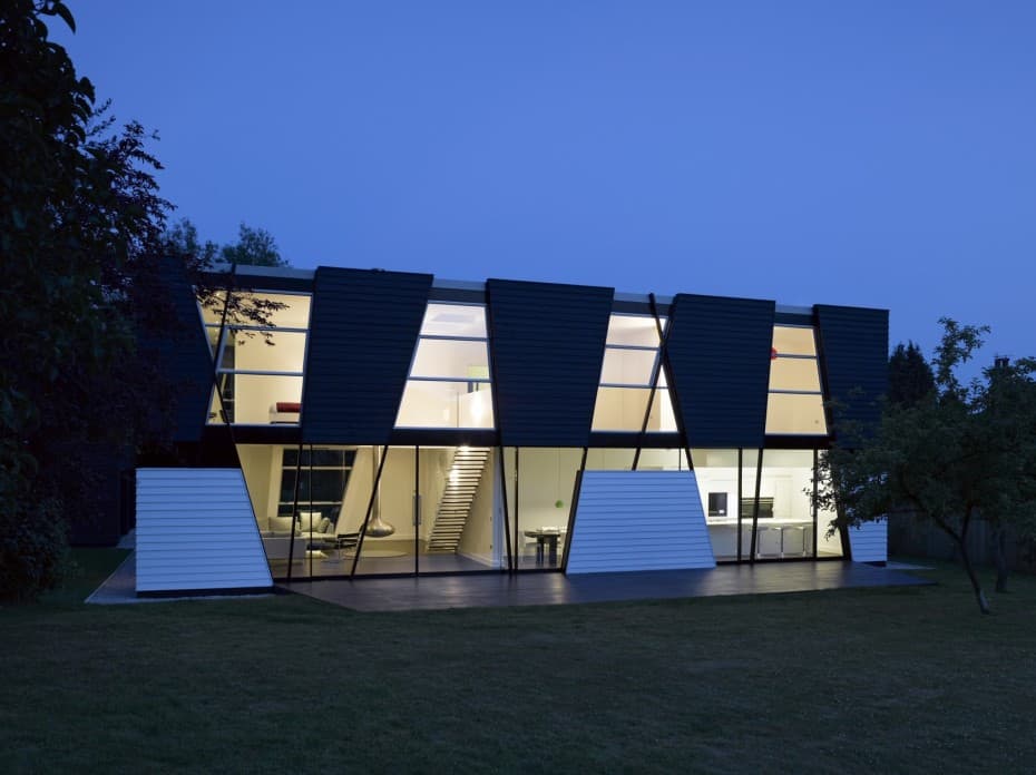
Located in the village of Sevenoaks near Kent, England, this family home makes use of the shapes created by steeply-angled upward lines along each of its faces to define rooms and spaces within, as well as to establish an external design theme. In addition to those thin black lines, other lines both black and white create horizontal definition and help to separate the two stories of the home, introducing more traditional boundaries to the vision of the contemporary house. The combination of angled and horizontal lines form the edges of the exterior siding and glass panels which make up the home’s facade, lending the planned spaces some haphazard essence.
It’s not angles and shapes alone that define this home. All over both the structure and the interior, the dominant colors are along the black-white spectrum, with few exceptions. Public spaces tend towards lighter hues and private spaces toward darker ones, but all the major color choices in the home conform to some hue along greyscale definitions. This creates both a clean, unified look and the opportunity for extreme contrast, depending on various combinations in different areas of the home. On the outside, floors are given definition with the polar opposites of white and black defining their realms; inside, the contrast is more subtly used to bring out certain aspects of a given room. The combined use of linear and color definitions characterize this British home, keeping it uniquely and elegantly modern.
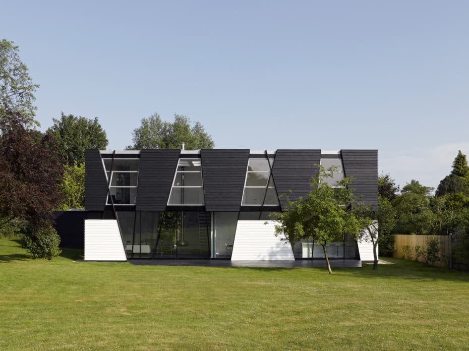
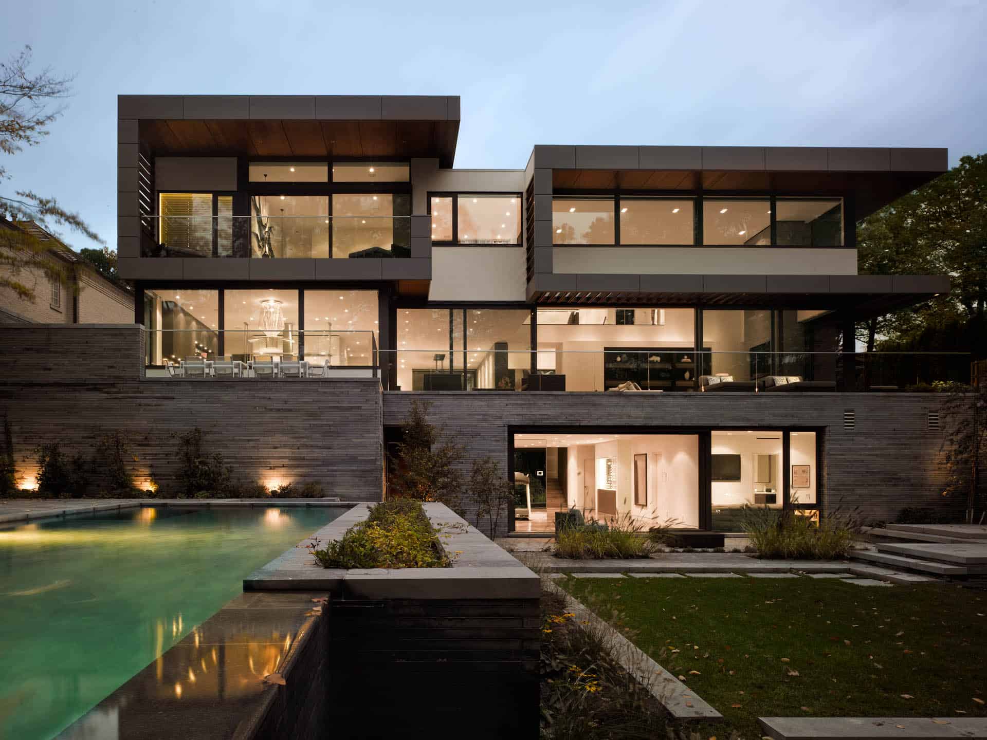
This side of the home is actually the rear, but is intended to be seen by its residents more than the front. As such, the entrance to the home from this side is more creative than that on the front, integrated into one of glass panels created by intersecting lines on the facade. Note also the use of white-lined window frames on the top and black ones on the bottom, creating an interesting and attractive visual contrast within each individual floor.
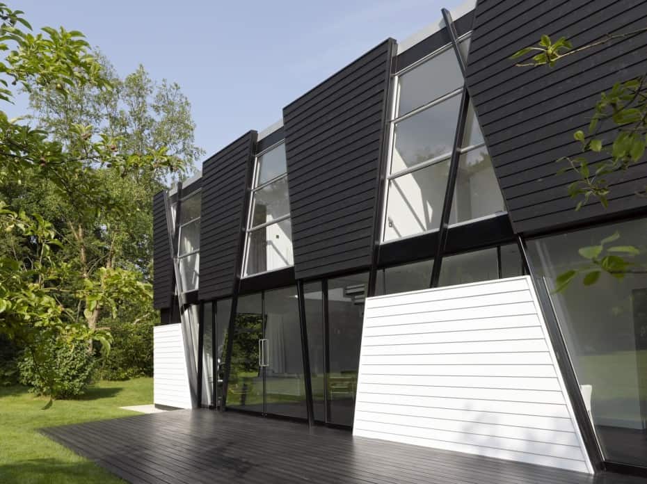
The home’s patio is black and its boards are about the same size as the siding panels on the home, extending the alternating-colors motif beyond the vertical space of the building.
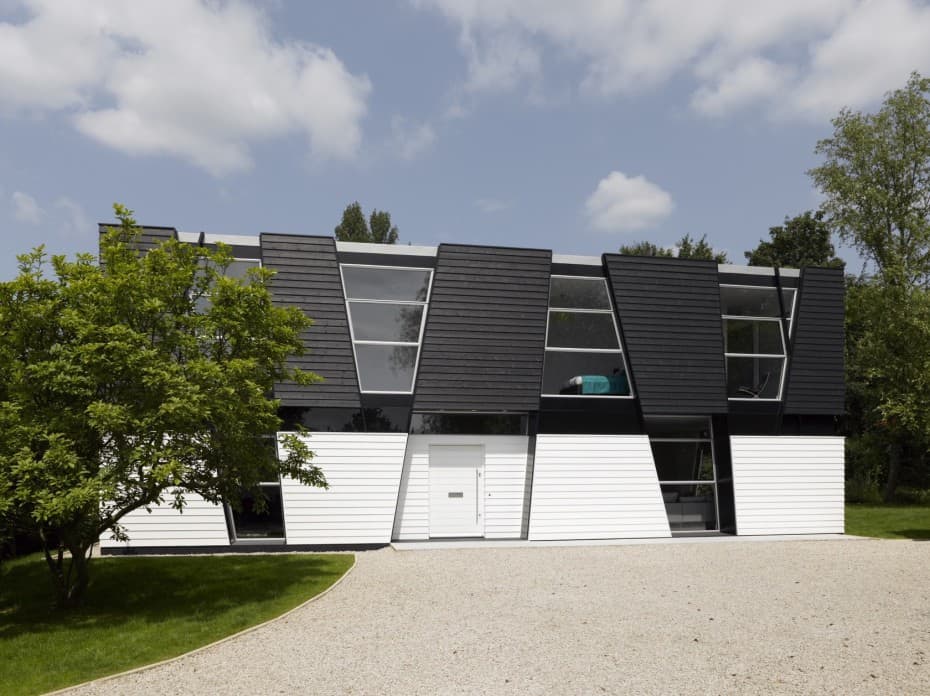
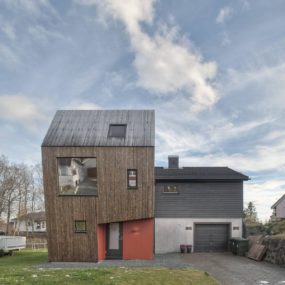
The public, driveway side of the house is more humble than the back, showing that the owners of the home are more interested in the design pleasing themselves than the general public. The driveway itself is elegantly shaped and populated with pebbles instead of asphalt for adherence to the clean design methods of the house.
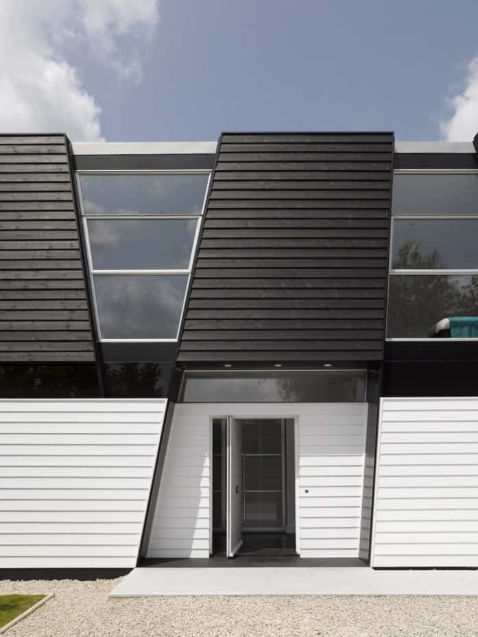
Unlike almost every other downstairs exterior panel of the home (including the door to the backyard), the front door is not framed by a glass surround and is not glass itself. This serves a purpose, making a strikingly modern design more humble and down-to-earth for those entering the home.
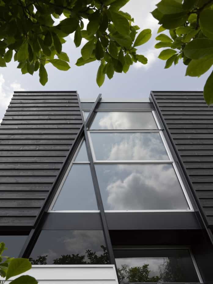
In a couple of places on the home’s exterior, a line continues past a siding panel without creating a new panel, usually on the fringes of the home. This makes the architecture seem more accidental, lending a playful disregard for traditional design lines.
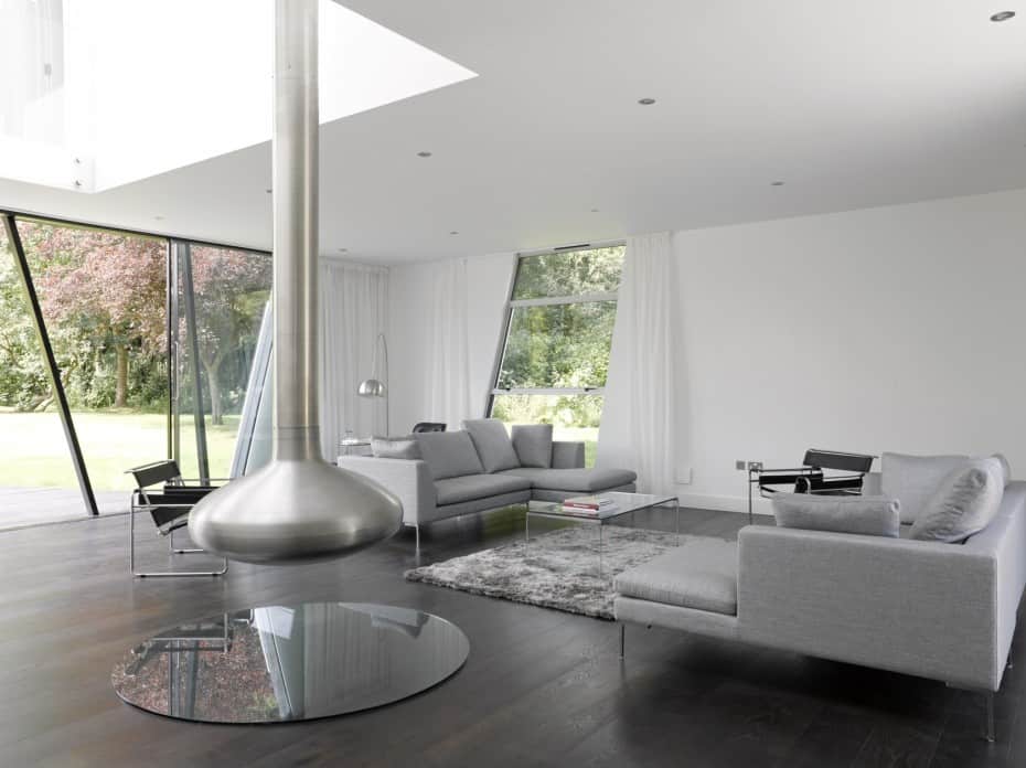
The living room is the principal communal space of the home, and as such it’s dominated by a medium silver hue with touches of black and white also present. The rug and wood flooring lend some visual warmth to the living space, and the floating fireplace adds the physical element thereof.

Decor in the living room is minimal and tasteful, consisting largely of various styles of furniture (including an Eames chair in one corner) and the ultramodern shape of the fireplace, which dangles from the ceiling a floor up.
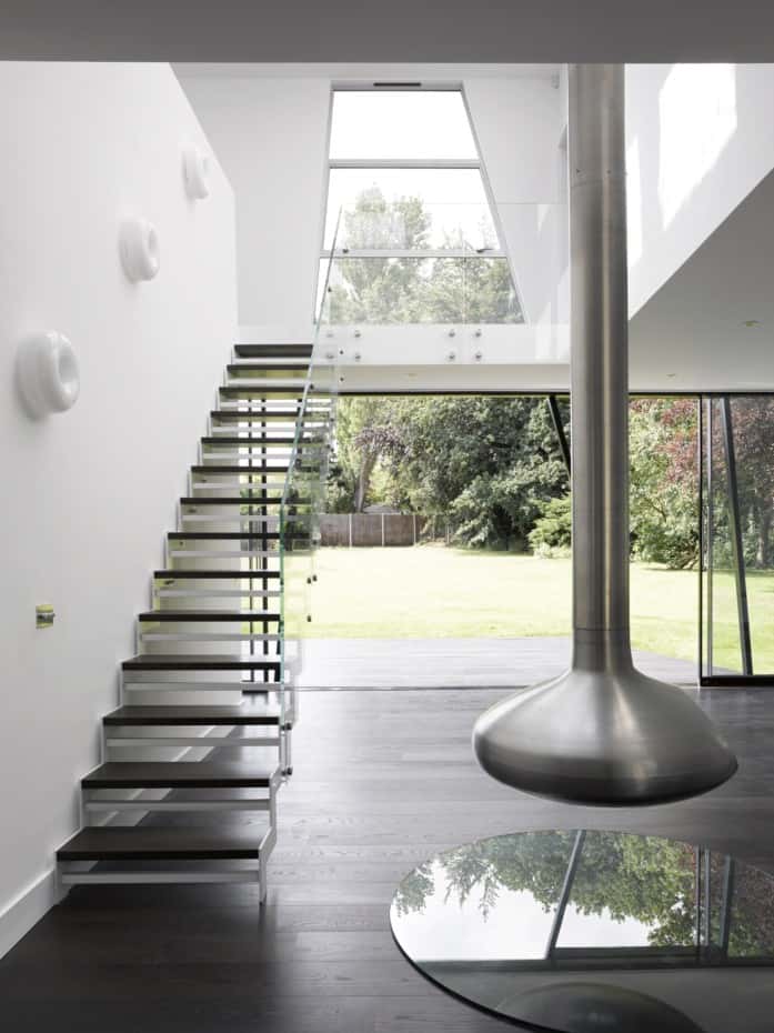
The wall with artistic accents on it doesn’t extend the full height of the building, opening far up on the second floor to come back down into the first-floor dining room on the other side. It’s a subtle nod to spacial continuity and openness in a home with more closed interior spaces than we typically see in a modern design.

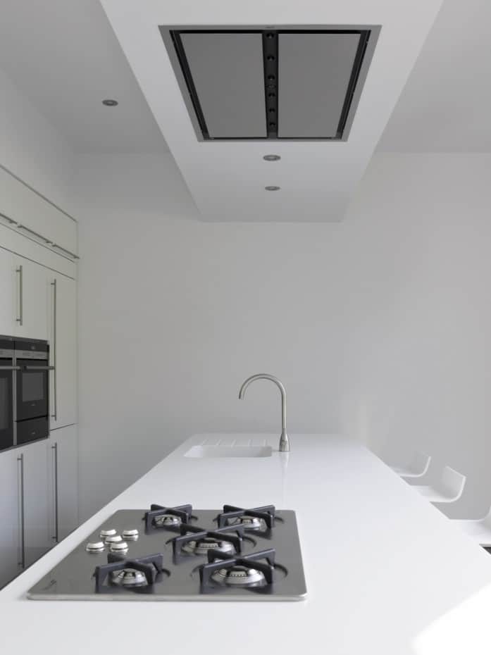
The principal hue of the kitchen is white, but as in the living room all three of the home’s main shades are present. In addition, the same flooring as is used across the main floor is carried over here, a dark-stained, almost-black unsmoothed wood.
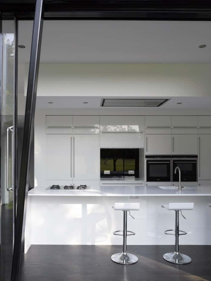
The handles on the kitchen’s cabinets are the same style as the handle to the home’s front door, aiding the continuity of space already discussed. The barstools are a standard pop-art furniture design, but they’re very well-implemented in this home.
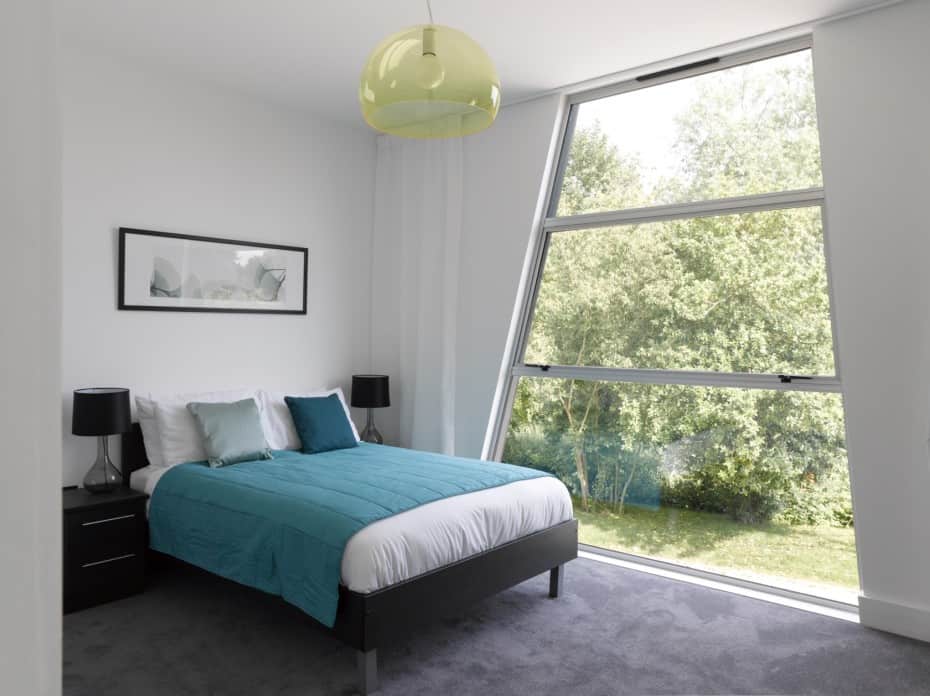
The bedroom has the most color of any room in the house, perhaps signaling the personal nature of the space. It’s not an opulent bedroom, meant to be comfortable as a sleeping place instead of a show of design prowess. The bedroom doesn’t give up any large glass area, avoiding privacy concerns with a strategic location by bushes and trees in the yard outside. Also, notice the carpeting of the room meant to increase the homeowers’ comfort, a rare and often risky design choice in modern homes. By keeping the color of the carpet in line with the home’s overall motif and its cut low, the material works.
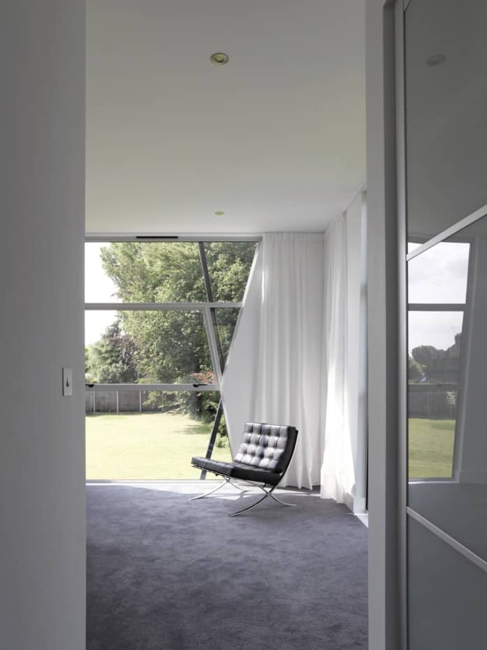
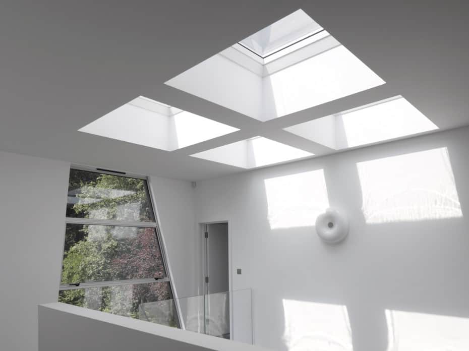
On the second floor of the home, a dissected skylight gives light to both floors, shining sun all the way down into the living room due to the open balcony structure above the staircase.
Matthew Heywood
