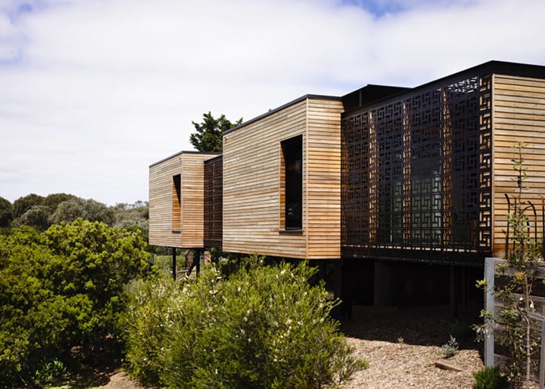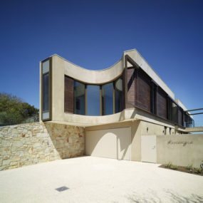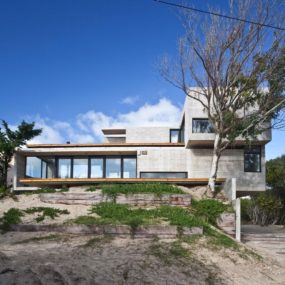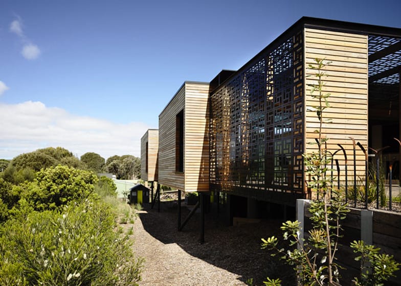
The Blairgowrie House by Wolveridge Architects is located on the southern tip of Port Philip Bay, Australia. Wrapped in horizontal timber boards, the seaside home features a pair of courtyards that are both encased in geometric screens for shade and privacy. The screen pattern – full of a repeating void pattern, was chosen as a reference to the perforated breezeblock details found in many of Australia’s Knox homes, and more specifically of the childhood home of the client. These screens also form ceiling details and partitions within the interior volumes.
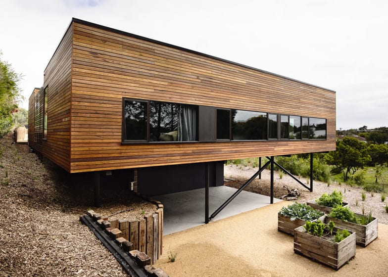
The client’s brief was to create a home with plenty of outdoor space for their children and children’s friends to play. As the home would be built on a sand dune, the architects design included excavating under the dwelling to create a large lower volume which would hold a family room and the extended upper volume would create a large open but sheltered play field next to it.
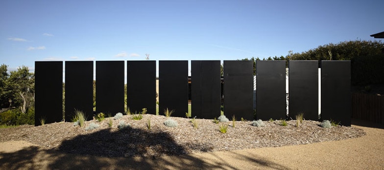
The road to Blairgowrie House is north of the site and to create an open, yet private space for parking, the architects designed a sculptural element of steel sheets mounted vertically in a row. A void of 100mm gaps between each sheet adds a “now you see it, now you don’t” effect to the design.

A garden path creates the connection from the driveway to the home and the path is defined by a second sculptural element of pillars made from rammed earth. Unlike the black steel sheets, the pillars are pale in colour and positioned side by side rather then end to end.
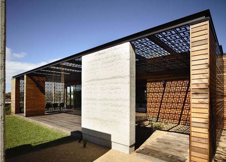
The home is divided into four main areas, two living zones separated by a service area that is just above the family room and a fourth zone that creates the outdoor lounge area at the entrance to the home.
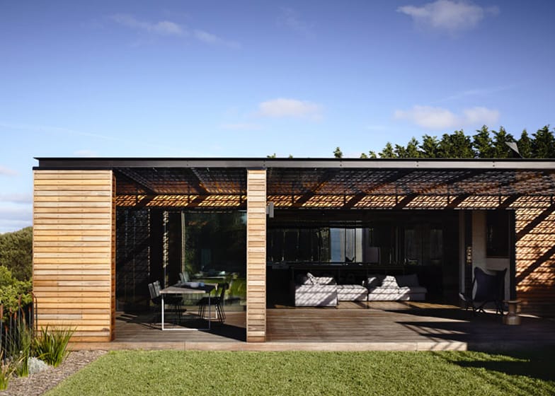
The outdoor lounge area is a covered terrace that includes both a sitting and dining area.
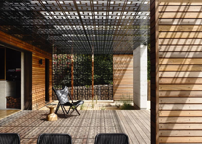
The outdoor lounge area employs laser cut screens on the ends of the terrace as well as on the ceiling. The shadow play as the sun’s rays pass through the voids create an ever changing pattern of light and dark.
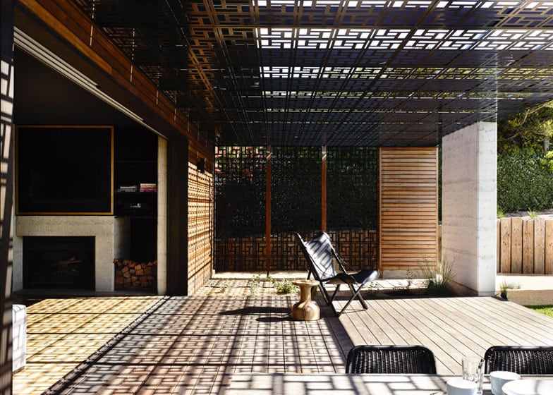
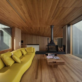
Just inside the terrace is the social zone with a wood burning fireplace. A void next to the fireplace is where the wood is stacked, keeping it close to the outside for ease of loading.
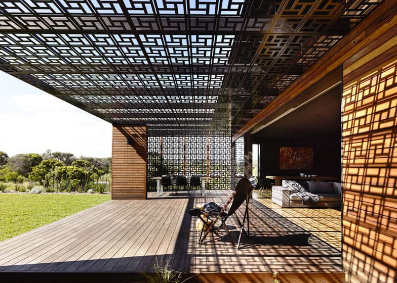
The far side of the social zone and just next to the outdoor dining area is the indoor dining room. When the walls of glazings are completely opened up, the two eating locations can be combined as one and used simultaneously.
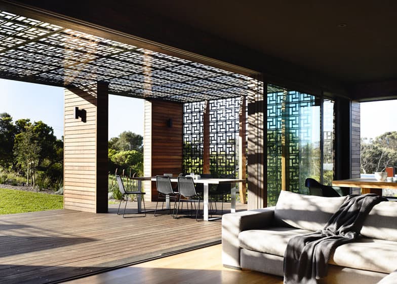
Just as the two dining zones are located next to each other, so too are the two lounge areas.
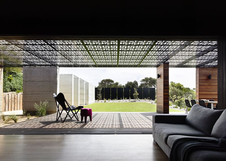
The views from both the interior and exterior zones are stunning. The sculptural elements of the architecture – both light and dark – positioned within the landscaping are simply amazing.
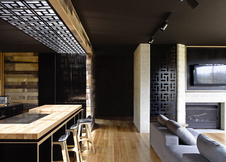
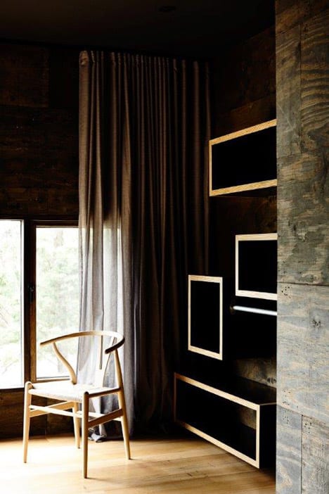
Enhancing the saturated colours within the landscape is the choice of blackened plywood walls and ceiling, this allows the interior framework to “disappear” from sight and let the magic of the views dominate.
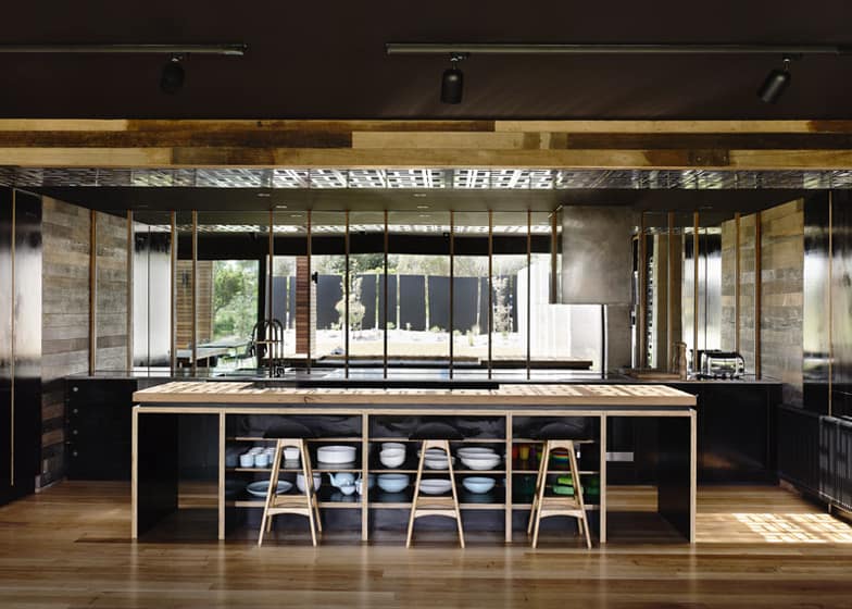
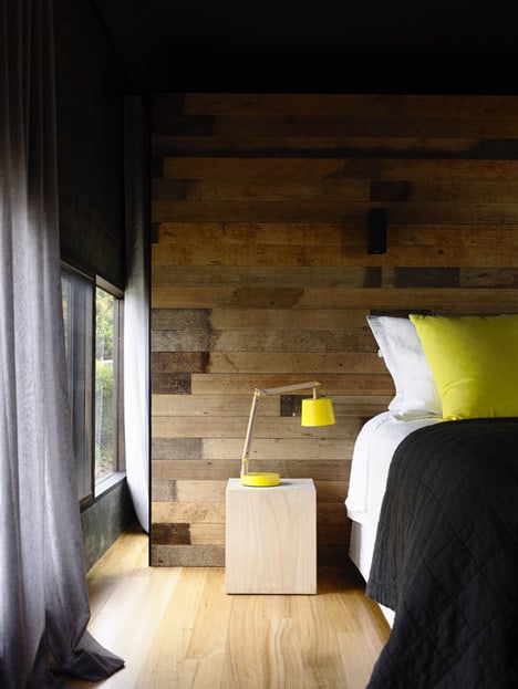
A smaller outdoor zone is just outside the kitchen, separating it from the Master Suite. With a view out both sides of the kitchen, the use of recycled wood planks as a design element gives the space a rustic cabin aesthetic.
