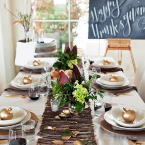
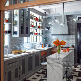
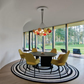
Fall is officially here which means the leaves are changing color, the air is feeling crisper and fall fashion is in full effect. With that being said, it is time to revamp your home and bring in a touch of fall directly inside. The best way to do just that is to switch up your color scheme for a more fall inspired one. Here are 11 beautiful fall color schemes that you will want to try in your home immediately.
Ruby Tones
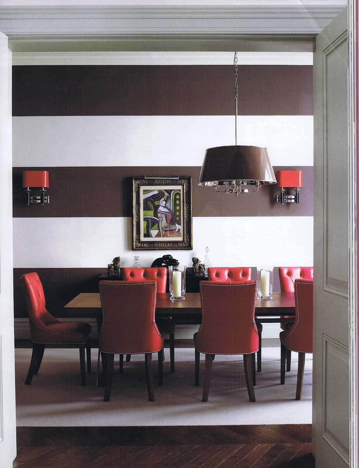
The easiest way of bringing a fall twist to your home is by bringing in the ruby tones. Ruby is a gorgeous color to decorate with especially during the cooler fall months. While the fall leaves are changing so should your home flooring add richer ruby tones as part of your carpet to bring that classic fall vibe directly indoors.
Green
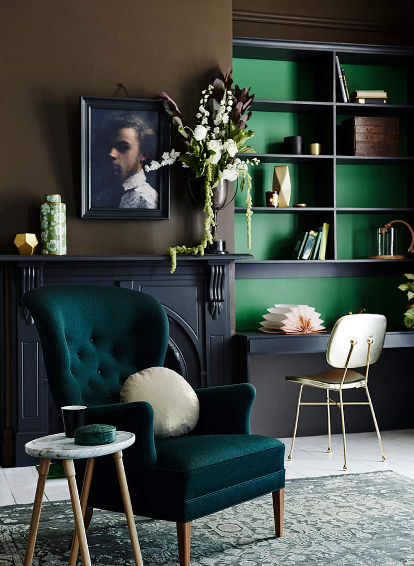
While green isn’t much seen outside during the fall it is the perfect warming hue inside your home. Go bold with a green staple, and pair it with wooden bits the bring a more rustic touch. Keep it fresh by having patterns throughout that adds a bit of vibrancy to the already vivid hue.
Purple
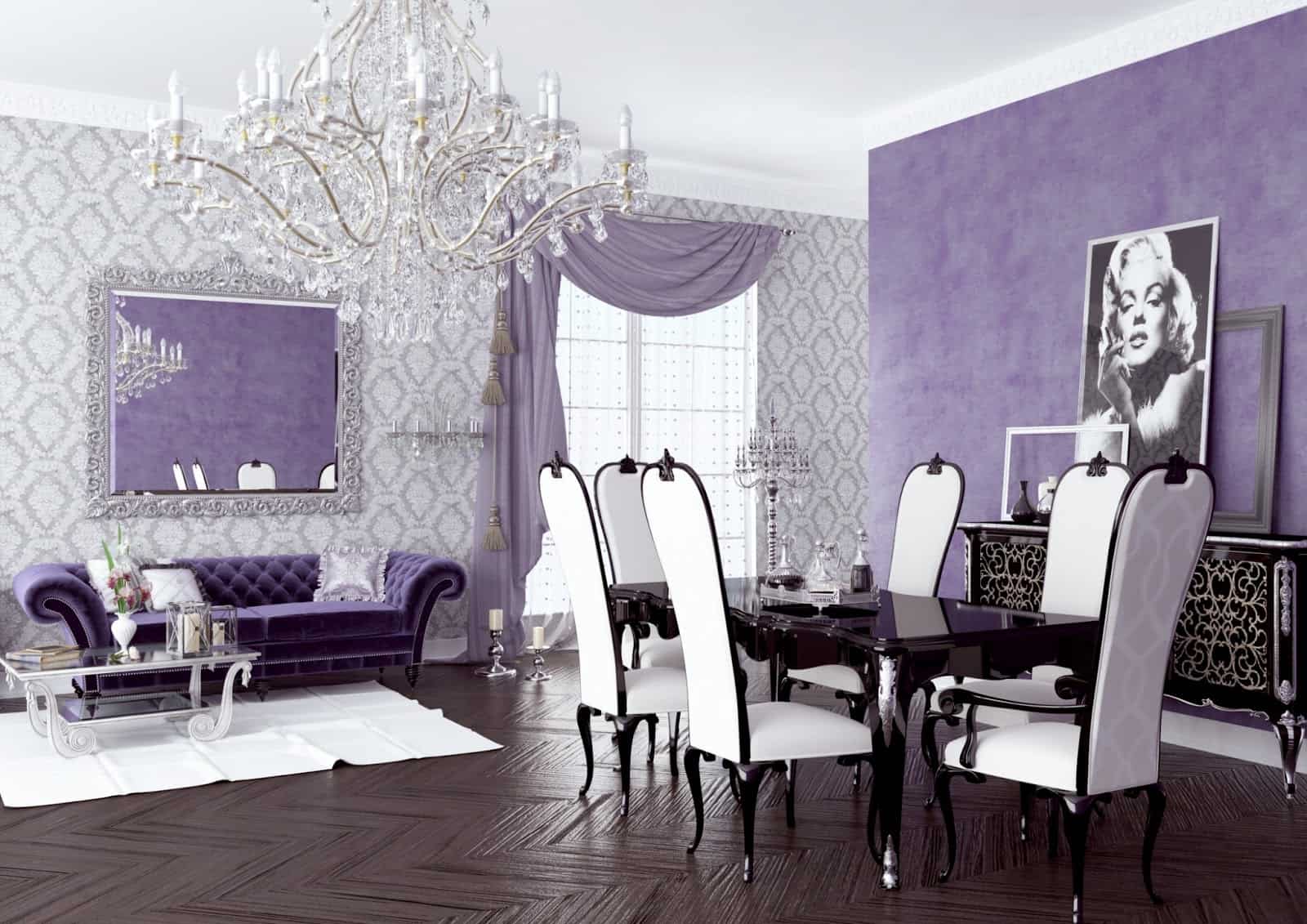
Do not be afraid of purple. Purple is a royal color, it looks luxe, it feels warm, and it works beautifully as an accent color wall tone or even as the main staple of the room. Consider purple as a color you didn’t know you needed yet makes a room come to life in a warmer kind of way.
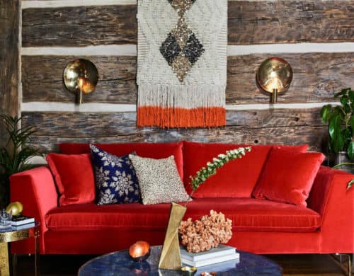
Scarlet Red
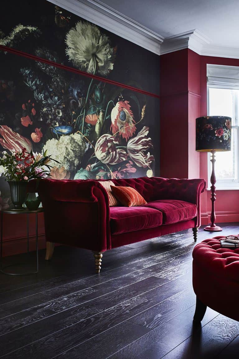
This perfectly delicious color with hints of orange in it is quite the fall staple. There is something about the shade that screams bold and daring; however, many will shy away from it because it could overpower a room. The key is having this color blend in with other hues that allow it to be the powerhouse its intended to be.
Gray with a Twist
If simplistic gray feels a bit too “natural” for you try a dove gray or lavender gray, these two shades are signature gray hues but with blue or pink undertones for a punch of unique. Whereas most grays offer a blend of white and blend a dove gray brings in more color while still being a classic neutral.
Saturated Orange
We couldn’t have a fall guide without including this vibrant daring hue. Whereas most people run away from the color because of how powerful it is we say embrace it and fall in love with it by trying a shade of tangerine. Tangerine is one of those hues that’s bold yet cohesive, so it will never feel overpowering to a room instead it will brighten it in a warming manner.
Mustard
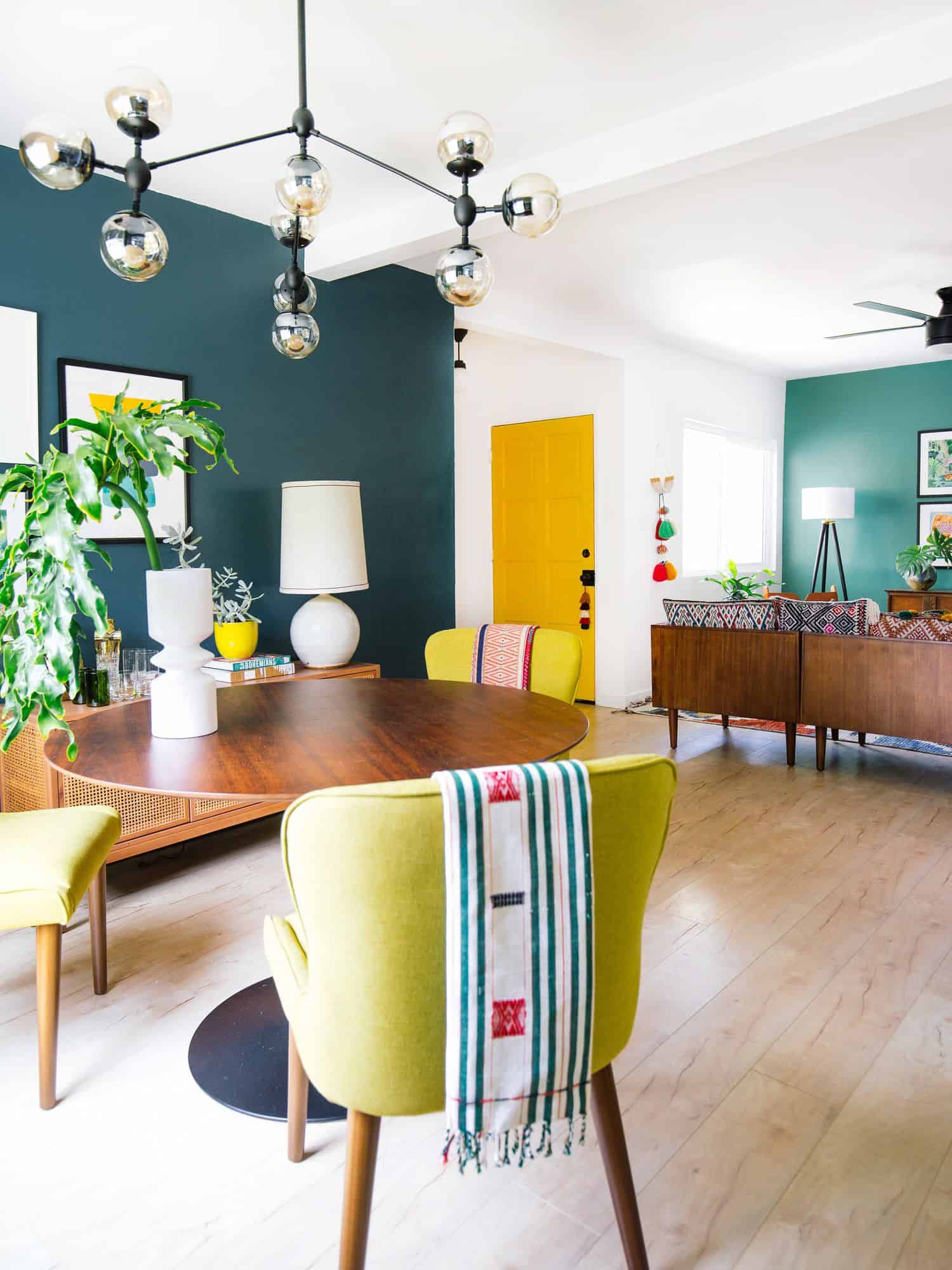
Mustard is the perfect shade when you need a brightening hue that brings the home back to life without using Spring or Summer colors. It is the perfect blend of yellow and orange without bringing too much into the room. If you’re afraid of how daring the color can be, paint a wall or two or even a door in the bold hue.
Terracotta
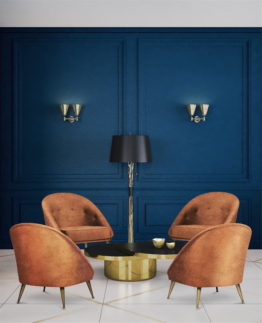
Terracotta is the perfect blend of brown with a reddish undertone. It’s not only fall approved but its sophisticated and chic while having that classic feel that comes from rich colors such as this one. This is another excellent form of bringing hues of brown to your home without having an overly neutral hue.
Cream
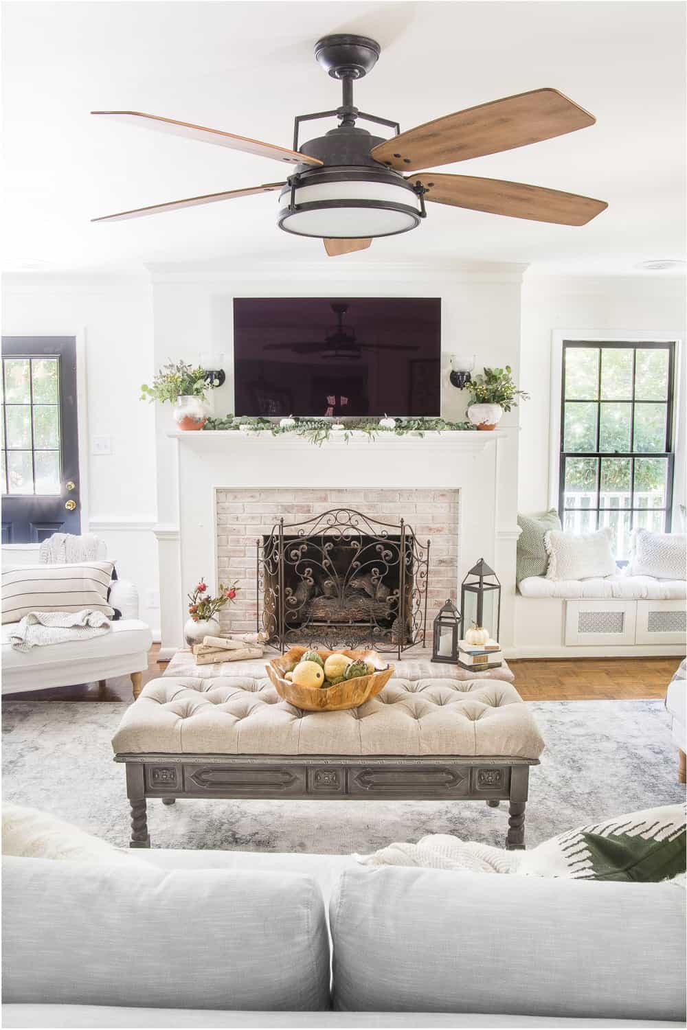
The color cream is an overall beautiful color, but somehow it becomes even grander when it is used in a bright decorative space. Incorporate cream as the additional color instead of the base hue. The idea is to have cream be a supplementary color while the brighter hues are the man staples of the room.
Navy
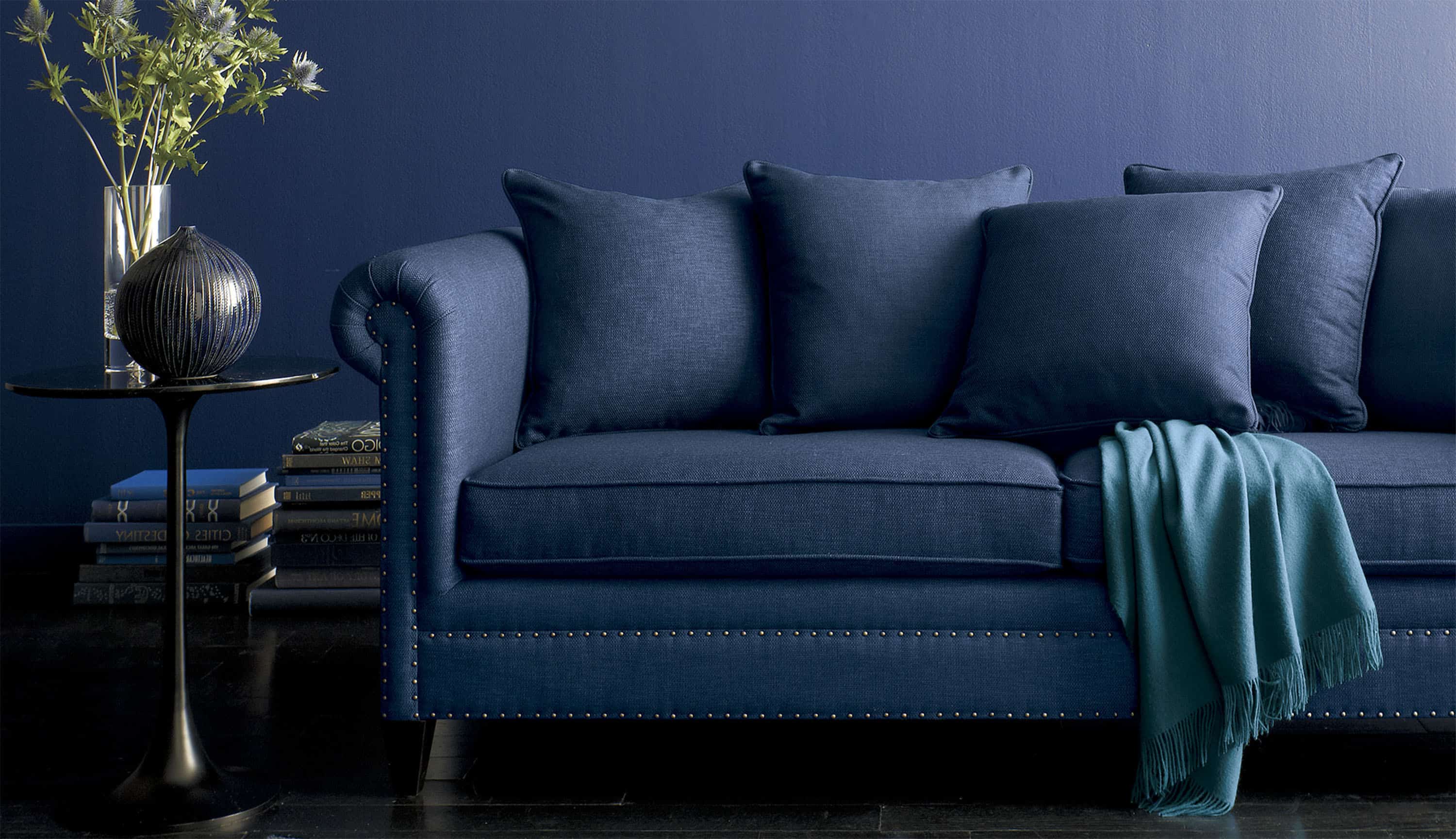
While most blues can be a bit much for fall a navy hue is not. Navy is a rich, elegant tone that is perfect for cooler months as it brings a cozy effect to the room without the need for additives. Consider a tufted, navy sofa for a classic signature appeal that brightens the room even during the winter months.
Burnt Orange
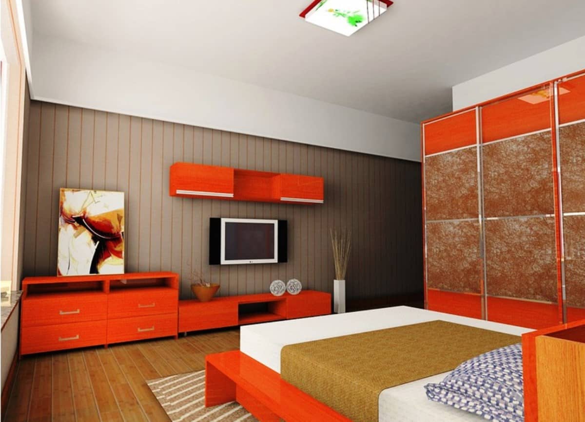
Just like traditional orange is the way to go when it comes to fall décor, burnt orange is as well. Burnt orange is a beautiful blend that’s a bit more rustic and cohesive. Add it into your décor when you want that classic fall vibe without having to add much to it. Consider it as one of the best falls touches you can add to a room.
Fall is here! What color scheme are you using? Please share with us your ideas below.
