Opposites attract in this contemporary dual-volume residence in Germany, designed by German architecture firm fabi architekten bda. The stacked black and white levels highlight each other, creating a striking contrast. Not only is this a visually complementary home, but the two-part design results in interiors that beautifully balance public and private living on its two levels – function and fashion, all rolled into one beautiful house. Surrounded by nature, this modern home truly has it all. Check it out:
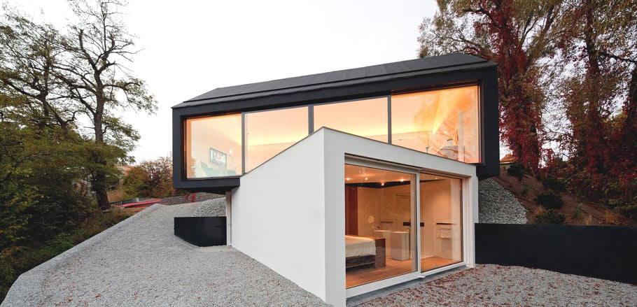
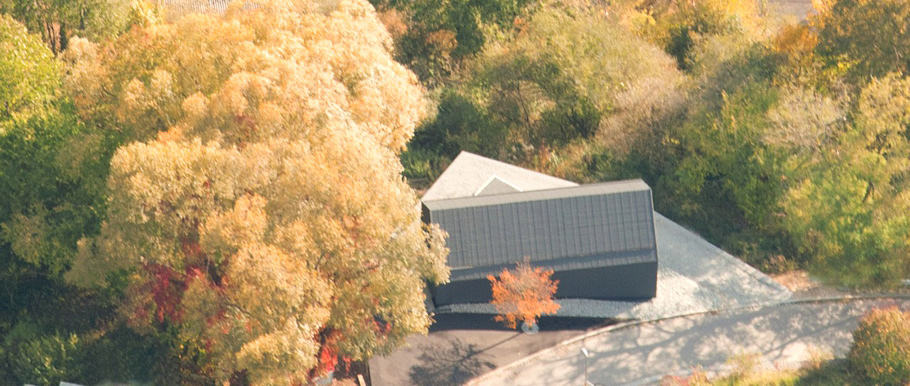
The house is perched on the side of a steep slope, following the tough natural terrain and boasting unobstructed views of the forested landscape rolling out below. This private setting sets the stage for an unexpected, modern home that seems out of place in this natural setting at first glance, but actually conforms to the site’s stringent demands with its thoughtful layout.
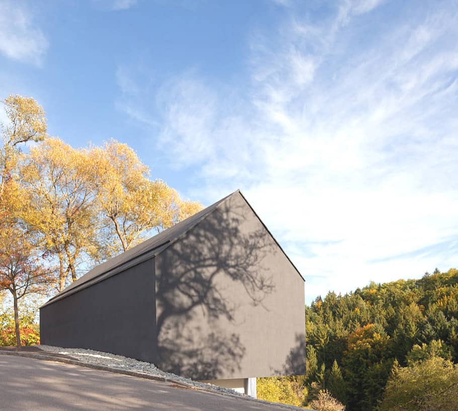
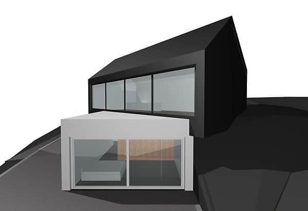
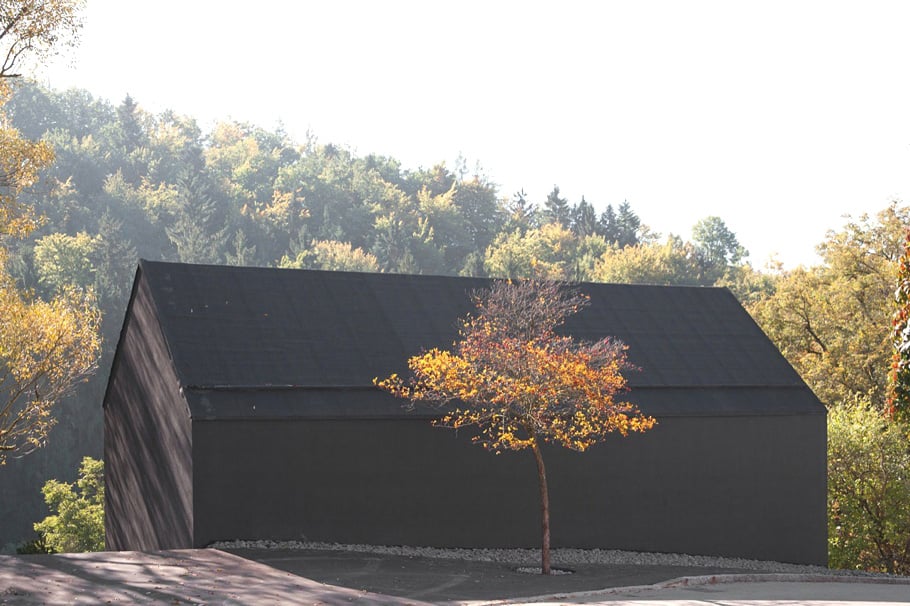
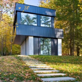
From its street side, this house takes on a more intimate scale and a traditional tone, from its dark color to its saddle roof and classic silhouette. But that all changes as you make your way around the hillside, where a second, modern, flat-roofed lower volume makes its appearance.
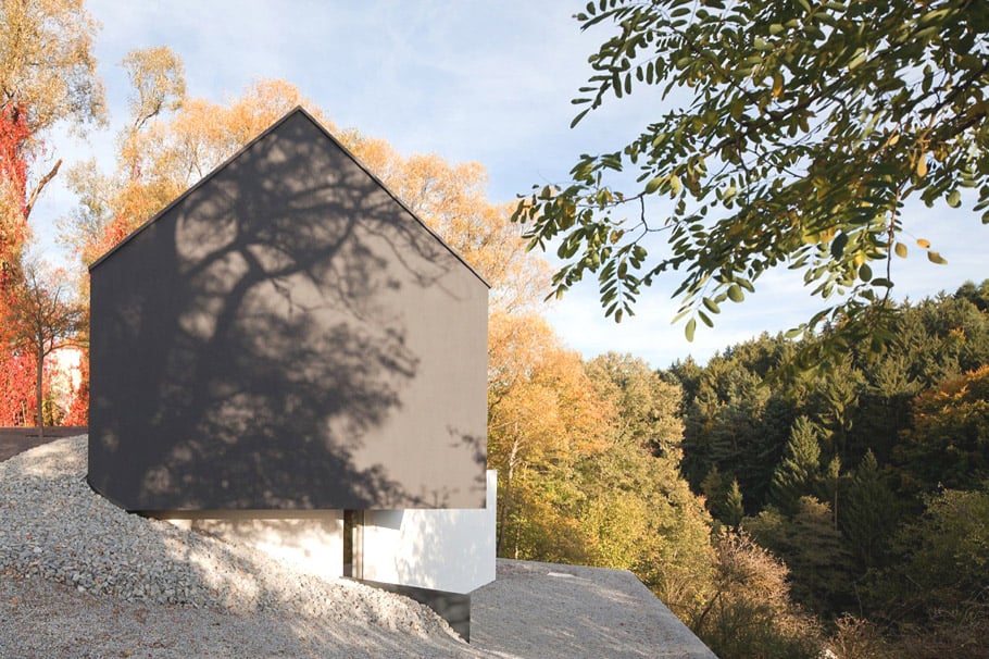
The slope drops quickly to reveal a whole other level not immediately visible from the street, adding unexpected living space and architectural interest while maximizing the views.
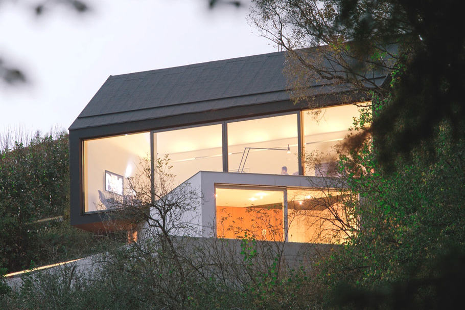
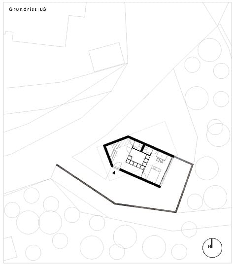
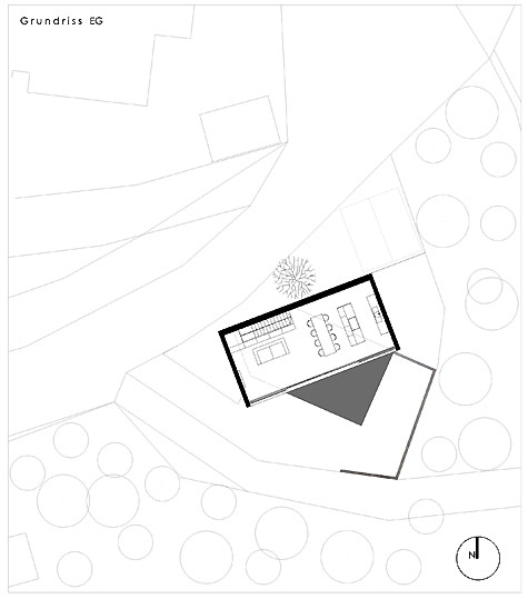
The dual-volume residence takes shape as a black upper level cantilevered over a white lower level, which is concealed by the hillside. The volumes are positioned on an angle from one another, looking out in different directions and framing a variety of views.
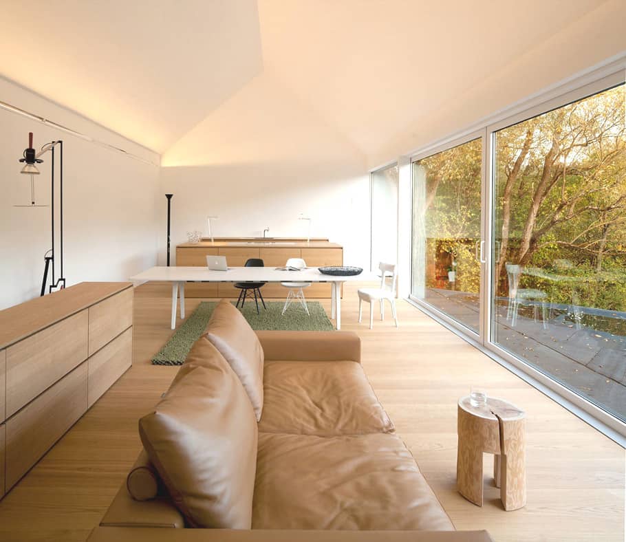
Inside, the two volumes separate the public and the private living areas. The upper level hosts the kitchen, dining area, living room and studio work space – all enjoying this breathtaking view. The architects describe this as “a room’ to work, think, talk, eat, celebrate, relax.” Below, in what the architects call the “belly” of the house, the lower volume houses the bedrooms hidden among the trees.
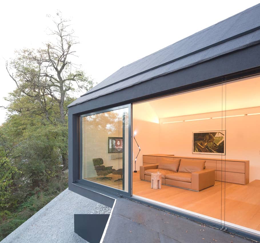
This office space boasts a walk-out to nature – a private piece of paradise that provides inspiration and an escape from the hectic hustle and bustle of every day.
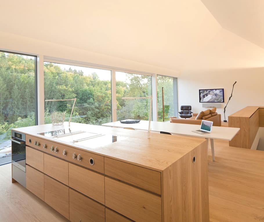
Interiors have a minimalist edge with simple, sleek furnishings and an open layout overlooking the landscape. The kitchen, for instance, features clean counters and elements finished in a blond wood that complements the floors and furnishings.
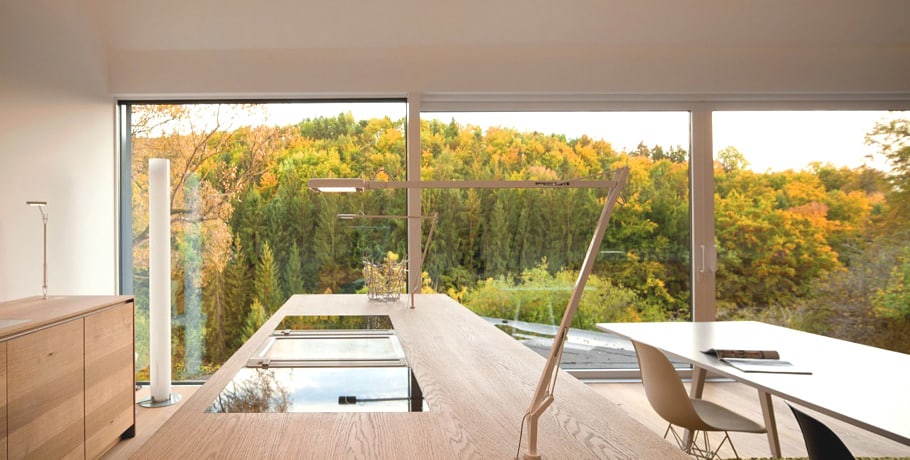
Beyond these light and airy interiors, nature makes its appearance through floor-to-ceiling glass. The open concept layout ensures every corner of this home gets a good view.
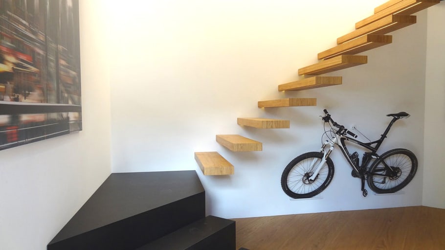
The stairs are like a simple sculpture, emerging from the wall and artfully working their way up and down. A black base grounds the design and leads up to these light-as-air wood stairs which seem to float effortlessly.
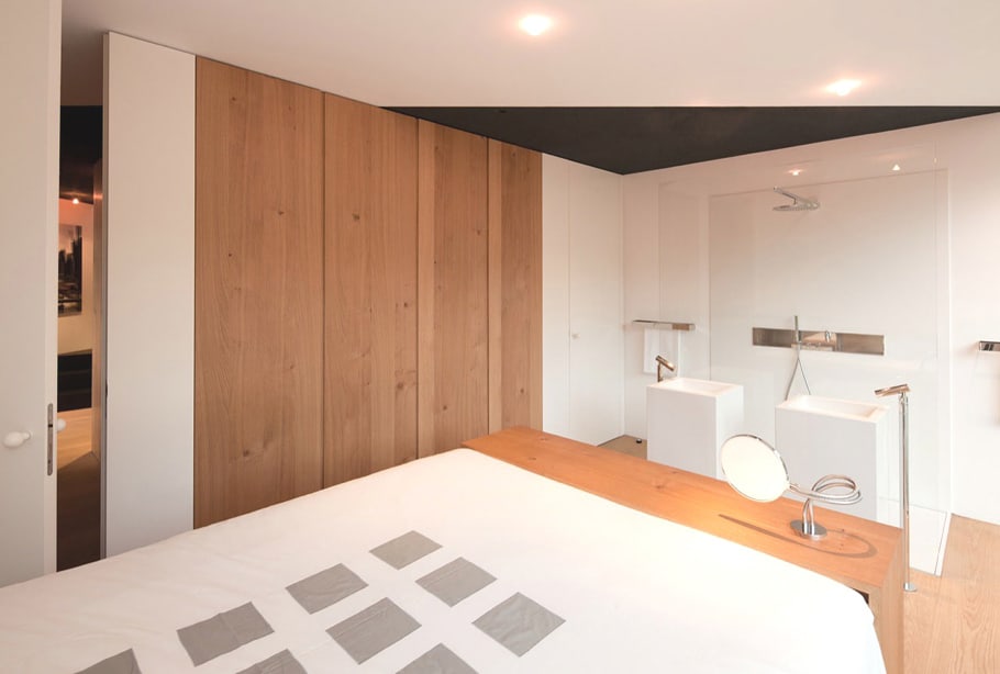
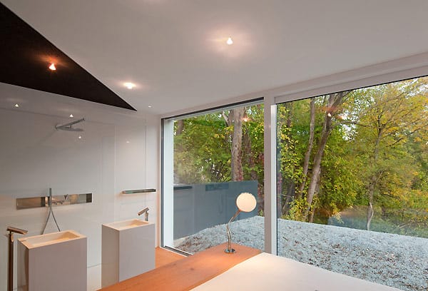
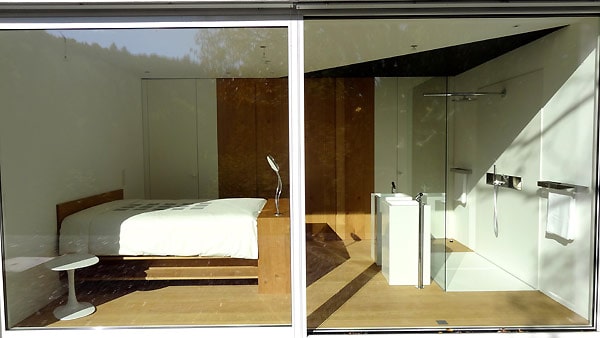
On the lower level, the bedroom carries the same neutral palette as the living spaces above, with white and wood walls, and an open bathing area that offers all the function you need and fashion to boot. The smart layout is key to this home’s efficiency from day to day.
