If your idea of a cozy home is one with layers of storytelling within its various design elements, then look no further then Brody House, a boutique hotel that celebrates its rustic, vintage and aged interiors by emphasizing them rather then hiding and disguising them. Located in Budapest, Hungary, this amazing home was originally built in the 19th century but underwent a massive upgrade in 2009 – thank goodness the renovation celebrated the heritage of the building rather then trying to minimize it!
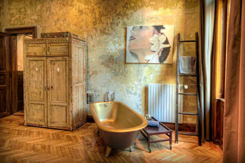
Even if you prefer to tread safely with your decor in the social zones, why not go the extra mile in your bathroom. Wallpaper the walls in a high def image of aged paper – maybe with a metallic pattern incorporated into it, install herringbone flooring either in wood or wood look tiles, lean a rustic ladder casually against the wall for towels – but don’t forget to also install a radiator style heated towel rack! All these details add so much character and life to the room but not as much as the amazing tub with its metallic sheen and the vintage wardrobe for storage. The only item in this room that does not have an aged appeal to it is the portrait on the wall and the contrast between the art and the walls is perfection!
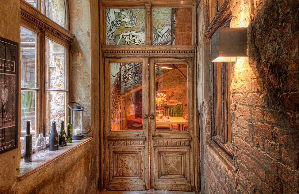
To add a layer of history to your home, why not start with the entrance and source out a pair of antique or vintage heavily carved doors. If you can’t find any, consider hiring a woodworker to recreate the look – nothing enhances a home’s facade more then an awesome entry.
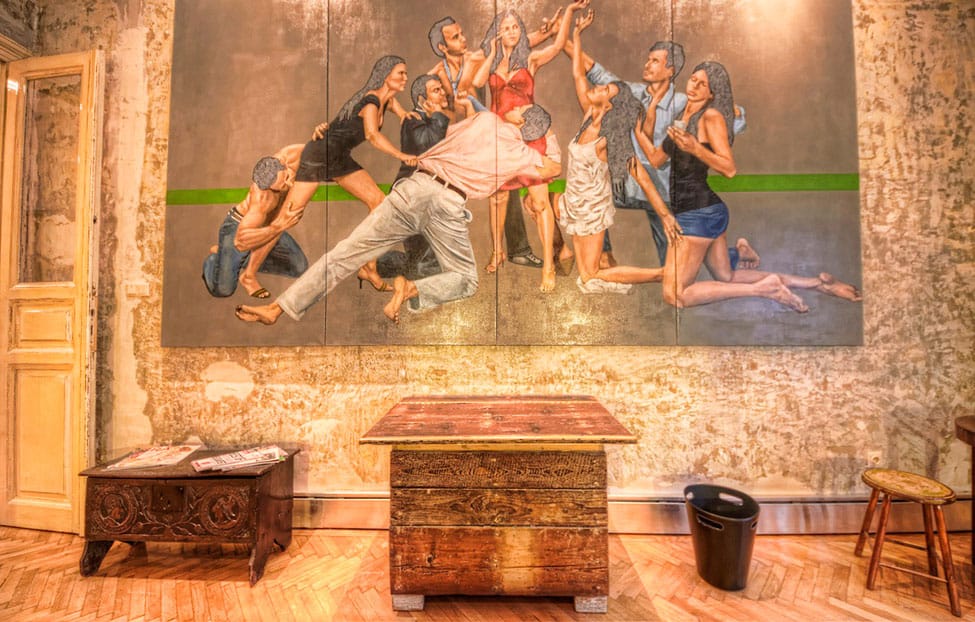
Once inside your home, your foyer needs to serve two purposes – function and beauty. Here a large canvas with a symmetrical subject centers itself over a small table with a stool on one side and a bench on the other. Like I said, function and beauty.
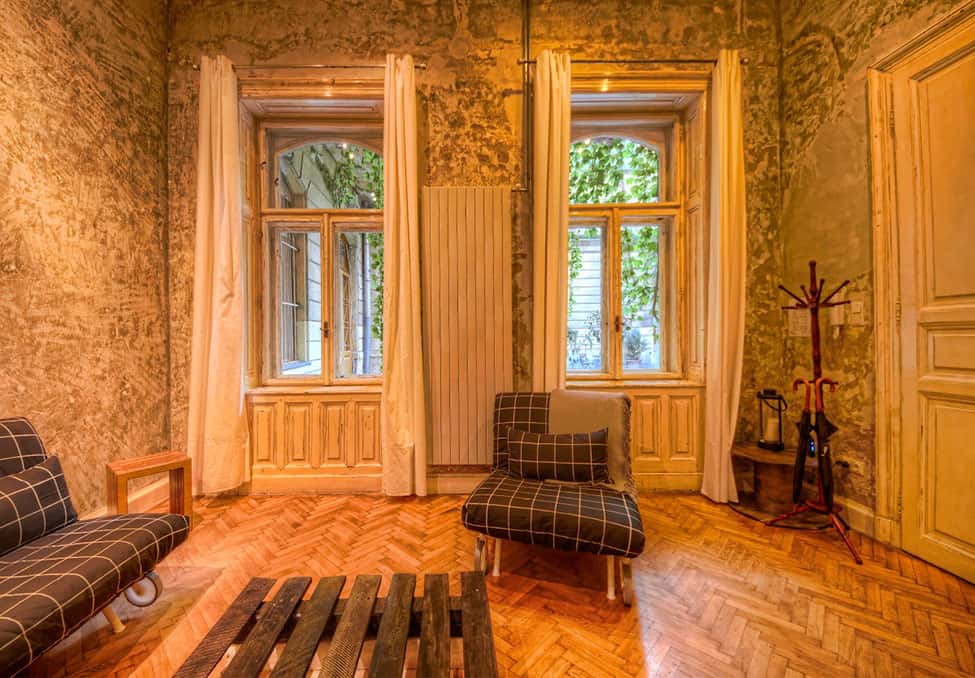
If your home doesn’t have a foyer but opens up directly into a room, consider creating a vignette with a coat tree and a small bench – its functional but quaint and look how well it plays off of the pallet coffee table which is a trendy DIY project that costs next to nothing and layers in a touch of whimsy.
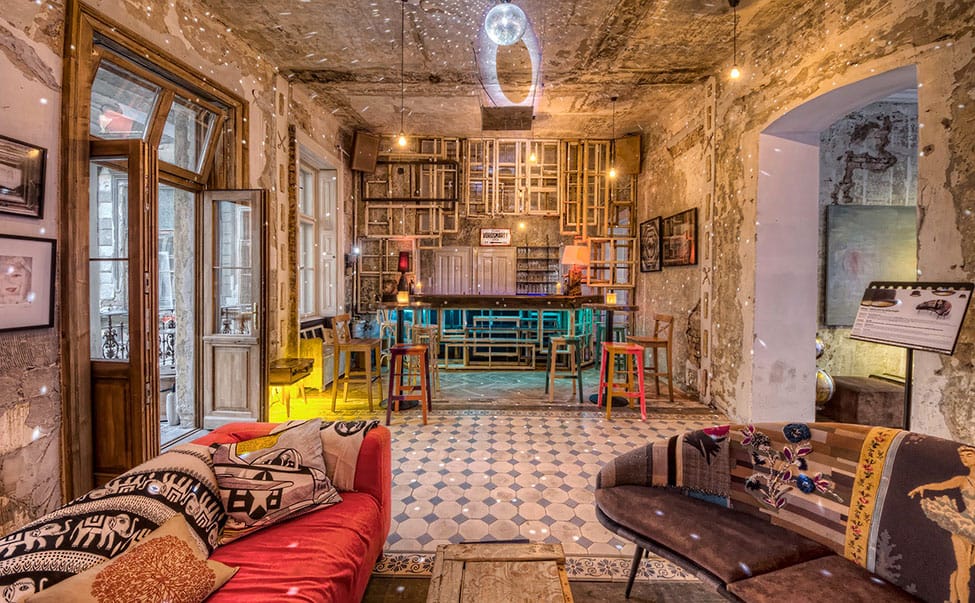
Aside from being a great DIY project, pallets also create an easy global storytelling moment for your home but if you’re not into DIY try using an old wood crate as a coffee table instead. I like how the weathered crate in this room counterbalances the bright pops of color and patterns within the seating area.
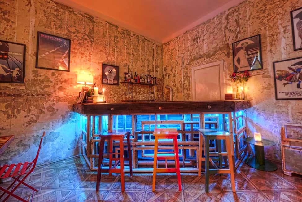
Did you notice how bright the bar was at the far end of the living room, here’s a close up to show you how they used LED lights to create a color story within the glass cabinet and then filled the cabinet with old wood windows sans the glass. Don’t the wood frames draw you in and make you want to look through them? Now that’s creating a story!
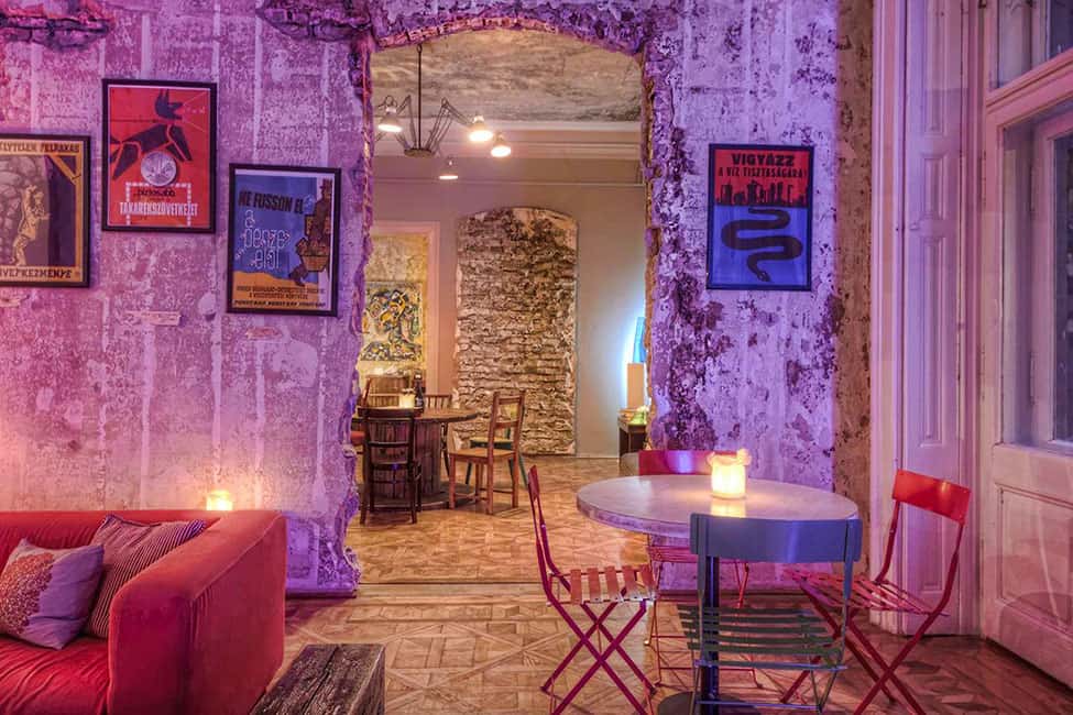
LED lights are also used to cast a color hue over the walls in the living room. Today its lavender, tomorrow its blue. What an easy way to adjust the mood without redecorating and what a fun way to entertain your guests. Each time your friends come by for a visit you can showcase a different color which is even easier to do then swapping out pillow!.
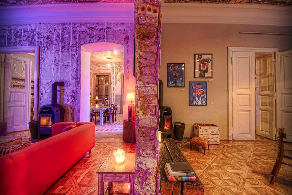
Look how different these two rooms look with the identical crown molding and parquet flooring. They even have the same wood-burning fireplace but one room has tan walls while the other has wallpapered walls with a faux aged patina and lavender LED lighting.
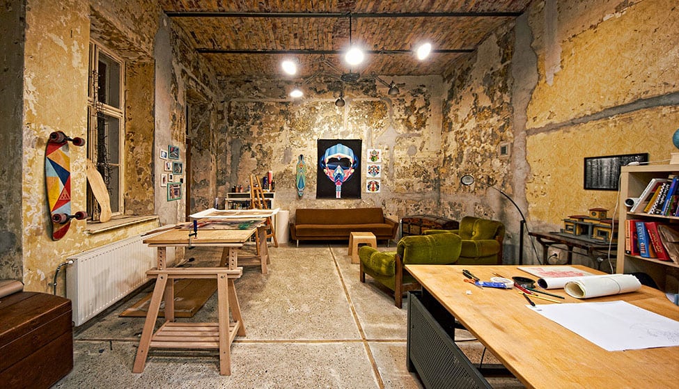
Brody House has a large office / arts and crafts room with the same patina’d walls but here the floor is more utilitarian and the furniture is kept simple and basic. Even so, the room makes you want to roll up your sleeves and get to work whether that work is pen to paper or paint to paper.
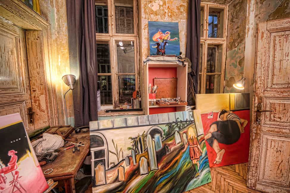
If its paint to paper (or canvas) that is about to take place in office / arts and crafts room, make sure you don’t hide your previous work away. Leave it out leaning against walls, shelves or propped up on easels as inspiration for your next masterpiece.
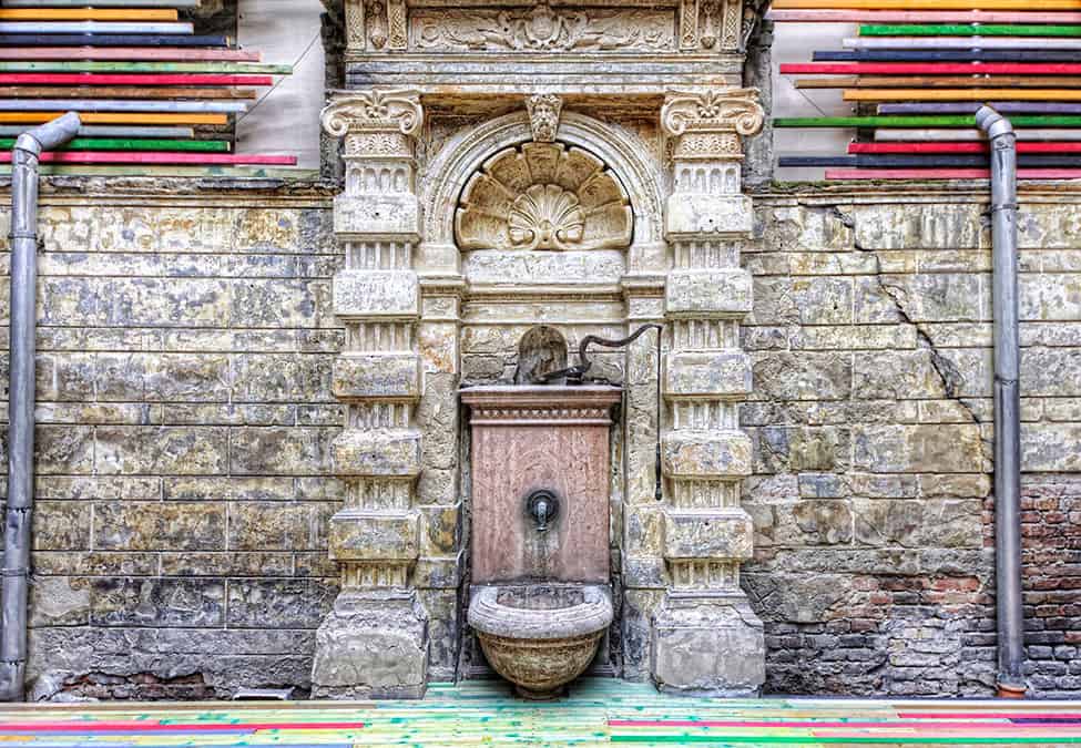
Creating a masterpiece doesn’t have to be on paper or canvas. Just look at how they used color on both the decking and the walls of the terrace. Yes, the majority of the space is neutral with its stonewall and stone water feature, but the various colors within the decking and the wall treatment really enhance the various shades of grey and beige within the stones. Even the piping takes on an artistic presence within this vignette.
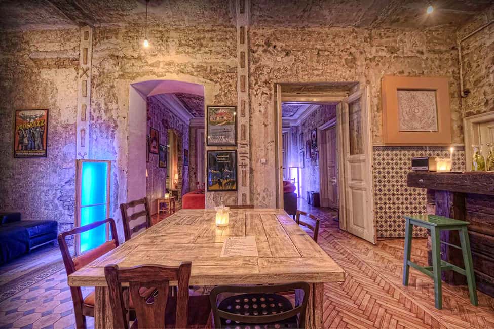
The dining room within Brody House features a weather-worn tabletop and vintage chairs – each one different, a well as a second bar made of reclaimed beams. All these wood textures (including the herringbone floor) add so much interest that even though the only color is within the green bar stool, the room is still visually exciting and stimulating.
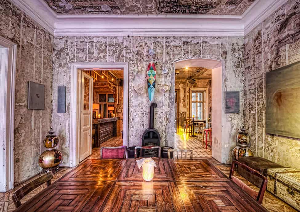
A second dining area right next to the first also has a tabletop made with weather worn wood, but this time stain has been applied and left to absorb naturally for a deeper but not uniform depth of color.
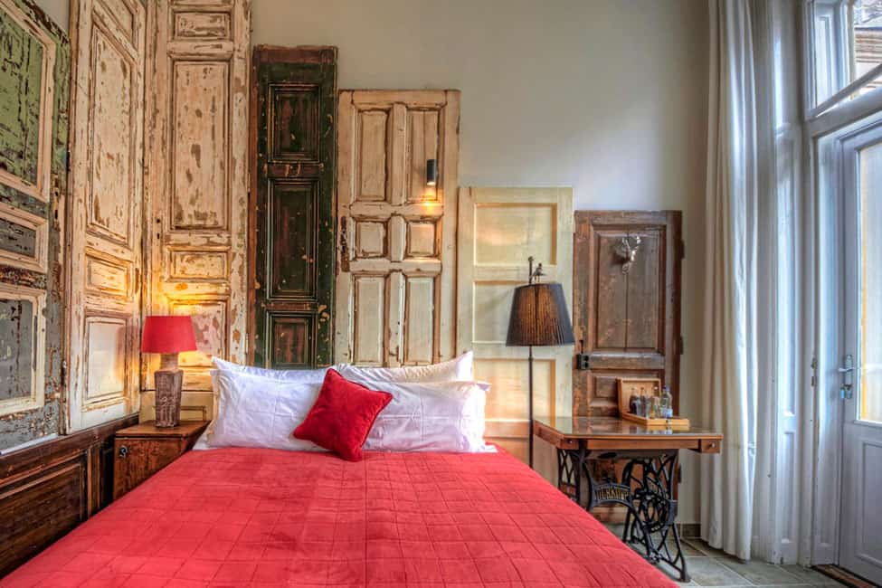
Brody House has 6 bedrooms, each with an individual decor and each with its own story to tell. I’ve seen many headboards being created out of an old door, but I’ve never seen two complete walls clad in vintage doors of varying heights. It’s a great look but the creme de la creme of the room is the addition of the old sewing table as a nightstand.
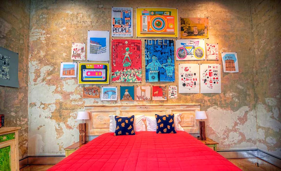
The second bedroom still uses vintage furniture but showcases a series of paintings and posters in bright pops of color. The colors are so attention grabbing that you almost don’t notice the emerald green within the dresser and night stands.
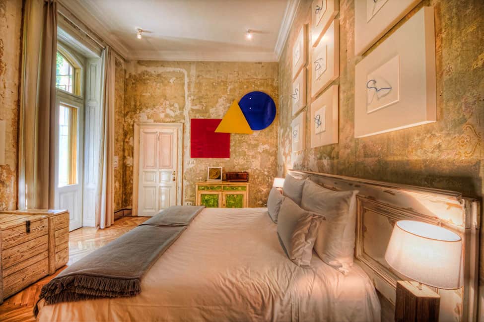
The third bedroom is almost identical to the second except that the art above the bed is neutral. Here the color is created by a modern 3D graphic above the dresser. You might wonder which is better – color above the bed or beside it? The answer is another question – does it keep you awake? If it does put the color above the bed where you won’t see it while you are falling asleep.

Color is not for everyone and if your tastes lean toward the neutral this bedroom shows that monochromatic is as interesting as psychedelic. Instead of using color to create the story, use patterns, textures and images and while this room feels much tamer then the others, it still features a series of vintage furnishings – just more refined ones.
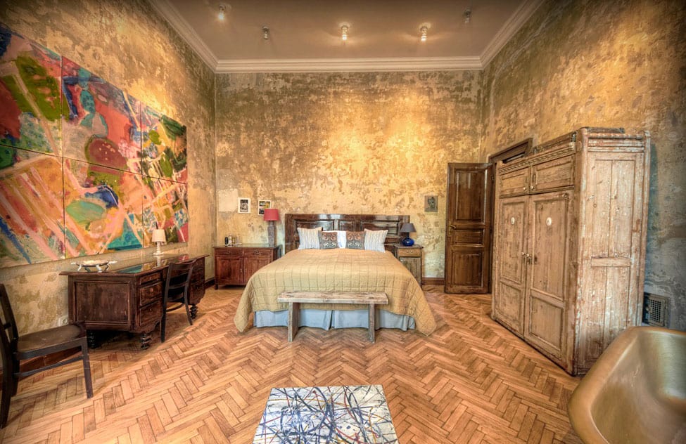
Of course, most of us are somewhere in the middle. We like a neutral backdrop but we also like to see color somewhere and if that’s you, this bedroom is the perfect compromise. All the hardscape is presented in warm shades of wood while color is added through a large 6 paneled painting, a lamp shade and a small table. What keeps the room really alive is the range of wood tones within the vintage pieces.
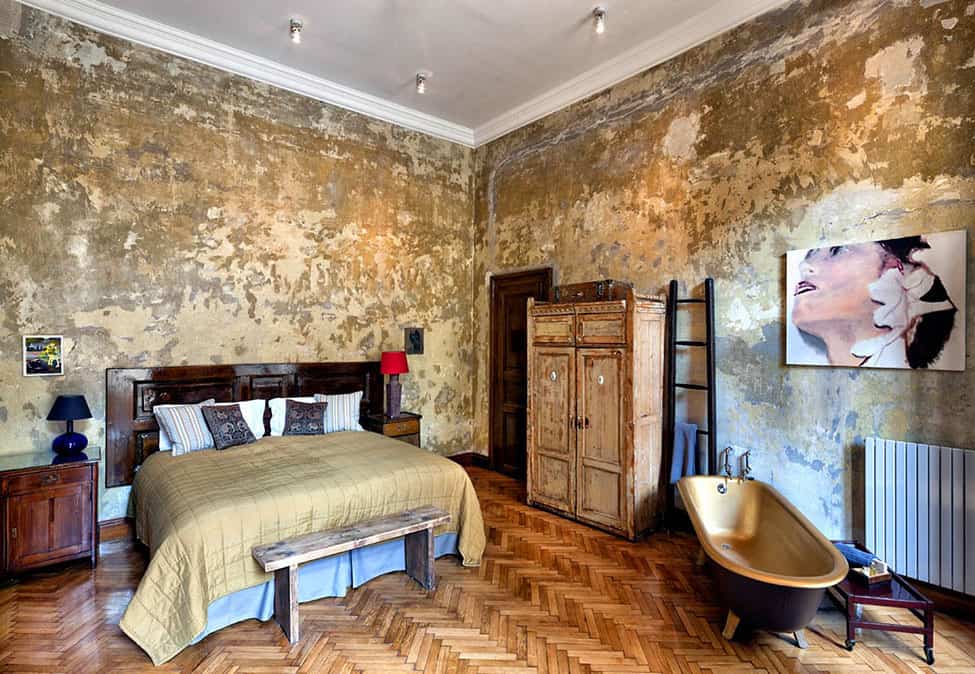
This room features the same color story as the last bedroom but it also layers in amber shades via the bed quilt and that amazing metallic interior on the tub. One thing that ‘s interesting is the lack of claw feet on the tub, they have gone missing and have been replaced with angular modern legs, yet somehow that modern touch is just what this room needed.
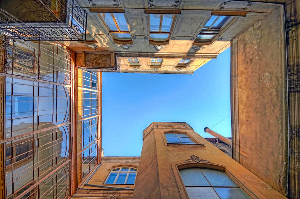
While this is not an interior shot, this would make a great framed photograph within one of the rooms.
Brody House
