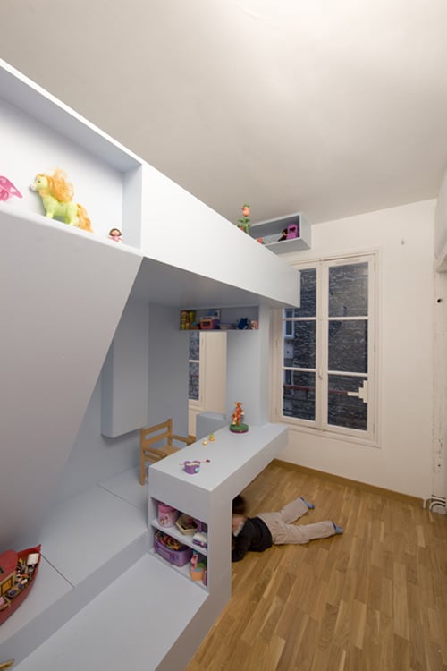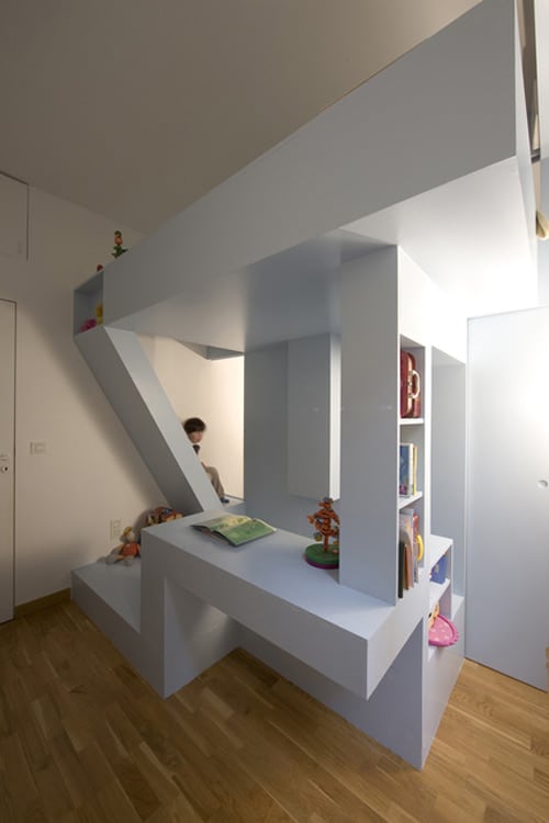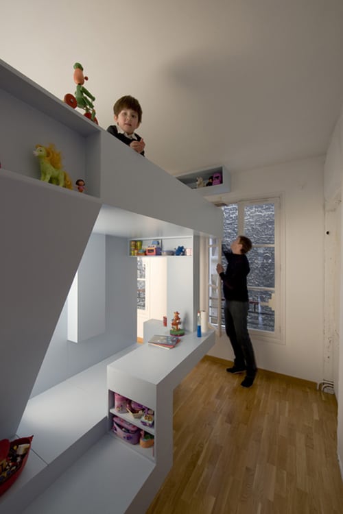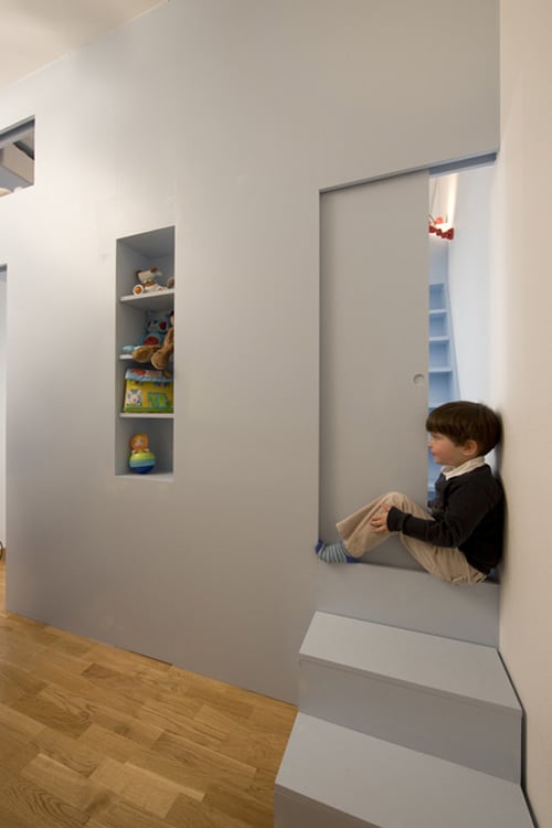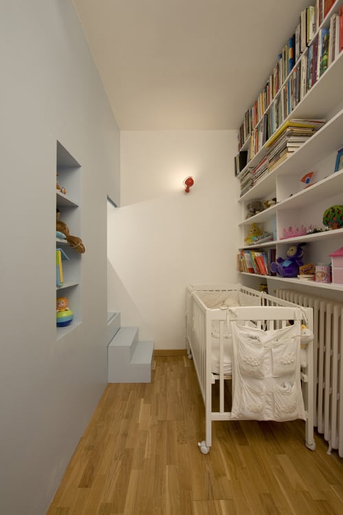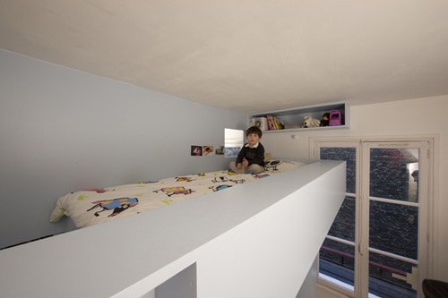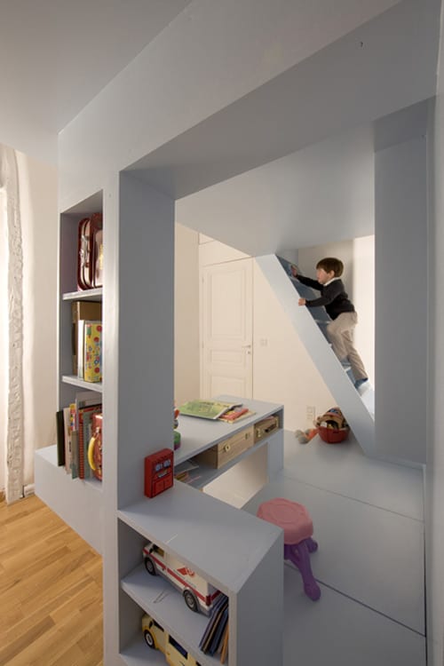
With a small but highly adored apartment in France and a new baby in the picture, this family (of now four) needed to consider some creative space design for the children’s room. h2o Architects came up with a unique and aesthetically pleasing solution. They developed a unit, which essentially splits the room in two areas (one for each of the children) and makes use of height of the room to gain space and maximize function. Using geometric shapes, platforms and supporting beams the unit has it all. The bed is situated on the top level and can be accessed via a darling staircase with built in lighting. Below is a play area that can be used in any way the children see fit – they can hide and play in the nooks and crannies or draw at the floating table. The bookshelves support the bed and are used for displaying and storing books and toys. On the other side of the unit is the baby crib, which can be observed from up top by a sliding partition from the older siblings bed. Another great feature is that the floor panels of this piece can be lifted to reveal some hidden storage space. Best of all, this unit has a modern and sleek design – yet playful enough for a child to enjoy. Everybody wins – children and parents alike. Visit h2o Architecture for more info.
Photo credit: Stephane Chalmeau.
via Dwell.
