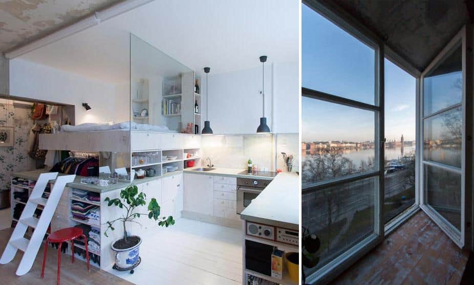
When Karen Matz was first show the HB6B Apartment in the heart of Stockholm, Sweden, she was amazed that in such a high demand area for living space, an apartment in the middle of an 80s renovation was frozen in time and used for nothing more then storing furniture. The original homeowner had begun the renovation before becoming ill and so it sat until now. A gem in the middle of the city with wallpaper half removed and only a wall faucet and a few tiles pointing the way to the kitchen. Luckily there was no electricity, otherwise lit up the apartment would have looked worse then it already did. Although incredibly small at only 36sqm (just over 380sqft) and in a state of obvious disrepair, Karen Matz was excited to take on the project not only because of the shortage of living space within the area, but also those stunning views outside the windows and the story that came with the apartment. Karen’s creative solutions to small space living and her desire to retain some of the original history resulted in multi functional spaces with both modern and historical references.
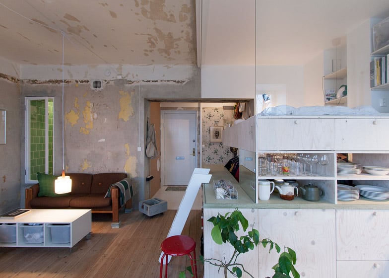
The apartment opens to a small hallway with an exposed closet on the left and the bathroom door, clad in cork on the right. From there it leads into the open concept living space that includes a glass panel within the bed platform overlooking the living, dining and kitchen areas. It’s a modern moment on top of pale wood cabinetry and surrounded by the aged and patina’d walls that were left to tell the tale of the previous owner, much the same way antique collectors prefer to leave coffee or tea rings and dents on furniture.
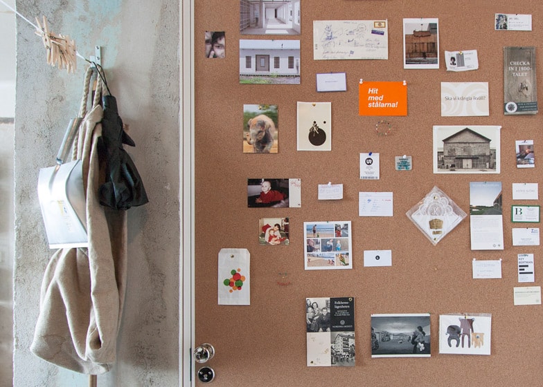
Gluing a sheet of cork onto the bathroom door creates a space for the occupant to pin up photos, notes and mementos at whim, its an easy DIY idea that can be replicated in very little time.
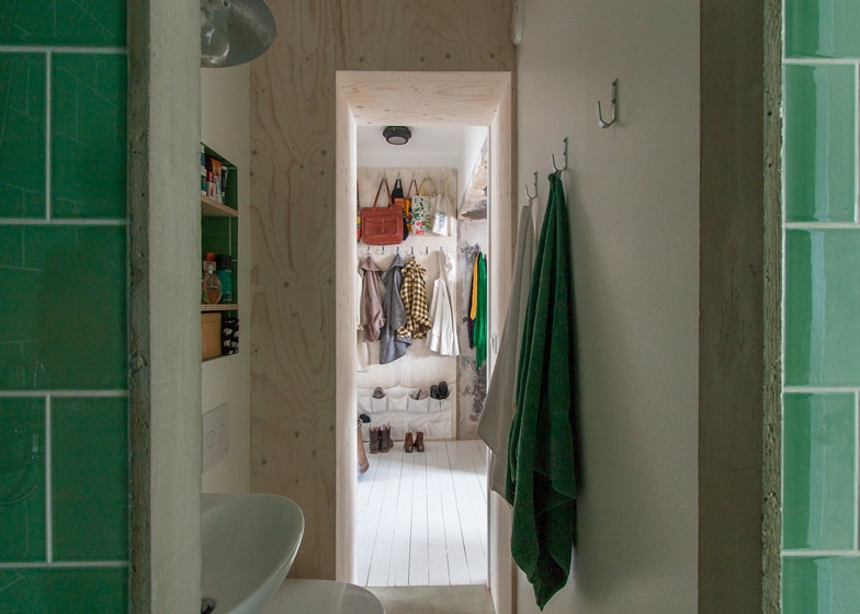
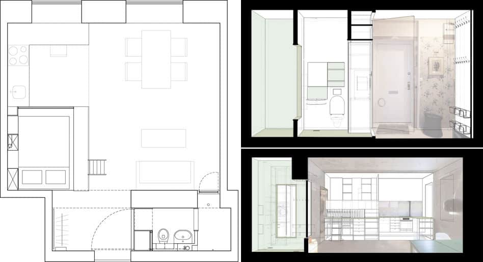
The bathroom is a teeny tiny space so functionality of space was a top priority. Recessed shelves where built into the wall above the sink and toilet and a row of hooks was installed on the opposite wall. This part of the bathroom was reduced to its minimal limits and opens up on the other end to the shower.
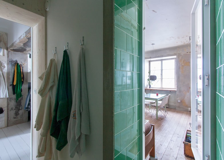
To let natural light into the bathroom, the shower has been fitted with an operable glass window that opens to the living room. This also means that the bathroom can be accessed from two locations
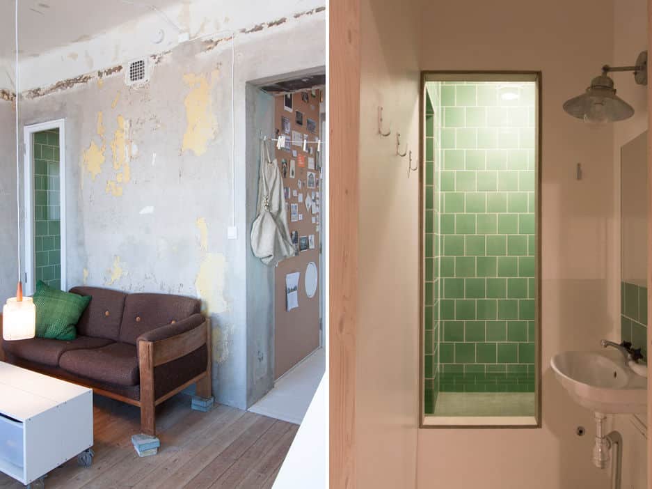
Both shower accesses are through openings one foot off the ground to contain the water and stop it from spilling into the connecting zones. While the way into the living room is an operable window, the one to the sink and toilet room is a glass free opening.
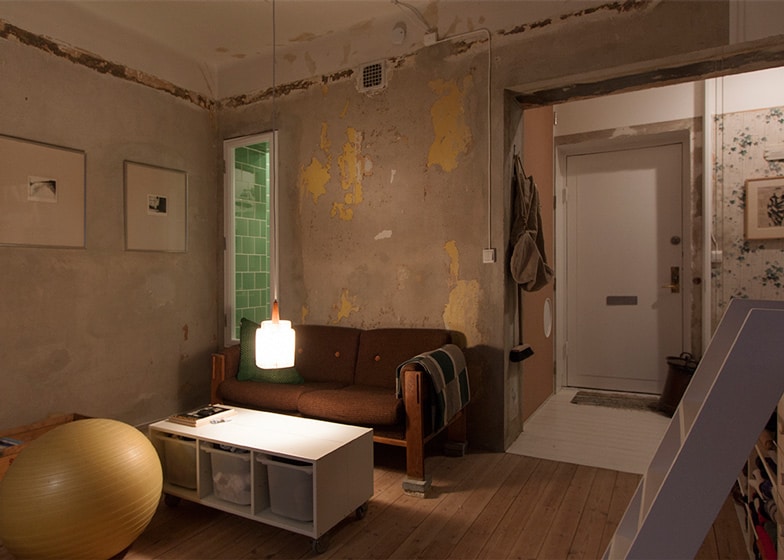
The brilliant emerald green subway tiles used in the shower stall create a splash of shiny colour within the living zone – in complete contrast to the neutral palette of heavily patina’d plaster walls. The contrast continues the complex story that the designer hoped to keep alive.
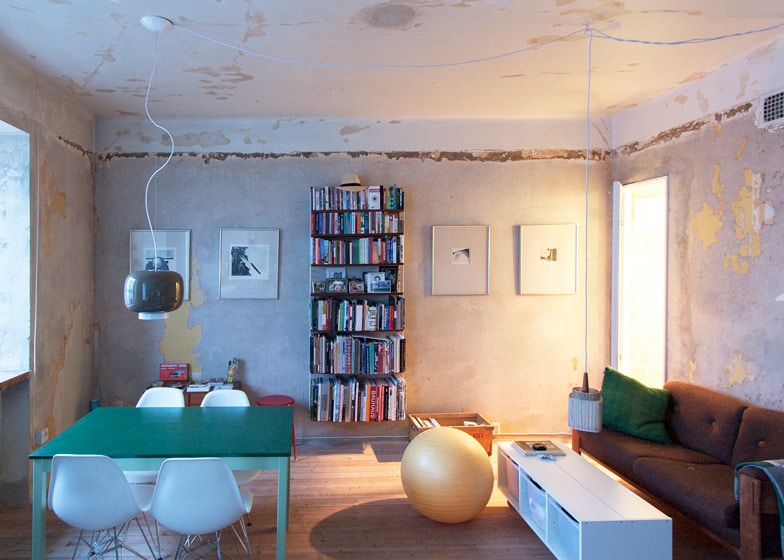
As architect and designer, Karen Matz wanted to leave the majority of the surfaces the same as they had been for last few decades. One of the ways she did this was to only fill the holes in the walls and remove the loose wallpaper and paint without opening them up to do the rewiring the apartment desperately needed. She was able to achieve this by mounting the new electrical cables and outlets on the outside of the walls – fully exposed.
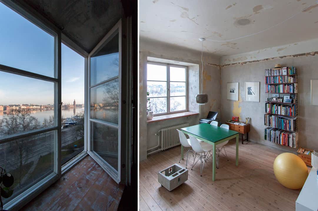
While the majority of the furnishings are neutral, an emerald green dining table was chosen to tie in with the view of the shower tiles and since the dining room overlooks the water vistas, the table also creates a connection to the natural landscape beyond.
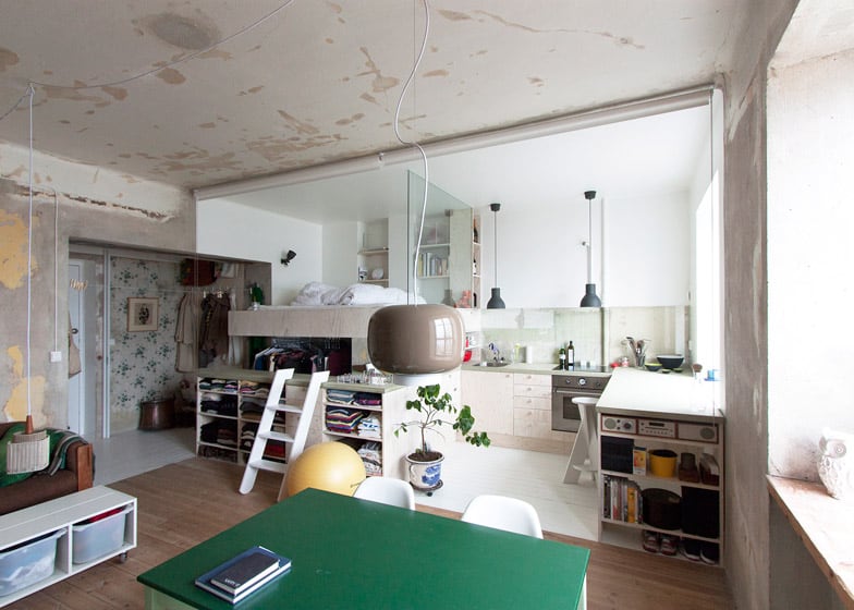
The dining room is tucked into the corner between the kitchen and living room and the three zones complete the floor space within the open area while an additional zone – the bedroom – is positioned where a kitchen island would normally be placed – only a little higher up.
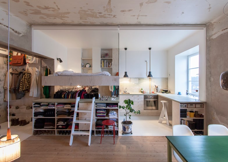
At only 36sqm it was never going to be a conventional location for the bedroom so Karen decided to push unconventionality as far as she could go and the final result is both clever and original. Positioned midway between the floor and the ceiling, the bedroom closet fills the space below the bed with shelves on one side and a hanging rod on the other. A gap between the bed platform and the shelving creates both a tabletop and a foot rest before climbing into the bed above and to keep the space from feeling claustrophobic but still safe, Karen installed a glass panel on the kitchen side of the platform. Brilliant.
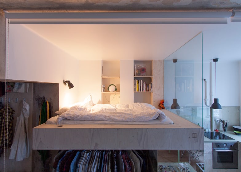
The platform is big enough to create a table surface all the way around the bed, making it an easy place to leave a book, magazine, cup of coffee or midnight snack. A wall-mounted light keeps the space functional after dark and recessed shelving in the wall behind it means the occupant can store a multitude of items – even music since there is an outlet within one of the shelves.
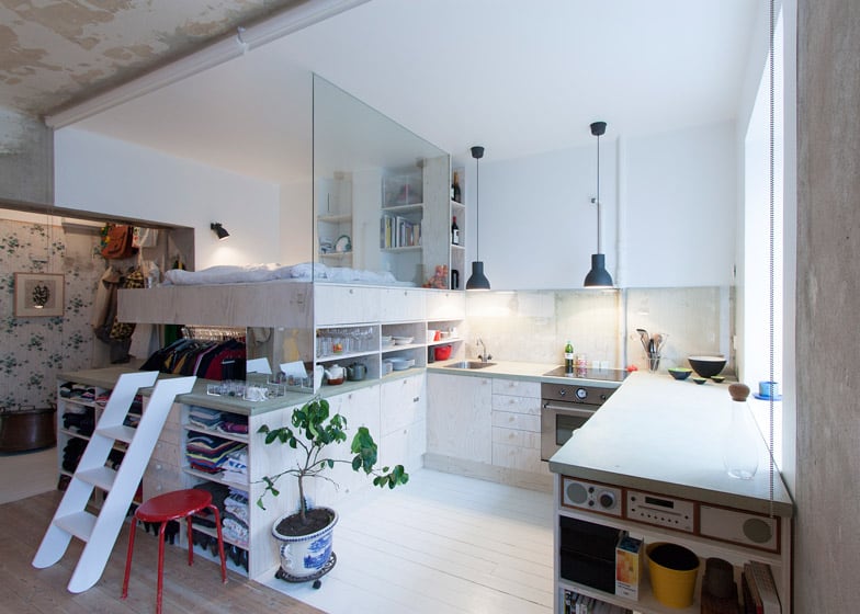
The kitchen doesn’t blink an eye with the infringing bedroom above, in fact the bed platform has been fitted with recessed cabinets on the kitchen side that are finished in the same pale wood as the rest of the cabinetry. And the space between the recessed cabinets and the lower cabinets has been filled with open shelving to tie in with the open shelves on both sides of the outside perimeter. The counter top open shelves have been fitted with a mirror on their end panel, creating the perfect place for the occupant to get themselves ready in the morning after climbing out of their bed.
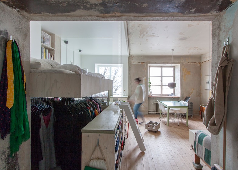
Right from the front door and all through the zones, functionality has been exploited in an “outside the box” kind of way that harmonizes perfectly with the decades of patina that has not only been saved, but also celebrated.
Karen Matz Arketekt
