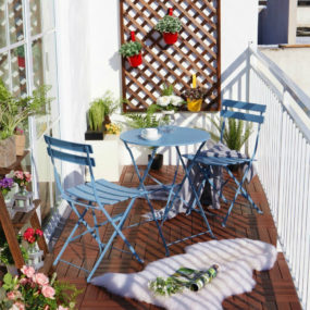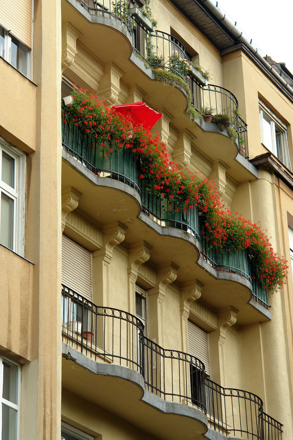
When you arrive at Margit and Geza Hamoir’s apartment building in Budapest, Hungary, it isn’t hard to tell which balcony belongs to them. The couple love colour – and their balcony is overflowing with it. An orchestra of red flowers spills over the rail surrounded by green foliage and a bright red umbrella stands guard over the scene. The lush blooms are just a hint of what you will see upon entering their home.
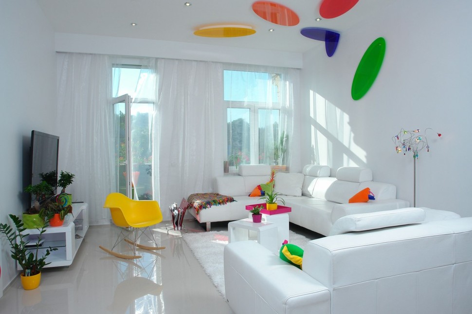
The balcony is adjacent to Margit and Geza’s living space and sheer white curtains create a breezy division between the two areas when the door is open. Inside the explosion of colour from the balcony continues – but in a more contained and controlled manner. All the hardscaping is bright white from the floors to the walls to the larger pieces of furniture. The fun starts with everything else – especially the lighting. Stunning elliptical light fixtures that start on the ceiling and then spill down onto the walls above the couch are each a different colour and this creates a feeling of life and movement – as though each one was a different tropical bird in flight. The pillows on the couch are bold pops of colour as is the fuchsia tray on the coffee table. A banana yellow moulded plastic rocker adds to the colour story, as does the flat screen TV that blends with all the other colour pops as just another graphic element.
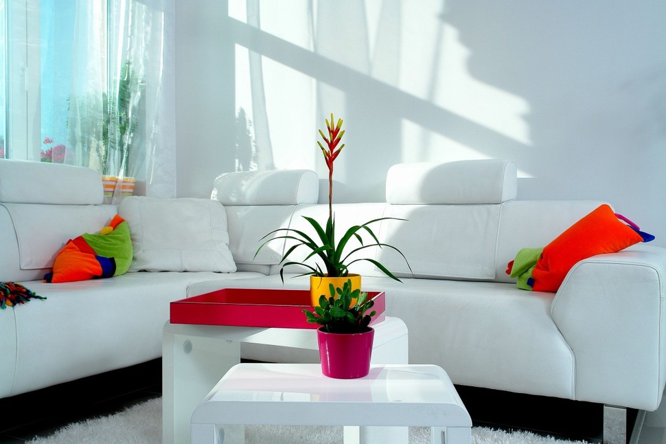
The white couch has a black recessed framework that leaves the viewer with the impression that the couch is floating, the two white coffee tables are small, bullnosed on the edges and open underneath. The eye is kept on top of these three surfaces with the use of power packed colours in the pillows, plant pots and tray. The shadows on the white walls add an extra layer of drama.
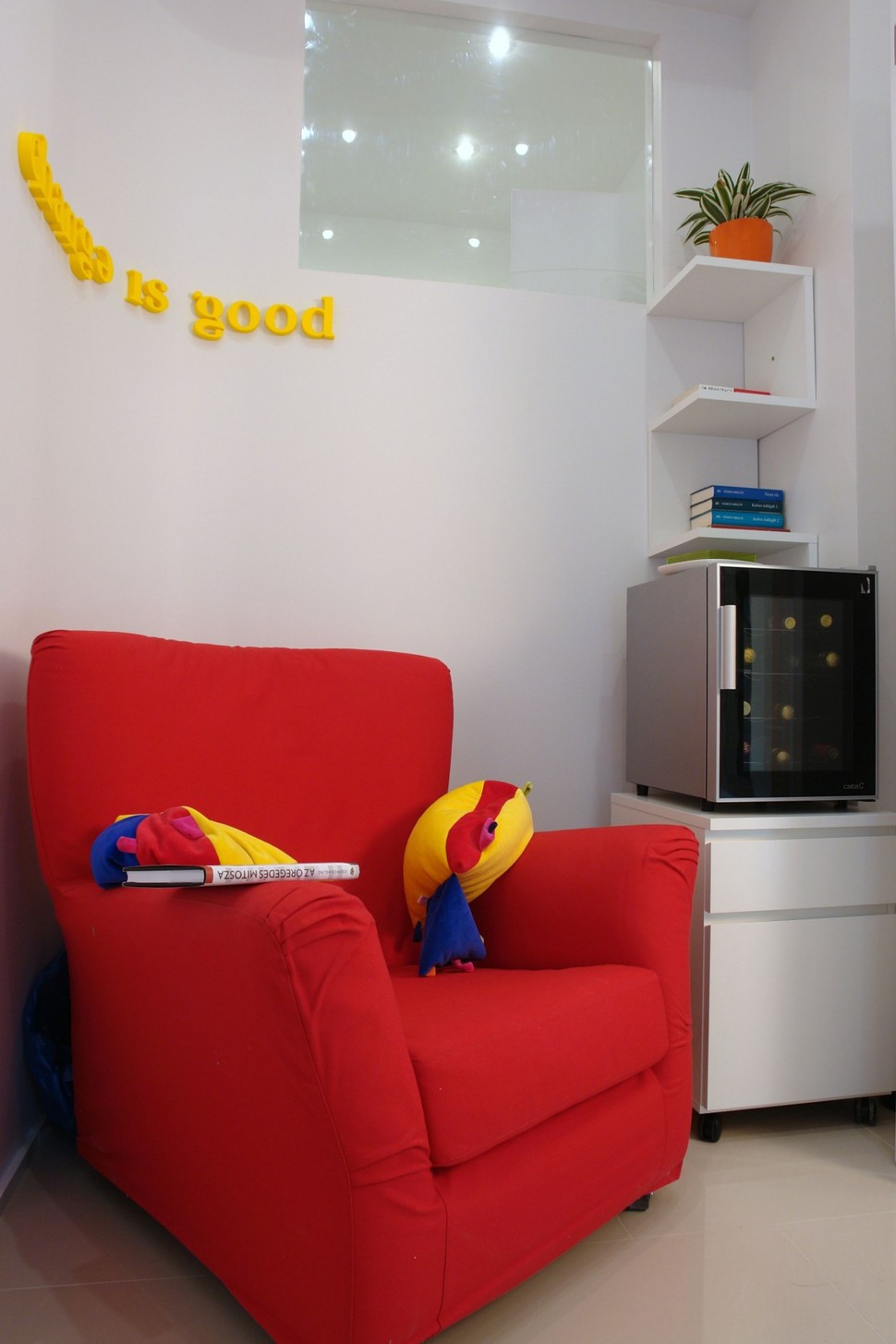
On the other side of the room bold Lemon Yellow letters are mounted in a short phrase above a Rose Red armchair. A whimsical yellow and red fish pillow rests its Navy fins on the armrest and colour blocked blue books are stacked on a shelf.
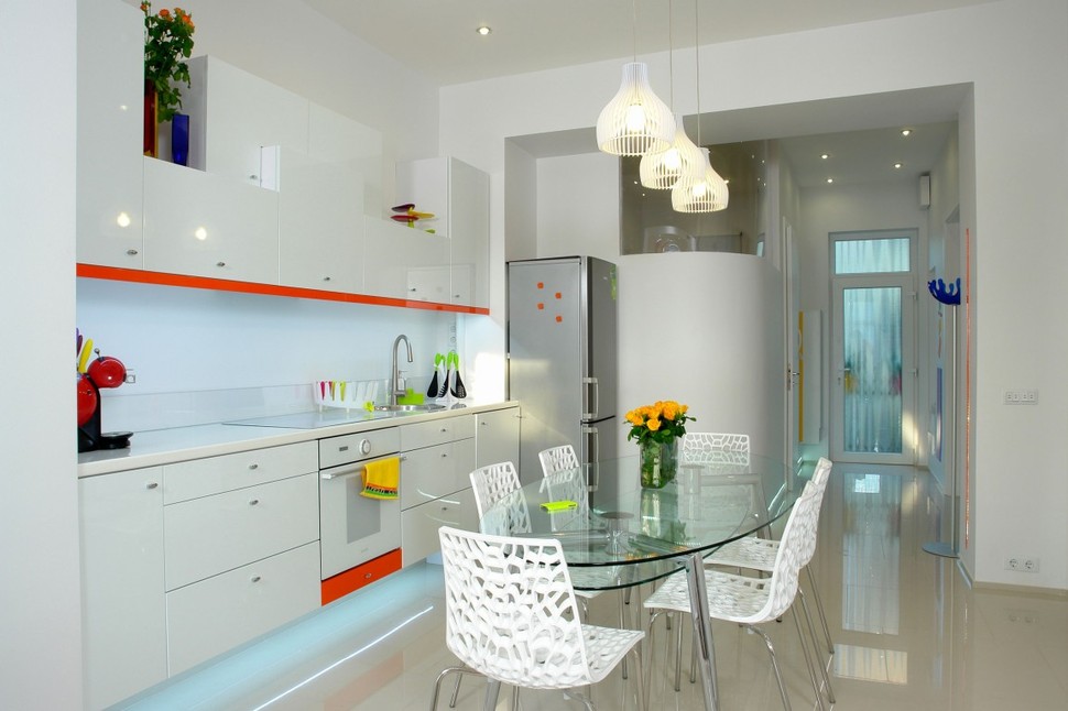
The kitchen continues the theme of using white on all the hardscaping – with a little addition. A Ferrari red running board follows the bottom edge of the upper cabinets and the kick on the stove. Additional pops of colour are only brought in via flowers, towels and a few small accessories. The kitchen table is glass so as not to visually impede the overall look of the room and the white chairs are an organic fractal pattern.
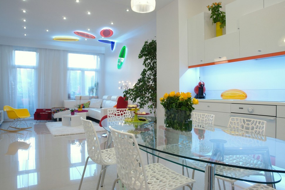
The full effect of the white backdrop against the pops of vibrant colour really come into their own when the lights are turned on. The glow of LED bulbs emanating from the fixtures creates shadows and reflections that become part of the overall graphic pattern of the room as though the complete space was a well thought out abstract painting. The balance of the light and colours create a rhythm through the space that is neither jarring nor busy. It is obvious that much thought went into the overall effect and the success of it is just awesome.
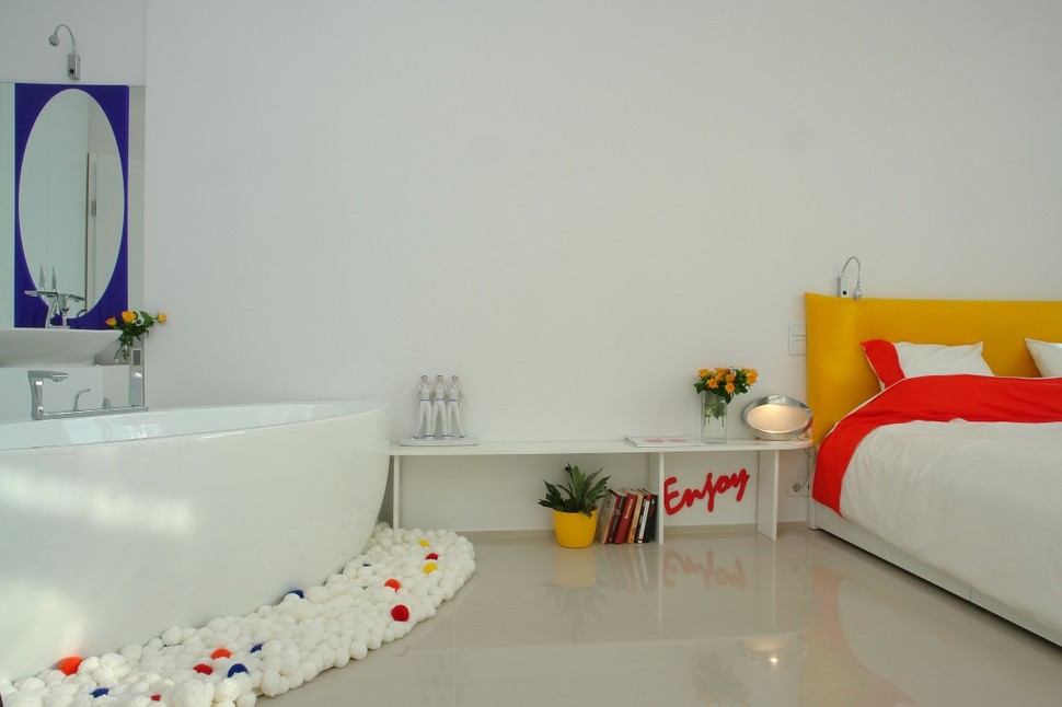
The Master Bedroom follows the same format as the living spaces, but while the colour is slightly more subdued – the whimsy is not. A Mustard headboard, red bands on the bedding, A red phrase “Enjoy” tucked under the elongated bedside table and a mustard plant pot are almost all the colour to be seen. Next to the bed is the bathtub and here a rich Midnight Blue frames the mirror below the shower head. All of this is not overly exciting – until you look down and see the custom handmade rug that surrounds the tub.
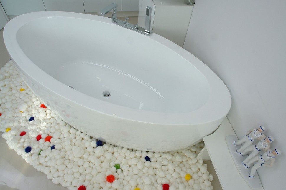
The handmade rug that surrounds the tub is a playful reinterpretation of bubbles, as though the homeowner was having a bubble bath and some of the bubbles spilled over. Every so often a bubble is done in a pop of colour, and this just adds so much more to the fun factor.
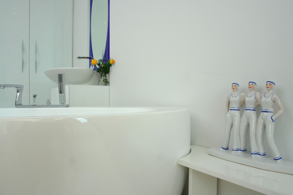
On the table next to the tub a group of 3 female sailors stand guard. Maybe they would like to jump in?
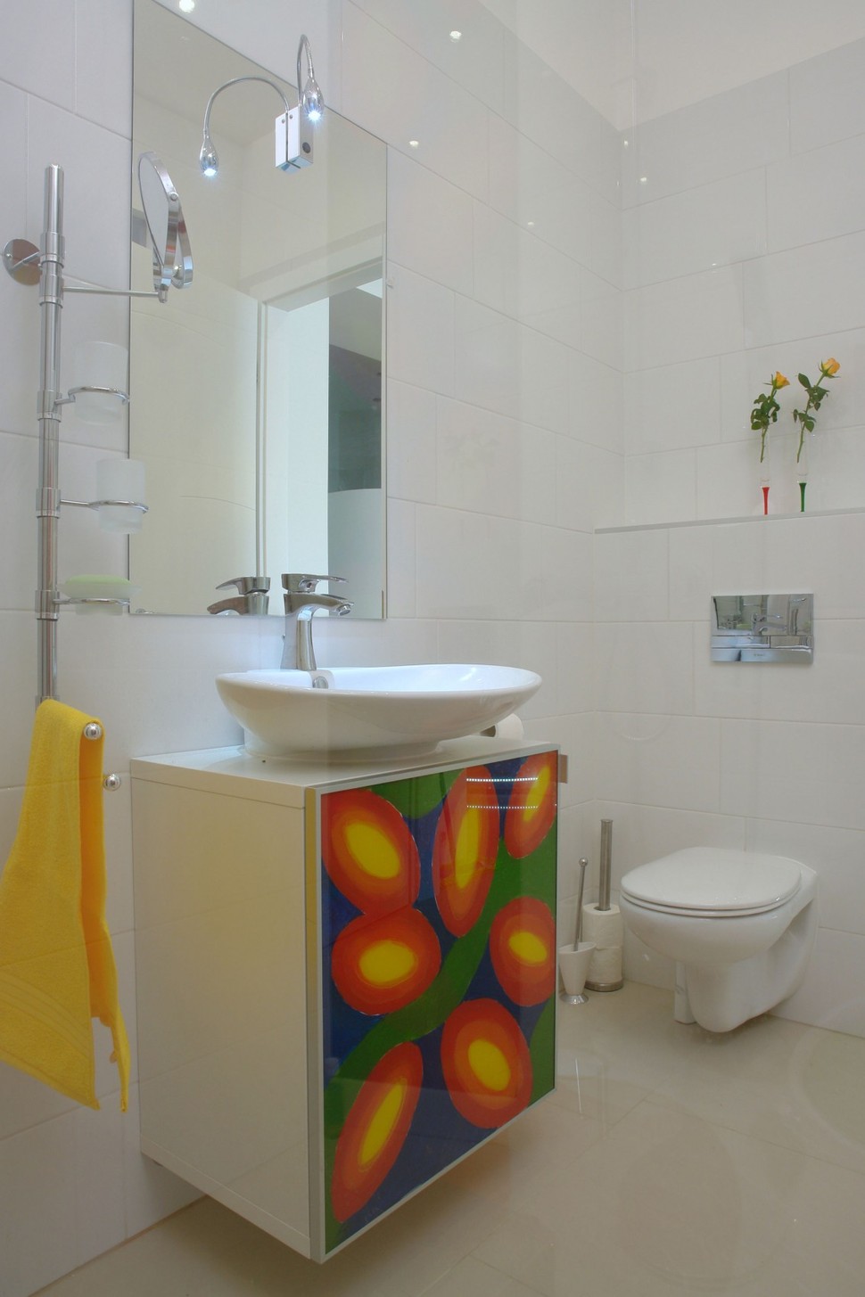
In the Powder Room, the Vanity is the only vivacious splash of colour and pattern. The elliptical yellow and red graphic representations of flowers next to their green stems and the dark blue night sky are beautiful. As whimsical and playful as the bubble rug, it would be a joy to use this space.
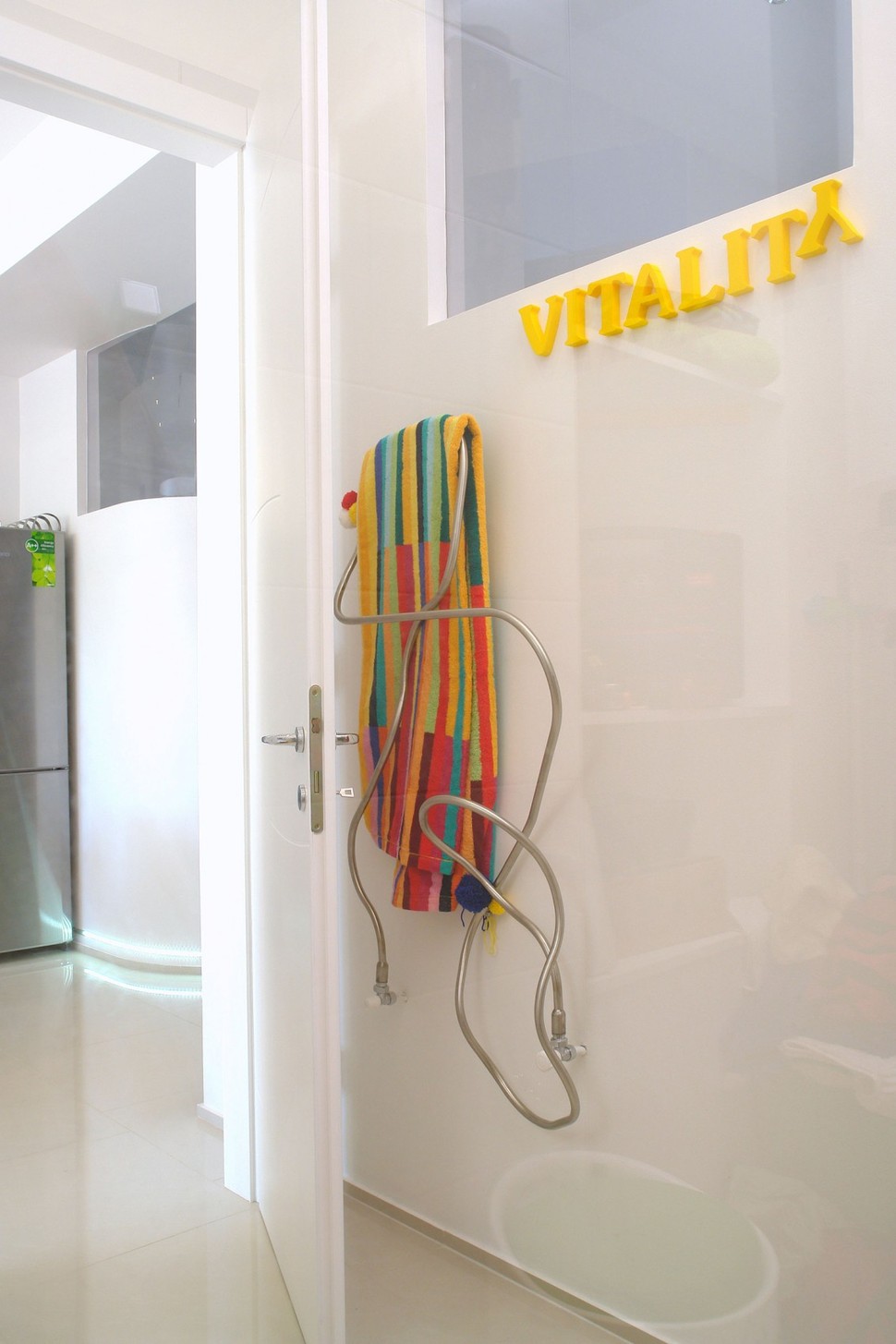
The heated towel rack is not the usual row upon row of heated bars, but rather a curving organic form that resembles a “found” branch or stretch of bull kelp.
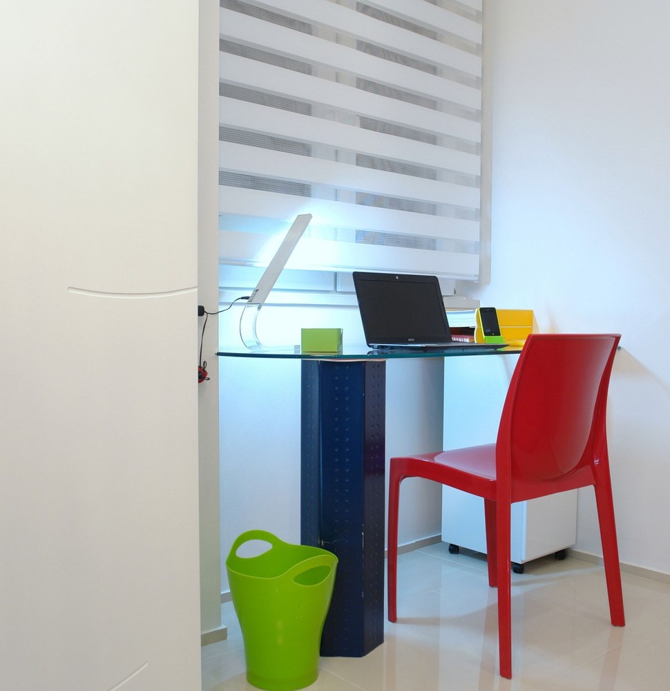
In a small niche below a window a laptop station is set up. The desk is a combination of black and white and is surrounded with more colour pops via the iPhone station, the chair and the waste basket.
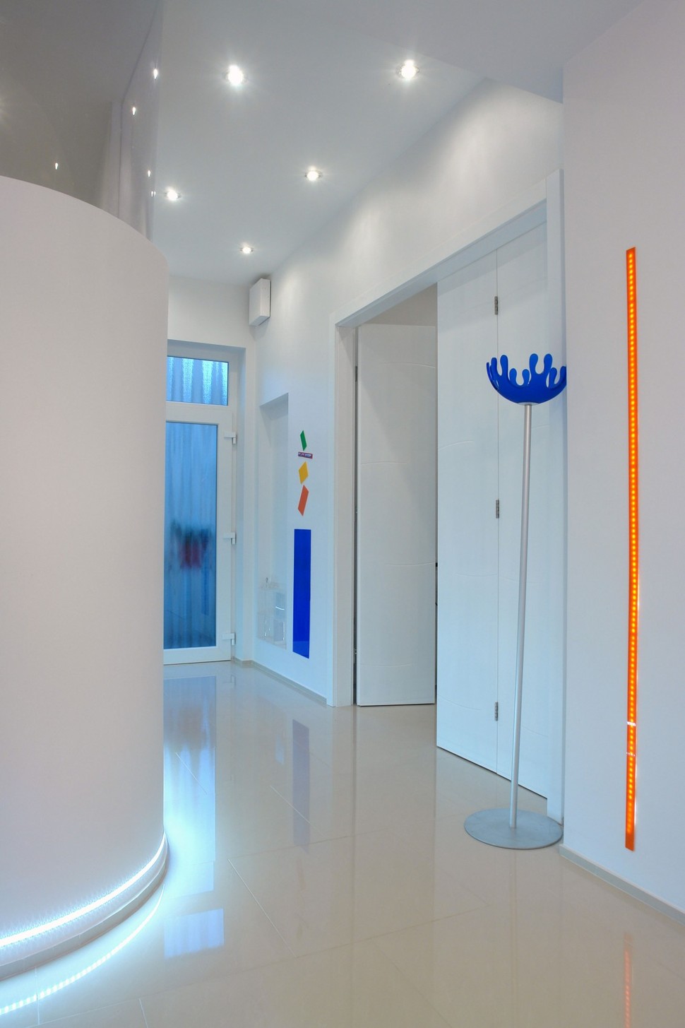
Usually hallways are overlooked areas, but not here. The vertical strip of orange lighting, a standing floor lamp with a cobalt shade and random rectangles of colour further down the hall create direction, flow and interest – and lets not forget about the uber cool lighting in the baseboards!
Margit and Geza Hamoir, founders of Margeza
