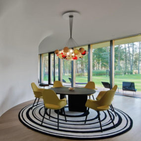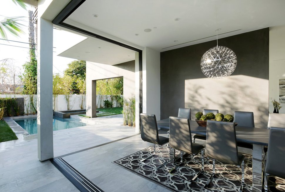
Amit Apel Design created a family home in Los Angeles, California, USA around the colours of black, white and various shades of grey. The bold contrasts between the black and white walls are tempered by the various textures used throughout the home. In the dining room the textures are presented first within the concrete flooring and then in the lush geometrically patterned area rug below the table and most impressively in the globe of sparkling crystals within the light fixture. While the room only uses black, grey and white as its muse, pops of blues and greens from the pool and garden outside wrap the space in a cool and crisp atmosphere.
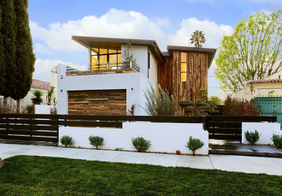
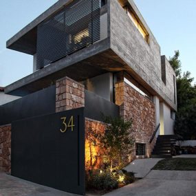
From the street, the home creates a profile of white and wood and does not belie the powerful black compositions within.
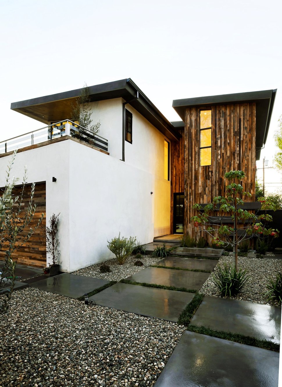
As you pass through the fence surrounding the property and make your way to the front entrance, shades of black make their presence known within the aggregate walkway an the smooth concrete pavers. Here, too, greenery is introduced via plantings as a grout line around the pavers and in small feature moments.
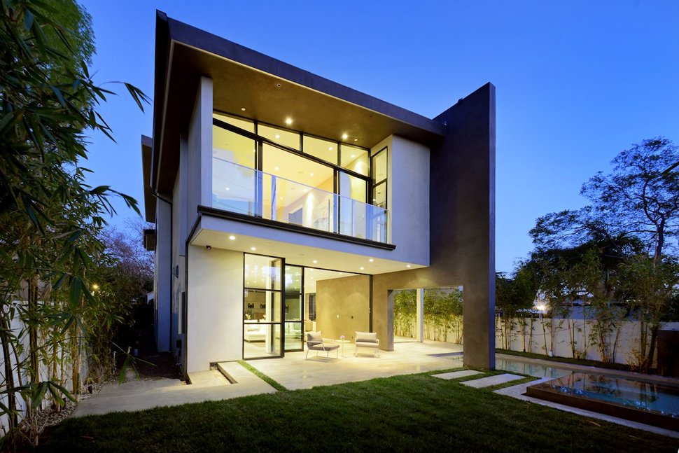
The back of the home presents a more modern profile with its walls of window glazings and geometric voids.
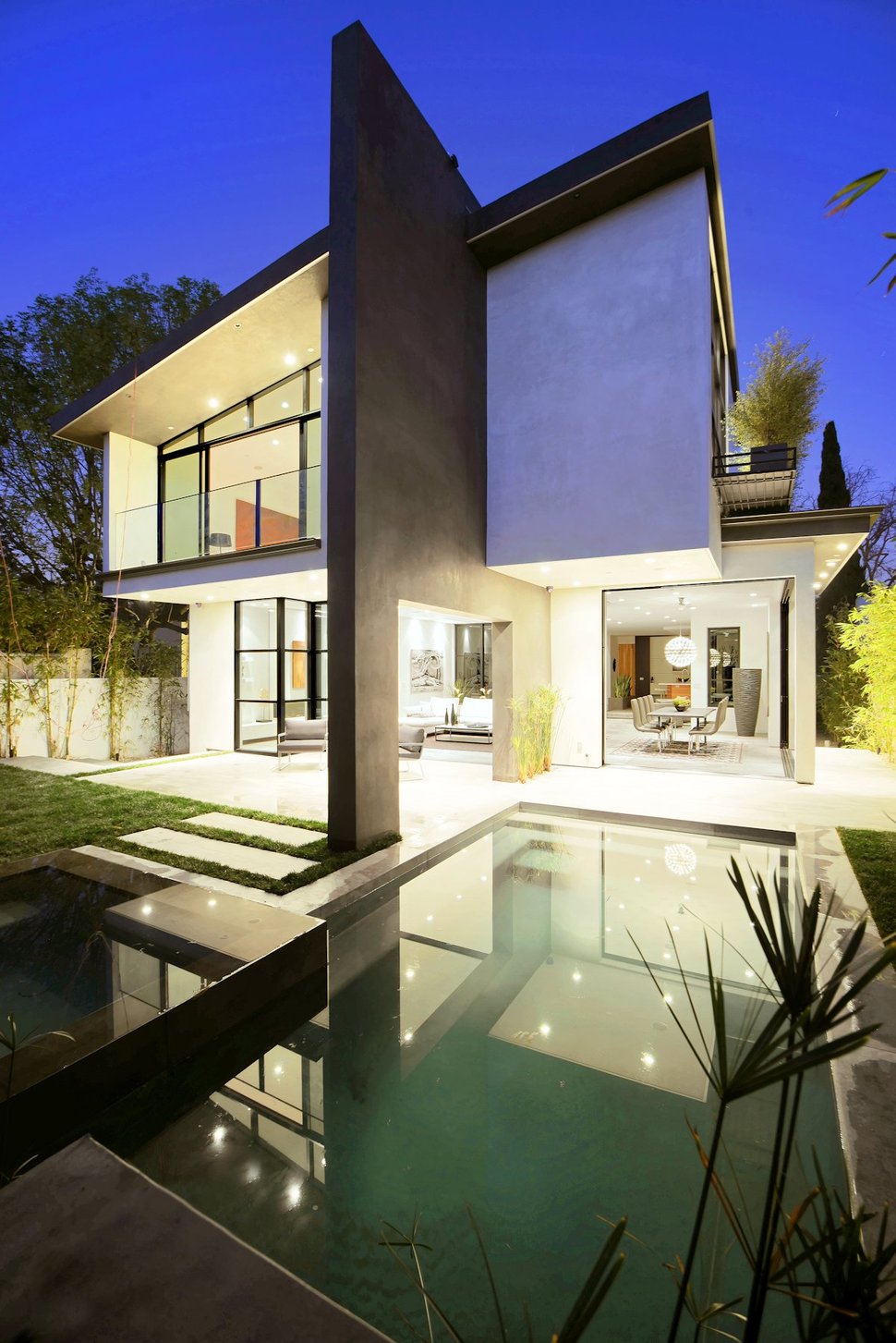
The backyard is divided with a lawn on one side and the spa and pool on the other. While the pool is directly outside the dining room, it can also be accessed via the outdoor lounge area just outside the indoor living zone.
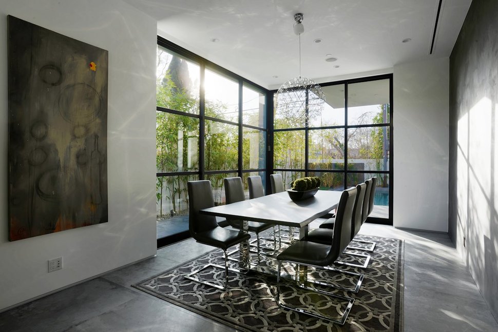
The dining room has two large sections of gridded window glazings that can be completely opened up for an indoor/outdoor lifestyle.
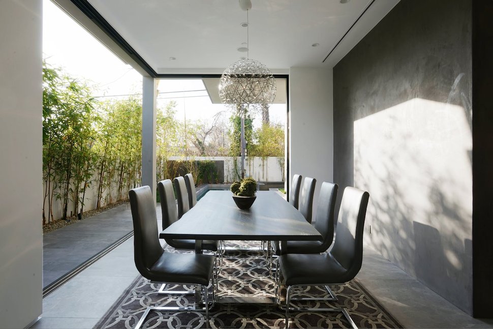
The windows completely retract into the walls for a seamless integration to the outdoors.
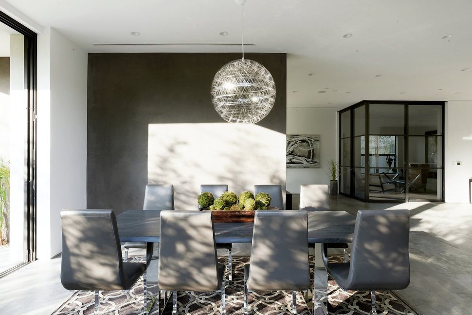
The black wall within the dining room does not run the complete length of the room, allowing for a view into the social zone beyond. In the corner of the social zone is the home office, completely wrapped in glazing, creating both a private and yet public space.
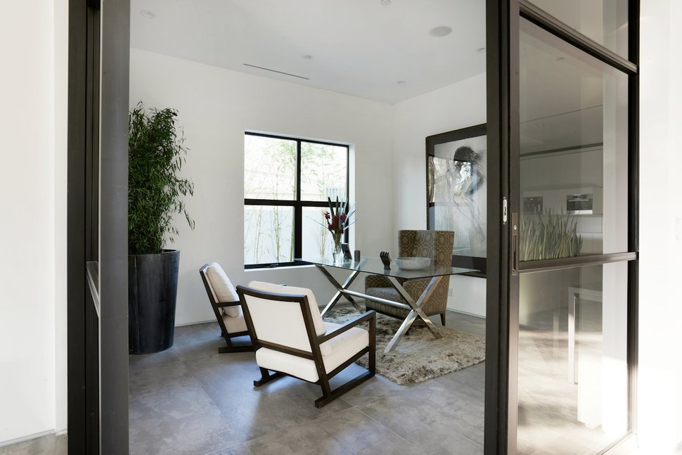
The office features the same black gridded windows as the dining room and this detail is continued within the framework of the two chairs facing the desk.
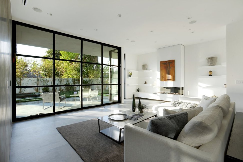
The wall that separates the living room from the dining room is also black on the living room side, while opposite the fireplace wall is a composition of white shelving.
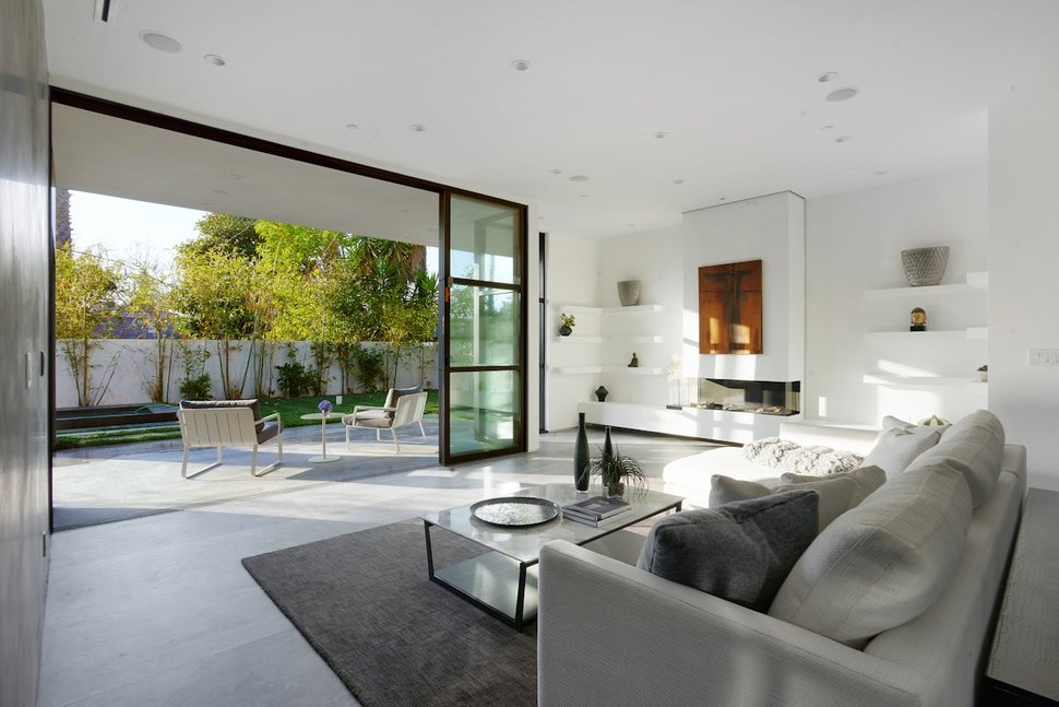
The gridded glass wall in the living room also opens up to create an outdoor extension of the social zone.
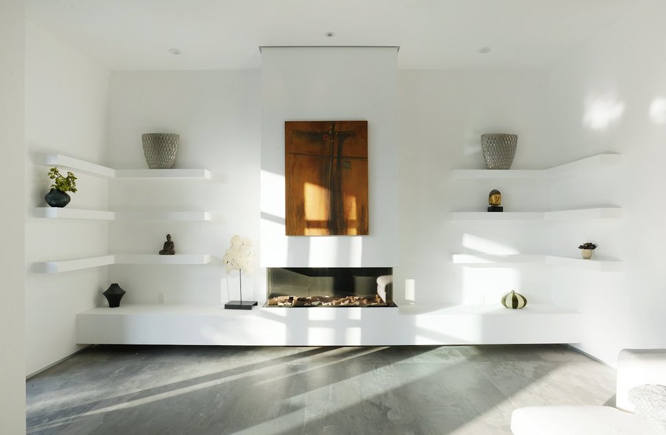
I love how the hearth floats a few inches above the concrete floor to create a dark shadow line.
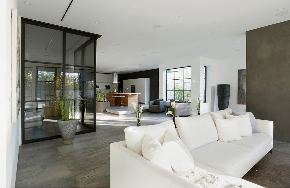
The office is centrally located between the living area and the kitchen
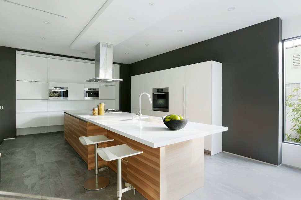
The white of the kitchen cabinets pop against both the black walls that surround them and the wood that wraps the island. The wood on the bar is a beautiful backdrop to the two white barstools. The look is clean, crisp and rather awesome.
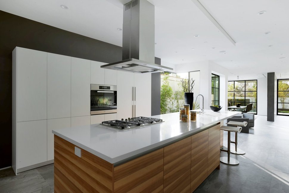
While the kitchen is in the front of the home, it can still take advantage of the garden vistas via the large expanses of glazings in the dining and living zones. The gridding on all the windows and the back wall separating the dining and living rooms create a continuum to the black walls within the kitchen.
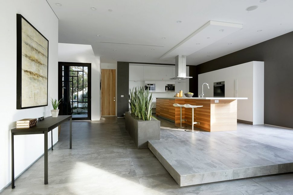
While the kitchen has the same flooring used elsewhere within this level, the kitchen itself is on a “floating” platform. Much like the hearth of the fireplace, the dramatic shadow line created at the level change emphasizes the change of plane. Creating additional geometry, verticality and colour to the space is the concrete planter filled with the yellow and green variegated leaves of a large clump of Snake plants.
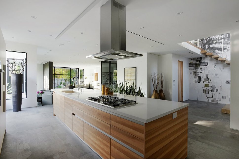
Just past the kitchen is the main entrance to the home and in this foyer, street chic is played up through the installation of a fun black and white wall paper on the stairwell wall.

The double volume foyer opens to the kitchen on the left, the stairwell on the right and a small powder room straight ahead.
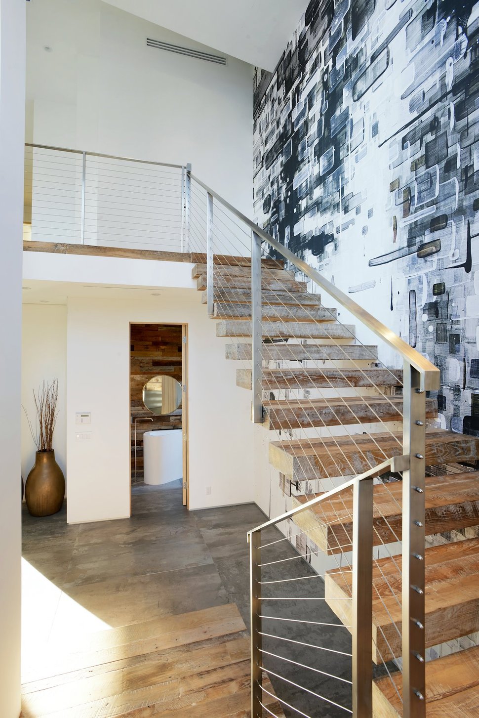
The powder room is tucked into the space below the mezzanine.
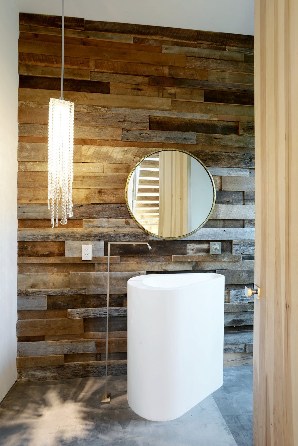
The powder room features a wall of reclaimed wood, a glitzy light fixture and a sculptural sink with a floor standing faucet. The room is fun, creative, elegant, rustic and down right stunning.
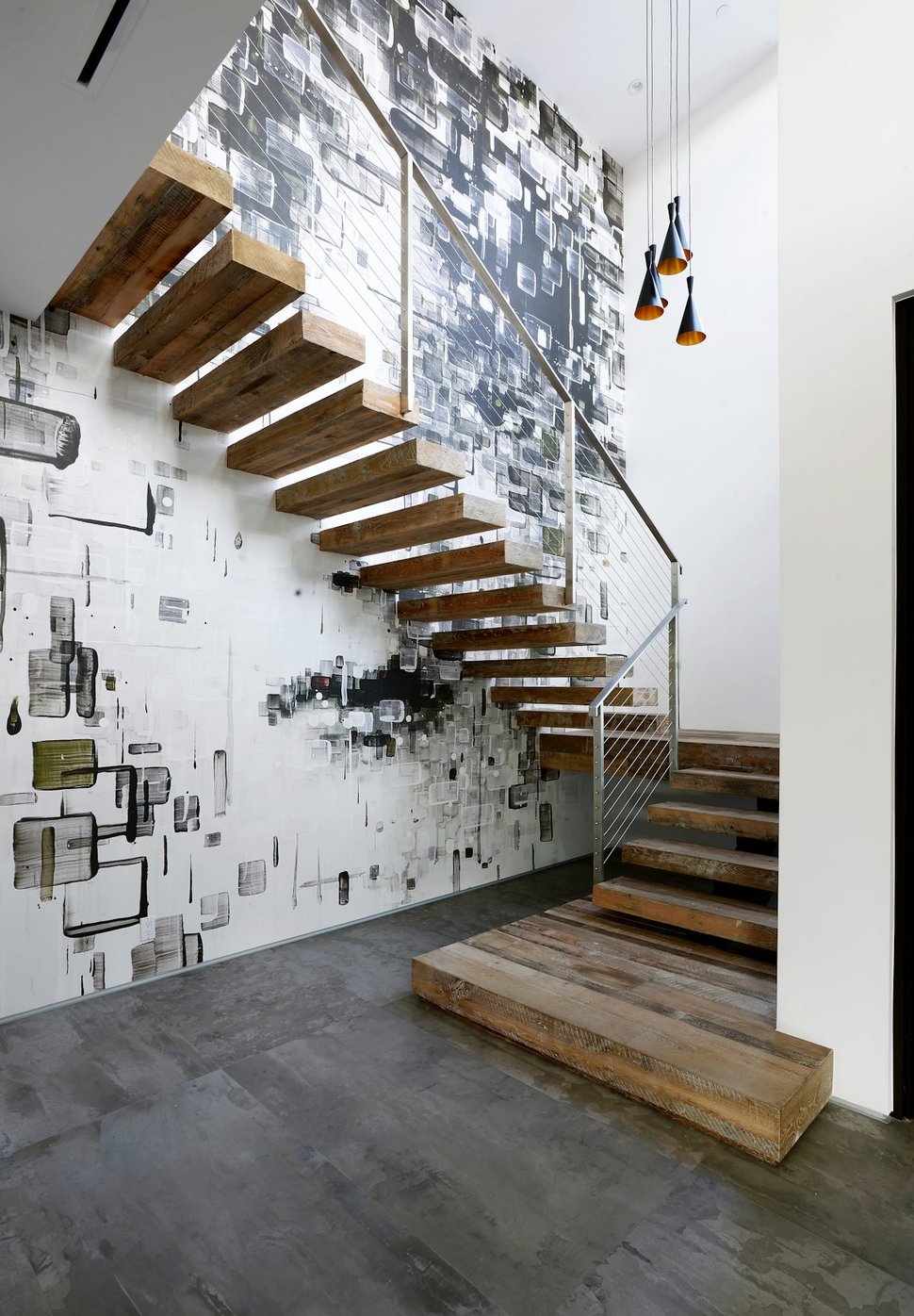
The treads within the open riser staircase are made from solid planks of wood cantilevered out from the street vibe wallpaper, creating a 3 dimensional statement that is more like an art installation then a functional stairwell, but functional it most certainly is.
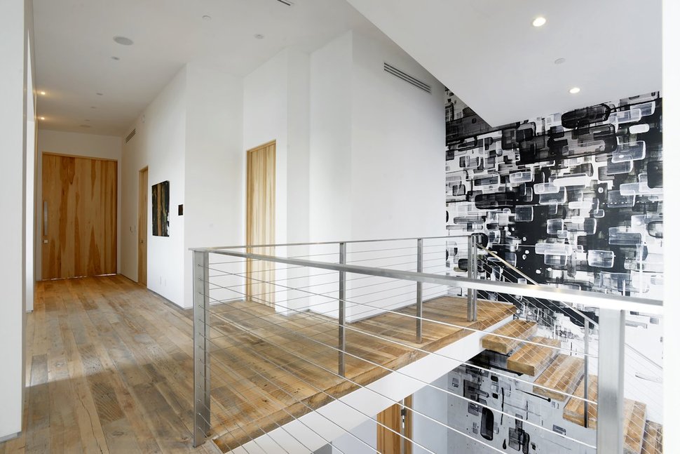
At the top of the stairwell a mezzanine wrapped in a Stainless Steel safety rail looks back down to the social level below.
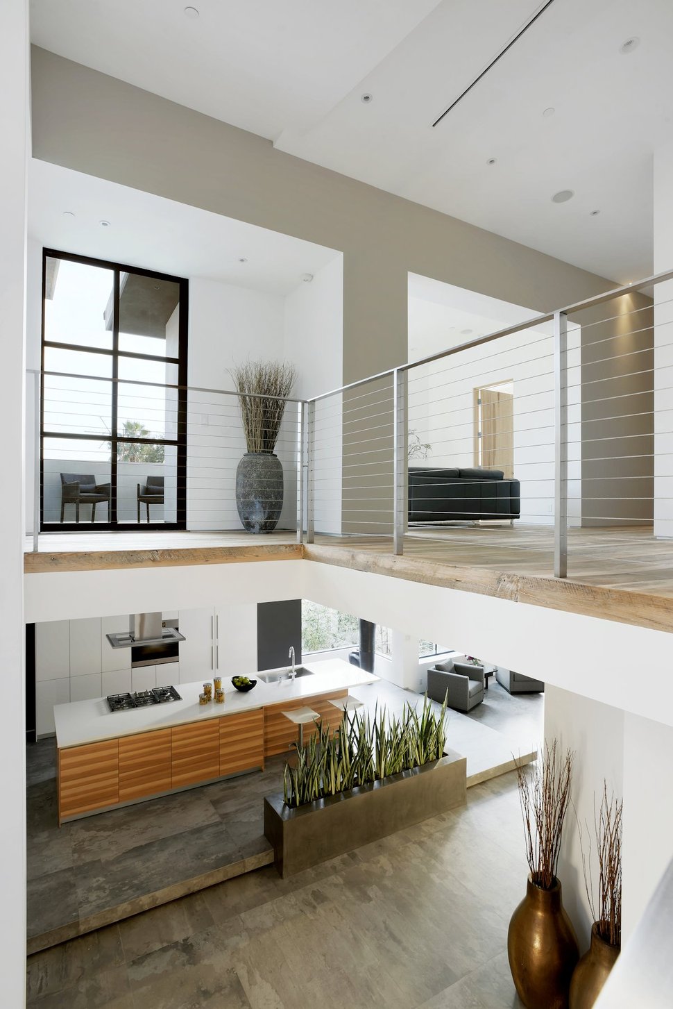
Just off of the mezzanine, an open family area offers comfortable seating for socializing before turning in for the night.
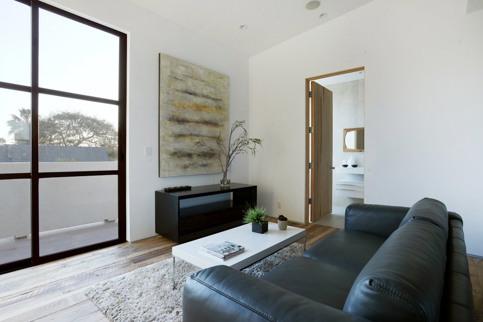
The family area has its own private washroom as well as its own access to a deck.
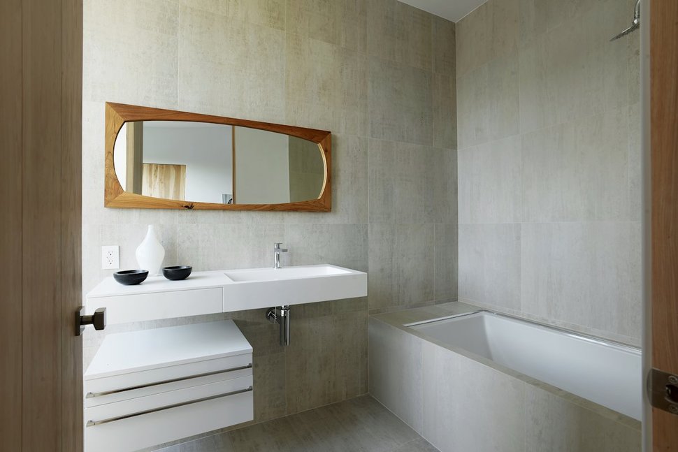
The bathroom off of the family room is wrapped in large 24″x24″ tiles tonally the same as the flooring downstairs.
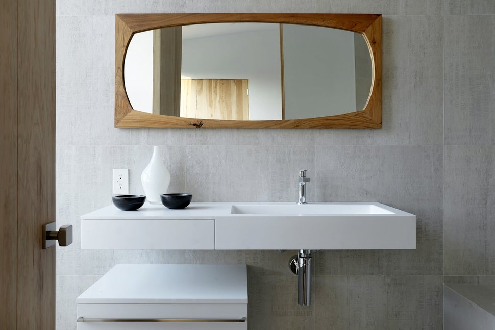
With no large pops of black within this washroom, the wood surround on the mirror becomes the focal point.
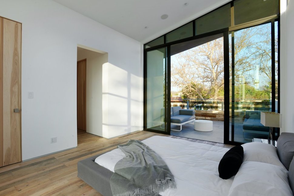
The Master Suite has its own private outdoor lounge area.
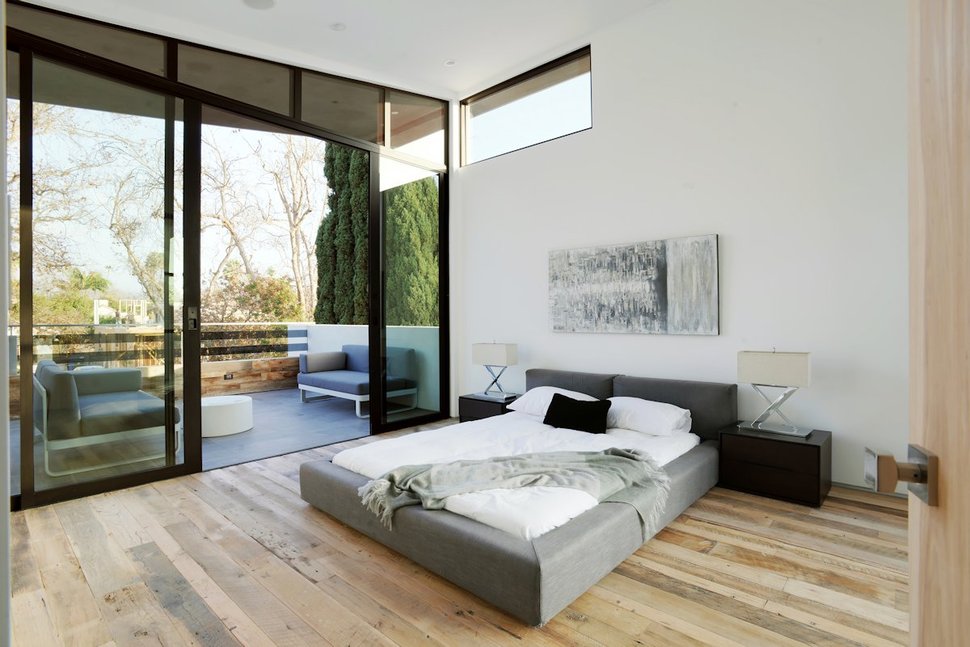
The deck off of the Master Suite is kept even more private by the tall evergreen hedging that flanks the side of the deck.
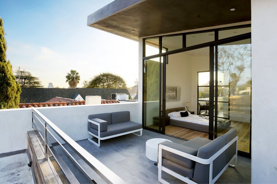
With the surrounding homes only one level, the view from the deck is all encompassing.
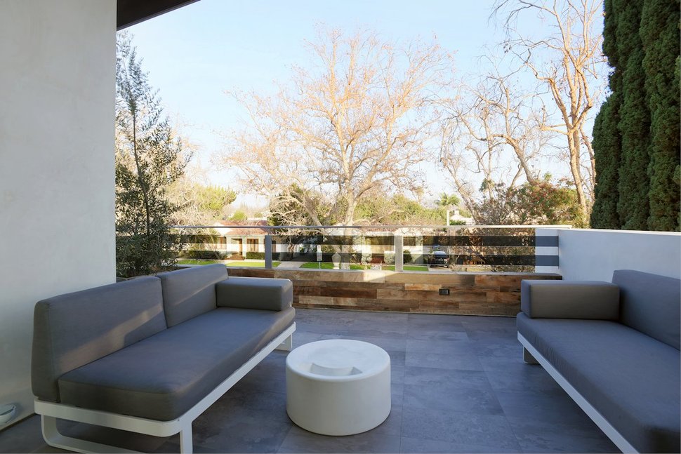
The deck overlooks the front of the home.
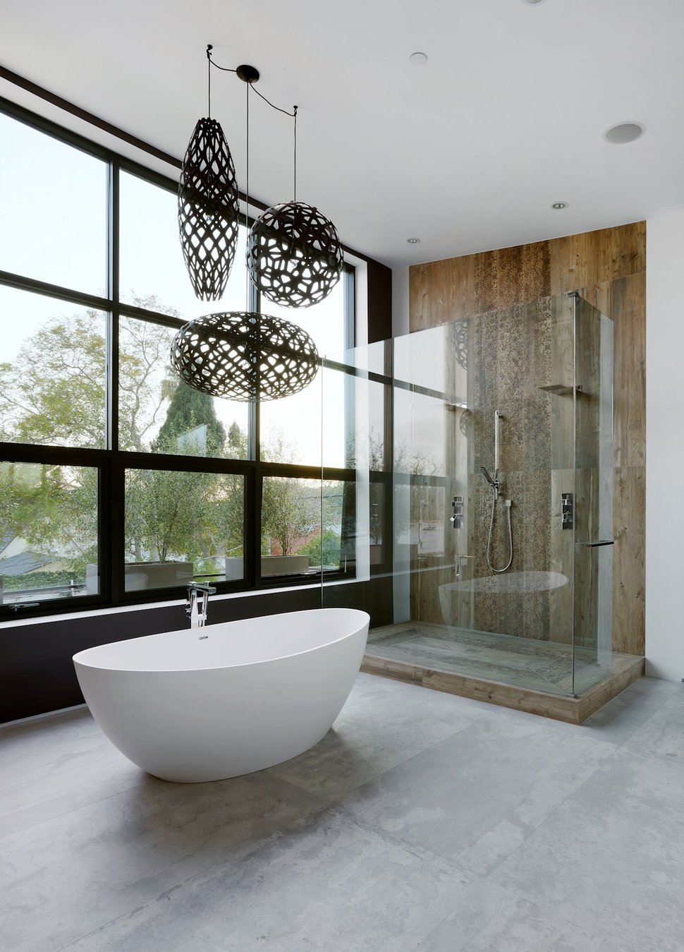
The ensuite also overlooks the front of the property, but even so, the architects designed this room to have large sweeping views through a wall of glazing that can be appreciated from every vantage point whether bathing, showering, using the sink or other and while the views are a pretty nice addition to the space, the elements within the room are simply stunning.
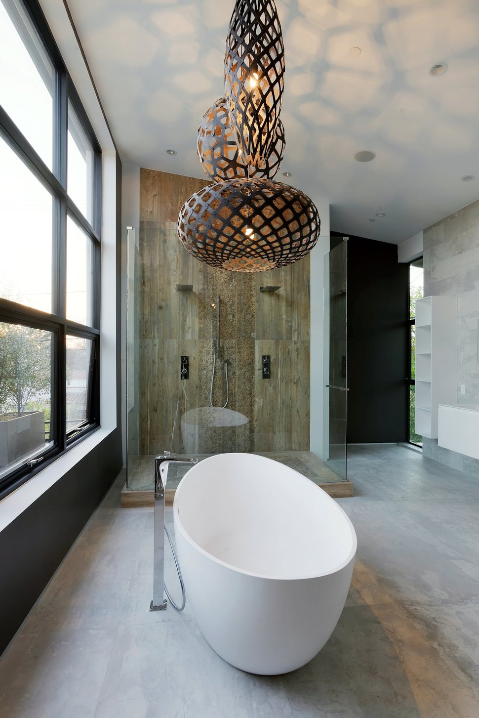
The 3 light fixtures over the soaker tub are a beautiful composition of gridding in various shapes that project a honeycomb shadow pattern throughout the room and the effect is as awesome as the pendants themselves. Then there’s the glass wrapped double shower stall – wow.
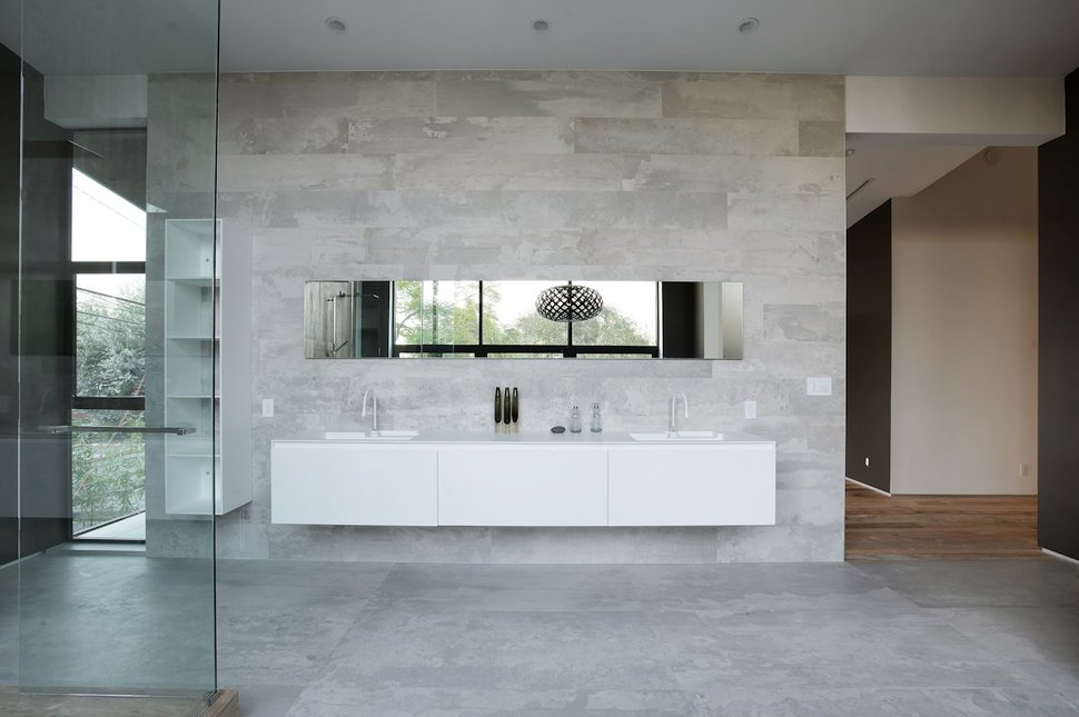
Across from the soaker tub and walk-in shower is where the vanity is located. A long white cantilevered cabinet with a white sink at either end and an equally long mirror above that reflects both the view and the pendants over the tub, the vanity zone is a functional, sleek, modern minimalist moment.
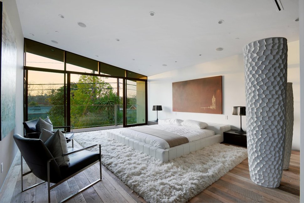
The second of the 3 additional bedrooms plays with the colour white through various textures in the gigantuous vessels, the area rug and the bed itself. Each one of these textures creates its own story within its shadows for an interestingly sculptural room composition.
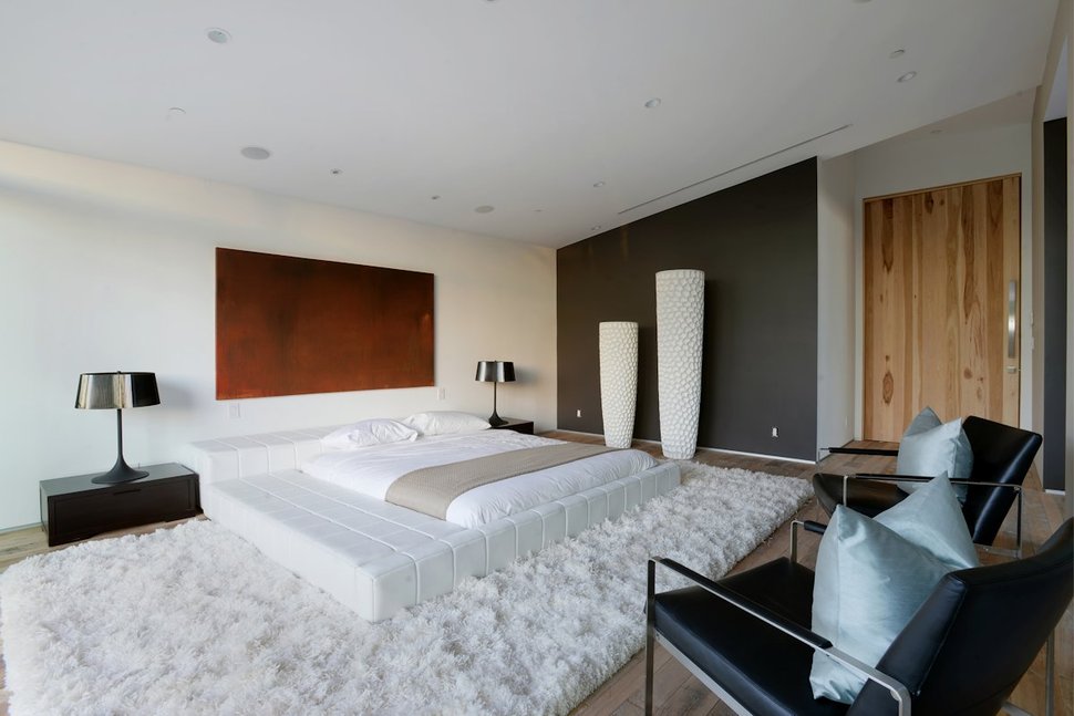
The room also plays with black and features a wall in matte black, bedside tables and lamps in black as well as two chairs. Unlike most of the other black and white rooms, this room has added a touch of colour via the two silvery blue cushions on the chairs.
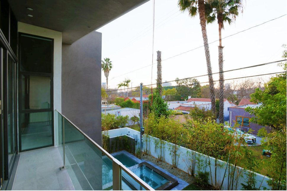
This bedroom has a narrow deck that overlooks the pool and spa, so the bluish pillows are picking up on the watery elements below
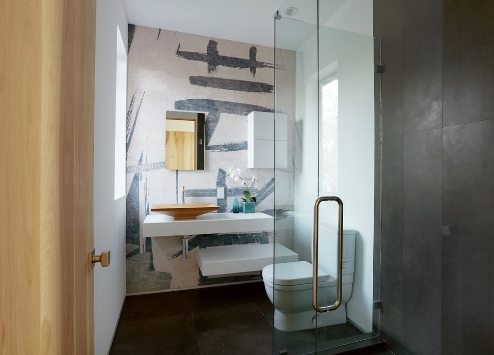
The ensuite of this bedroom is a jazzy expression of giant brush strokes on the wall that is countered by a geometric display within the vanity and storage systems. Layered into these opposing fluid and structured designs is a simple and elegant wood vessel sink. Simply beautiful.
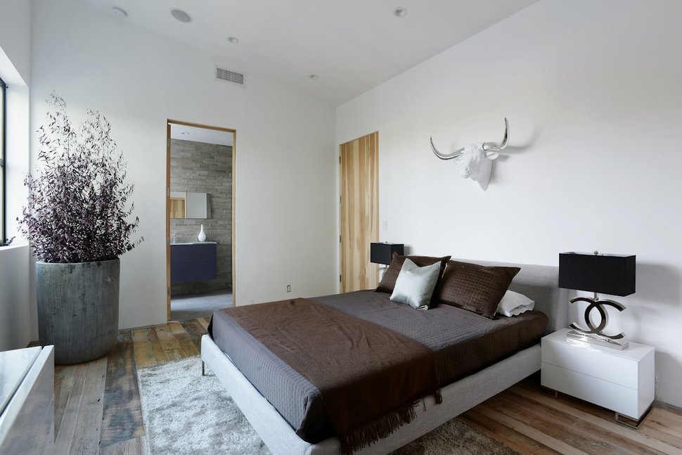
The guest bedroom features a white and silver bulls head above the bed for a moment of whimsical fun.
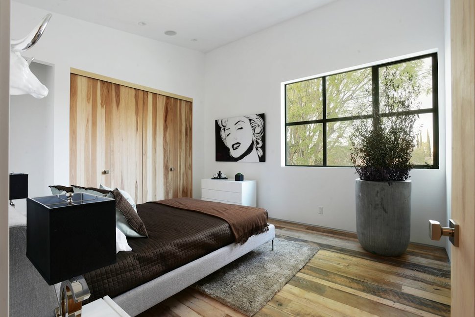
Adding to the “fun” aspect of the room is the black and white pop art painting above the dresser.
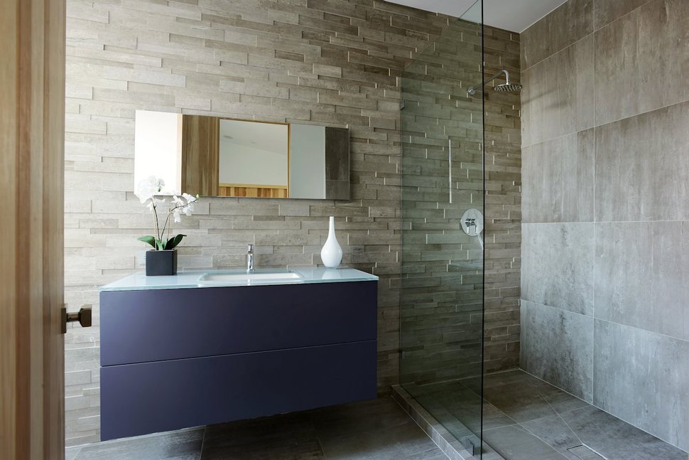
The ensuite to the guest bedroom replaces the white cabinetry with a midnight grey floating vanity that features a glass countertop. The vanity is a crisp statement against the textured stacked stonewall.
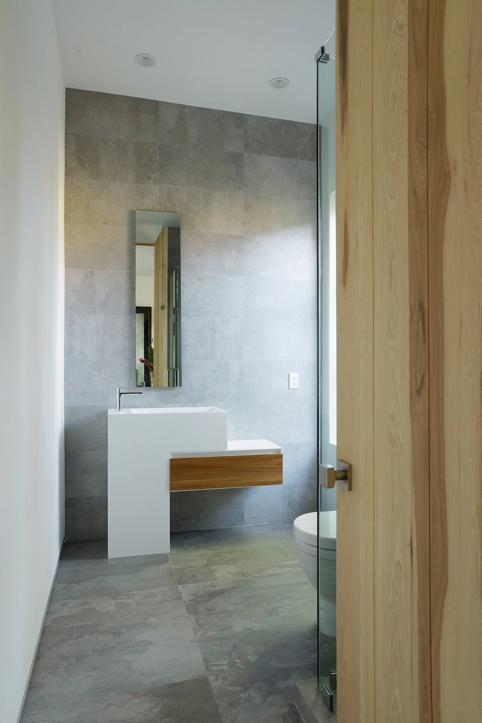
Another bathroom within the Mansfield home plays with horizontal and vertical shapes by layering a tall and narrow mirror over a two-tiered vanity. Pretty cool.
Amiat Apel Design
