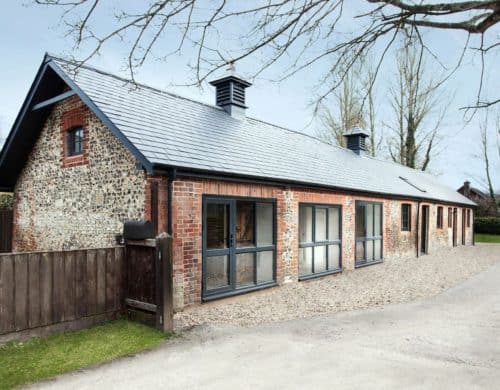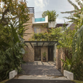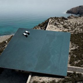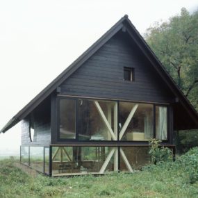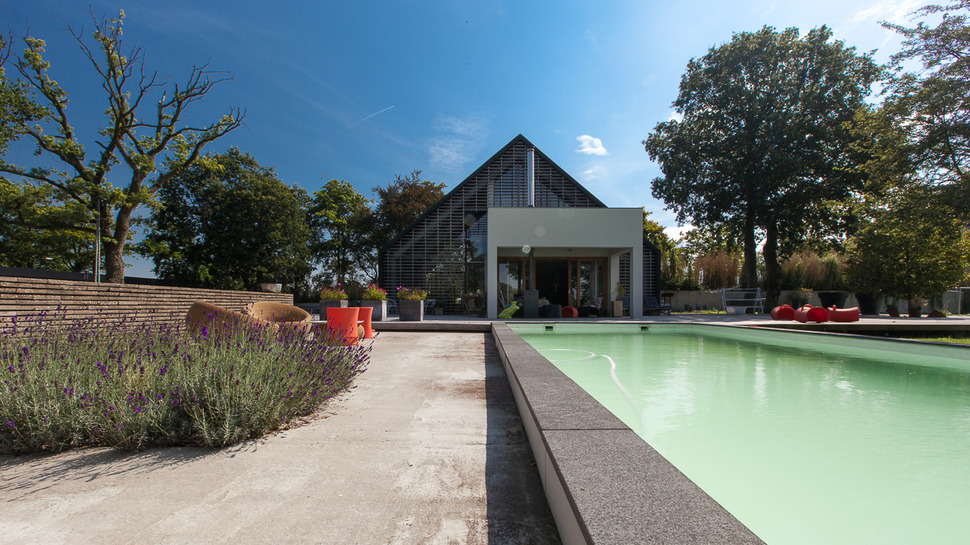
Aat Vos received a brief from their clients to rebuild one of the first barn houses ever built in The Netherlands into a contemporary house that reflected both the history of the site and the comforts of modern day life. Located in Donderen, the Netherlands, the barn was a simple building made with inexpensive local materials, it was spacious and positioned in a beautiful lush setting of pastures and trees. In coming up with a reinterpretation of this historic barn, Aat Vos took an “outside the barn” approach to the design by interpreting the existing silhouette as a contemporary geometric form. They expanded on the shape idea with additional elements such as a cube formation for a covered outdoor lounge and a rectangle for the pool. Softening up the hard lines of the geometry and tying it into the landscape are the lush lavenders spilling out onto the pool deck.
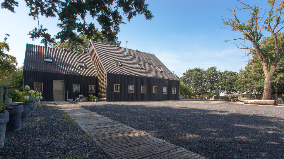
Using the geometric attributes of the home as the design muse has created a historic facade full of contemporary lines, even the sidewalk leading up to the home exacerbates the linear aspects with its thin strips of planking running horizontally along the paths length. This linear pattern is repeated through out the horizontal and vertical siding as well as the roof of the barn and is played up with the square window and skylight treatments.
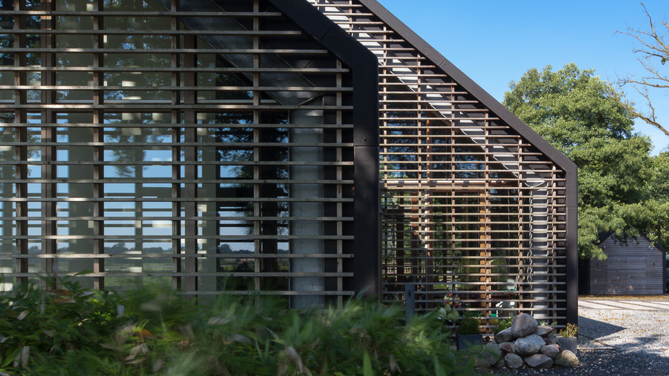
This detail of the home’s facade shows how clever the architects where in continuing the geometry of the home even where large window glazings where applied. From inside the slats are no different then an indoor blind treatment but from the outside the glazings are barely noticeable.
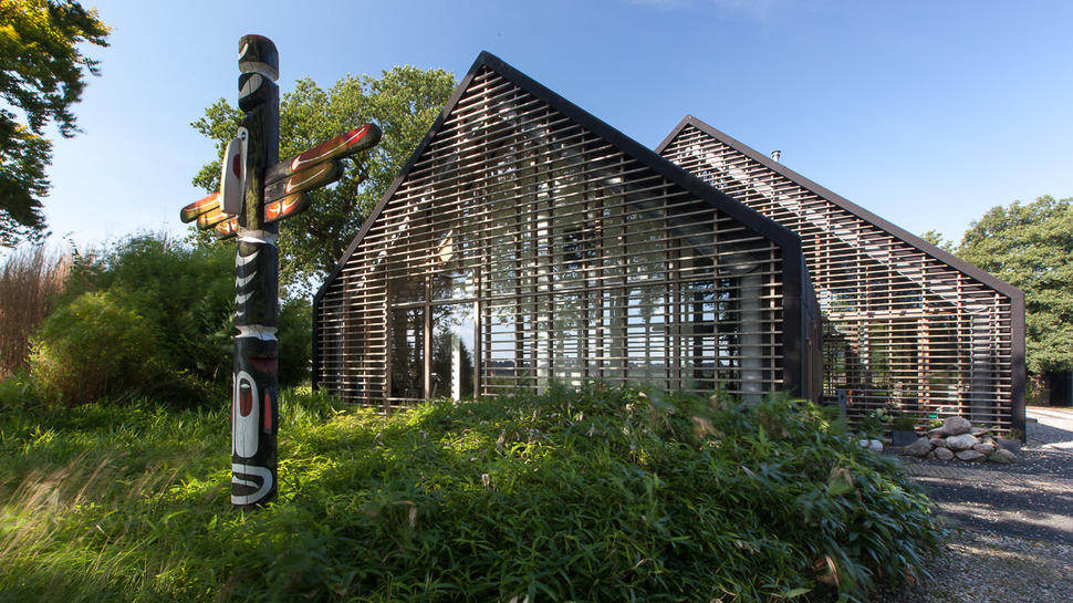
On the left of the home, the slat detail that covers the large window glazings is only stopped to allow for glass doors to lead out to the grassy slope, but with all the reflections, this section of glass is barely noticeable.
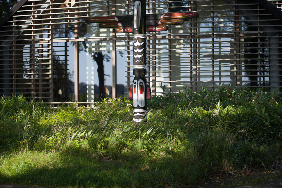
The shadows and reflections created by the slats and glass also create an intriguing continuation to the detailing within the totem pole, blurring the lines between art and architecture.

While the grassy slope is left to a natural state on the left side of the home, the reverse story is presented as the grass travels around to the backyard. Here the grass is a carefully manicured lawn perfect for outdoor enjoyment.
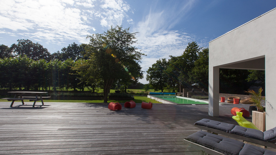
While the raised pool acts as a stopping point for the lawn as it travels around the home, it continues uninterrupted through the small orchard and beyond, offering both sunny and shady sections to enjoy.
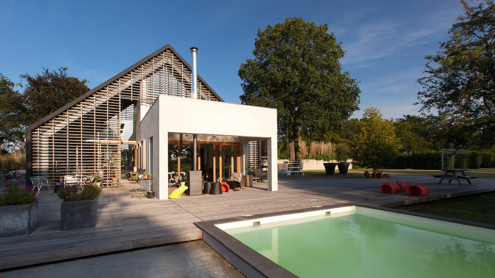
The pool is presented in a soft green palette to blend harmoniously with its lush surroundings of lawn shrubbery and trees. The architects expanded on the landscaping aspect by placing concrete planters along the edge of the deck. These planters continue the cube theme used for the covered lounge area.
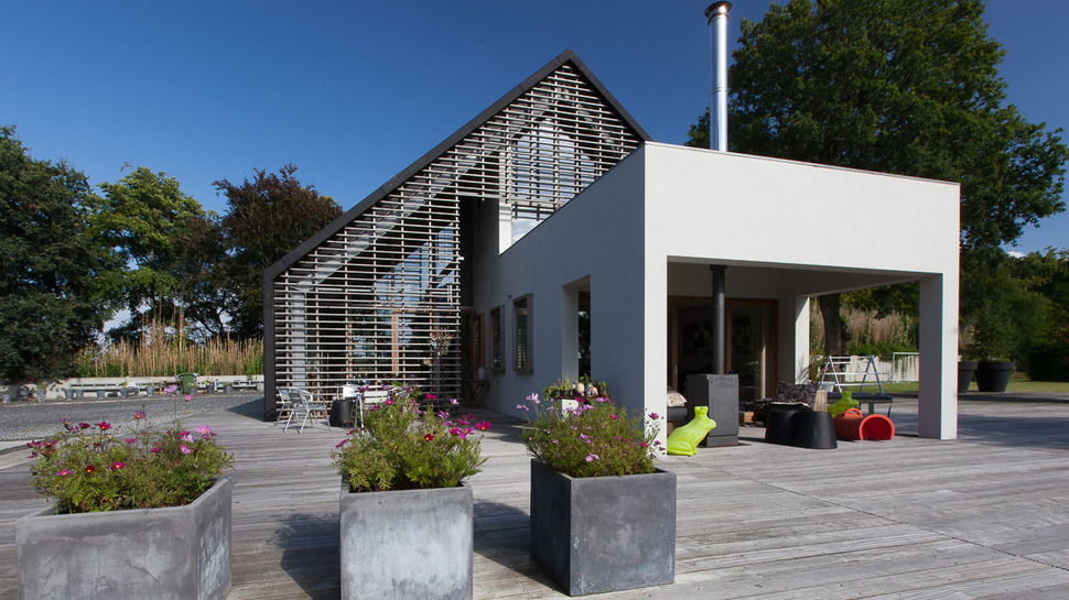
The planters are filled with colourful cosmos, easy to look after and returning each year, the loose and feathery appeal of the flower stocks flow with the lavenders on the pool deck below and create a nice contrast to the hard lines of the architecture.
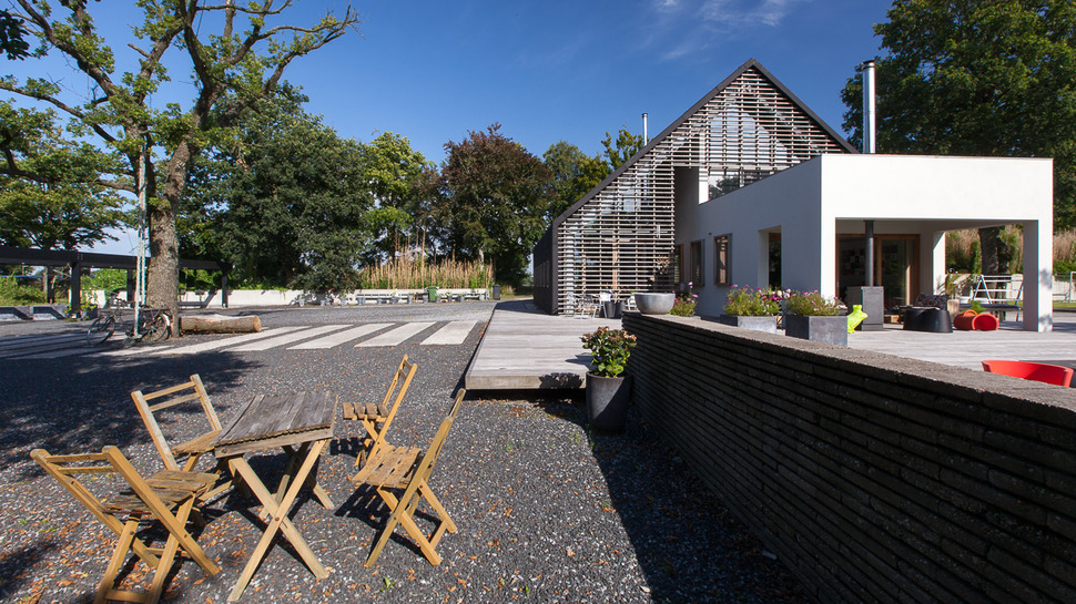
In direct contrast to the lush lawns and orchard, the complete length of the entry facade is landscaped with gravel for ease of driving on and ease of maintenance. Only a tree breaks the plane of grey. Gravel was chosen over solid concrete as it is far more environmental with its drainage capabilities.
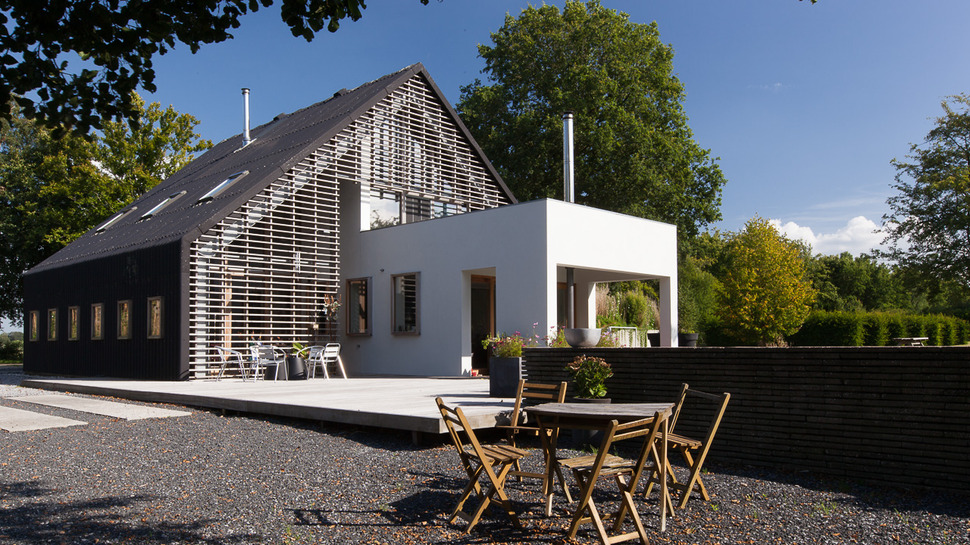
The gravelscaped in front of the home uses geometry to play up the facade by the use of large rectangular sections of concrete, creating a pattern as it slices the gravelscape in half on its way to the deck. This sectioning off of the gravel creates more intimate moments within its visual, perfect for creating an Al fresco dining moment near the pool
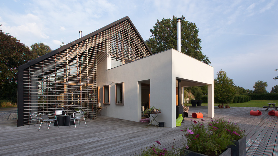
Aside from the gravel area, the deck itself is also broken into individual rooms by the cubular barn expansion. A sunny outdoor seating area sits within the elbow of the extension while an open but covered section offers both shade and warmth via the wood stove positioned centrally in the space.
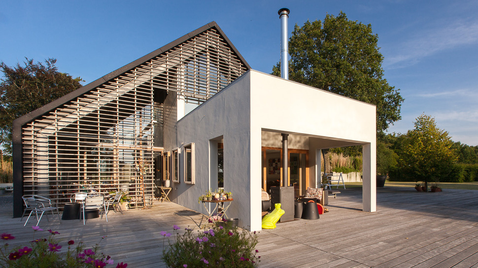
The outdoor wood stove is a tall and linear model to leave as much circulation as possible to this outdoor room. While large in profile, the outdoor space is only half of the cube, with the other half part of the inner volume.
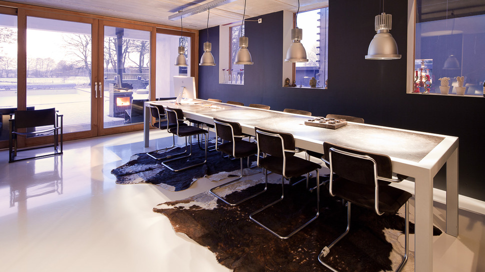
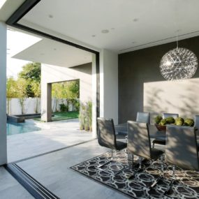
The inner volume to the concrete cube is the dining room, positioned perpendicular to the living area and across from the kitchen. This room instantly shows the advantages of barn living. The room is huge and features a table big enough for 14 to dine comfortably. While huge, it is made to feel more intimate with the choice of a black wall.
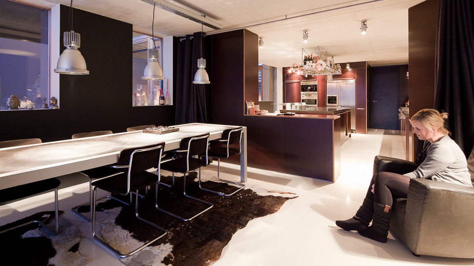
With such a large space reserved for the dining area, not centralizing the table, but rather keeping it off to the side, allows for a wide passage from the kitchen to the deck, maintaining easy access to the outdoor zone. When a large dinner party is being entertained and the mess in the kitchen is preferred to be hidden, black floor to ceiling drapes pull across the opening along a ceiling mounted rail. This rail detail is repeated in the track used for the industrial pendants over the table.
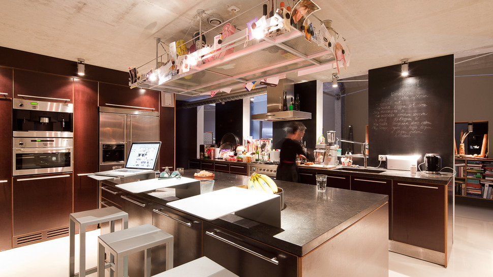
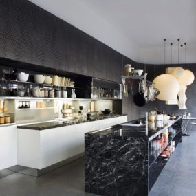
Big is a repeating design element to the interior zones and the kitchen is no exception. Large and spacious and fully equipped, there are even laptop station inserts on the island. When its time for everyone to pitch in and help the chef, these inserts can be pulled out and put aside. As big as this kitchen is, the architects did not leave out using the ceiling for additional storage and this ceiling storage unit really offers that restaurant kitchen aesthetic to the space while the blackboard walls keeps it fun and playfull.
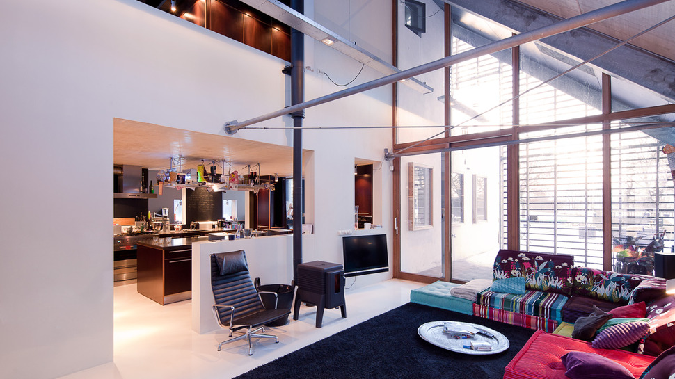
Next to the kitchen and perpendicular to the dining room is the living space. Here a TV is mounted on the wall next to a wood stove and a large and comfortable sectional splashes patterns and colours on each of its multiple cushions. No wall pictures are needed – the couch is the art.
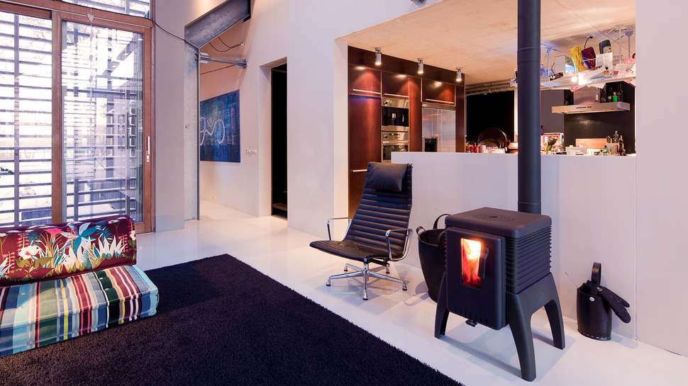
As with the dining room, black is used to cozy the room up, but here rather then featuring the colour on the wall it is presented in a large area rug. This large swath of black rug ties into the fireplace and chair as well as to the chalkboard panels visible in the kitchen. The black also is a calming moment to the myriad of colour stories within the sectional.
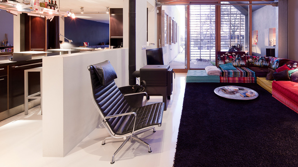
The sectional is a very low seating unit and most coffee tables would simply be too high, the homeowners realized this and simply placed a large round metal disc on the floor in lieu of a table. This might actually have been a table at one point that simply had its legs removed.
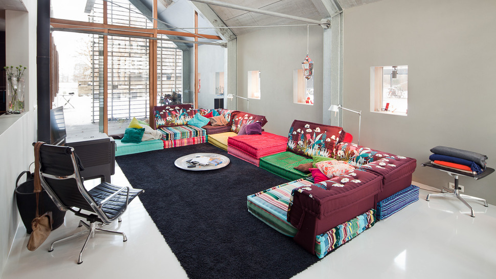
As colourful and crazy as this sectional is, it looks so incredibly comfortable and practical. How easy would it be to switch out the fabric on one cushion without anyone noticing? Love this bohemian moment, it is so food, child and pet friendly making this living room a place that’s easy to “live” in.
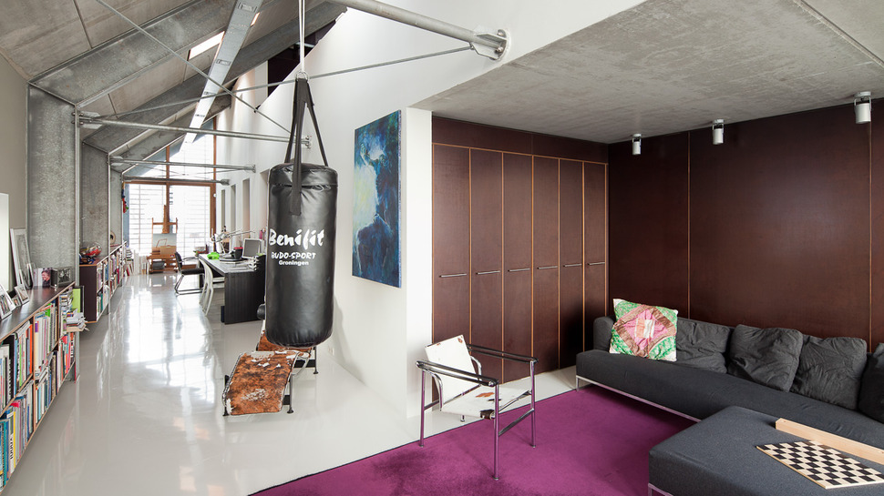
While the downstairs is all about living large, the upstairs presents an office area easy to knuckle down in and get some work done. If frustration sets in there is always the punching bag. When work is complete for the day but a quiet moment is wanted before joining life downstairs, there are two classic moments presented for lounging – the Le Corbusier ( and Charlotte Perriand, his female protegee) LC1 chair and the LC4 Lounger – which just happens to be one of my favourite loungers of all time, hard to believe it was designed in 1928.
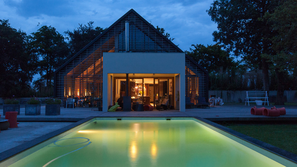
A hard day accomplished, the guests have gone home, all that’s left is an evening dip in the pool surrounded by stars, trees and the sounds of nature.
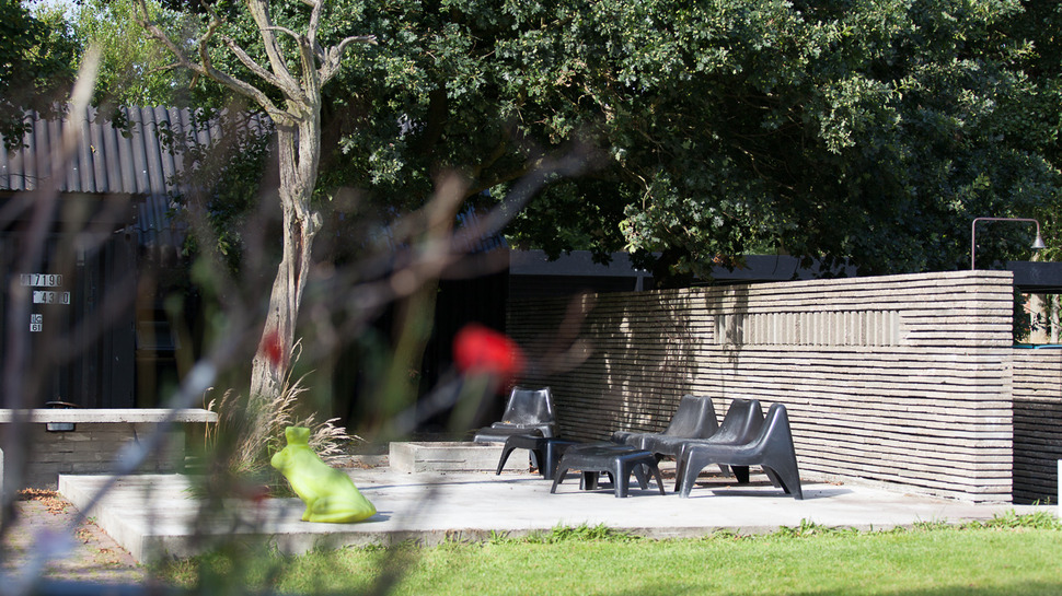
And then before turning in, you can also shower outdoors via the outdoor rainshower at the far end of the pool If it leaves you a bit chilly simply warm up by the outdoor fire. Pure bliss.
Aat Vos
Photography by Stijn Poelstra
