What makes cool designs? A designer name? A wow factor? Maybe an ingenious combination of function and appearance? Today we are showing design solutions that are not only practical but also fresh and exciting.
Being quite a subjective term, coolness can still be identified and agreed upon by many. We gathered here everything we think is cool, but you can always chime in and tell us about what you think is cool.
Cool Surfaces
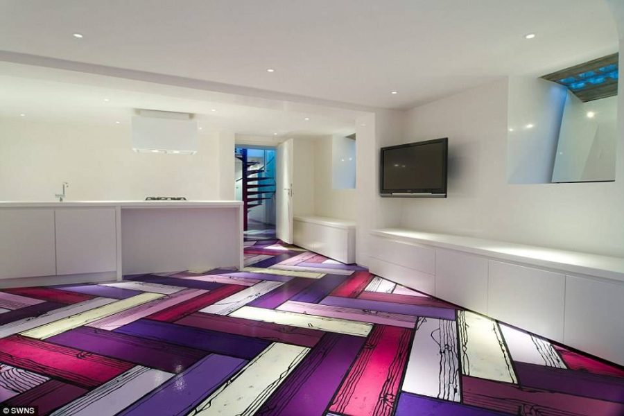
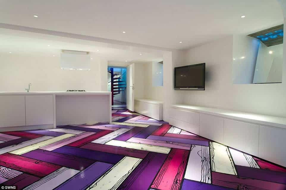
Oh, how fun these painted floors by Richard Woods look in a stark white minimalist kitchen! Drawing on all kinds of surfaces, Woods brings color and mock wood detail to flooring.
Masterfully combining purple shades Woods’ works look cartoonish in the best possible way.
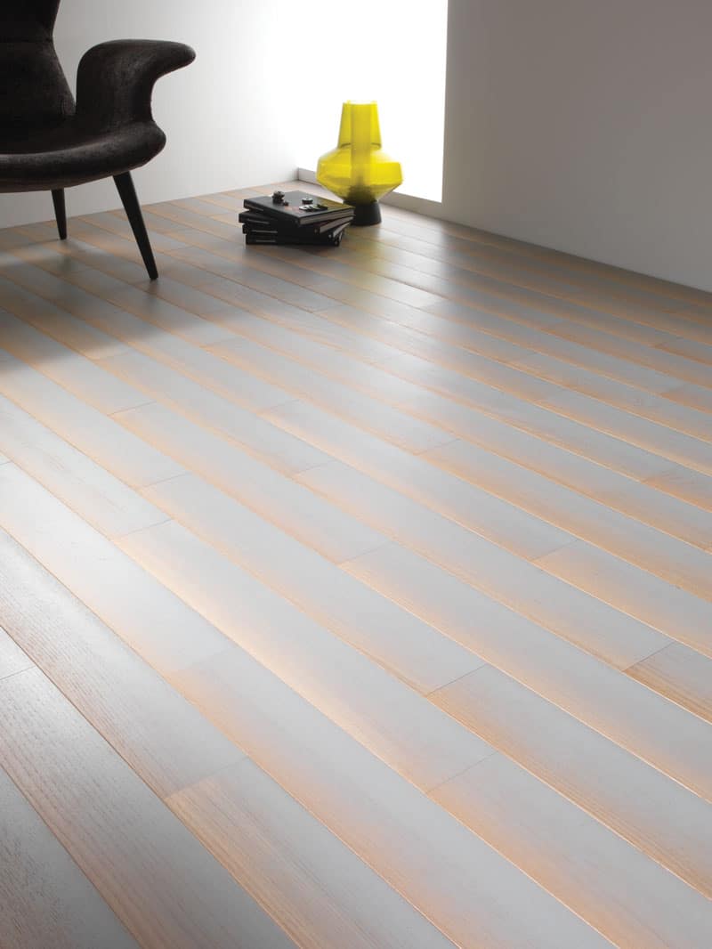
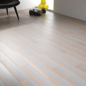
These unusual floors look like they’re glowing. DIESEL LIVING worked with the flooring manufacturer BERTI to create these illusionary designs in stylish black, urban grey and natural brown.
Aptly named ‘Shadow’ the design features wood planks that were specially treated to create an effect of ambient lighting.
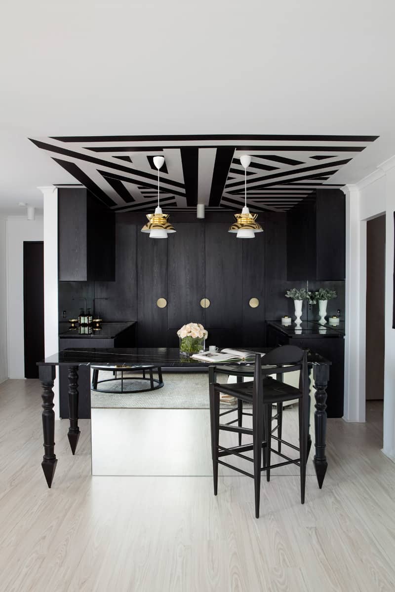
Interior designer James Dawson decided to visually separate the kitchen area in an open layout with an abstract geometric ceiling pattern that matches a monochromatic color scheme of the entire apartment.
Using a kitchen island as a reference for the pattern size, Dawson made the kitchen look contained and sharp.
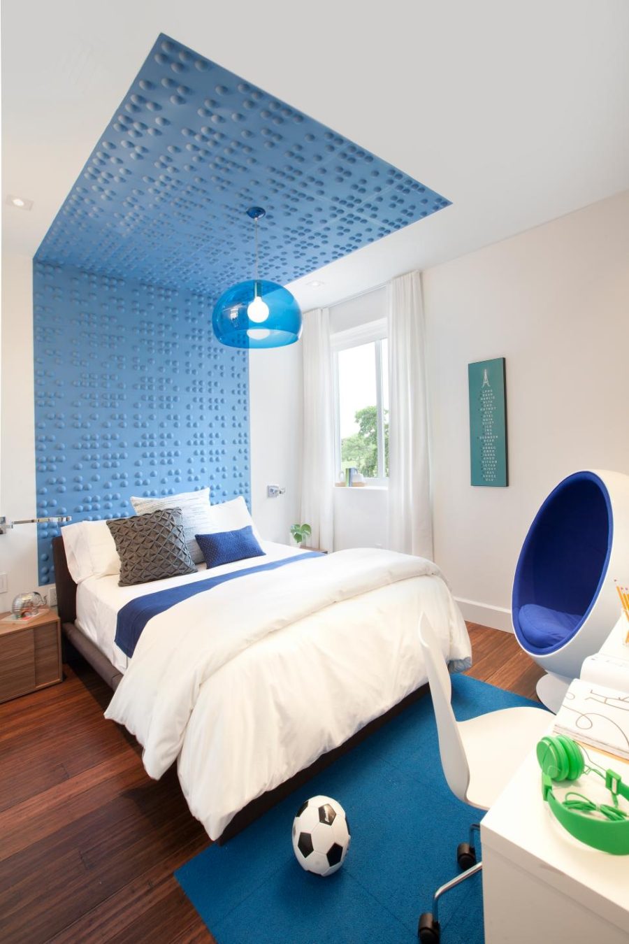
Walls are surrounding us everywhere at home, so if they have a cool design it instantly impacts a whole room. Take this teen bedroom design, for instance.
Creating a stark contrast between white and blue, the 3D wall feature that extends to the ceiling giving the bed a futuristic look, which is only strengthened by Eero Aarnio‘s Ball Chair.
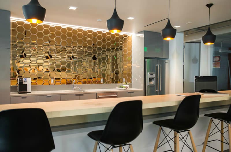
Backsplash often acts as a feature wall in the kitchen and can be designed in a great number of ways.
This beautiful backsplash looks unconventional in a living space. LIFE.STYLE used gold mirrored hexagons to bring glamour to the modern minimalist kitchen that is otherwise neutral and simple.
Cool Kitchen Islands
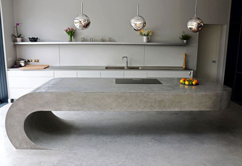
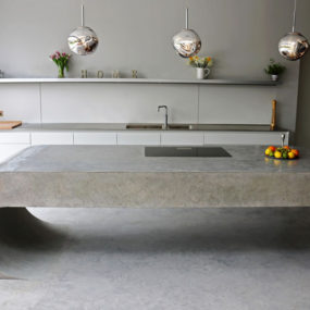
Cool furnishings can make almost any dull interior ignite with character. This ultra minimal kitchen has at least one thing that makes it so intriguing. A gravity-defying massive concrete kitchen island designed by BeauConcrete.
Juxtaposing fundamental quality of stone and a post-modern design it attracts attention standing out against slim kitchen cabinets.
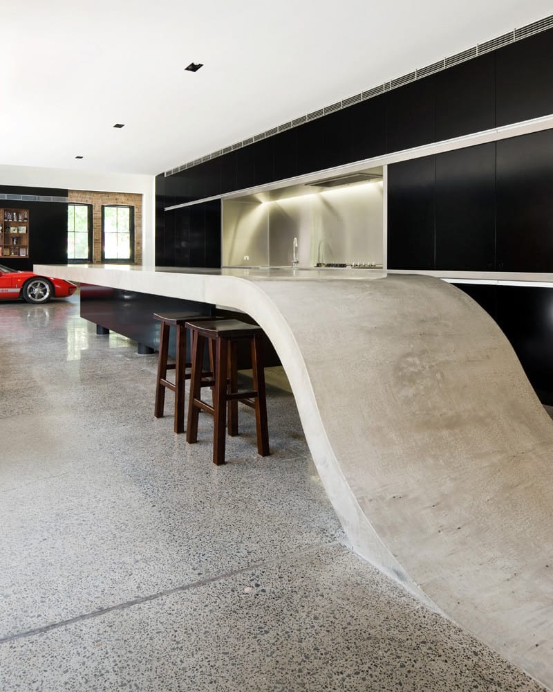
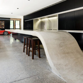
The kitchen island designed by Corben Architects is an integral part and continuation of a kitchen design. Light and grounded it works well with the black minimalist kitchen cabinets highlighted with a stainless steel backsplash.
It may not be the most practical but it brings an unexpected detail to a mundane furnishing piece that we came to anticipate in every kitchen.
Cool Kid’s Furnishings

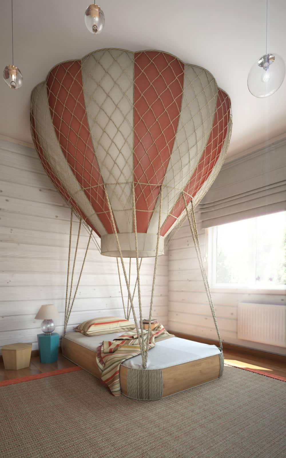
Anton Saveliev has come up with a kid’s bed concept that alone creates a room’s interior design. Hot air balloon with a bed instead of a basket is truly a thing of fairy tales and bedtime stories.
What kid would feel scared or bored to sleep alone in such a room? And you don’t need to add anything else decor-wise.
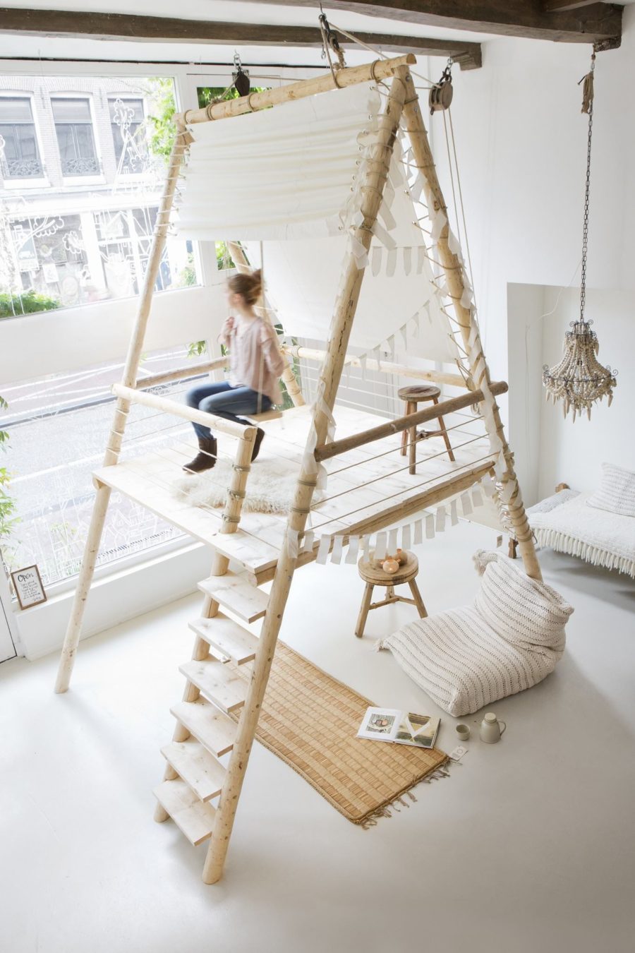
If you’re after creative kid’s room ideas you’re in luck. There are so many fresh and original ideas/designs out there.
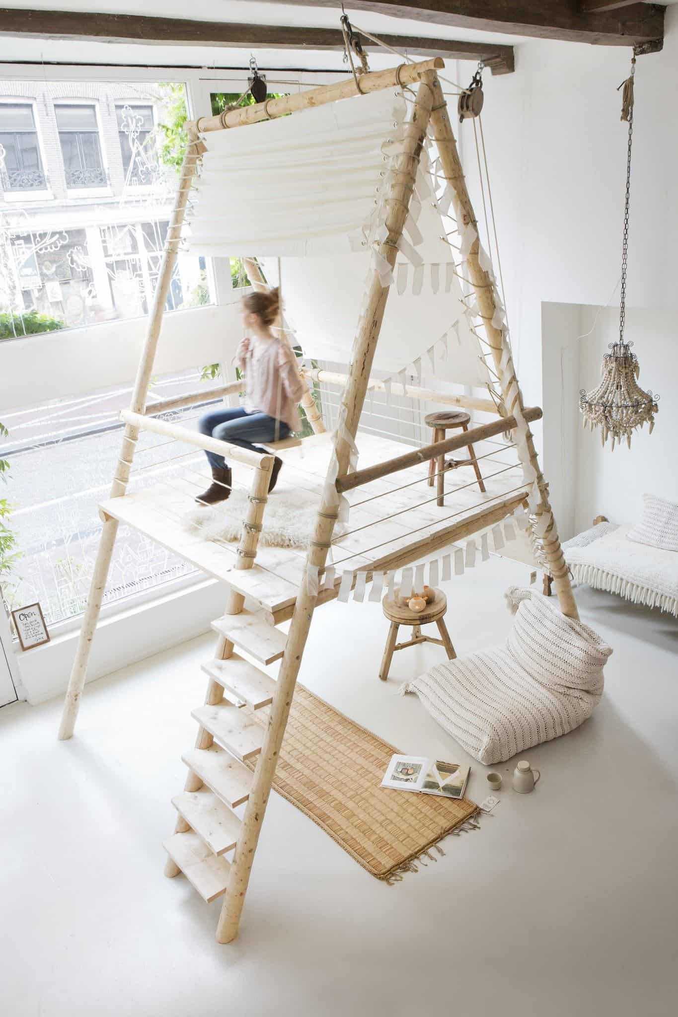
Most kids would love a fort or their own tree house in a room to play and hide. If you think there isn’t space for that, take a cue from vertical structures like this one that creates additional playing areas without overwhelming the room.
Cool Bed Designs
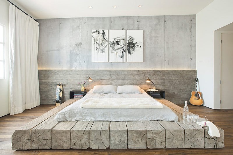
SUBU Design Architecture probably believe that sleep is too important to enjoy on a tight unremarkable bed. Hence, they went on to create a custom platform out of 12×12 inch reclaimed logs accented with a backlit headboard stretching from wall to wall.
Looking more like a pedestal, it’s hard to ignore such a bed since it occupies most of the room. Although massive, it provides surface for drinks and food in place of the (not at all) lost space.
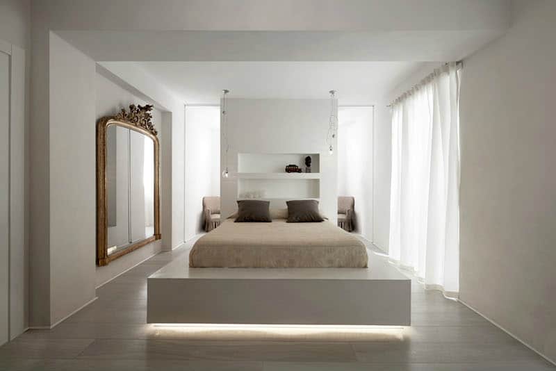
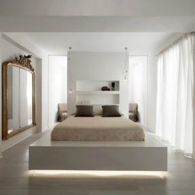
Carola Vannini too considers slumber too precious to have in a simple bedroom. She shows how it’s supposed to look like in an interior she designed for a private client in an apartment of Rome.
Elevated and backlit the bed takes center stage in the modern luxury bedroom interior. Punctuated with a divider wall/headboard it looks positively dramatic.
Cool Bedrooms
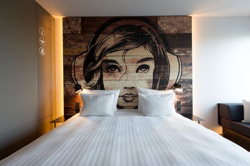
Inspired by music JAZ Hotel, located in Amsterdam, features cute themed headboard murals backlit with soft yellow ambient light.
Contrasting immensely with a purely practical interior, the mural works as both an artwork and a design element in the interior.
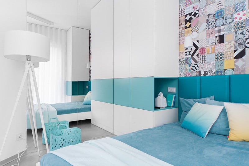
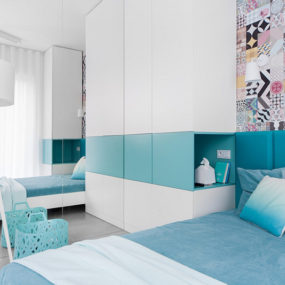
Widawscy Studio Architektury are using color and patterns in their Polish home project to create a crisp modern bedroom design.
In it they combine pristine white interior with breezy aqua accents and sparing yellow throwing in a small pattern mix to create an exciting feature wall.
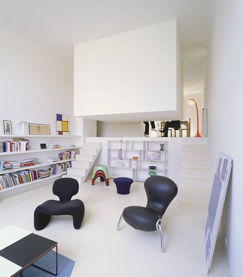
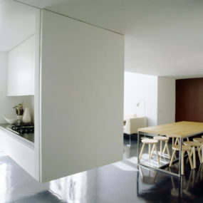
In an attempt to divide an open layout into separate zones the architects Emmanuel Combarel and Dominique Marrec of ECDM came up with an idea of a suspended bedroom.
Placed inside a wooden cube the bed also serves as a seat for an adjacent dining area. With its back to the living zone the bedroom is safely disguised from public space.
Cool Bedroom Ideas
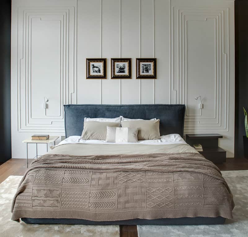
2B.group designed bedroom interior in this Odessa apartment generating multiple cool ideas you can steal to improve your space.
First thing that catches the eye is a wall detail that accentuates a big plush bed with a soft headboard. If you follow the pattern you’ll connect that it is actually night light cables that create it.
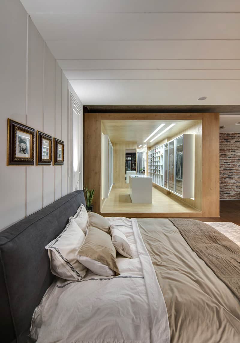
Looking to the right you’ll discover a cleverly-designed wooden walk-in closet with white display cases and inbuilt accent lighting.
Thanks to its wooden box frame the closet looks like a furnishing module, but because of its spacious area it makes an entire separate room.
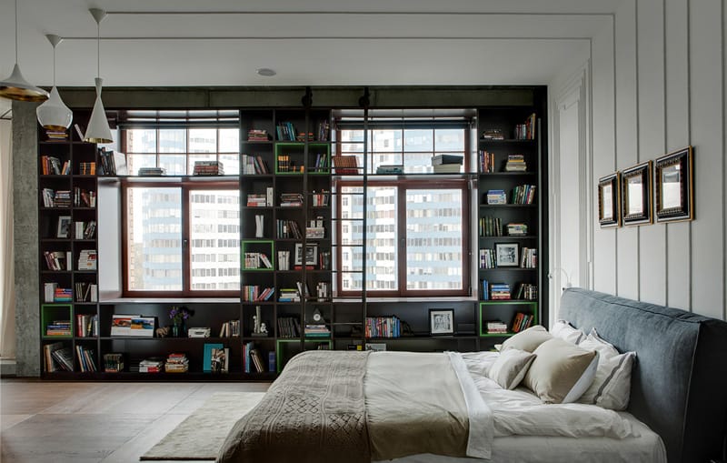
Looking to the left of you’ll see a home library built into a wall around two big windows with a ladder and all.
Separated into rectangular and cubic shelves, it also houses small decor objects and framed pictures. By the way, what can be a better place for a home library than a quite bedroom?
Cool Small Bedrooms
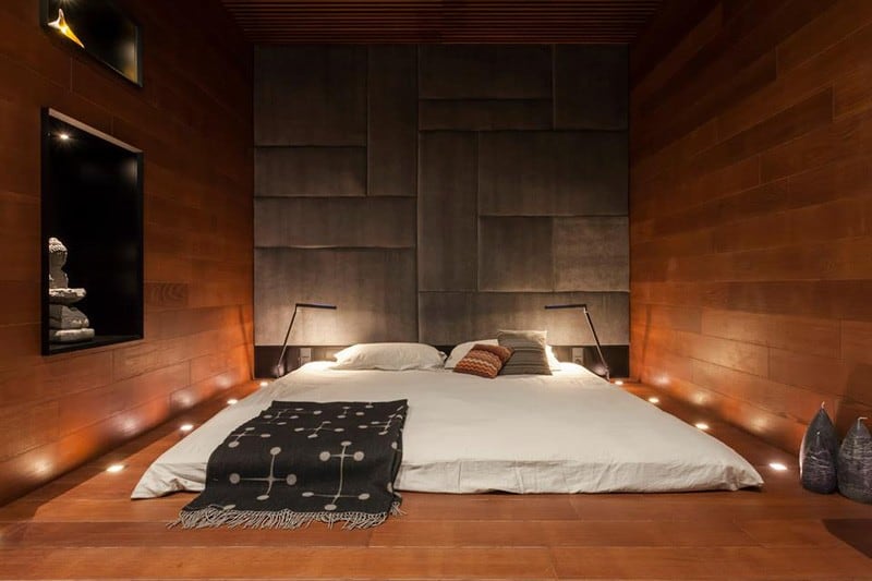
Another bedroom design from Ukraine is the work of Soesthetic Group and a complete opposite of the previous interior.
This Kiev slumber room has a soothing atmosphere created by a contained boxy shape, lots of natural wood and a low-rise bed. Making use of niches the designers kept decorations minimal as not to overcrowd the small area devoted to the sole purpose of resting.
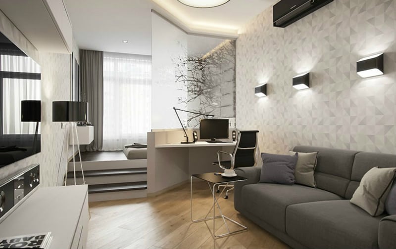
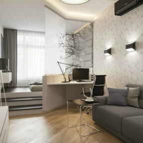
Igor Glushan introduced not only a stylish look but also a practical privacy solution to this small one-room apartment.
Demarcating different areas with an elevated platform the designer created a whole separate bedroom in the living room using steps and a half wall with a frosted glass inclusion.
Cool Kitchens

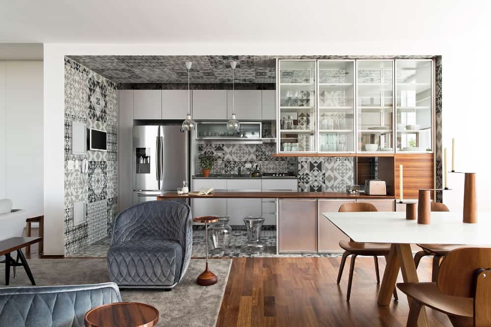
Diego Revollo reimagined kitchen design in his 360˚Apartment in Brazil. Covered with patterned grey tiles from top to bottom the kitchen has plain white and wooden cabinets as well as stainless steel elements of technology.
Partially hidden behind glass upper cabinets, it offers a designing contrast to the modern interior with a hint of mid-century aesthetic.
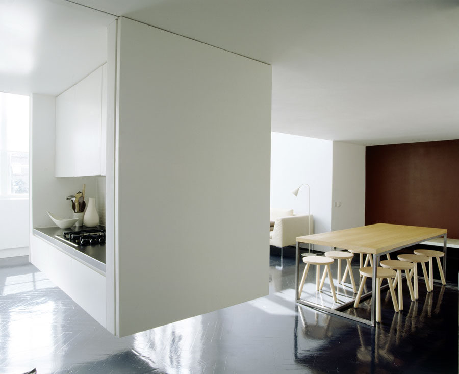
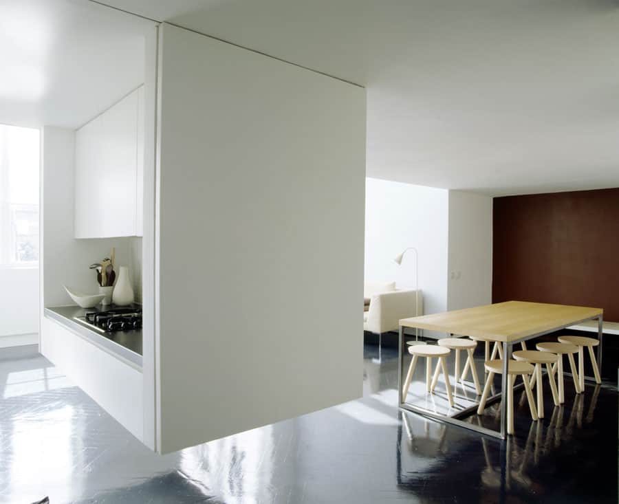
A bedroom is not the only room that can be suspended for a practical or purely dramatic effect. Viewport Studio had to come up with some non hackneyed idea for their Victorian schoolhouse conversion.
To create a galley kitchen without disrupting an atmosphere of an open plan the architects built a similar box ECDM did for their bedroom to include a stove along with some cabinets.
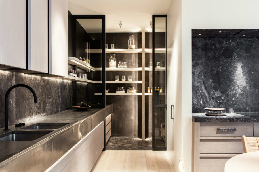
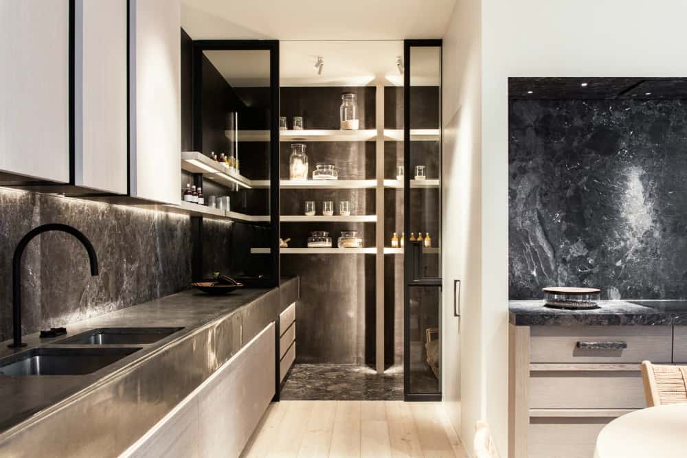
Obumex shows how stylish and glamorous a modern pantry can look with steel-framed glass doors and textured stone floors.
Its light wood floating shelves call for decorative storage glassware that puts simple everyday foods on display for both practical and decorative purposes.
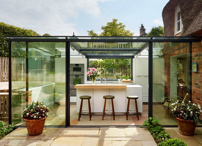
Alex Saint of bulthaup by Kitchen Architecture was commissioned to build an extension for a traditional English brick cottage with a thatched roof and a postcard curb appeal.
The result is an unassuming glass rectangular room with minimal kitchen cabinets and a breakfast bar kitchen island. With gorgeous views all around it makes a perfect place for a morning coffee.
Cool Kitchen Designs
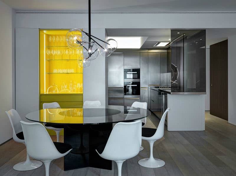
Another cool kitchen design was conceived by Buratti Architects. They used stainless steel to create the cabinets and all surfaces in the room. Complemented with smoked glass and grey-ish wood flooring it looks distinctly modern.
In an adjacent dining area a built-in mini bar adds a bright pop of yellow to the neutral decor with an open display shelf cabinet filled with glassware.
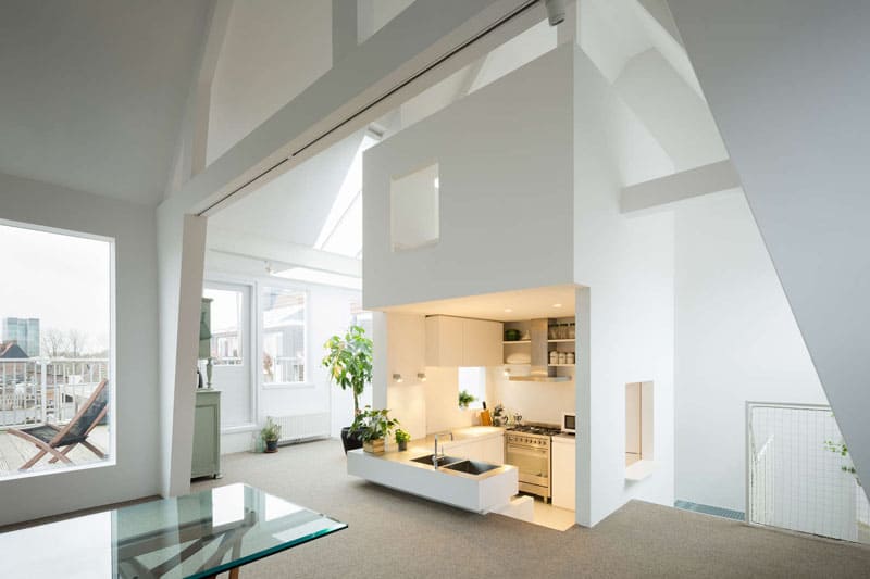
When it comes to interior architecture elements nothing can beat sunken areas. Well, probably only suspended rooms we showed above can compete with them.
MAMM DESIGN created a sunken kitchen for an Amsterdam apartment in an 85-year-old building. Located in a tower together with all the plumbing the kitchen was sunken to separate it from living room. Its roof also houses a playing area for kids whereas the windows allow more natural light into the contained area.
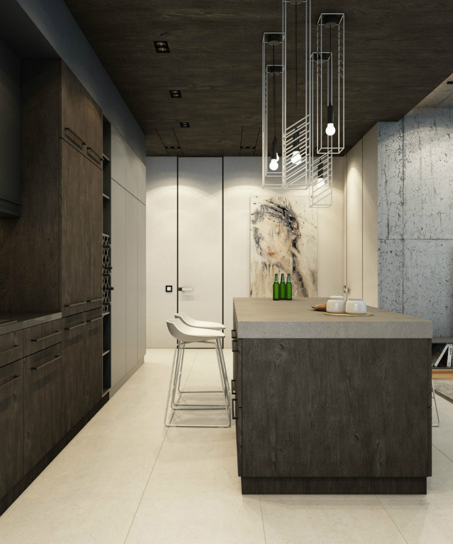
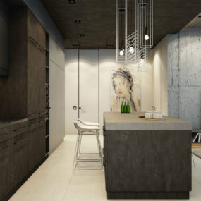
Rounding out the cool designs for kitchens is this interior concept by Vladimir Fill. It addresses the fact that few kitchens make use of artworks in their decor making this design stand out in particular.
Styled with rough textures of natural wood and concrete the kitchen’s plain cabinets give space for a beautiful drawing of a girl.
Cool Bathrooms
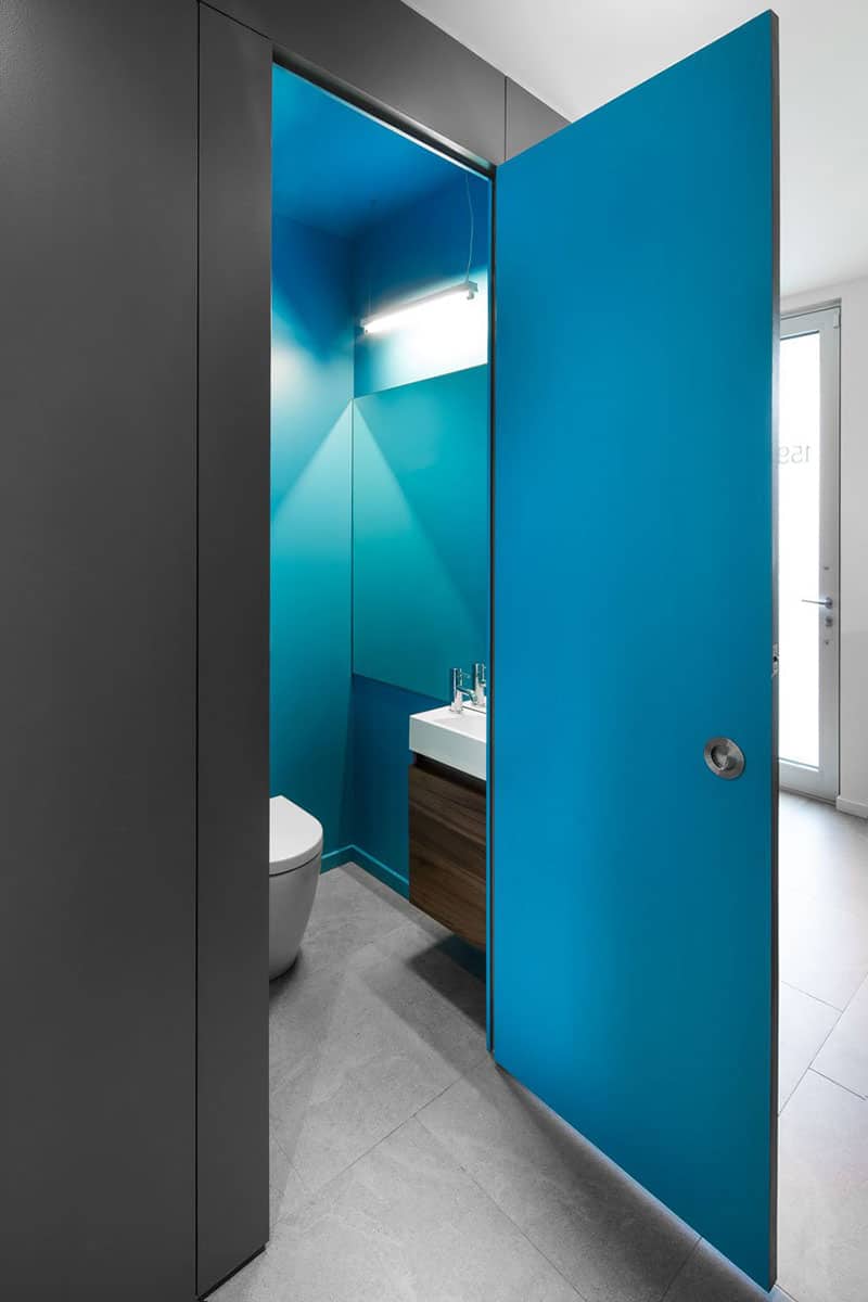
Small baths and powder rooms are often seen as practical spaces without much thought put into their design and decor. naturehumaine offer an easy cool way to make a small bath eye-catchy.
Choose a bright but not glaring hue that you really like and fill the room with it completely. In a house in Montreal they covered every wall and a door in a saturated blue to dress up its sleek modern interior.
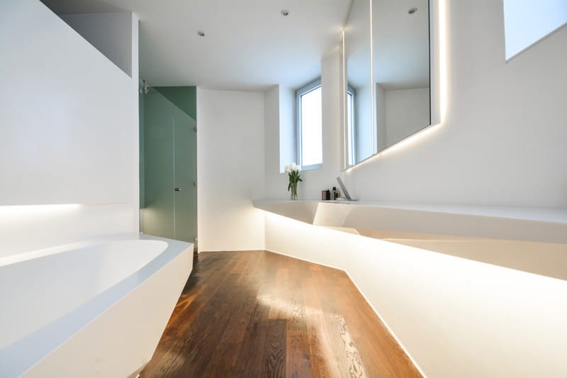
Who Cares?! Design got inspired by irregular ice shapes to create their Ice Bath design that comprises polygonal furnishings and plumbing.
Made of Corian the floating bath is equipped with a smart controls system and falls well the layout shaped by the angular inbuilt furnishings.
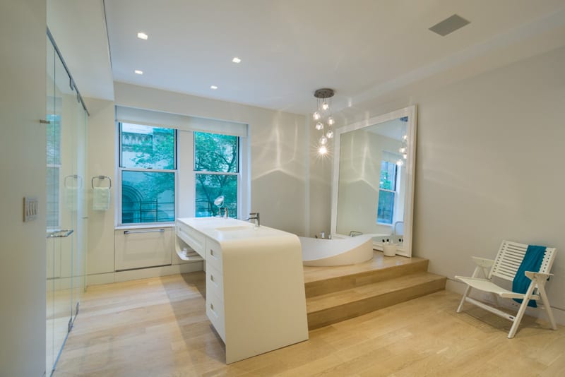
Chelsea Atelier Architect invested a bold meaning into this master bathroom that boasts a sculptural sunken bath and an adjacent desk-like vanity with a double sink and a folding mirror hidden underneath its tabletop.
Roomy and light the bath also boasts a glass shower and a double window opening to a fine architectural example and nature of New York.
Cool Living Areas
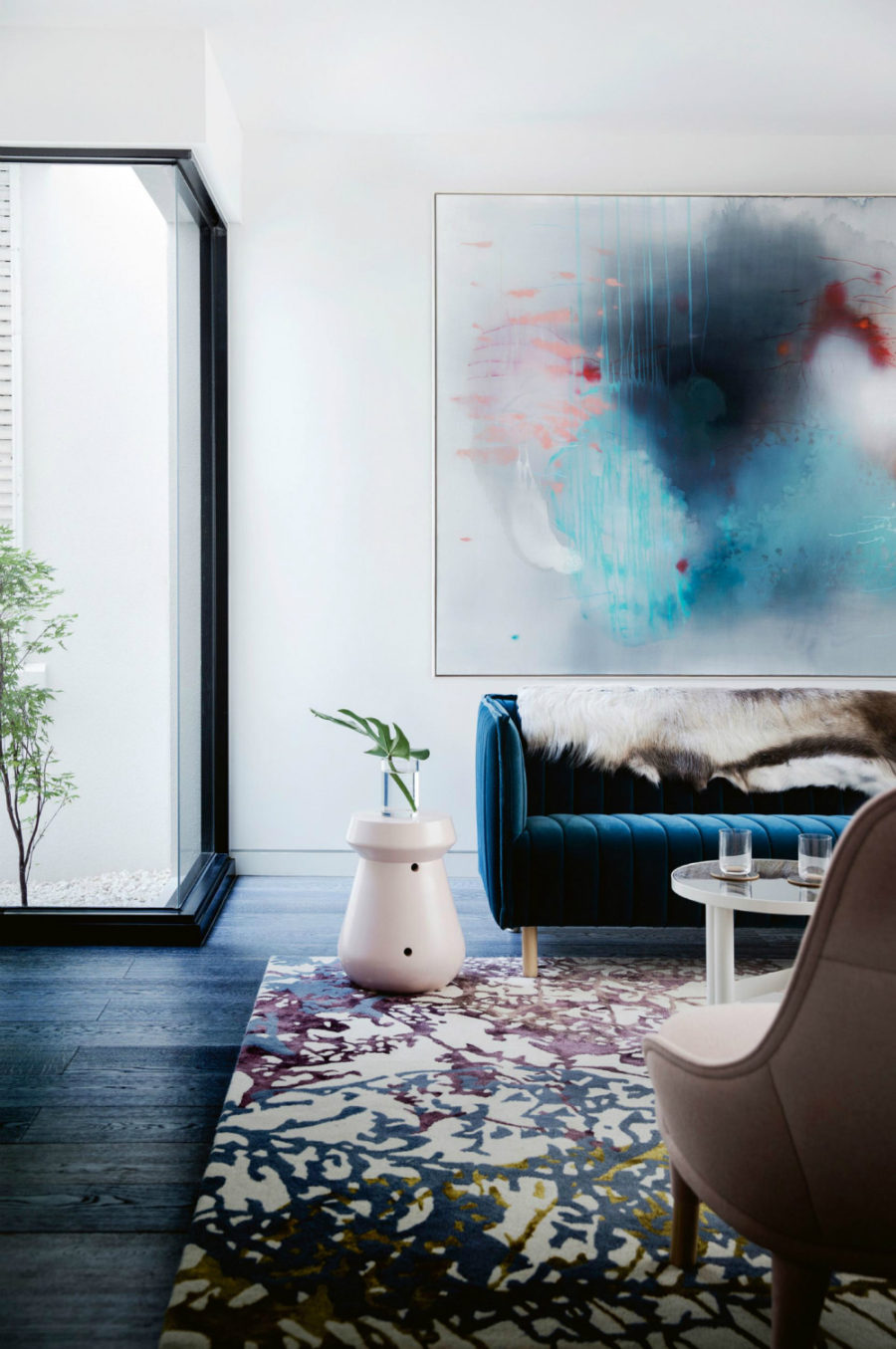
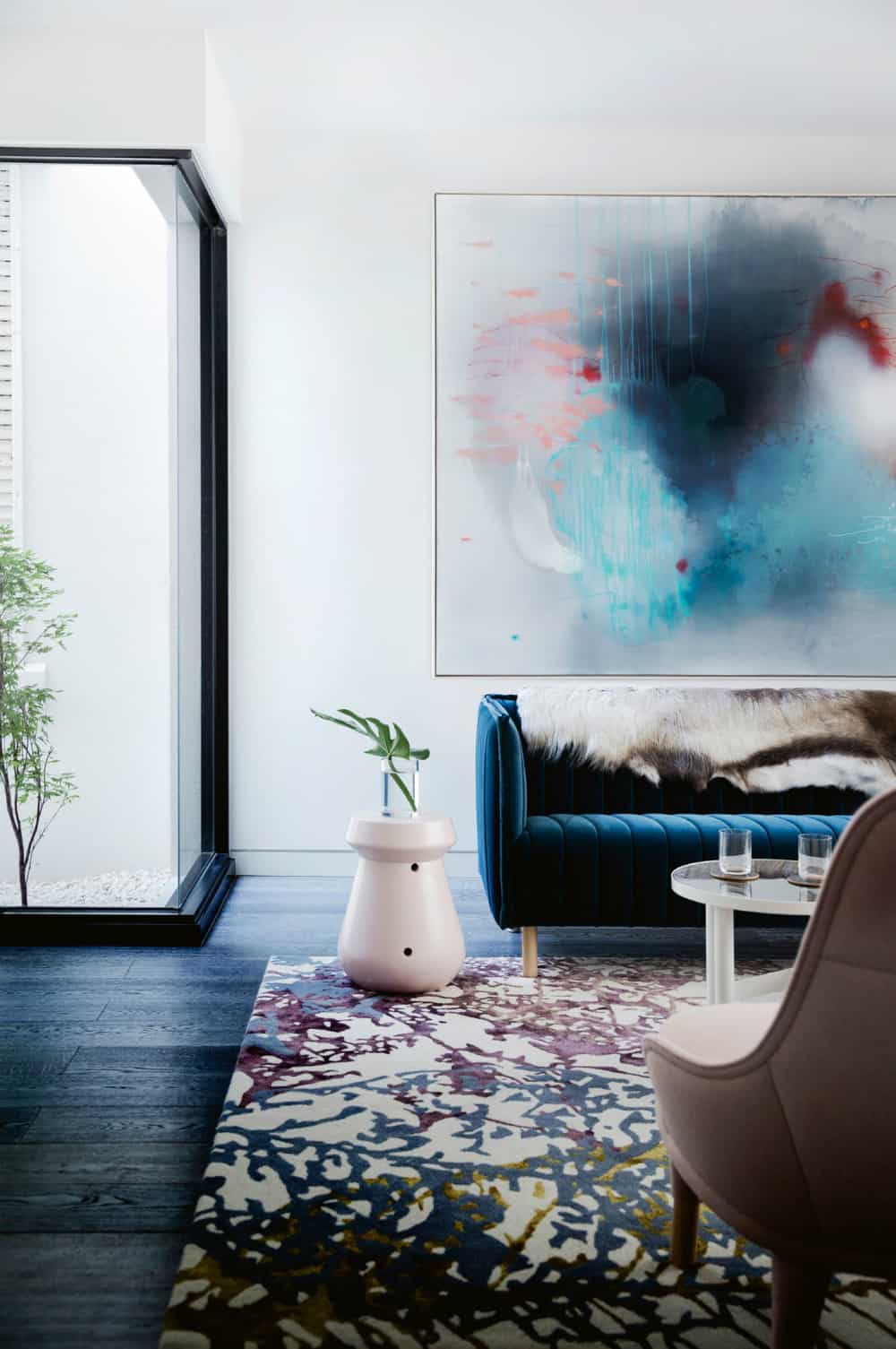
This contemporary home‘s living area is nothing short of splendid. It uses an abstract artwork to set the color scheme for the furnishings, which are in turn too sumptuous to ignore.
Masterfully combining decorations, patterns, and colors it invites to entertain guests and talk non-stop about art.
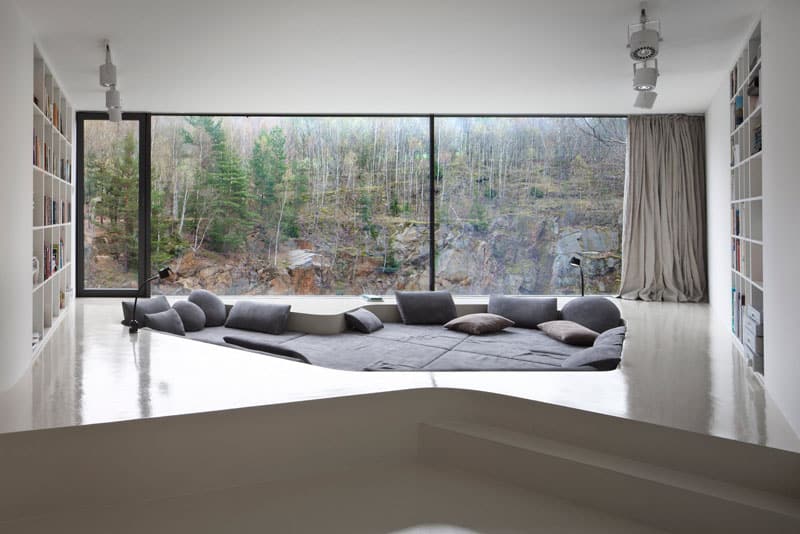
Sunken seating areas were quite popular in the 60’s, but today look completely unexpected and cool. Architectural studio A69 lodged a soft lounge into a platform in a house in Czech Republic to create a perfect reading space.
Flanked by two bookshelves the platform is equipped with reading lamps and functional lights that are to replace natural light from a wall-sized window during the evening.
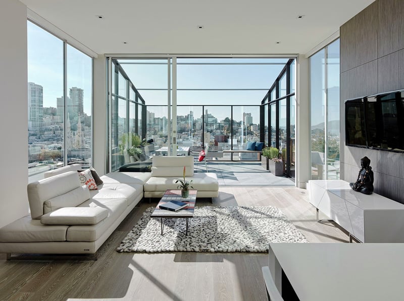
Where else can you find such a breathtaking sun room? While renovating this San Francisco penthouse Feldman Architecture opened the space up to plenty of sunlight and city views.
Featuring glass walls and ceiling it looks like a potential conservatory and an exceptional place to receive and entertain guests.
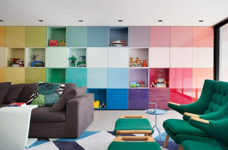
Storage can look cool. Studio Guilherme Torres used colorful cube storage to add dynamic to this already lively main room.
Echoing the feature wall in every color of the rainbow room’s furnishings and rug come in bright colors, which makes for a punchy decor.
Cool Transitional Spaces
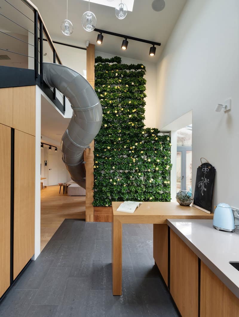
Staircases may still be the most popular elements of transitioning from level to level in a house, but slides are quickly conquering the hearts and minds of homeowners.
Ki Design Studio added a slide connecting a living room and a second floor of this Kharkiv apartment. Paired with a blooming vertical garden it sends us reminiscing about childhood.
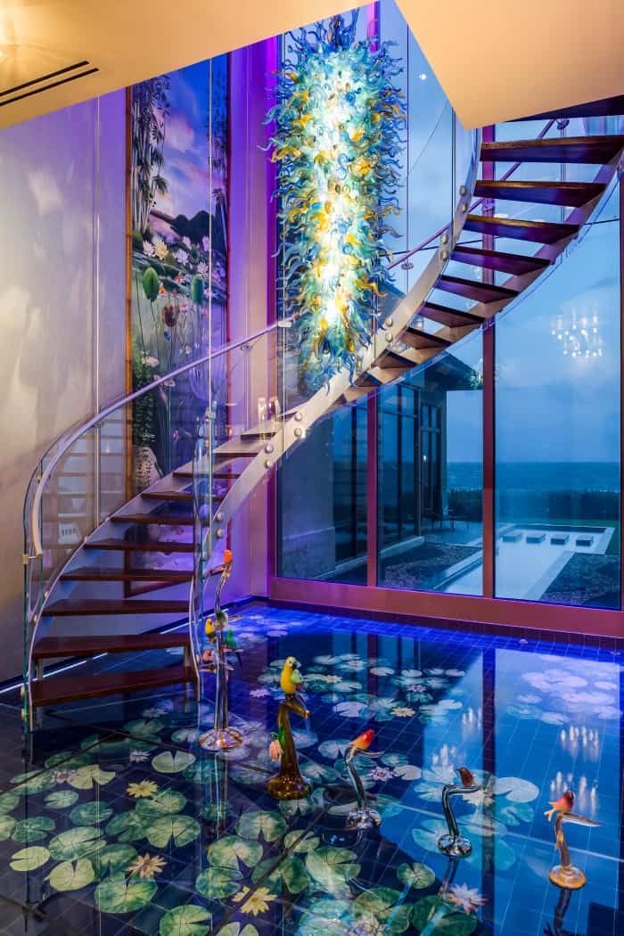
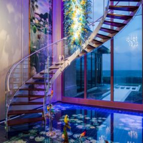
Sotheby’s offers this Tahitian-inspired Florida estate with a 2,000-gallon aquarium and reflective flooring at $26,500,000.
Looking every bit as expensive as it costs, the mansion boasts a modern sculptural staircase emphasized with a more sculpturesque colorful glass chandelier.
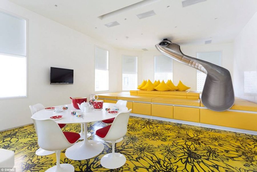
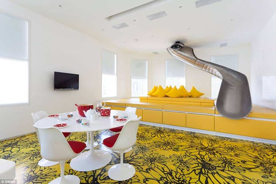
AB Rogers renovated this townhouse in 2009 adding a fun and showy slide to the bright living area.
Beside the cool transition between levels the so-called Rainbow house includes Richard Woods’ fun floors that look so appropriate in its bright interiors.
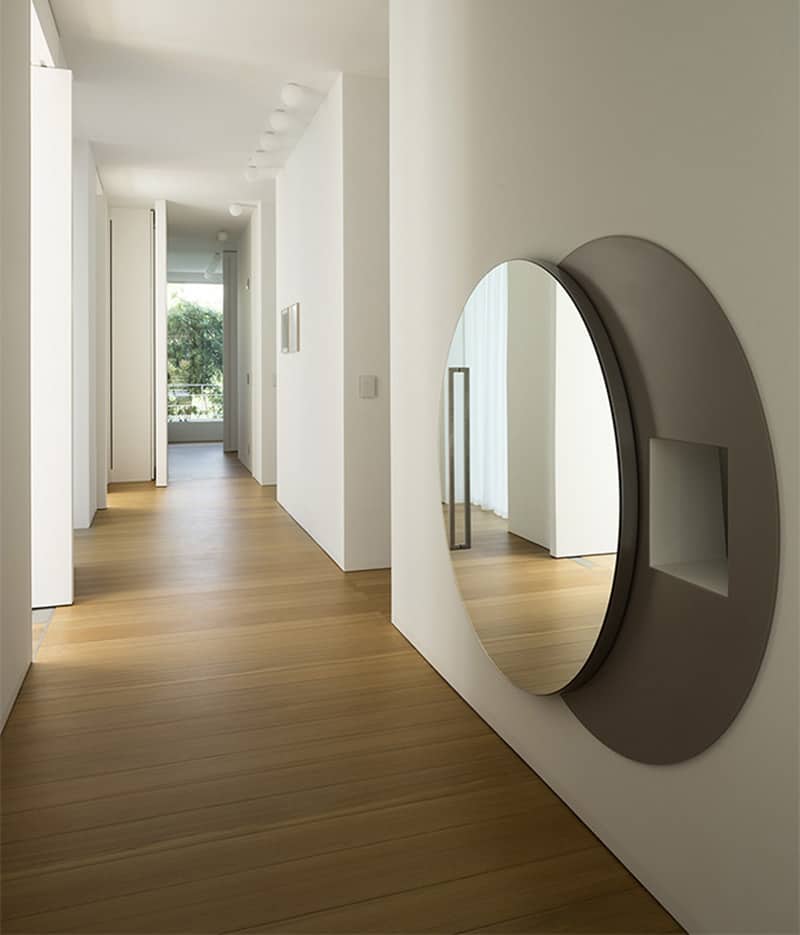
One of the cool designs that probably has no equivalents anywhere in the world is this laundry chute by Zaetta Studio Architecture. Located in a hallway of a modern Italian home the convenient opening connects the hallway with a laundry room downstairs.
Hidden behind a large mirrored moving disk the chute never ruins the minimal look of the corridor whereas the mirror visually enhances the narrow space.
Cool Kid’s Playrooms

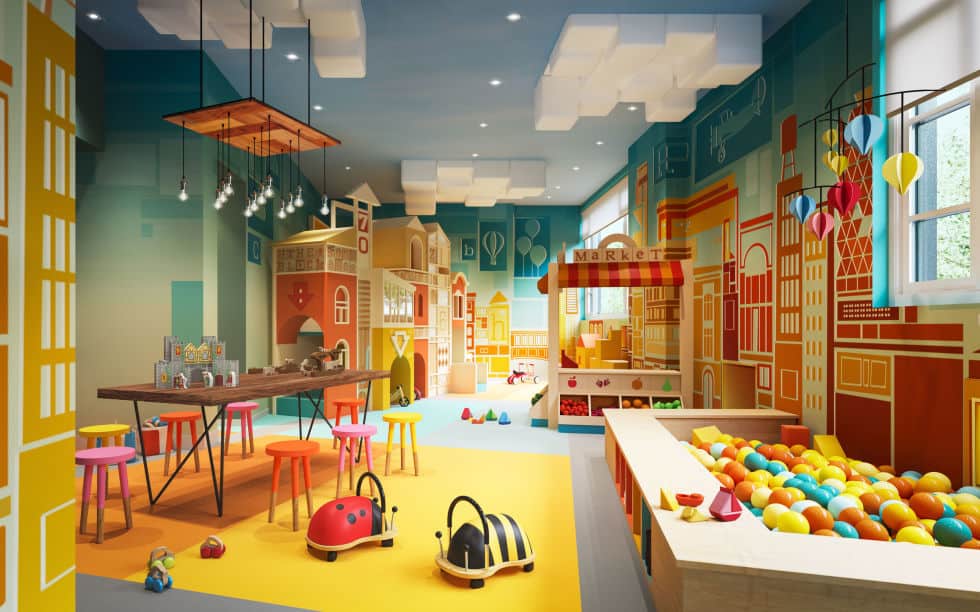
Roto designed a kid’s playroom that looks like a small imagined town within a room interior. Using wall and ceiling space the designers filled it with toy-like buildings and hiding places.
Entering such a room will definitely take kids out of the real world and into their creative imagination stimulated by exciting bright design and numerous toys.
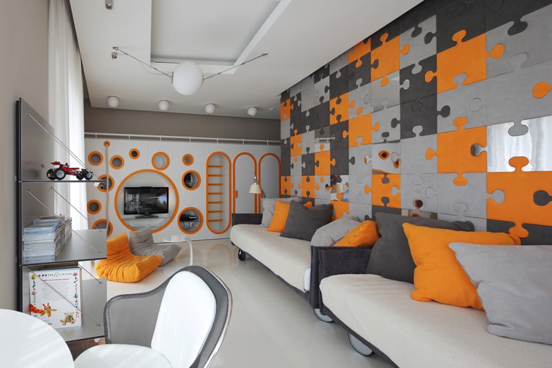
Combining a lively color scheme and functional design Geometrix Design created an entertaining bedroom for a Moscow home that could work for kids and adults alike.
The children’s room includes a study area with a couple of desks and shelves along with a play area with a climbing wall and a TV niche.
Cool Specialty Rooms
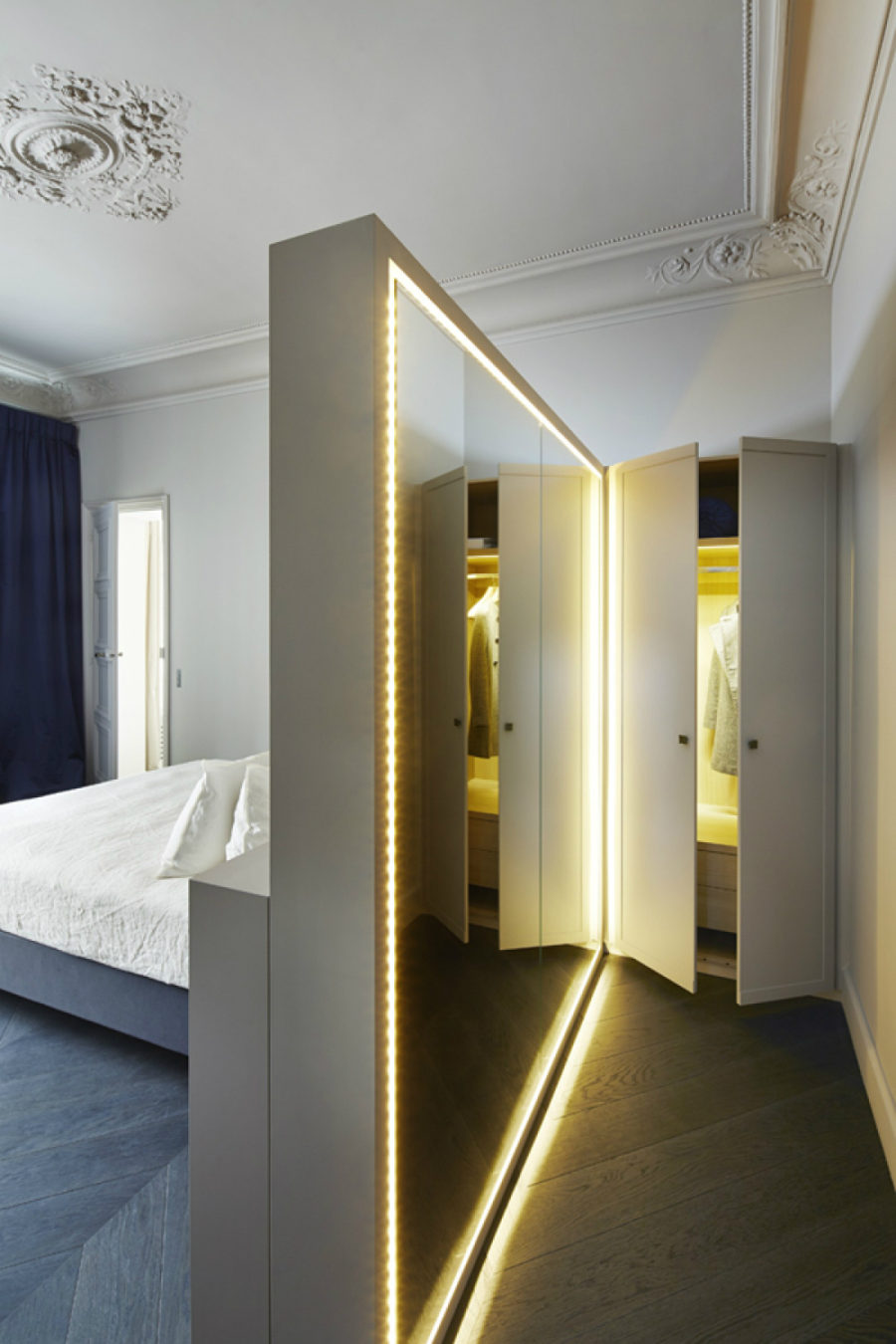
Sarah Lavoine found a perfect solution for incorporating a dressing room into an existing bedroom. Leaving a small space between the wall and bed makes a perfect area for shedding clothes as well as dressing up.
A 3/4 wall dividing the bed from dressing area is helpfully supplemented with a full-sized lighted mirror flanked by a wardrobe also illuminated for more convenience.
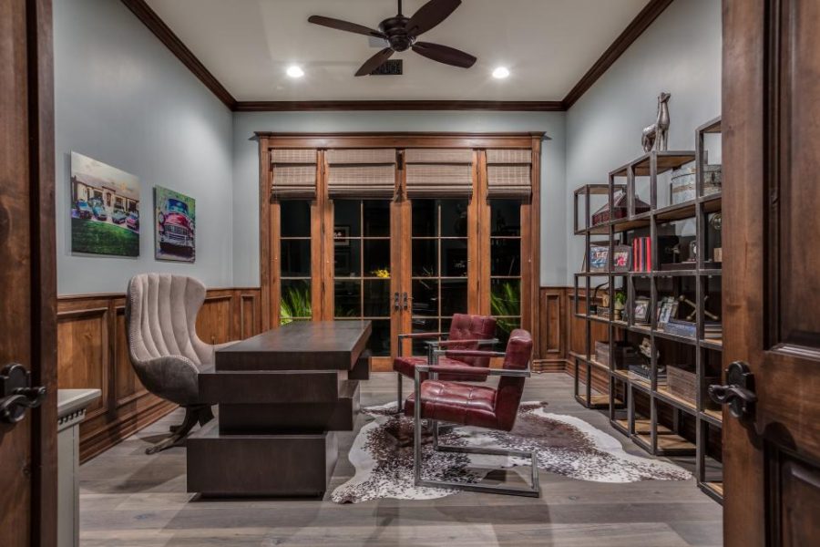
Home office design should above all be functional, but can you really resist cool furnishings? No one says it can’t look smart and stylish.
Raegan Ford filled this traditional office room with bold industrial metallic furniture to take the utilitarian feel out of design all the while keeping it functional.
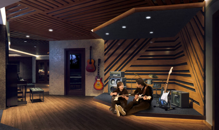
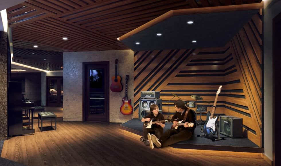
Besides being an influential artist Lenny Kravitz has a real knack for design. His works include stylish tiles, door hardware and a collection of modern furniture.
Here is, however, an interior of a practice room the artist designed for The Kent building in New York. Pure dream for musicians of any status and caliber.
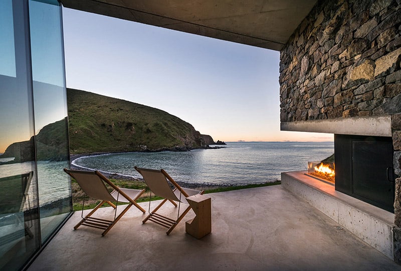
Patterson Associates took advantage of a New Zealand coastline to create this cozy picturesque patio for a private retreat on the Banks Peninsula.
Partially hidden inside between glass and stone walls the concrete deck boasts an open fireplace that seems fitting for cooler breeze-filled evenings.
Cool Door Design
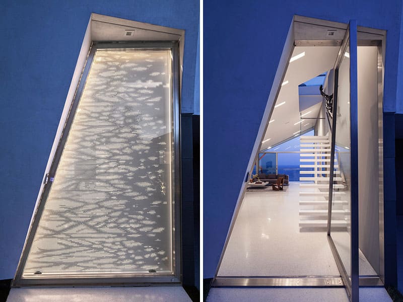
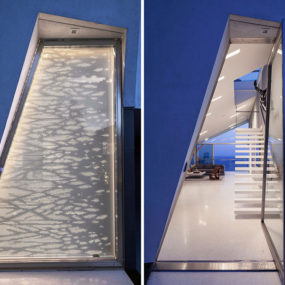
Patrick Tighe Architecture wasn’t keen on keeping a familiar door in his renovation project in Malibu. Instead he created an irregularly shaped door that is 10 feet high with a decorative screen that lights up whenever the residents turn on the lights.
Operated by a hydraulic pivot the door is easy to open. It is closed with help of a magnetic locking device to keep strangers out.
Cool designs are bound to no rules, so almost anything that can be imagine can also be implemented. So what do you think is cool?
