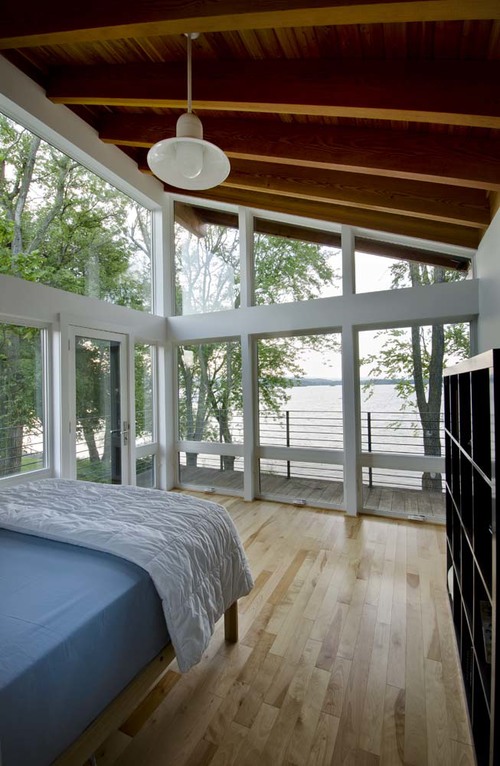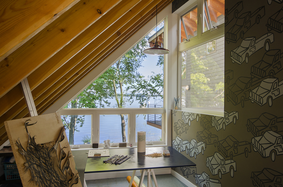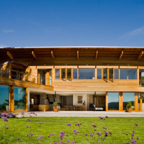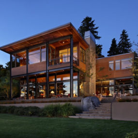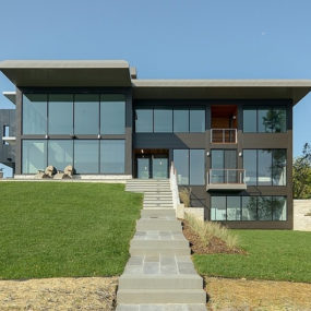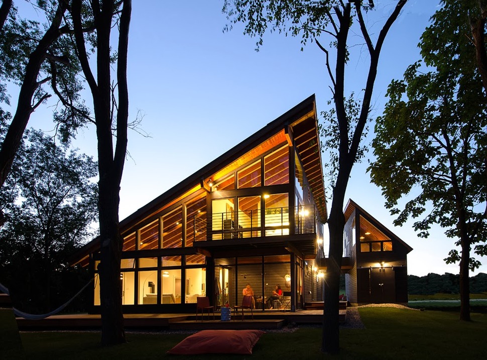
The Projector House is on a small lot with 100ft of lakeside waterfront and majestic mountain views beyond. CULTiVation Design was tasked to design the Projector House to isolate the best views while diffusing the periphery sight lines. The architects achieved this by creating cones of vision that use the lake’s horizon as the picture plane and, much like a projector, the views are framed by the home’s architectural elements. Also much like a projector, the views open up, expanding conically the closer one gets to the framed views and by creating this static relationship, the lake and the mountains take center stage, remaining the focus while all else fades from focus.
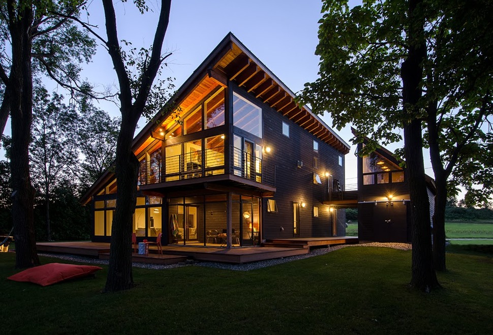
The smaller building is set back quite a bit from the main building which offers quite a bit of privacy to the interior volumes, even though they are completely covered in glazings.
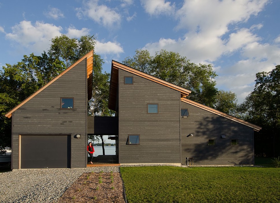
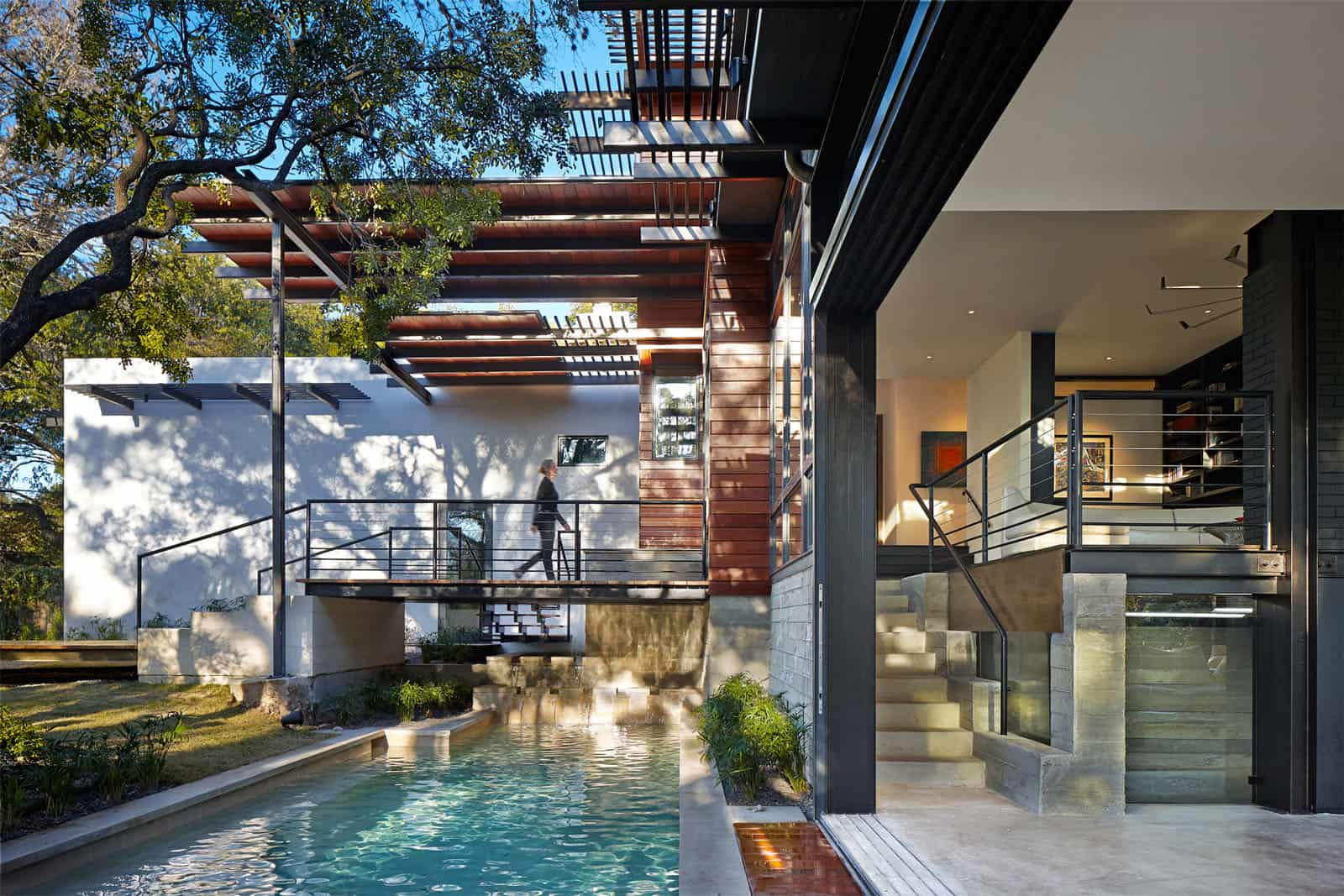
The front of the house, while presenting a closed and private facade still manages to focus on the views beyond by the innovative view corridor that slices the home in two with the exception of a 2nd storey bridge. The choice of a deep greenish grey stain on the homes siding also allows the brilliance of the lake “pop” and be the main focal point while the home itself fades into the surrounding greenery.
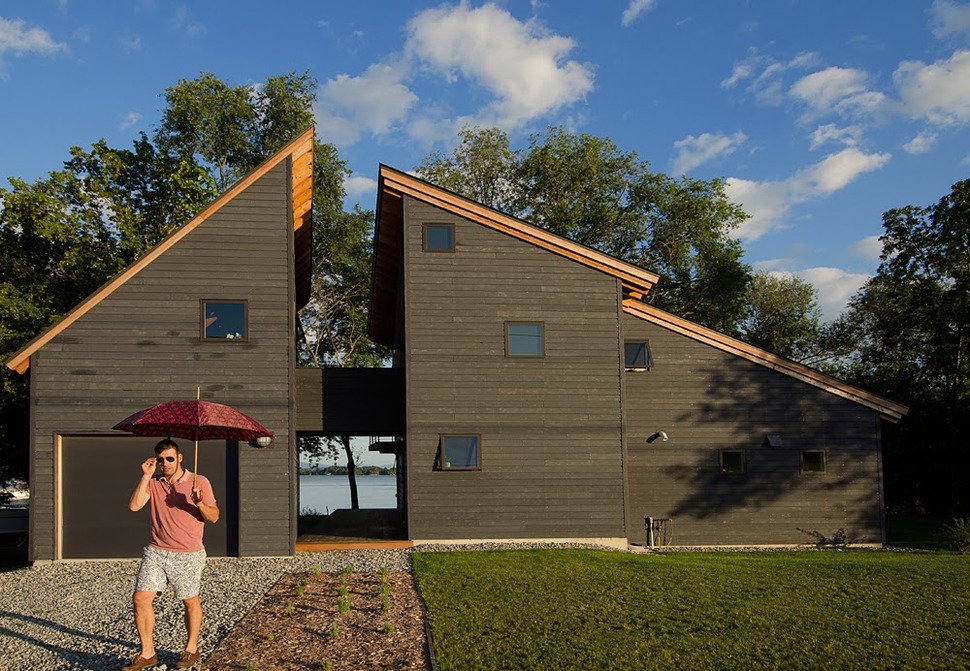
As much as the bridge accentuates the view corridor from the front of the home, so to is the same view accentuated from on the bridge and while the terrace off of the social zone wraps around the side of the home, it is barely noticeable when looking past it to the lake, it does however offer a communication post to the two 2nd storey outdoor zones.
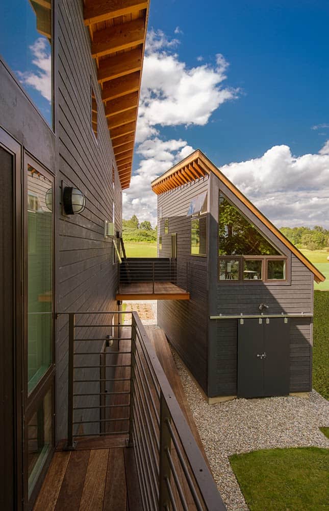
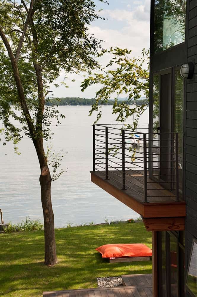
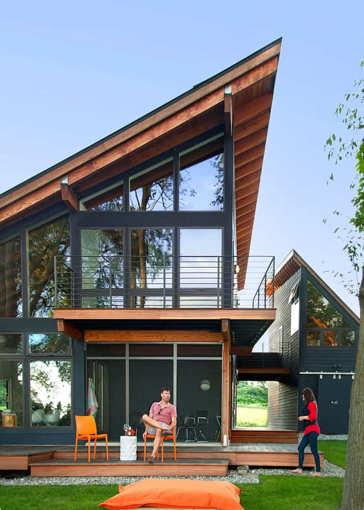
The main part of the home is taller, wider and deeper then the smaller segmented portion giving the home a fat L shaped footprint.
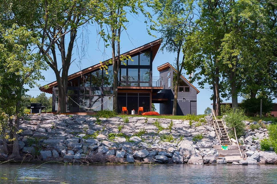
The Tree line between the lake and the home shields the exposed interior volumes as well as the outdoor living zones from those using the water whether by kayak or by sailboat.
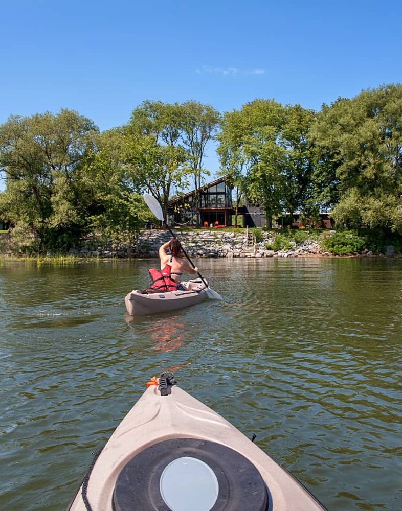
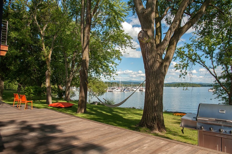
From the deck, the trees don’t inhibit the views at all and they even offer the perfect place to string a hammock.
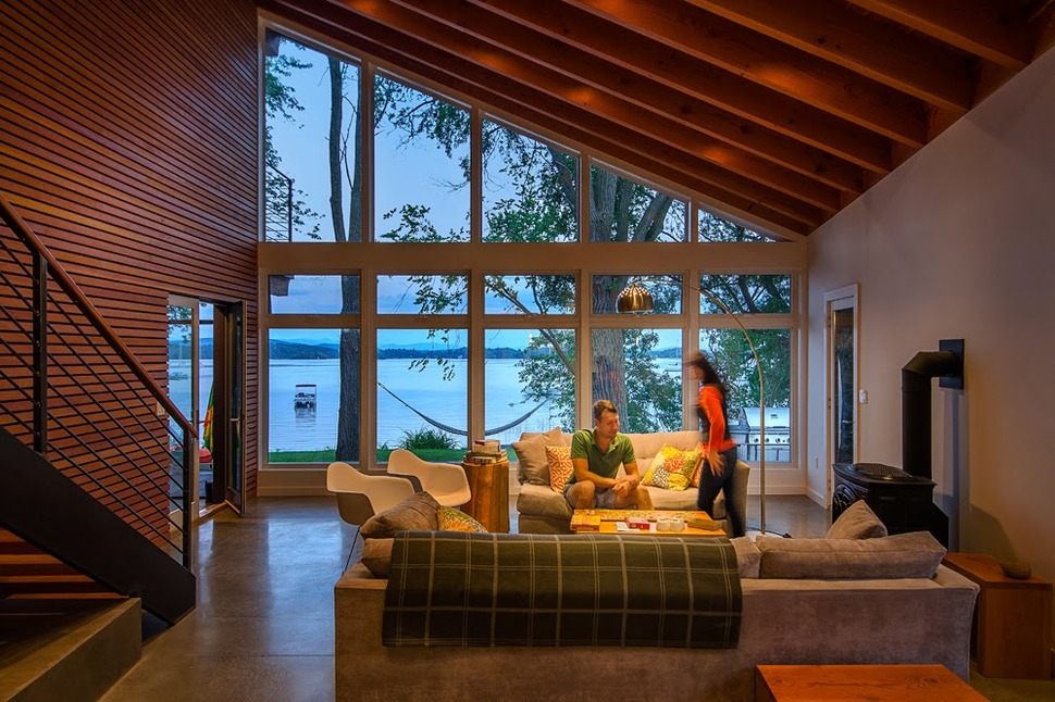
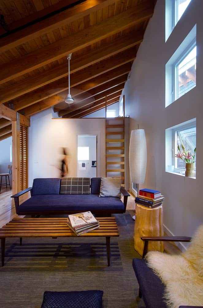
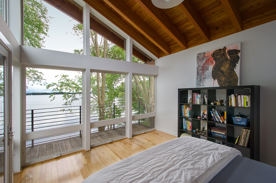
The living room is positioned on the waterside of the home against the outside wall beneath the lowest point of the roof. This location creates a steep inclined ceiling covered in exposed beams. The beams and the wood clad wall create a continuum with the trees just outside the window, allowing the brilliant blues of the lake, mountains and sky to be the main focus. Had the walls been blue or green, the trees would have dominated the view.
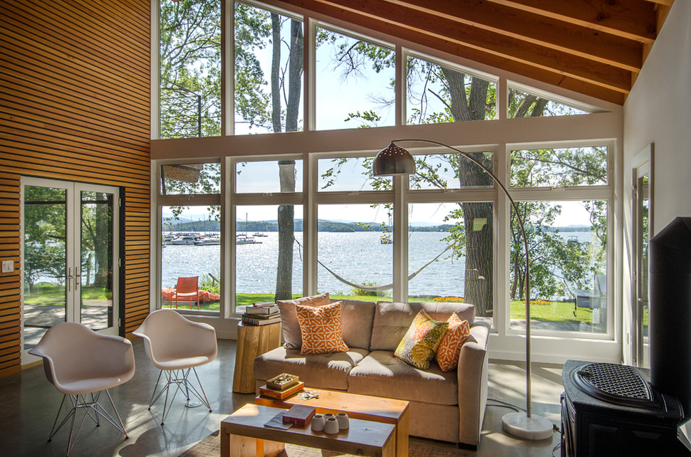
The living room has outdoor access on both sides with French doors leading out to the deck and a single door leading out to the side of the home. This side door offers the easiest passage of firewood for the wood-burning stove located next to it.
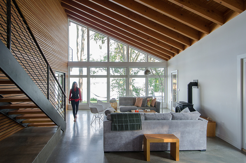
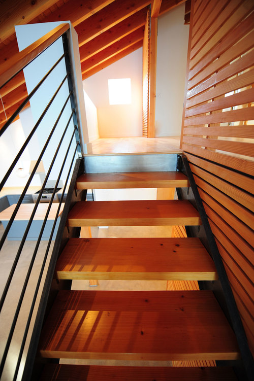
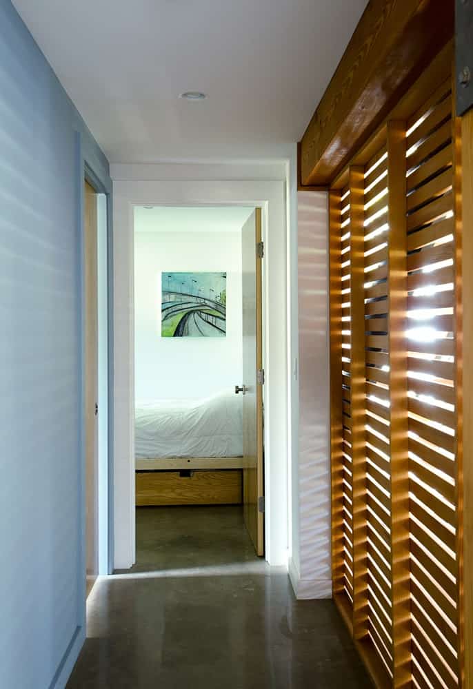
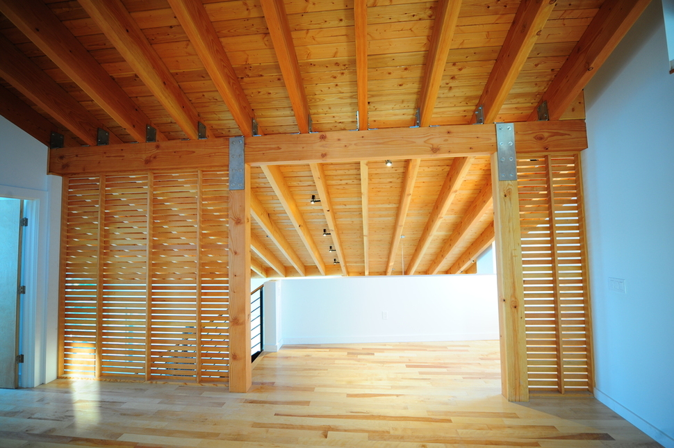
On the other side of the wood burning stove is another door leading to the side of the home and opposite it is a beautiful steel staircase with and open tread design and solid wood treads. The lines of the beams, horizontal wood wall screen, solid wood treads and steel balustrade all create a multitude of linear formations that helps diffuse the vertical tree trunks just past the deck.
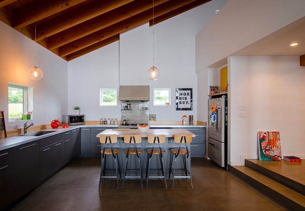
The kitchen is positioned on the front of the home, behind the living room. Two small cube windows overlook the front yard with the stove positioned in such a way that the hood creates a vertical detail between the two windows.
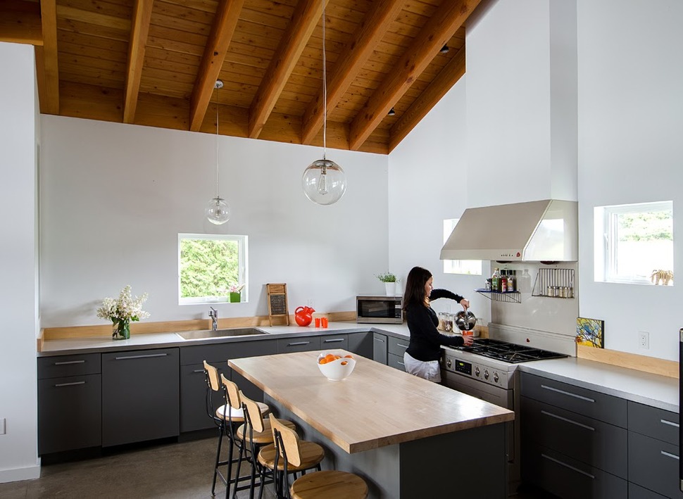
While the cabinets and counters are all shades of grey, the backsplash is made from 1×6″ pale wood boards. This pale wood detail is also used on the island’s butcher block counter and on the bar stools. Had the wood all been the same mid tone as the ceiling, the room would have felt heavy and claustrophobic.
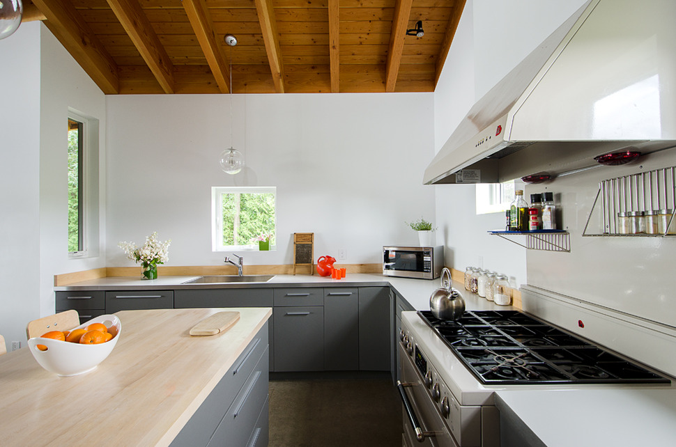
While the windows flanking the stove are too high to look out of, the windows above the sink and at the end of the counter offer views to the side yard. All four windows make sure the room is filled with natural light.
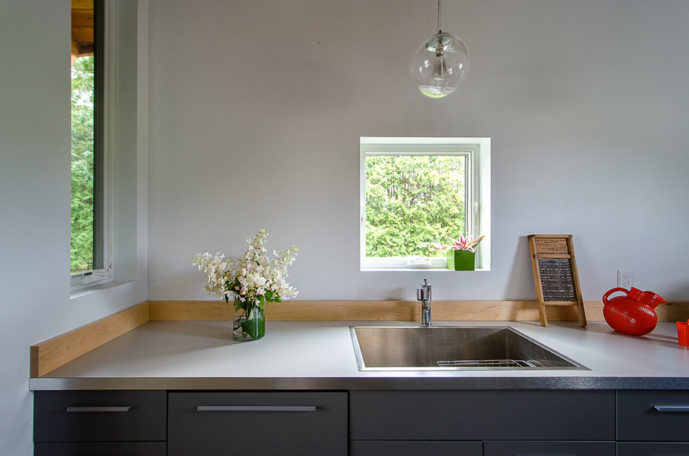
A hand blown clear glass light pendant suspended over the sink adds an organic free flowing shape to an otherwise precise space.
