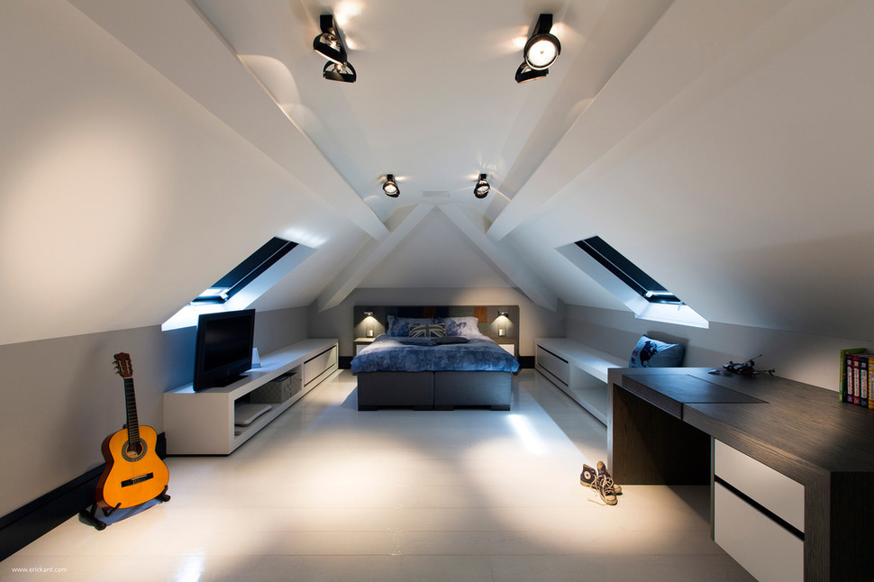
A Home in the Netherlands designed by Eric Kant has been completely renovated from top to bottom and even here, in the attic, the attention to detail is spectacular. What would normally be a utilitarian space with a bedroom tucked under the roofline is instead a study of geometrical shapes. The A-line of the ceiling is emphasized by the drywall clad beams and end posts. A pair of matching windows opposite each other add in an extra dimension of width and a desk and low consoles line the wall.
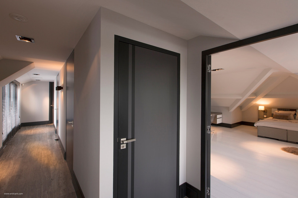
There is more then one bedroom in this upper level of the home. A long hallway runs the length of the building for access to both bedrooms on this floor. The hallway is kept fun and interesting with the use of interesting graphics on the charcoal doors and dark trim. The beams in the second bedroom are treated with the same drywall surround as in the first.
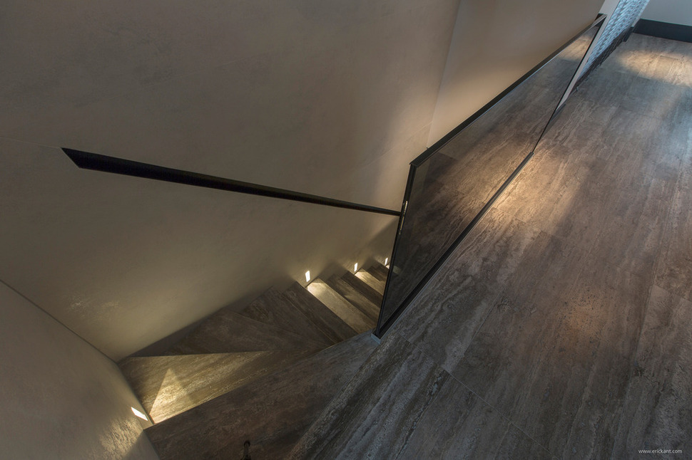
Even the stairwell up to the attic level shows attention to detail. The lights mounted just above each 2nd tread, making it easy to traverse the steps at night and create a fun sparkle to the stairwell while at the same time being super functional. The smoke glass balustrade ties in the the dark trim and charcoal doors.
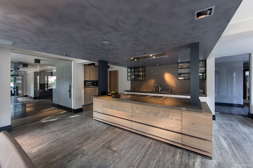
Downstairs is where the magic really happens. The kitchen is centrally located and has a dropped charcoal ceiling above it and the dining space. Here two dark grey posts rise from the centre island for support in this large open area. With walkways all the way around the kitchen it is accessible from every direction.
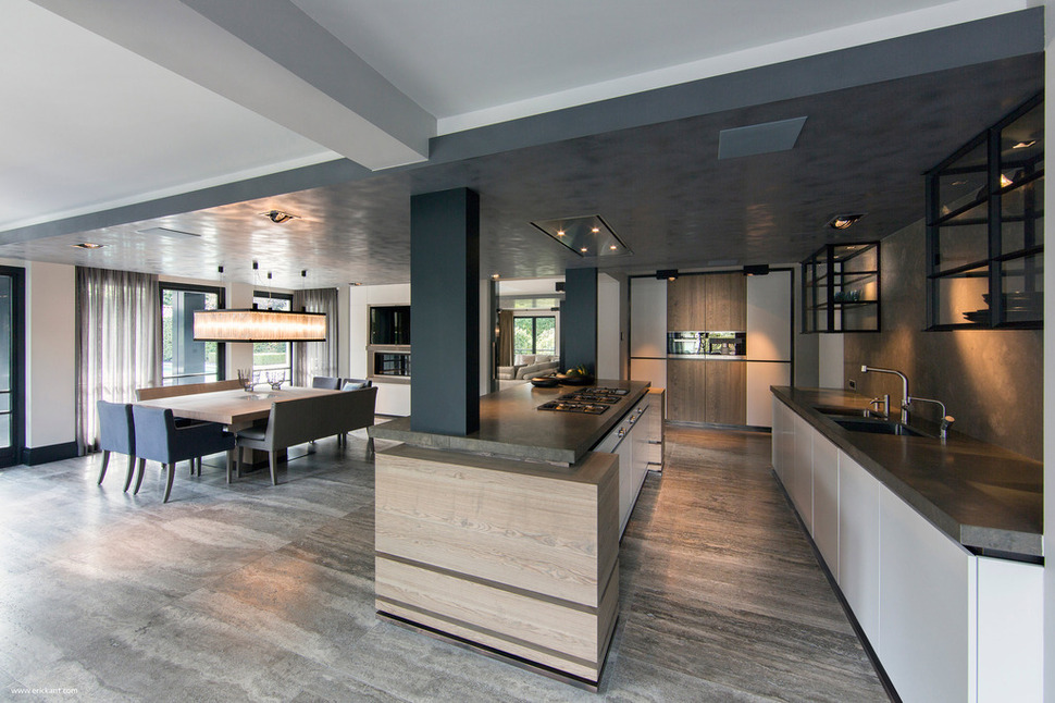
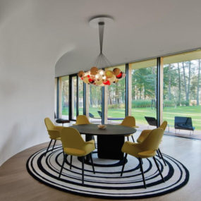
The dining area just beyond the kitchen continues the theme of grey with its upholstered chairs. The large table is able to accommodate two chairs on either end with benches running the length of both sides for a total of 10 to 12 seats. Just beyond the dining space are windows overlooking the backyard.
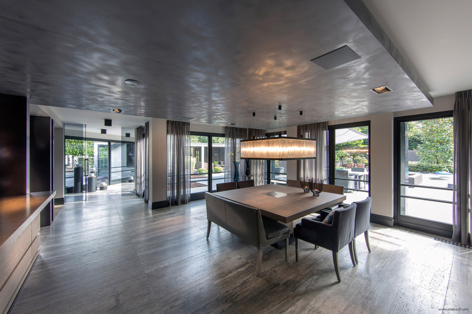
The windows in the dining area are flanked with soft smoky drapery and through the windows is a view of the large terrace next to the pool. Just past the dining area is a glassed walkway that leads to the terrace.
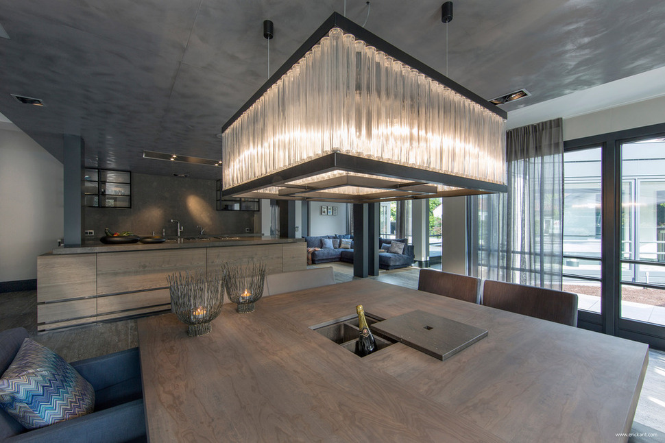
The dining table is large enough to have a hidden cooling compartment for Champagne or white wine and it is the perfect place to enjoy either. The mood created by the multi-grey colour scheme is one of intimacy and relaxation that is punctuated by the drama and sparkle of the contemporary chandelier.
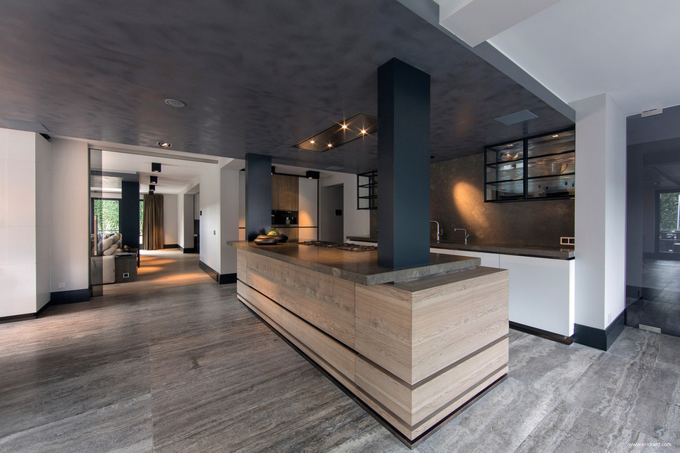
Next to the kitchen and dining area is the living room. The living room is situated to also take advantage of a poolside view while at the same time being close to the kitchen for snacks.
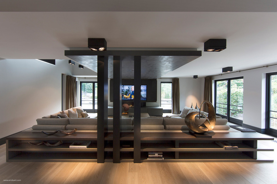
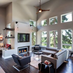
The living room is plays off of low furnishings and vertical supports. The dropped ceiling of the kitchen and dining area is repeated here with a long dropped section running the length of the space starting just above the media centre and finishing at the 3 support columns. A long low run of shelving behind the over-sized sectional offers table surface to the seating area and visual interest to those walking through the hallway.
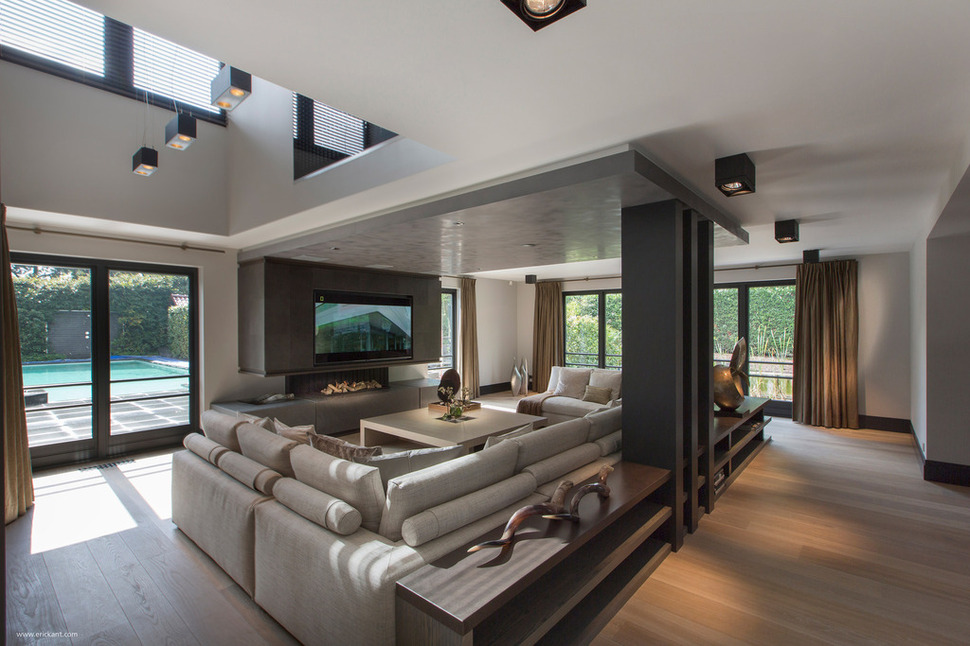
The TV is mounted on a protruding section of wall that acts as the mantle to the fireplace below. This allows the heat of the fireplace to curve up, around and out into the room without having a direct line of flow to the flat screen. Just beyond the media area the ceiling rises up to the next level creating a mezzanine for the floor above.
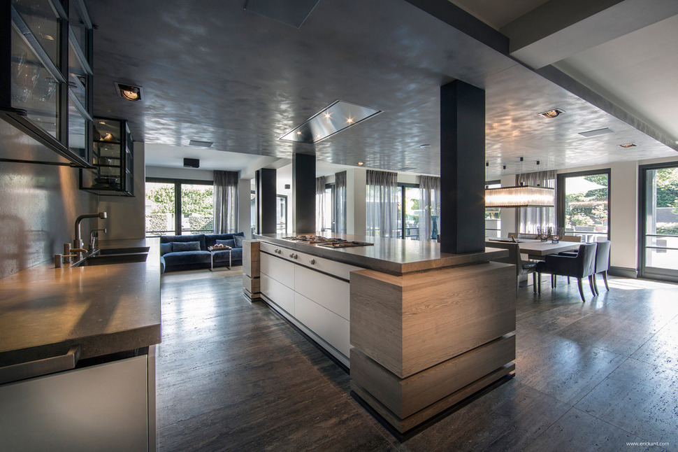
There is also a small sitting area on the other side of the kitchen, this is a more informal arrangement, a place to have your morning coffee while reading the newspaper, or perhaps a quiet conversation away from the noise of the media area.
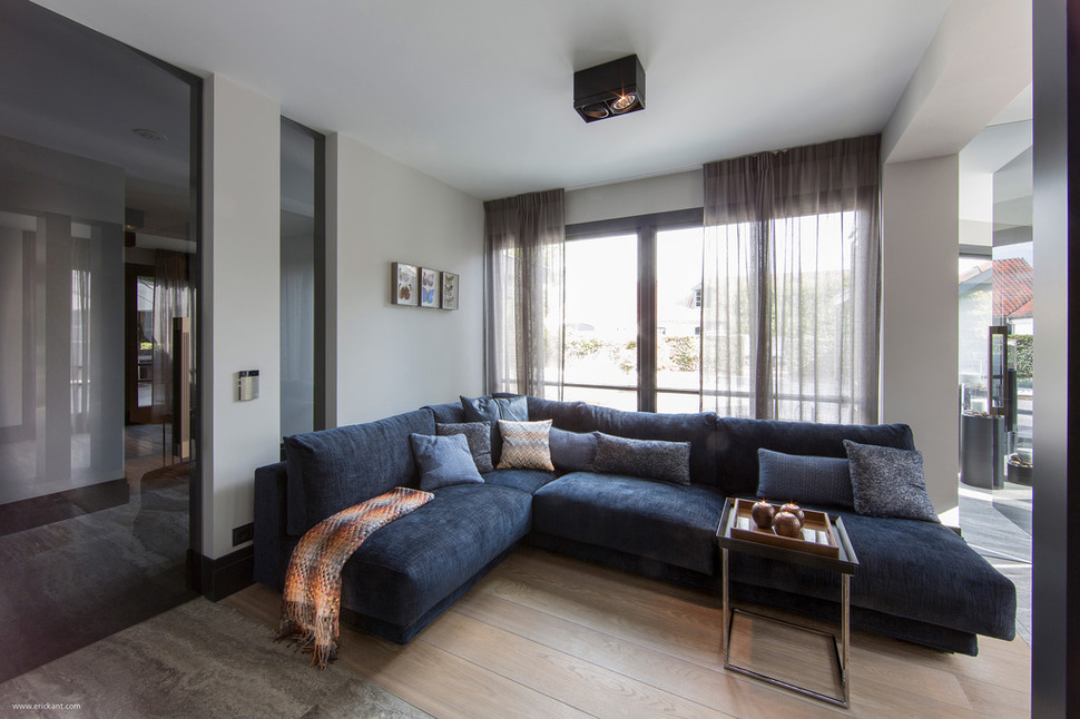
This small sitting area also has views outside – but not to the pool. A short hall leads off of this space in one direction to the gym and in the other to the pool.
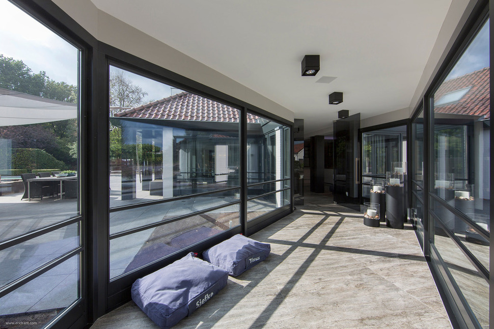
The hallway that travels to the pool area is glassed on both sides and offers an atrium effect so that even on a cold and rainy day, the outdoors can be enjoyed from a warm and sheltered location.
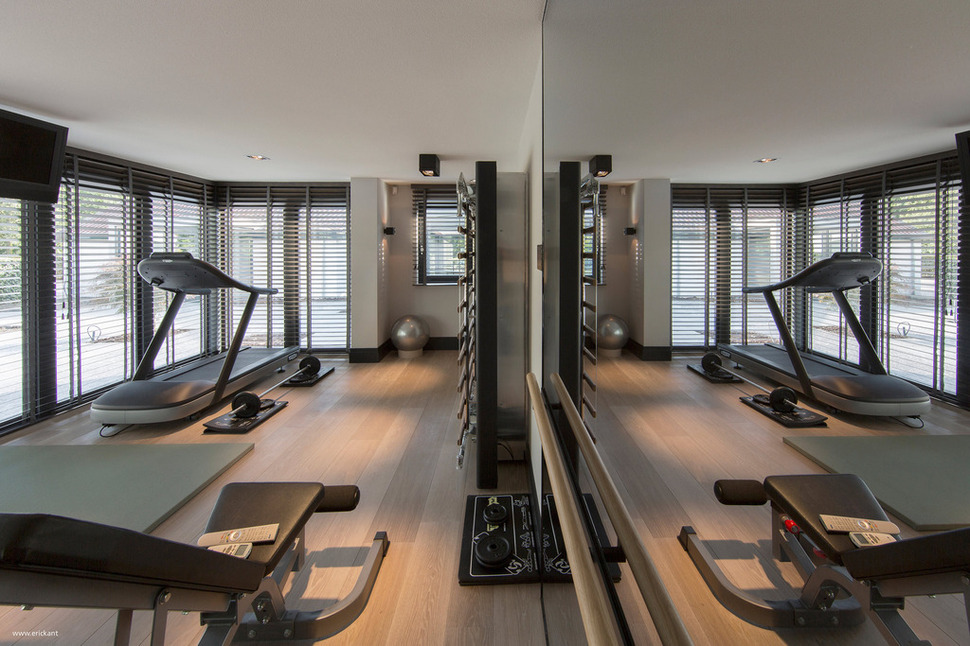
The gym is decked out with everything you would want from a home gym, including a wall of mirrors to check your form as you lift free weights.
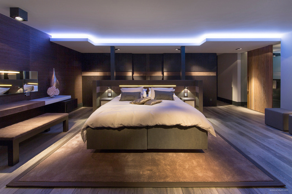
When the day finishes and its time to retire, what better place to do so then in this stunning Master Suite. Here, a bed floats in the centre of the room with the headboard offering storage on the far side. The architect continued the concept of dropped ceilings, only in this room the drop is white and surrounded with ambient lighting. Here, too, a couple of charcoal columns supports the open space and rise up from the headboard location. Beyond the headboard wardrobe are is a wall of dark cabinetry with a horizontal stripe of copper. The cabinetry appears to run the length of the wall.
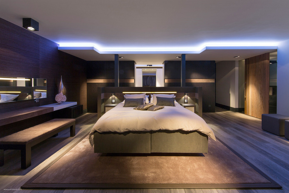
While the far cabinetry appeared to run the length of the wall, it in fact was hiding a doorway to the ensuite. Centrally located behind the bed, when the door is open a mirror on the far wall of the ensuite is also centrally located.
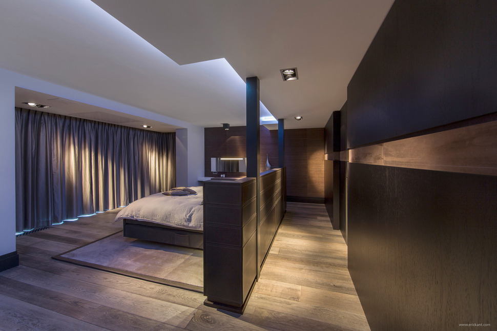
There are other hidden secrets to this Master Suite. Beyond the bed is a wall of windows and above the windows is the secret. Look very closely – can you tell what’s hiding?
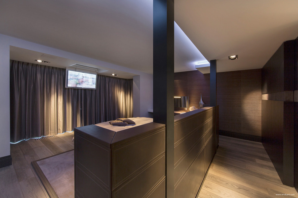
A drop down TV is hidden in the ceiling section above the windows. Aside from the secret doorway to the ensuite and the hidden TV, the headboard continues the theme of secrets with its run of storage behind the bed and out of view.
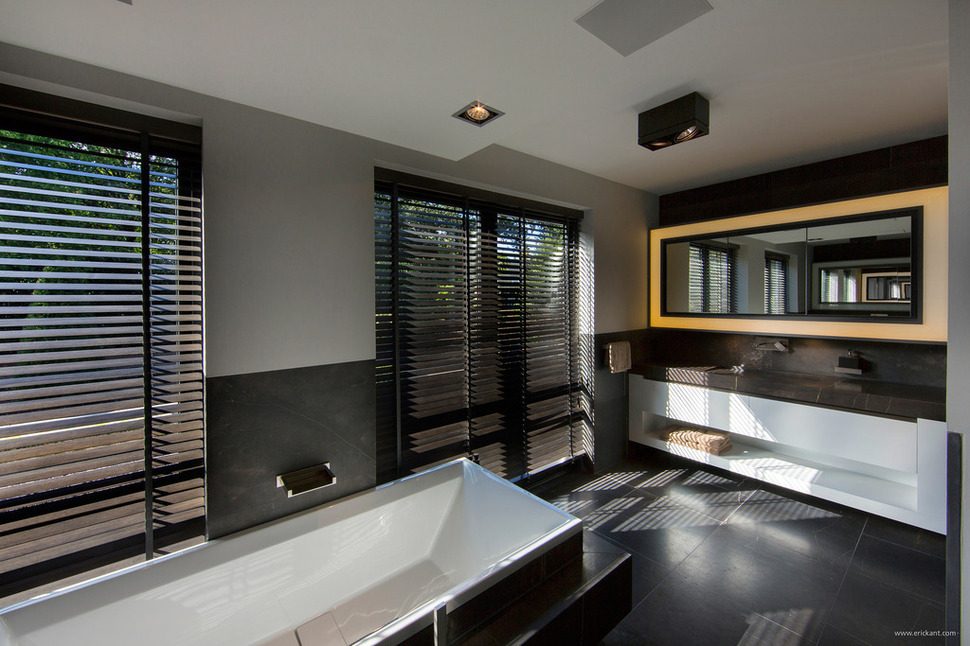
The ensuite is large and elegant. A centrally located modern soaker tube divides his and her spaces with a vanity on either end.
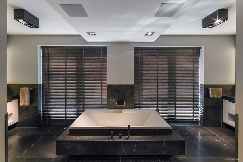
While most spaces within this home are balanced asymmetrically, the ensuite has a symmetrical layout with the tub flanked on either side by windows of the same proportion, followed by towel racks and then the vanities. Here, too, a dropped ceiling extends out to ‘frame’ the tub area. It even has a double fan system for removing moisture visually balanced within the dropped ceiling and in line with the lighting.
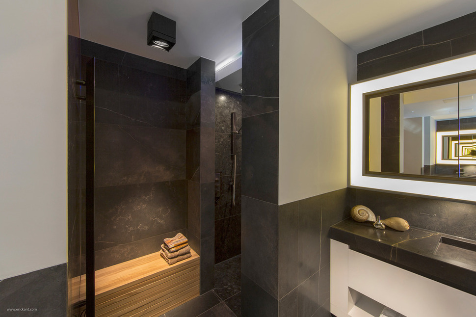
While not part of the symmetry but tucked out of the way so as not to affect it, a large walk in doorless shower is next to one of the vanities, and it comes complete with a bench just outside the showering area.
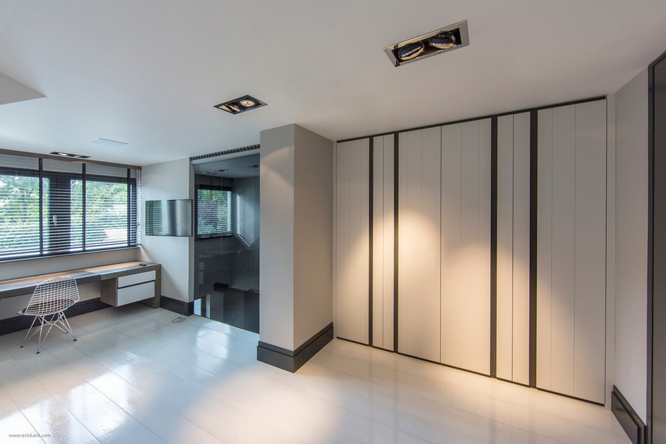
The fourth bedroom is also on the main level and is a study in white. Here, the charcoal tones are kept to the trim (just like in the attic level) and on a few vertical stripes on the closet door. A long desk takes advantage of the view. Each room within this home is large, spacious and full of interesting details that make the home’s structure a visual feast that is complimented by the minimalist approach to its décor.
Eric Kant Contemporary Design
