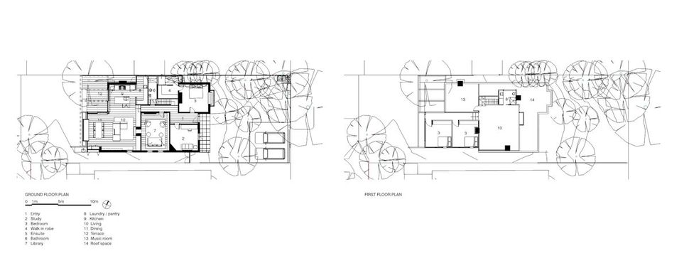
Robson Rak Architects recreated a two storey Edwardian home located in Melbourne, Australia in a suburb called Elwood into a contemporary home with a Scandinavian aesthetic with the help of Interior Designers Made by Cohen and stylists Joan and Veda. The extension at the back of the home consists of the new kitchen, living and dining areas on the main level as well as two additional bedrooms accessed off of a central hallway and an office that opens up to the original open plan rec area.
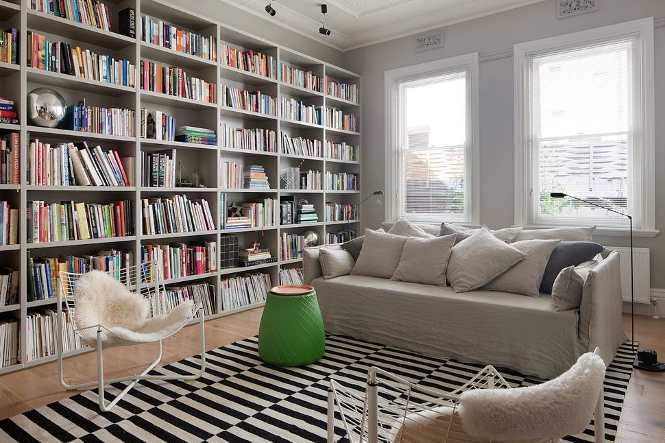
Downstairs in the original part of the home, the living room is now a large library / family room complete with a floor to ceiling shelving unit filled to the brim with books. Made by Cohen tied this portion of the home to the new addition with the use of modern steel occasional chairs powder coated in white with sheep skin throws, a bright emerald green drum shaped table, a bold black and white graphic area rug, pale wood flooring and a soft silvery grey shade on the walls.
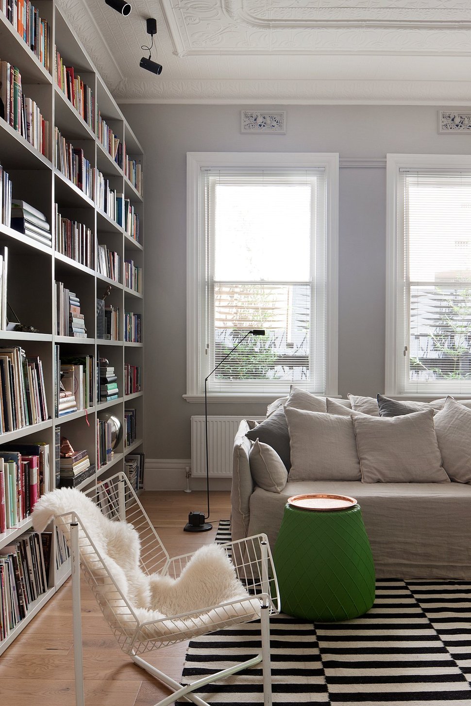
black Industrial lighting choices both in the floor lamp and the spots on the ceiling help balance the ornate trim work around the windows and on the ceiling.
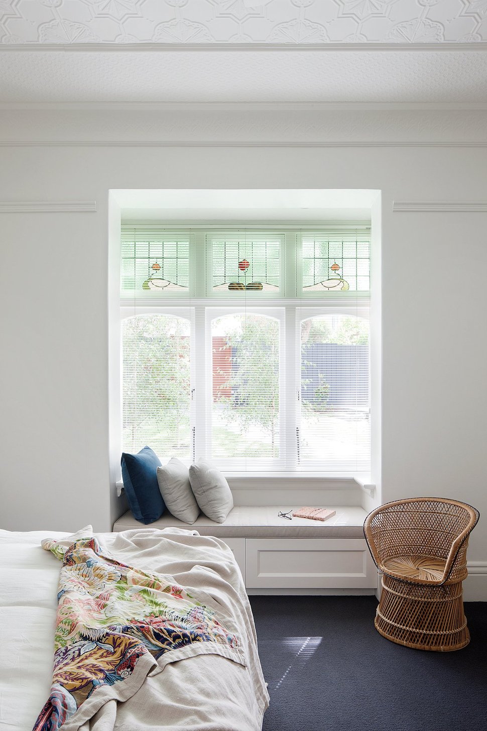
Also located in the original section of the home on the main level is the Master Suite, overlooking the front yard. The architects and designers chose to keep the original throughout the room, including the ornate ceiling plaster and stained glass in the window bay.
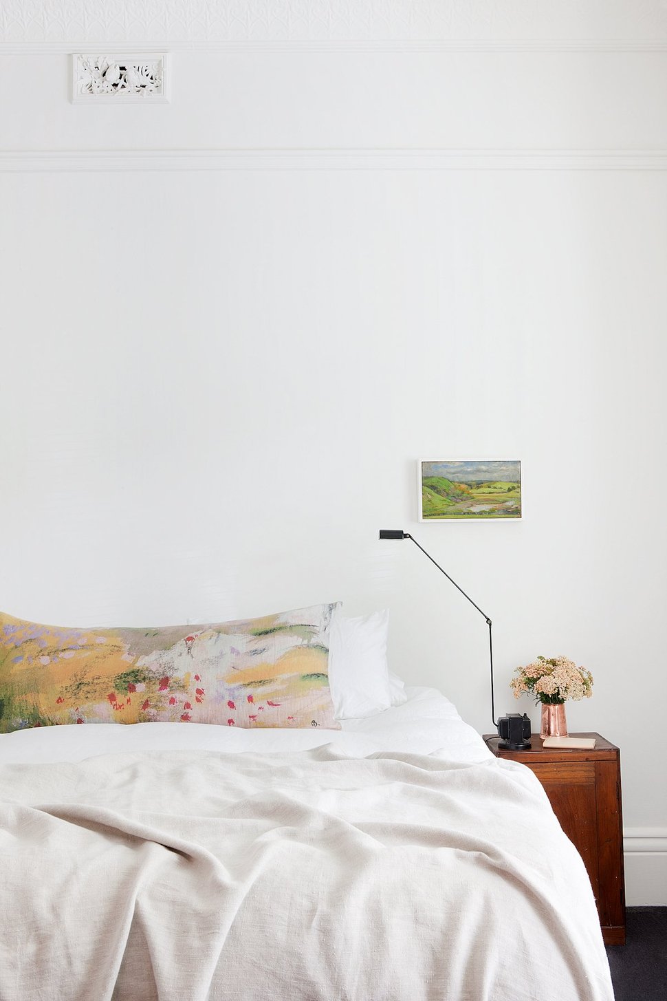
With all the preexisting intricate details, the rest of the room was kept to the basics of bed, night stands and lamps. No fancy headboard required.
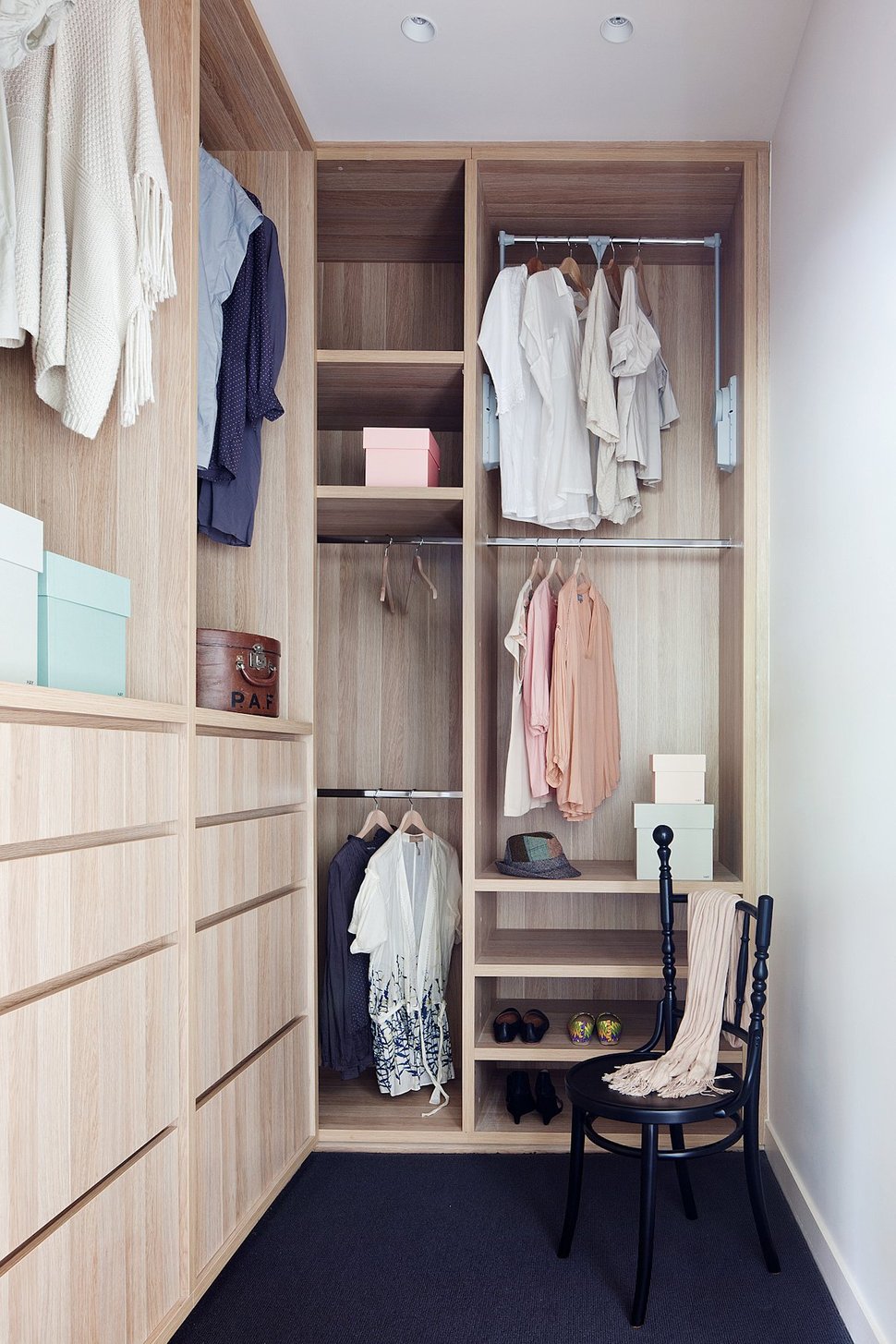
Although most period homes lack in closet space, the architects and designers where able to give the homeowners an ample sized walk in closet – there’s even enough room for a chair.
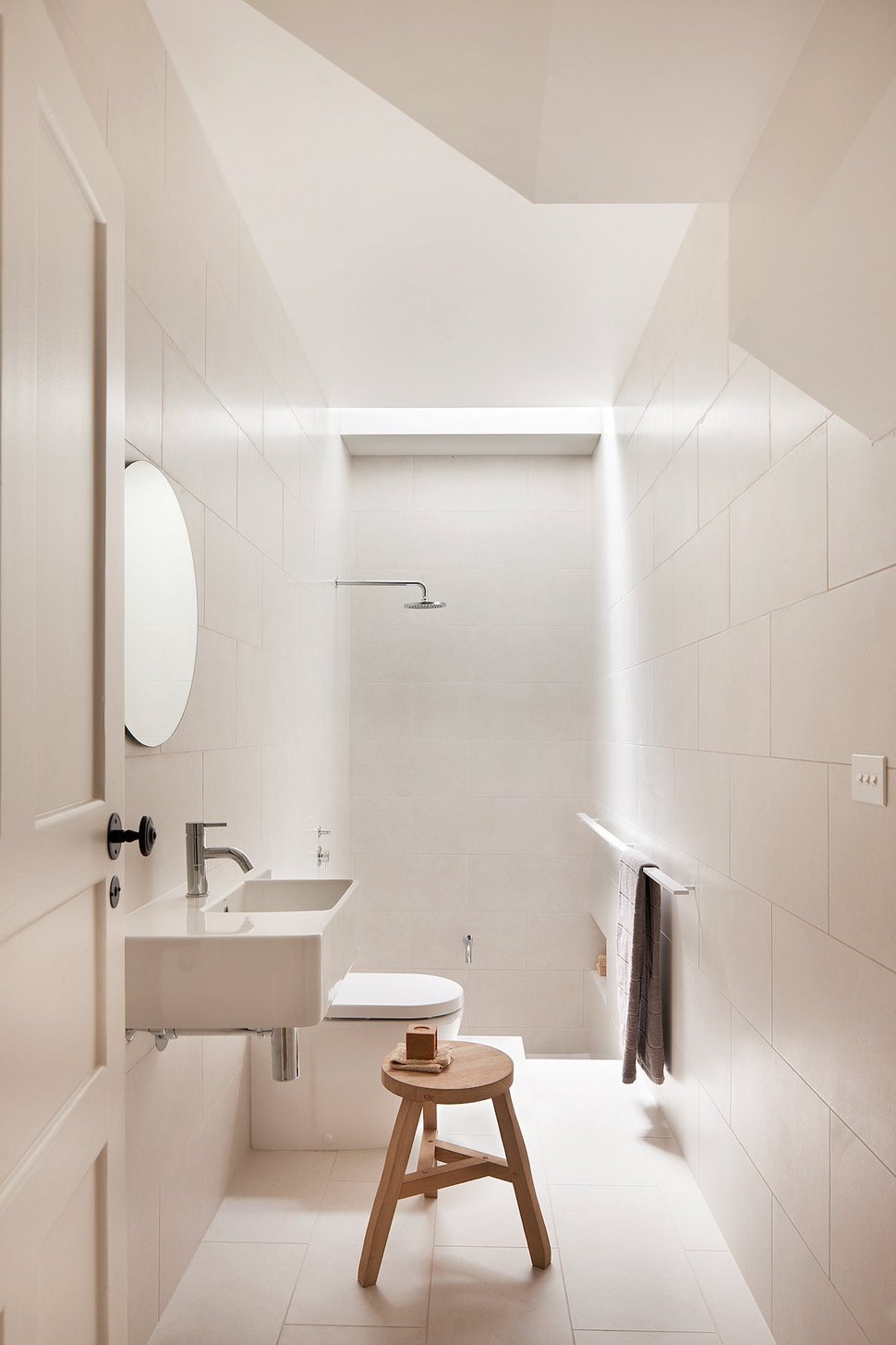
While the Master Suite has a small ensuite, there is also a bathroom just down the hall from it, under the stairs. Long and narrow, the door opens to a cantilevered sink with the toilet behind it and a shower stall at the back. Completely tiled in white, the space is kept light and bright – and easy to clean.
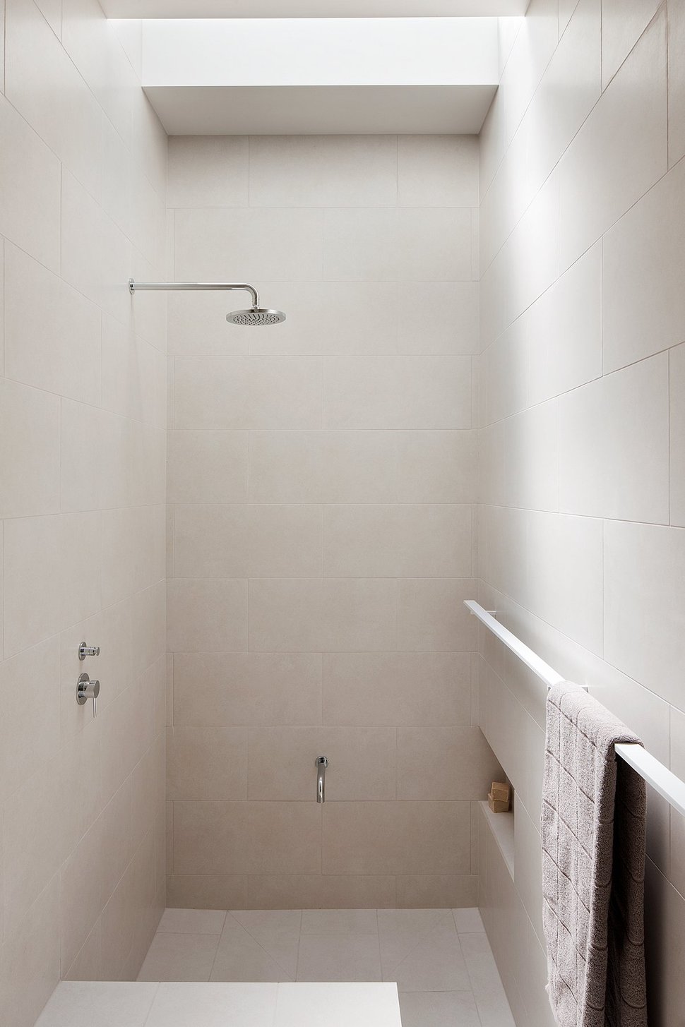
With the room completely tiled, there is no need for a glass enclosure or shower curtain, all that’s needed is to keep the towels far enough away to not get wet from the spray of the rainshower head. If the owner’s have been gardening barefoot a low faucet mounted on the wall makes foot washing a breeze.
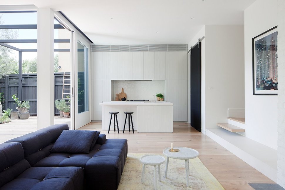
A few feet further down the hall and there is a two step drop down into the new extension of the home and the architects played up this level change by cantilevering the first step midway and over a lower step that extends part way along the wall of the social zone. The extension is covered in glazings that overlook the back deck with several sections that can be slid open to create the perfect indoor / outdoor experience.
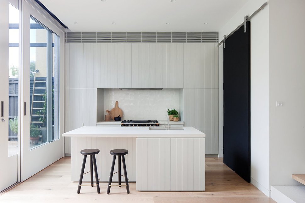
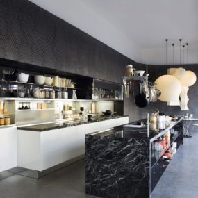
Located on one end of the extension is the kitchen, which is fitted with white cabinetry that has a contemporized beadboard pattern, white solid surface counters, a linear grey striated tile above the cabinetry and a jet black barn door that hides additional workspace.
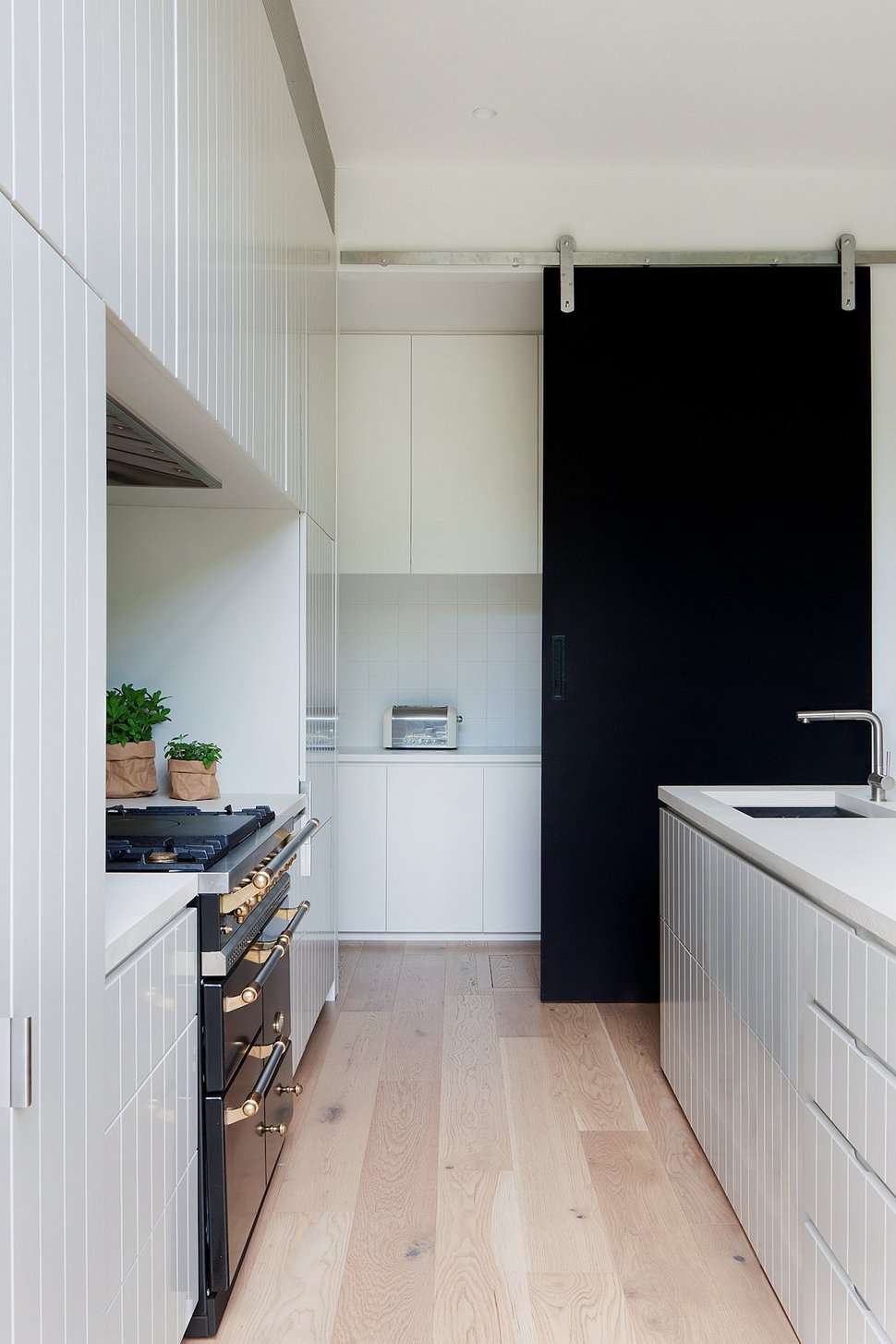
When the barn door is slid aside, a long bank of upper and lower cabinets fronted by a hallway is revealed.
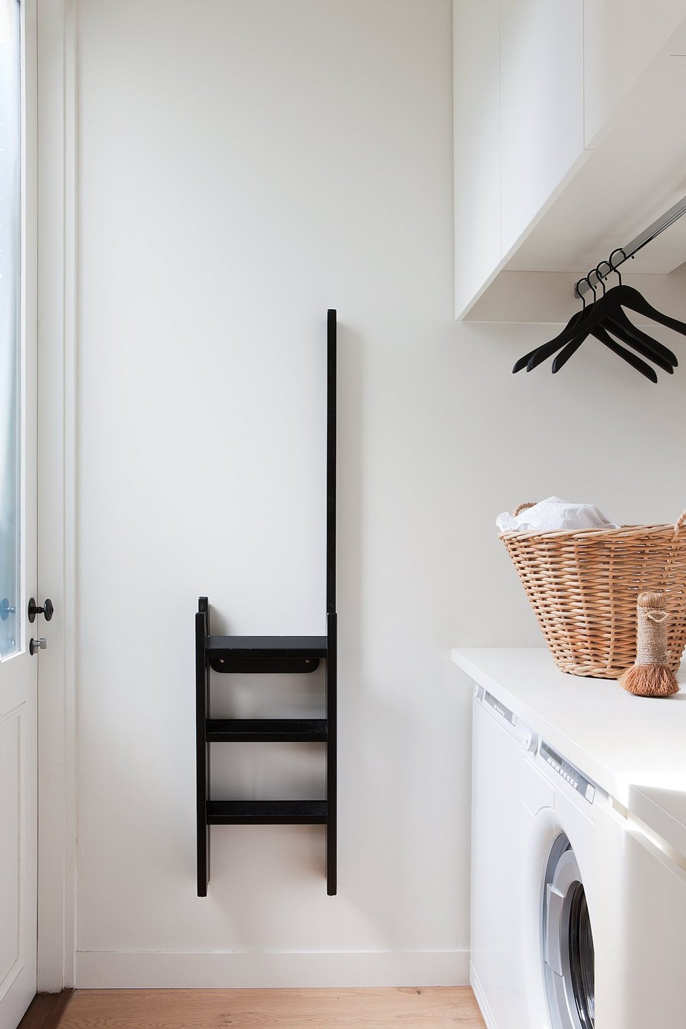
At the end of the hidden hallway is where the laundry and an outdoor access is located.
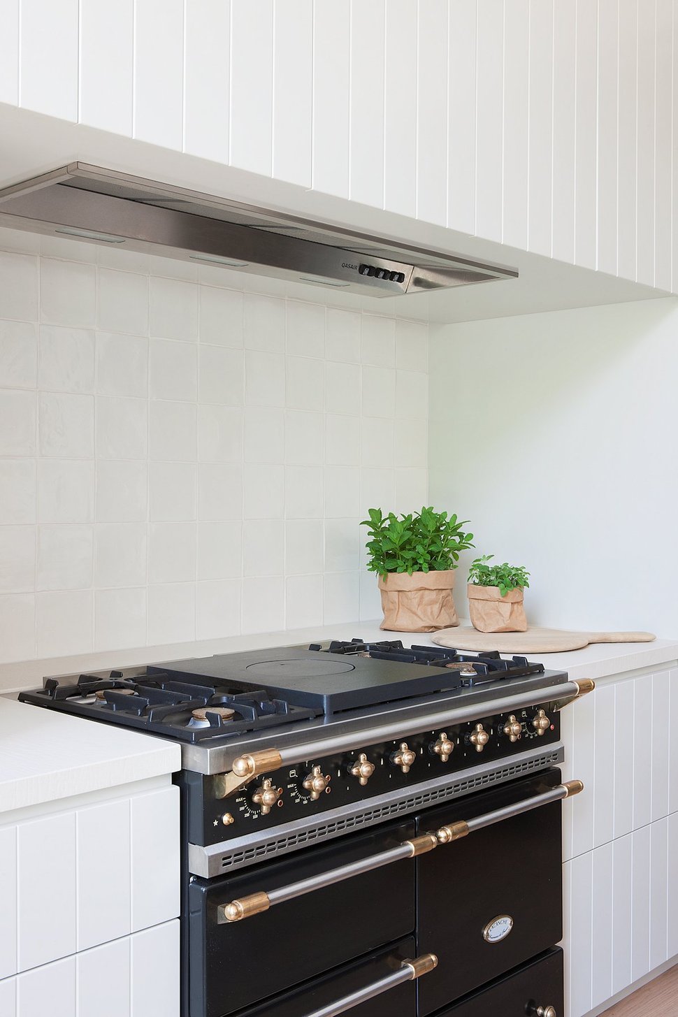
With all the extra storage in the pantry area the architects and designers could afford to give up storage in the working zone for a large and stunning gas stove with double ovens, warming tray and oh so much more.
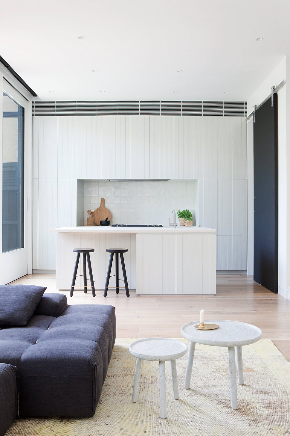
The living room side of the island is divided between storage and bar seating and this asymmetrical design stops the zone from feeling too precise. The living area next to it continues the asymmetrical feel with its pair of similar but different sized coffee tables.
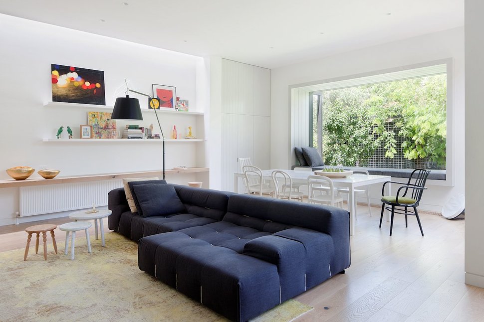
The living room has the kitchen off to the side of it and the dining room behind it. Grounding the zone is the large navy blue sectional with supersized tufting, almost everything else in the space is either pale wood or white.
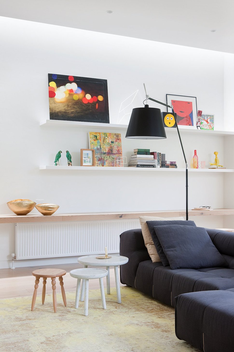
The living room wall opposite the kitchen is fitted with a floating pale wood plank shelf over the radiator and two additional but white floating shelves higher up. Art is casually placed to lean against the wall rather then hang and additional books and mementos finish the vignette.
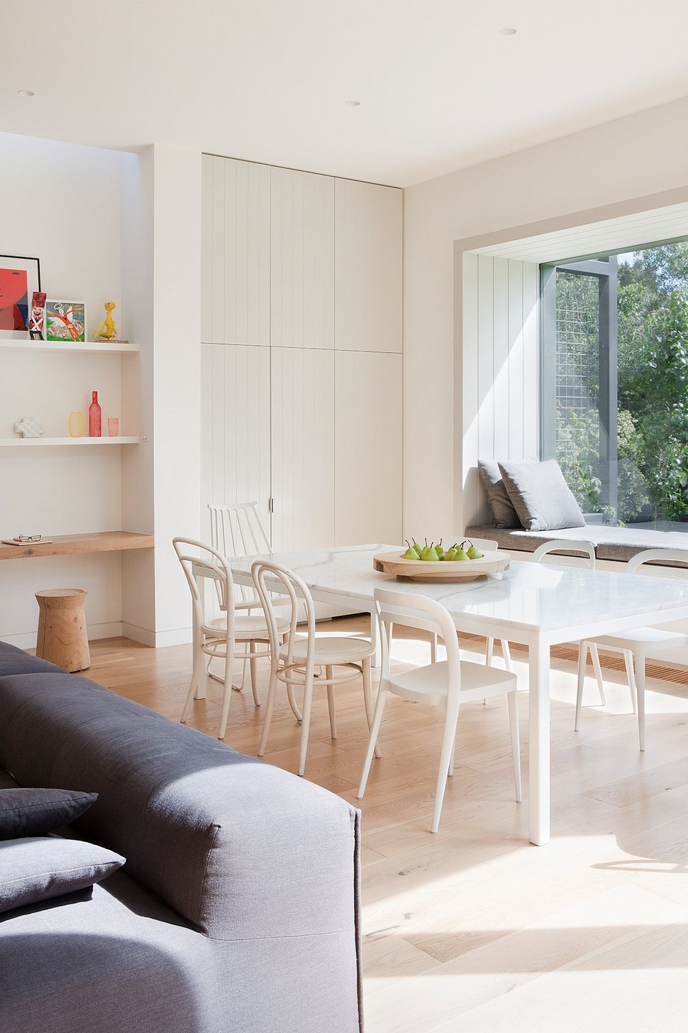
The shelves come to an end where the wall converts to hidden storage for the dining room. The storage is within the same cabinetry used in the kitchen.
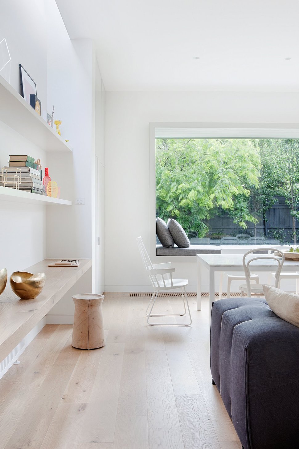
The space in front of the shelving is used as the main traffic pattern from kitchen to living to dining.
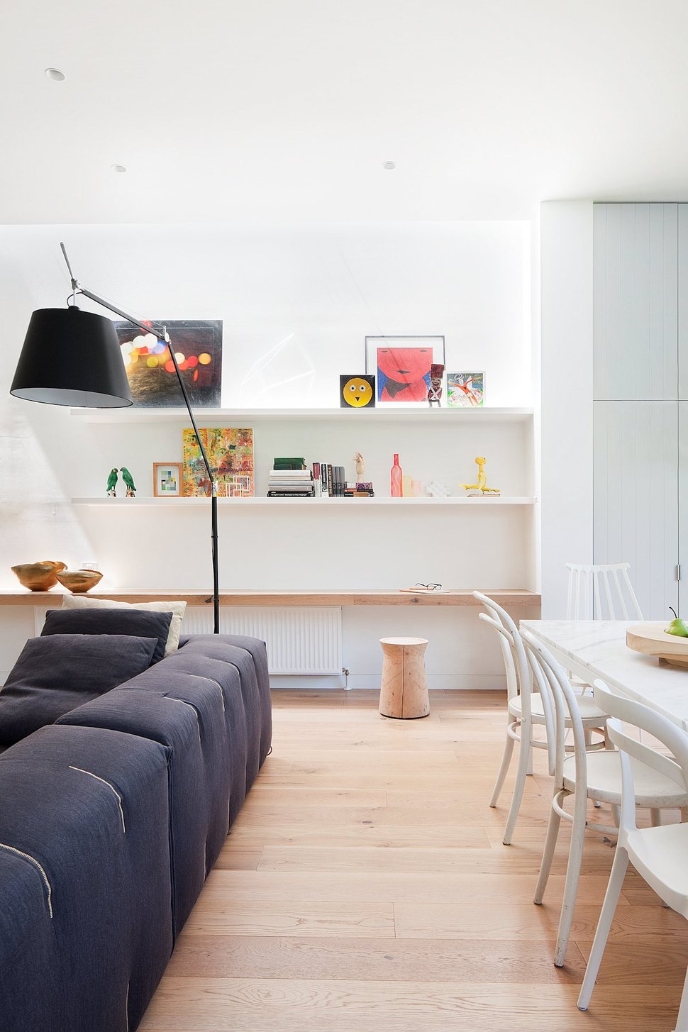
A secondary traffic zone T’s off of the shelving to travel between the couch and the dining table, allowing for easy access to each of the dining chairs.
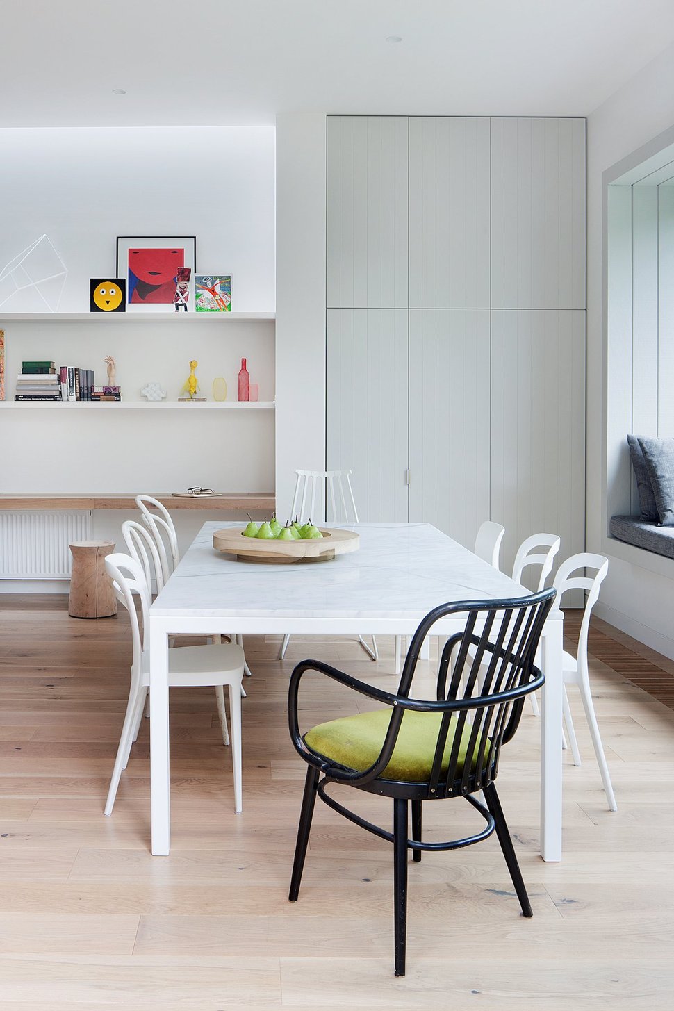
Mismatched bentwood chairs are used around the dining table to create an informal and comfortable atmosphere. Adding to the aesthetic is the choice of using one singular black moment in the grouping.
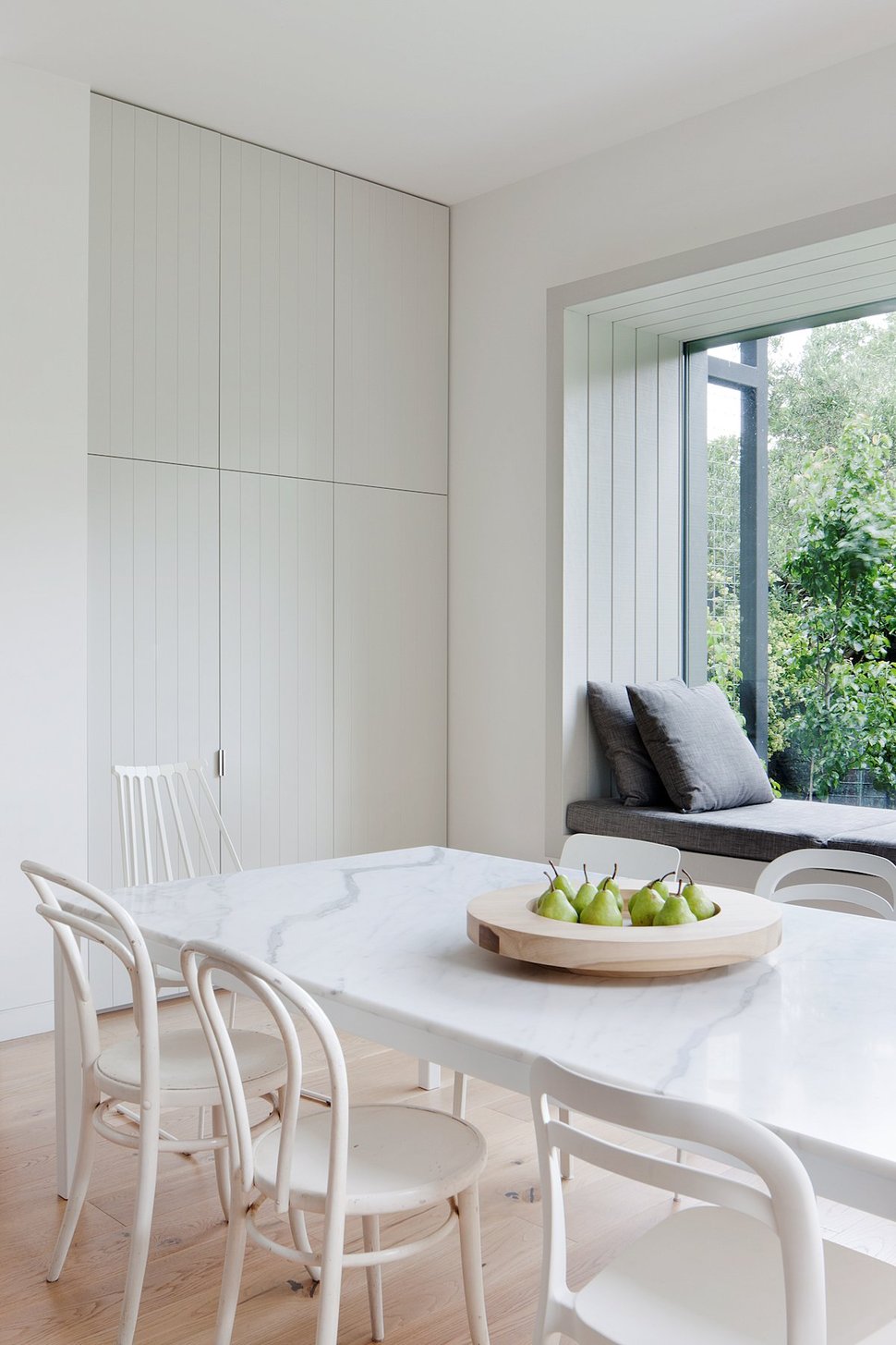
As with the Master Suite, the window has been fitted with a window seat and the chosen upholstery picks up the grey veining within the marble top on the table.
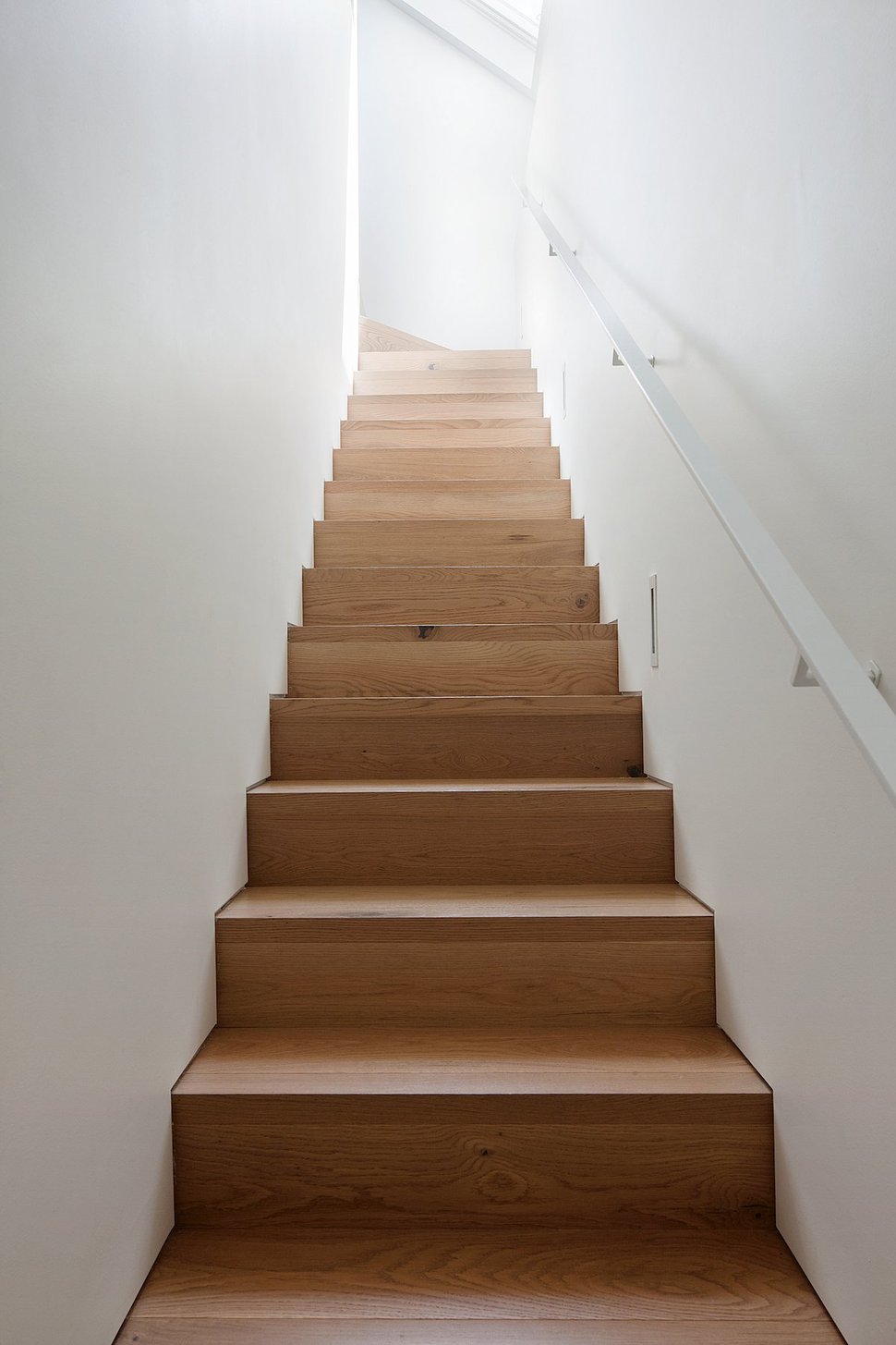
While the lower extension is all about the adults, a stairwell in the original portion of the home, behind the hall bathroom, leads upstairs to a rec room as well as bedrooms, office and an additional washroom – all with kids in mind.
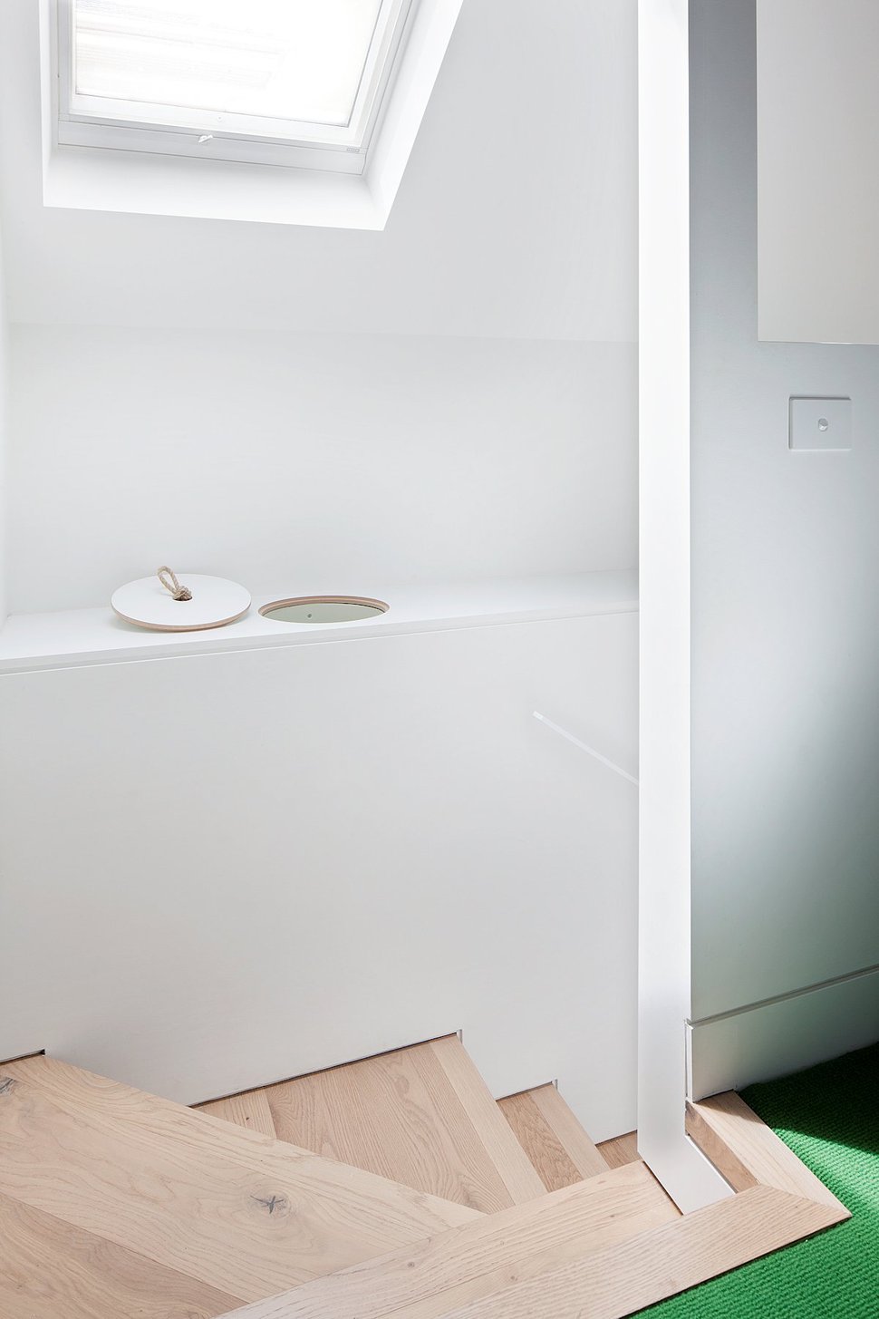
A skylight at the top of the stairs keeps the space brightly lit.
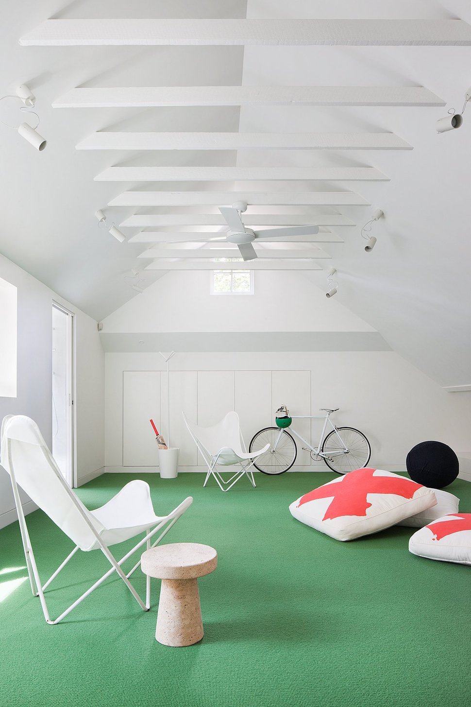
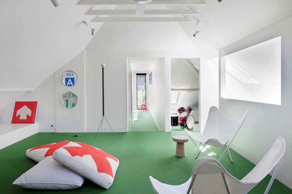
While the rec room is painted all white, vibrant energy abounds thanks to the emerald green carpeting and the coral crosses on the floor cushions.

The study of the rec room continues the green theme within the task chair while the work surface is all about pale wood and bright white. The trestle legs on the desk are adjustable which makes this a very versatile office area.
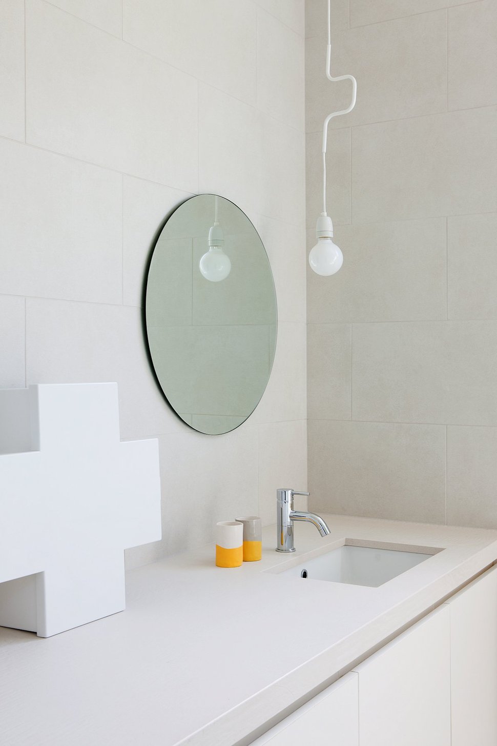
Also off of the rec room – and behind the stairwell – is a bathroom that leaves the green and coral behind in favour of an all white scheme. While the colours may be missing, the large cross emblem is still present within storage unit on the counter. A subtle but brilliant tie in.
Robson Rak Architects
Made by Cohen
Photography by Shannon McGrath
