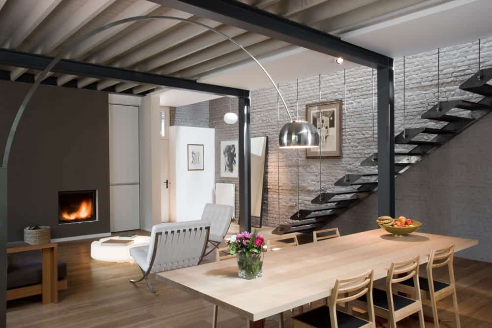
With natural brick walls and exposed steel beamwork, the bones of Maison Franken, a warehouse residence creates its own set of circumstances that when embraced will create a home of fascinating features that can be played up or down. In this case the features are not only played up but also celebrated. The repeating steel post and beam support structure is reinterpreted into a stunning stairwell of steel platforms that each takes the form of two treads. A minimalist balustrade of steel rods runs vertically from the steel platforms to the floor joists of the upper volume and that natural steel tone is picked up on the floor lamp that gracefully swags over to the dining table. Also playing of the exposed post and beam structures is the fireplace façade which picks up the same dark grey shades of the steel.
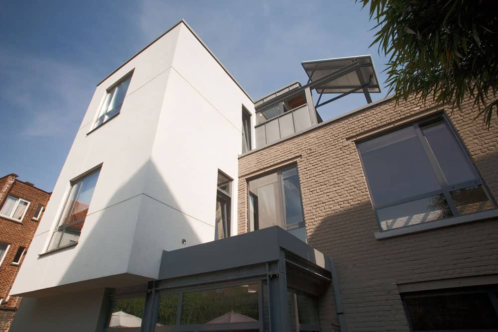
The spacious interior of this residence belies the tall and narrow feeling to the tall and narrow white cube that is its upper façade. 3 storeys high and with a private courtyard in the back, the lower volume is a combination of steel and glass that overlooks the courtyard.
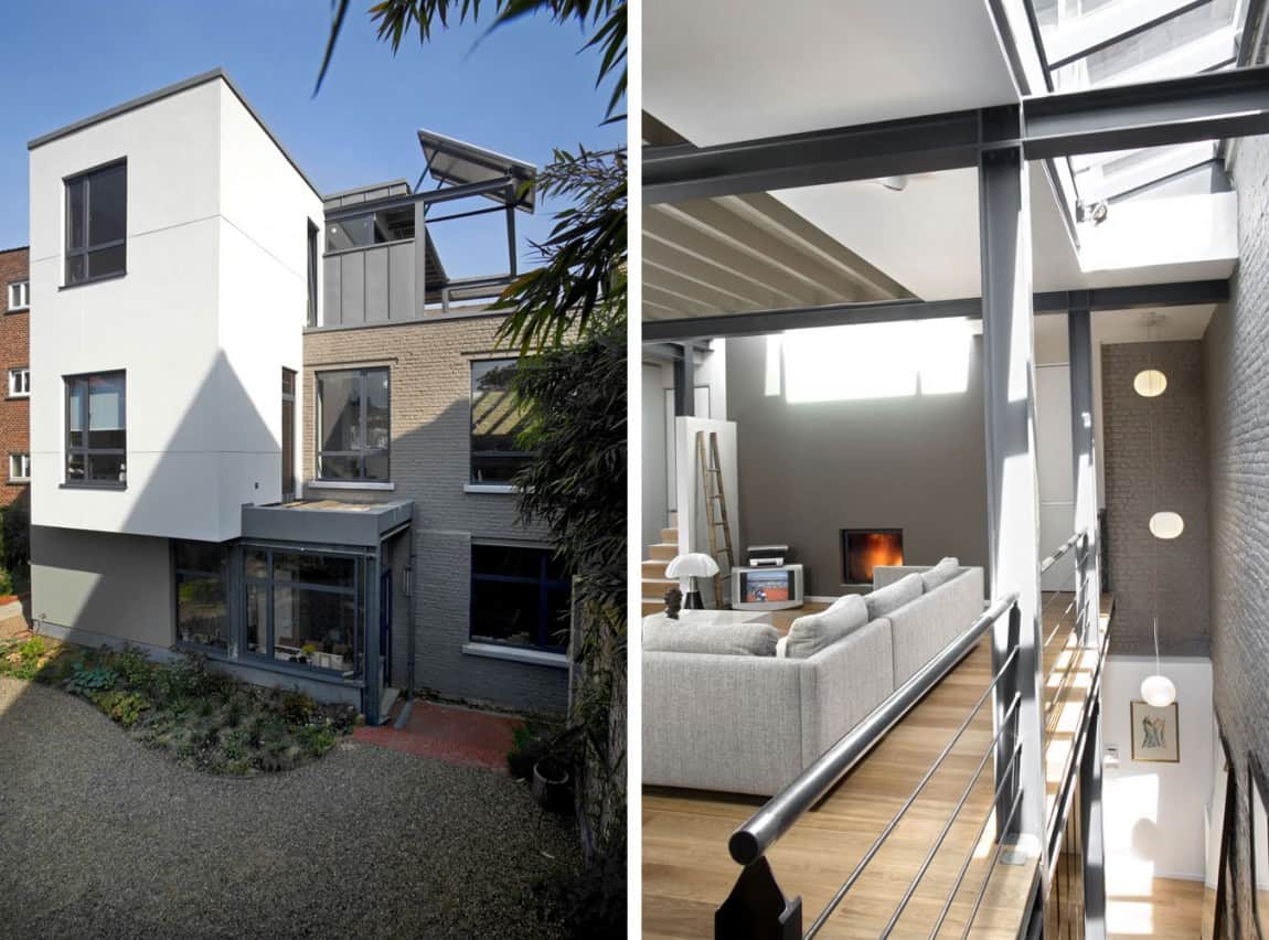
The courtyard has a small garden that is accessed through the kitchen and is the perfect place for growing herbs. Upstairs, on the second level a family room is flooded with light via the skylights that run the length of the steel stairwell. The family room continues the design aesthetic of exposed structural elements by keeping the ceiling joists exposed. Less obvious then the steel bones the ceiling joists act as a reflection of the wood flooring beneath. Also continuing the theme of the lower level is the dark grey façade on this second level fireplace.
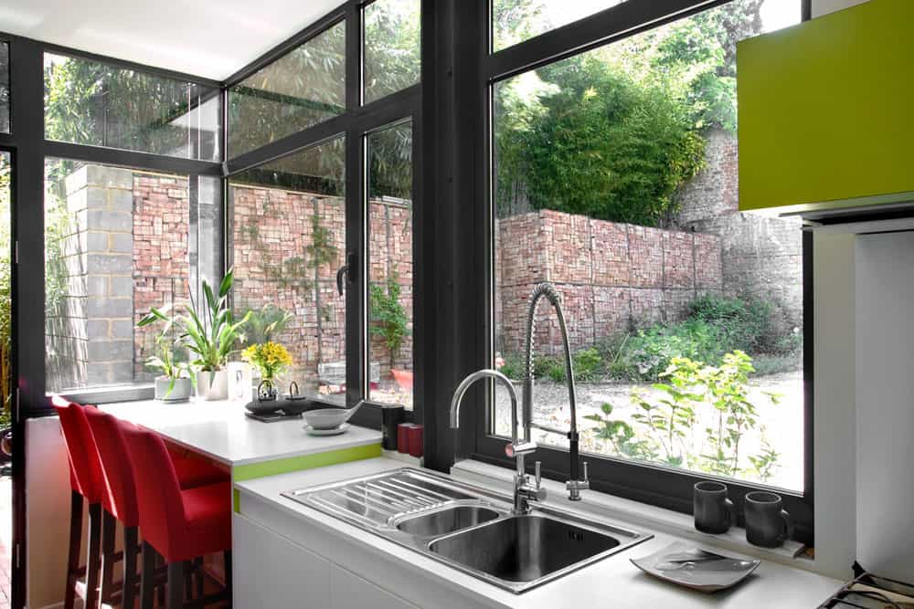
Just inside the courtyard is the kitchen. Making the most of the view the architects have placed both the sink and the bar in line with the windows so whether the homeowners are working or relaxing, the private courtyard is always right there. Wrapped in tall brick walls, the intimate feeling to the courtyard is a dramatic contrast to the busy street on the other side. With the red bricks being so dominantly part of the overall “look and feel” to the kitchen, the architects and homeowners have chosen to play off of them with the introduction of rose red bar stools. Even the greenery is repeated in small area created by the change of height to the counter and the surround to the stove hood.
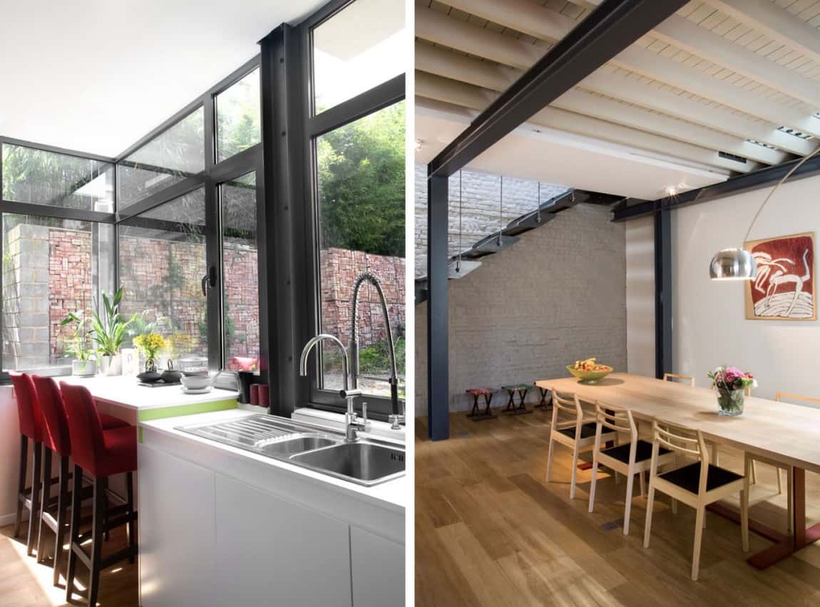
While there is intimate seating for 3 within the kitchen, there is a large dining area capable of sitting 10 in the social zone of the residence. Here, unlike the kitchen, bold colours have been replaced with natural pale woods. Even the “reddish” shade within the painting is more of a natural reddish wood hue.
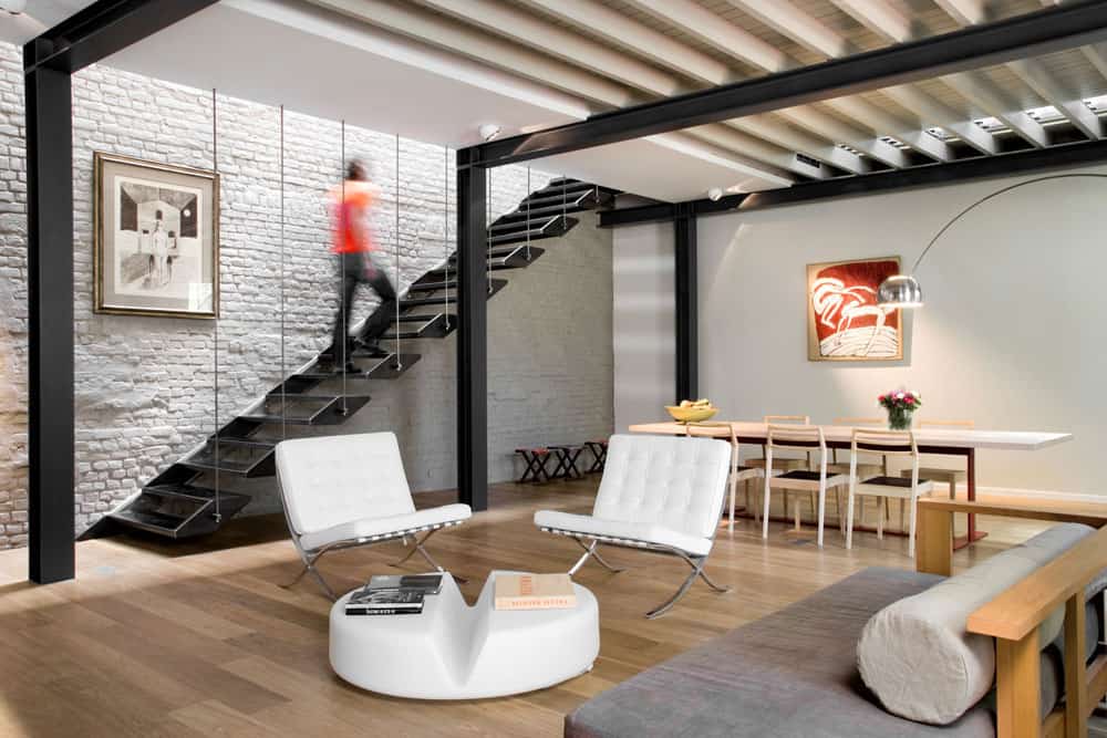
The dining table runs the length of the street wall and is therefore windowless. In front of it is the living area and white Barcelona chairs – true classics – are paired with a modern white coffee table and a casual sofa. The soft lines of the sofa and coffee table are in direct contrast to the linear patterns created by the beams, stairwell, balustrade and brickwork, while the Barcelona chairs offer a bit of both. They have the curvaceous lines within their chrome legs and the leather tufting, as well as the more angular lines in the silhouettes of the leather sections. This combination of soft and hard lines is what makes the Barcelona such a staple feature in many homes.
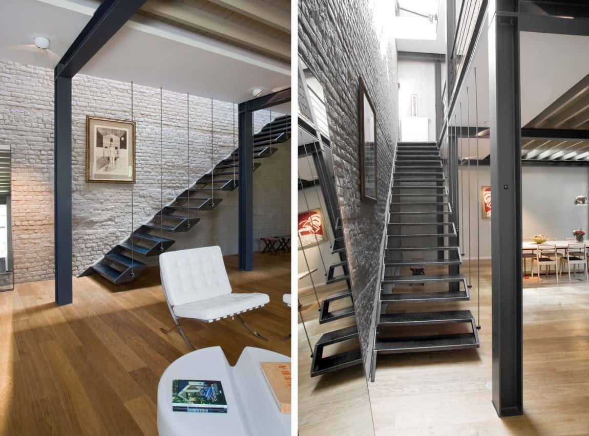
The stairwell not only is important as a repeating element of steel, but it also becomes the focal point to the room, appearing more as a sculptural installation then a staircase. The line of skylights above flood light down onto the steel platforms further enhancing the sculptural effect created by the planes. With the riser being created by the treads and only appearing as the joining force to each pair of treads, the poetic verse is a steady prose of balance, rhythm and harmony – which just happen to be the three most important features to any good design whether room, art, or land.
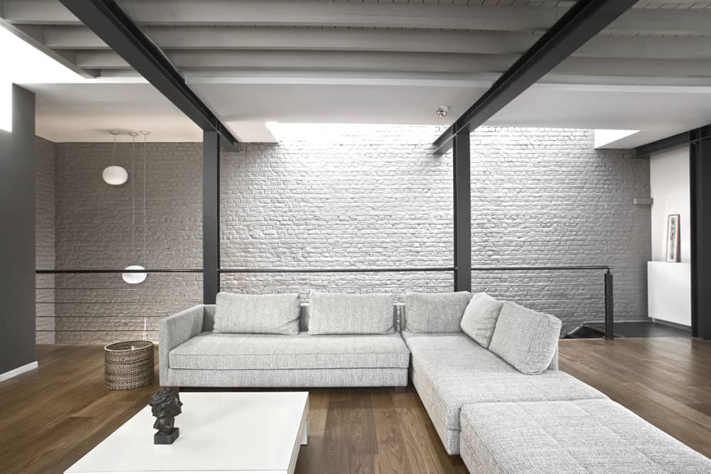
The stairs no matter how artistic are meant to be used. Without them this super comfy family room would be inaccessible, and that would be a shame. In the family space the balustrade has switched from vertical elements to rows of horizontal steel rods that play off of the exposed ceiling joists. The low profile to the extra deep sectional keeps the space feeling tall while the wood floors keep the space feeling warm.

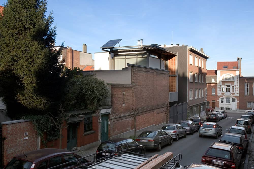
From the street view one would never know there was such a stunning contemporary residence within the walls of the warehouse. The hustle and bustle of the city passes unaware of the quiet retreat within.
Bekhor Architecte
Photography by Laurent Brandajs
