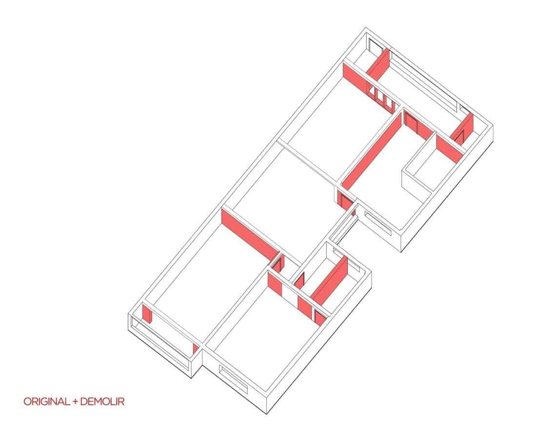
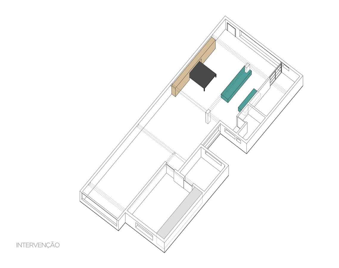
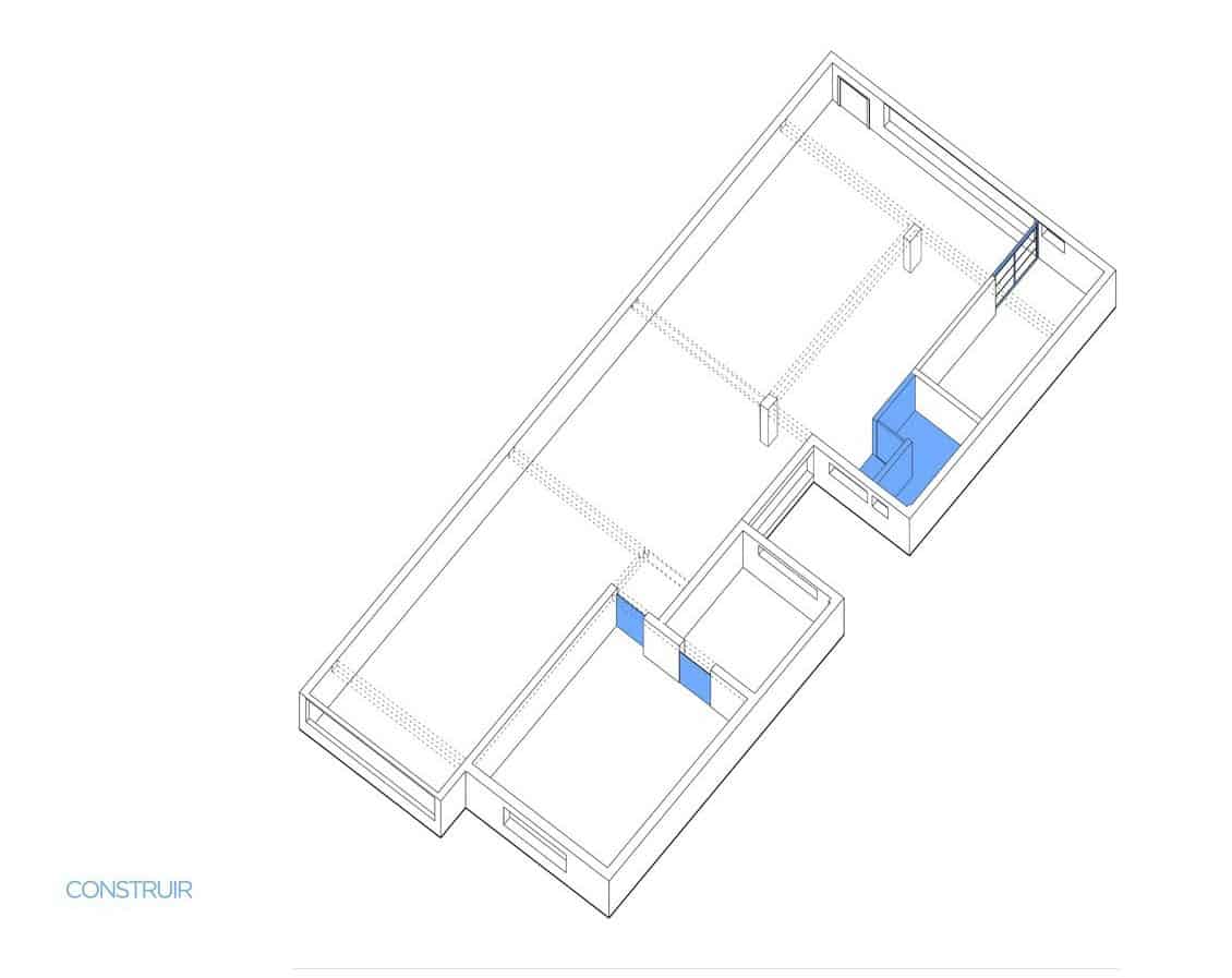
Apartment Joao is located in Sao Paulo, Brazil. Renovated for a retired couple, the home is a comfortable 1,173 sqft but originally interior walls created numerous small rooms and RSRG Arquitetos removed a number of walls and added a few small ones to create a large open plan social zone that includes the kitchen and instead of having two small bedrooms, there is now one large master suite complete with ensuite. In the process of the renovation structural elements where left exposed to become an important part of the overall apartment decor.
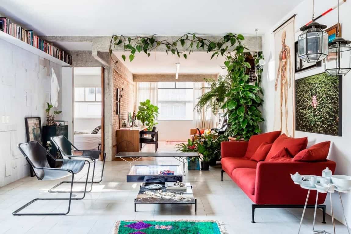
Layered against a backdrop of rough post and beams, natural brick as well as painted brick is an eclectic mix of color, art and furniture design all comfortably grouped together in a large open plan social zone that starts at the kitchen and ends in a home office / music area.
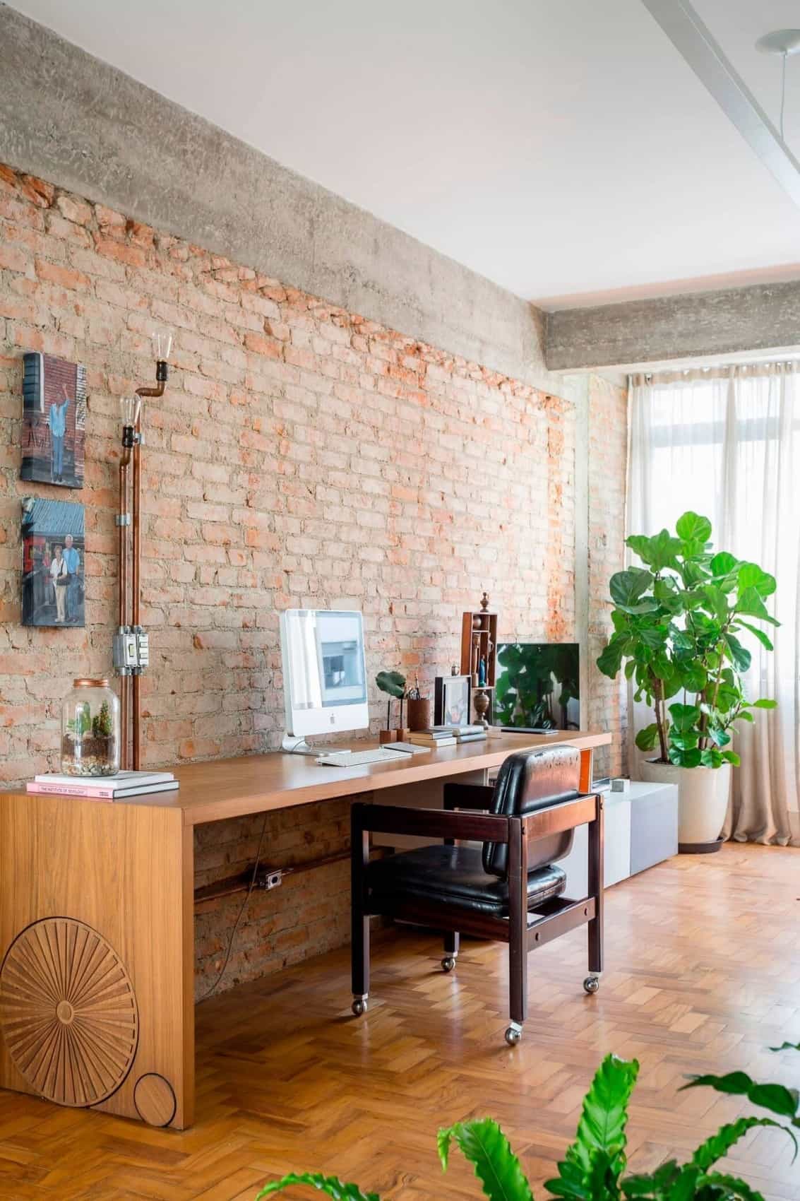
The home office is created with a custom wood desk that is 8 feet long. It also features Edison bulbs on the end of electrical conduit tubing.
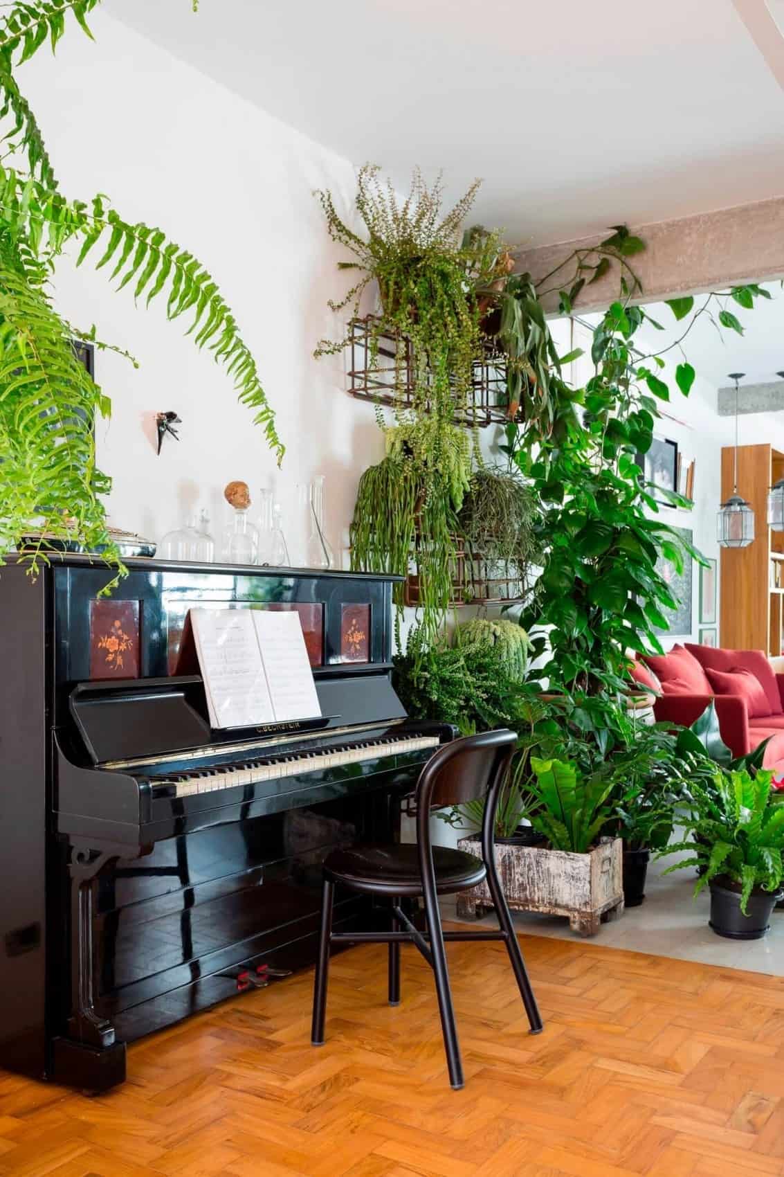
Across from the desk is the music station which features a stand up piano tucked behind a series of indoor plants that screen it from the living room.
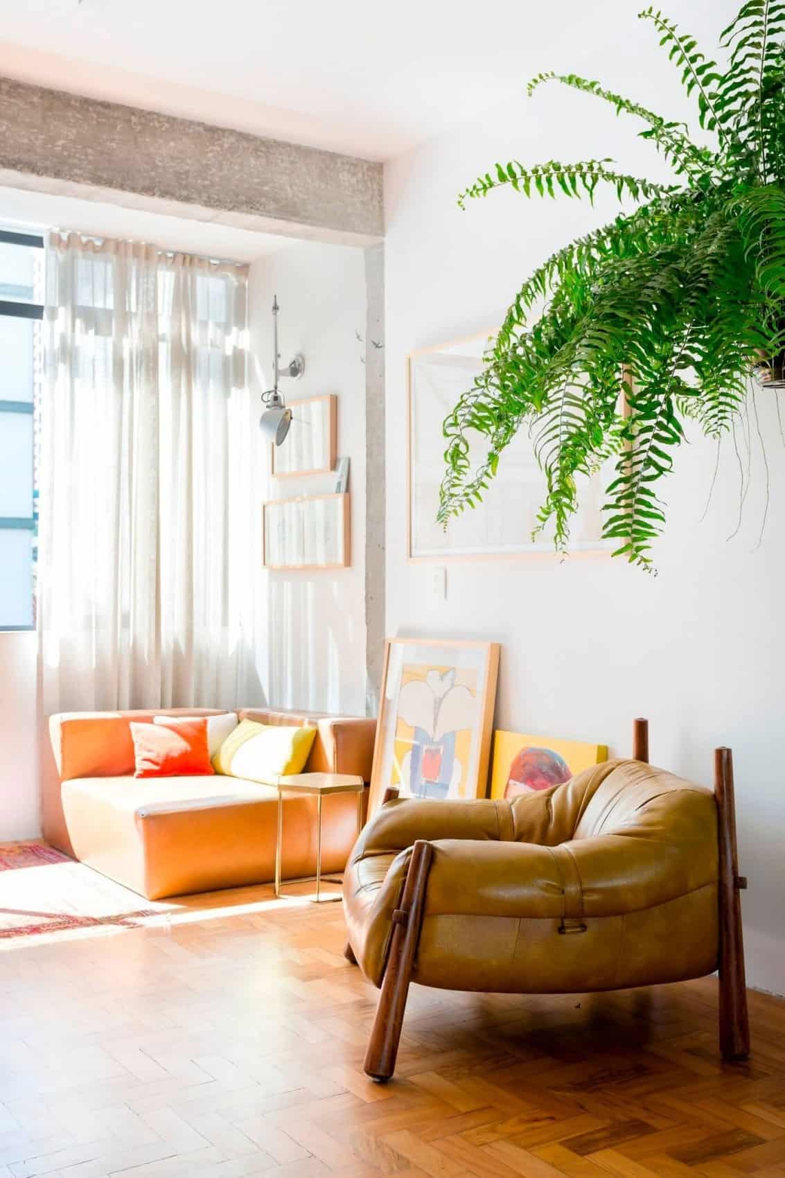
Behind the office and music stations is a small intimate seating area that gets flooded with enough sunlight during the day to keep the plant screen on the other side of the piano healthy.
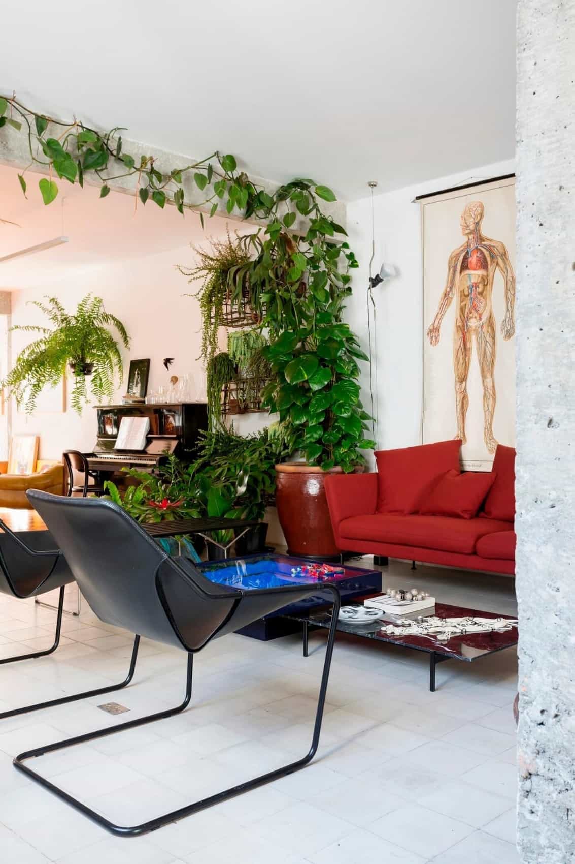
The plant screen includes ivy that is trained across a structural beam where a wall used to separate the living room from a second bedroom.
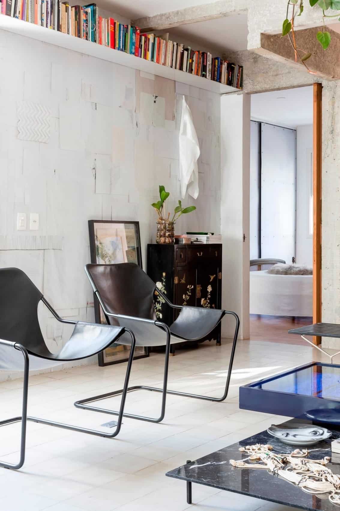
Behind the office area and next to the original second bedroom is the master bedroom that now includes a large walk in closet and an ensuite.
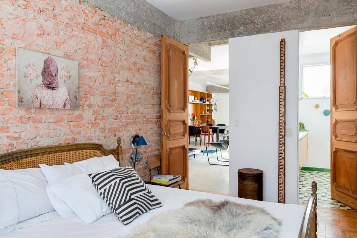
The bed in the master suite is positioned against the same brick wall as the home office while the ensuite is behind the painted brick wall of the living room.
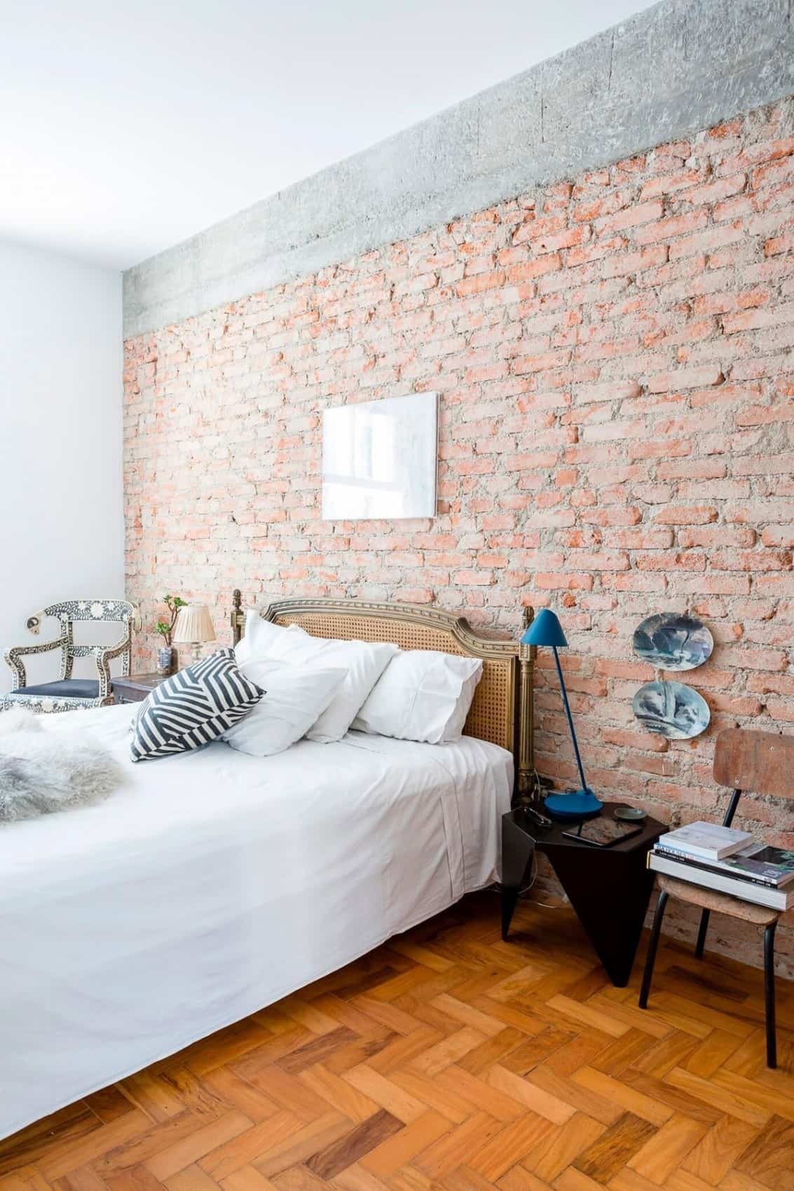
The bedroom area is kept neutral, allowing the textures and patterns of the brickwork and the original herringbone floor to be a main feature.
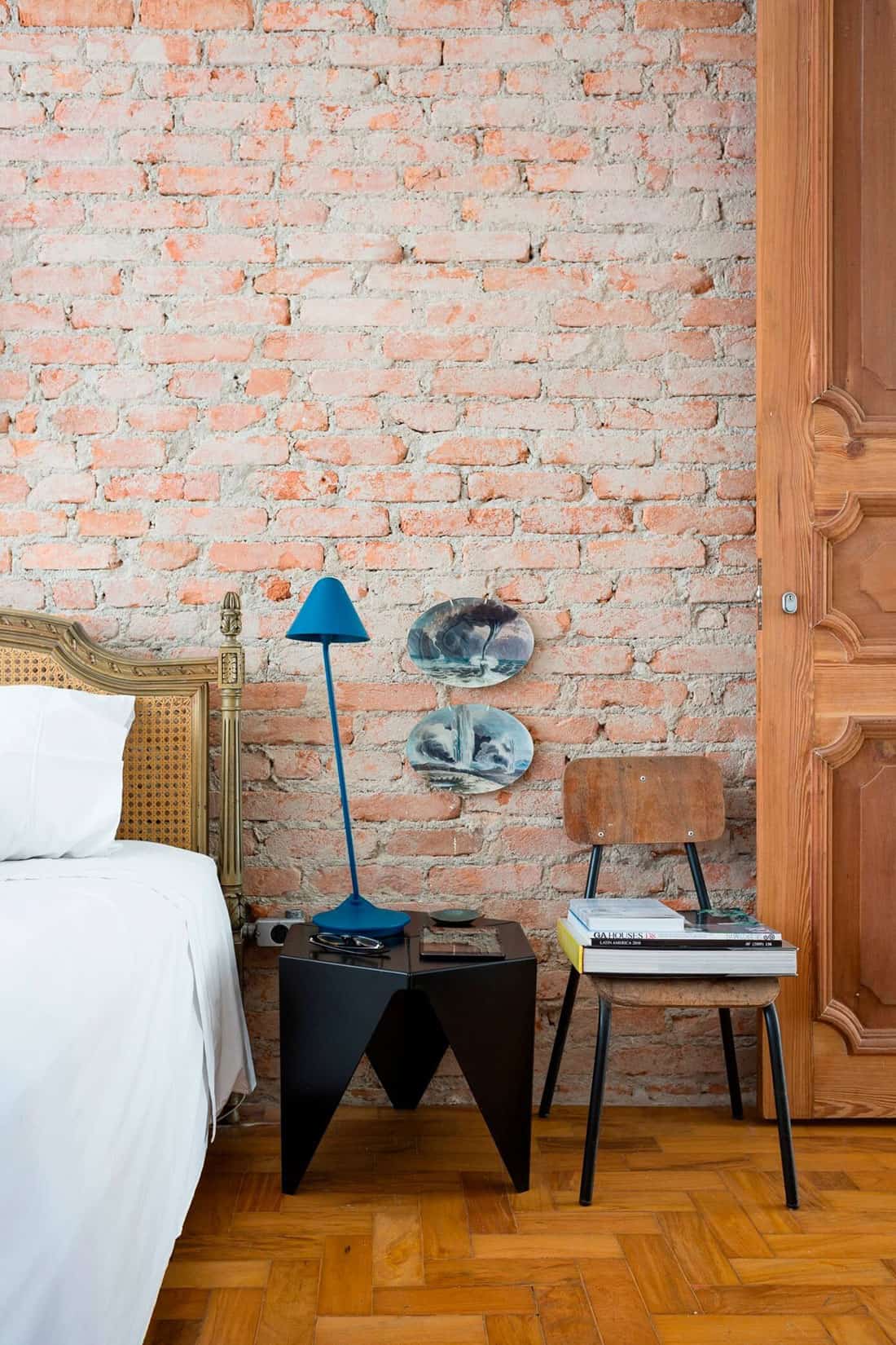
The only punch of color in the bedroom area is the brilliant blue of the bedside lamp.
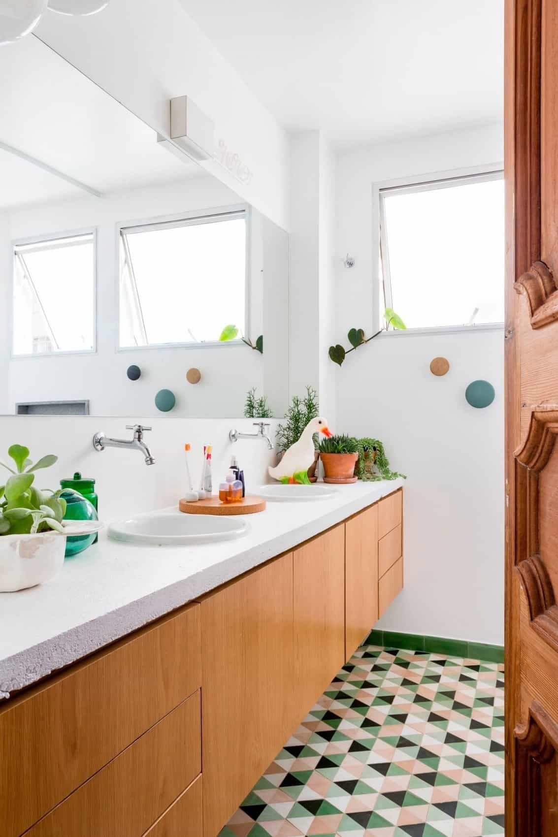
Unlike the neutral palette of the bedroom, the ensuite rocks a vibrant geometric tile pattern on the floor of greens and pinks, which are complimented by the knob towel hooks in the same color scheme.
Although a bedroom is a place for rest and relaxation, it is unusual that the bedroom in Apartment Jaoa is neutral when you take into account the fact that every other area boasts a kaleidoscope of color.
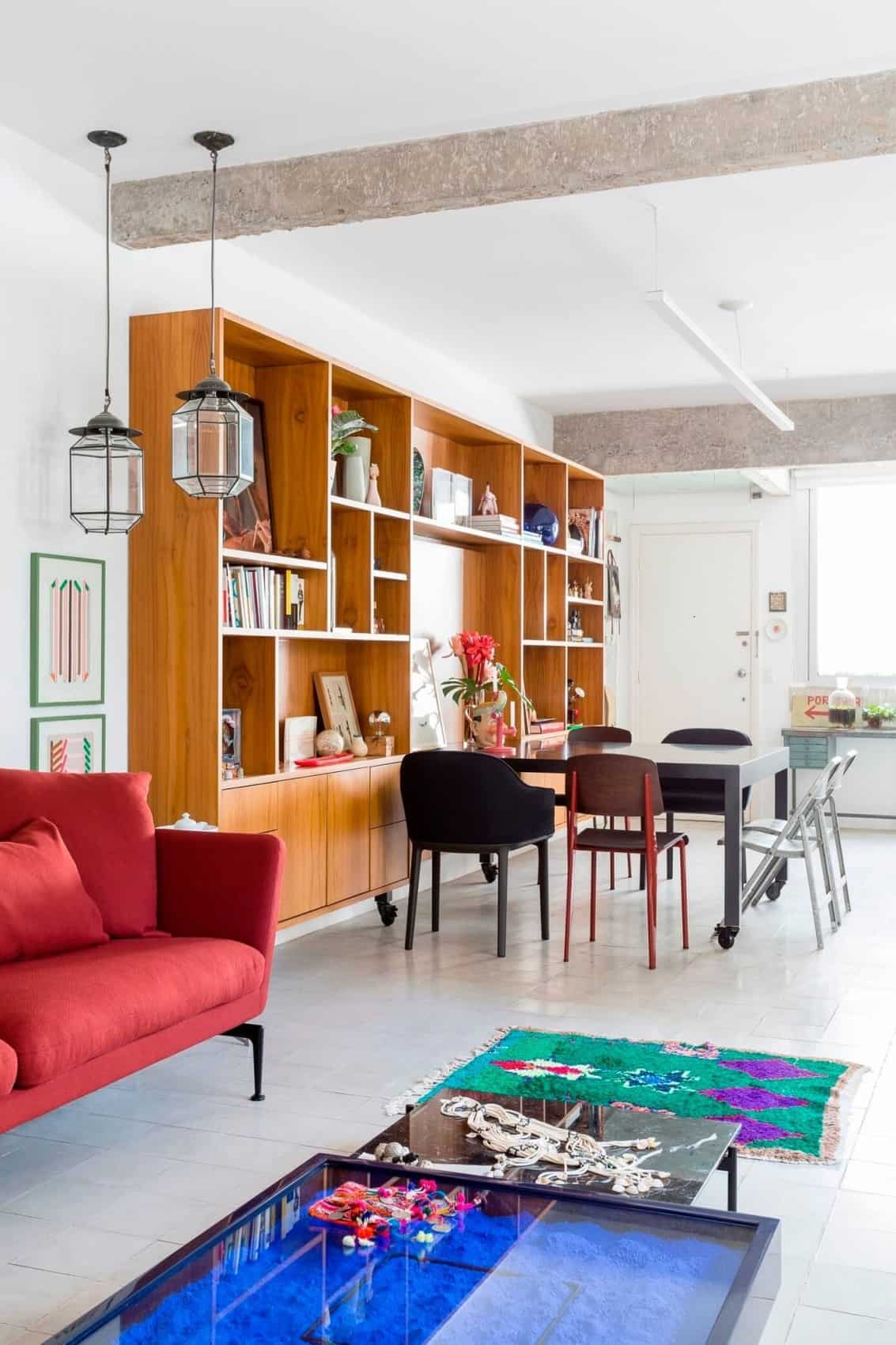
Another exposed beam between the living and dining/kitchen areas tells the tale of another wall that has been removed.
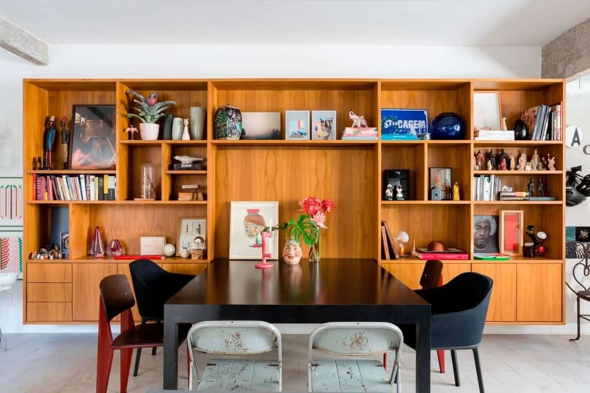
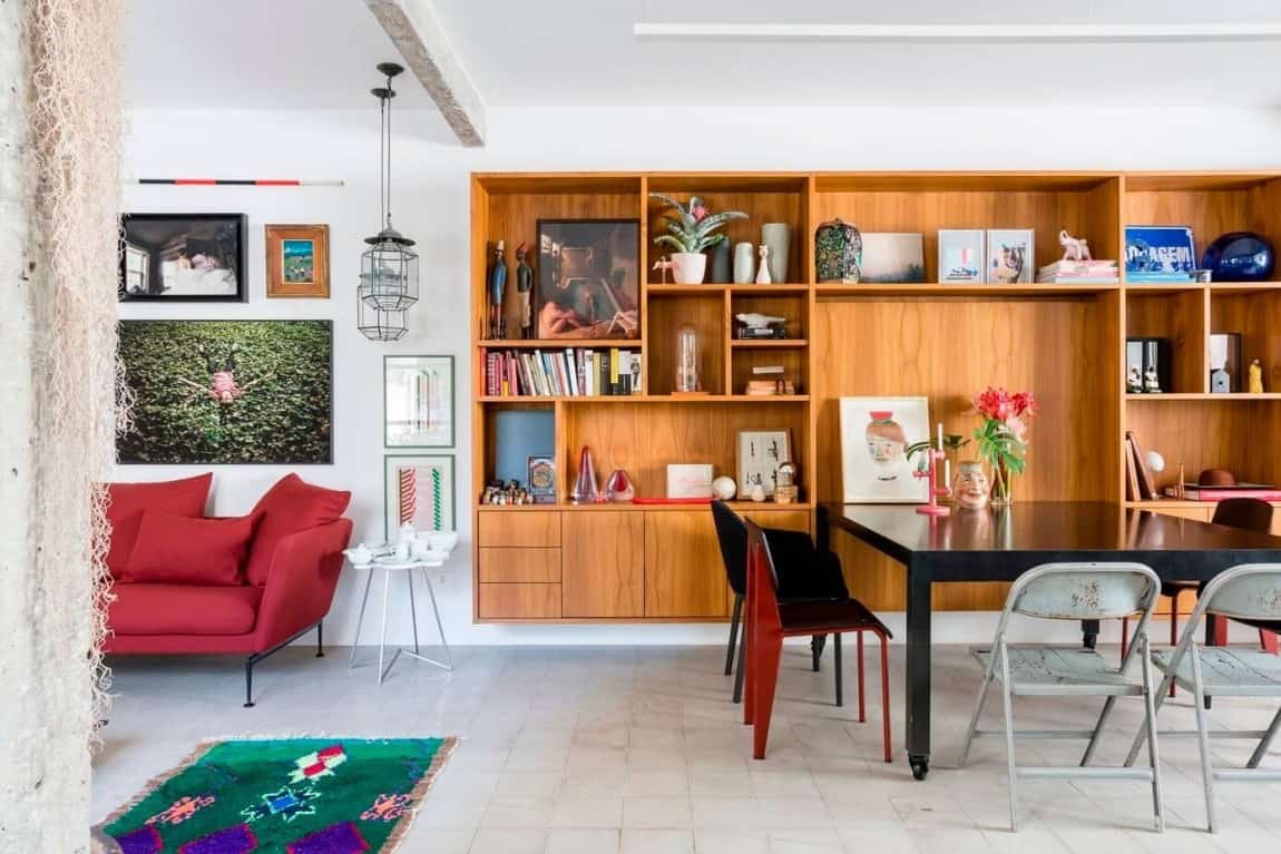
While the social zone is one large open floor plan, custom millwork along the wall of the dining area creates a visual definition between the living space, the dining area and the kitchen.
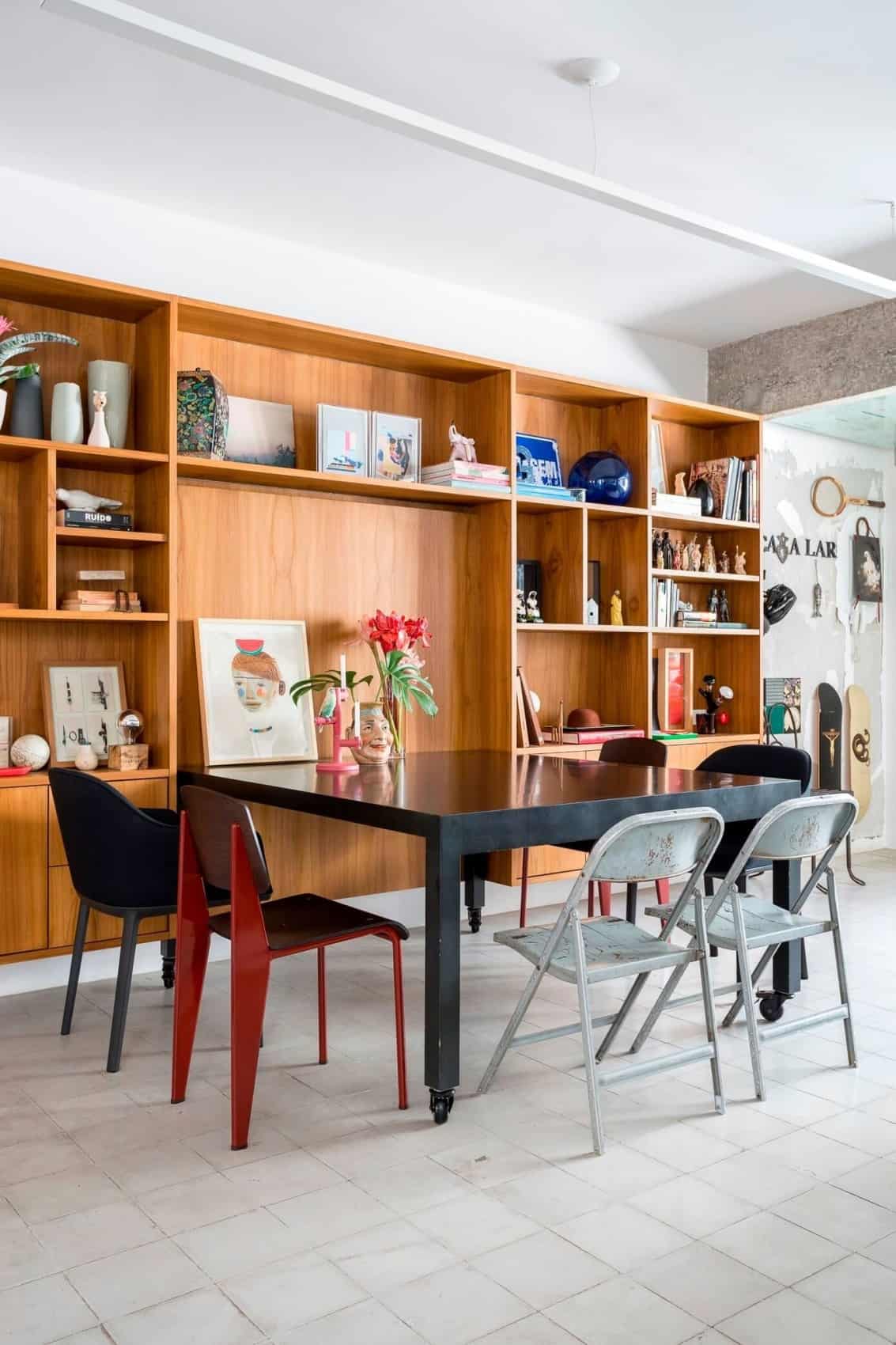
The custom millwork was designed with a niche perfectly sized to fit the homeowner’s square table for 8, which seat six unless pulled out into the room.
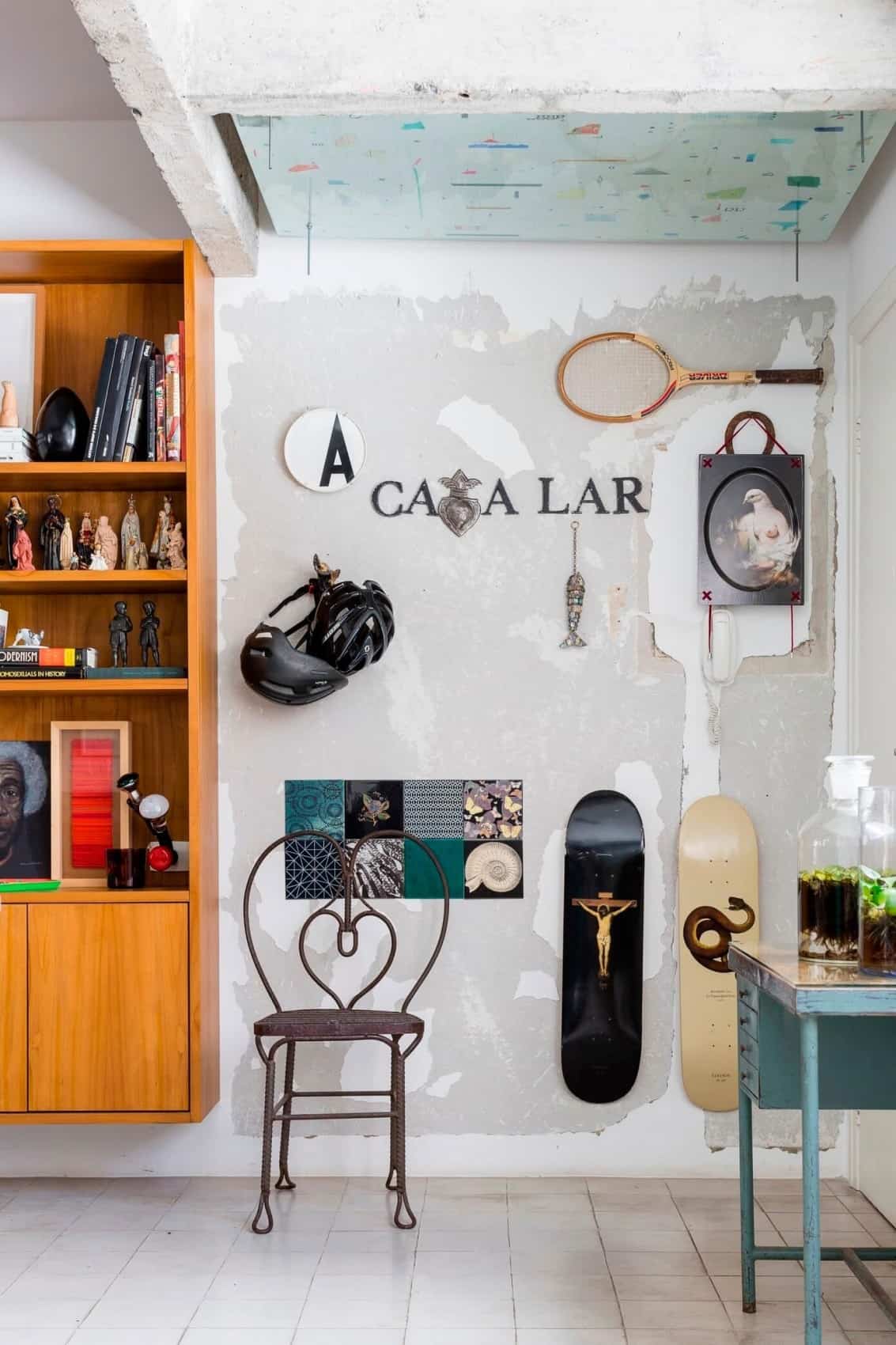
Next to the shelving unit is a fun corner that has been filled with a variety of items, including sports equipment that has been hung like art.
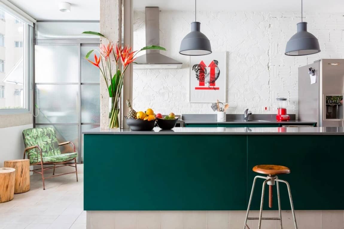
The corner of sports art continues along the end window wall before culminating in a pair of stump tables and a green easy chair, all of which are separated from the dining/kitchen area by another exposed beam (and in this case a post as well) denoting the location of another removed wall.
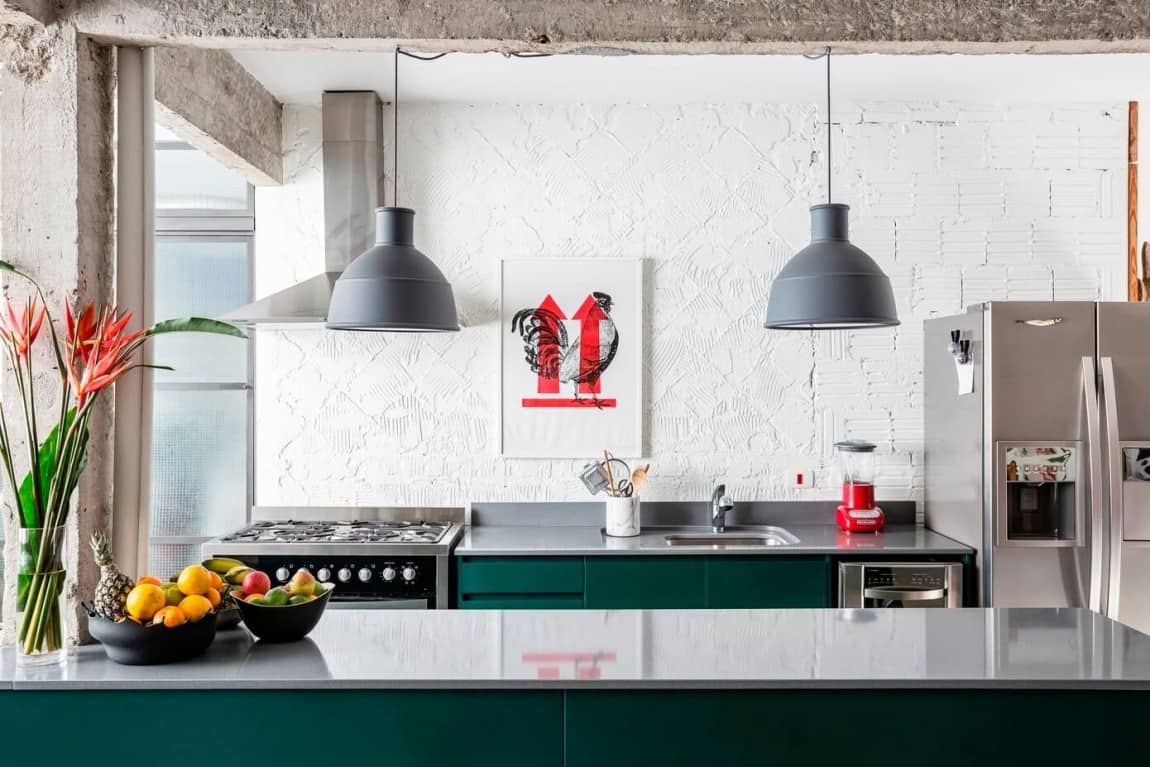
As with almost every other space, the kitchen is vibrant with rich color and rich with textures.
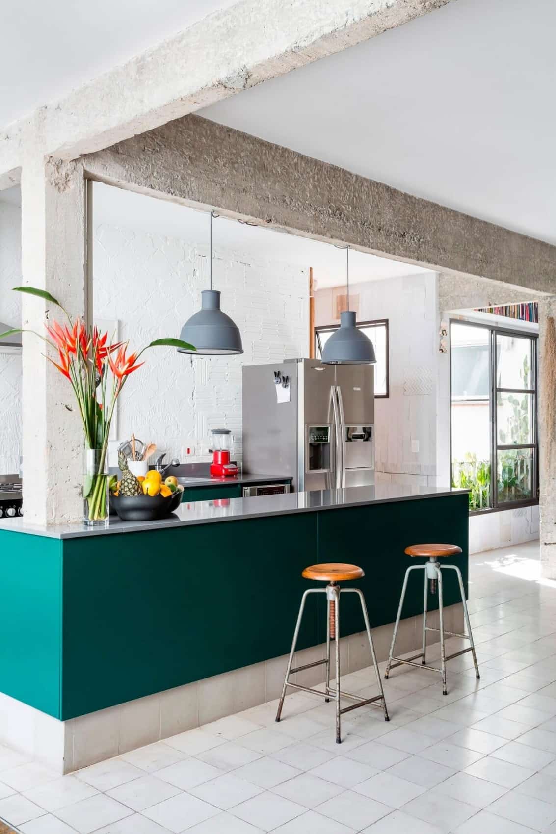
Next to the kitchen is a small alcove with a door to a guest bathroom positioned directly behind the kitchen, the alcove also has a window overlooking a void in the building filled with plants and overlooked by not just the alcove, but also the living room and the master ensuite.

Like the master suite, the guest bathroom features an original wood door that has been stripped back to show the beautiful oak graining. Complimenting the door is a round mirror above the trough sink that also features an oak frame.
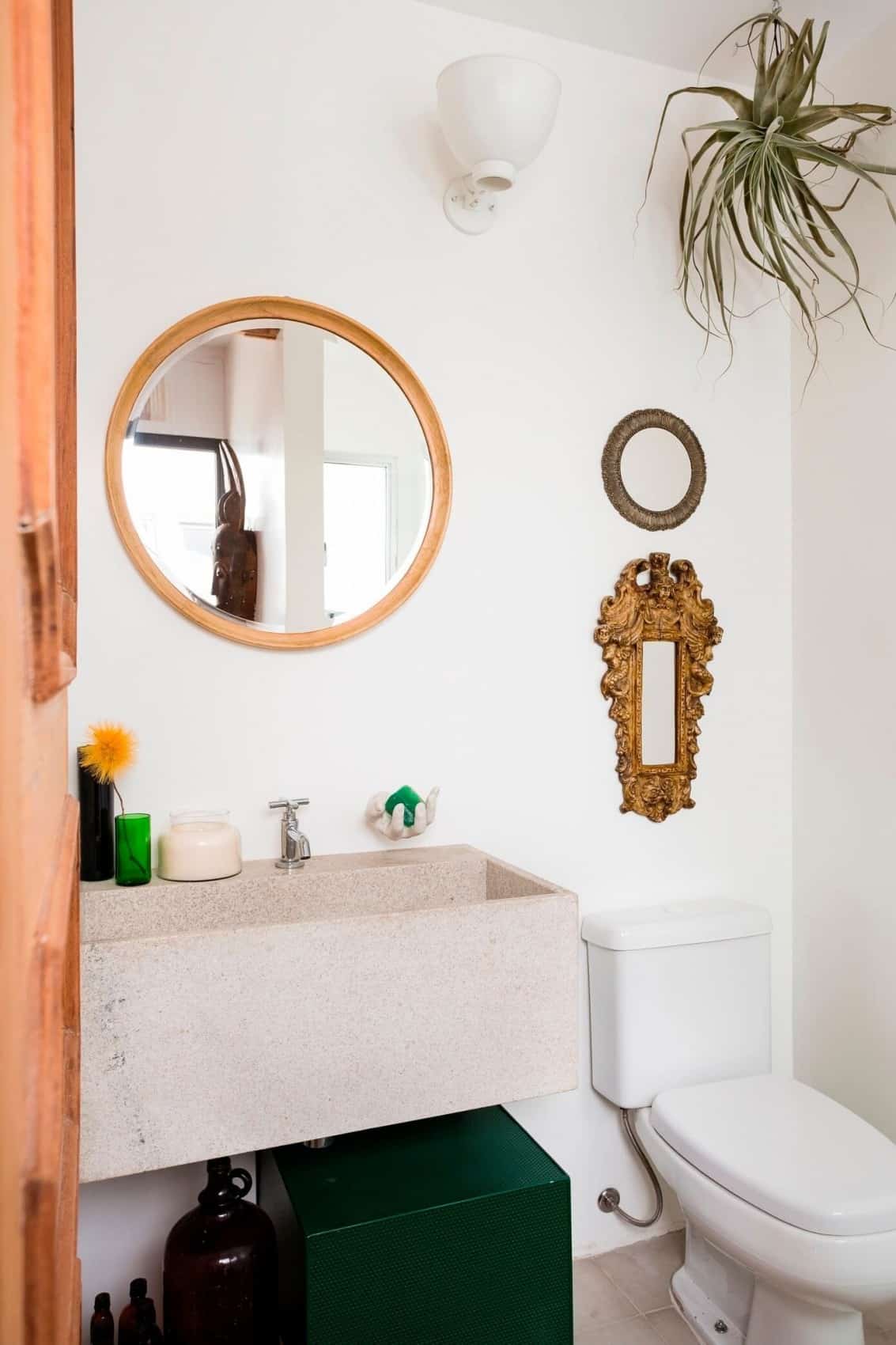
The guest bathroom is small but has been filled with a myriad of interesting details from the air plant to the 2 empty frames above the toilet as well as that trough sink and the lacquered green storage cube beneath it.
RSRG Arquitetos.
Photography by Fran Parente.
With apartments not offering much opportunity to create architectural statements, highlighting exposed structural elements, original wood and brick is one way of creating an architectural story without sacrificing space and while these elements also help layer in a sense of warmth, so does the use of plants, as seen in the screen between the music station and the living room, the extra benefit of this is that when used correctly, plants also help to soften up the otherwise hard lines within the apartment.
