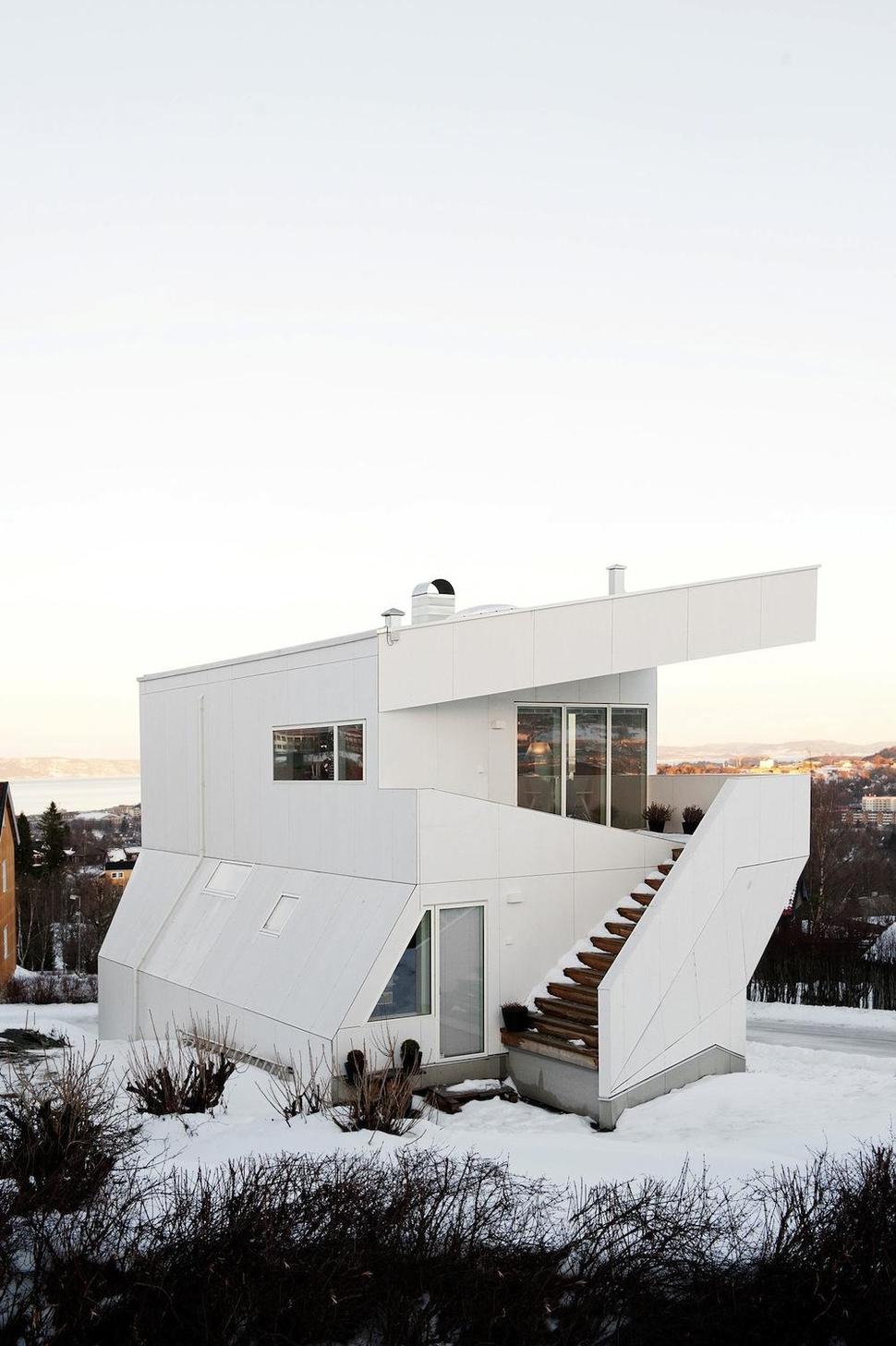
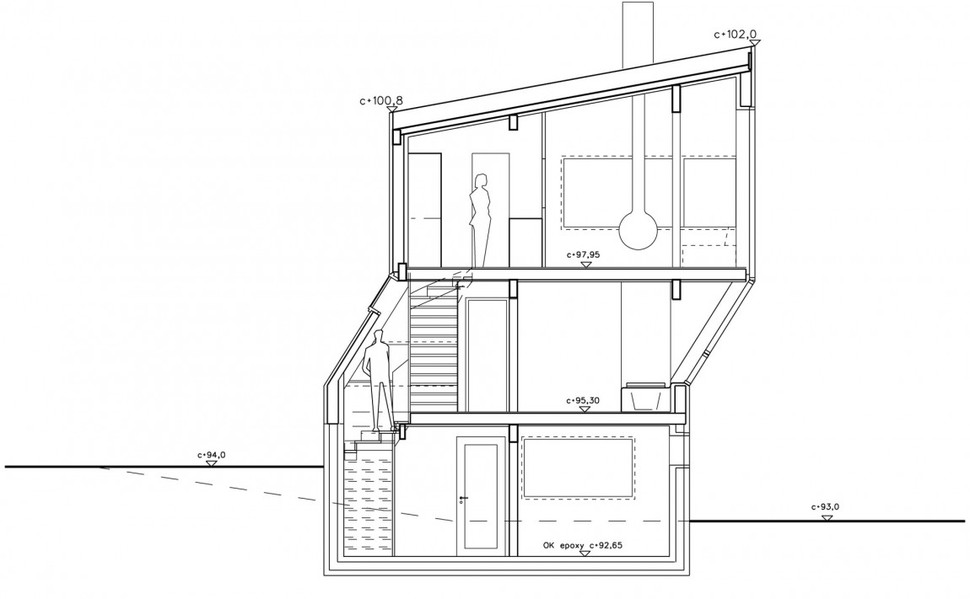
Located in the ancient city of Trondheim, the erratic design of this family home stands out from afar. Envisioned by Jarmund/Vigsnæs AS, the stark white house stands high above its lot, with creased, angular lines and sleek construction. The building’s layout is as unconventional as its overall shape, with private rooms on the middle floor and public living spaces on the top. Windows of all sorts dot its facade, giving everything from small strategic light shafts to full panoramic views of the Norwegian landscape. With its aviation-style riveted paneling accented by concrete and metal, the abode gives off a technological, ultramodern air. Its overall architecture, formed from practicality, is much more creative than it may seem at first glance.
Though harsh geometry and cool metal surfaces may be striking and even brutally beautiful in a way, they don’t often make for comfortable interior design elements. As such, the inside of this family dwelling is much more relaxing and soft to the touch than its high-strung outdoor cladding. Most rooms of the residence have plaster walls, cross-sectioned into massive panels for visual interest. Ceilings and beams, as well as space dividers, are mostly made from a light, warm variety of wood, further breaking up the monotony of the off-white walls. Popular hanging paper lights and chic furniture bring a splash of playful colors to the interior spaces. A contrast to the cold, wintery exterior of the house, the interior reflects the warmth you might expect from a place called “home”.
With no defined symmetries or predictable structure, this house has a design all its own. The architects chose to adopt a design built around a few key constraints instead of a basic architectural outline, leading to a completely unique building.

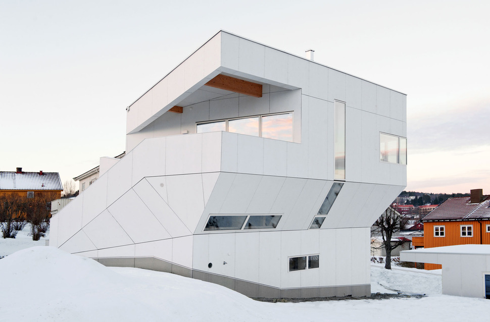
The house has windows of all shapes and sizes, from thin vertical multi-floor strips to wide landscape view glass.
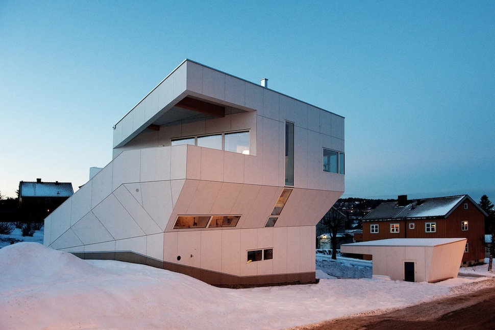
A small matching garage, with architecture made from condensed cues of the main home, sits just down a small hill.
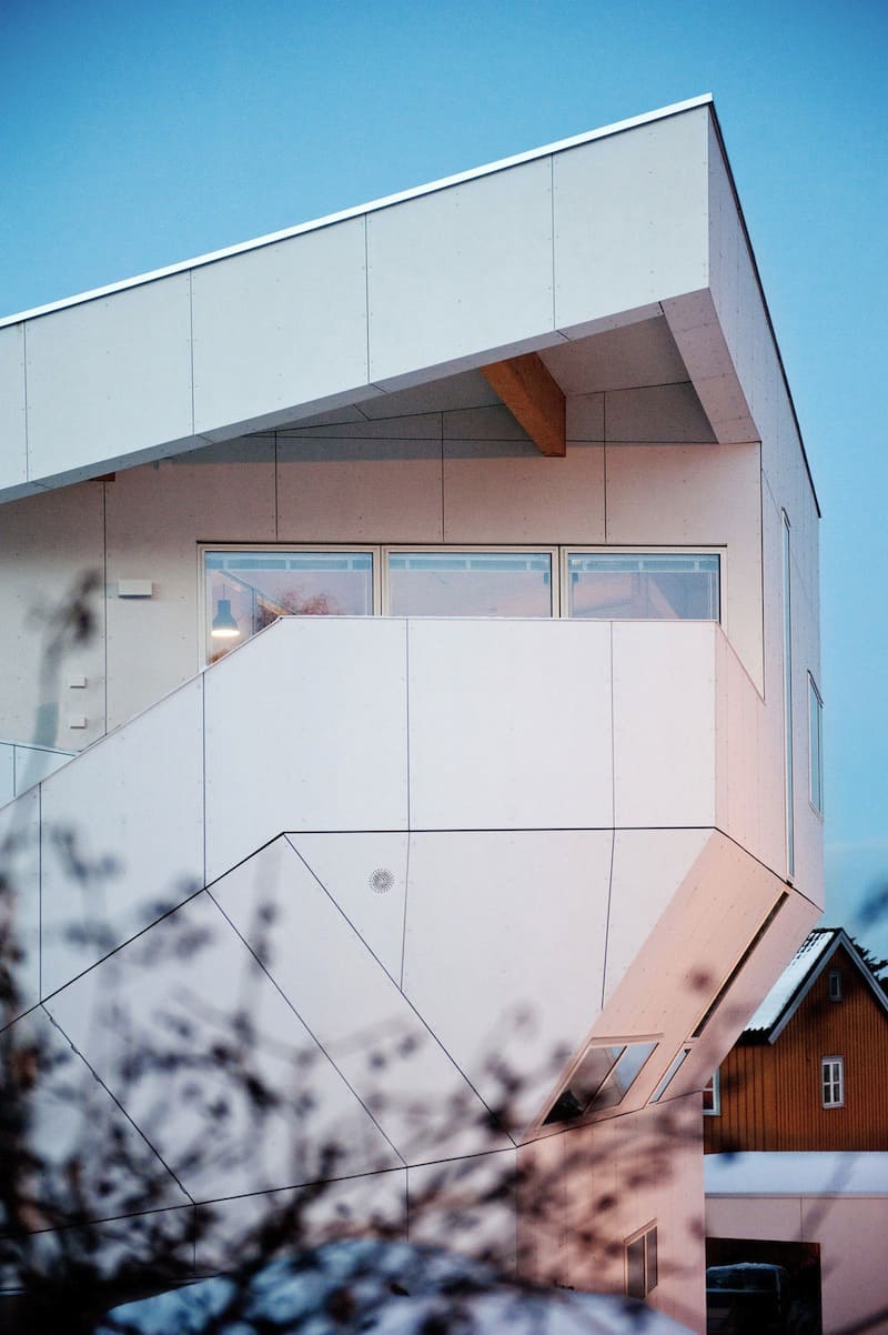
The roof juts out past the line of the exterior stairway’s deck, widening the profile of the building and adding one of the most acute angles of the structure.
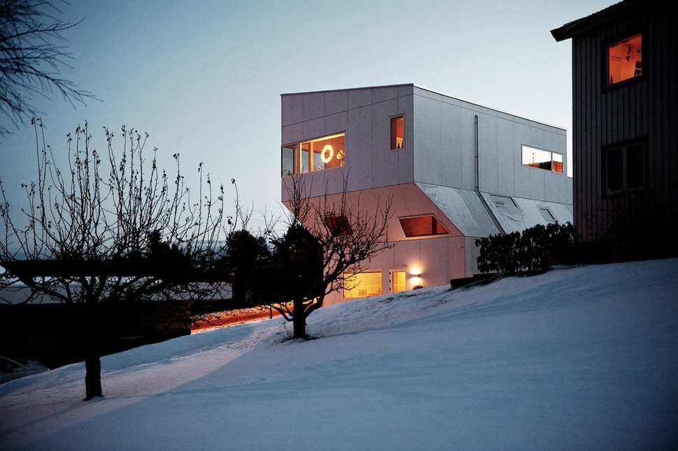
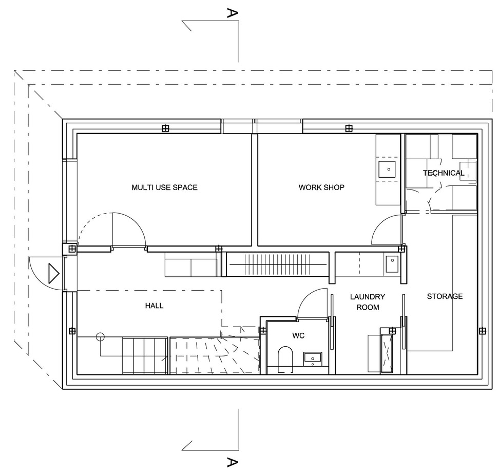
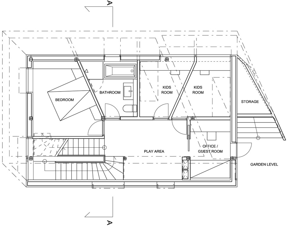
The middle floor of the residence, defined by its angular walls, contains all of the home’s bedrooms and bathrooms.
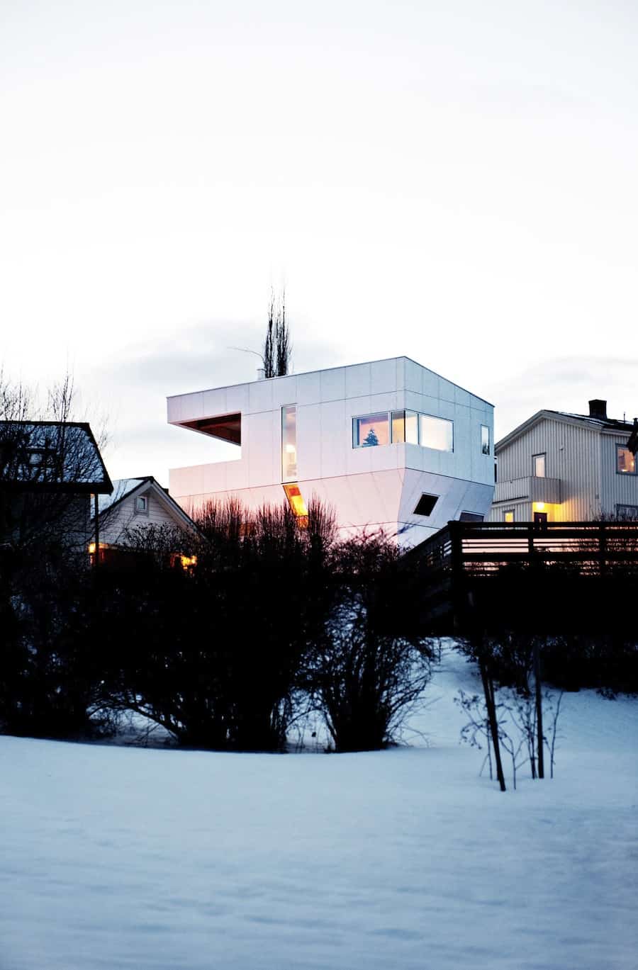
The building looks strange and impressive rising above its lot, gaining width as it gains height. Though it’s three stories tall, its interesting shape makes it seem like less.
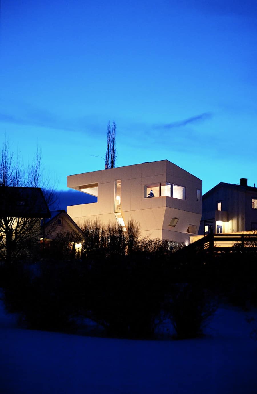
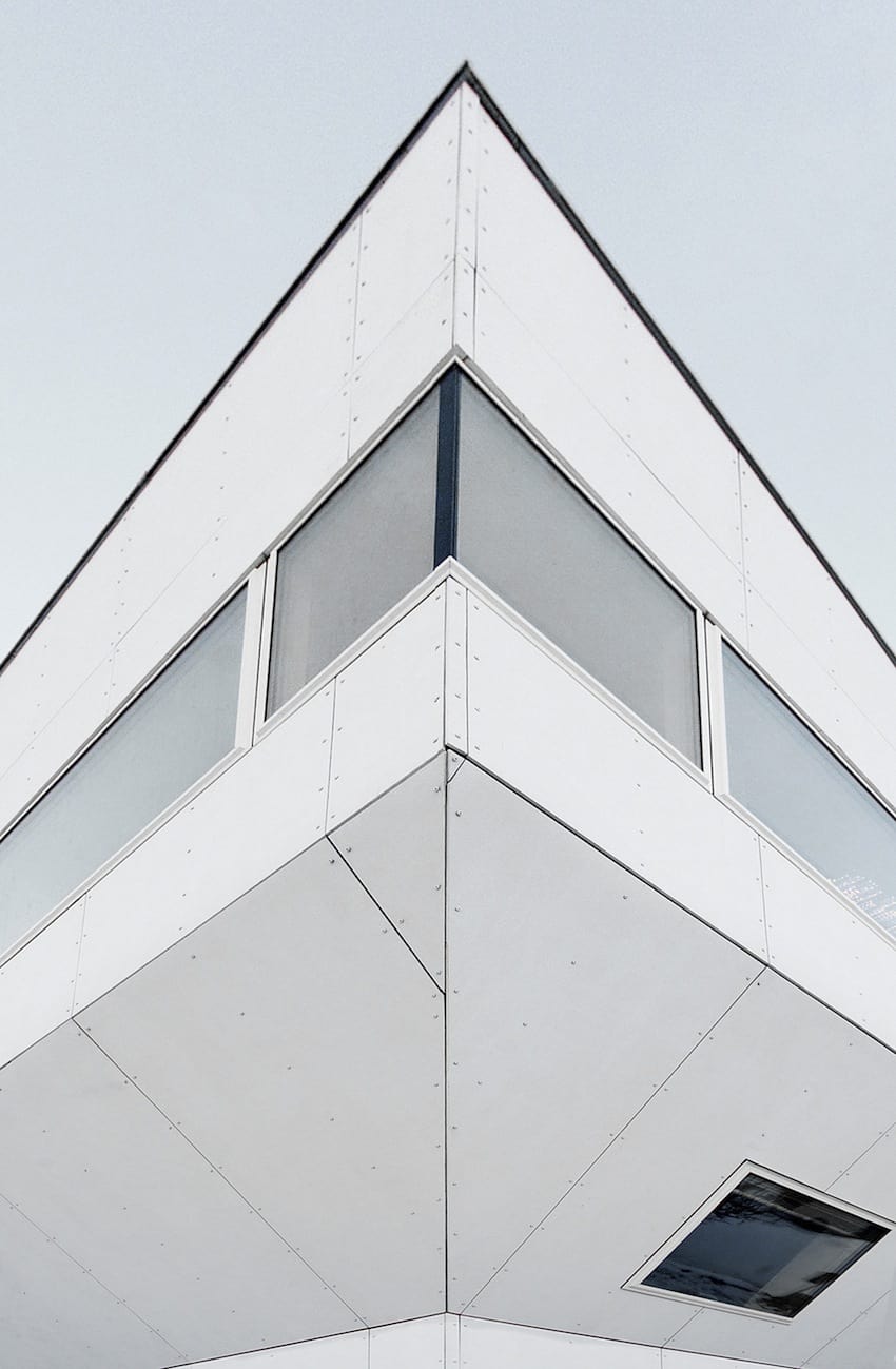
The exterior cladding is divided into sections ever-decreasing in size as it runs towards each corner, keeping the house’s uniform color scheme captivating up close.
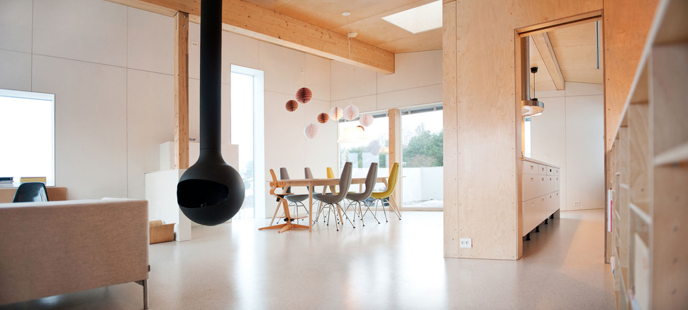
Inside, the decor is sparse and creative. Light wood accents create much of the inside structure (including the ceiling), accented by brightly colorful furniture pieces.
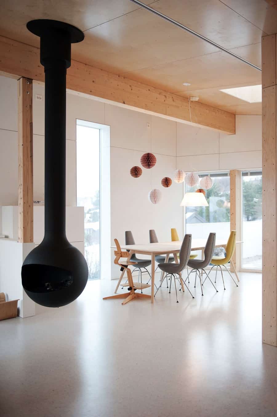
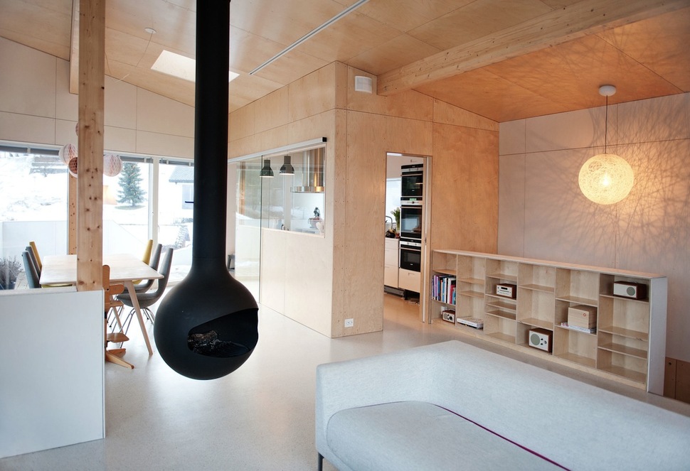
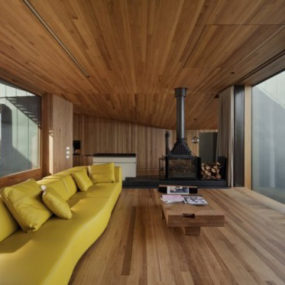
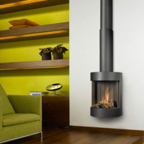
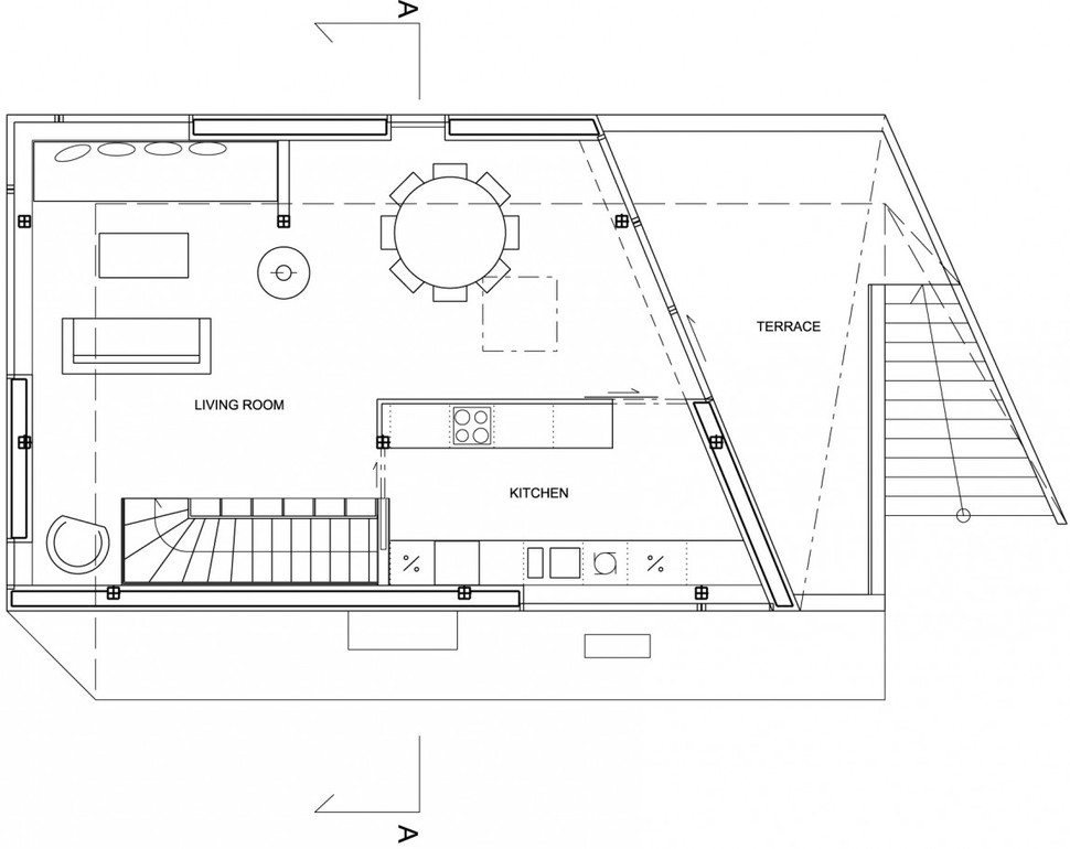
A chic hanging fireplace completes the scene, warming both the living and dining areas. A small half-height structural partition also helps to create a division between the two.
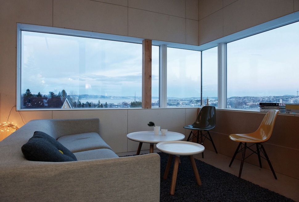
The living room is carpeted and cozy, with a window set encompassing the entire corner of the home. This floor has mostly vertical walls instead of the angular ones elsewhere.
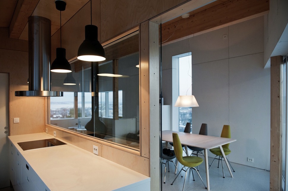
Set inside a rectangular plywood box behind the open living area, the kitchen features hanging fixtures and an expansive window providing a view of the room beyond.
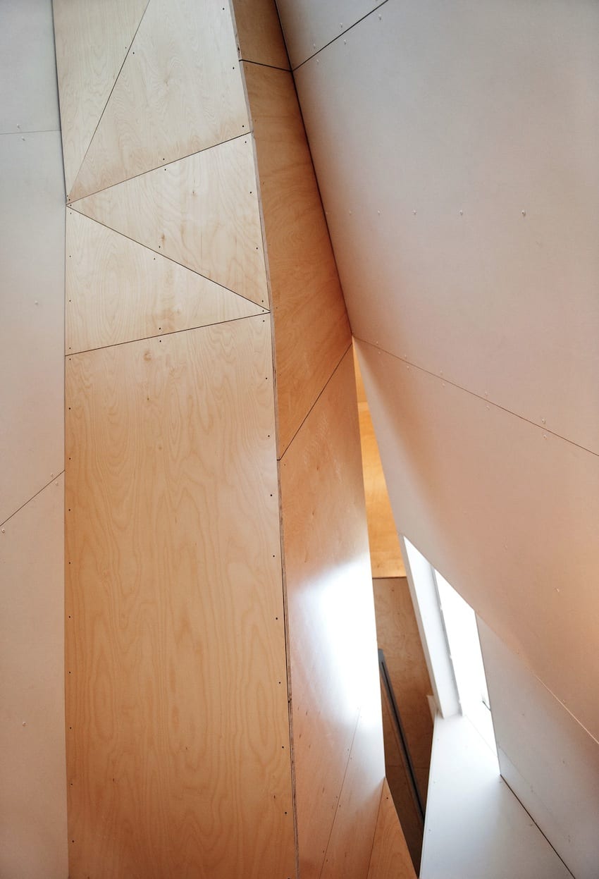
As with on the outside, the interior structure of the dwelling includes some very complex geometric forms, seen here where the cream-colored wall meets a piece of staircase structure.
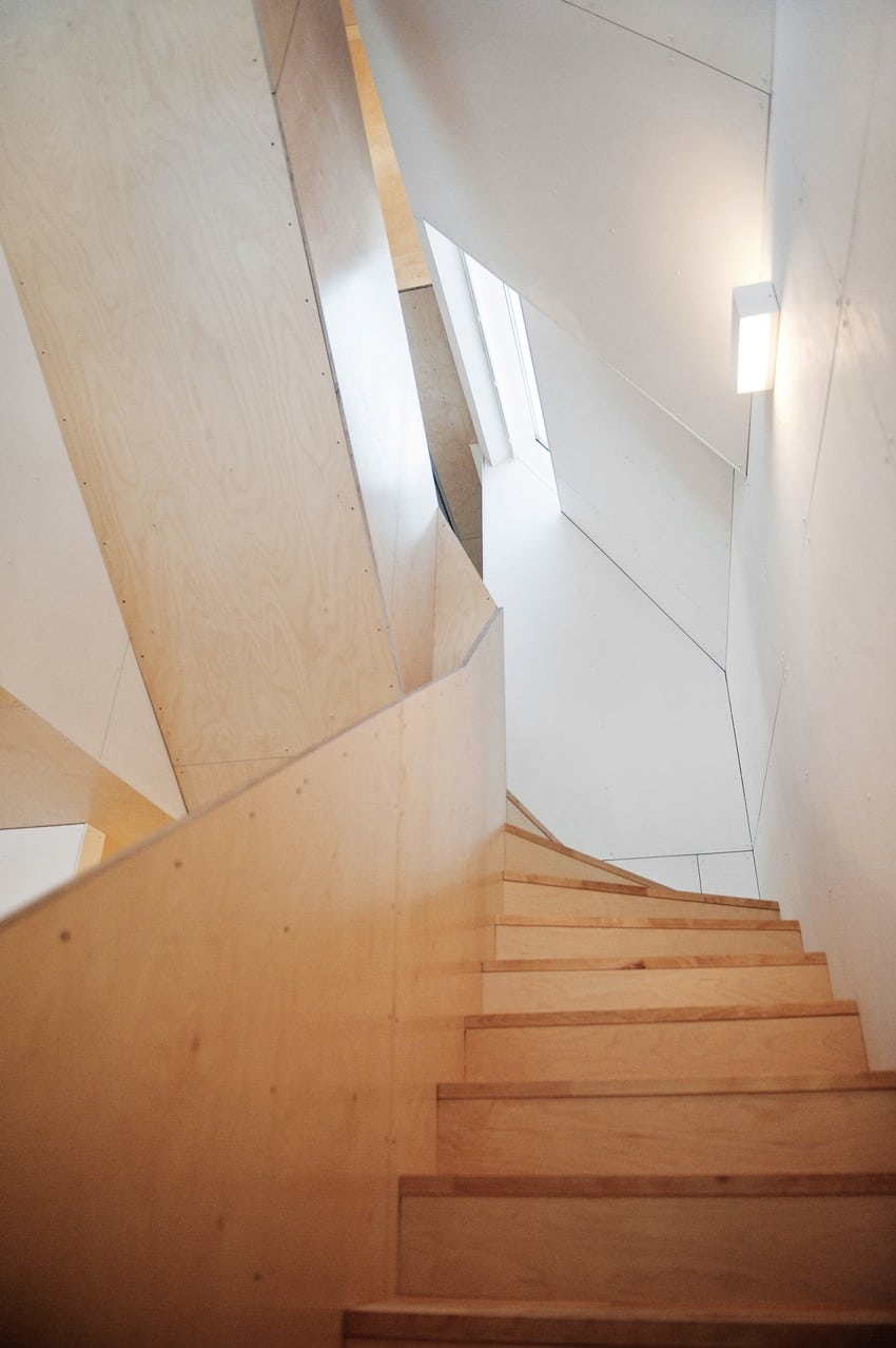
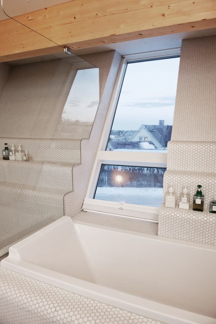
Some rooms are set against the angled outer walls of the residence, with windows looking down onto the landscape of its lot. The opposite edge of this second floor has walls angled in the opposite direction, with windows angled up towards the sky.
Jarmund / Vigsnæs AS Architects
