There is something so timeless, chic, romantic, and dreamy about the grey and white color combinations. Not only do they mix well with other tones but left as a duo they can truly take on any style or interior design genre with ease and comfort. Then, settled in the kitchen you get a clean palette to work with from top to bottom – filled with texture and a lot of room to personalize as well. And these 15 grey and white kitchens below will have you swooning and begging for one of your own.
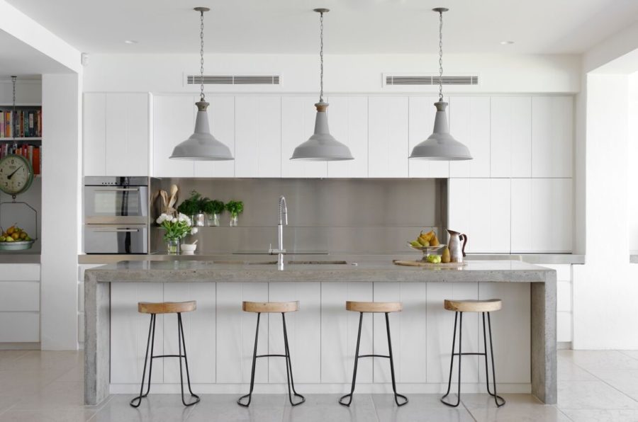
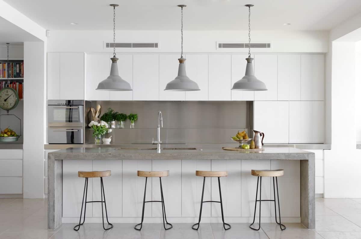
We’re starting out our super fresh list with this romantic design from Home Designing. The two-material island is a beautiful focus here and the industrial-style lights really make a blend of interior design genres so easy. The pop of natural wood adds a more casual air to the crisp space.
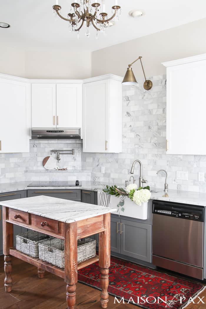
Here’s another contemporary and farmhouse blend we found over at Maison de Pax. It’s got a lot of gorgeous, modern accents like the marble backsplash and stainless steel hardware. But it’s that wooden, vintage-style island that makes the mixing of the two styles so interesting!
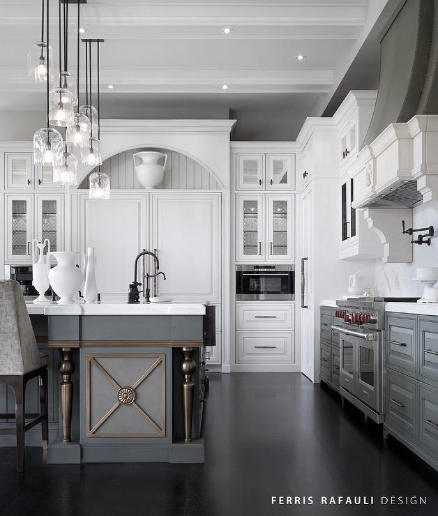
Here’s a more traditional space we found over at Decor Pad . The darker cabinetry at the bottom contrasts so nicely with the light and bright designs above. There’s a welcoming, family vibe here without sparing the details of stylish home.
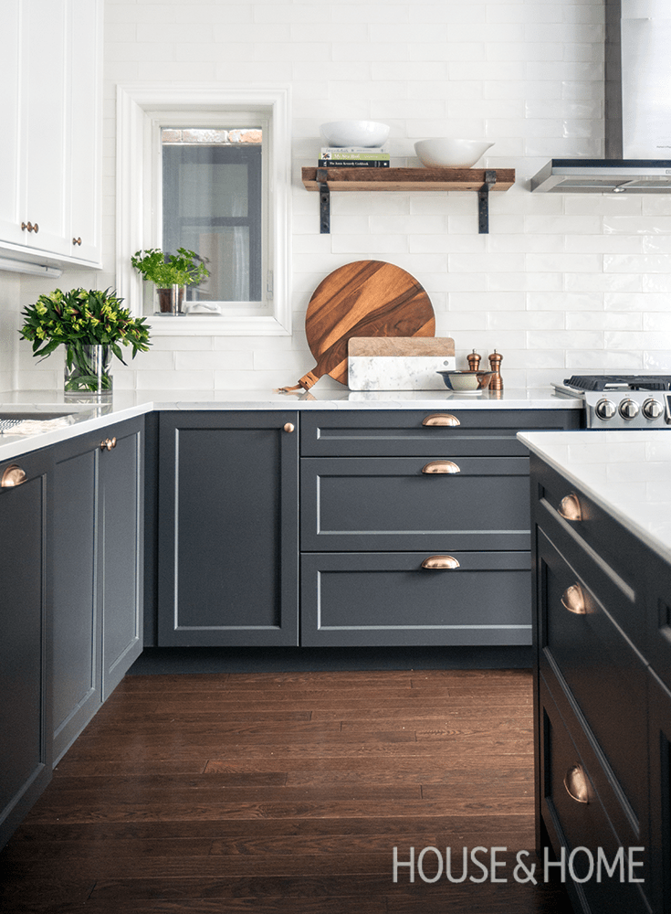
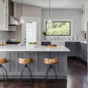
If you want an even greater contrast than think about going with charcoal tones. It makes for a sleeker and chicer foundation. House & Home had this beautiful up their sleeve and that golden hardware gleam was a sure winner for us.
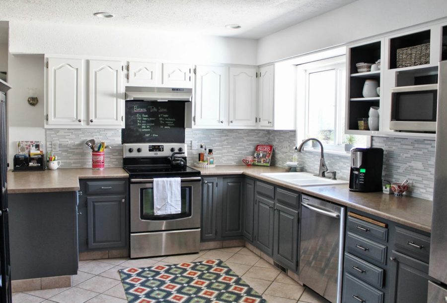
Remodelaholic had another more traditional design that we were drawn too. But it’s the posh, grey and white finish that elevates this to more than just a standard, family kitchen. The backsplash also ties in the two neutral quite nicely.
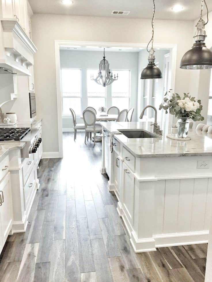
Here’s a more monochromatic white kitchen that we found while scrolling through Pinterest. There’s a subtle accent of light, romantic grey with the choice of flooring and countertop. This space is much more feminine and chateau-inspired.
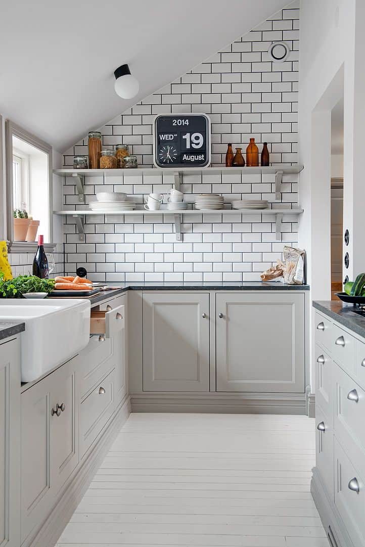
Homedit had a light grey and white design up their sleeve as well. This kitchen is a bit smaller, some would categorize it as a galley space. But the lightness opens up the hallway and creates the illusion of more square footage.
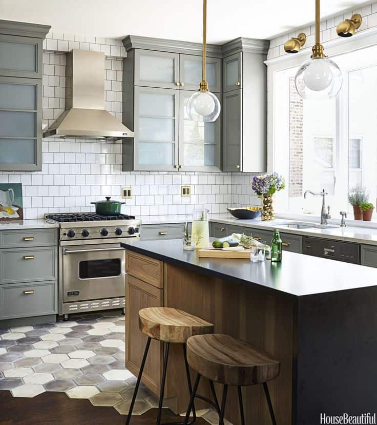
The Inspired Room had this trendy space featured and we had to snatch it right up. The grey cabinet, golden hardware, and pops of wooden texture make this a really interesting spot to be. And check out that tile floor design that steals the show!

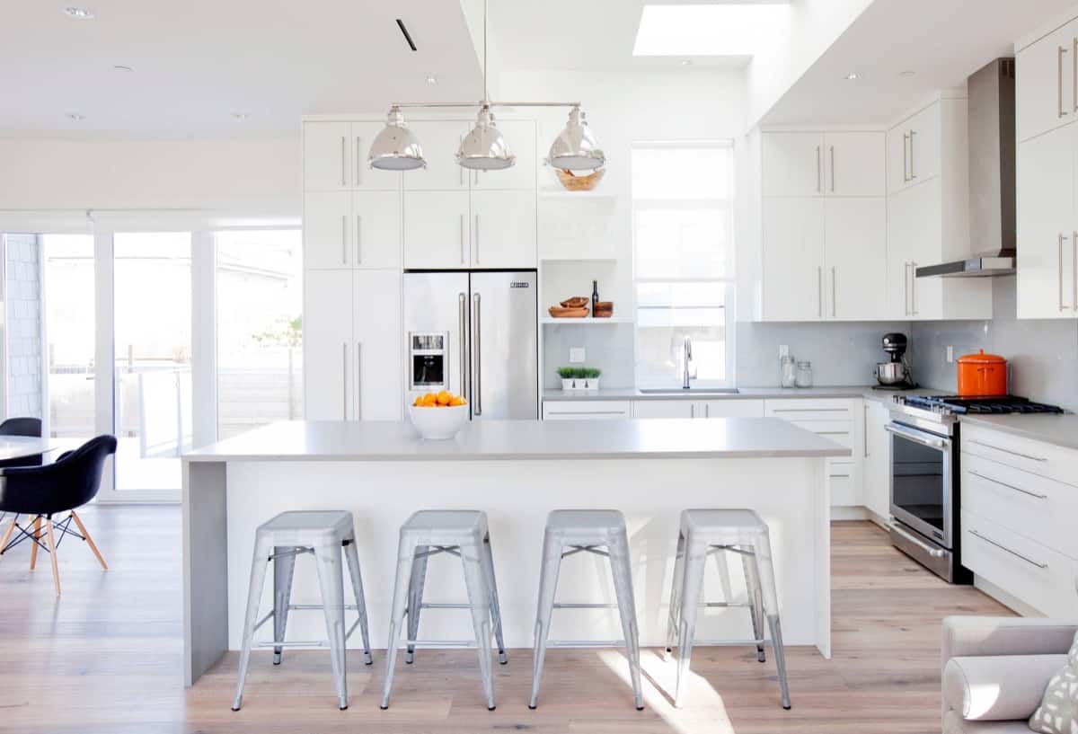
If you’re drawn to a lighter, bright space then check out this kitchen we found at Home Designing. There’s a small, French grey accent that surrounds the crisp white foundation. And it pairs really nicely with all the natural lighting that this area gets throughout the day.

The Kitchn showcased this n look and we fell in love with its ease as well. You could definitely find this in a lot of family homes or design your own kitchen after its peek. The dark countertops and light base is a classic.
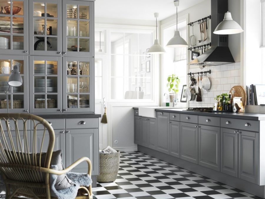
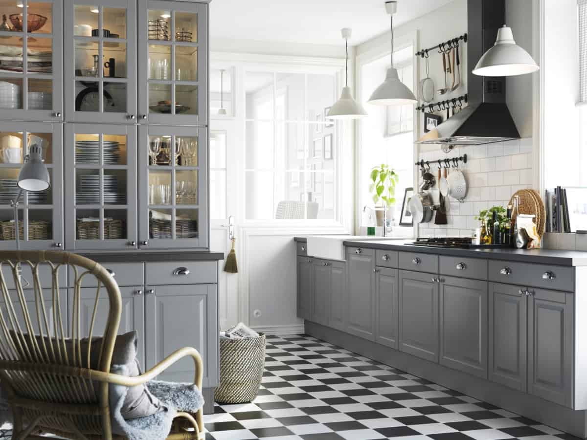
For those that want a definite farmhouse or vintage feel to their kitchen, grab some inspiration from this space found at Builders Surplus. Between the industrial hangers and checkered floor it’s really a showstopper. We love the contemporary touches as well that make it a force to be reckoned with.
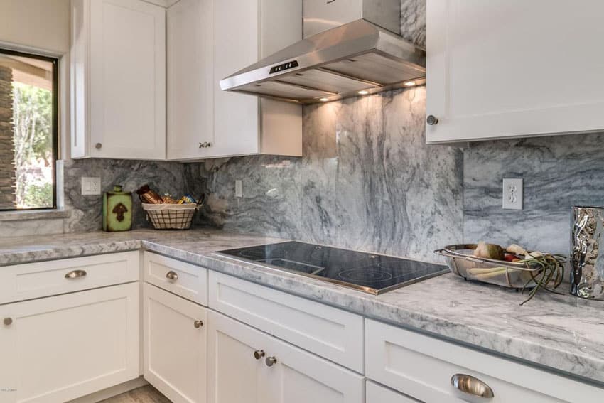
The marble is the star of the show in this kitchen. Found on Zillow, this space had up swooning. It’s a modern design that’s really all about the backsplash. The white cabinets were a good choice to keep the room open and bright.

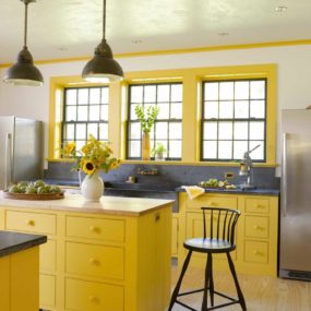
We’re loving this cottage-inspired kitchen found over at Country Living. The pop of yellow brings in a bout of personality and the open shelving evolve the theme so nicely. Again, the white foundation is a great choice when you want to keep things fresh and airy.
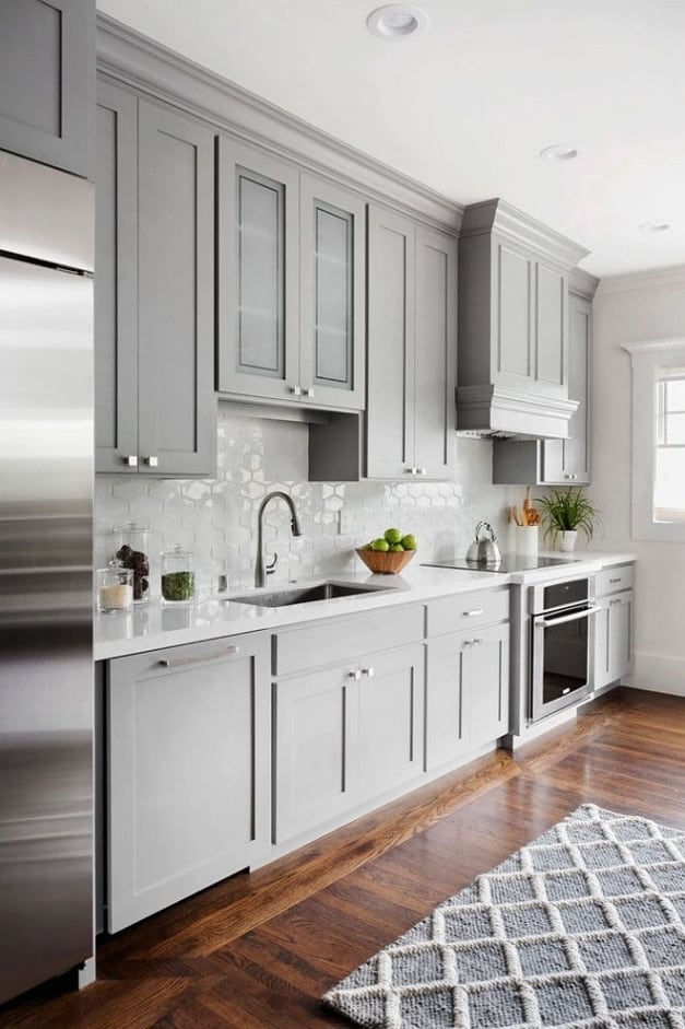
Suzanna Childress Design went with a French grey foundation, which is the perfect way to go for those that love a romantic, welcoming feel. It pairs well with dark hardwood floors and contemporary, honeycomb backlist as well. And the stainless steel appliances help to push the modern envelope.
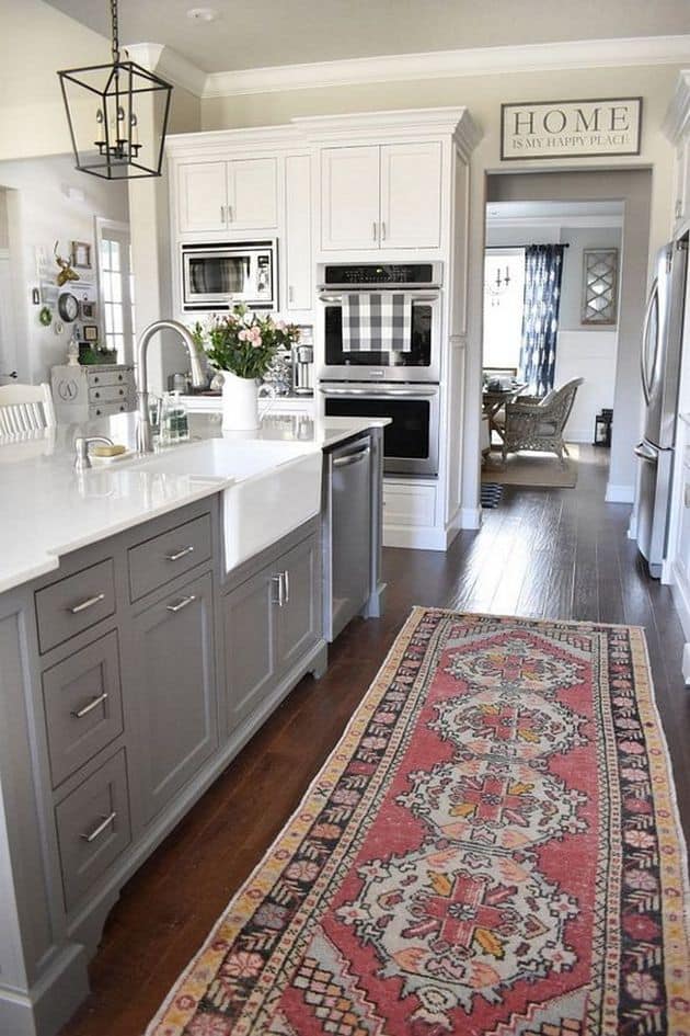
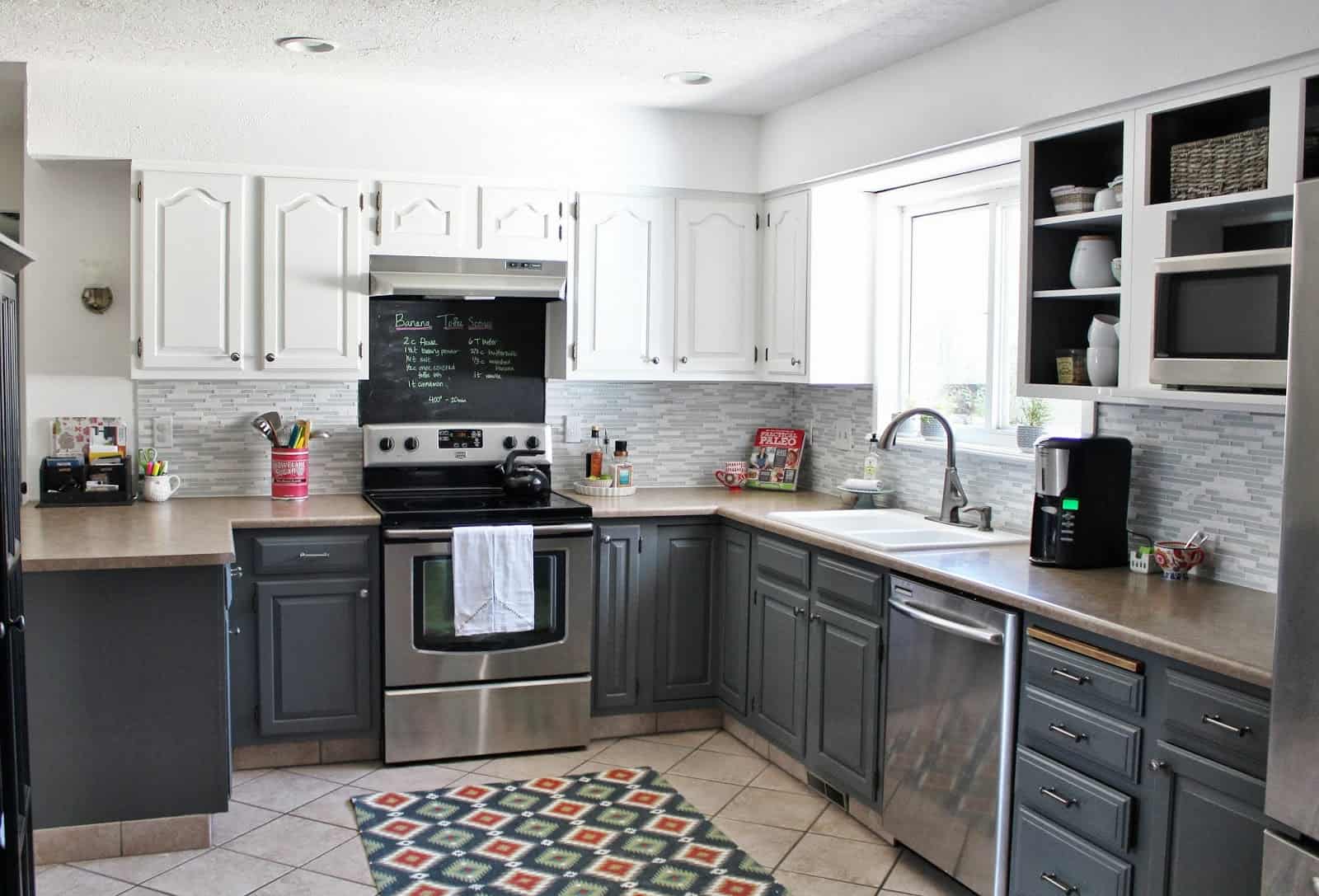
Finally, we visited Beneath My Heart and snatched this kitchen view. It’s a beautiful, family kitchen with all the needs and accents you’d want. And that bohemian rug really adds to the trendy vision.
