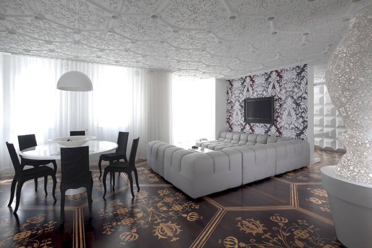
Creating a monochromatic colour scheme within a home does not have to be simple. Case in point is this extravagant and elegant private residence located in Amsterdam, The Netherlands. Designed by Marcel Wanders as a place of exciting textures and bold patterns, the home is anything but simple – and yet it boasts only black, white and shades of brown. While each pattern and texture creates a bold statement on its own, combined, the room is a harmonizing statement of neutrals that is both relaxing and exciting.
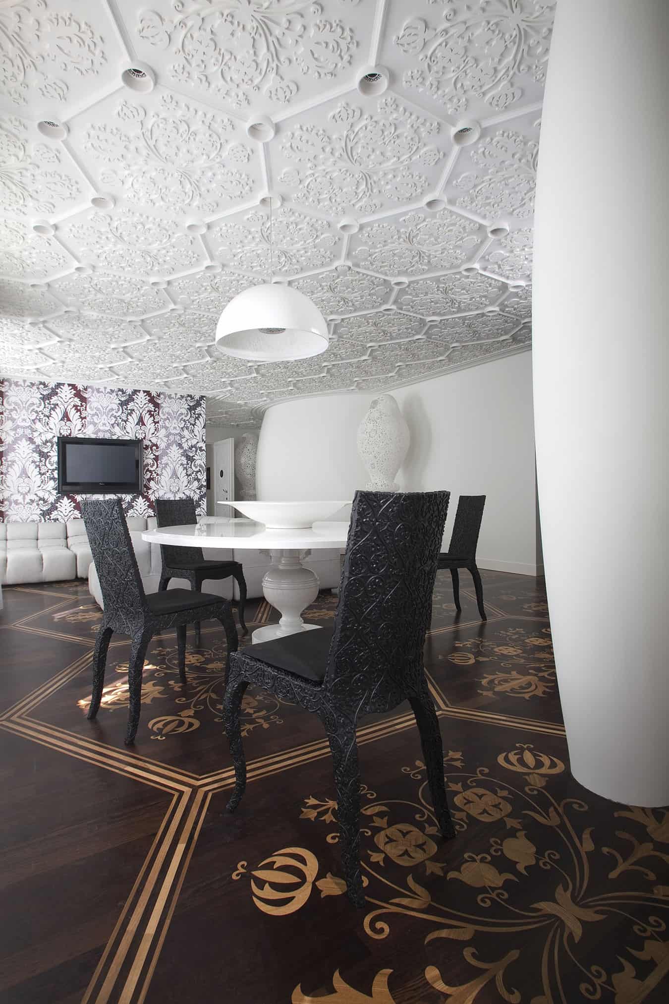
Even the furnishings are highly textured with the dining chairs covered in a relief pattern complimentary to the ceiling detail and the sofa boasting a deep tufting.
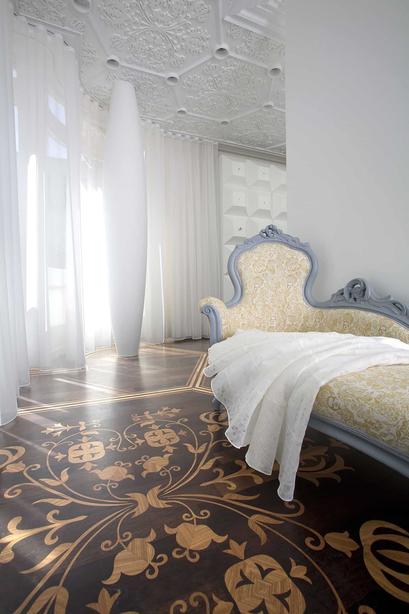
Just around the corner from the dining area is a small lounging area featuring an antique sofa with soft amber and white upholstery and cool grey frame. This sofa is a contrast to the other modern pieces chosen in the social zone but it is the traditional profile combined with a modern makeover that makes it work so beautifully within the space.
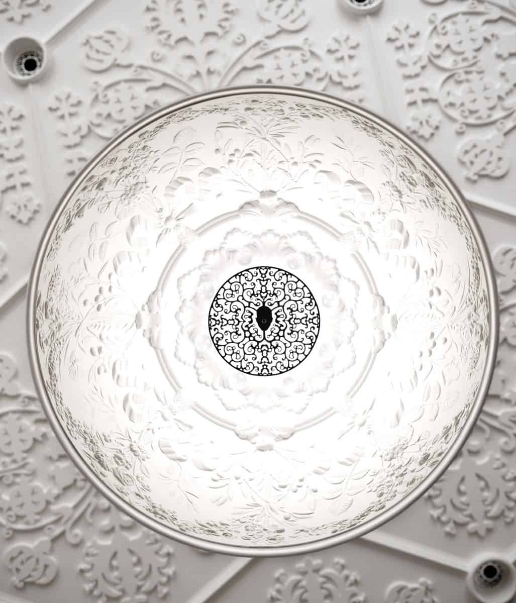
Back in the dining area, the pendant over the table is smooth on the outside but filled with detail from within.

The choice of a matte black on both the upholstered seat and the textured framework of the dining chairs is one of my favourite aspects to this amazing residence.
 </div
</div
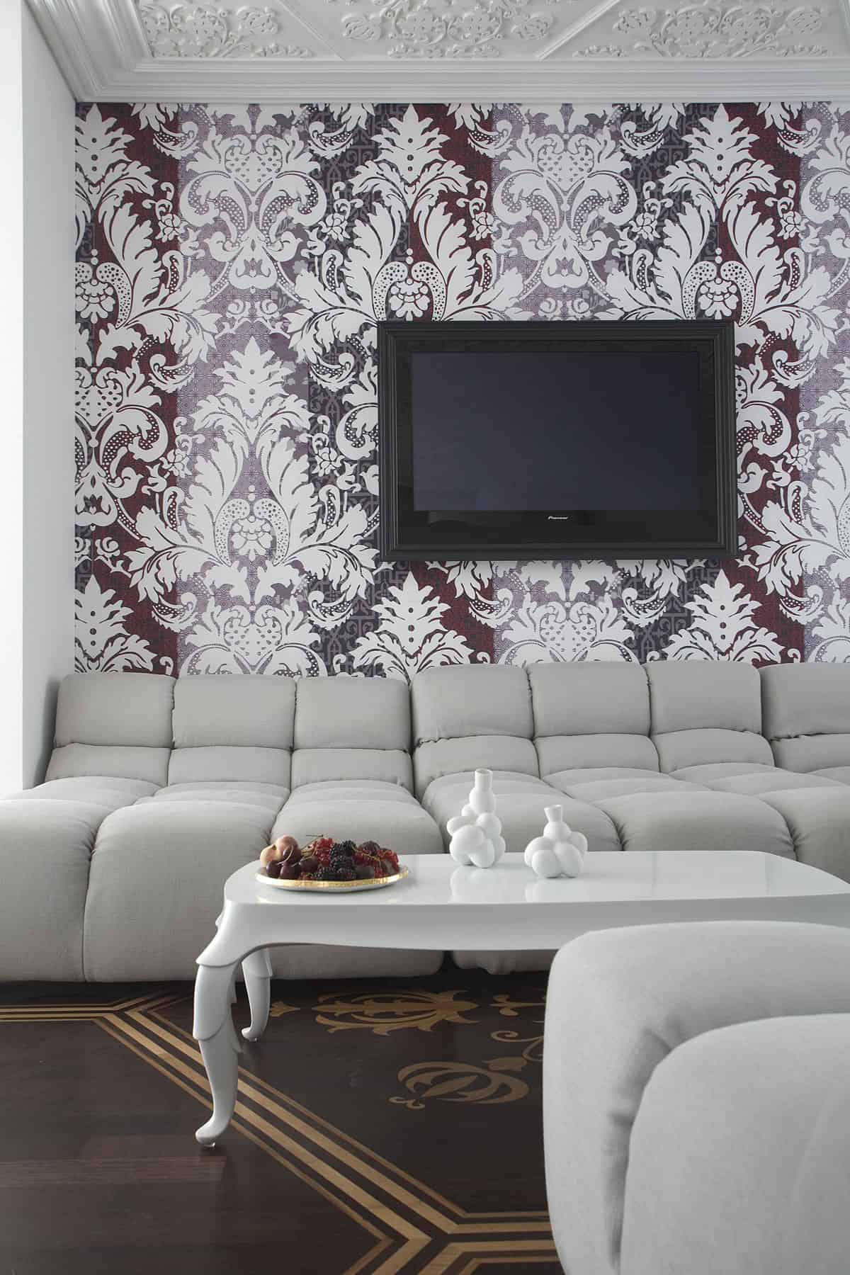
The black moments within the dining chairs is the perfect way to connect the black of the TV into a feature of the room.
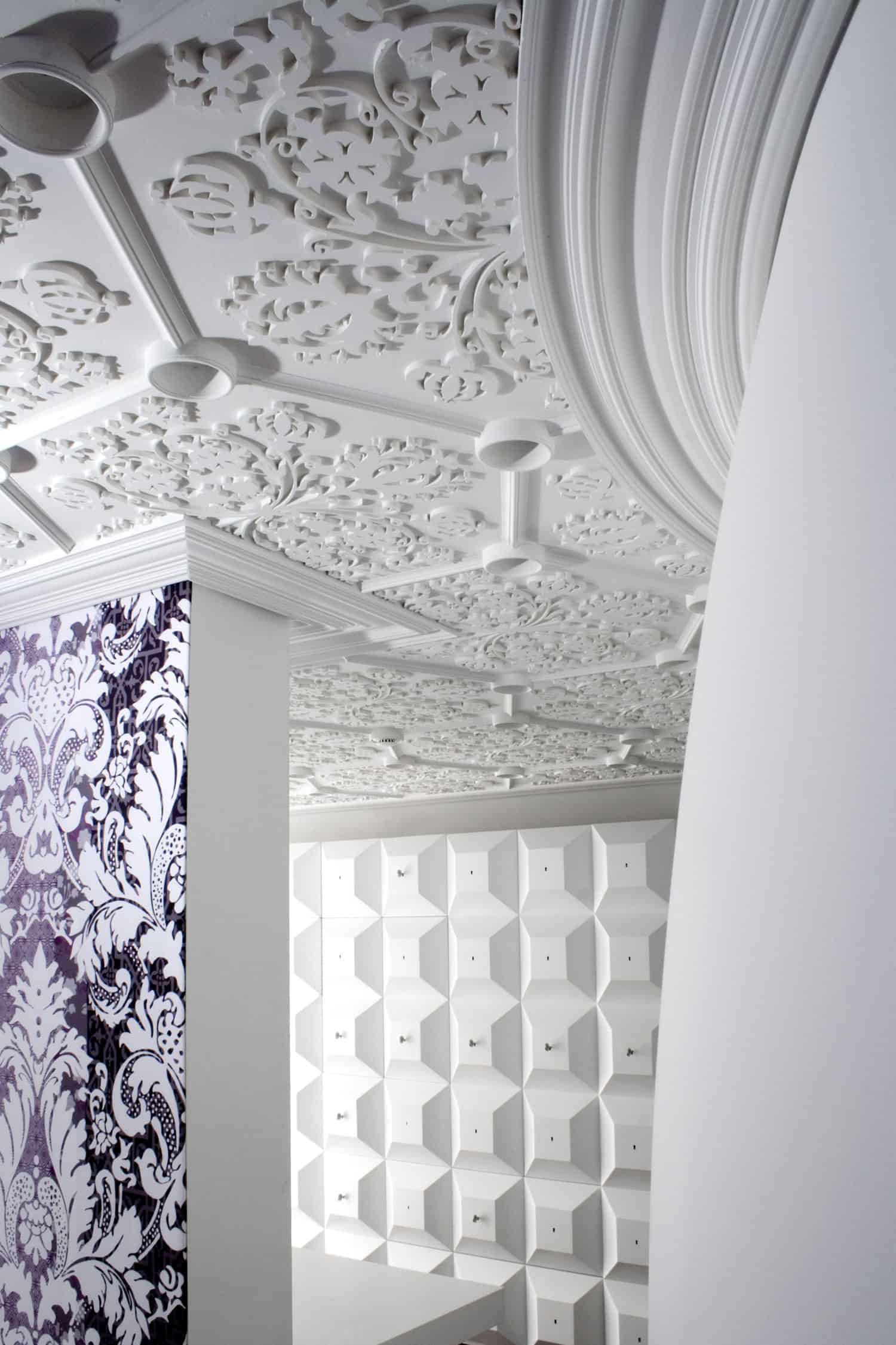
Just behind the TV wall is an office area that is just as visceral as the social zone – check out 3D geometric wall – wow.
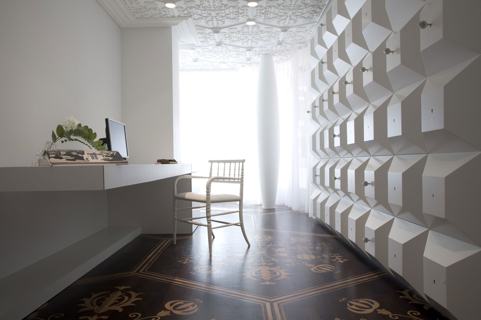
The workstation of the office is one of the few areas of this residence that features smooth surfaces which is quite the contrast to the geometry of the wall behind it. This however does not mean the workstation is void of texture, it simply features a “smooth” texture.
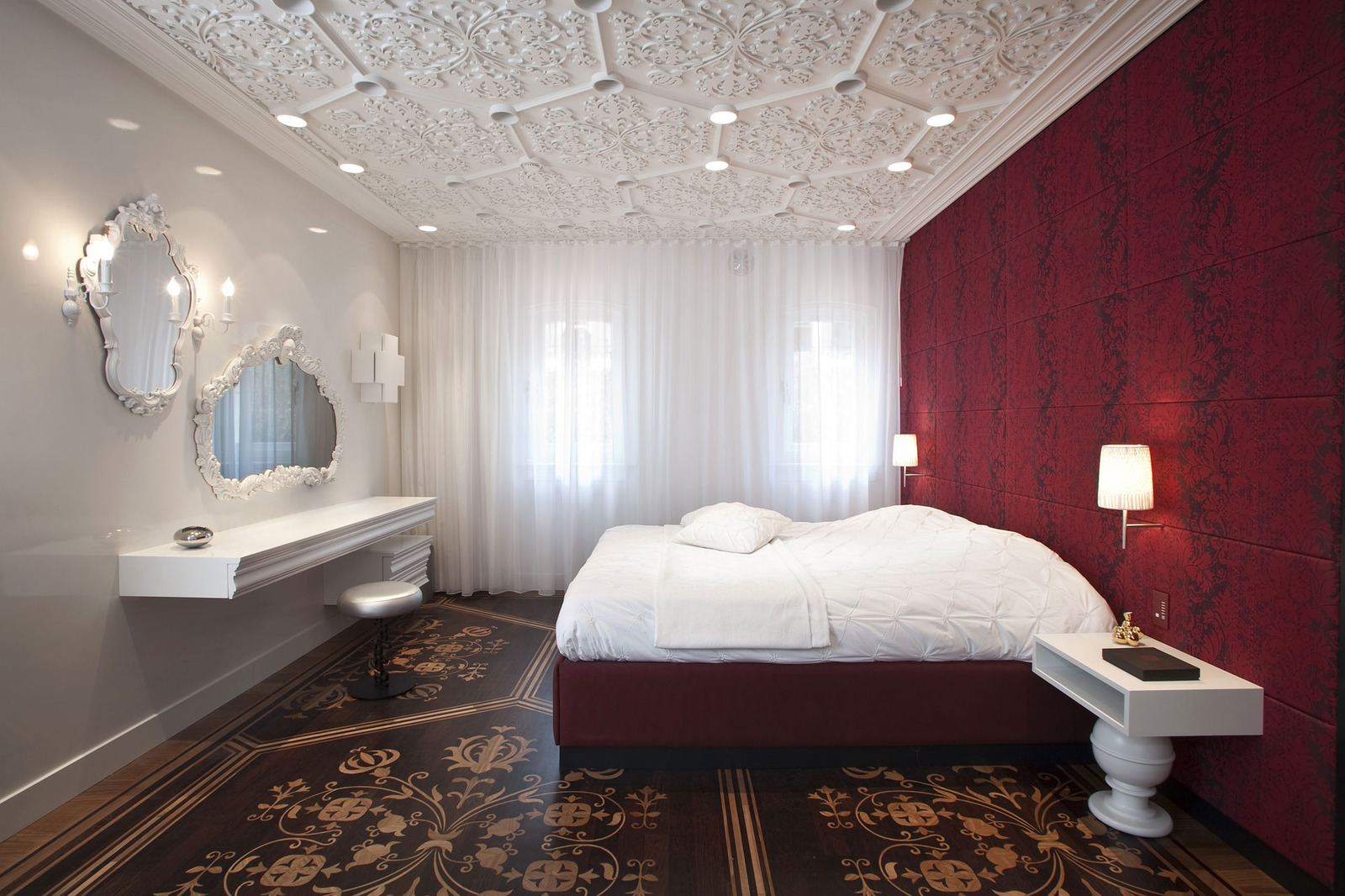
The bedroom throws neutrality out the window in favour of a deep red headboard wall and bed frame. This splash of red, although heavily patterned, seems quite calm amidst the rest of the rooms elements. Love the bases on the nightstands and the white frames on the ornate mirror frames.
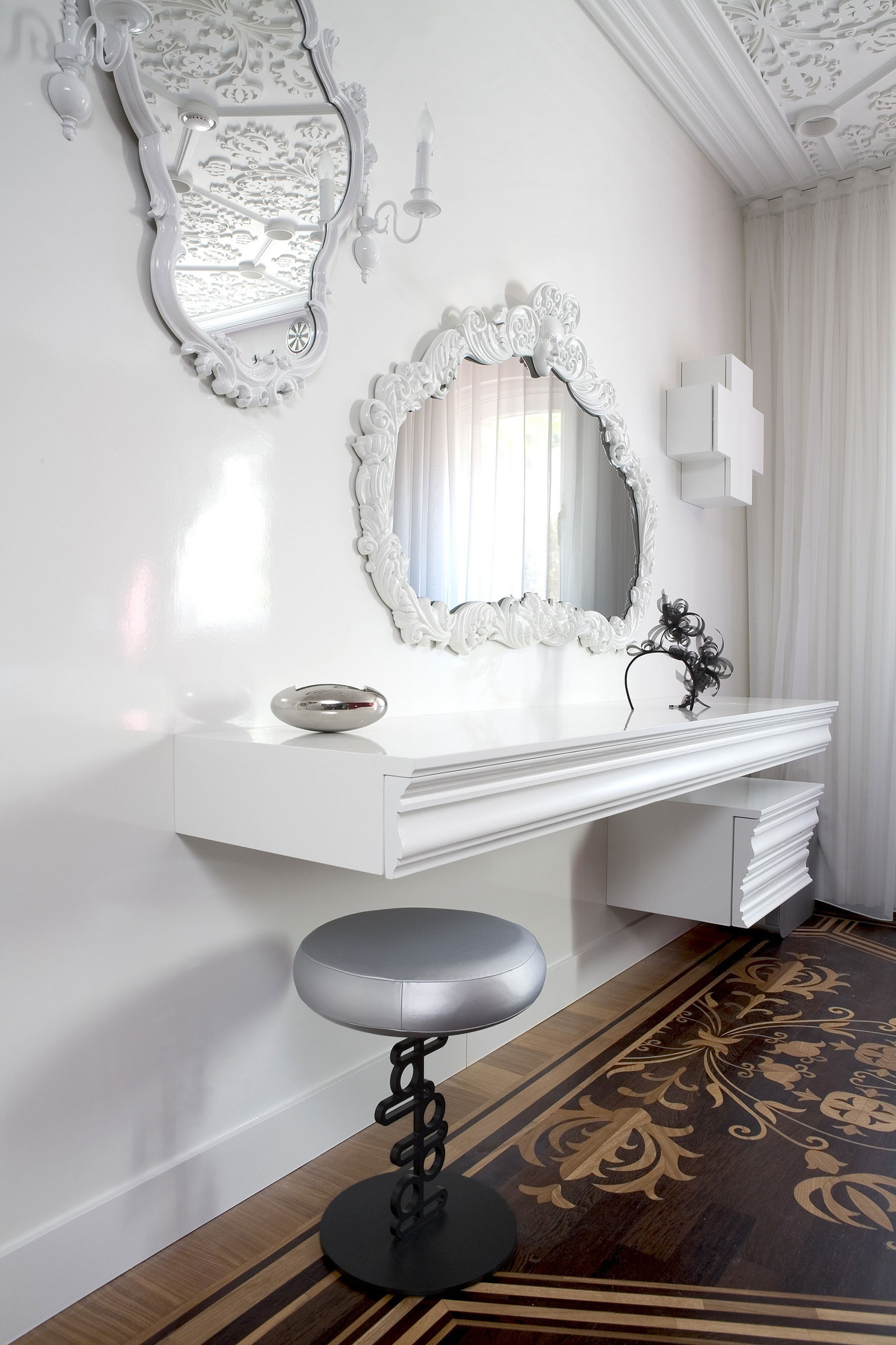
The white on white of the dressing table, the mirror frames, the light sconces and the swiss cross cabinet create a vignette of texture as exciting as any wall of art.
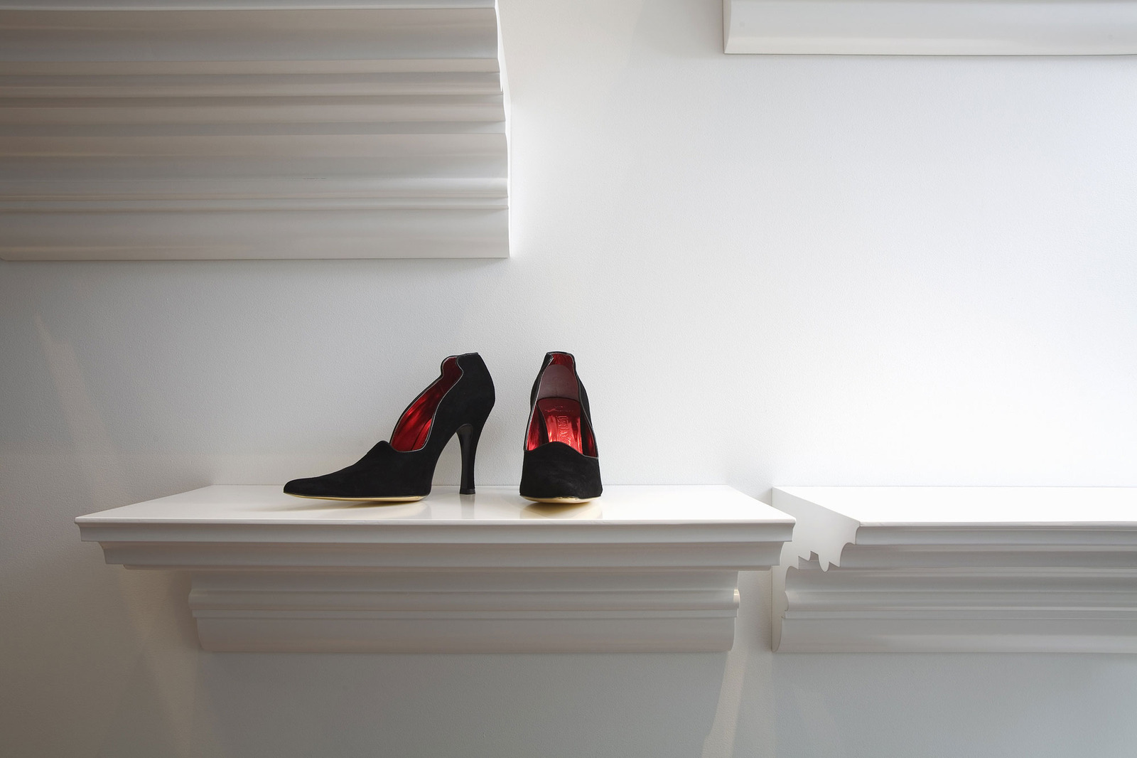
The idea of using functional pieces to create artistic vignettes is carried through into the closet. Here heavily moulded white shelves float on the wall to create a sculptural statement of the homeowner’s collection of shoes, purses or any other favourite accessories.
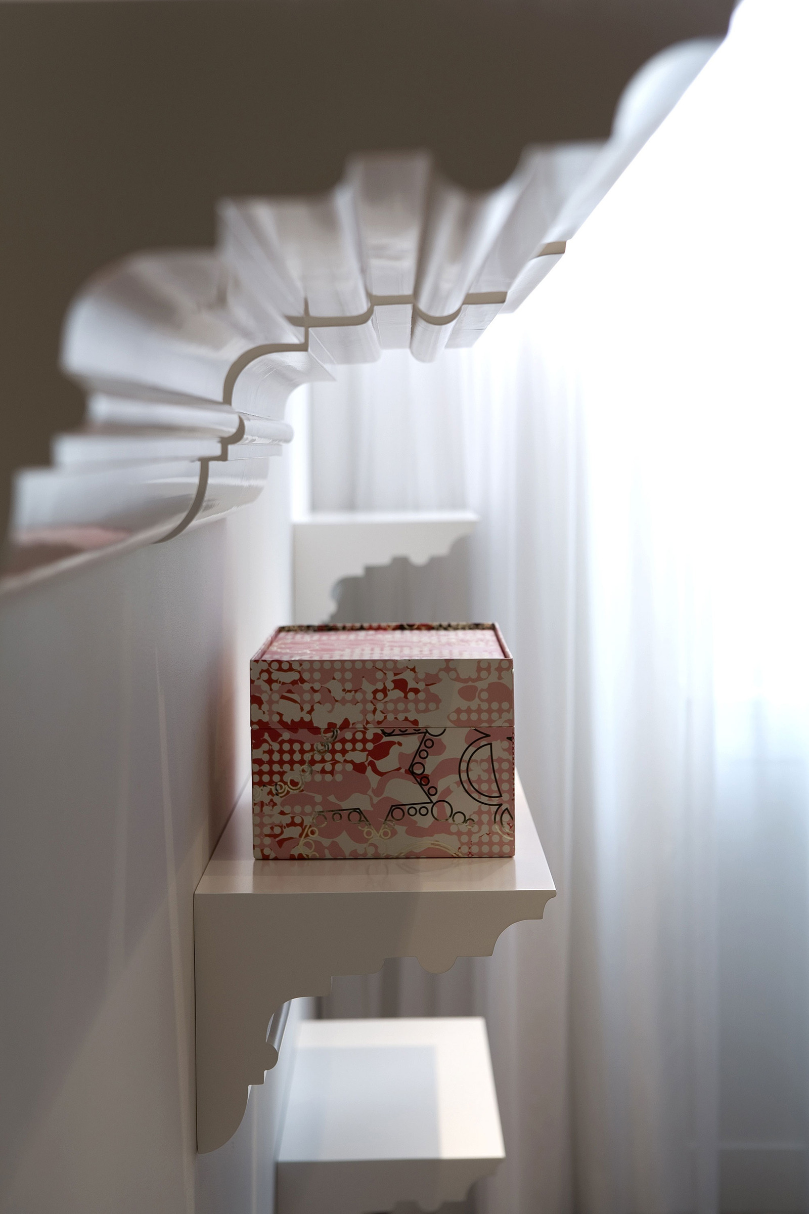
Even colourful containers can be featured as art on the shelving.
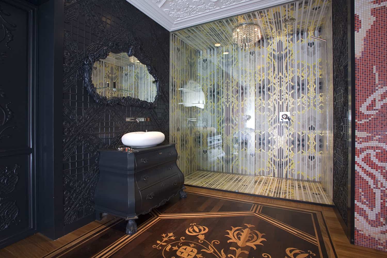
The ensuite boasts all the feature colours used throughout the home – deep red on the mosaic tiles, white on the fixtures, amber throughout the shower (and check out that chandelier in the shower) and black on the vanity and vanity wall. Simply awesome.
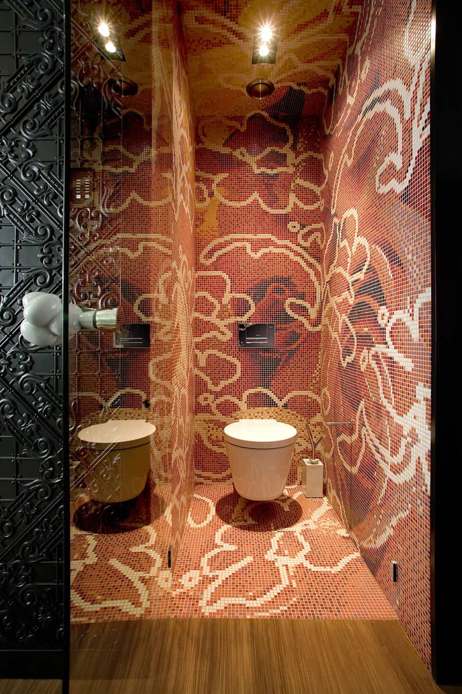
The mosaics are used in the toilet zone create a large floral pattern for both texture and pattern. Who knew a toilet room could be so beautiful?
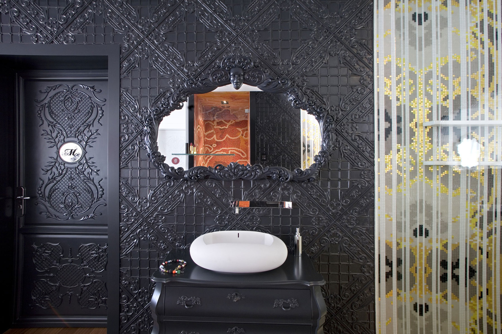
The vanity zone is a stunning black on black vignette that features one of Marcel Wanders trademark humanoid moments. If you’re not sure where it is, look closely at the mirror frame.
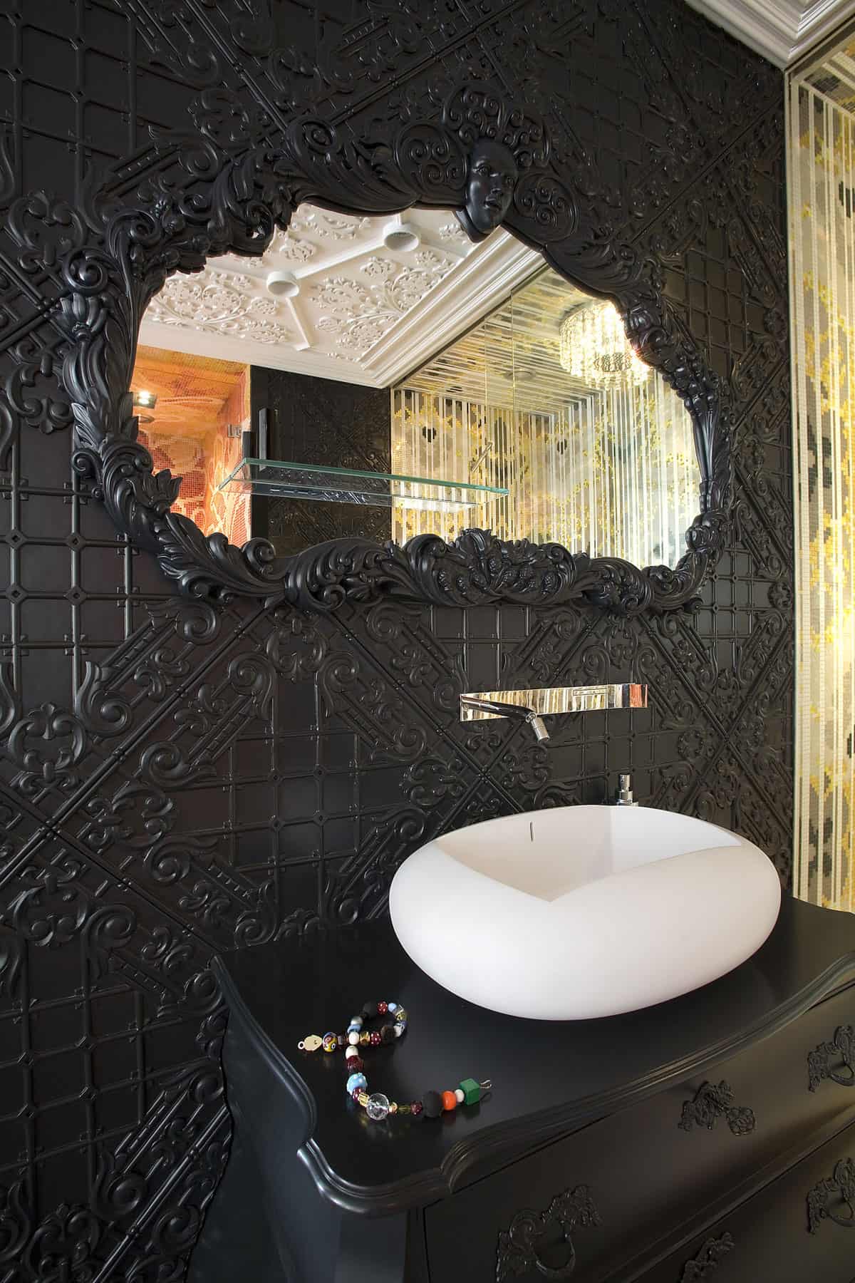
The black and black of the vanity zone allows the white, amber and red of the bathroom to “pop” in the mirror’s reflection.
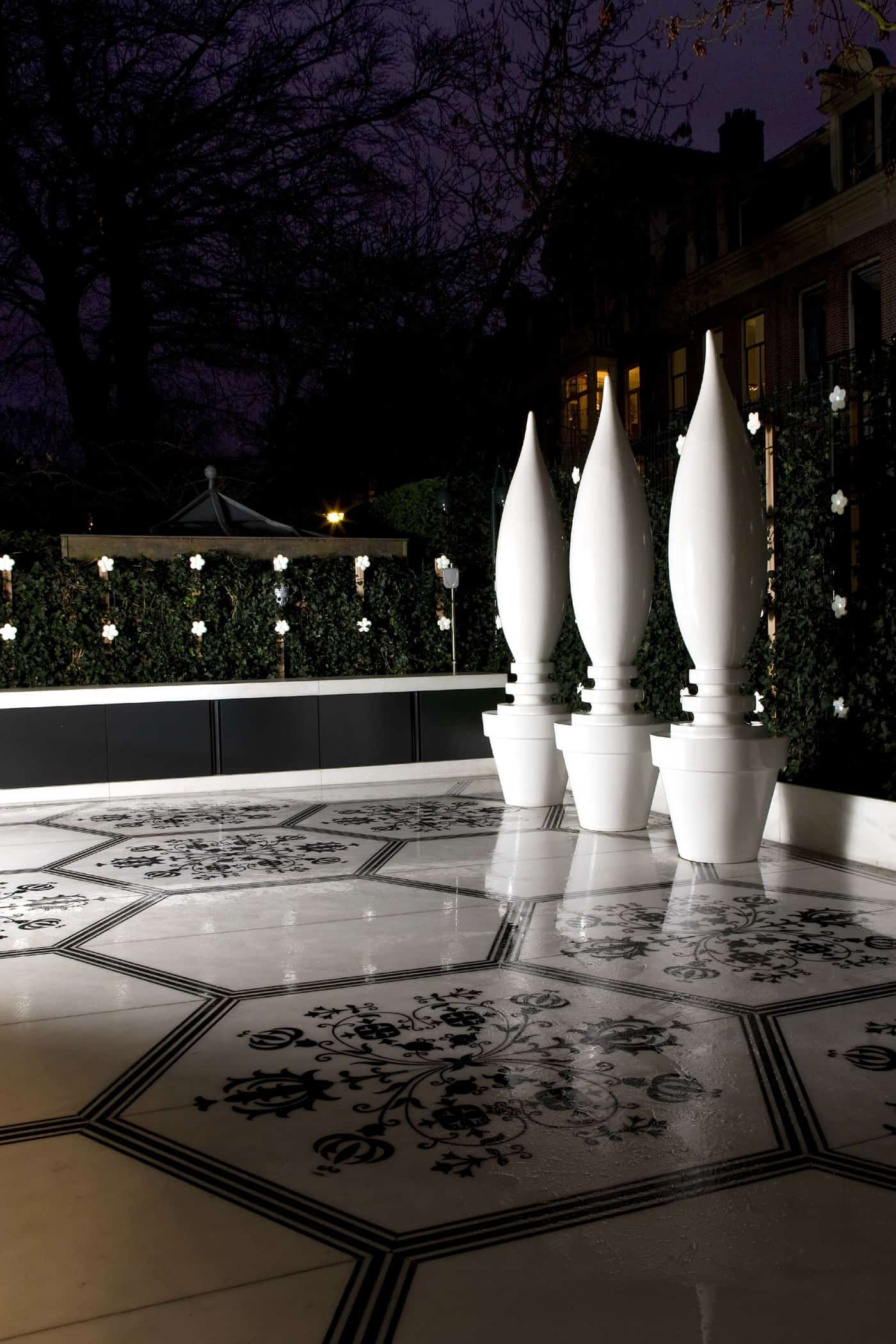
On the terrace, Marcel has used the same floor detail but in a different colour. Here the shades of brown have been replaced with white and black and it looks stunning – especially with the row of plant pot lamps. Here outside – just as inside, the bold use of textures and patterns create a visceral experience.
Marcel Wanders
Photos through Marcel Wanders
