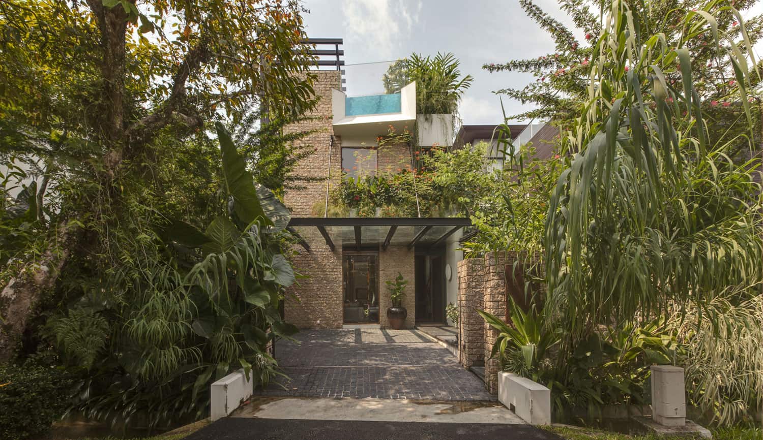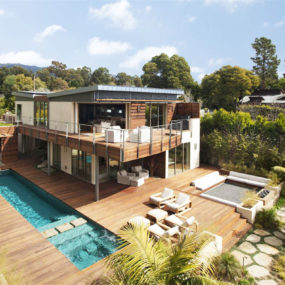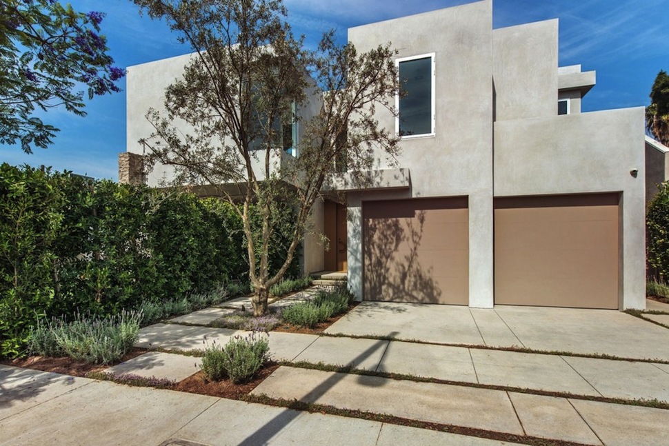
Built on two combined West Hollywood lots that once housed small single-story bungalows, this family home by Amit Apel Design is a stunning example of how the smart integration of natural elements into a design can completely transform its character. Starting from a property surrounded by high shrubs, the architects chose to make the most of the lot and mold it into a green paradise, integrating garden elements into the core of the house at the same time. Various nooks of the home’s shape hug trees and shrubs, and window space is maximized to provide views directly out at plant life. All around the constricted lot, grass sprouts from pavement gaps and trees rise up to give a natural environment to this city house. All of this nature comes with practical benefits, too, providing a wall of plants to keep prying eyes out.
The house is arranged on three levels, two of which follow the traditional indoor arrangement of a family home. The kitchen and living room are on the bottom floor, with three bedrooms and bathrooms above. What makes this house unique, however, is its system of elevated decks, of which there are four in all. Each bedroom has access to its own outdoor space, and the entire roof of the house has been turned into one large outdoor living room for entertaining guests or just enjoying the sun. The design of this residence proves that no matter the size of the property, any house can maintain a connection to the environment.
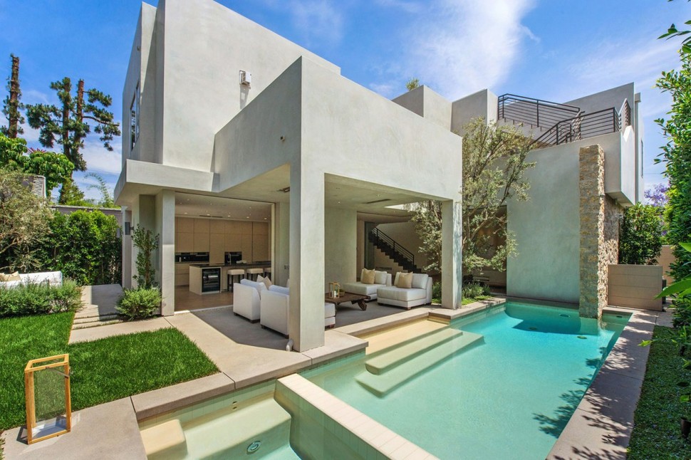
Though it occupies a fairly compact L.A. lot, the main focus of the home is still on the outdoors, with plenty of entertainment space on every level. A pool and stretches of lawn surround the house at the bottom, while a series of decks stem off of various rooms on the second floor and the roof.
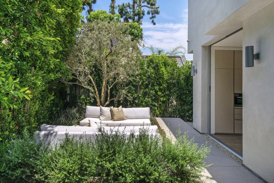
Around two corners from the front of the dwelling, the first outdoor social space is a fireplace just off the kitchen, surrounded by two weatherproof couches.
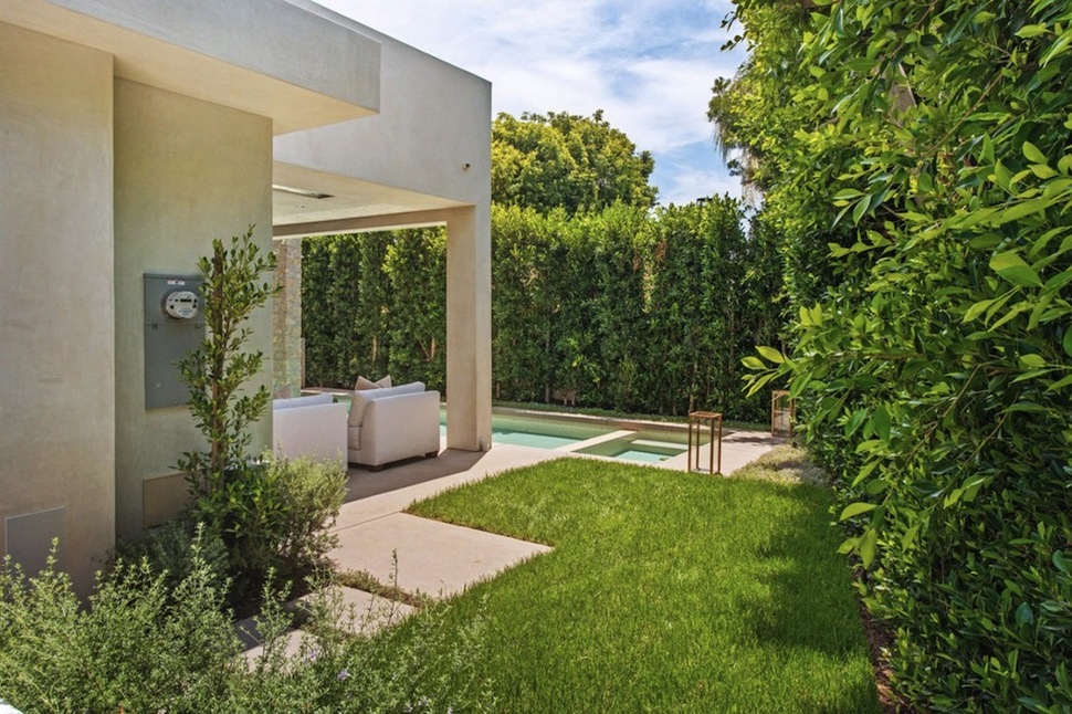
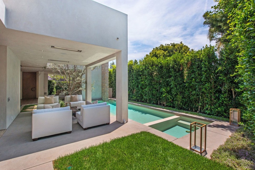
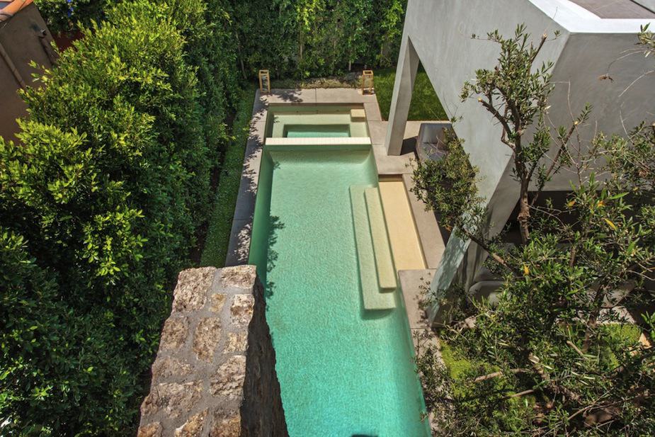
On another corner of the kitchen just beyond the first seating area, a second patio extends as an indoor-outdoor social space next to the pool and hot tub.
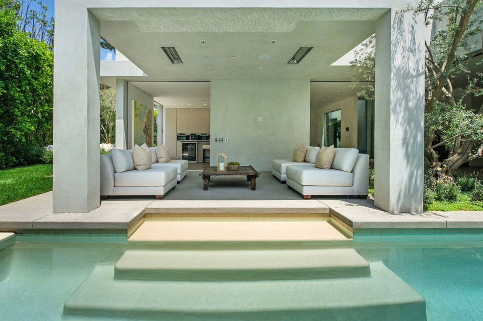
The roof and supporting structure of the patio is shared with the architectural structure of the home as a whole, supporting an additional deck above it. This similarity between the patio’s cover and the house itself helps to integrate it more thoroughly into the design and help it feel a part of the home.
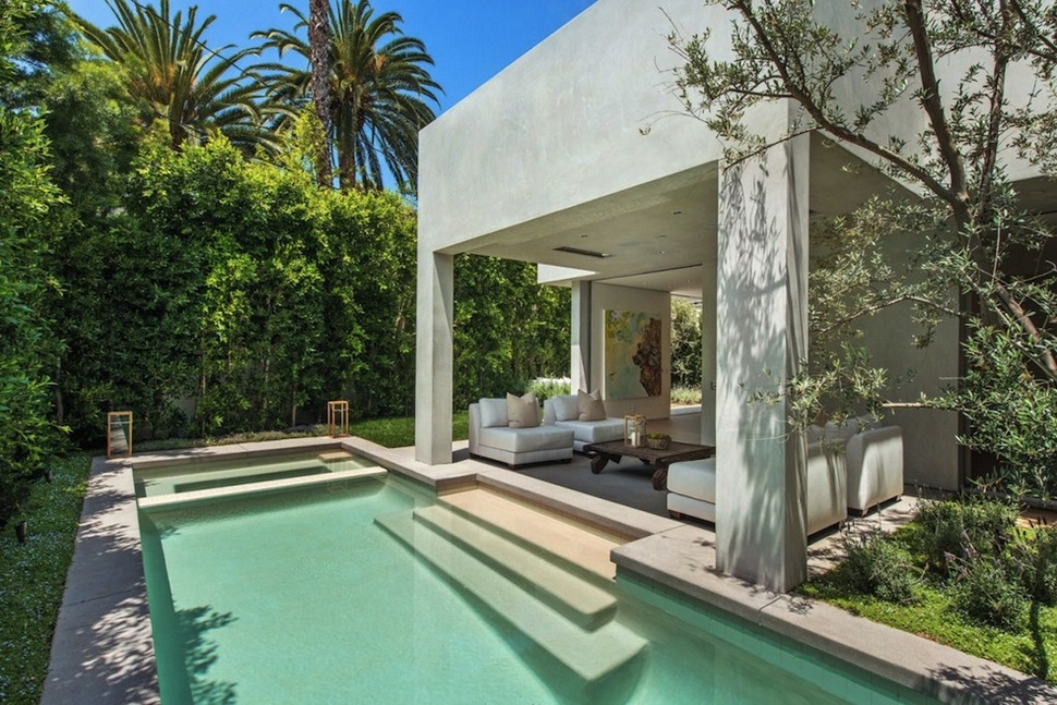
A set of steps descends gracefully into the pool, which shares its border material with the patio’s flooring.
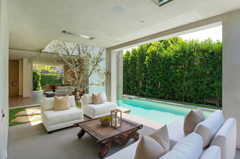
The kitchen patio is the most isolated outdoor space in the house from the traffic nearby, located at the rear on the first floor. It serves as a peaceful neutral zone between indoors and out, perhaps even taking place of the living room and roof deck on sunny days.
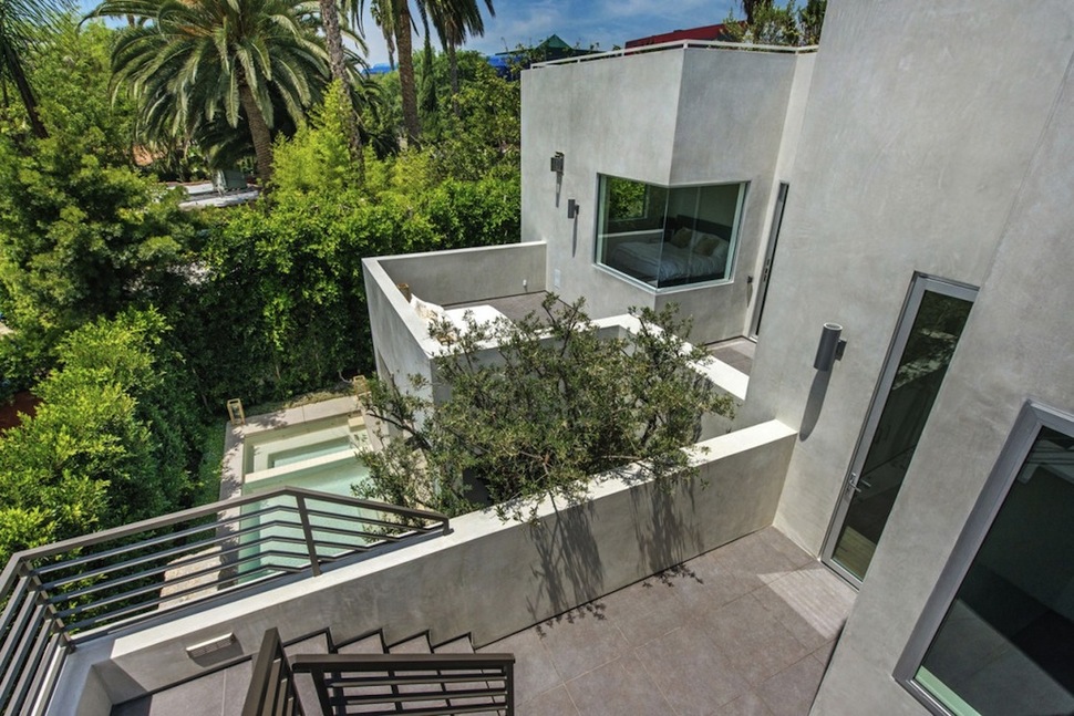
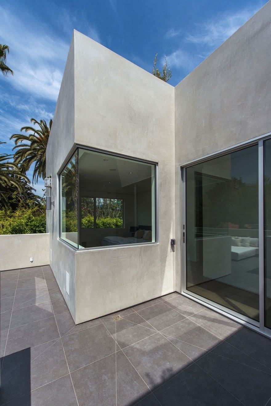
The house’s second level hosts a series of decks along its edges, each separated from the next by a corner intersection with the interior walls. One deck can be accessed from one the two smaller bedrooms of the residence or from the upper hallway, and includes a common staircase up to the roof, while the second deck is reserved for the master bedroom alone. The third bedroom has its own private deck at the front corner of the house.
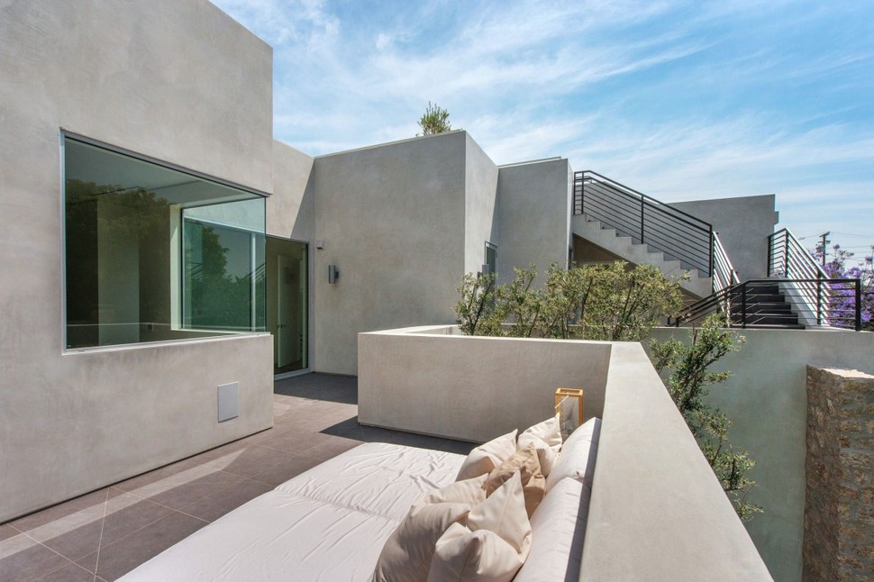
All of the bedrooms are located along these sideways-facing decks, giving them plenty of space for windows facing the edge of the property.
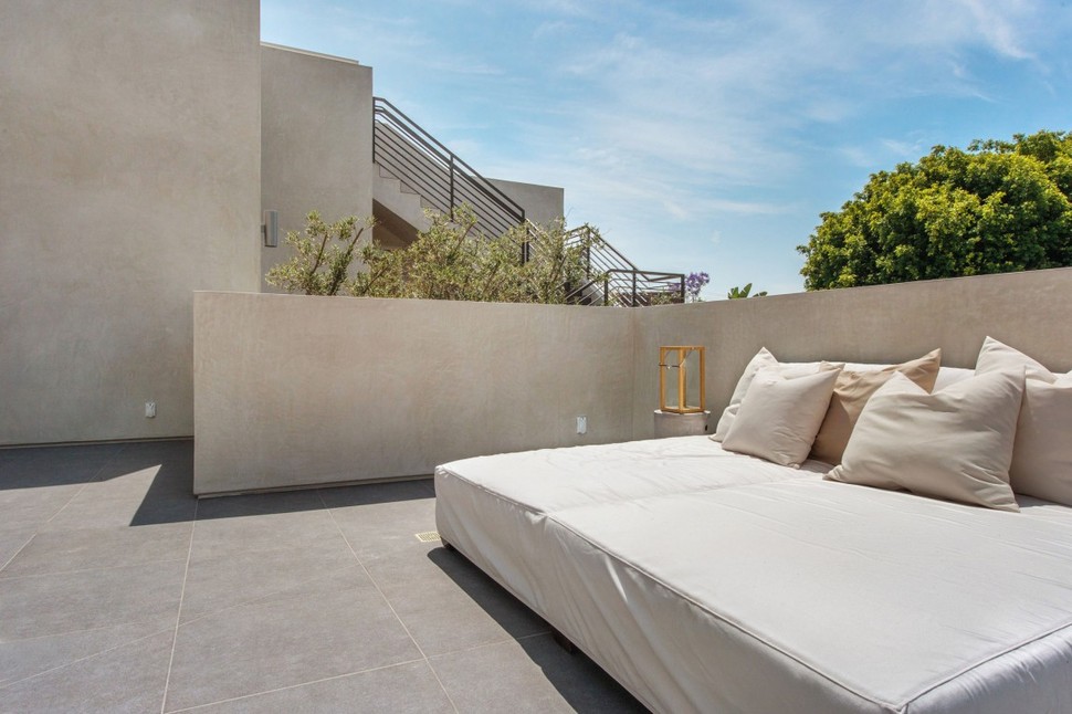
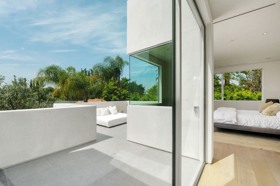
The master bedroom’s private deck is the largest, featuring a two-person lounging couch and plenty of floorspace to spare. It also features a sliding glass door for access, as opposed to the smaller, more traditional doors stemming from the smaller bedrooms of the structure.
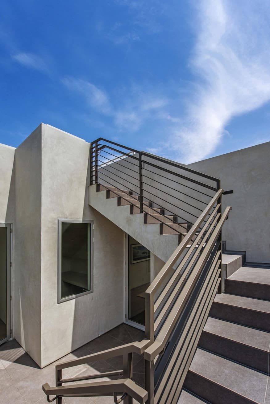
Back on the other deck, a set of stairs (which is carefully folded to avoid getting in the way of window views) leads up to the home’s roof, an outdoor third floor living space of sorts.
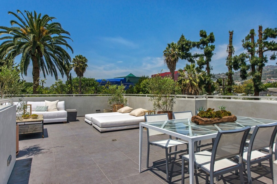
Up here, a full luxury living space showcases the surrounding landscape of West Hollywood, filled with palm trees. The top deck contains living and dining spaces with an eye toward hosting guests.
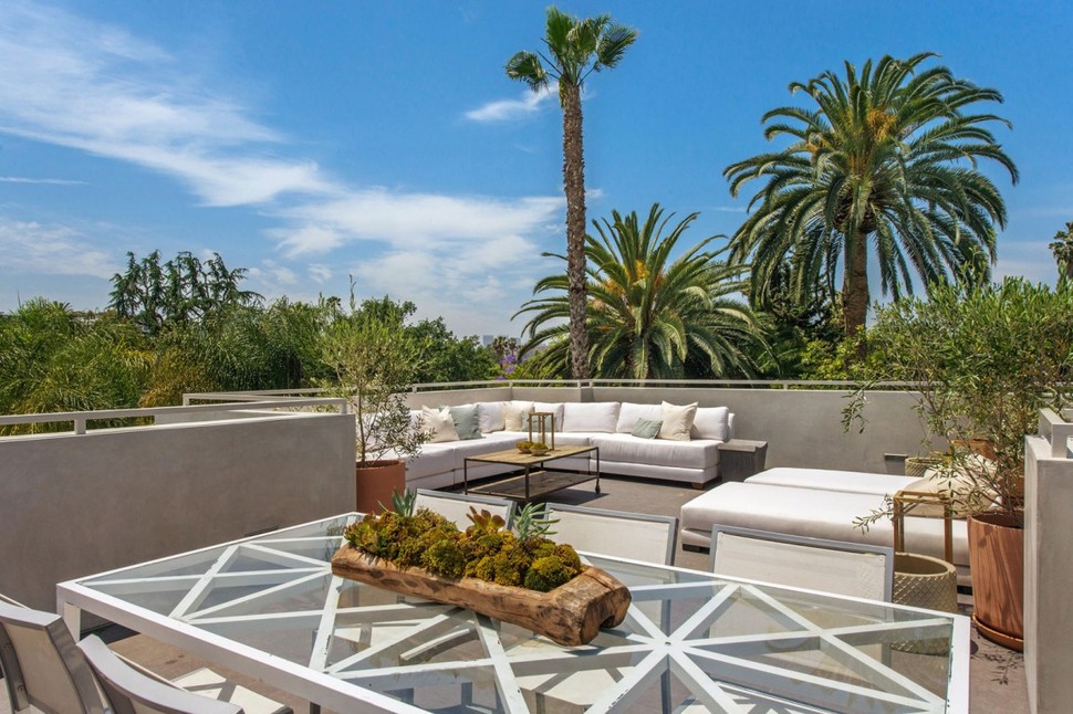
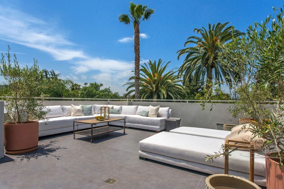
The dining table and couches could fit more than a dozen people, with plenty of room left over on the roof for mingling. This makes it the perfect place for parties or casual social gatherings whenever the weather cooperates.
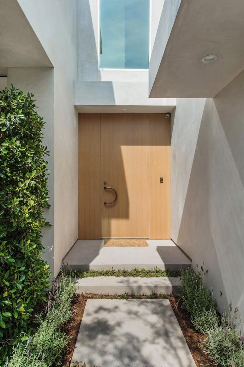
Back at the front of the dwelling on its first floor, a bright wooden door tucked back between the garage and living rooms provides a relatively unadorned entryway for such an impressive house.
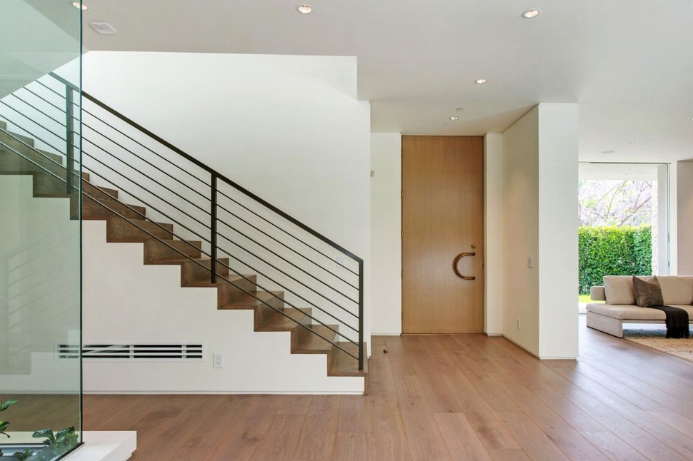
Inside, a stairway provides convenient access to the upper floor, but is placed to the side to be out of the way of the open floorplan which opens up in front of anybody entering the home.
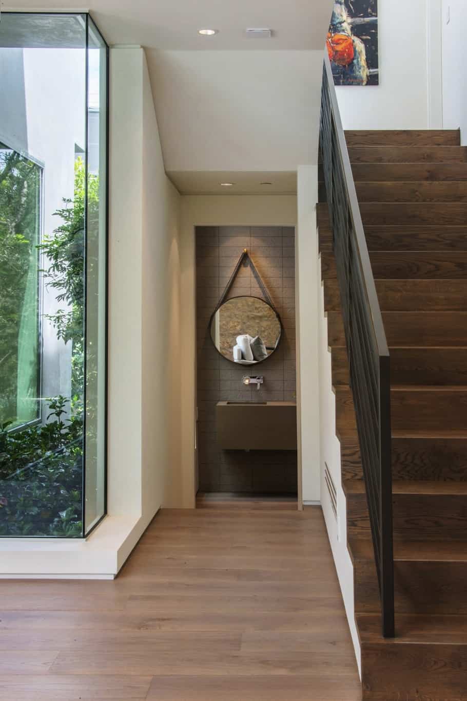
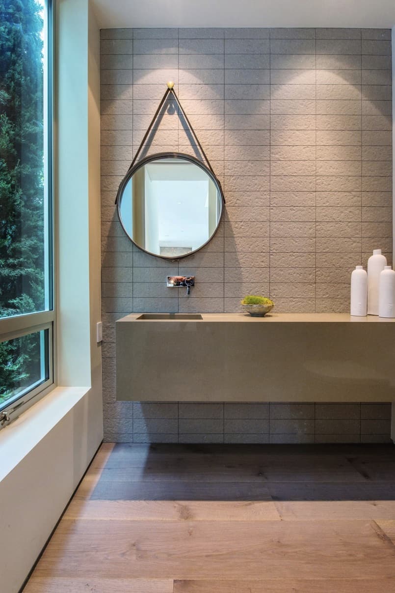
Tucked behind the staircase, a small common bathroom fulfills the practical needs of the first floor without getting in the way of its major rooms.
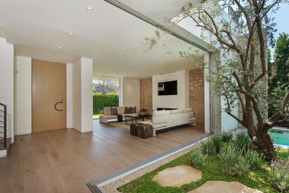
The living room occupies a wide space to the opposite side of the front door, with a large wall-length window in the front to bring light in and another at the back to showcase the landscaping and pool there.
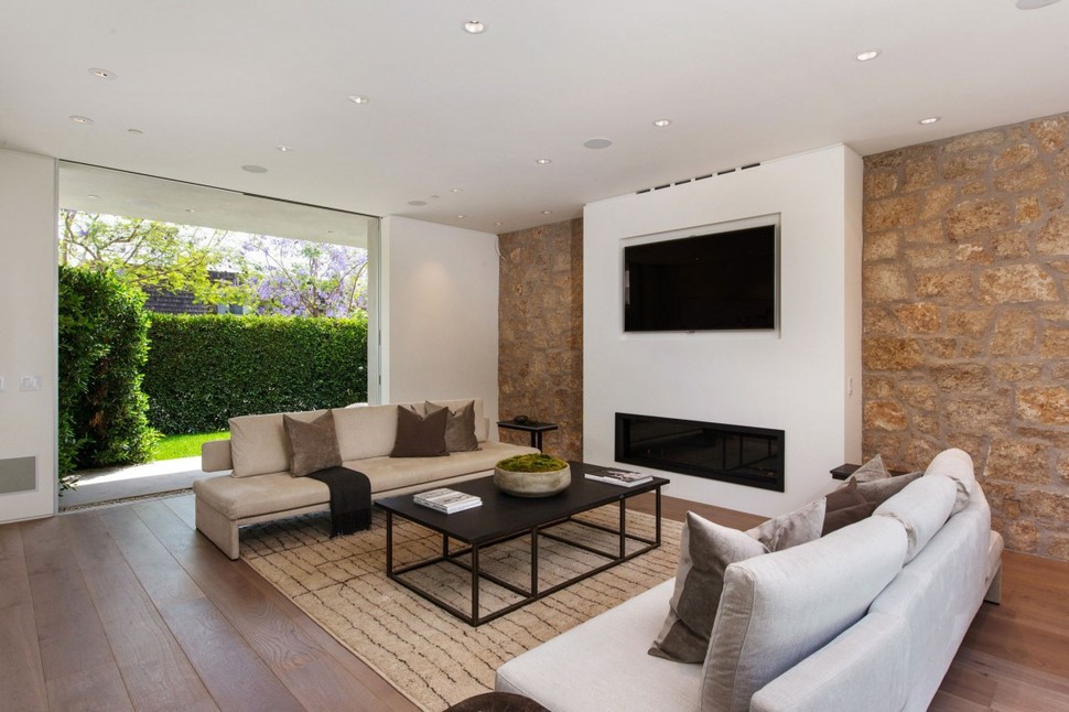
The rear of the room is finished in rough stone, a contrast to the smooth white seen both inside and out almost everywhere in the house. Couches are arranged to put a focus on social interaction rather than television entertainment.
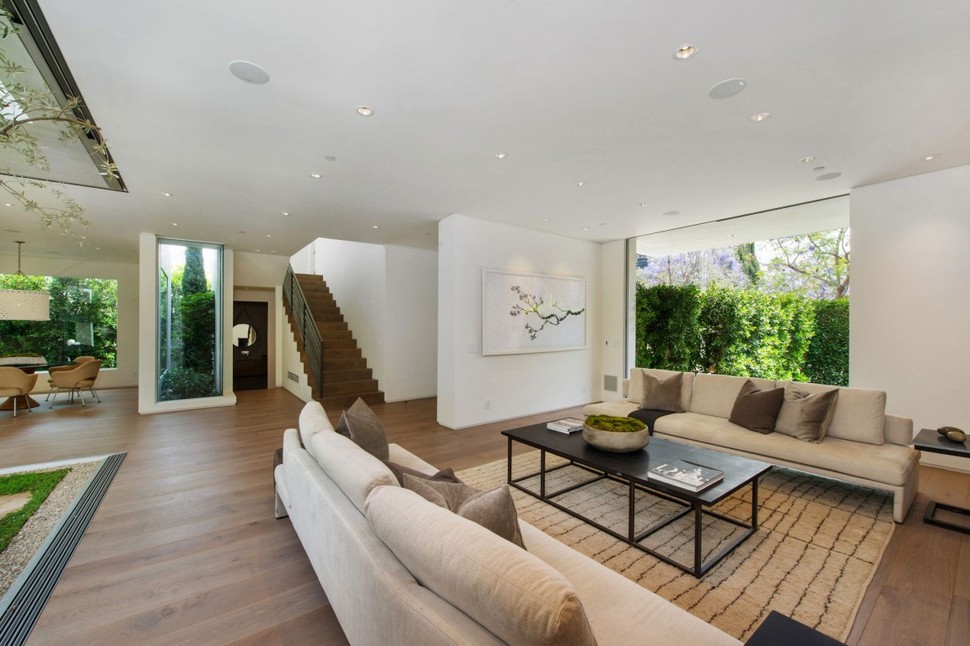
A piece of artwork breaks up the monotony of the opposite wall, with a branch theme echoing the branches of the tree just beyond the room’s window.
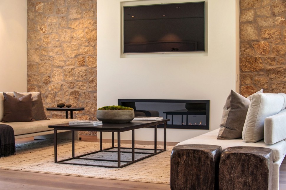
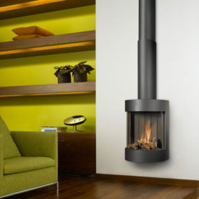
The home’s two fireplaces are both gas-powered and very minimalistic, set behind a glass viewing window in a black metal frame. One of the fireplaces is here in the living room, while the other is in the master bedroom.
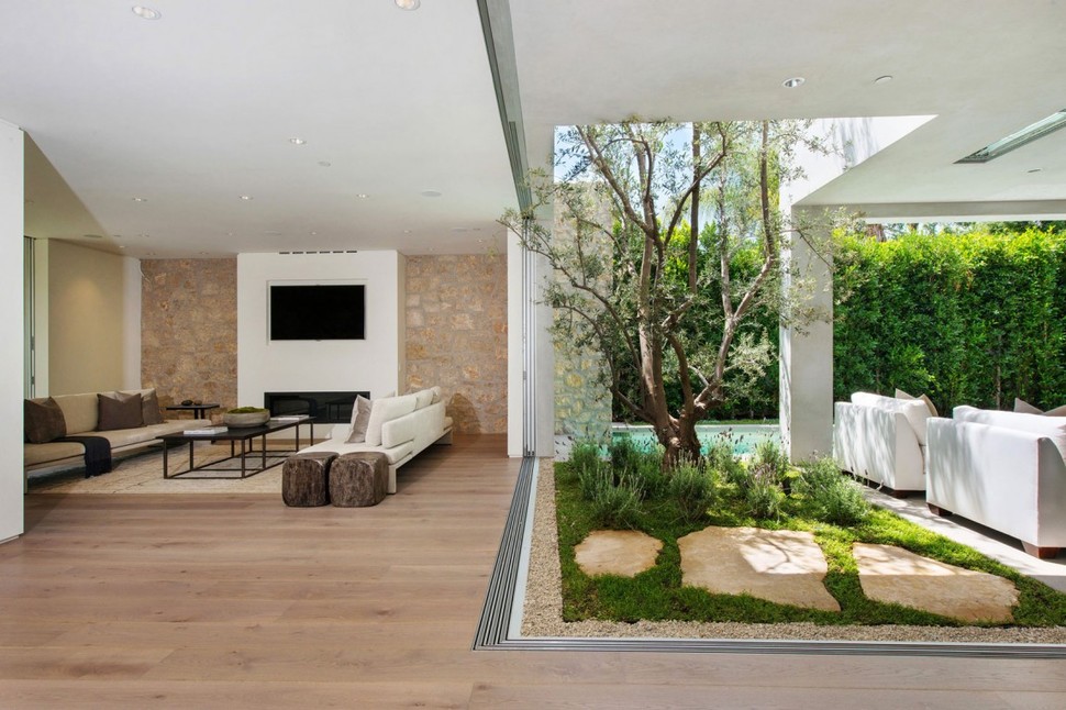
The home’s garden cutout at the rear truly enhances the openness of the interior, providing sight directly into the kitchen and its patio from anywhere in the living room. The plants contained within, including a large tree, bring a touch of nature inside.
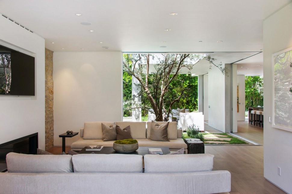
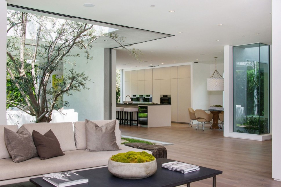
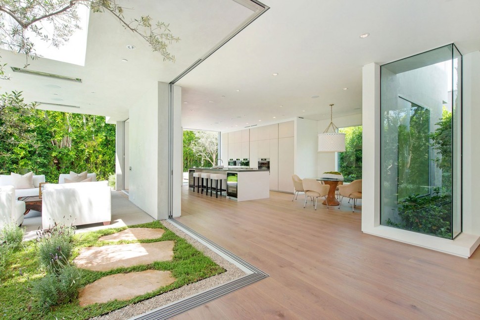
Near the staircase, and additional, smaller window set is cut out of a wall corner, providing further views of the lush green gardens grown on the home’s lot.
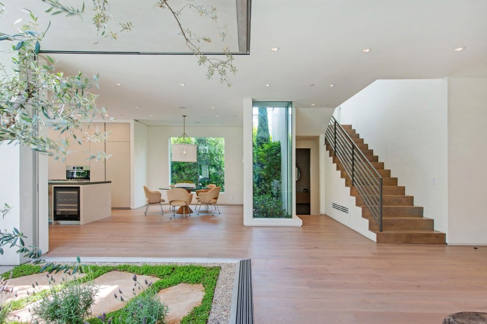
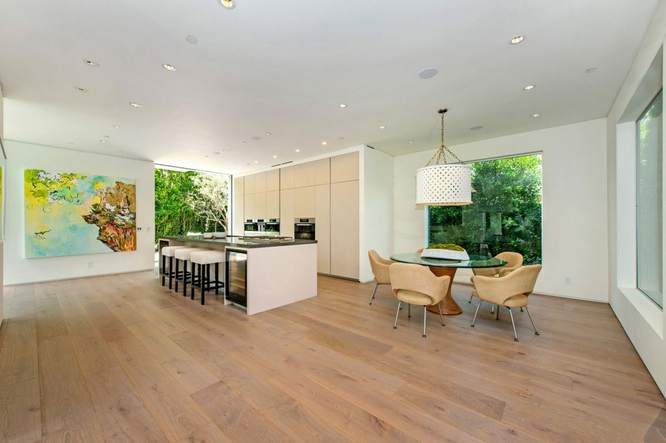
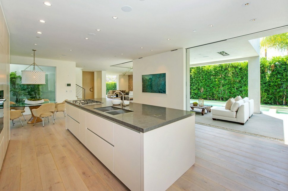
The kitchen itself is the most open room of the entire residence, with free space taking up almost half of its square footage. A casual dining table sits in one corner, while luxurious cooking facilities line the rest of the side of the space.
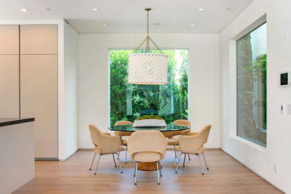
The table is framed perfectly by two windows, creating a visually pleasing symmetry to its placement. A hanging light fixture overhead further solidifies the permanence of the eating space.
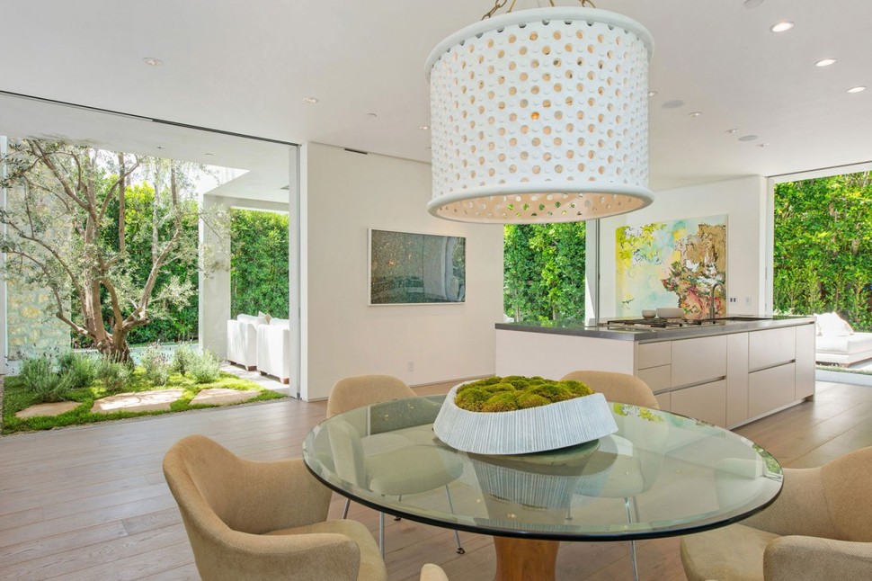
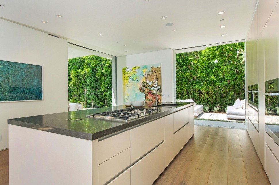
All of the counter storage in the kitchen is mounted flush to the edge of the countertop, with cutouts at the top of each drawer to pull from. Except for the faucet and stovetop, the counters have an uninterrupted rectangular profile.
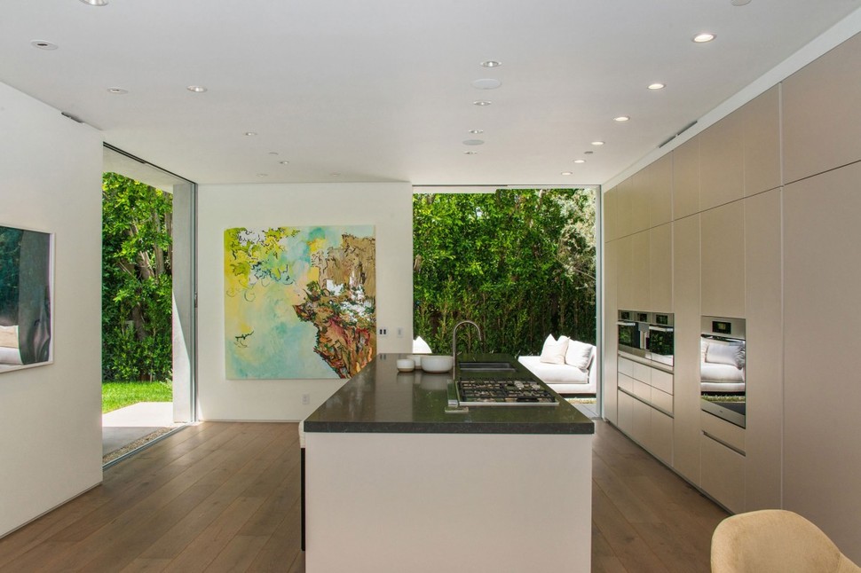
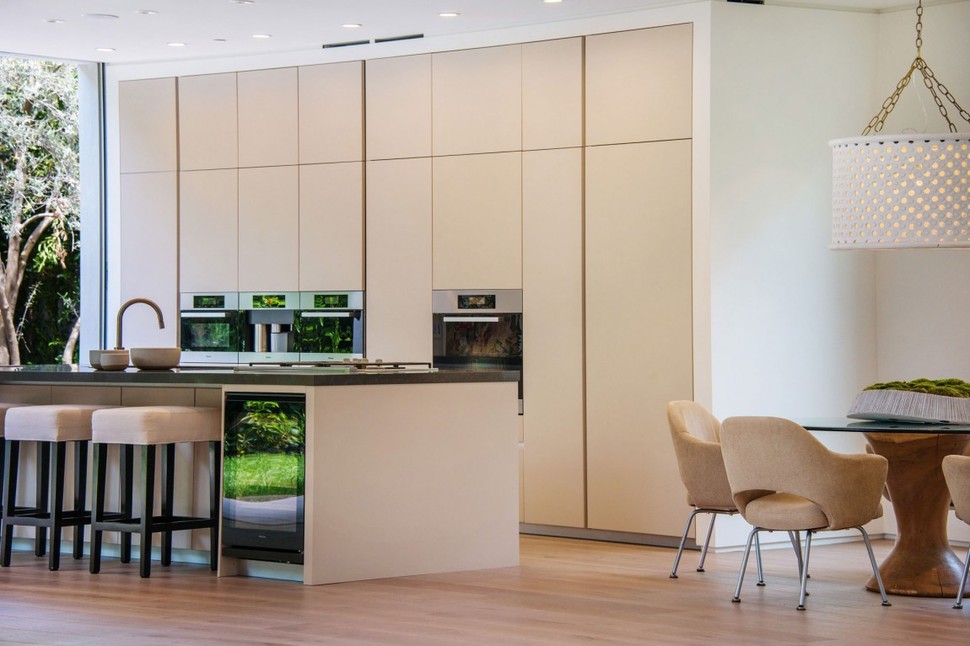
The service side of the counter includes two wine fridges with a short three-person bar tucked between them, allowing for casual eating by day with minimal preparation or cleanup required.

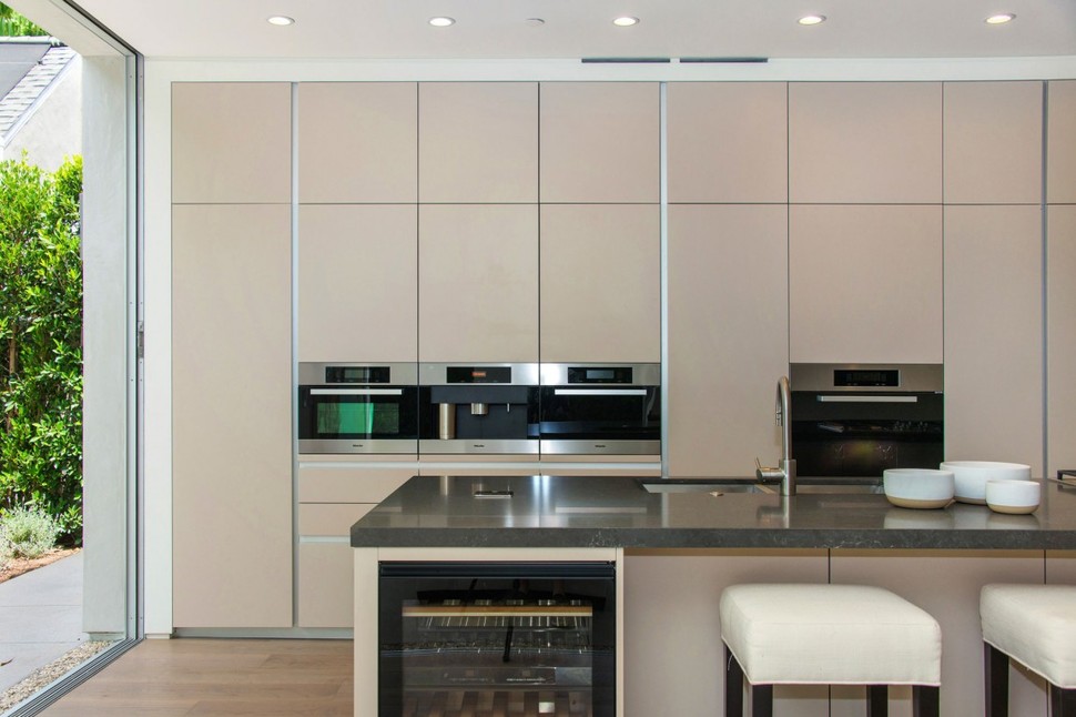
As with the counter’s drawers, the cabinets lining the oven wall are also all flush-mounted. There is very little protruding that might get in the way of preparing a meal.
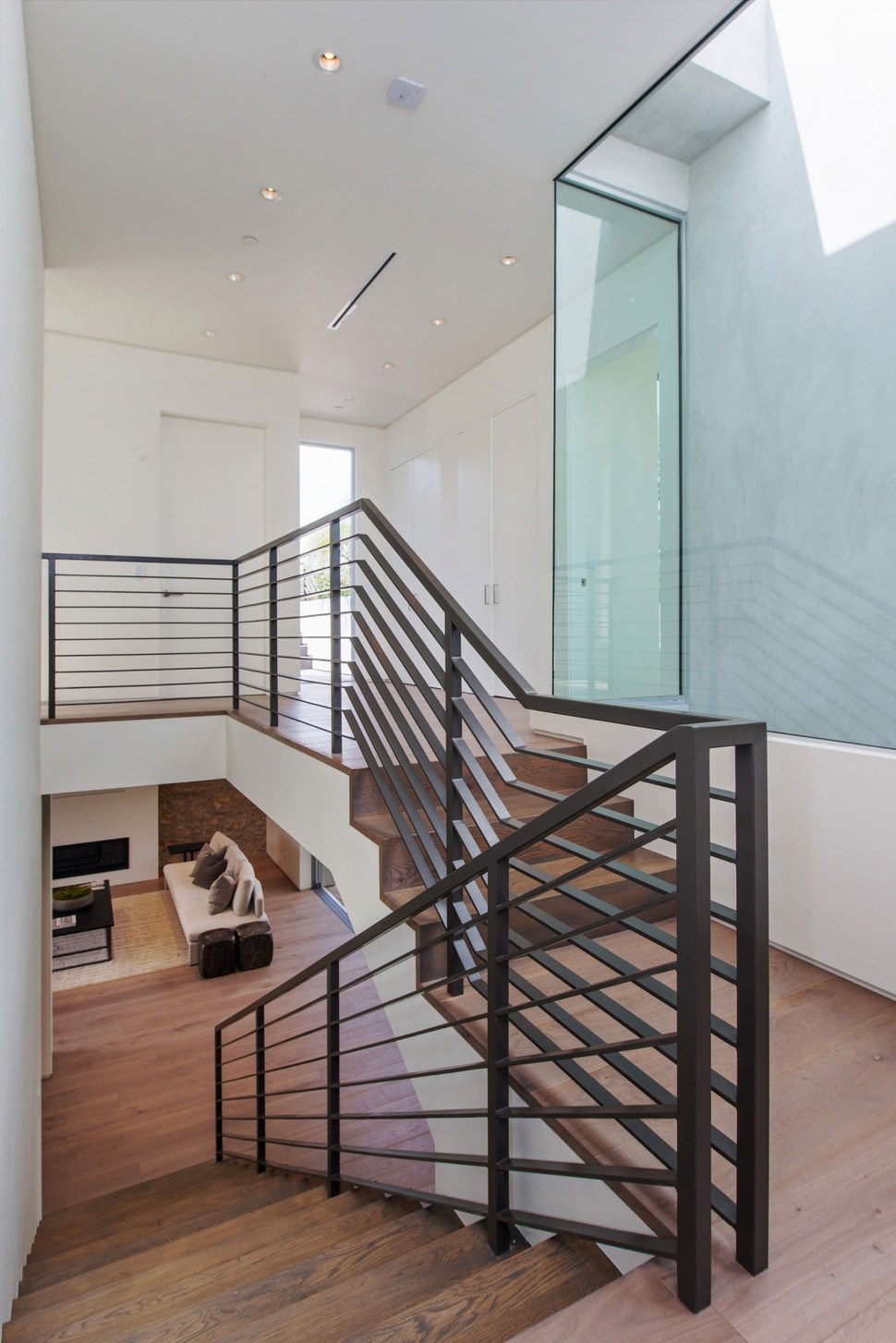
Two stairs and a few steps more leads to the landing of the upper floor, from which you can walk to any of the home’s private bedrooms or directly out onto the side deck which has a staircase leading to the roof. Guests can navigate these stairs to go to the rooftop without ever having to enter a private space.
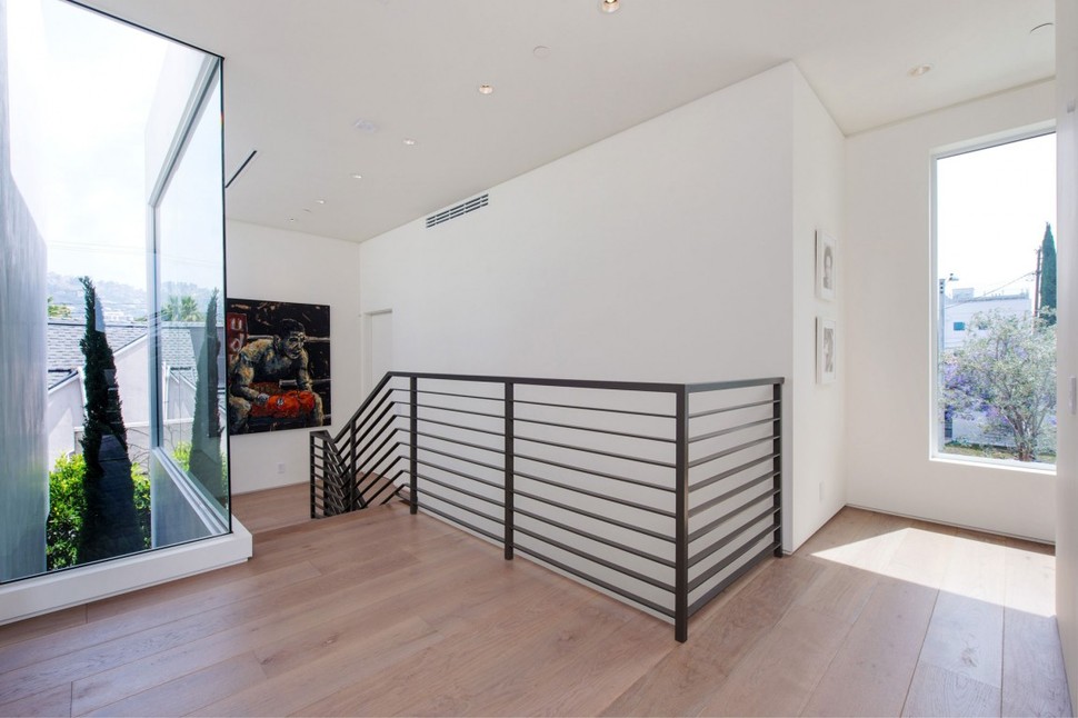
As with many of the home’s glass window sets, this one reveals a little bit of vegetation built into the crevasses of its architecture.
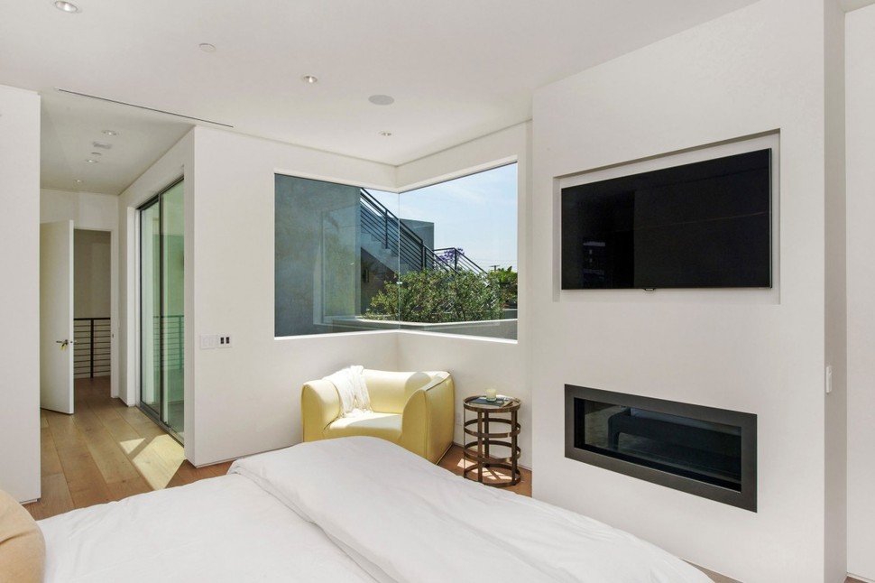
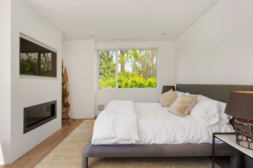
The master bedroom, home to the dwelling’s second fireplace, has the most window space of any private room inside. Its windows open to the side and to the rear, where passing eyes are less likely to see inside than at the front of the building.
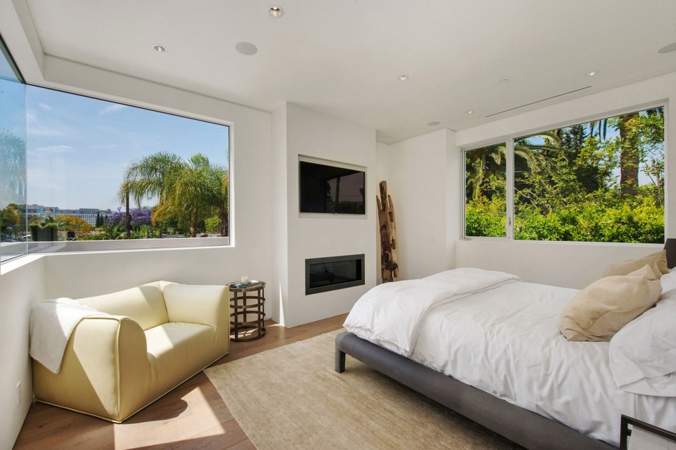
The room has space enough for a small reading chair, an entertainment center, and plenty of room to stretch out and walk around in. A rug underfoot adds warmth to the space and frames its bed.
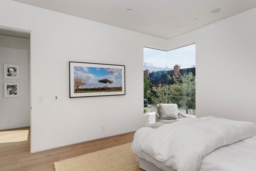
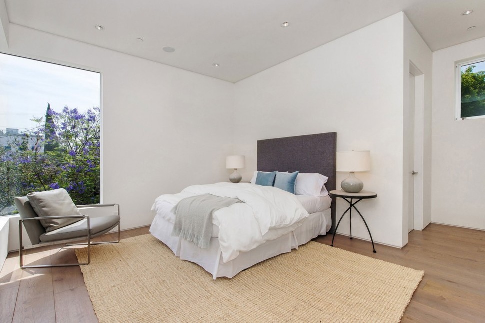
This second bedroom, the last area in the house to contain a corner window, uses cooler blue and grey tones in place of the creamy yellow color which was more common in the master bedroom. However, its physical format is largely the same, with a chair in one corner and access to its deck and bathroom near the edge.
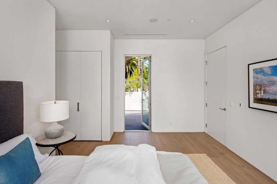
This room leads out to the shared deck underneath the staircase to the roof.
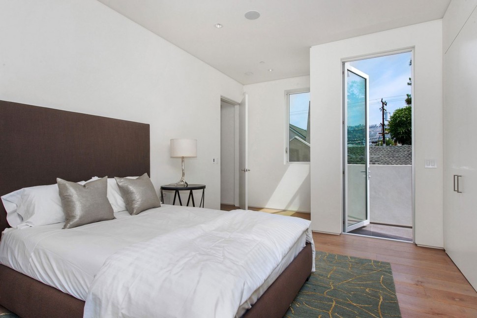
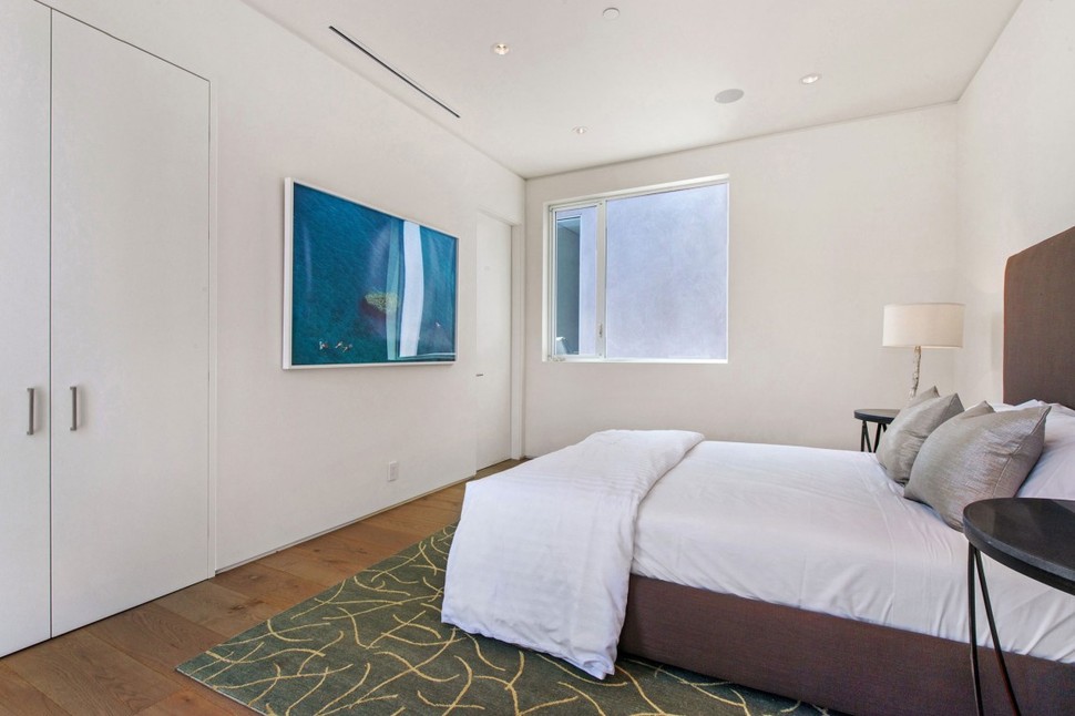
The third and final bedroom is done up in even more subdued tones than the last, with its only touch of color coming from the carpeting and floorboards. This is the room which leads out onto a front-side deck instead of the array of decks on the left side of the house.
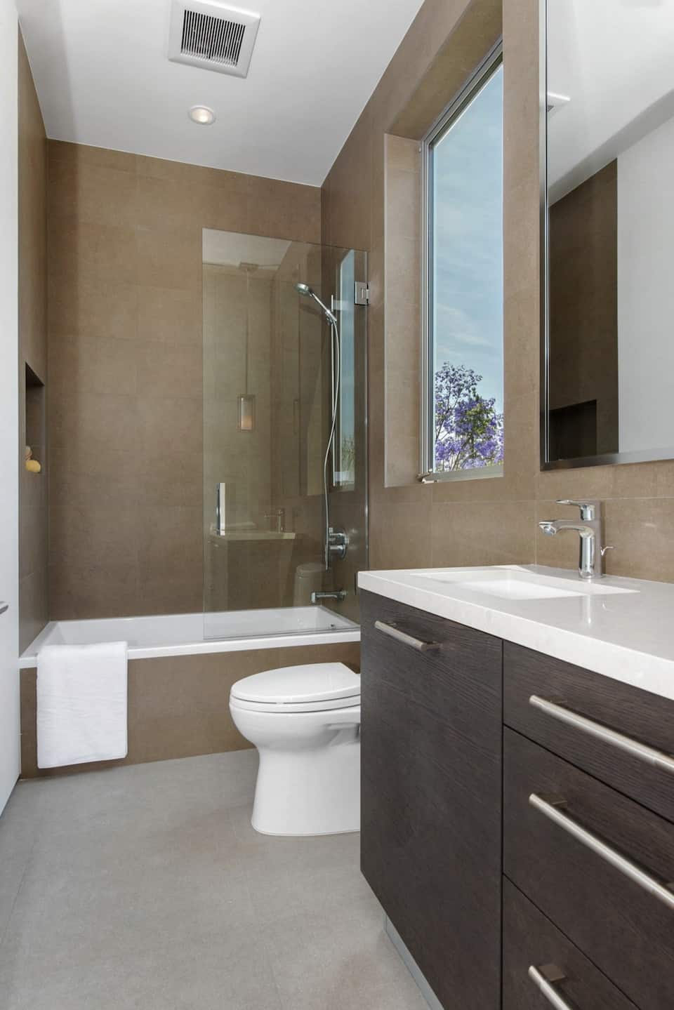
Each bedroom has its own bathroom, each of varying size in accordance with the room it’s linked to. The third bedroom, which we just took a look at, his this compact space with a combined tub and shower, finished in comfortable mud tones.
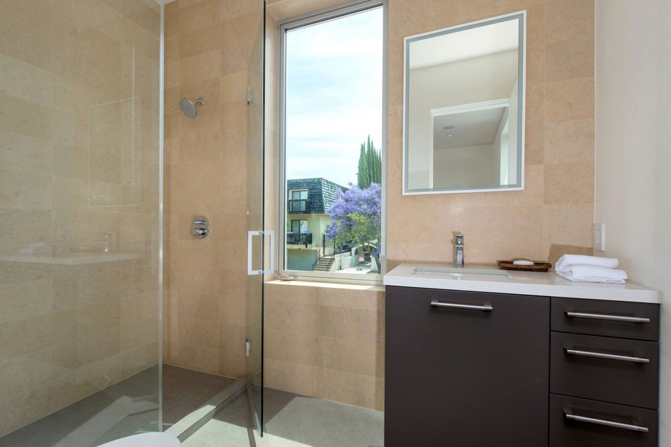
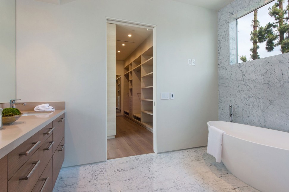
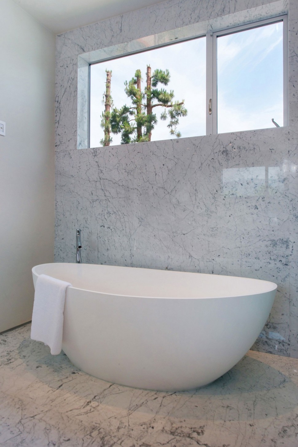
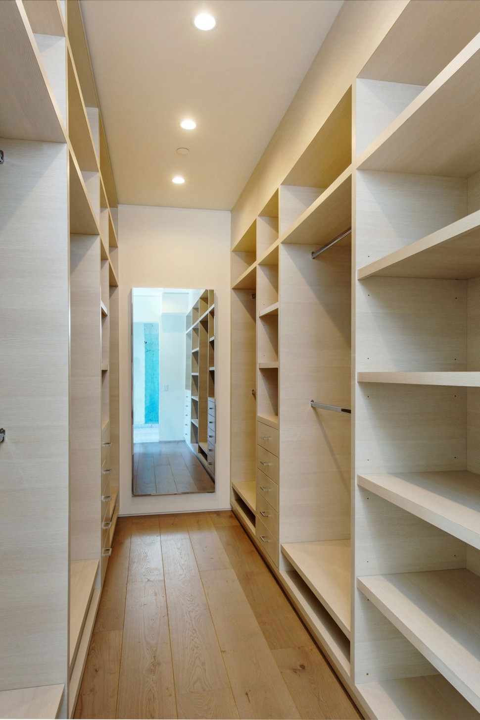
The second bedroom is paired with this luxurious larger bathroom, featuring a full walk-in closet and freestanding tub.
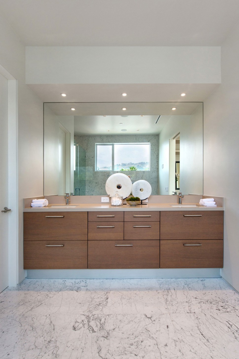

The room is lined in marble on both the walls and the floor, covering every available surface on one side of it while traditional wall finishes are substituted near the sinks.
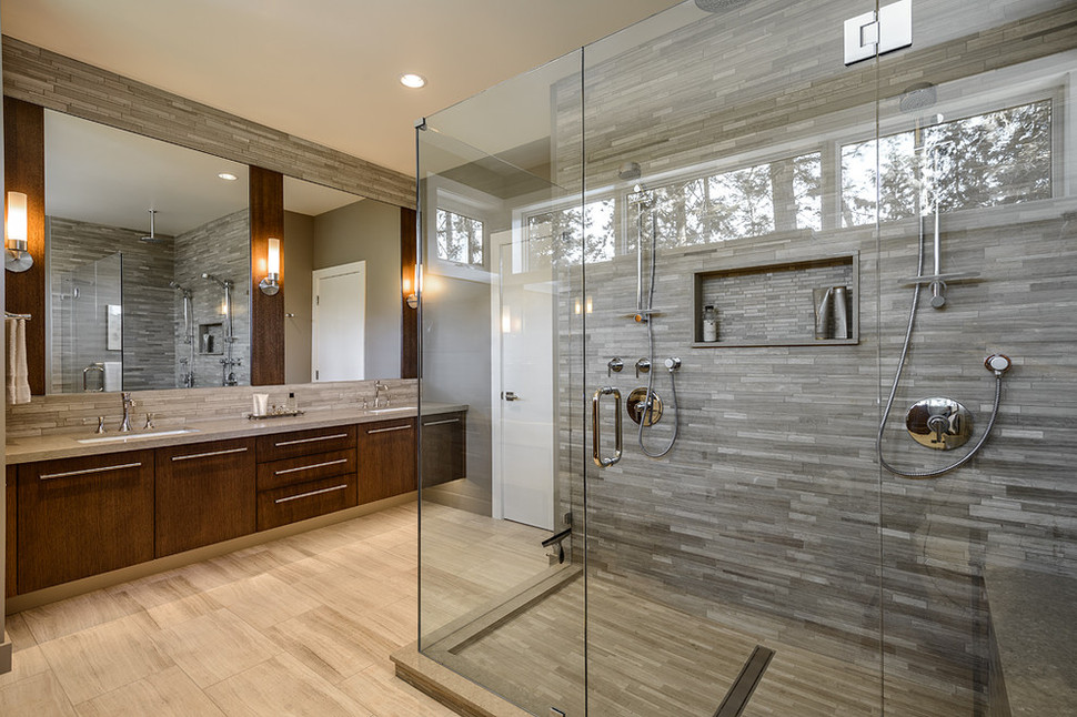
While the elegance of the last bathroom was impressive, there’s no mistaking it for the grand master bathroom, decorated in dark wood tones and two different styles of tile for the walls and floor. The room features two separate shower stalls and plenty of counter space near both sinks, with open floors between every amenity.
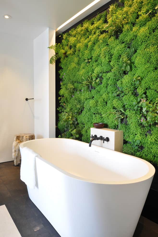
The master bathroom brings in themes from outside decisively, with a whole wall covered in plant life framing its large freestanding tub.
Amit Apel Design
