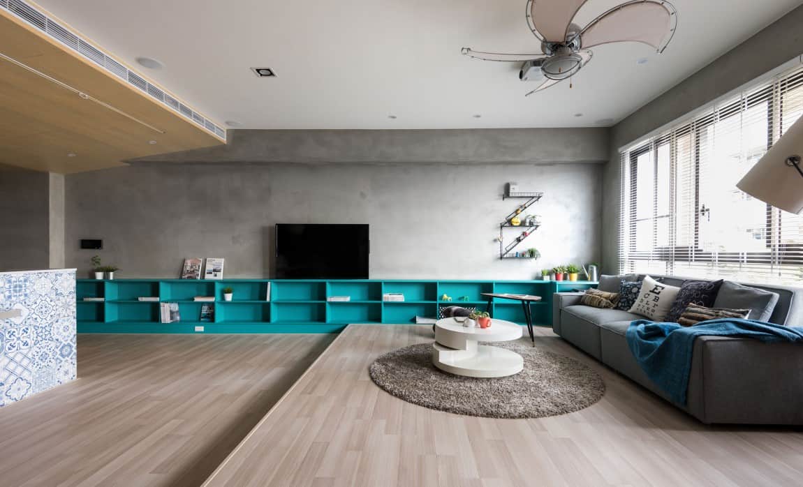
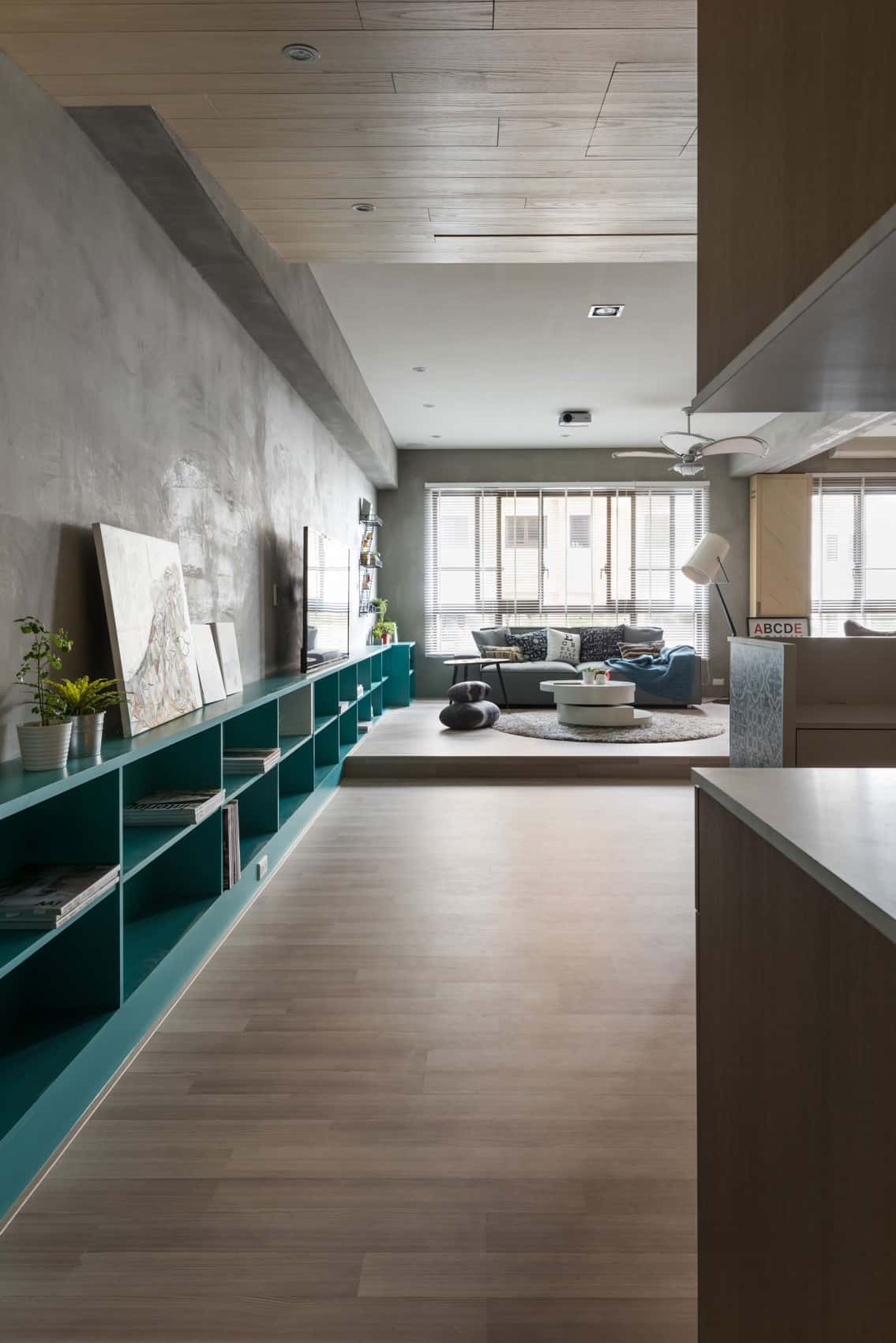
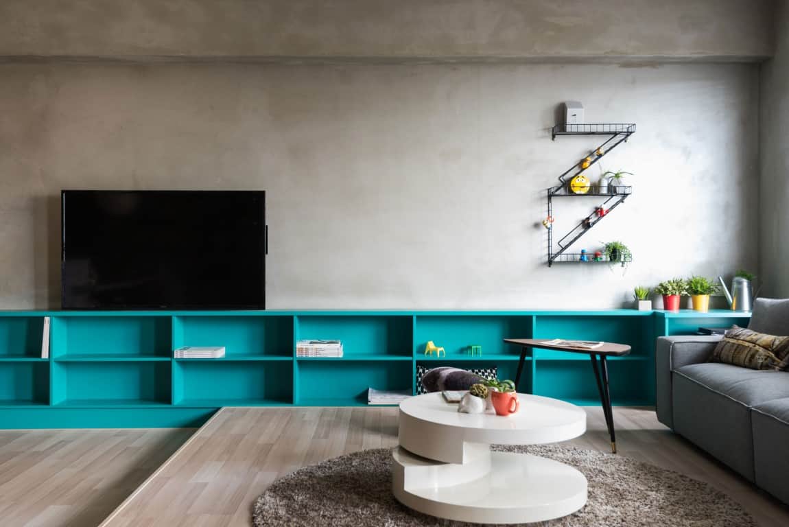
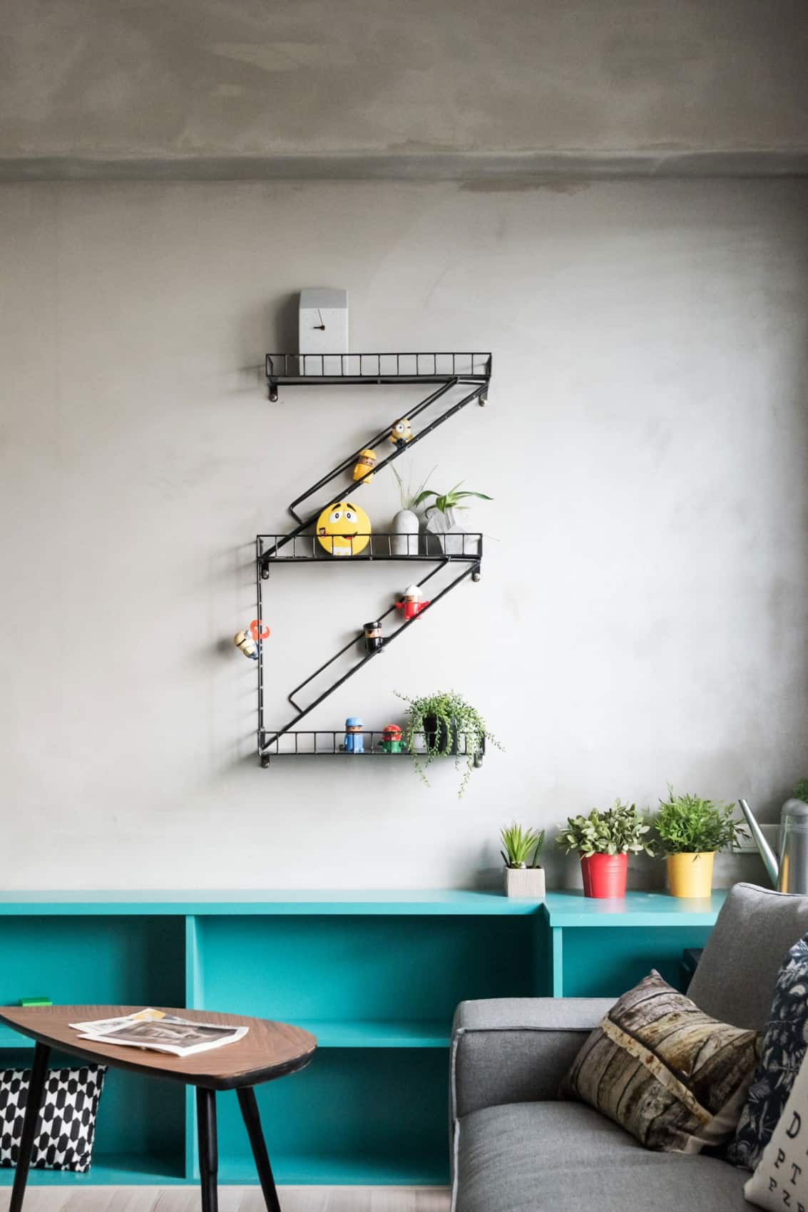
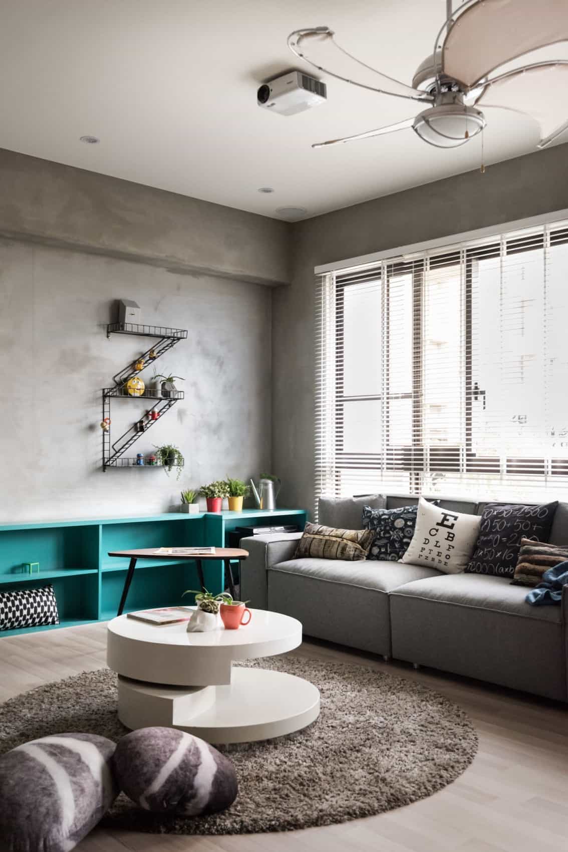
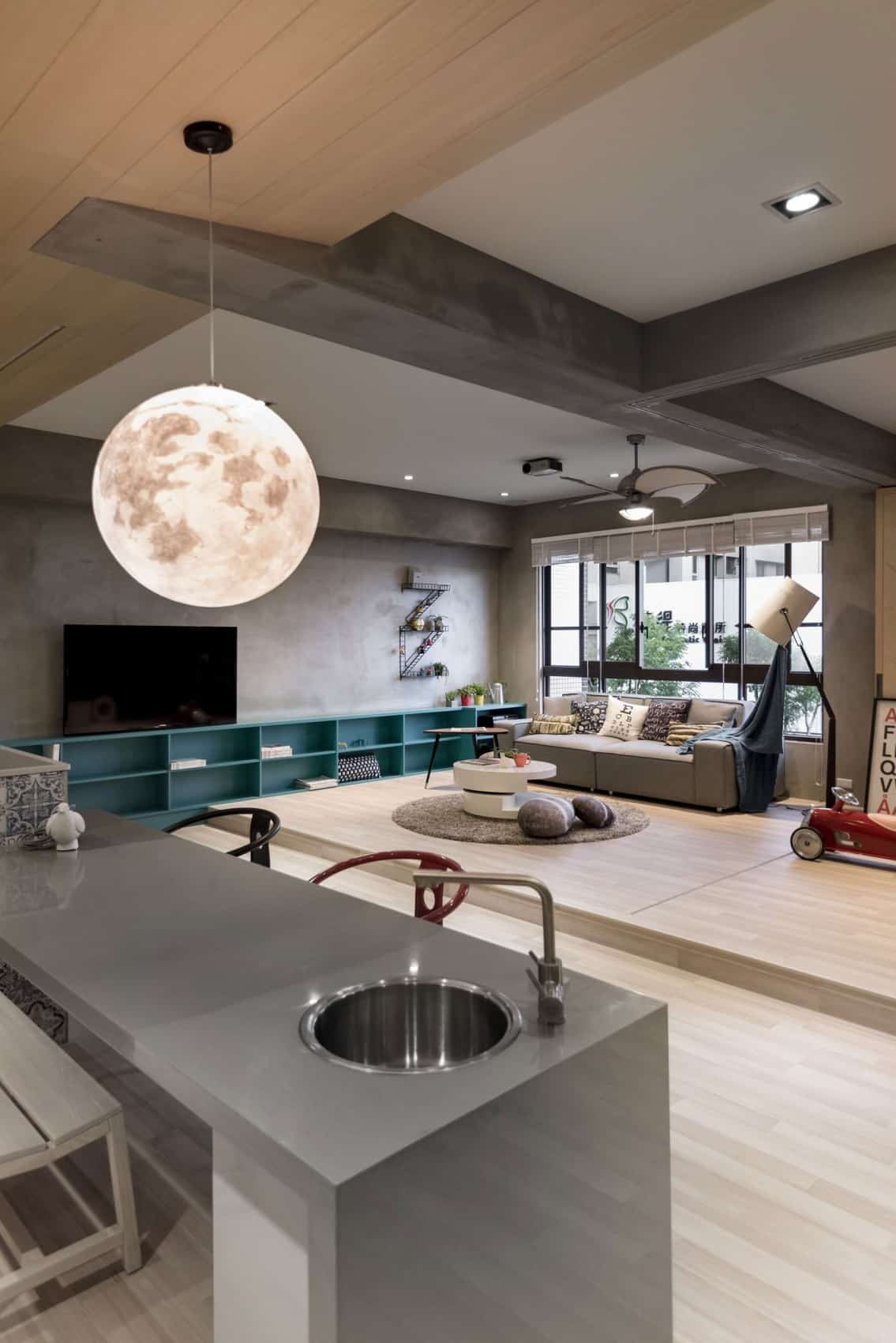
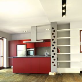
If this isn’t one of the best examples of how to define a space with a low storage wall system, we don’t know what is. It’s fantastic. And we really like the color, too. It really pops in a plain room – that wall is pretty boring. Running down the length of the cement wall really gives it presence. And when the living space changes into the kitchen space, the shelf gives it continuity. By HOA Design of Taiwan, it’s low slung and just full of storage room. You could even use it as a bench. And we love the whimsical wall shelf, with the wooden characters going up the escalator. A playful way to look at storage design. We think they’ve got a winner!
