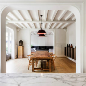
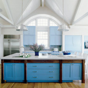
Exposed trusses are traditionally found in barn style house designs or renovated warehouses but more and more often architects are choosing to incorporate this feature in new homes to offer a sense of times past to a house that has no history. When incorporating trusses in a new house, painting them white is a great way to keep an urbanized aesthetic but white can often come across as dull and uninteresting. Luckily in this case black details where layered into the design to create a dynamic and exciting modern decor.

Located in Sydney, Australia, the gorgeous Fairlight House is the project by Luigi Rosselli Architects and Decus Interiors. By working together the decor of the home is as much a part of the architecture as the architecture is a part of the decor. Photo by Justin Alexander.
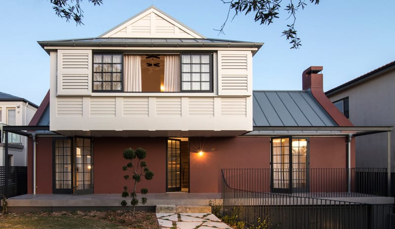
Even the approach to the home is a study of white and black with a swathe of Ox Red thrown in for good measure. Photo by Edward Birch.
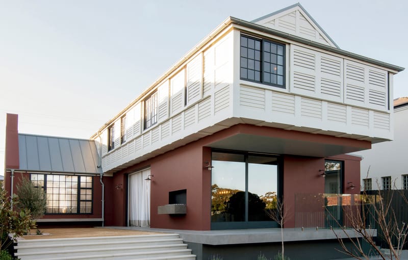
The back, like the front cantilevers its upper volume past the facade to create shade for the concrete decks below and both sides are covered in laser cut plywood shutters for cross ventilation allowing the home to be air conditioning free. Photo by Edward Birch.
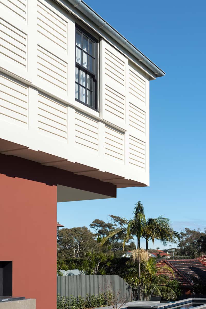
The Ox Red on the masonry was chosen to pay homage to the color of the clay bricks used traditionally in hearths – again layering in a sense of history. Photo by Edward Birch.
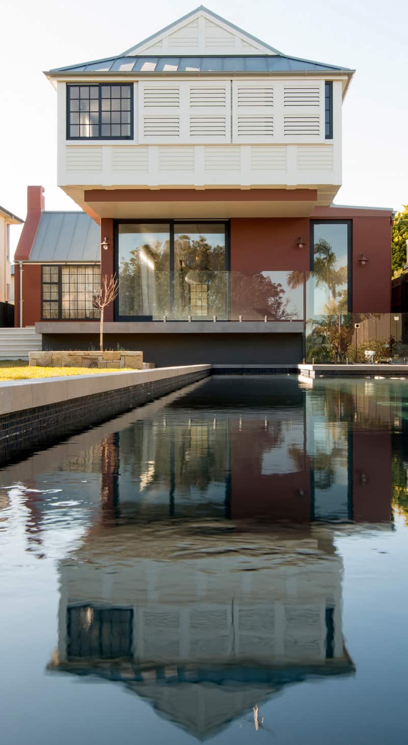
The backyard features a swimming pool with dark blue and black mosaic tiles around its circumference, thus repeating the aesthetic of black details used throughout the home. Photo by Edward Birch.
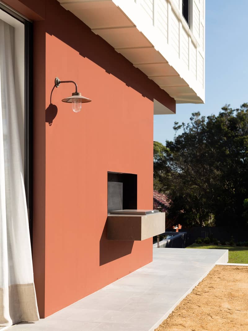
For outdoor cooking, a built in Electrolux BBQ is partially recessed into the wall next to a pair of sliding doors. Photo by Justin Alexander.
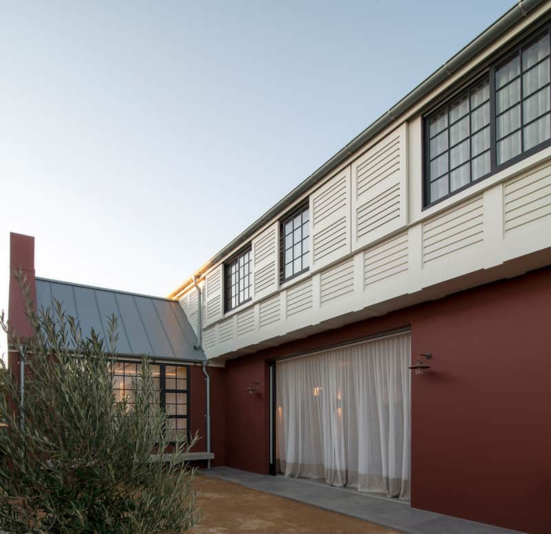
The full height glazings slide back into wall cavities, creating a seamless transition from outdoor to indoor zones. Photo by Edward Birch.
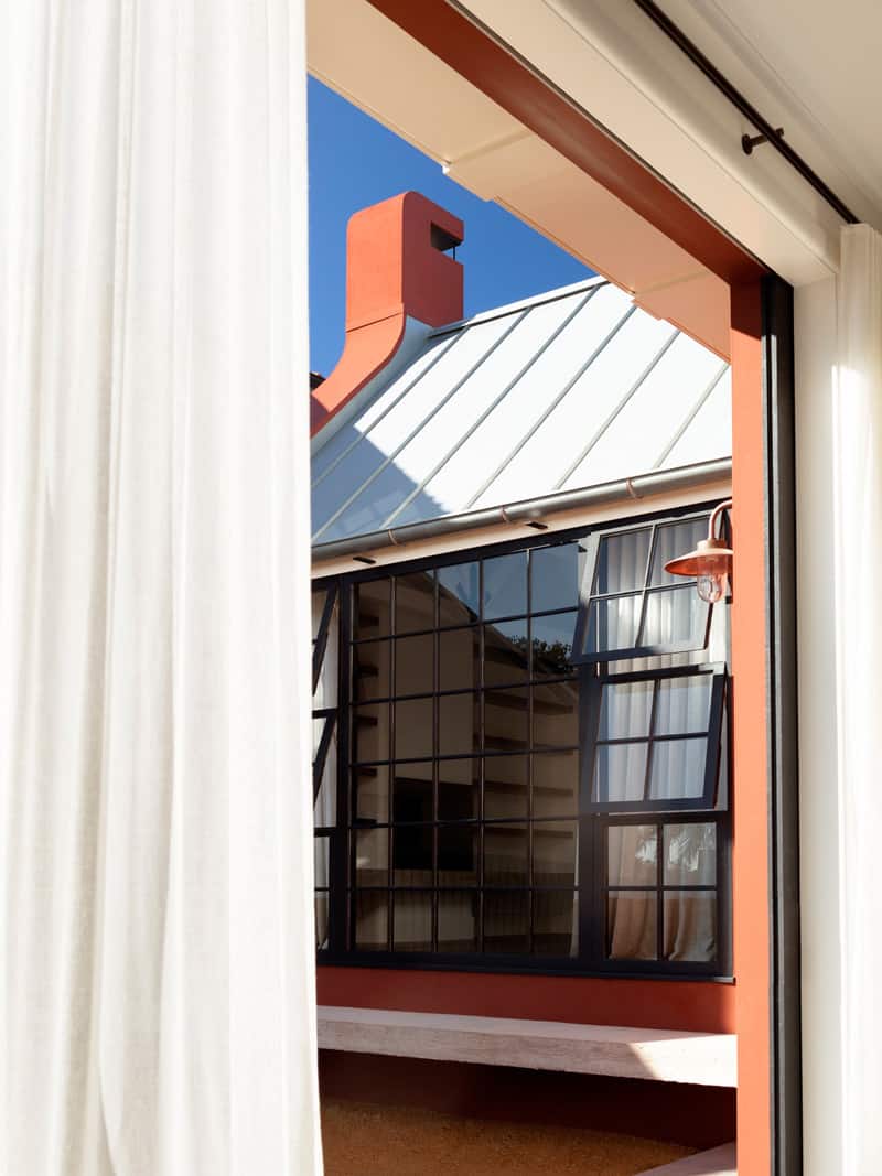
This cantilevered concrete bench is positioned just outside from the library area, making it easy to grab a book and read outside. Photo by Justin Alexander.

The library flanks both sides of the fireplace, which also has a cantilevered concrete bench, or hearth. Photo by Justin Alexander.
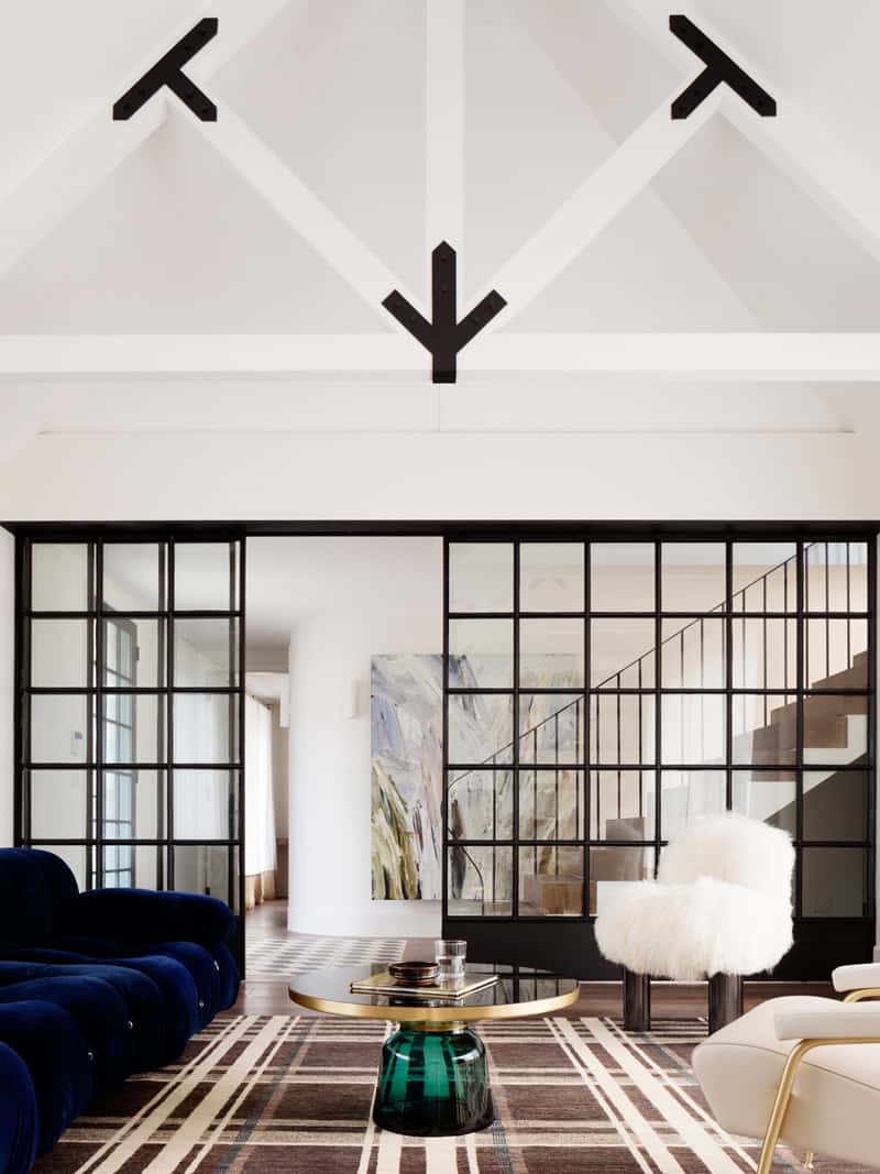
The client envisioned a home with a fireplace, steel framed windows, high cathedral ceilings and soft furnishings, I think the architect and in-house designer fulfilled and went beyond her wish list, especially with the amazing trusses and the sliding black steel partition whose grids are repeated in the area rug – clever. Photo by Justin Alexander.

The front door repeats the black steel pattern of the sliding partition and while there is no area rug per say, the inlaid tile rug picks up on the geometry and layers in a bit of optical illusion at the same time. Photo by Edward Birch.
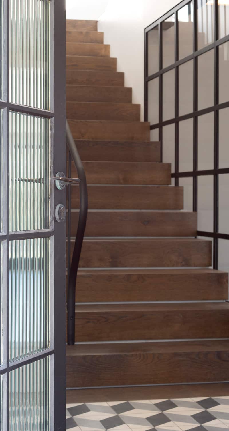
Broadline glass is used in the front door to obscure the view while at the same time creating a repeat pattern to the vertical rods in the steel balustrade next to it. Photo by Justin Alexander.
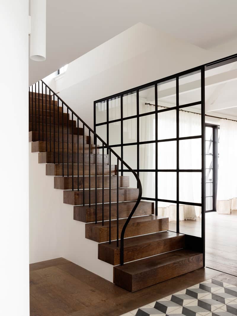
The oak stairwell is designed to mimic solid blocks of wood, which creates equilibrium to the thick ceiling trusses. Photo by Justin Alexander.
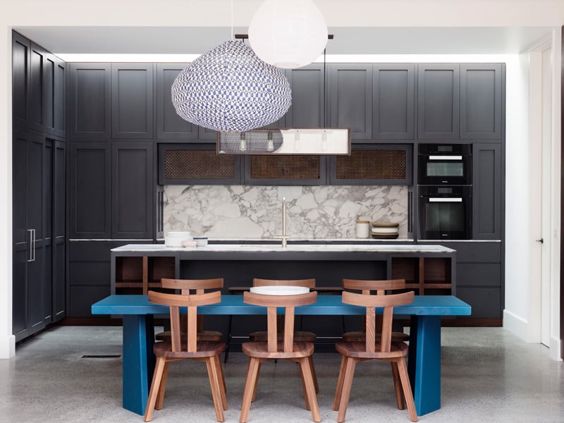
The Fairlight House kitchen has a more intimate design with ceilings starting just above the cabinetry. The black detailing is reserved for the ovens while the paneled joinery (by Sydney Joinery) is a few shades darker then polished concrete floors. As with the punch of blue in the living room couch, Decus Interiors has integrated a punch of saturated blue only here it is in the Classicon Pallas table and the Tekna Nautic Porteath Pendant light. Photo by Justin Alexander.
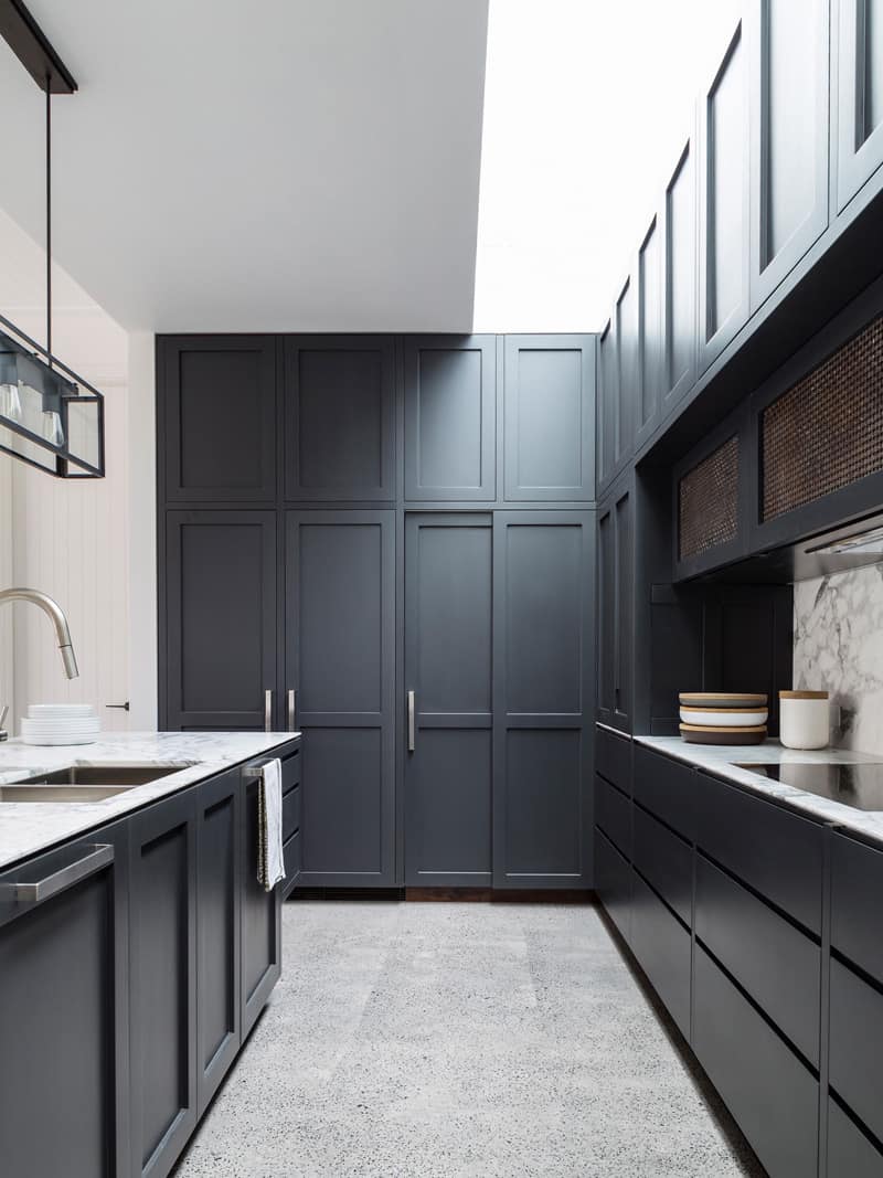
Two fridges and a pantry are hidden behind full height doors and a Statuario marble is used on the countertops. Photo by Justin Alexander.
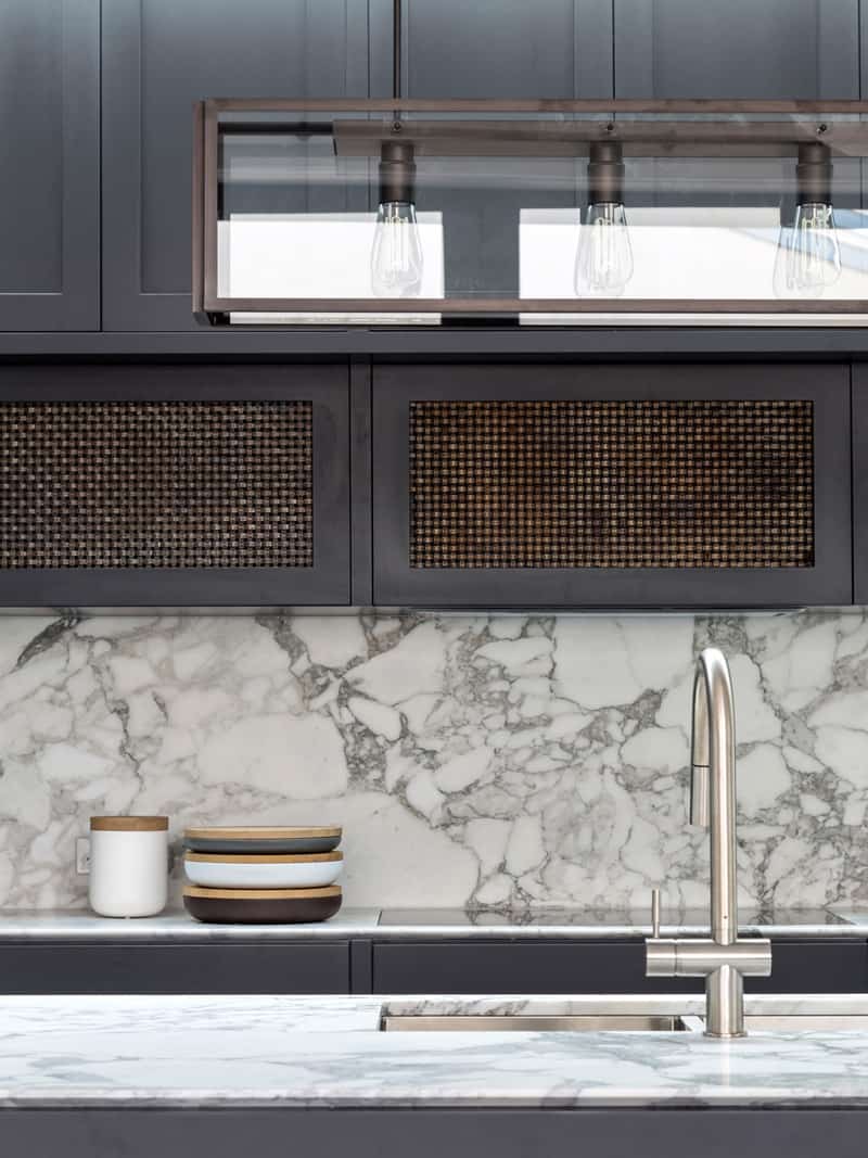
The graining in the marble continues the theme of grey. Photo by Justin Alexander.
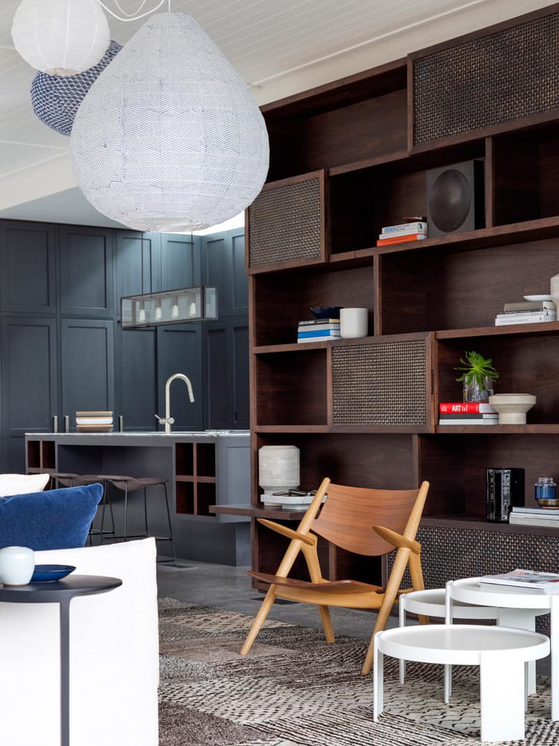
Next to the kitchen is a family room with more pops of blue in the Tekna Nautic Porteath Pendant lights and the cushions on the couch, but here the backdrop of choice is not grey but brown. Photo by Justin Alexander.
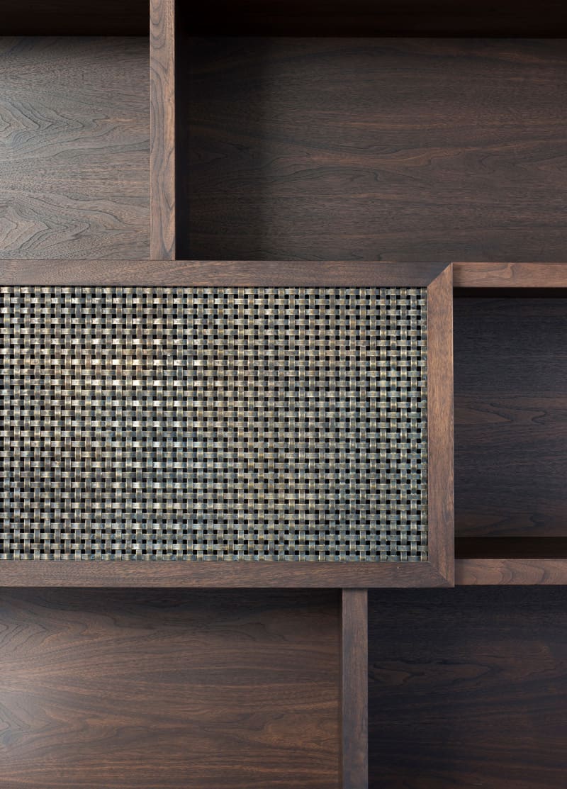
The main block of brown comes from the walnut stained shelving and as stunning as this joinery is, it’s the woven aged brass mesh that really catches my eye. Photo by Edward Birch.
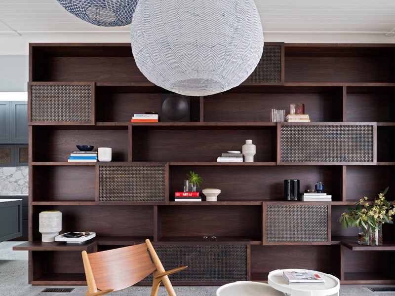
The closed mesh areas within the shelving unite create a relief pattern for depth and perspective. Photo by Justin Alexander.
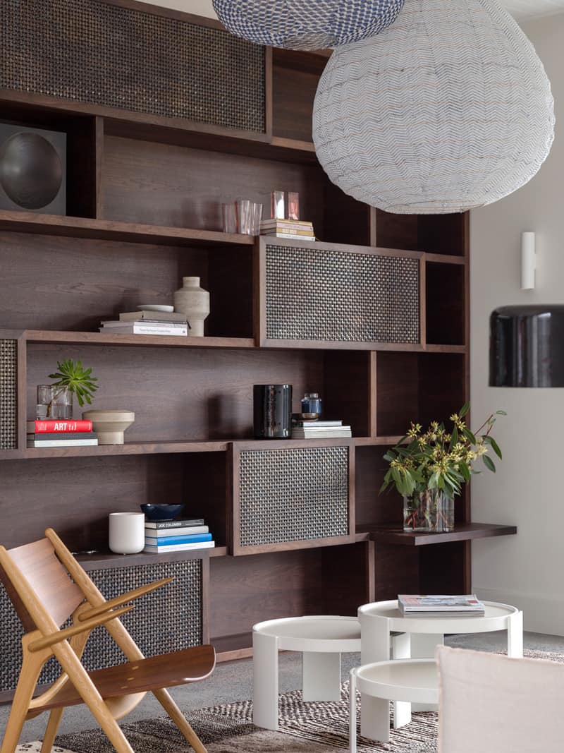
The large light pendants and the mesh panels add a solid graphic punch to the linear lines of the shelving. Photo by Justin Alexander.
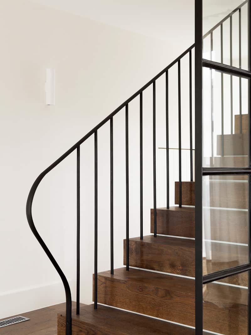
Upstairs is where the bedrooms are located. Photo by Justin Alexander.
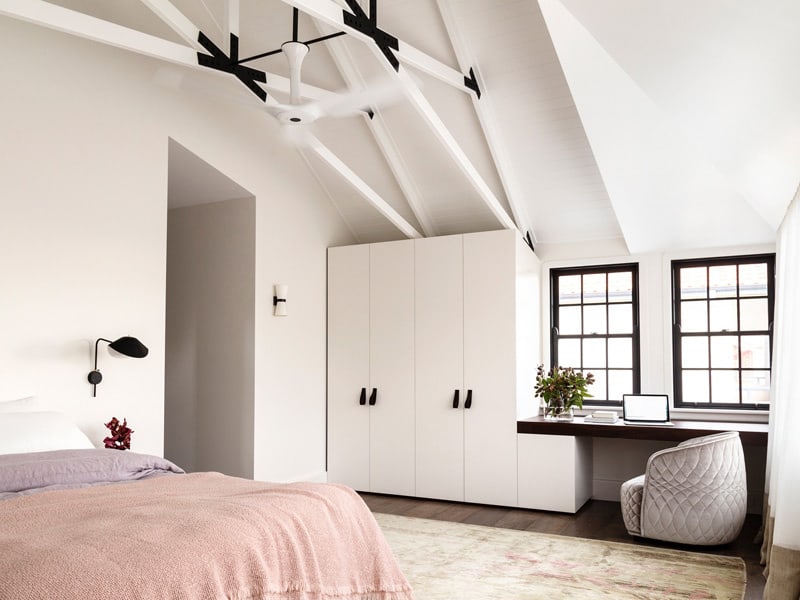
In the Master Suite a laptop station is positioned in front of the windows that overlook the front yard. Photo by Justin Alexander.
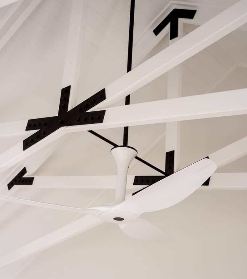
Above the bed a white ceiling fan visually disappears amongst the trusses. Photo by Edward Birch.
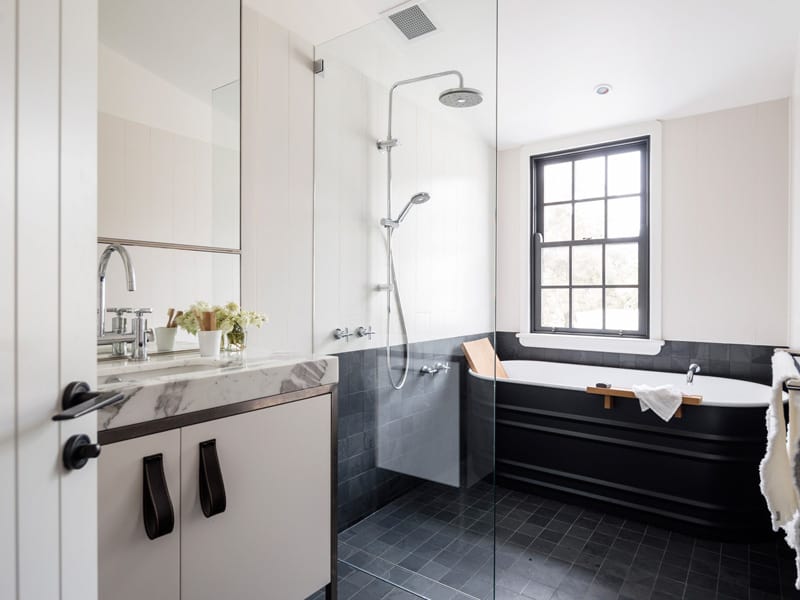
In the ensuite the same leather hand pulls are used on the vanity as are on the wardrobe within the sleeping area and check out that tub! Photo by Justin Alexander.
Luigi Rosselli Architects.
Interior Design by Decus Interiors.
Photography by Edward Birch and Justin Alexander.
Trusses make quite a statement but can sometimes appear heavy. Painting trusses white can counter the immense weight of the wood while still ramping up the visual volume – just like in these heavenly interiors.
