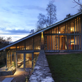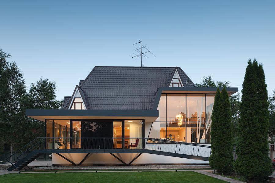
Built on a suburban lot in Moscow, this family home combines the best of traditional European influences and modern design flair. Designed by 4a Architekten, the house’s steep roof gives it a much smaller profile that you might expect of a three-story dwelling. Underneath the arched roof are walls of paneled glass which span from floor to ceiling in most areas and soar to two stories tall in some. The juxtaposition of the contemporary glass panels and conventional angled rooftop works quite well, as does the black and white color theme of the exterior. Each modern touch keeps the home impressive, while every time-honored design cue enhances its personal and intimate appearance.
Inside, the lowest floor of the house forms its principal public space, with free flow between its two main rooms. The living room occupies the tallest and most open-air section of the level, with window walls on two sides and an impressive chandelier overhead. All over the first floor, metal structural support poles are integrated as design elements, emerging straight up to create natural passageways or a jaunty angles to add visual interest to a room. The upper floors are significantly more closed-off than the much more public bottom level, but many of the rooms within are still quite tall due to their placement under the roof’s arch. The master bedroom, bathroom, and storage are integrated into an impressive second-floor suite, a place of secluded luxury for the owners of the house.
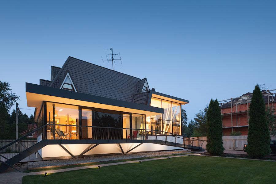
Though the rooftop architecture of this house appears fairly conventional and in line with European residential traditions, the dwelling underneath reveals just how modern it truly is with a facade made almost entirely of windows.
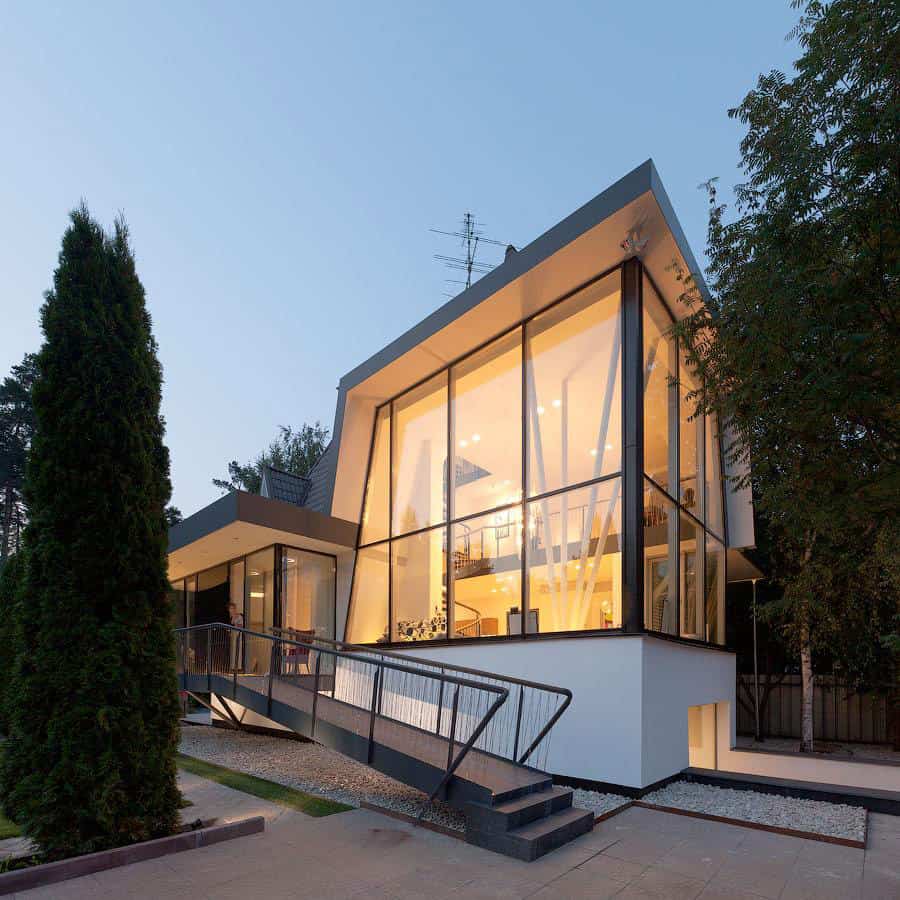
At its tallest first-floor room, the home’s roof soars upwards and becomes a flat, contemporary surface two stories tall. Thin black metal frames surround each window panel, breaking up the exterior appearance of the residence.
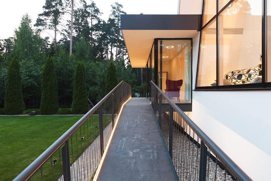
With its main floor set about three feet off the ground, the front porch of the house consists of transit space, with a ramp on one end and a short set of steps at the other.
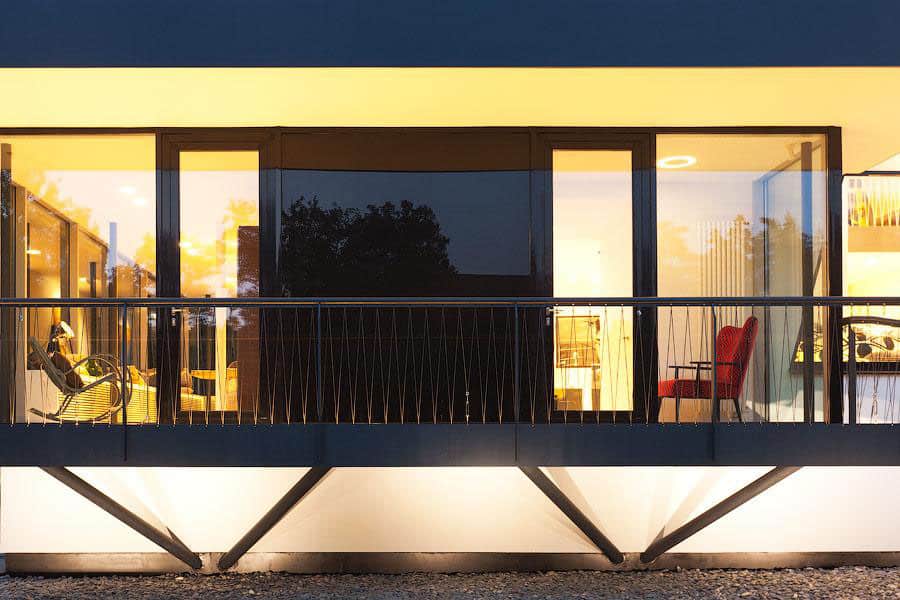
Metal supports extend from below the main floor to hold up the walkway, arranged symmetrically around the two main entrance doors of the building. The architects chose to accent the entrance with a ceiling-height glossy black panel instead of an overly ornate doorway.
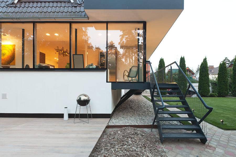
Off the left edge of the house is a spacious patio for outdoor entertaining. The wooden deck is smoothly finished in a very light hue which carries over into the interior of the dwelling.
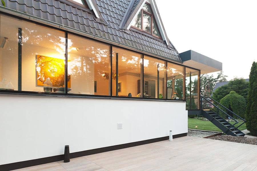
Along this side of the house, the kitchen and its adjoined social areas overlook the patio through windows which are shorter than those seen elsewhere. Inside, the window height corresponds to rows of shelves along the kitchen wall.
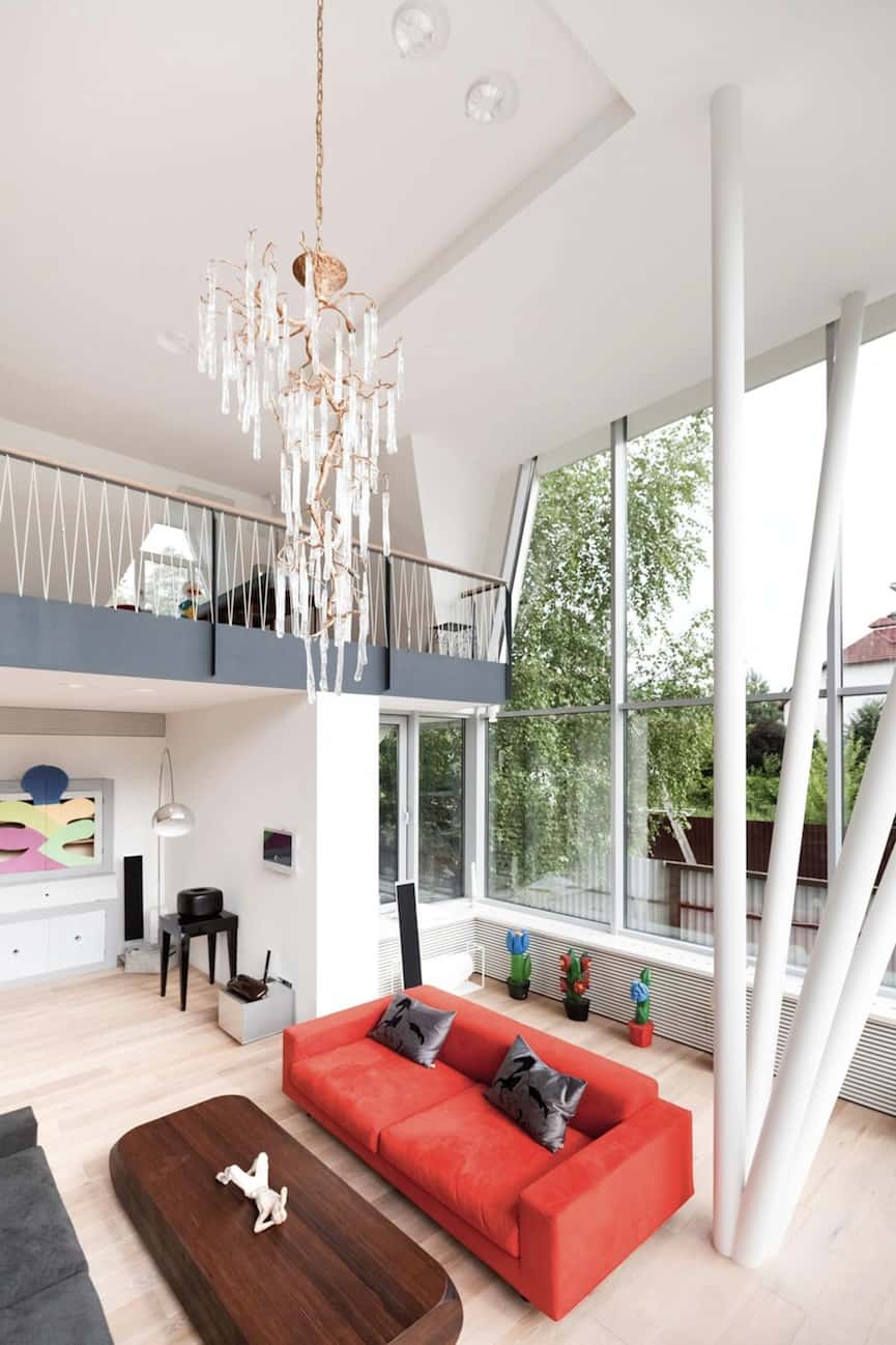
The main living space of the residence, complete with a second-floor balcony overlooking it, occupies the tallest corner of the first floor, above the garage. A unique array of four metal rods sprouts from the floor, holding up the ceiling in an almost sculptural fashion.
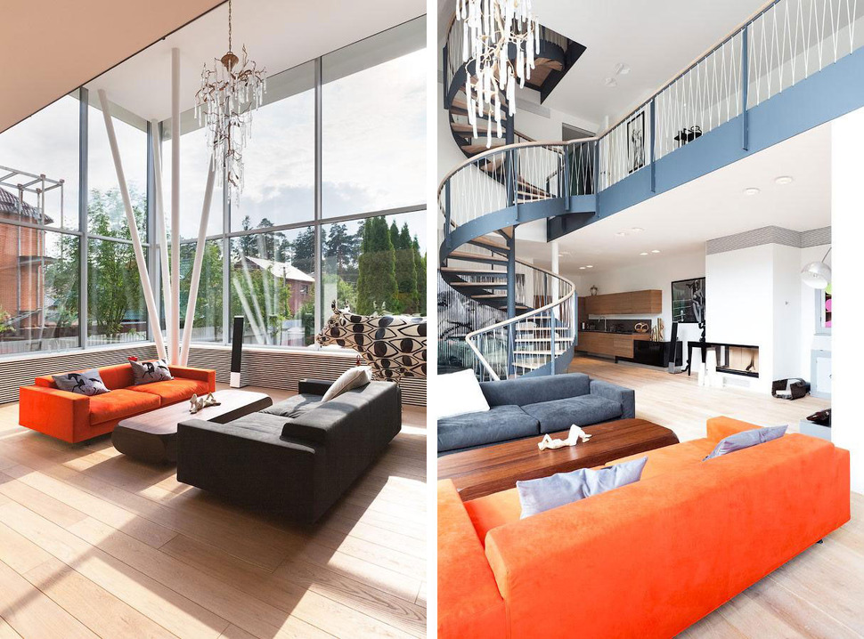
The first floor’s two largest rooms, the living room and kitchen, are free-flowing and open in nature. However, the identity of each space is conserved by changes in color palette and ceiling height between the two.
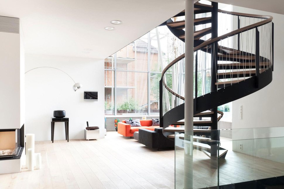
One of the most eye-catching features of this house is its impressive spiral staircase, which leads up to the second floor and further to the well-hidden third. The railing of the stairs and the second-level balcony is made by threading a long cord through small holes in its metal frame.
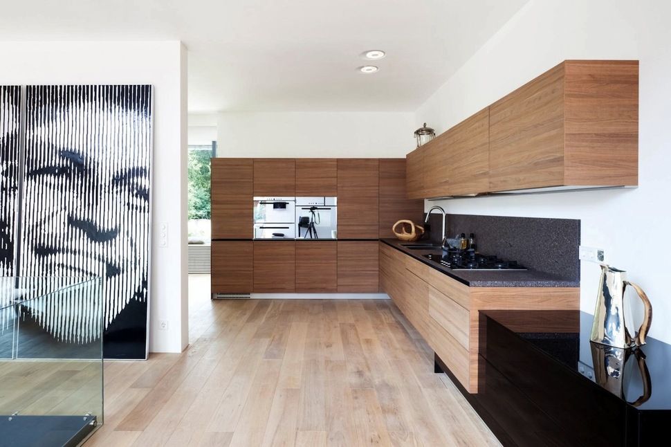
The wood used two construct the kitchen storage and counters is darker than the floorboards of the home, but would still be considered a medium hue (if not lighter). In fact, the only darker wood used anywhere else in the house is in freestanding furniture, not built-in features.
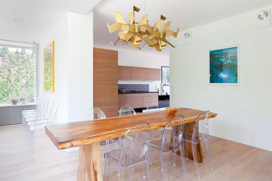
Off the cooking area, an airy dining room and seating area finish off the kitchen. This space has a few unique features, such as its sculptural light fixtures and clear dining chairs.
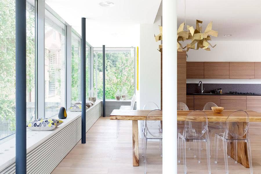
As with elsewhere, the architects and owners of the residence chose to integrate metal support poles into the design instead of disguising them within walls, retaining a functionally modern feel.

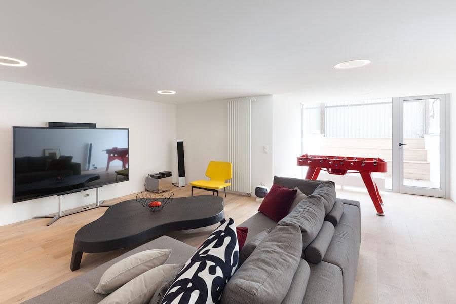
A second living room, this one more casual, hosts low-slung furniture like the organically shaped central table. While most of the room is somewhere along the scale from white to black, a few pieces like the red game table and yellow side chair help spice things up.
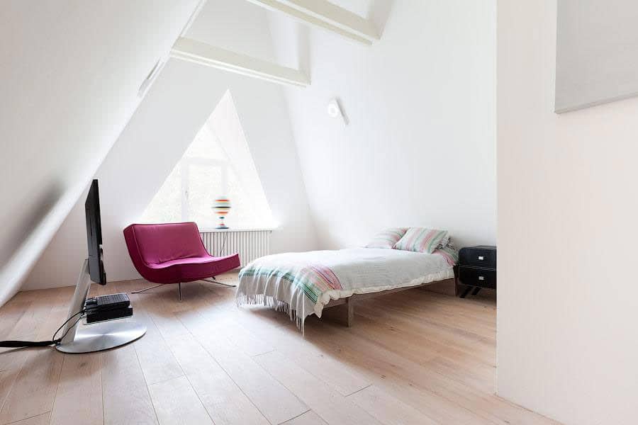
Located on the second and third floors, the bedrooms of the house each have unique shapes formed by the arching rooftop above them. This one is the tallest of the bunch, set the an A-frame endpoint of the top level.
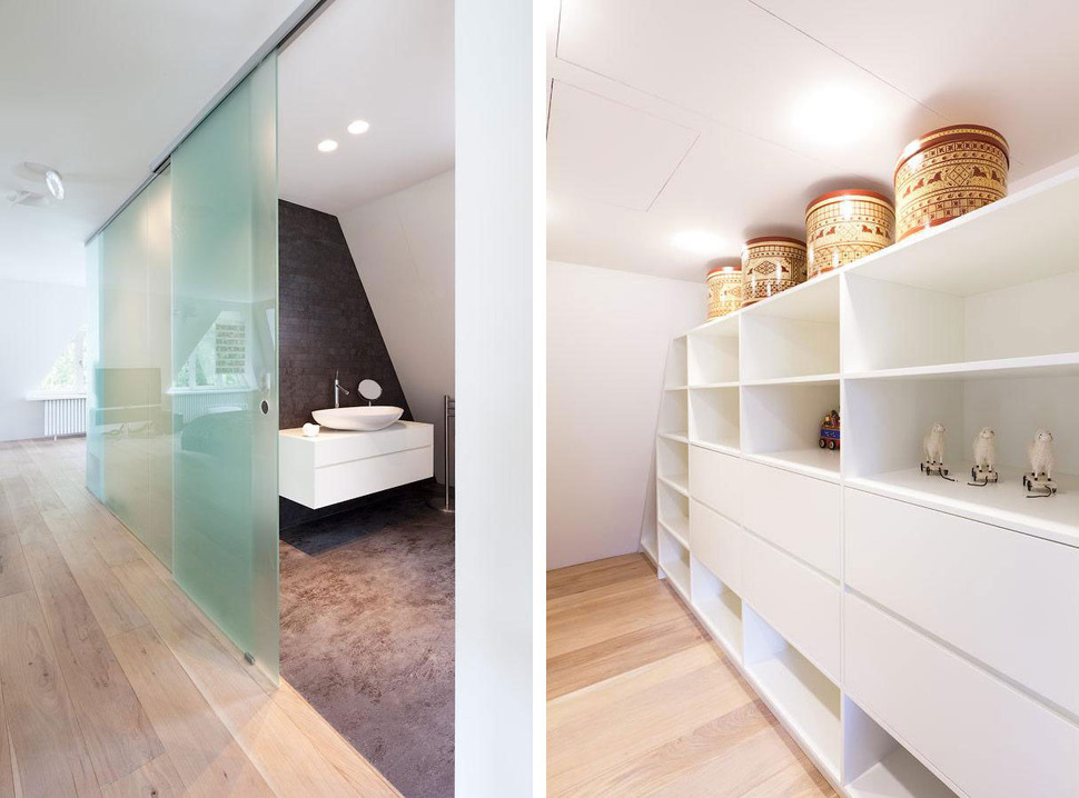
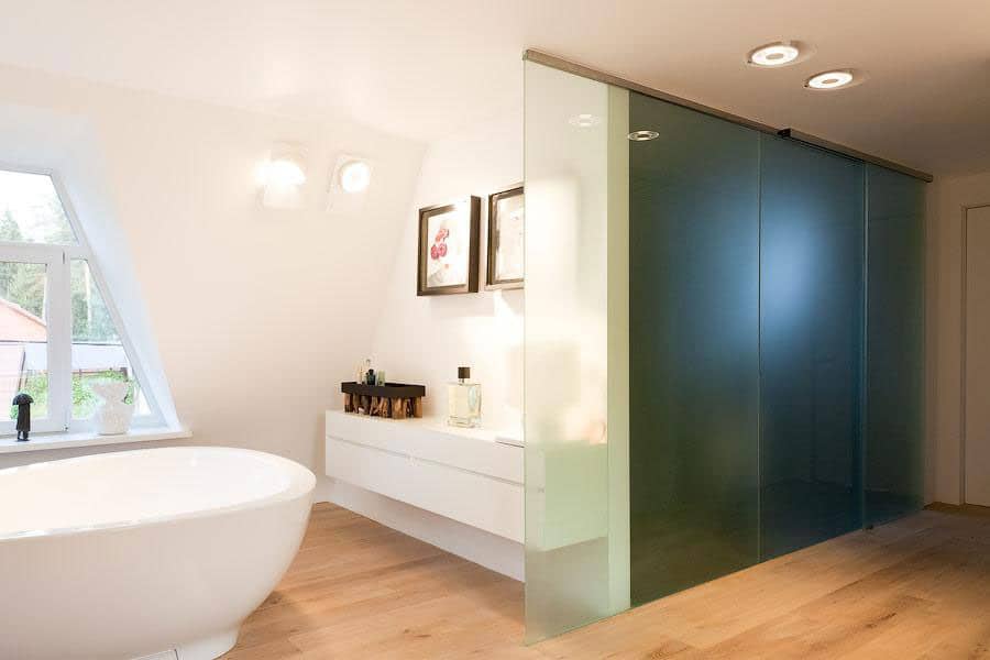
The master bedroom and bathroom are part of a generally free-flowing suite, separated from each other by a set of sliding blue-green panels. The suite also includes ample storage for clothing and other items in its own dedicated closet area.
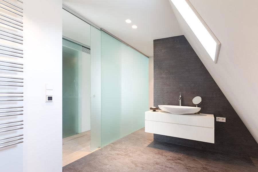
The toilet and bathroom sink are across a hallway from the closet, all contained within the master suite. Here, the flooring is a weathered black stone finish instead of the warm wood found elsewhere.
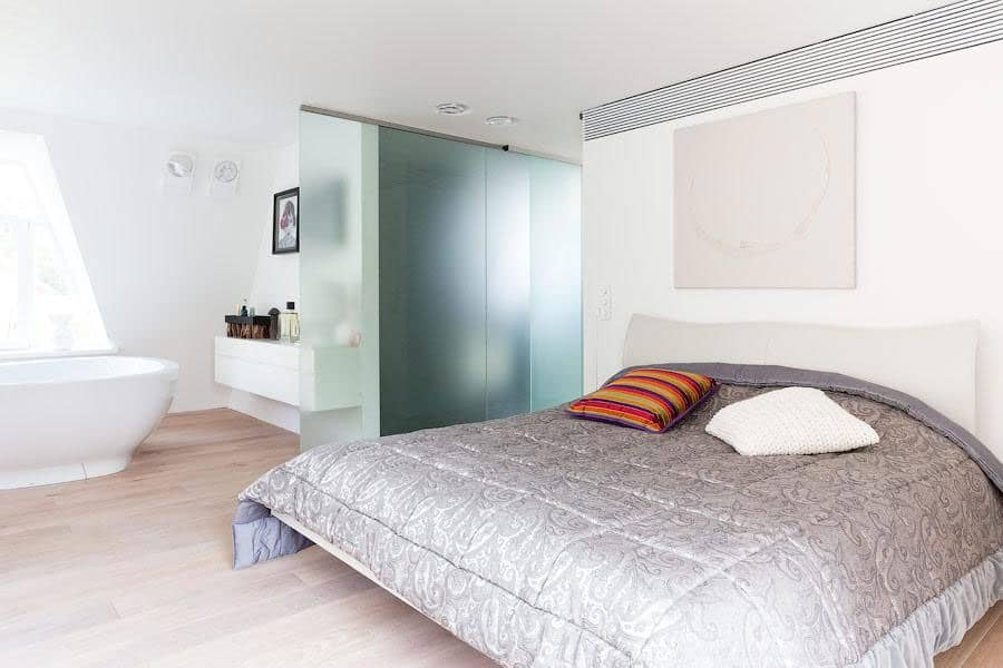
The master bedroom and its freestanding bathtub are in a single room, but the tub keeps its relationship with the rest of the bathroom amenities by being places under the same section of the ceiling’s slope.
4a Architekten
