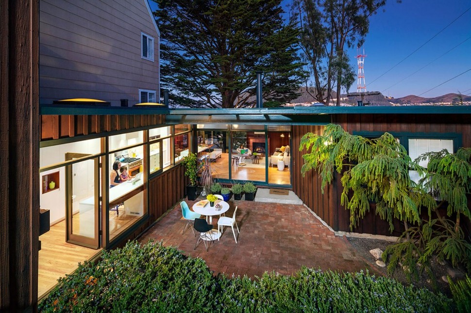
The Wurster House in San Francisco, California, received a new and modern makeover by Jennifer Weiss Architecture with the addition of a new glass fronted kitchen area that blends seamlessly into the pre-existing large living zone just beyond. The living zone was also opened up to the inner courtyard with the use of floor to ceiling glazing. The combination of the new kitchen and vast expanses of glass has created a third easy access outdoor zone in the courtyard that is now part of, rather then separate from, the interior volumes. Located on a steep slope, the living zone is well above grade on the front, and below grade at the back.
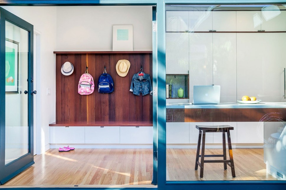
Access to the courtyard is just at the end of the bank of cabinets in the kitchen with the final section of cabinetry open below to hold a stool, and continue the view line. This section of counter is the perfect place for the homeowner to work on his or her laptop while watching the kids play outside. When its time to come indoors, the floor to ceiling cabinetry on the other side of the kitchen transforms into a closet niche complete with coat hooks and bench seat. The seat holds 3 drawers to hold miscellaneous outdoor equipment.
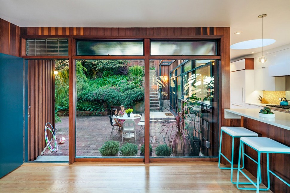
The courtyard is also accessible via a flight of stairs on the far end. Lower then the street level, the space is both contained and private. To break up the visual of the retaining wall, and keep the space feeling natural, lush landscaping has been densely planted in a narrow garden just in front of the wall.

On the other end of the kitchen a small bar area creates the ending punctuation. Here two turquoise bar stools pop against their dark wood backdrop. This pop of fresh colour is complimented by the sun dappled multi toned backsplash. The dark wood tones of the bar and open shelving tie into the woodworking that wraps the interior windows. To keep the space feeling light and bright, Jennifer introduced light wood flooring and white cabinetry. The combination of light, dark and bright creates a composition of lively energy – perfect for a family with young children.
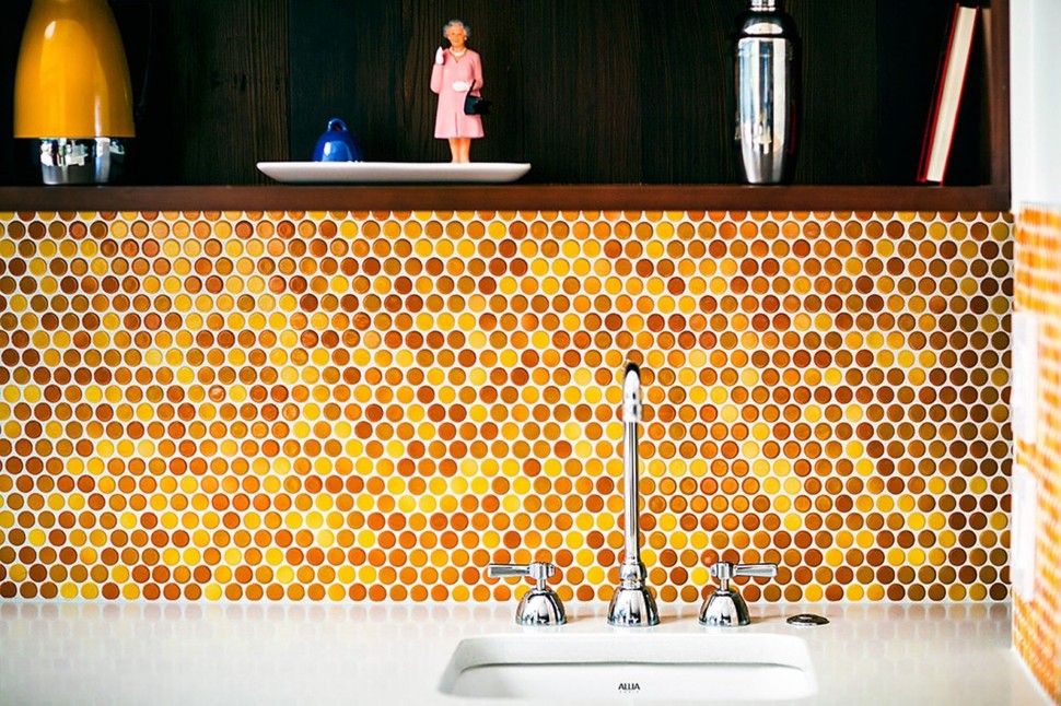
The backsplash is a composition of penny tiles in tones of yellow, orange, and brown. The combination of all the shades gives the effect of shimmering sunlight dancing across the wall.
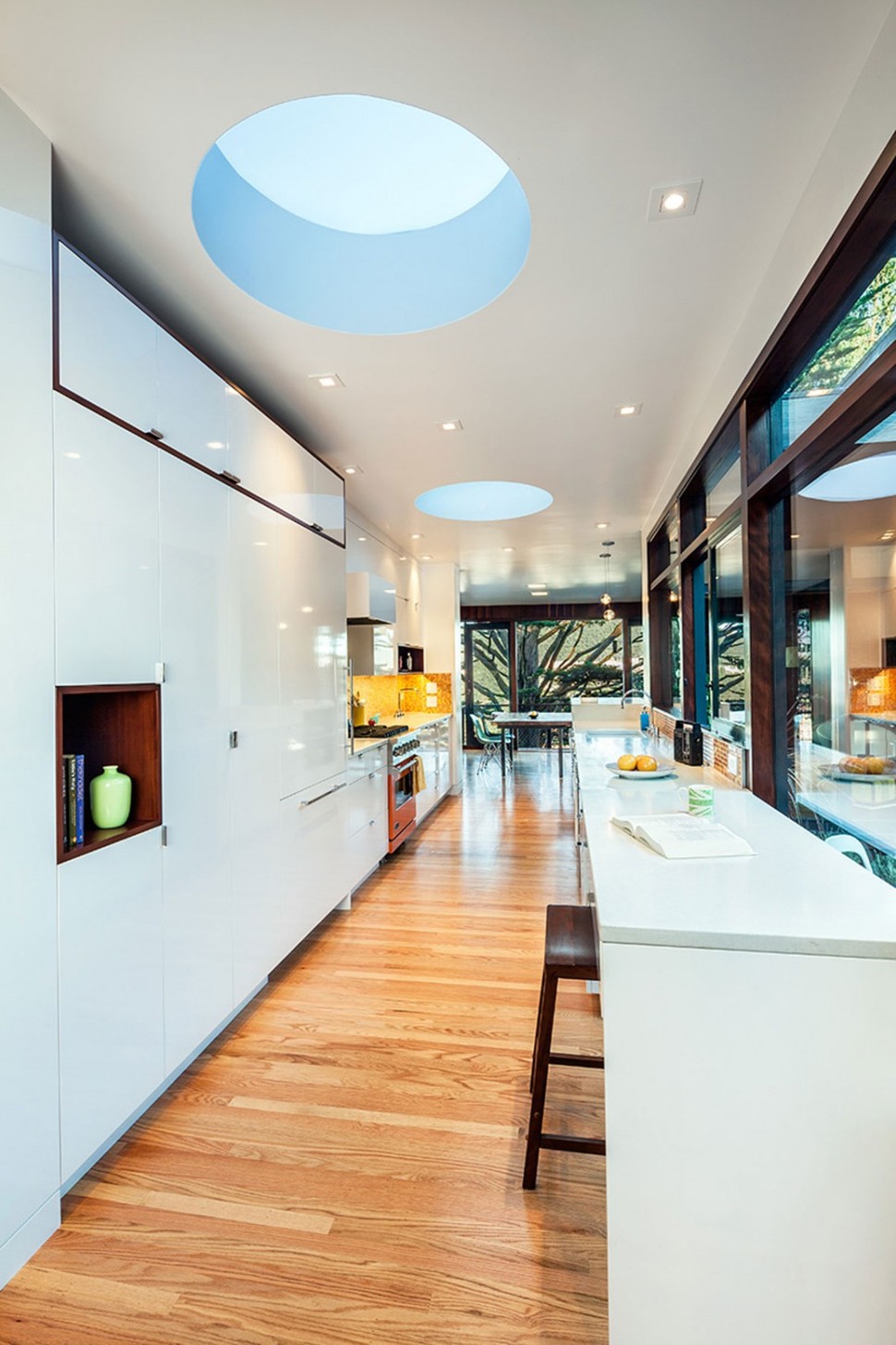
Playing of the sun dappled backsplash is the use of two large sky domes flooding the interior of the kitchen with natural light, supplementing the sky lights is the wall of glass and multiple pot lights.
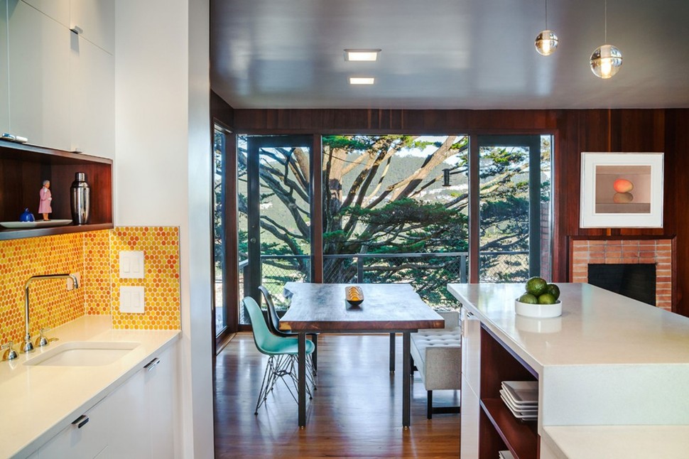
Just beyond the kitchen is the dining room. Here, too, the walls have been opened up to expose the views. The dark paneling on the walls create an unobtrusive frame to the stunning tree just outside and these same dark walls are the muse for the dark tones used in the new kitchen. Repeating the colours of the kitchen, a turquoise moulded plastic mid-century chair is pulled up to a live edge dark stained dining table top.
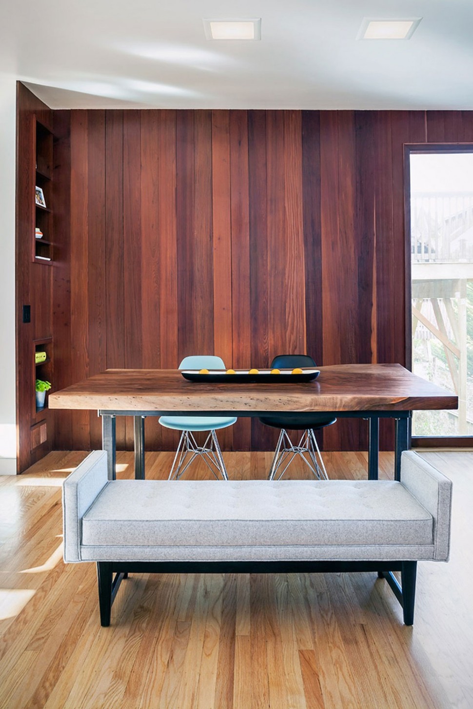
The other similar chair at the table is black, creating an asymmetrical story that is balanced on the other side with the use of a very contemporary upholstered bench seat. Here, as in the kitchen, the combination of light, dark and bright creates a youthful vibrancy, that is cozied up with the addition of the upholstered bench.
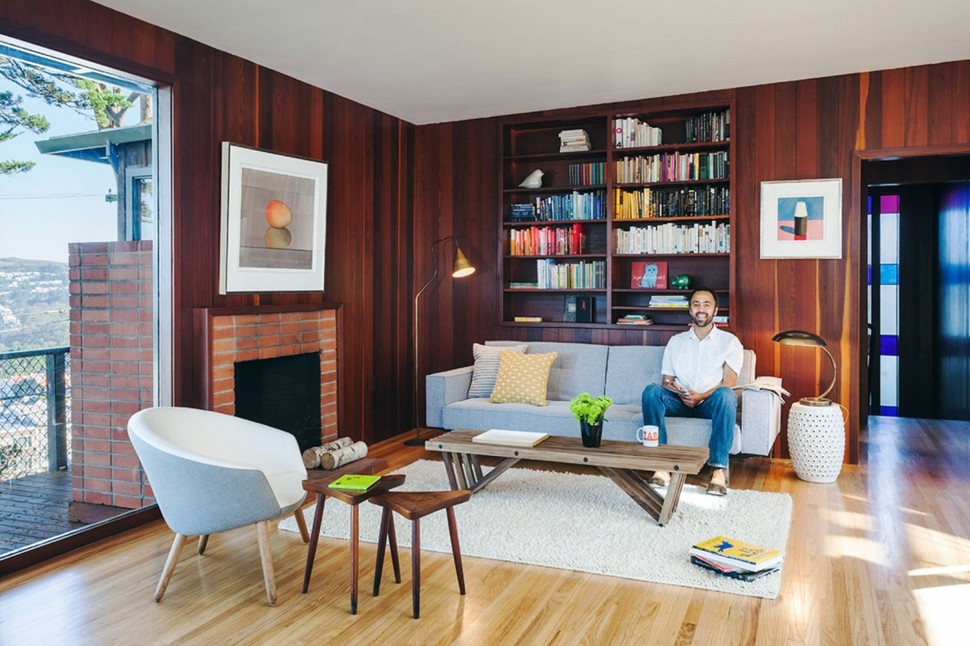
The original brick fireplace in the living room adds to the ageless appeal of the home by creating an additional layer of time. Mid century shapes, natural materials, modern accents and the stunning views all combine to create a space of timeless enjoyment.
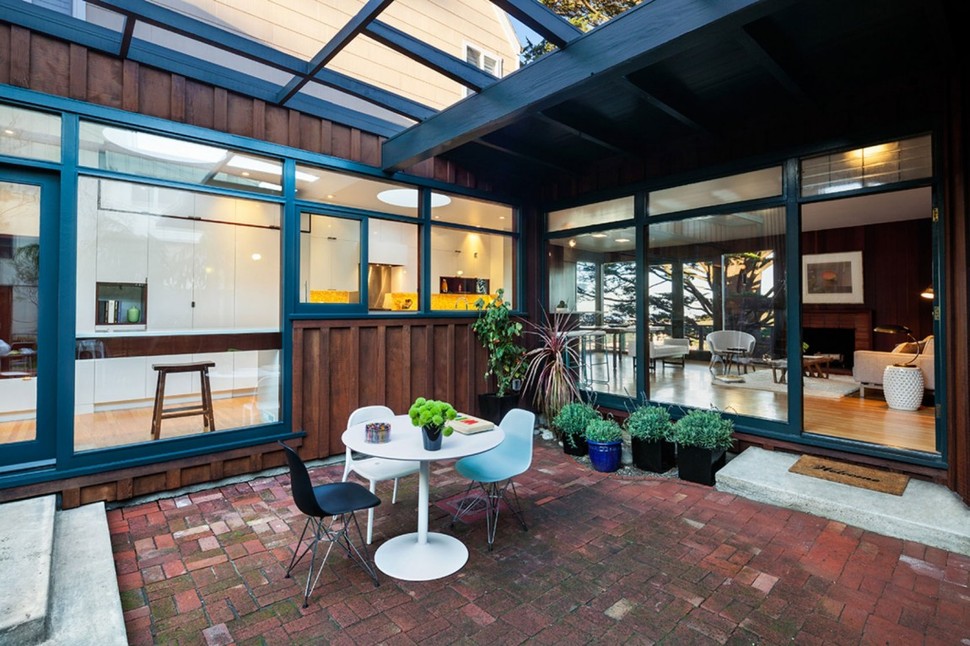
The transition from the more traditional living room, to the modern kitchen is effortless and the added layer of outdoor living makes this home the perfect place for a young family to grow.
Jennifer Weiss Architecture
Photos courtesy of Jennifer Weiss Architecture
