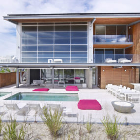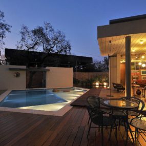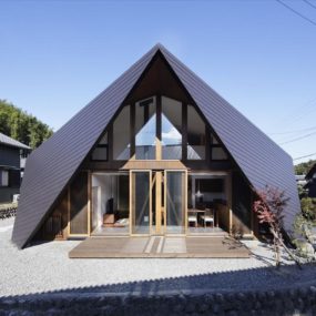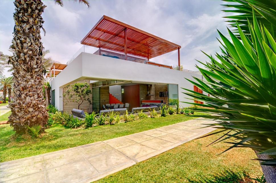
Located in Lima, Peru, Martin Dulanto Arquitecto designed the Casa Seta to be all about the outdoors and whether on the main level, or upstairs, the outdoor experience is the predominate feature. On the main level two of the exterior walls are clad in retractable sliding glass panels, and on the roof top terrace a glass rail system wraps the edges of the home for an uninterrupted view of the landscape beyond. While most homes use the 2nd level for the bedrooms and bathrooms, the architects of the Casa Seta opted to keep them on the main level thus leaving the roof as a complete outdoor lifestyle experience, complete with dining, living and swimming zones.
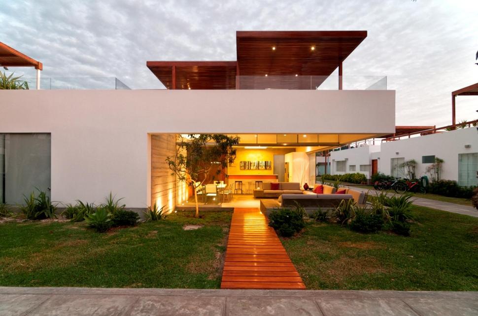
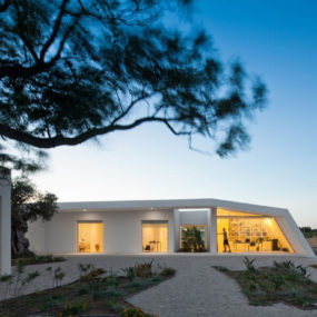
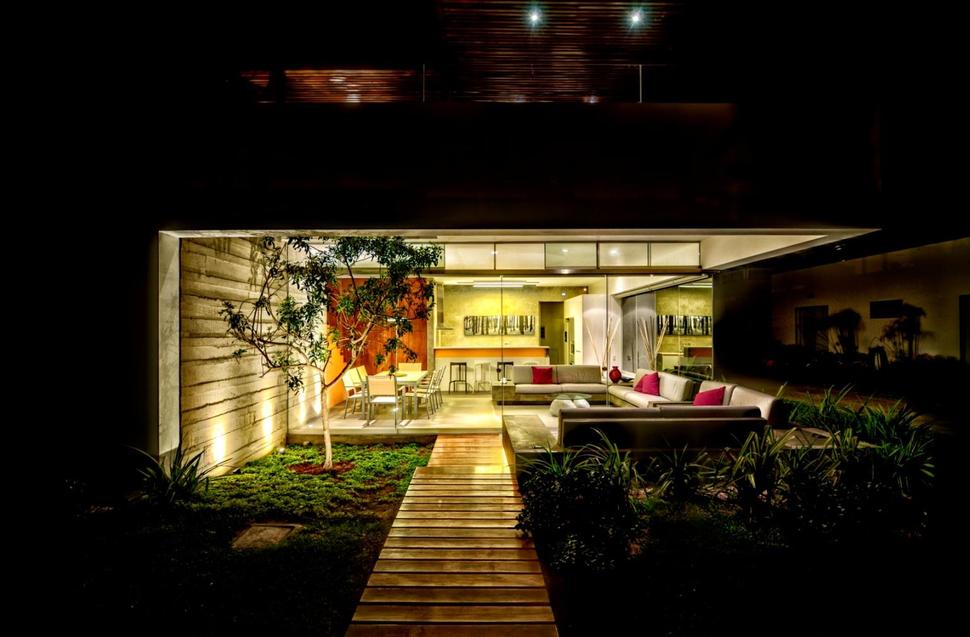
A wood plank walkway leads up to the ground level social area. Grass surrounds the walkway on both sides and as you get closer to the entry point, small shrubs have been planted for visual interest. The path continues under the cantilevered roofline and a tree next to it is also under the roofline. The planking on the walkway appear almost as a reflection to the shade arbor located high above over the roof top terrace.
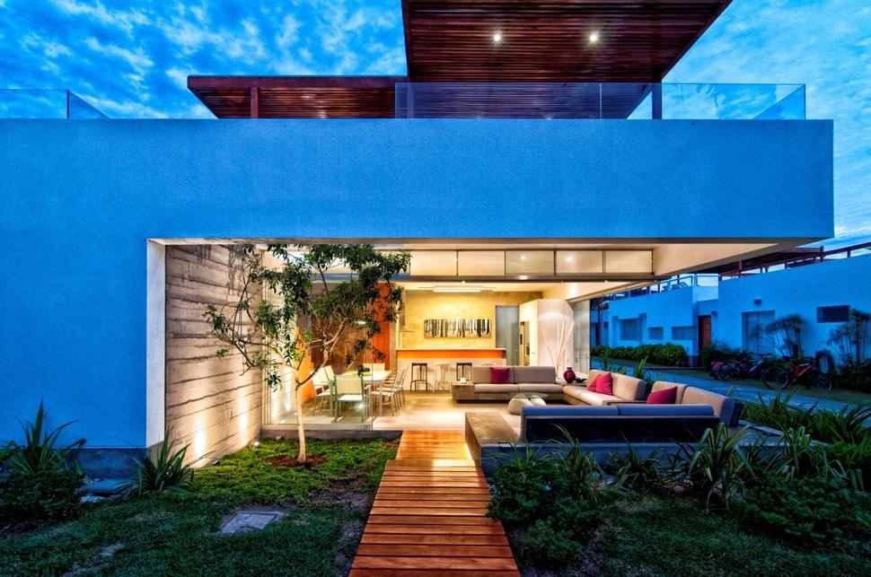
The walkway leads right up to and in-between the dining and living zones, it even passes the first section of seating. The seating area is a large 3-sided bank of couches that face inwards.
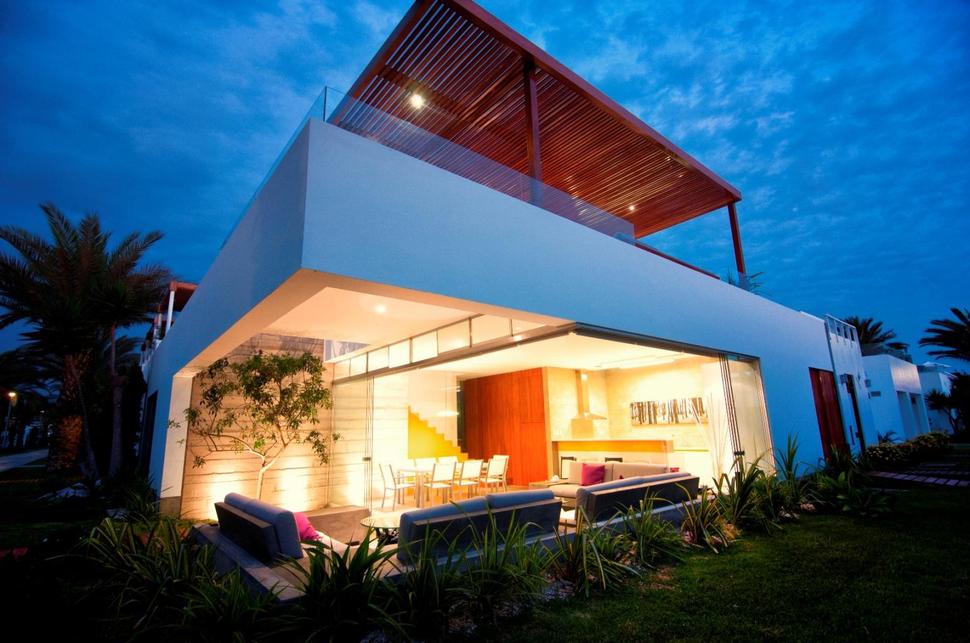
Opposite the walkway on the far wall is where the kitchen is located and next to the dining area is the stairwell that leads to the roof top terrace. Behind the stairwell and kitchen is where the private zones are.
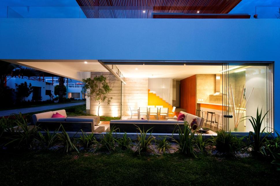
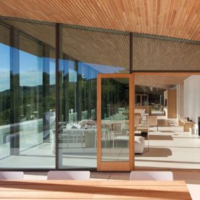
The cantilevering of the design allows the homeowners to completely open both walls without a corner support.
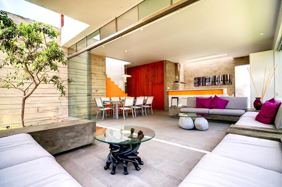
The inclusion of a tree within the living area blurs the line between indoor and outdoor zones. The sliding glass panels stack neatly in front of the tree and a row of clerestory windows adds architectural detail without compromising the backyard view. Reinforcing the indoor outdoor lifestyle is a glass top coffee table with 3 boulders as a base. Complimenting that table is a 2nd glass top table with an abstracted story of 8 figures looking up and getting ready to catch something.
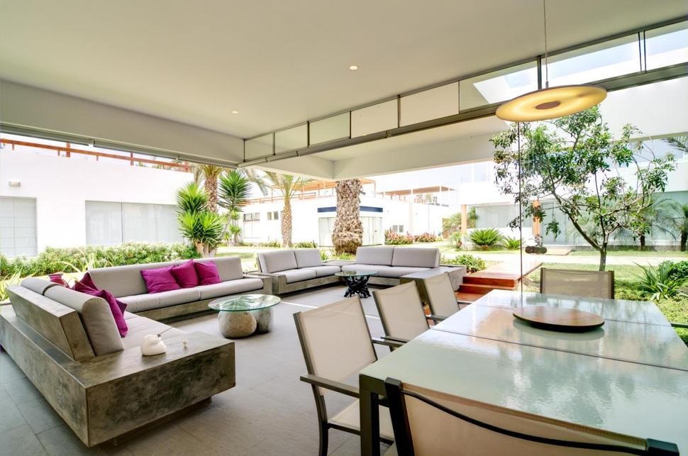
the framework for the clerestory windows creates a cross bracing for the cantilevered ceiling above.
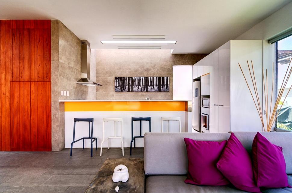
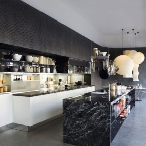
Tucked into a enclosed area in the back of the social zone is the kitchen. The wall of cabinetry next to the wall of glass creates a space that is almost window free, however creating a wall of cabinets eliminated the need for upper cabinets on the other two walls and a skylight above the far counter floods the work station with natural light.
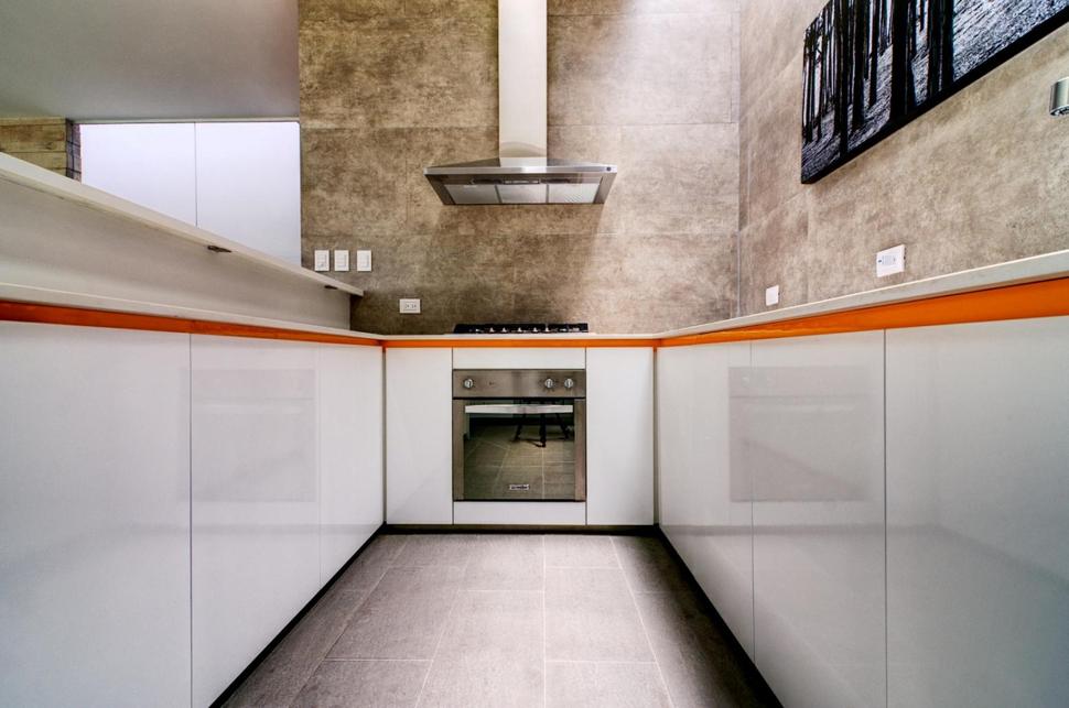
While the kitchen cabinets are a high gloss white with push pull hardware, the addition of a warm running board detail just below the counter edge brings in a sense of vibrancy while the large 24″x24″ polished marble tiles on the walls brings in an organic flare that is picked up on by the black and white photo of a treescape.
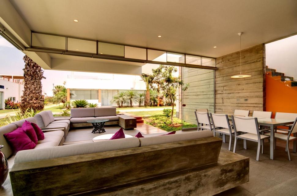
The marble slabs that create the framework for the large seating area is the same marble used on the kitchen walls and the orange of the stairwell repeats the warm tones on the kitchen’s running board.
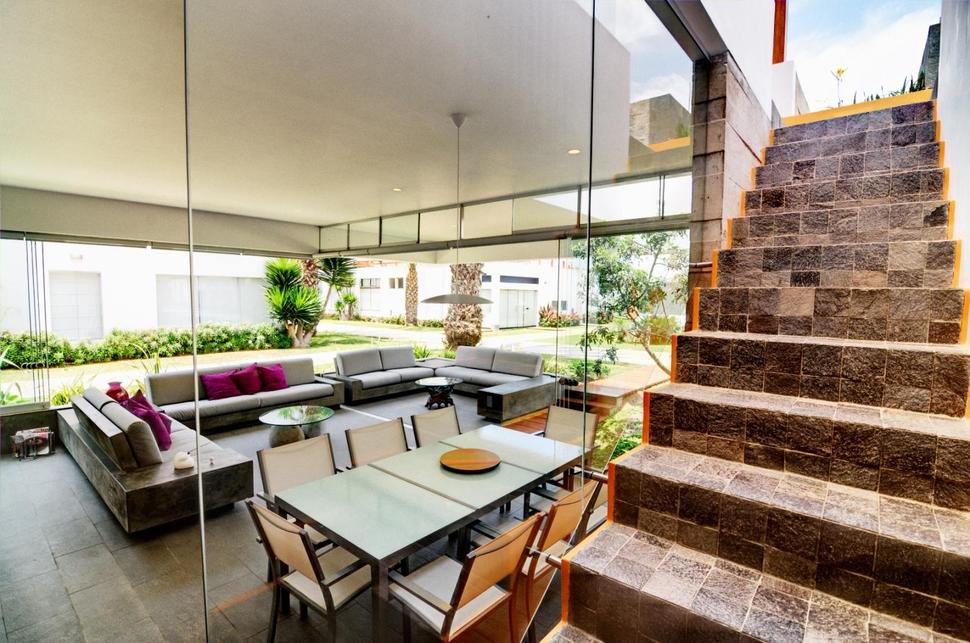
The stairwell retains the flamboyance of the orange by keeping the edges of the framework visible on both sides. The stairs are also clad in the brown marble and are kept safe via stair to ceiling tempered glass panels.
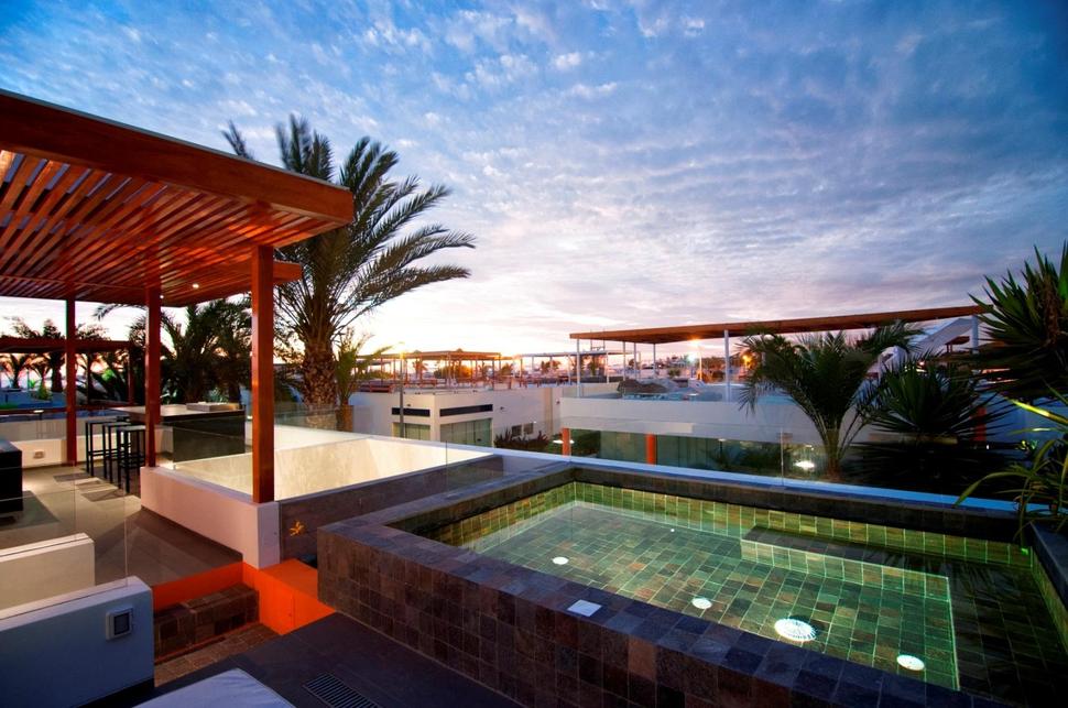
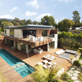
The stairs enter the roof top terrace in a central location with the four corners divided by BBQ, living, dining and swimming.
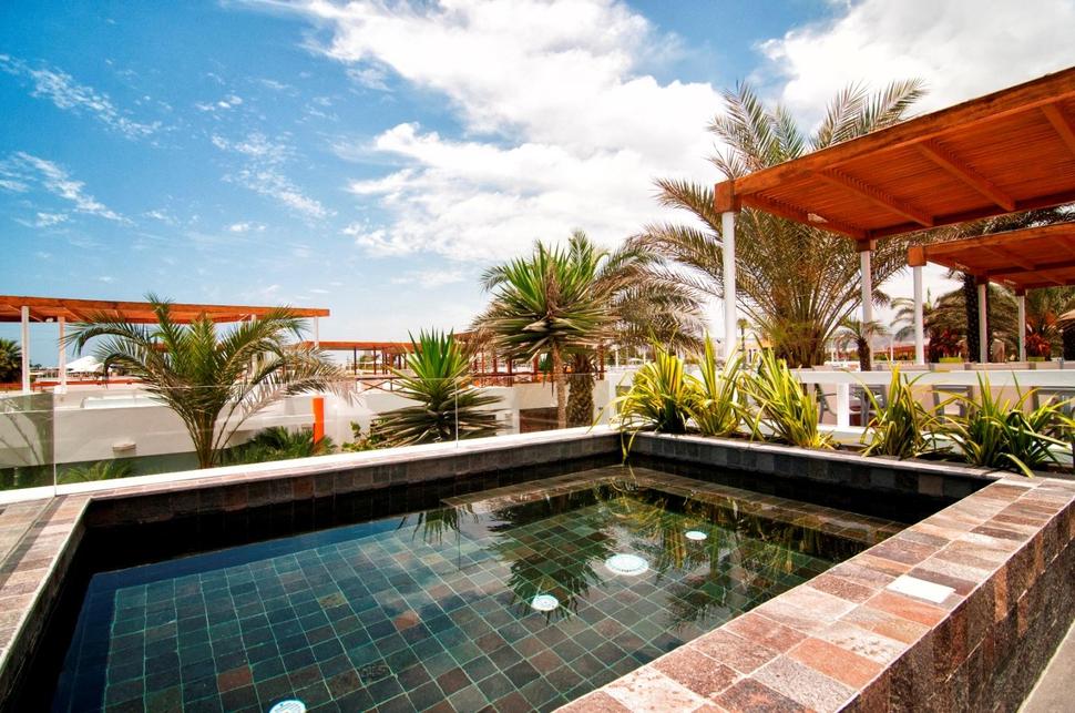
By raising the pool and wrapping it in two widths of bricks, there is plenty of room for perching on it or using it as a tabletop.
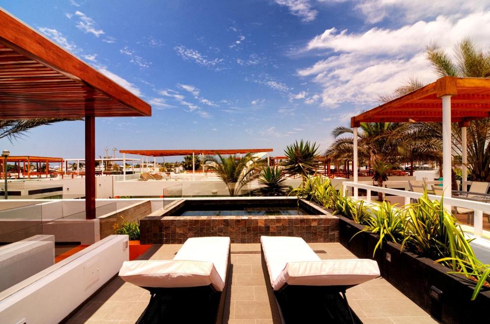
Two lounge chairs next to the pool are the perfect place to dry off while enjoying the view beyond.
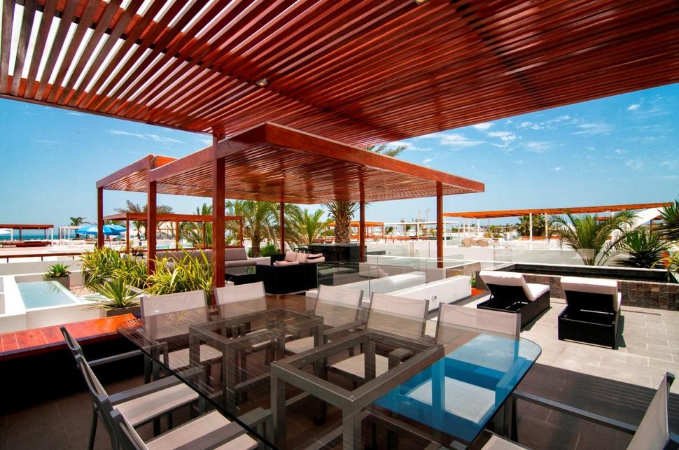
Behind the lounge chairs is a shaded outdoor eating station complete with 10 chairs. The vertical staggering of the arbor defines this zone from a distance and the small lights attached to the arbor keep it well lit into the evening.
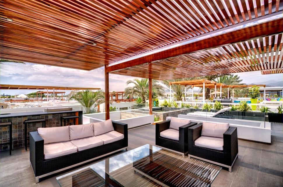
Two seating stations are on the other side of the terrace. The social station which consists of a comfy arrangement of couches and armchairs, and a fully operational BBQ station complete with bar counter and bar stools.
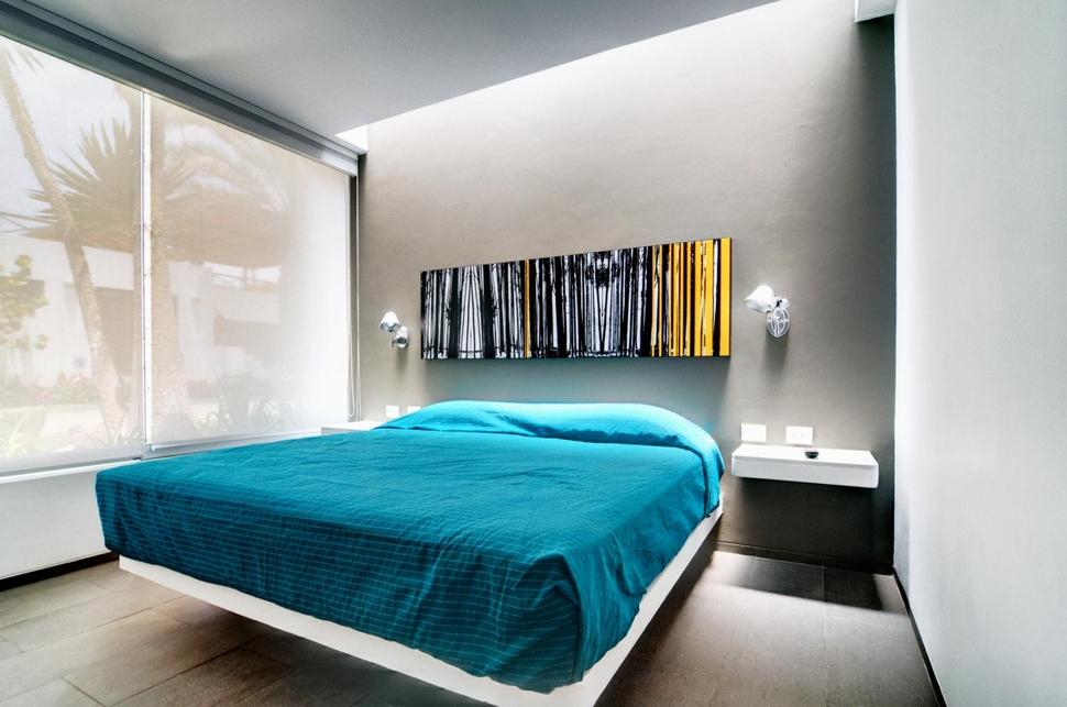
As extravagant as the social zones are, the bedrooms are kept to a modernist profile. A floating bed and night tables with two light sconces are all that’s needed in a room meant for relaxation. The addition of a large abstracted forest canvas creates a focal point when entering the room, but beyond that the focus is on rest and sleep.
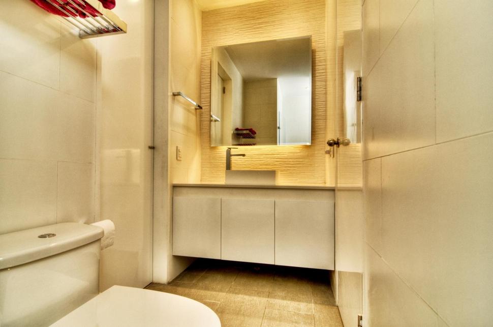
The ensuite to the master bedroom is fitted with the same high gloss cabinets as the kitchen. Adding visceral interest to the room is a textured wall behind the vanity and marble floor tiles on the floor.
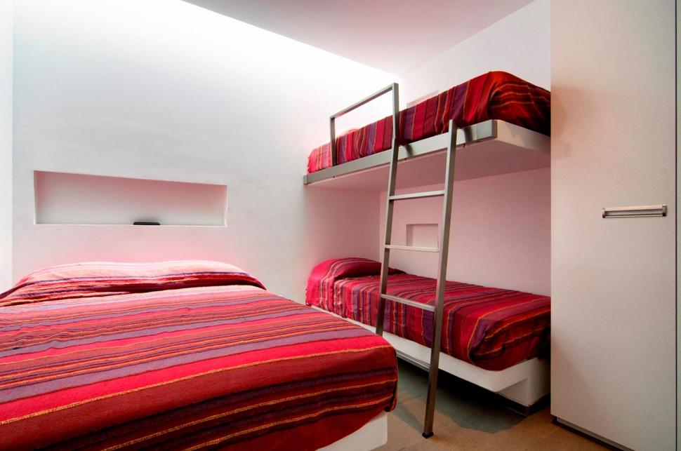
The guest bedroom is outfitted with a queen sized bed and a pair of bunks to accommodate a family of four. Wall niches above each bed creates the perfect perch for a book or cup.
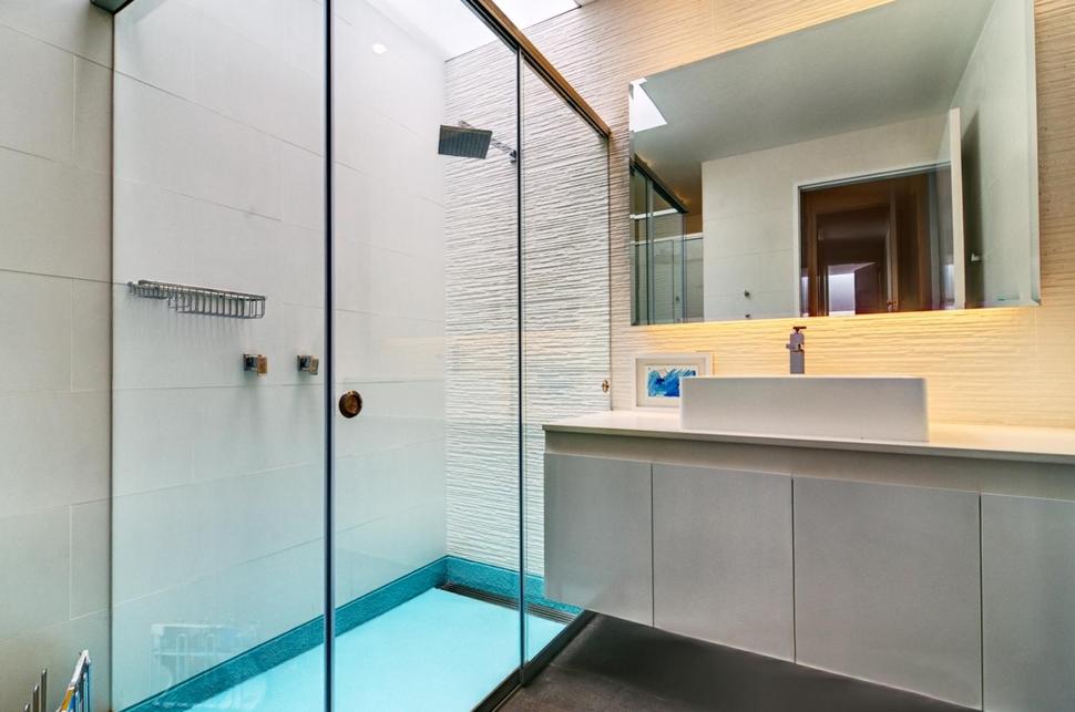
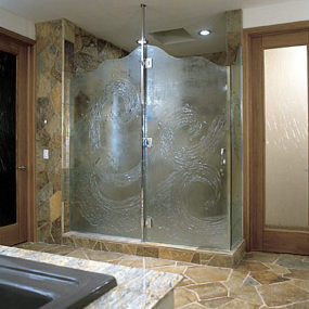
The guest bedroom has its own private bathroom complete with walk in shower stall.
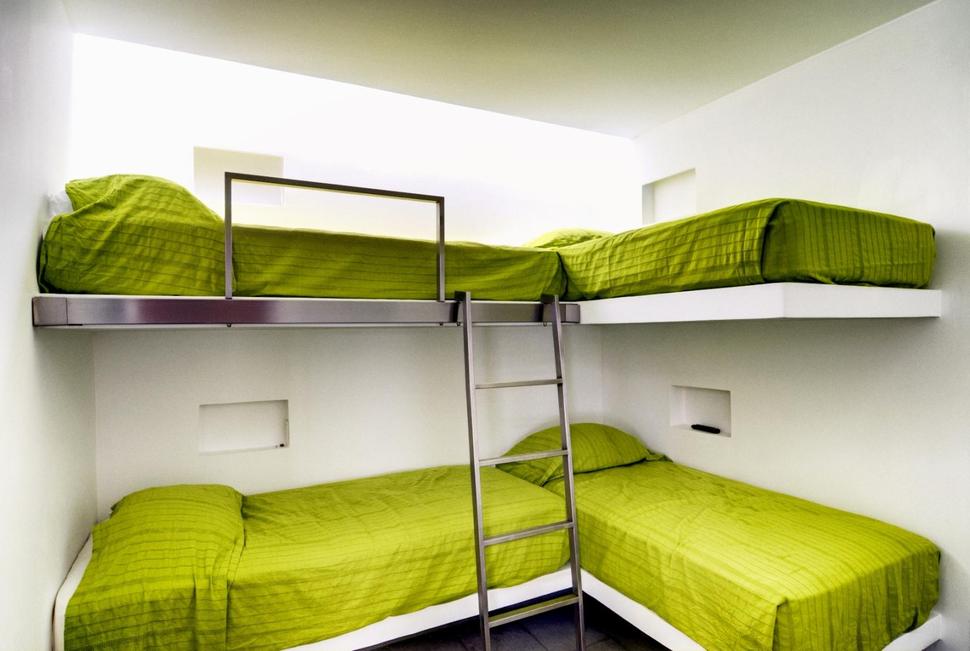
When the guest list grows and its time to squeeze in more overnight visitors, a third bedroom is fitted with four bunks. Here, too, wall niches take the place of bedside tables.
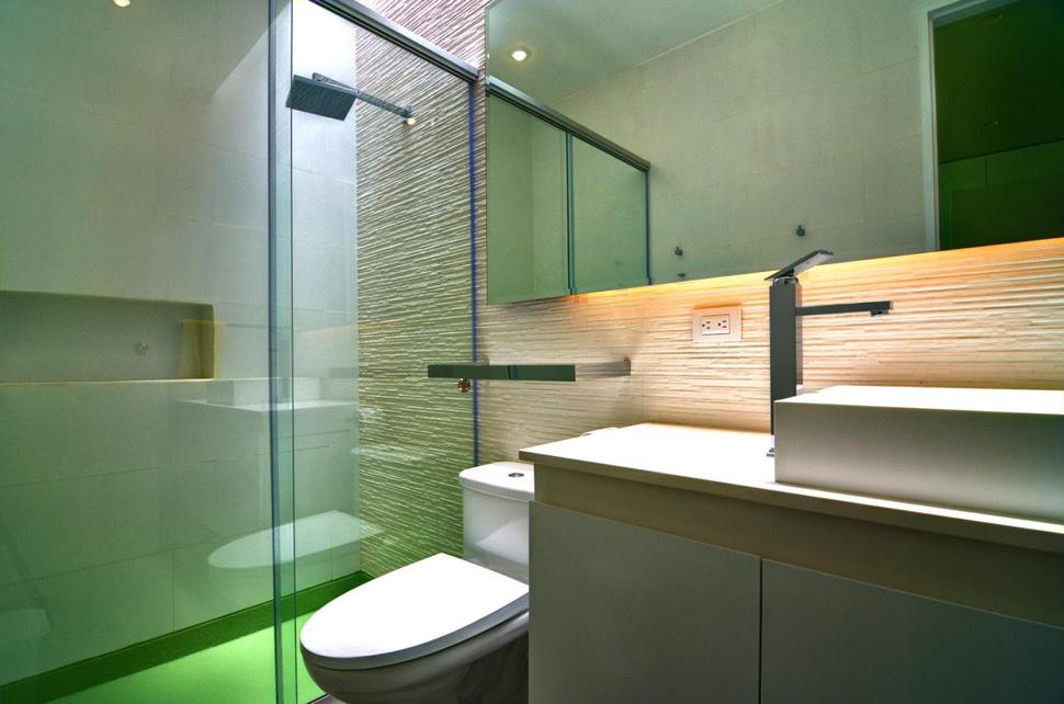
The bunk room also has its own bathroom and the shower stall in this room repeats the green of the bunk bed covers.
the bedrooms on the main floor can be closed off from the social zone via a sliding door so no matter how late into the evening the entertaining goes on, those that want to sleep, can.
Martin Dulanto Arquitecto
Photography; Marco Simola
