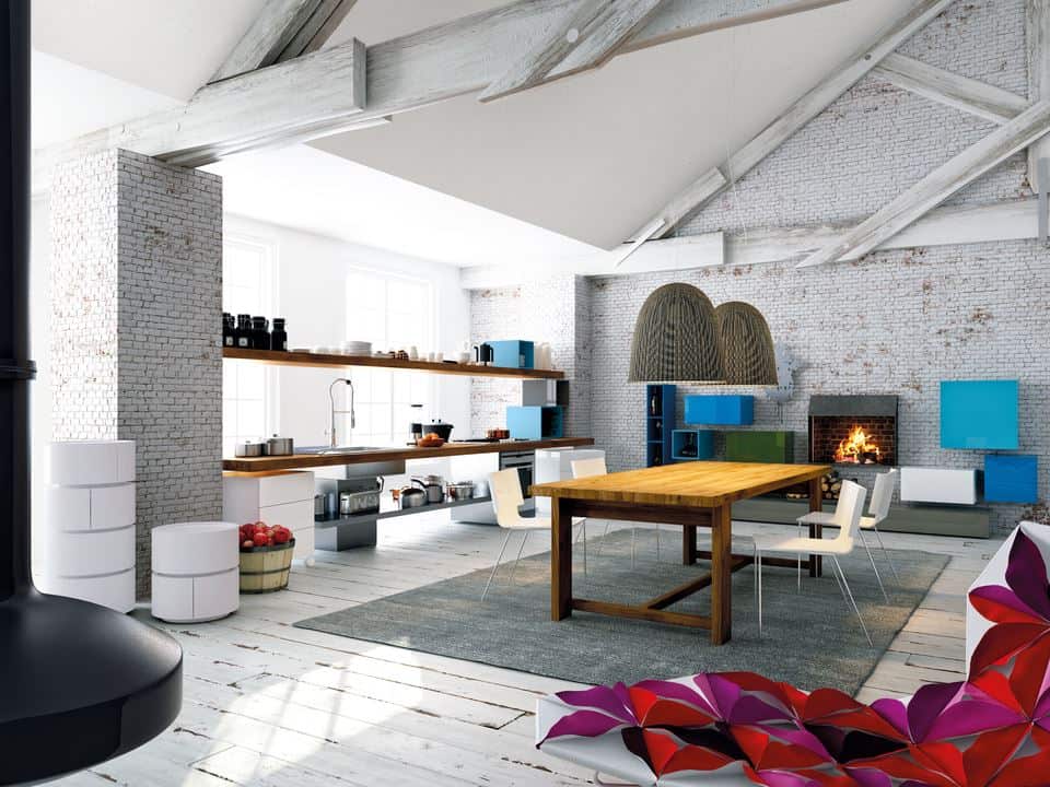
White Washed Post & Beam Modernizes A Rustic Room.
Homes with large timbers and brick walls tend to have a heavy and dark presence to them – a great industrial look, but not something that goes well with modern furnishings. A great way to bring a pre-existing industrial or barn type structure into a more modern aesthetic is with paint, but when you have rough-hewn wood, it would be a shame to loose any of the texture. In this space the solution was to still use paint, but in a wash. This allows the paint to soak into the wood without hiding any of the structures nuances. With a whitewashed surround of wood and brick, the bold pops of blue and red used throughout the space take centre stage and the clean lines of the furnishings are not crushed below the weight of the trusses.
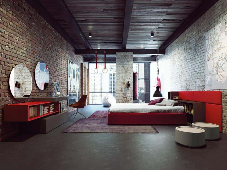
A Red Hot Brick & Mortar Bedroom.
The shades of rustic red in natural bricks can be hard to design around, but in this bedroom those shades are celebrated. Rather than ignoring the red tones they are celebrated by creating a monochromatic room based around the colour red. The strength of the red furnishings balances out the weight of the dark timbered ceiling and the natural brick wall while the added hits of white bring in the contrast. Bedrooms are a great place to express a more personalized statement and in this case that statement is a bold and beautiful shade of red.
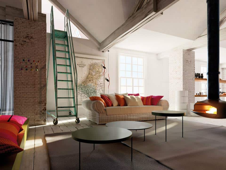
The Warm & Cozy Of Modern Design.
When most people think of a modern interior they think of a space that is clean lined and hard surfaced – but it doesn’t have to be. This room showcases just how cozy Modern Design can be. With a neutral backdrop in shades of white, it is surrounded by the warm glow of a suspended fire. The heat of the fire is visually expanded upon with the use of pillows in patterns of reds and oranges. The use of multiple pillows and layered carpeting add in the cozy factor while the hit of an emerald green vertical ladder creates a whimsical punch of drama.
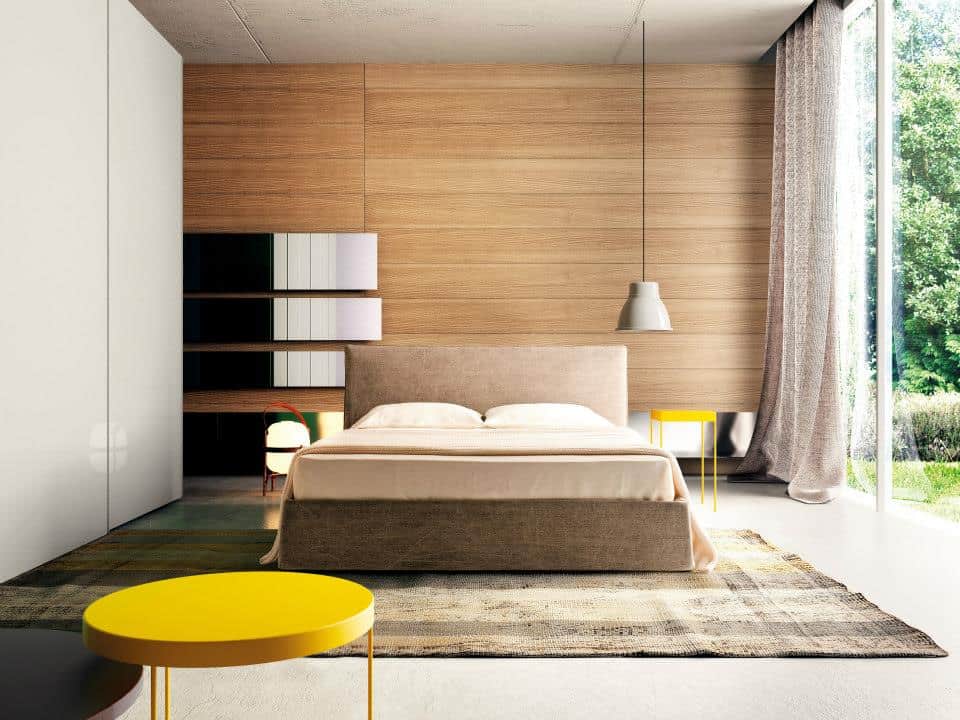
Asymmetrical Bedroom Brings Home The Wow Factor.
The most interesting spaces are not symmetrical, but are still balanced. In this case the brighter yellow bedside table and hanging lamp on the right, balance the grouping of shelves on the left side of the bed. The round yellow table in the foreground creates much needed depth and creates a visual flow to the smaller yellow table in the distance. All the pieces are clean lined and simple with just the shapes and punches of colour creating the wow factor.
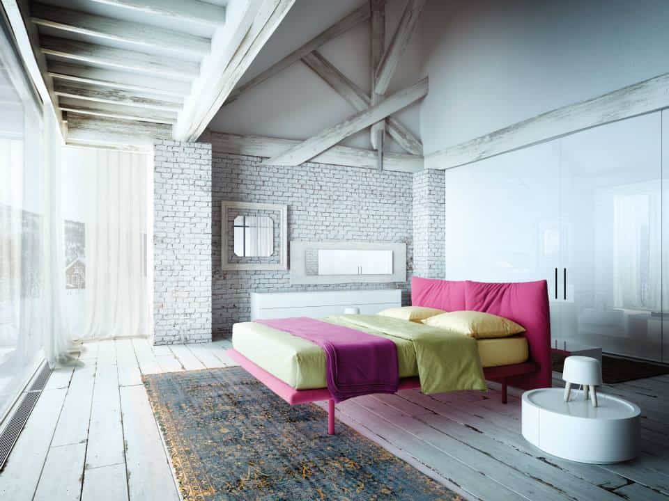
Perfectly Pink Punches For Neutral Decor.
A safe way to create a design aesthetic that can grow with you is to surround yourself with a neutral and then punch it up with colour – any colour. In this case the room is a mid-tone soft grey that on its own, doesn’t bring much interest to the space. Add in the power packed pink tones and an otherwise boring room becomes spicy hot. The pink could be substituted with any strong colour – even black, and as your tastes change, so too can the colour.
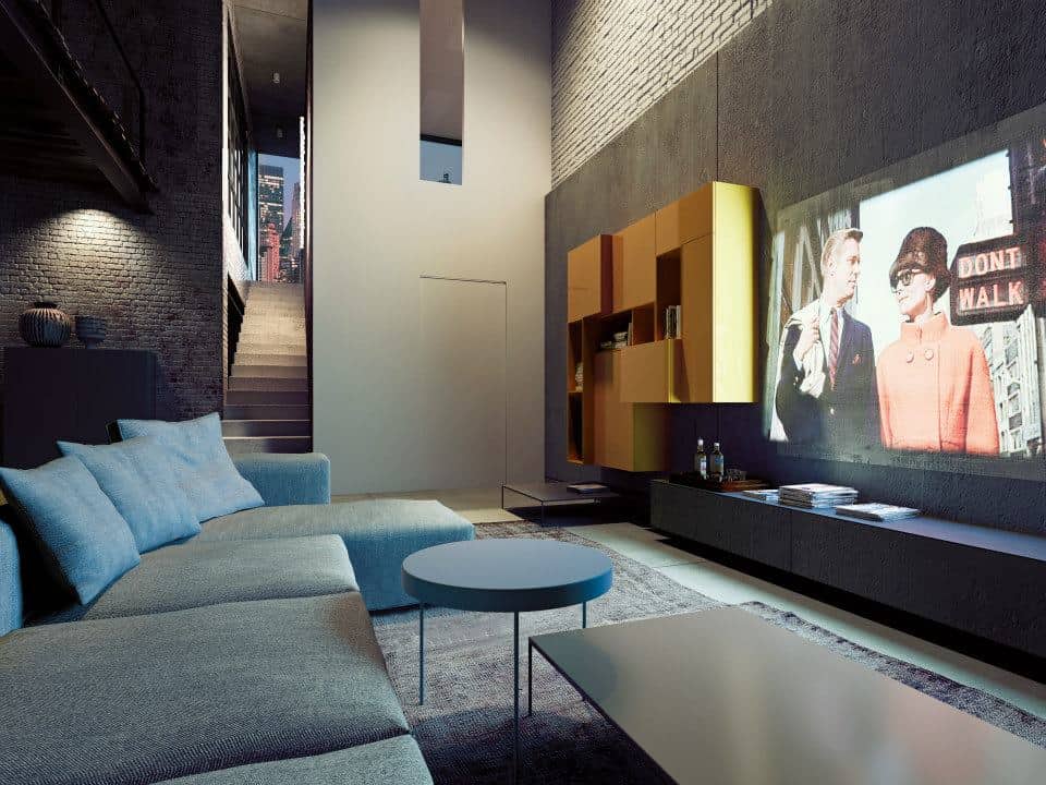
Mixing Shapes Create Fun Visuals
Who says that if you need two coffee tables they should match? Combining two tables of similar style but different tones and shapes is a far more interesting and versatile vignette. In this case a round blue table punctuates the end of a lower rectangular dark grey table. Both tones are pulled directly from the couch and pillows and create a fun and dynamic grouping.
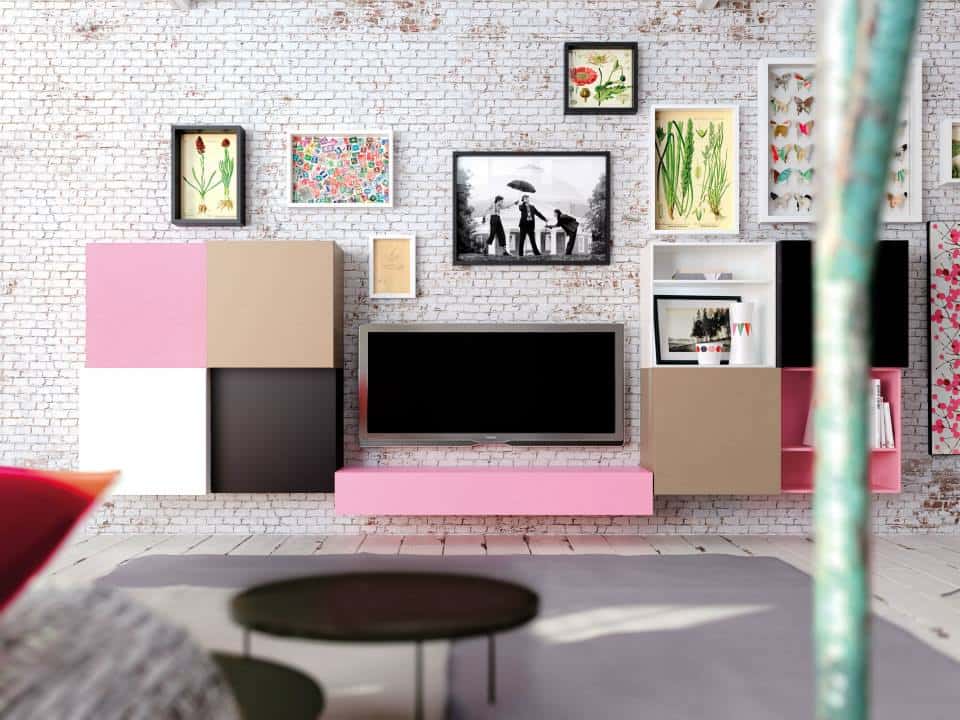
Using Your Flatscreen As A Design Feature.
With TV’s becoming ever larger, it is a necessary design choice to include them in the overall look of a room. One of the best ways to do this is to treat them as a large black piece of artwork and arrange your furnishings and accessories around them as though they are the focal point, rather than trying to ignore them. This room does an exceptional job of this by treating the TV as a black rectangle and surrounding it with smaller rectangles of beige, white and pink. The finishing touch is to then complete the vignette with favourite photos, paintings, and framed collections, all working harmoniously with the Flat screen rather then against it.
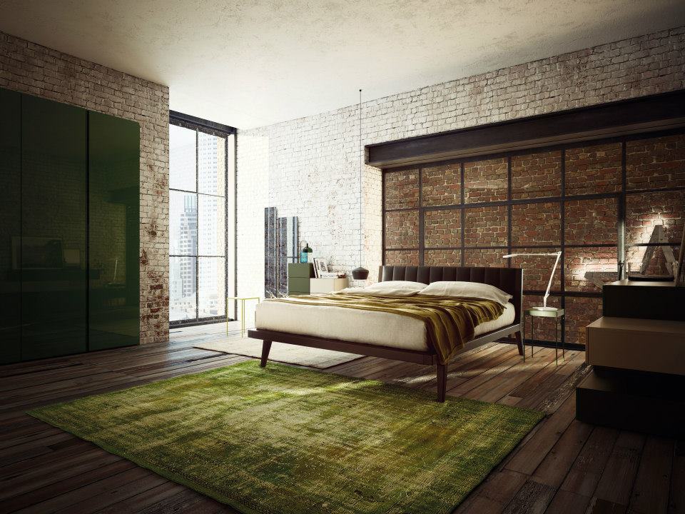
A Modern Take On Nature.
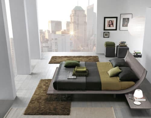
A moss coloured carpet, natural brick walls and stunning urban views through floor to ceiling windows -who couldn’t fall asleep in this setting? The natural shades of moss and brick, the wide plank flooring and the hits of ebony and white creates a sense of serine peacefulness. The simplicity of the room and the subdued choice of colours is the perfect foil to the fast paced life of city living. In fact, surrounded by natures colour palette it is hard not to feel like you are in your own private and hidden valley – an oasis in the middle of the city.
Based on Inspirations from Day and Night Collection by 8emezzo / Pianca Spa
