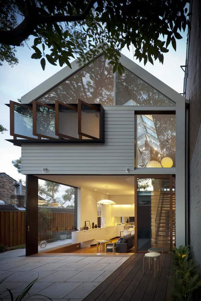
There are many modern residential architecture designs that rely completely on utter reinvention of every concept within and without the home to be unique, which produces some of the most extreme and innovative homes in the world. However, this approach to architecture can be alienating to the practical purpose of the buildings, resulting in homes that are wonderfully high-tech but end up being nearly unlivable. To avoid any of the cognitive discomfort which occasionally accompanies modern home design, Australian architect Christopher Polly chose to stick with familiar materials in this design for a home located in suburban Sydney. Relying on a unique structure and subtle decor modernization to complete the picture of a contemporary house, Polly’s design retains the feeling of “home” while immersing its owners in modern amenities.
The components contributing to this home’s design aren’t as exotic as those we sometimes see in state-of-the-art residential architecture: there’s no burnished bronze orbs for lights, no cantilevered walkways extending from the every side of the building at jaunty angles, and the home isn’t covered in carbon fiber or orange paint. No, what you see here is a design based on fairly common residential building materials, including stone and vinyl siding, often unpopular elements in current high-end home design. However, the home is still entirely modern, and that’s due to the implementation of the materials. The traditional structure of a suburban home is opened up and enlivened with significant glass area, open landings, and a lack of many traditional room barriers. Fixtures within the home have smoothed edges and floating facades, and furniture is comfortably contemporary. Everywhere you look, you see a well-thought-out subtle modernization of various elements of the house, which come together as a whole to form a versatile and relaxed environment with a present-day touch.
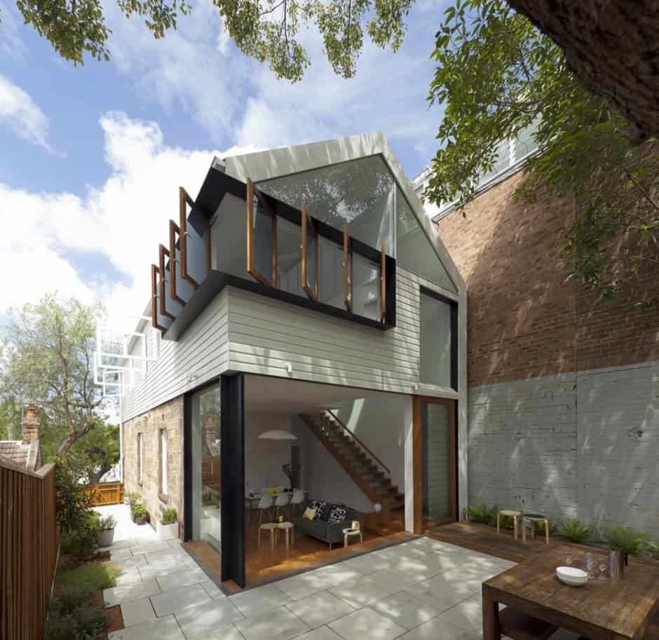
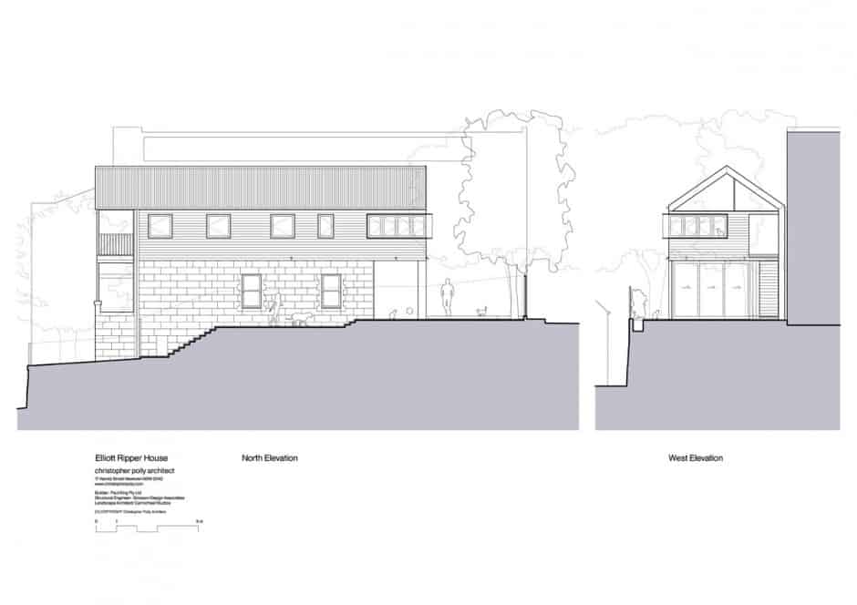
The color scheme of the home’s exterior is a soothing combination of the subdued white color of its siding, the dark natural accent wood from the door frame to the table in the yard, and the sandy beige tones of the stone behind the living room. This scheme is fairly pedestrian, so the home relies on its unique structure to bring out the modern potential of each material.
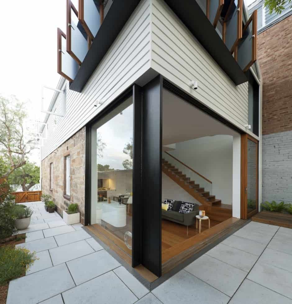
The most obviously modern piece on the home’s exterior is the glass bottom corner, framing the living room. Note the stylish wood floor accent that continues into the home to blend with the flooring inside the living room itself, and the black-painted beam to give visual definition to the glass space from afar.
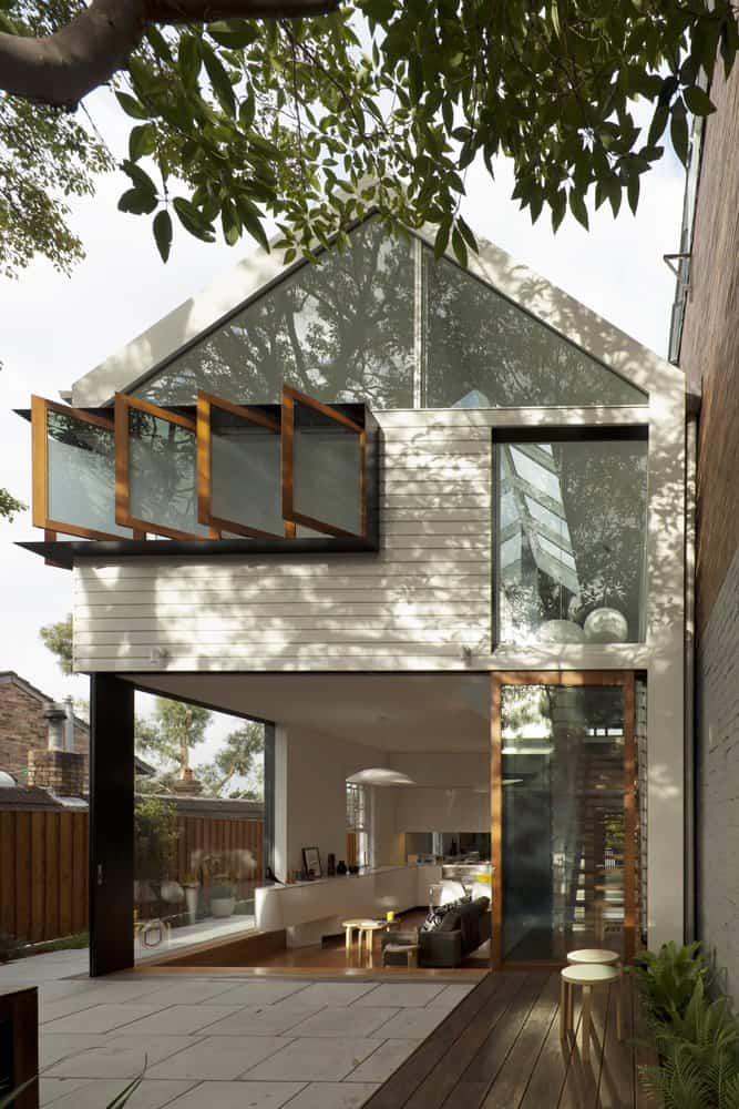
Huge window spaces, including the entire front of the house from the living room, can be opened to the air, making the yard just another part of the home on days with good weather. On the bottom floor, panels slide out of the way, and on the top a few side-hinged windows extend with visual grace.
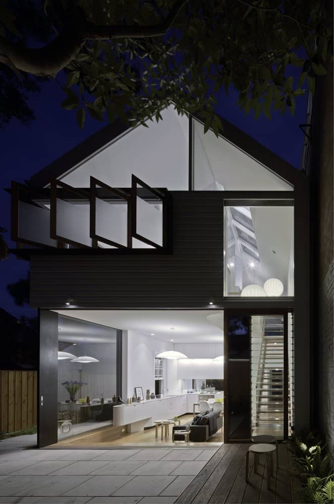
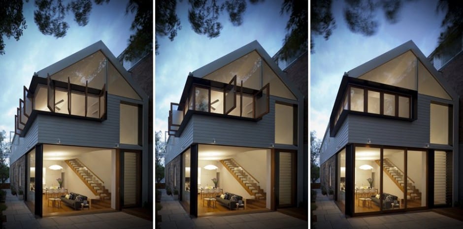
The upper window set extends all the way around the corner, extending the lines of the living room vertically and enhancing the height of the house. These windows are those of the home’s bedroom.
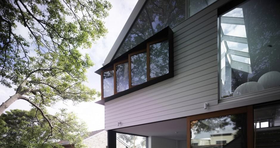
The window frame juts from the building a tasteful amount, defining the bedroom’s footprint as well as mimicking the color scheme of the living room’s support beams on the outside of the building.
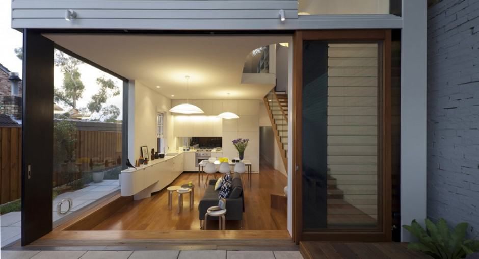
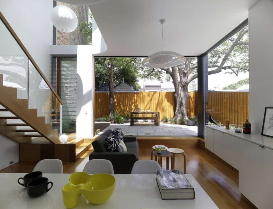
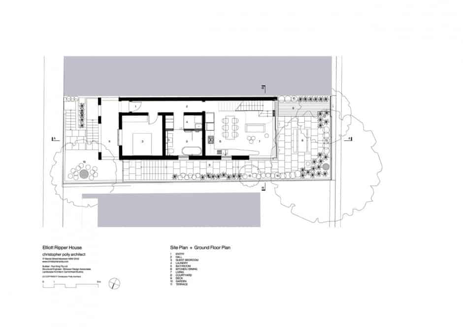
The living room and kitchen are a unified space inside, but the living room is given definition by the massive glass area on its side of the home. It features cozy yet chic furniture, and substitutes a view of the yard for the typical television entertainment center.
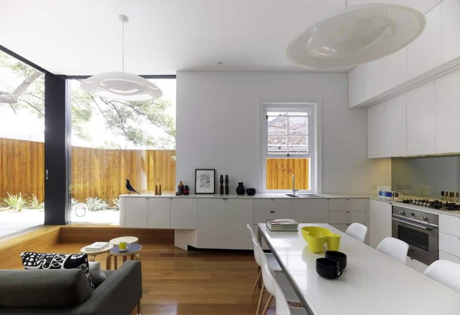
The kitchen actually has more amenities than the living room, with a plethora of custom cabinetry to store any ingredients and tableware you could possibly want. The storage is one of the most concertedly modern pieces of the home, with curving borders, minimal modern handles, and a finish matched to that of the table.
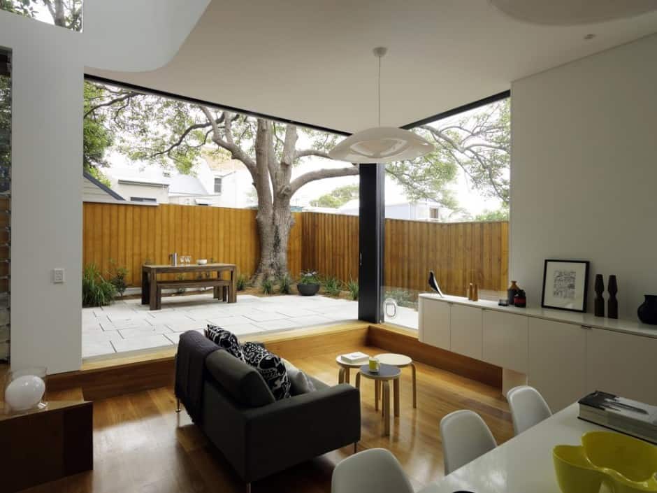
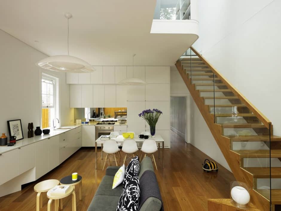
The entire space is extremely open, be it to the outdoors or to other parts of the home. The ceilings are high, and the white of the walls and kitchen fixtures lighten and open the space further.
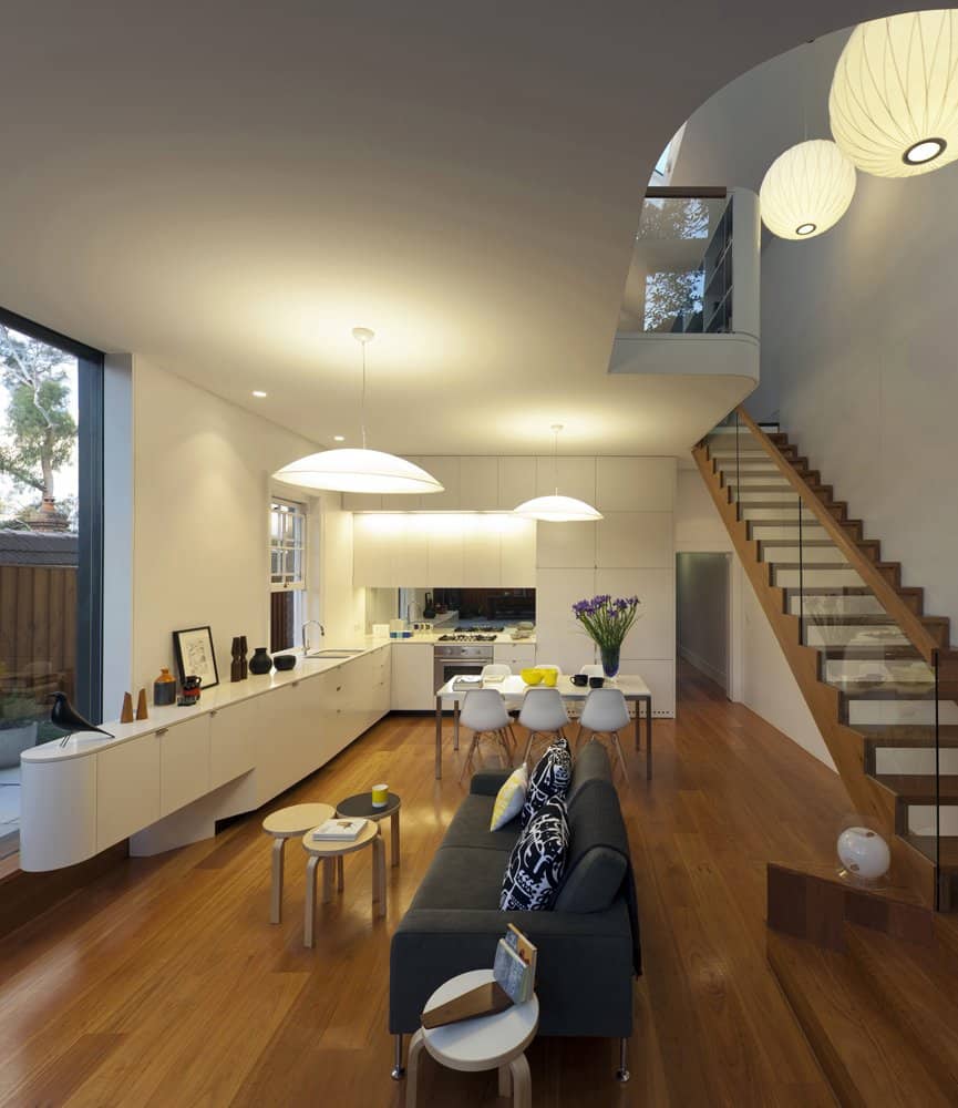
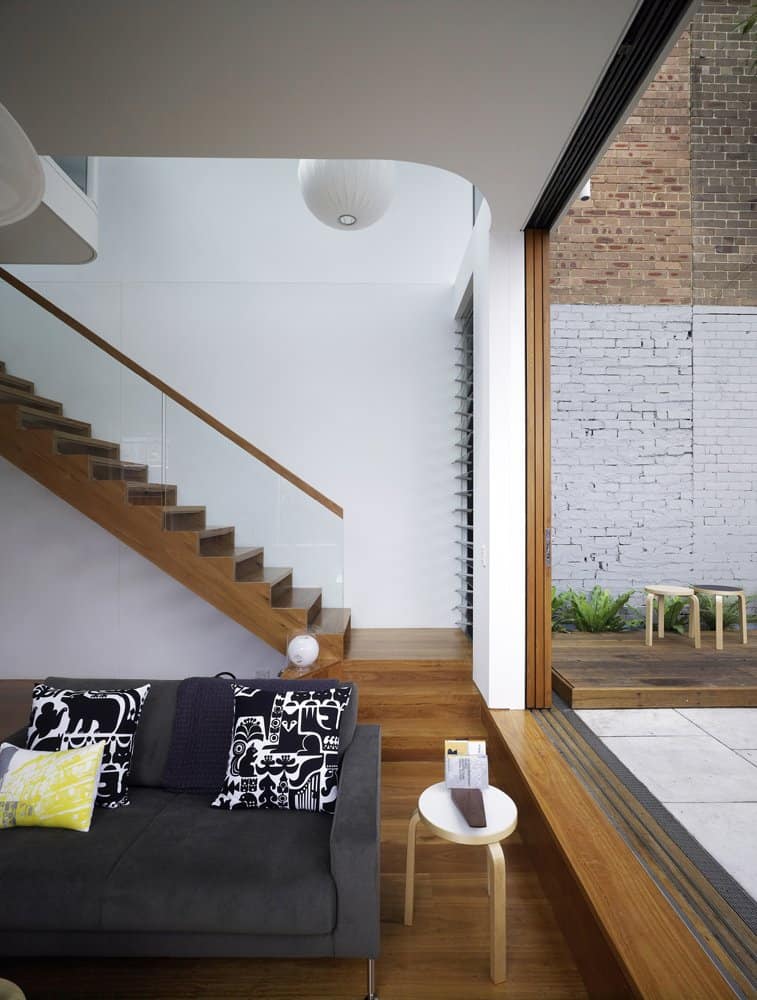
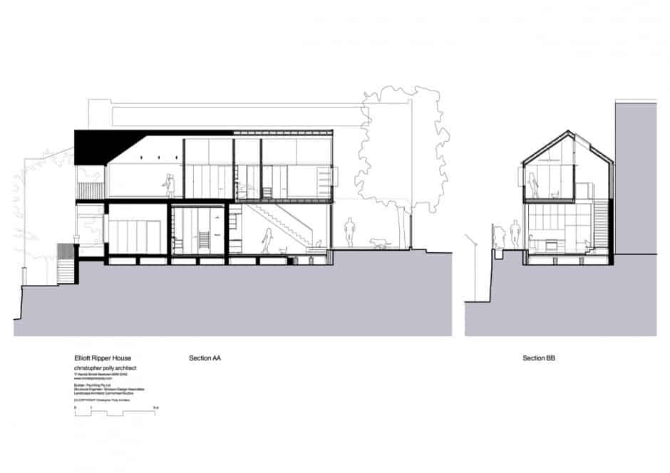
The living room is a step or two down from the outside ground, creating an effective distinction between spaces while keeping the home open to its useful outdoor patio.
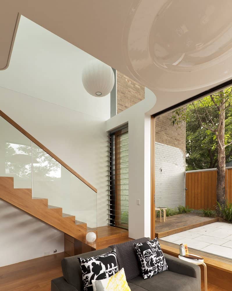
A bit of possible upstairs floorspace is sacrificed to drastically heighten the ceiling at the entrance of the home, giving unobstructed views up the stairs to the second story or vice versa.
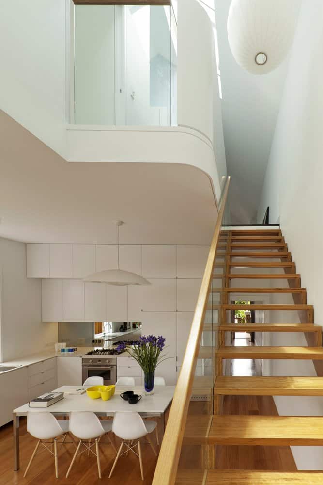
The stairs themselves are both minimal and stylish, with a glass barrier and medium-stain wood being the only materials visibly used.
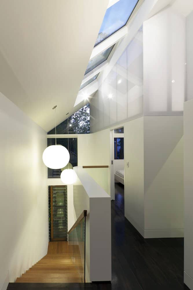
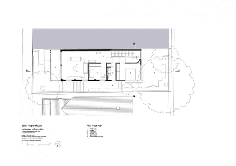
The wood on the landing changes to a significantly darker tone than that of the stairs, signaling a transition to private space. This transition is also evident in the appearance of more traditional doors and walls as space barriers, applied to the bedroom and bathroom.
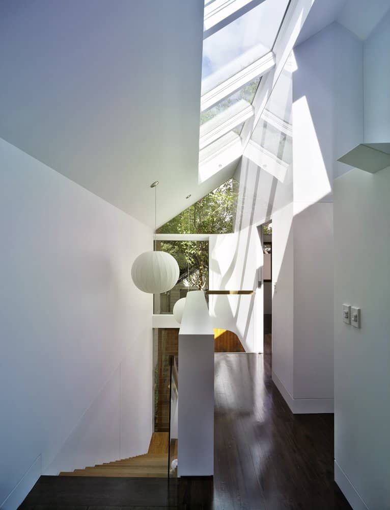
Continuing on the theme of the home’s openness to its surroundings, a number of skylights are placed on the landing to provide moonlight at night. In addition, one wall of the landing is glass to let light in from the living room windows below, and almost all the walls present on the living room’s side of the house have large glass glass-filled apertures.
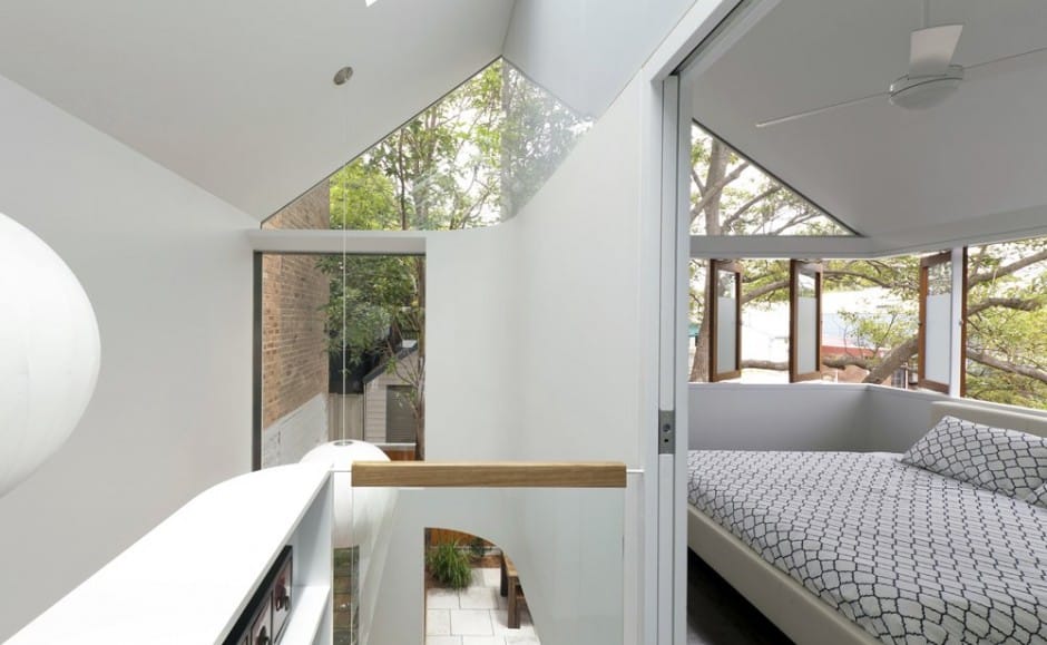
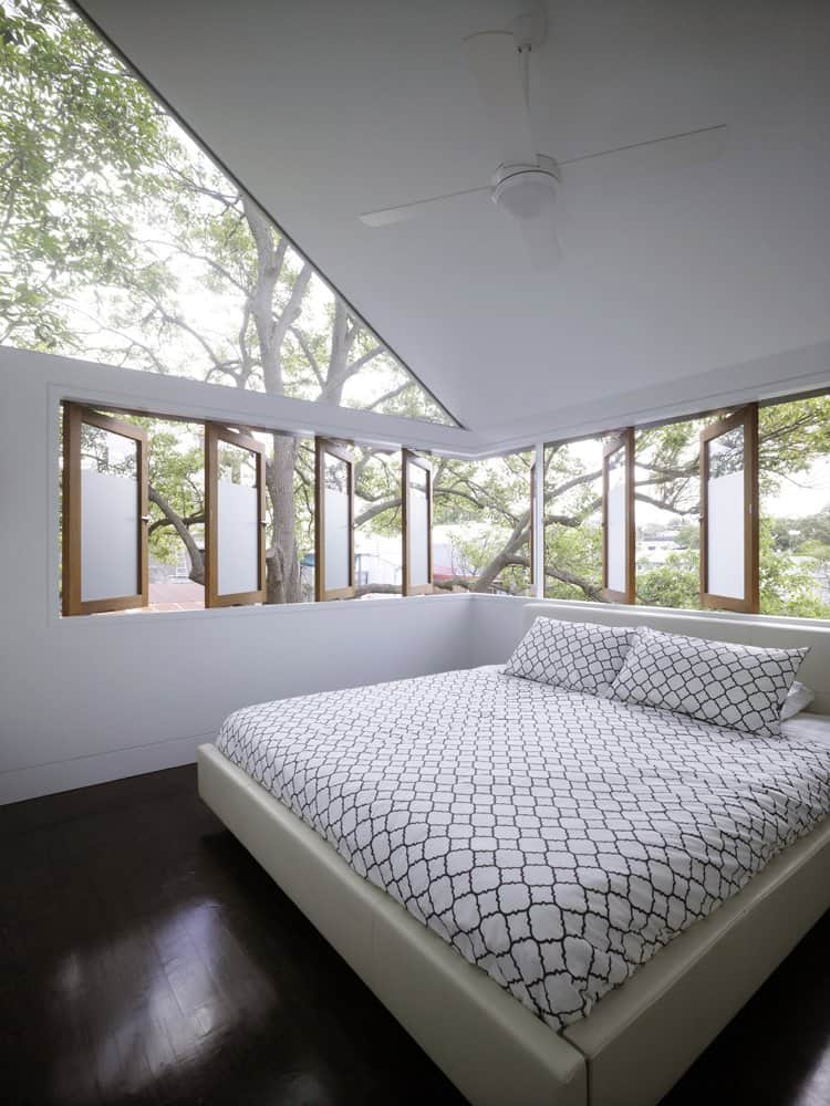
The bedroom is calm and simple, an open space with unrestricted ceilings reaching up to the home’s roof. Different parts of the room are rounded off in a similar manner to the kitchen fixtures, ergonomically fitting more storage into the home.

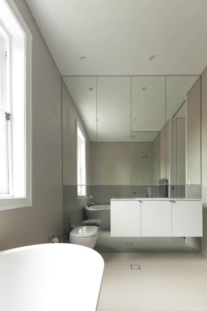
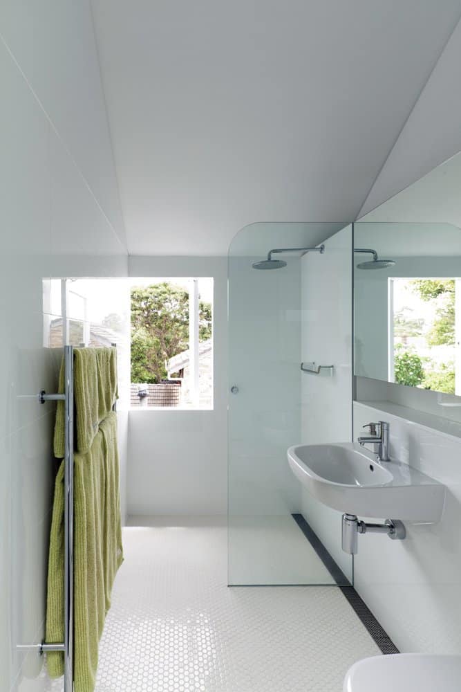
Every piece of the bathroom is familiar and puts you at ease, but each part of it has little details used to modernize the room. The mirror is extended to become an entire wall, the sink is a “floating” design with the same modern cabinet handles as seen downstairs, and the shower is an open-concept corner instead of an elevated box on one side of the room.
Christopher Polly Architect
