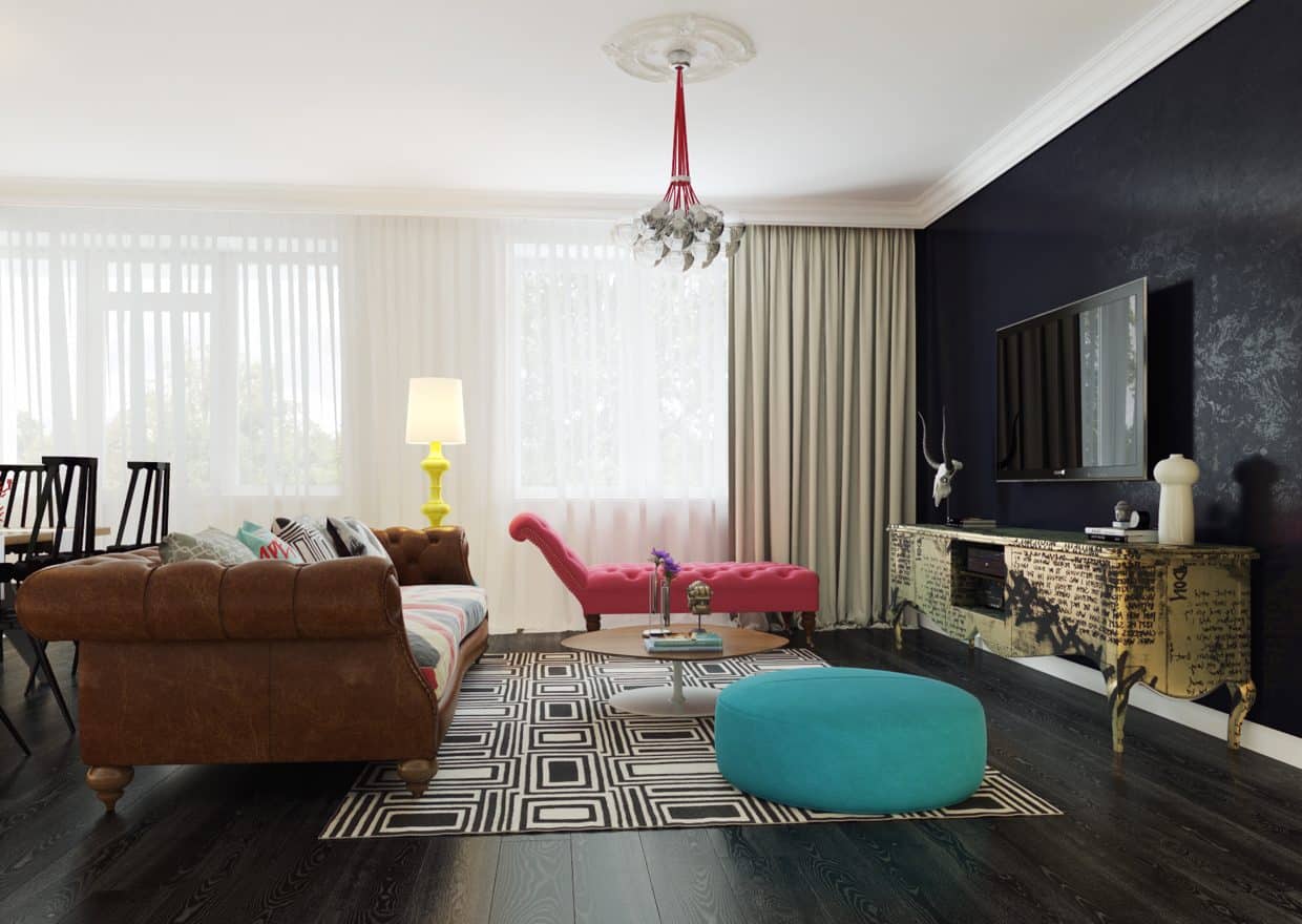
This home, designed on the inside by Dmitriy Schuka, started out as a fairly typical bungalow before getting a thorough re-working. Scattered with nearly every color imaginable, the various living spaces of the house each have been transformed by an infusion of color, furniture, and material choices that reflect their purpose and a modern design ethos. Schuka’s work proves that even the most unassuming of formats, a typical family home, can be completely modernized without a change in structure. Many of his changes and choices are easily adaptable to your own home, without knocking down walls or relocating to a space that has modernity built into its bones. With respect for the idea of the house as a usable space, the interior design elements here are both beautiful and functional. They go to prove that, with a little bit of creativity and effort, your own home can become an ultra-modern haven.
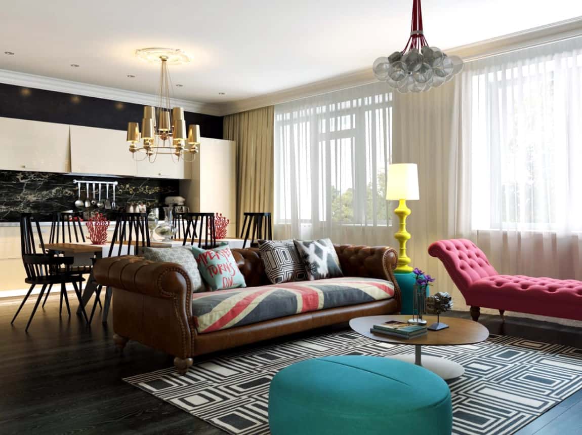
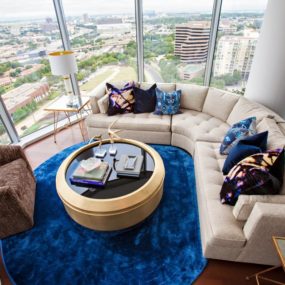
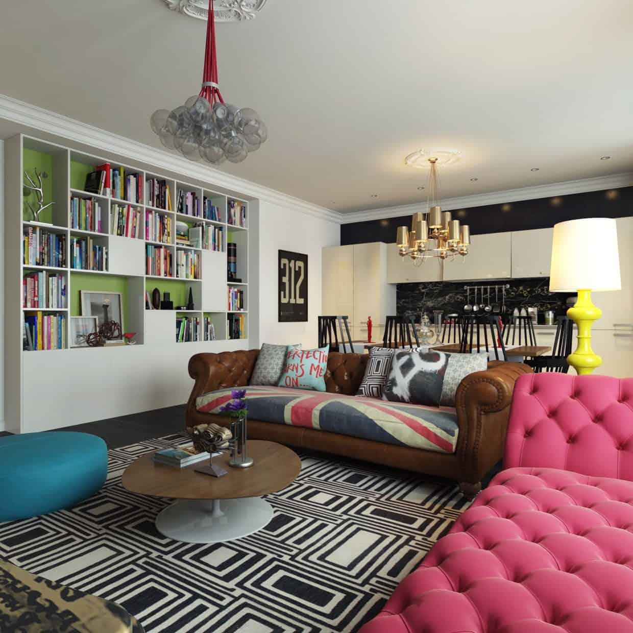
Early on, a theme begins to emerge from the design of this home. Some of its spaces are extremely bright and full of neon colors, while others contain only a few, usually darker, tones. This is a nod to the usability of the home, with the design kept freshly colorful while not being overwhelming. Darker spaces throughout the home, like the kitchen on the left here, provide calming respite from the busier areas like this living room.
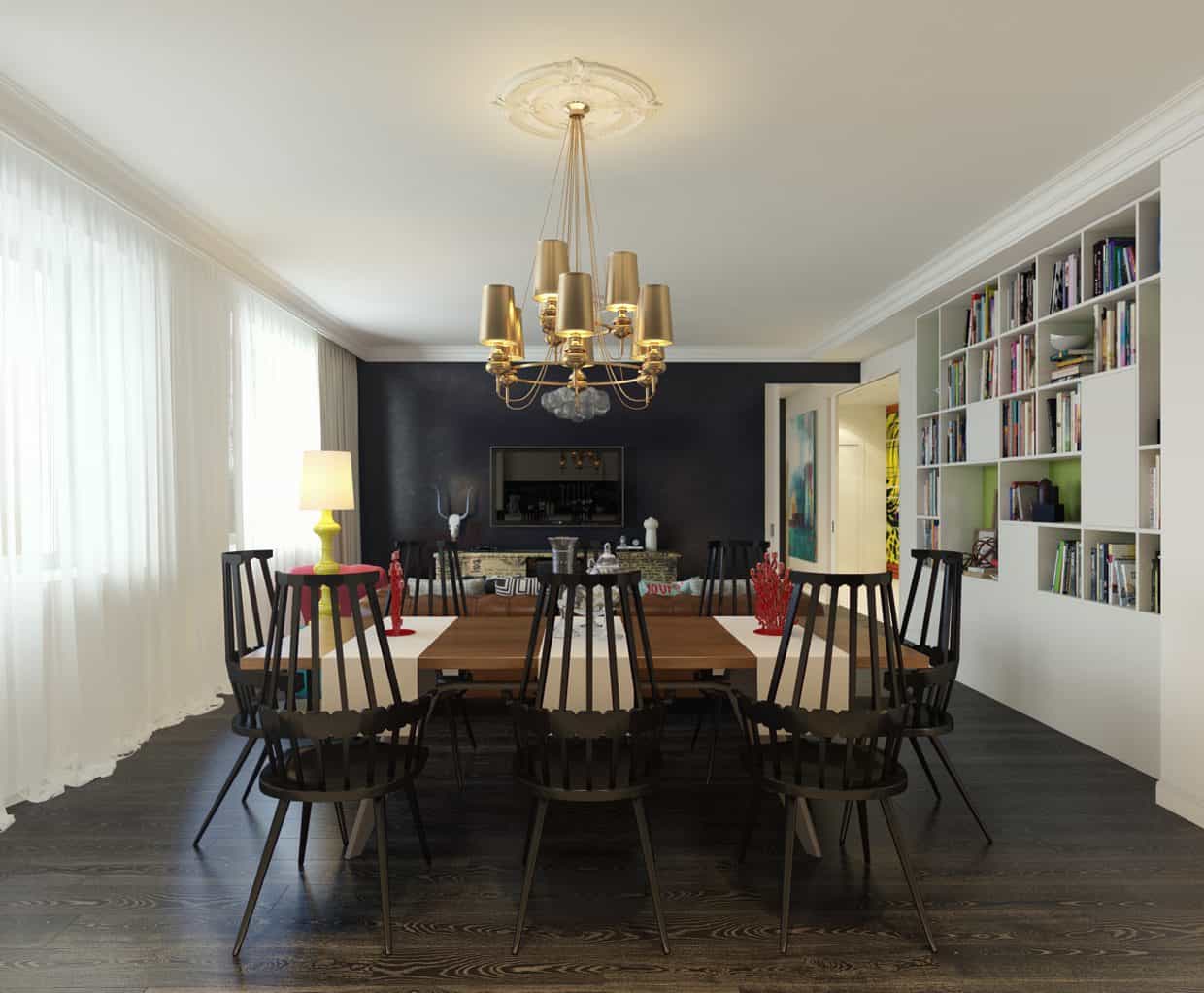
Here we can see two distinctly unique light fixtures, one above the dining table and the other in the living room. One of the most important parts of any room is its lighting, and adding fresh, modern lights can be the factor that tips the scales in a design to make it atypical and interesting.
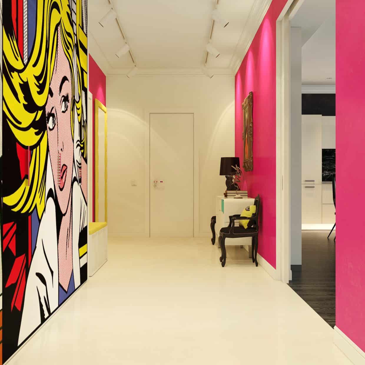
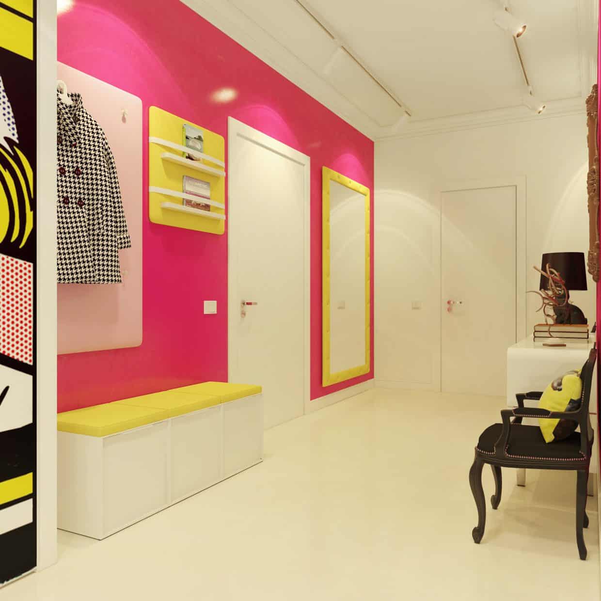
The most visually distinctive section of the home is its foyer, complete with a comic-style print covering a section of the pink walls from floor to ceiling. Even with a long hallway of homogeneous color, you can still mix things up with an entrancing visual cue like this piece.
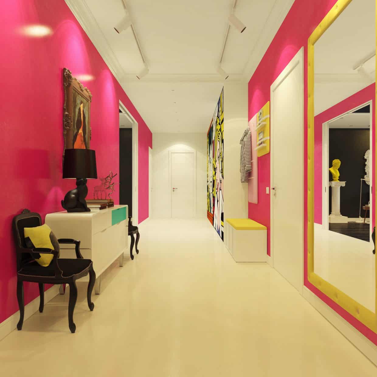
As the main passageway of the house, this foyer has to make a statement that will leave a lasting impression on anyone visiting. To that end, it’s easily the brightest spot in the house and is filled with visually enticing objects and furniture.
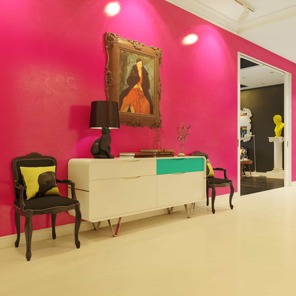
Even within a single piece of furniture, you can spice up a room’s looks fairly simply. This chest of drawers has one intentionally mismatched drawer, an eye-catching design choice that makes the space seem more even more lighthearted and one-of-one.
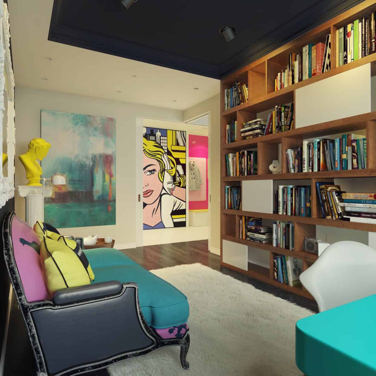
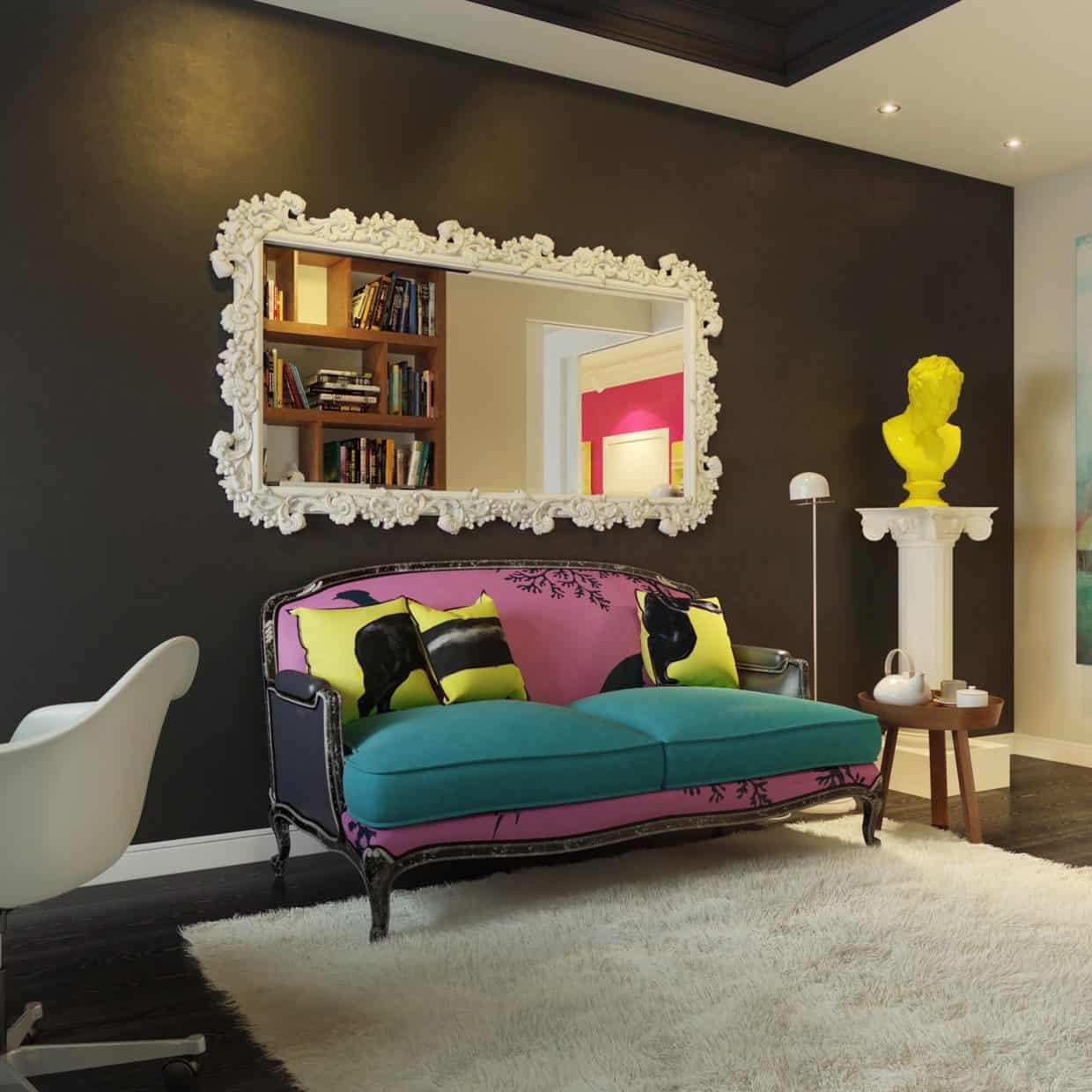
When the time comes to kick back and get some relaxation, you don’t want bright neon colors in the way of your thoughts. To that end, this small library off the foyer is full of natural tones, with only a few bright spots. For reading a good book or getting a bit of work done, it’s an environment that is both modern and calming.
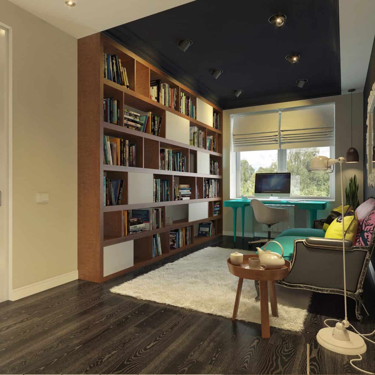
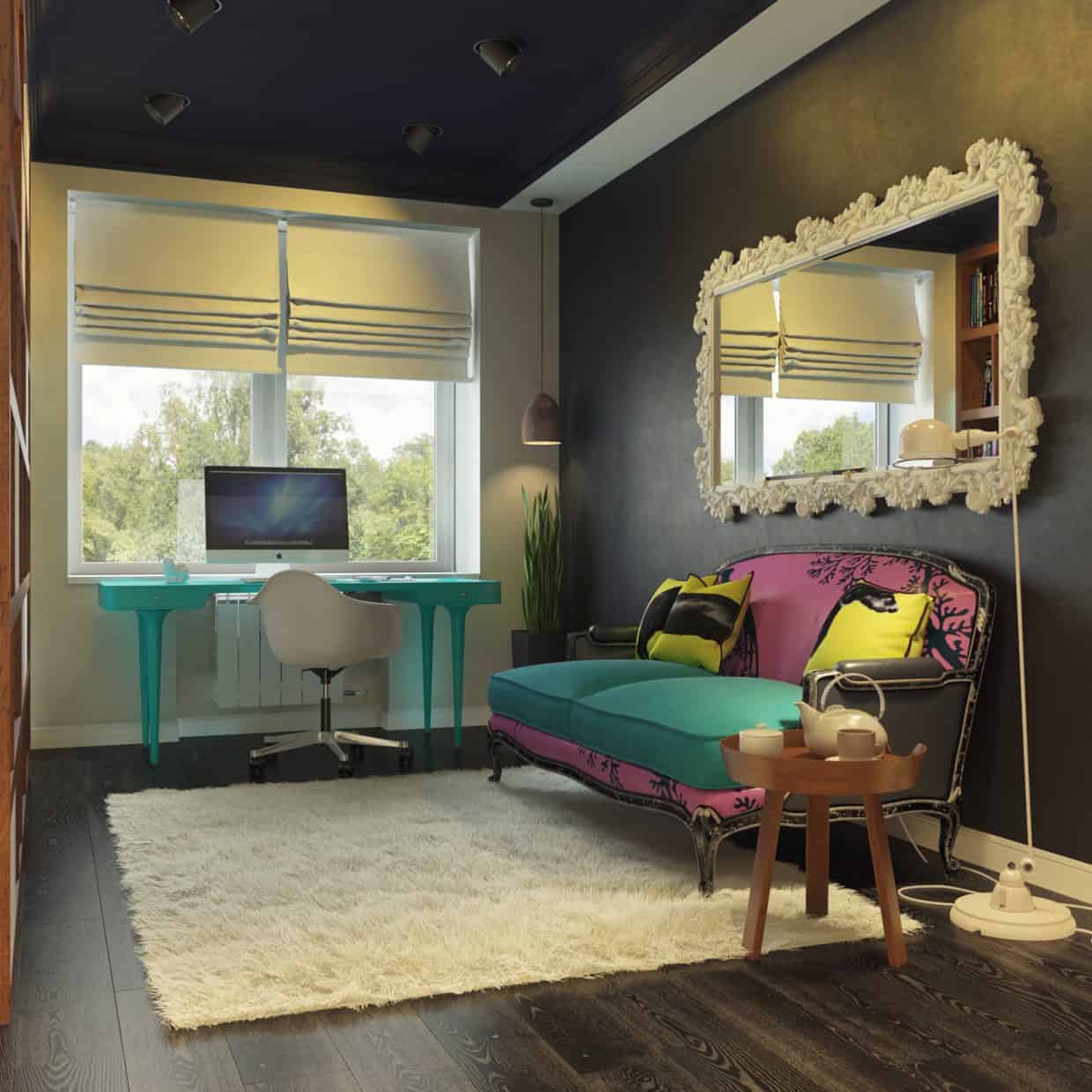
Everything in the library, from the rug to the mirror, is intended to compliment the overall design ethos of the room and the entire home. If you really want to transform your own home, it’s often the details that are the trickiest to design in. However, those details can make or break the space, so much attention should be paid to them.
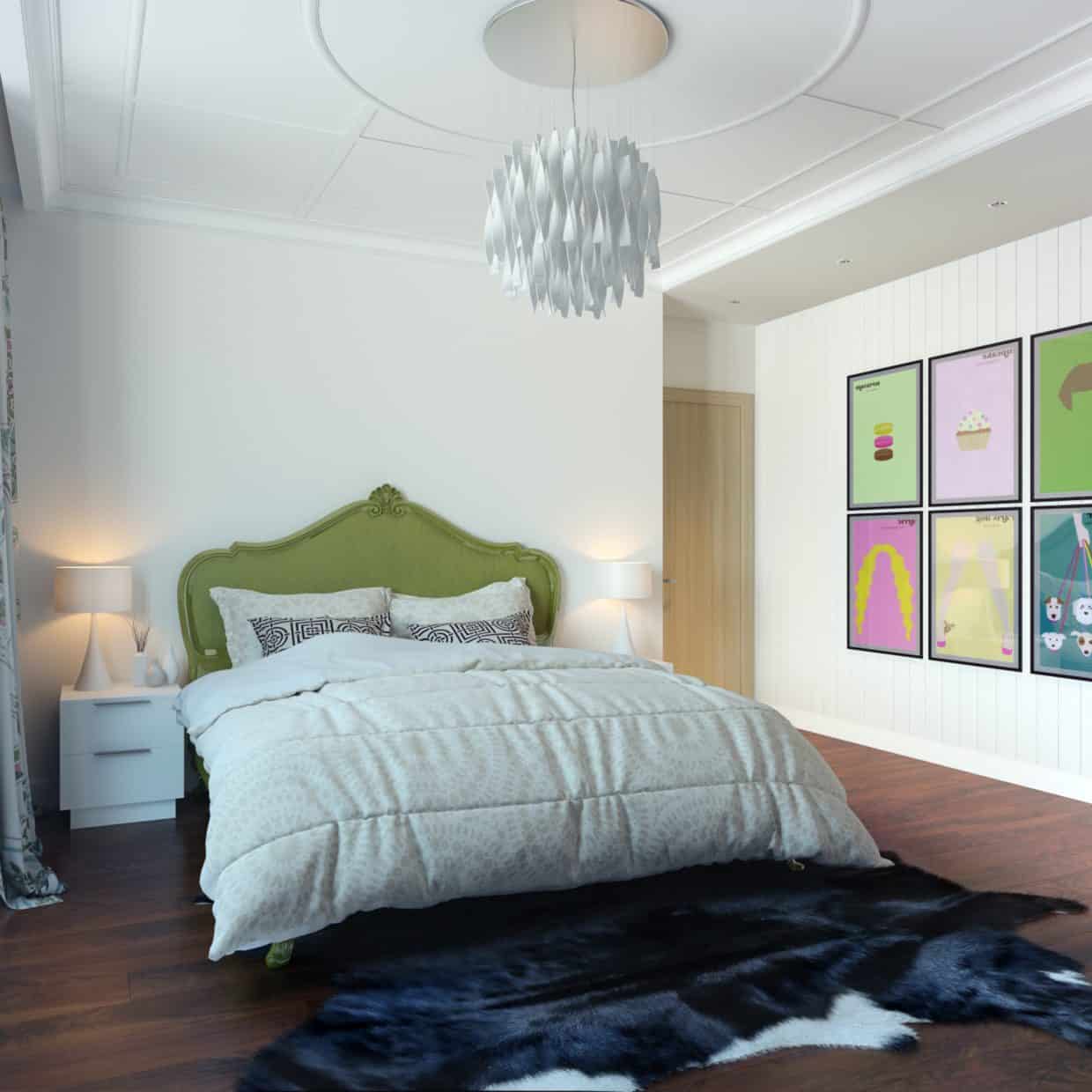
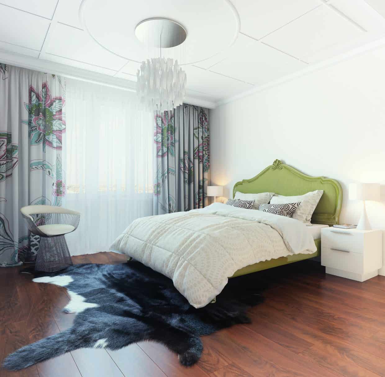
The bedroom is the best example here of a successful blend between modern brightness and serene surroundings. Instead of being dominated by ultra-bright colors such as those in the living room, the most-used chamber of the home sticks with a simple white and various grays, keeping it light but still easy on the eyes.
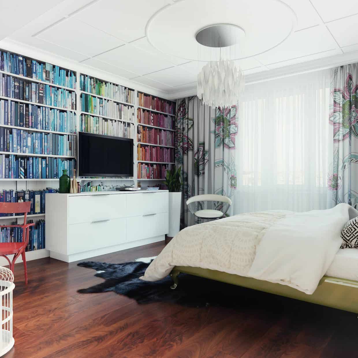
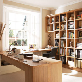
Full-wall shelving never goes out of style, and completely reinvents a wall without the need for structural renovations. Almost every home has at least one wall that would be prime candidate for such a treatment, and the result is captivating.
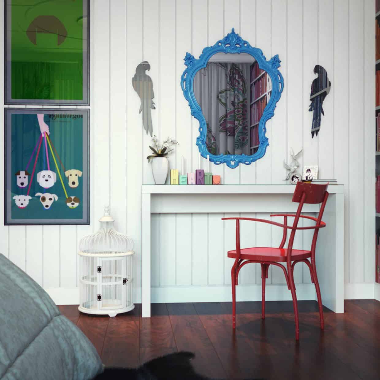
Furniture style, too, is a contributing element to making a home visually appealing. This desk and its chair, like much of the furniture throughout the home, has a vintage appeal that evades any particular design trend and is guaranteed to be fashionable for years.
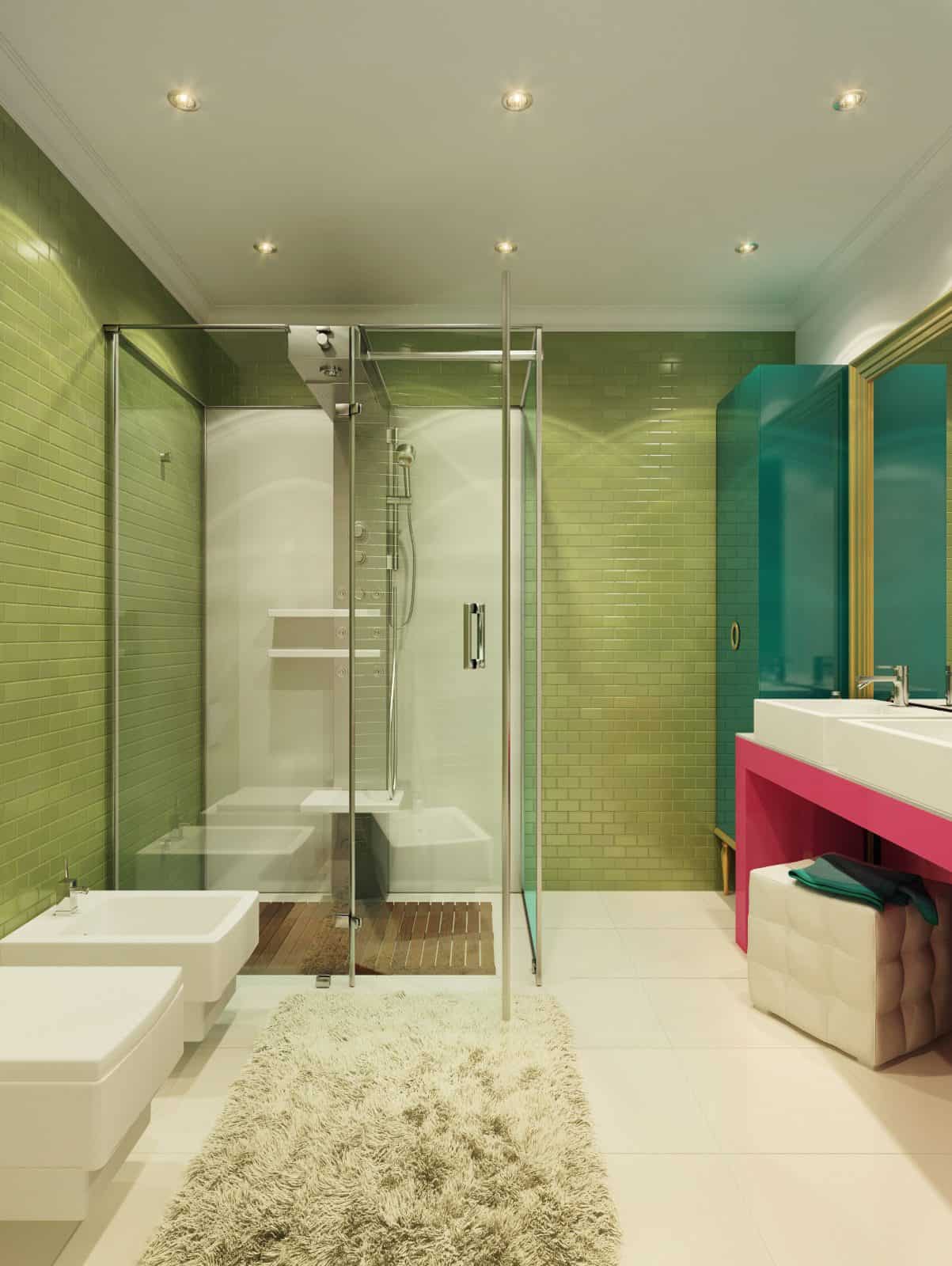
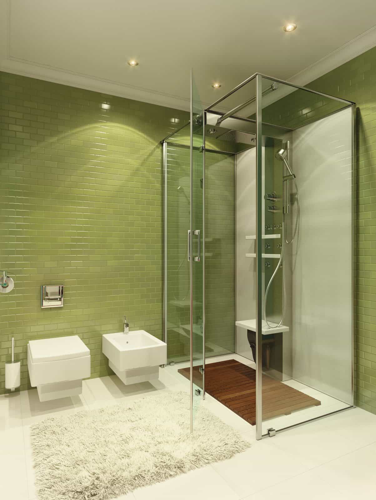
Like the library, the bathroom is a more naturally-colored space, designed with a personal feel for relaxation time. A single color scheme is used on most of the materials in the room, bringing unity to the space. Such an approach can help make your own bathroom feel more unified and updated without changing much else.
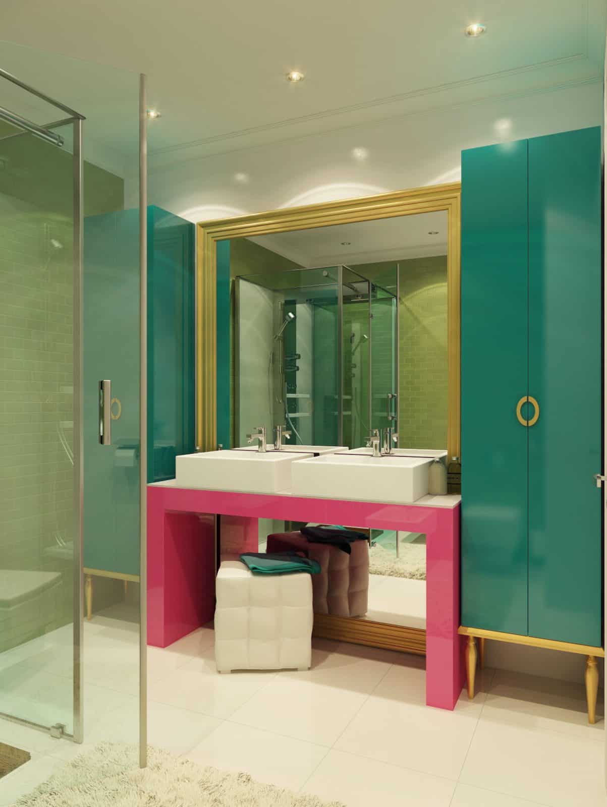
In this house, the bathroom counter reminds the homeowner of their bedroom, living room, and the obligations beyond. While the bathroom overall is serene, this small addition makes it seem less isolated from the rest of the house than it may be otherwise. It also brings the bathroom in line with the general visual feel of the home as a whole.
Dmitriy Schuka


