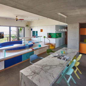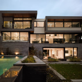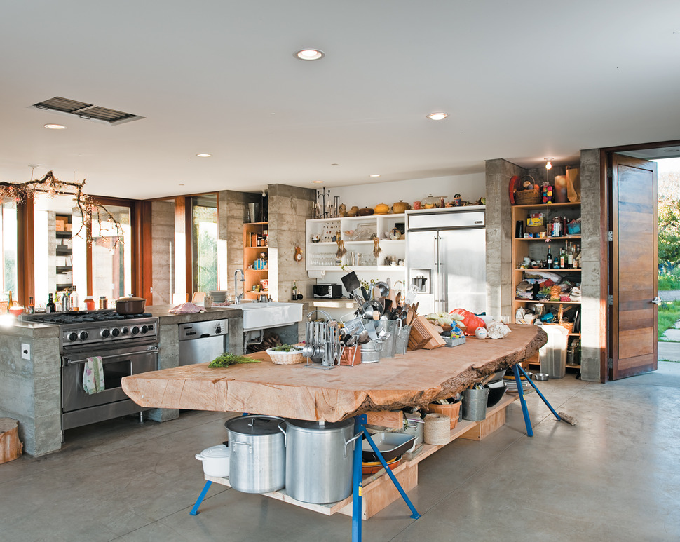
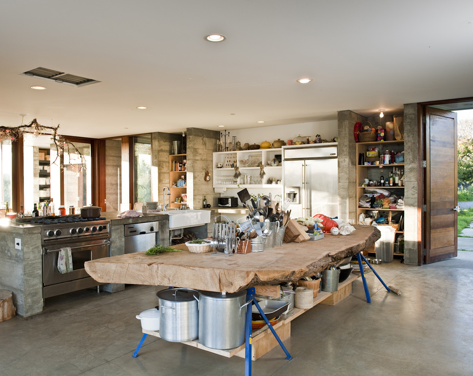
Anderson Anderson Architects where challenged to create a home for a relocated New York family that reflected their east coast Manhattan loft aesthetic within their new west coast site on an apple grove in Sebastopol, Sonoma County, California, USA. Approximately 50 miles north of San Francisco. The location was an idyllic rural setting that included not only apples but olive trees and grape vines which meant that during harvest season the client’s requested and needed a kitchen capable of handling the large amount of product that would be prepped and transformed into wine, olive oil and a variety of apple products. Aside from requiring a kitchen with major storage and prep space, the room also needed wide traffic patterns and open shelving for the client’s wheelchair bound son. The final result is a kitchen of massive proportion and within this kitchen is a prep space created out of a proportionately massive slab of old growth Cyprus wood supported by bright blue saw horses with a lower shelf spanning the length below the slab.
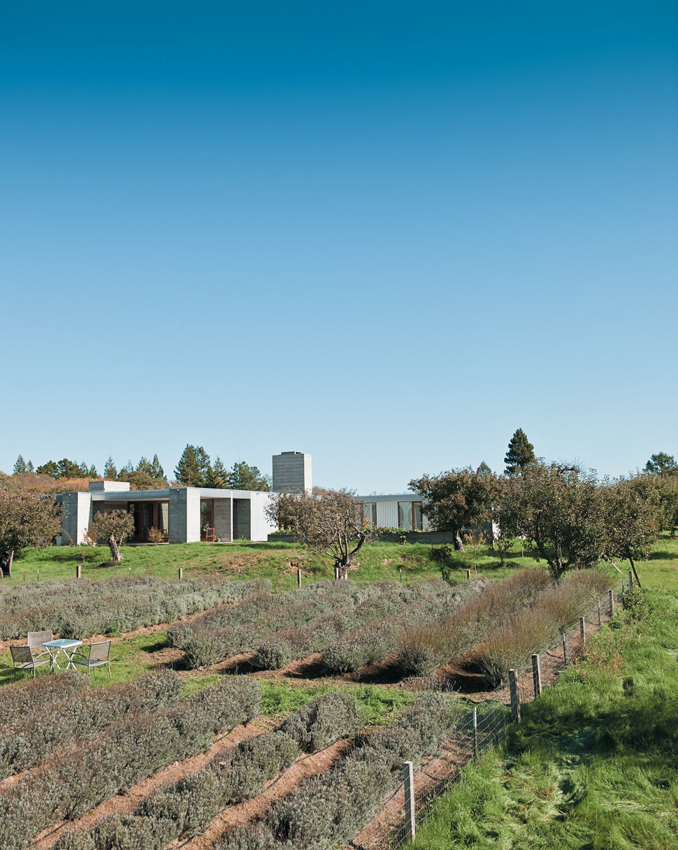
The need for a kitchen of this magnitude becomes obvious when looking at the rows upon rows of fruit crops and trees that span out from the Hupert-Kinmont house. The trees are planted on a grid with 25-foot spacings and the walls of the home line up exactly with the rows to create a visually unifying outdoor vignette. The architects where even aware enough to position the window glazings between the rows of trees to create long and continual vistas of foliage.
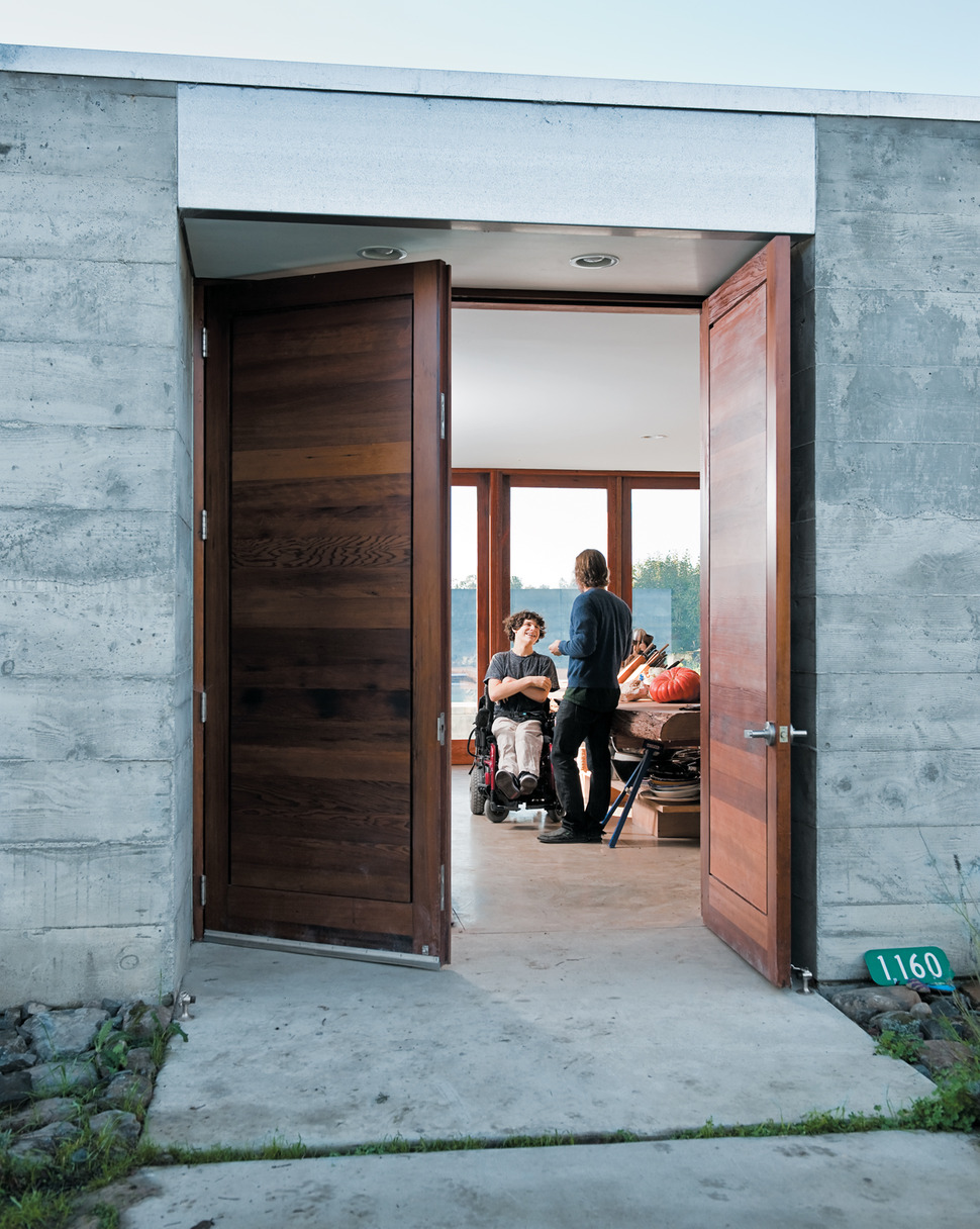
With the kitchen being the heart of the home it made sense to locate the entry doors in such a way that they open to the passageway between the salvaged Cypress slab and the large gas stove.
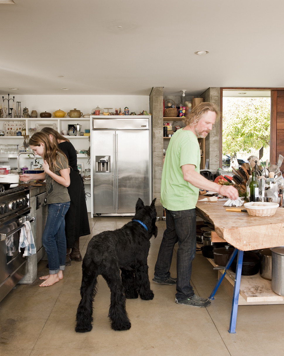
The passageway is wide enough for the whole family – including the dog – to congregate and still leave room for a wheelchair to navigate through.
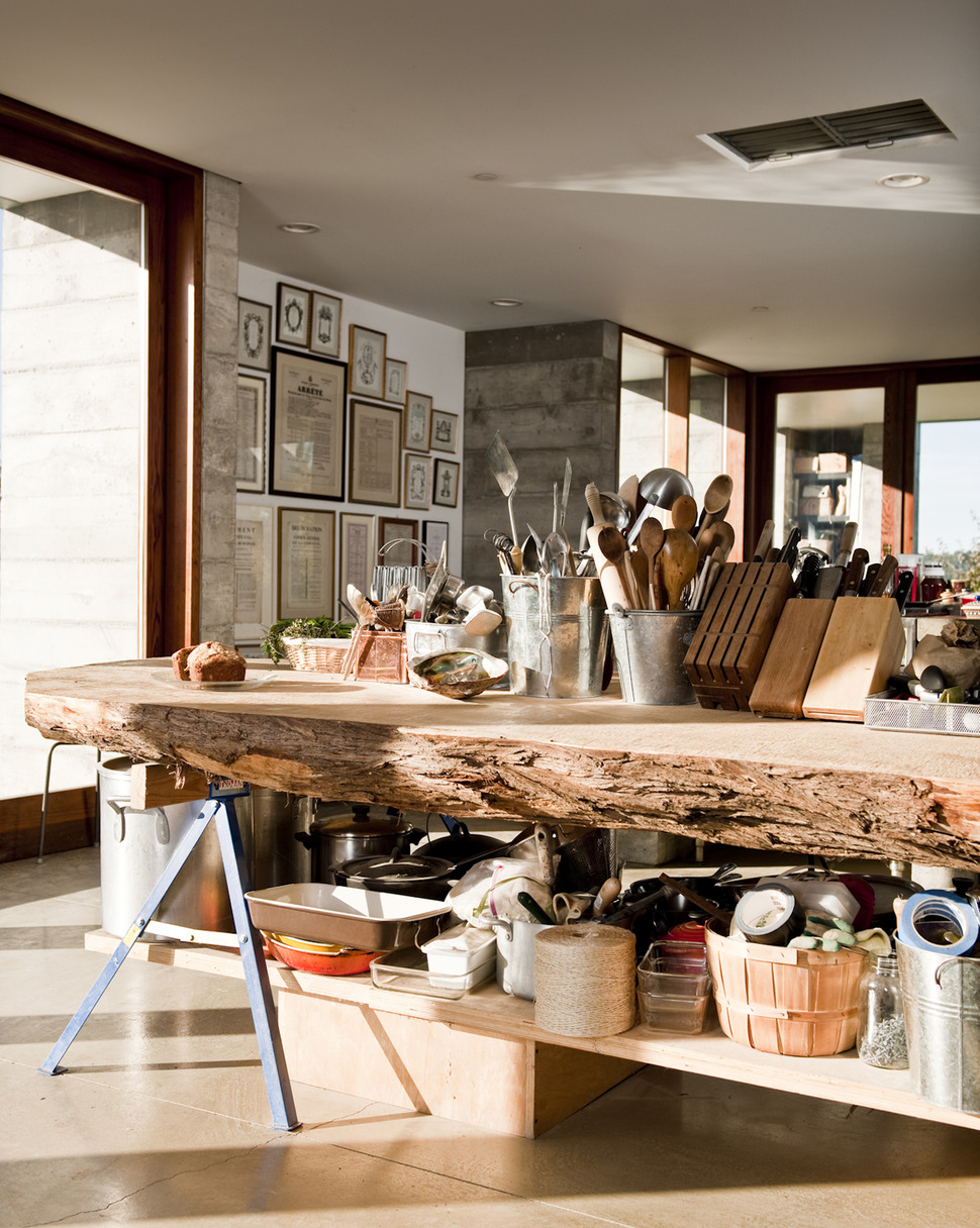
Since wheelchairs cannot back up that easily, it becomes difficult for a wheelchair bound person to open doors and drawers and so the architects designed the complete Hupert-Kinmont house with open shelving. There is even an easy to access daybed next to the windows.
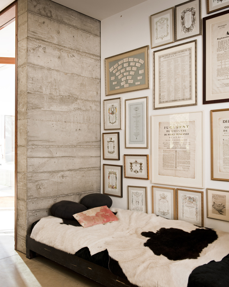
The daybed niche is designed with a backdrop of personal framings and this reduces the resting aesthetic turning it rather into a fun place to hang out and watch the chefs in action.
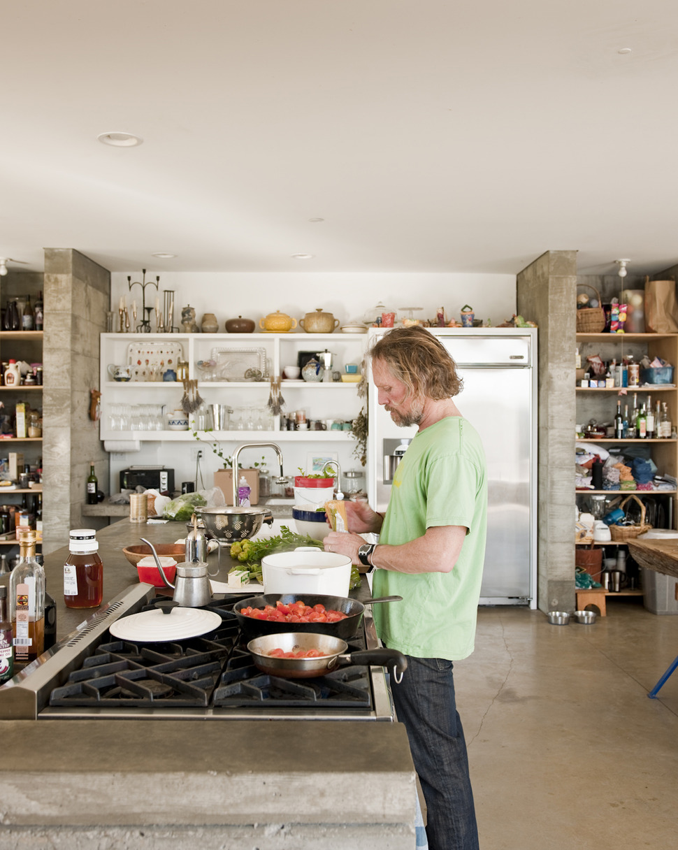
One of the chef’s that loves to experiment within the kitchen is the dad. An artist and dealer of antique books revolving around the subjects of food and wine, he is continually testing out old time recipes found within the pages of his books. To do so a large 6-burner gas stove is set into the second island within the kitchen – this one made of concrete to match the structural material used throughout the Hupert-Kinmont house.
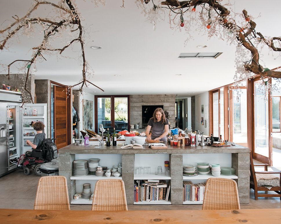
As with most open concept homes, the kitchen is just beyond the dining zone and the large concrete island acts not only as a cooking and baking zone but also as a serving counter to the dining table just in front of it. With the rustic country aesthetic of the kitchen clearly exposed to the dining room, the mom created a stunning art feature – suspended from the ceiling – over the dining table of crystals and strung bulbs mounted and woven through a twisting and turning salvaged branch.
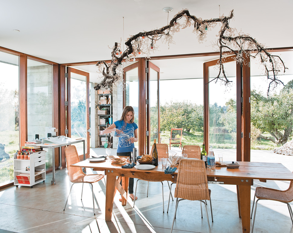
While the home is made from prefabricated concrete modules, wood is present within the home’s framework and doors – and this isn’t just any wood, all the door frames are made from reclaimed redwood wine barrels.
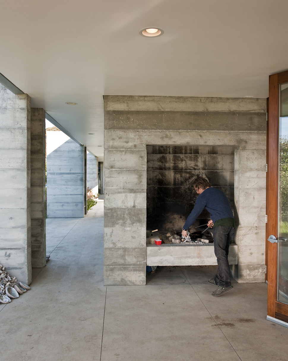
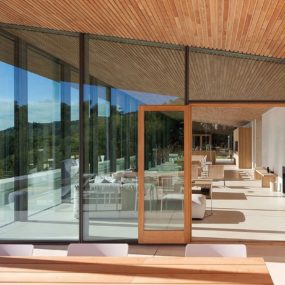
Just outside the glass doors of the dining room is a covered deck complete with a large wood burning fireplace that is used for cooking during the warmer summer months. Supporting the ceiling overhang on the deck are a row of modular prefabricated concrete forms and these modules are identical to all the modules used throughout the Hupert-Kinmont house.
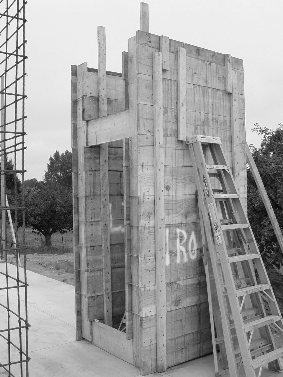
The architects designed a prefabricated C-shaped reusable forms from 2×12 boards that could be easily relocated around the site during the construction period. Using the modules saved on costs and materials and reduced the need for an onsite concrete truck to 5 or 6 visits only.
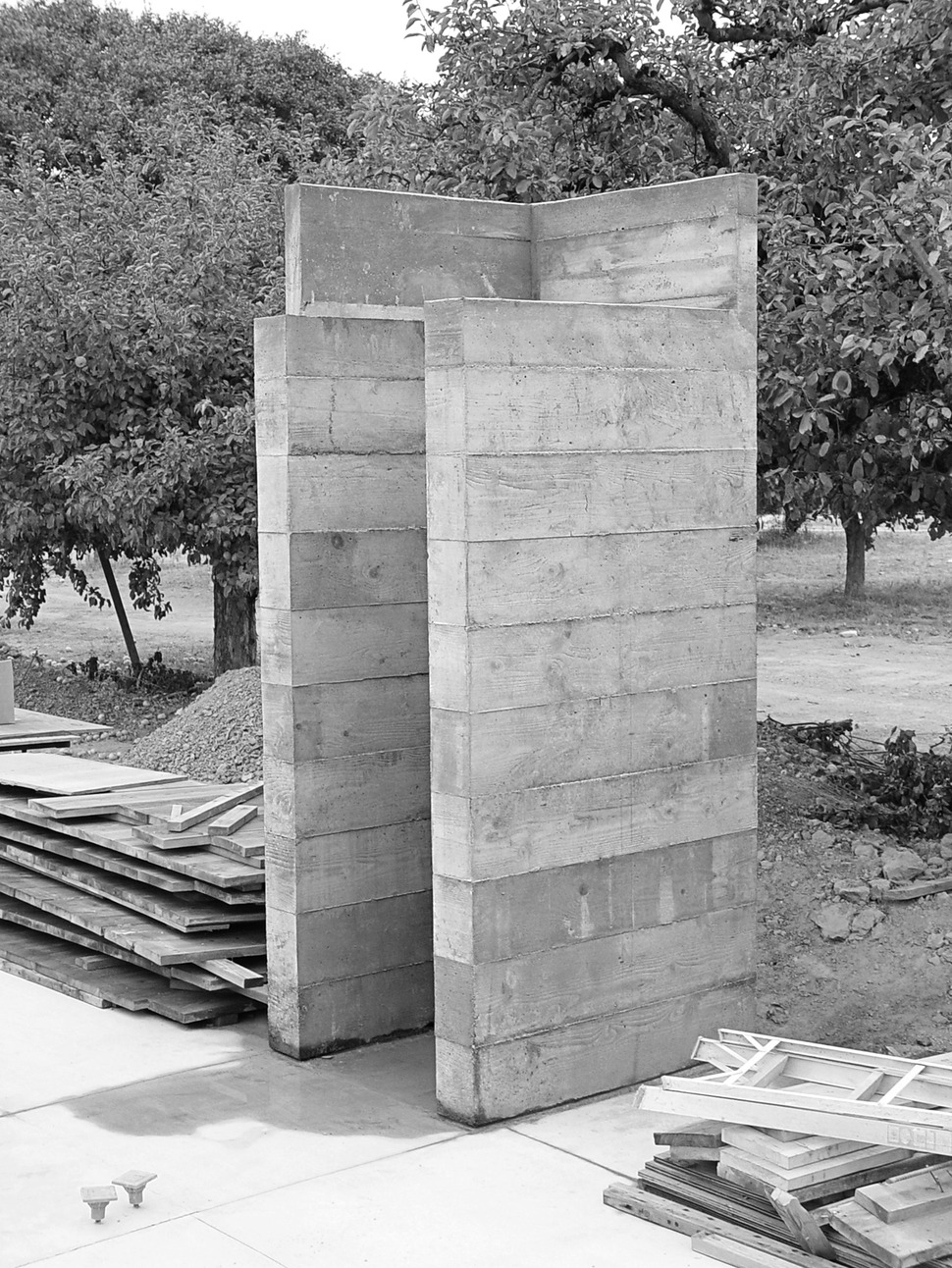
The 28 finished 4’x4′ concrete modules took on the rough texture of the 2×12 planks used to create the forms. These textured modules are used throughout the home and each one sits on a continuous slab foundation. Only the tall chimney above the roofline was framed out and poured separately.
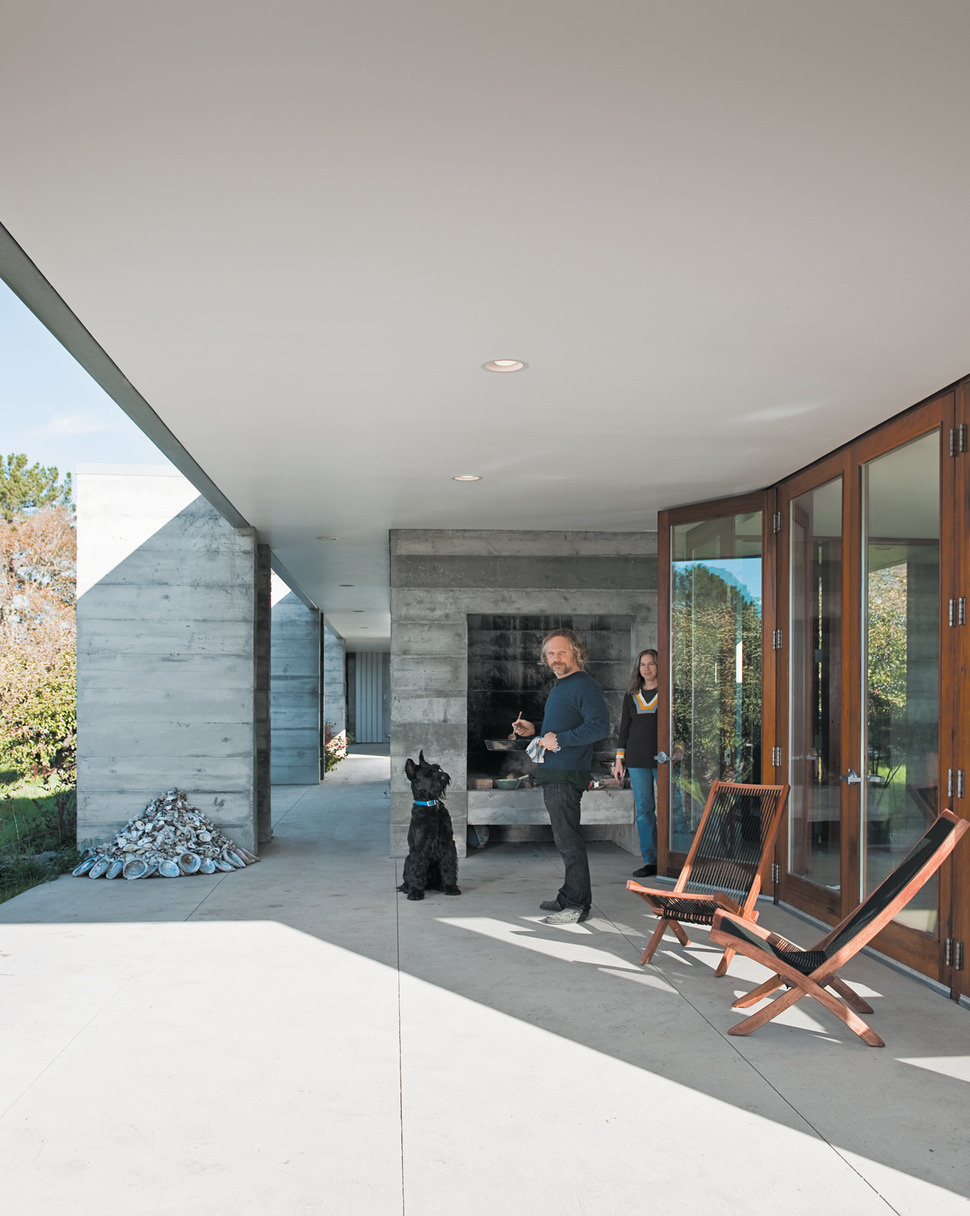
The texture within the modules creates an added sense of warmth to an otherwise cool material, and if that’s not a warm and toasty enough feel, there is always that amazing outdoor fireplace!
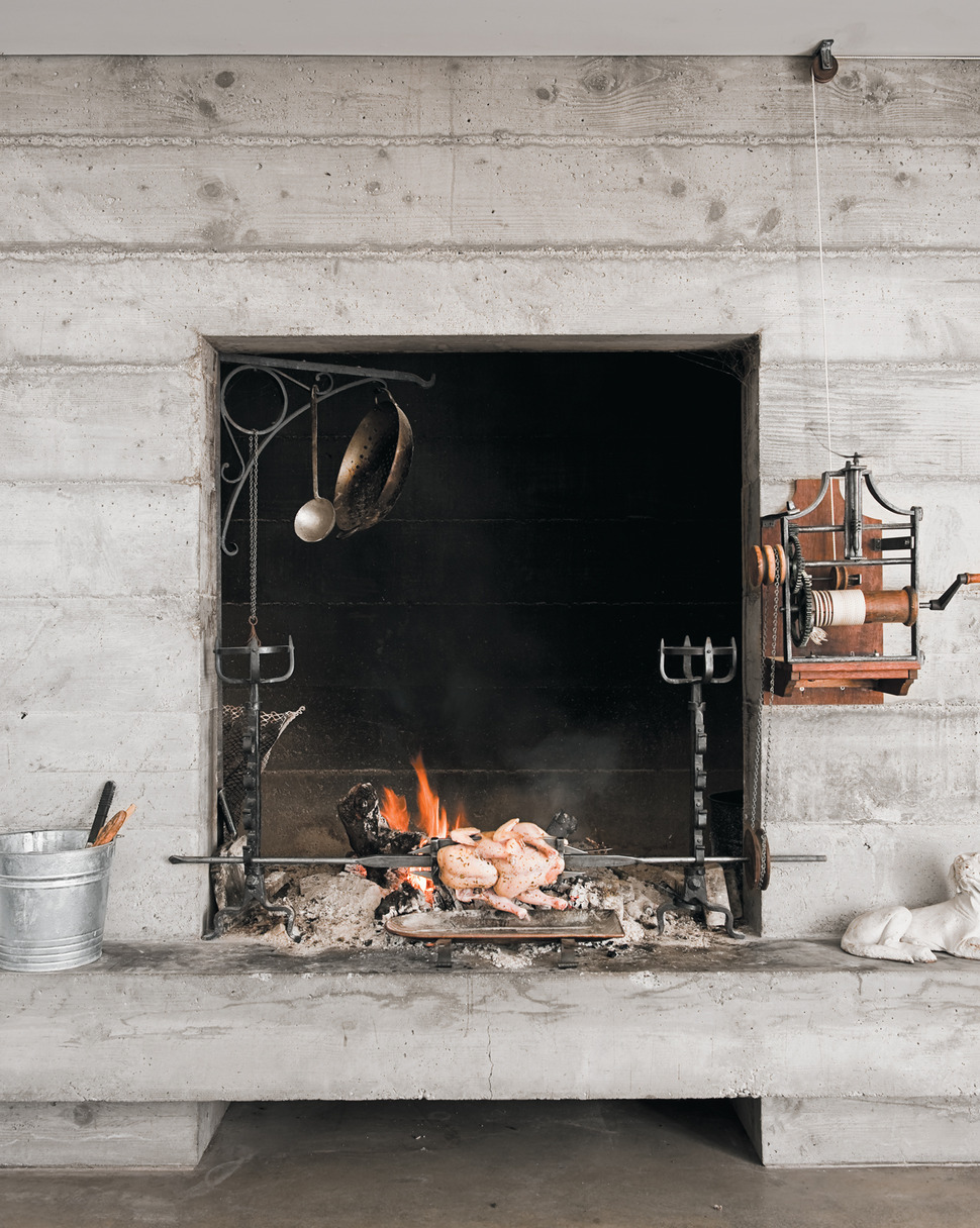
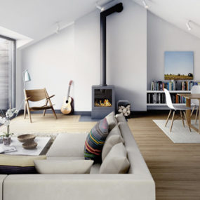
The deck is not the only location in the home that has an overscale wood burning fireplace. There is also one in the living room – and this fireplace is fitted with an 18th century French tourne-broche a poids, which in layman terms is a manual spit that functions by spinning a wheel connected to a set of pulleys that turn a metal rod over the fire.
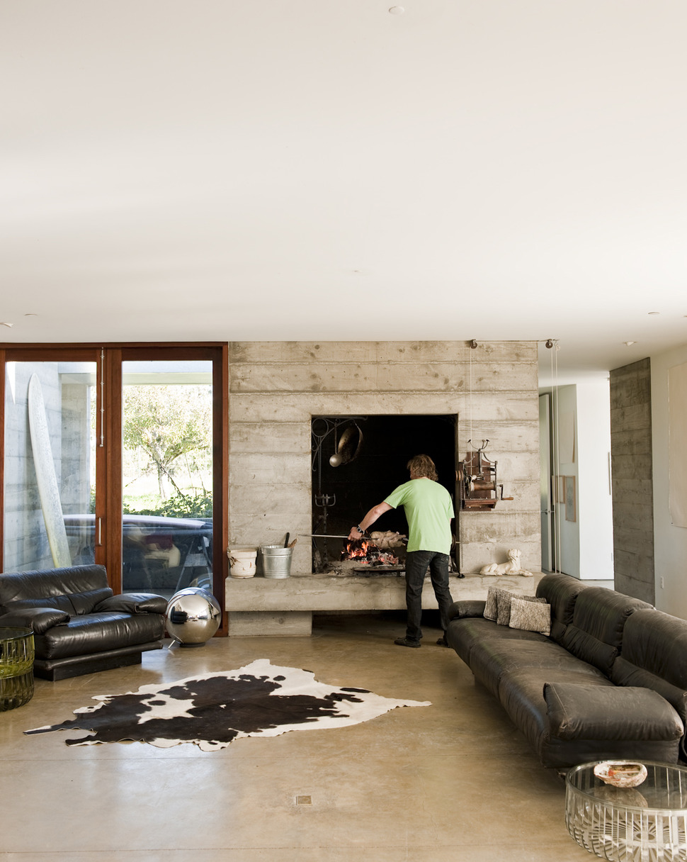
The living room is next to the dining room and continues the requested concept of a wide open floor plan with dedicated wide traffic patterns, unseen but close at hand, is one of the two home offices – tucked in just behind the fireplace.
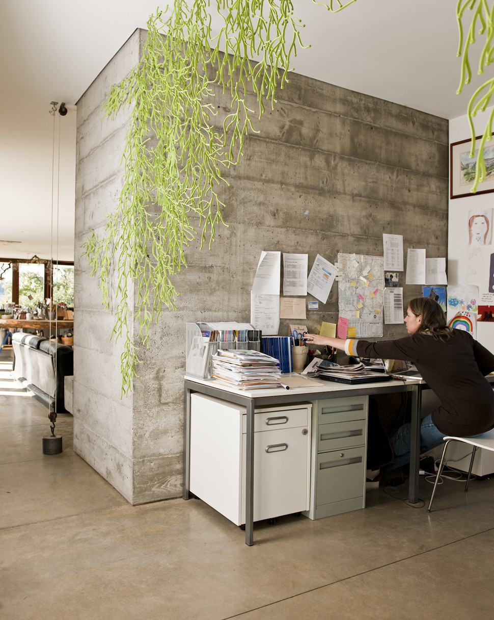
The clients requested a home with two offices. One for the dad and his large collection of antique books and the other for mom as well as a study area for their wheelchair bound son where he could be home schooled separate from the hustle and bustle of regular life.
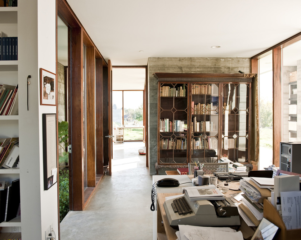
The second office is much larger to accommodate the large collection of books that dad has. This office is just off of the kitchen and features rows upon rows of shelving behind glass – one of the only places in the home that does not have open shelving.

Even in dad’s office, while there are glass doors protecting some of the books, the rest are featured on a wall of easy access open shelves – it almost looks like wallpaper!
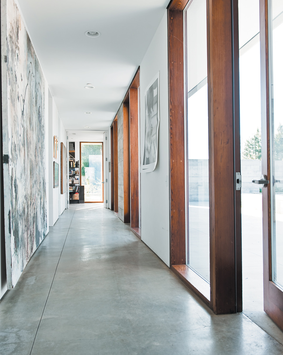
While the social zone is completely wide open, the private zone is accessed through a long and narrow hallway and here, rather then books lining the walls, a gallery of family created artwork is on full display.
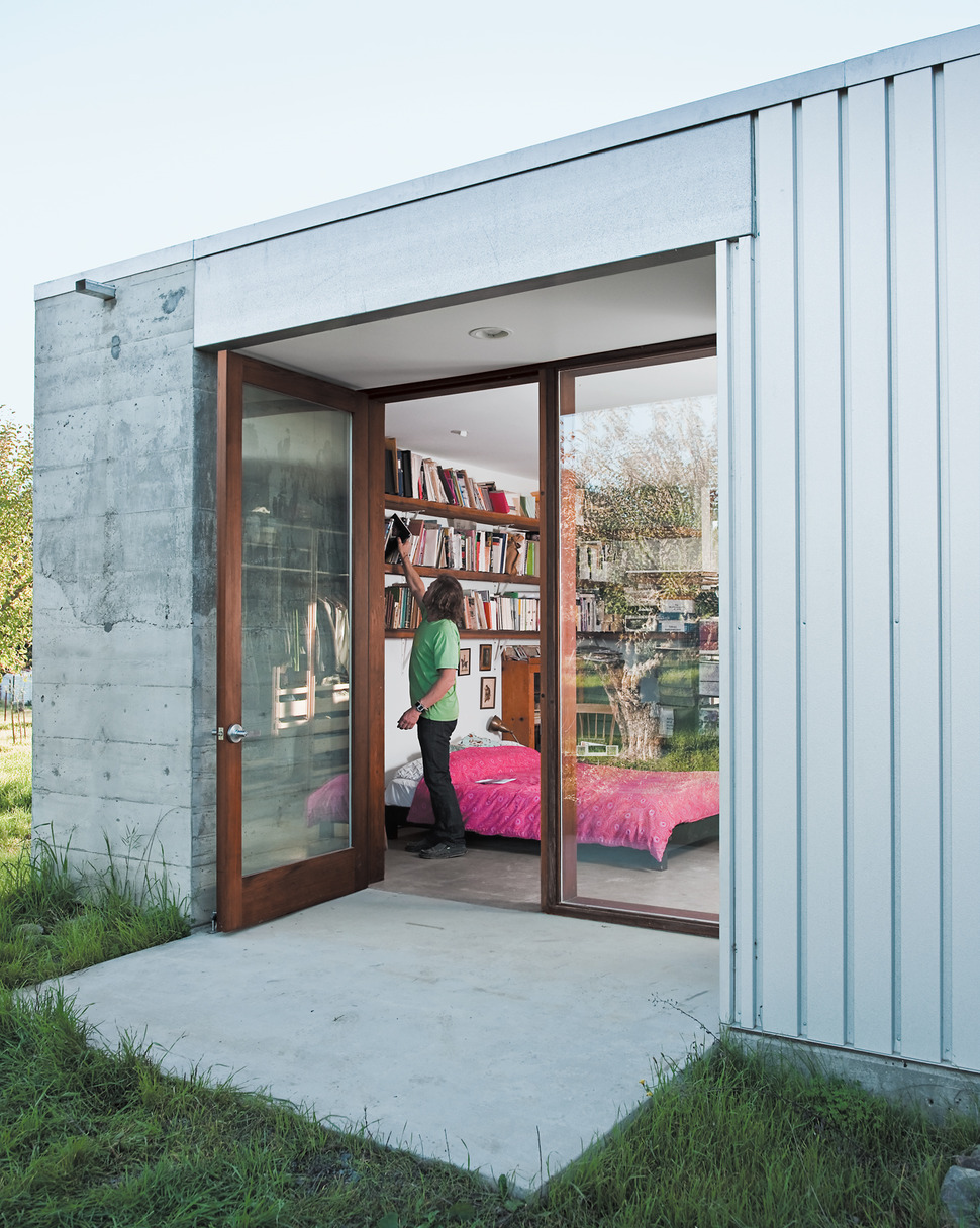
Furthest down the hall is the master bedroom and here, books continue to create to be the accessory of choice as they travel across three long shelves above the bed. A pair of doors opens up to a small private deck and just to the right of the deck galvanized steel siding is visible. This change of concrete is only used on small portions of the home’s exterior.
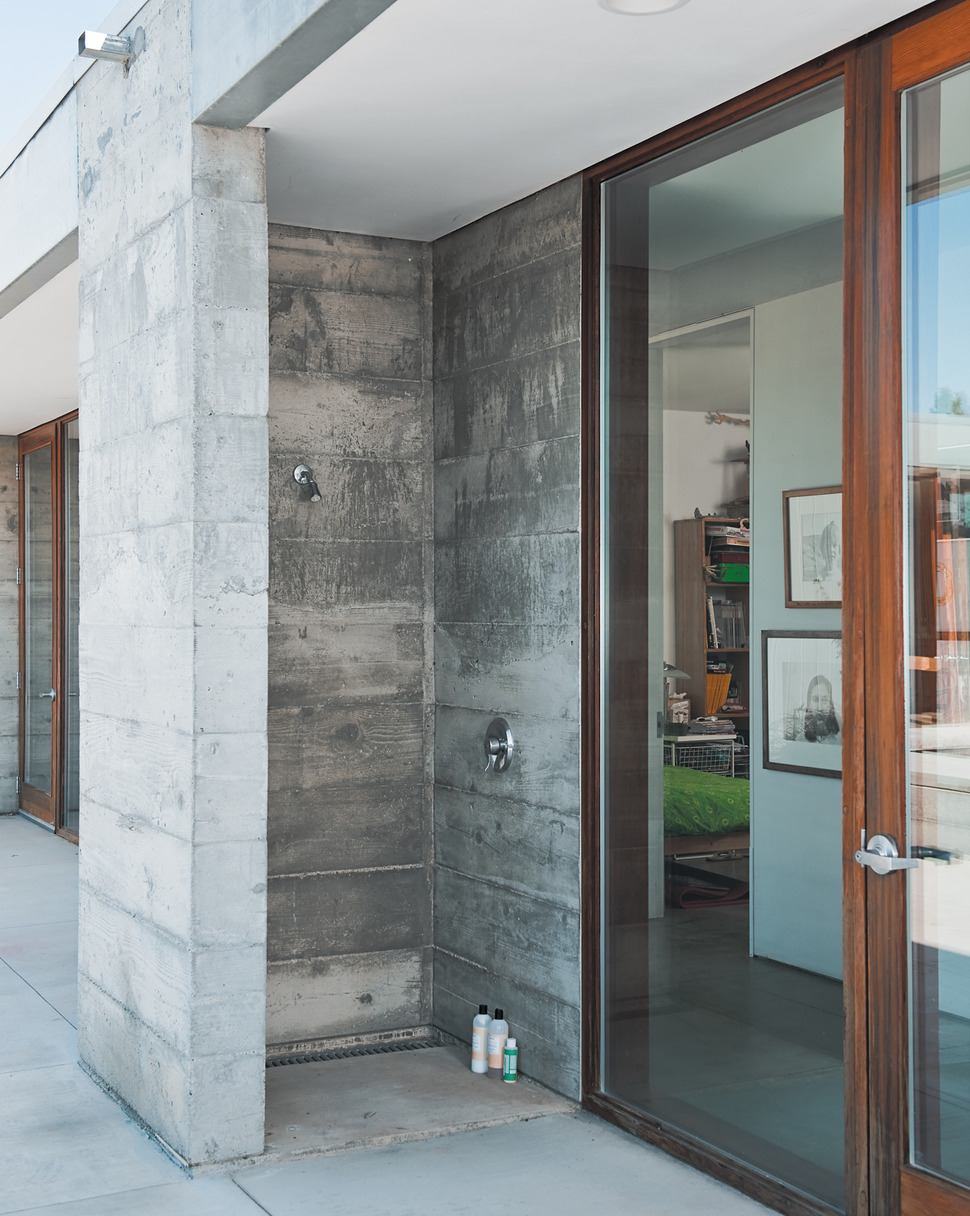
Just outside the hallway within the private zone is an wheelchair accessible outdoor shower. There is even a lower shower head for ease of use. This shower is made from one complete concrete module and shows how versatile the 4’x4′ components are.
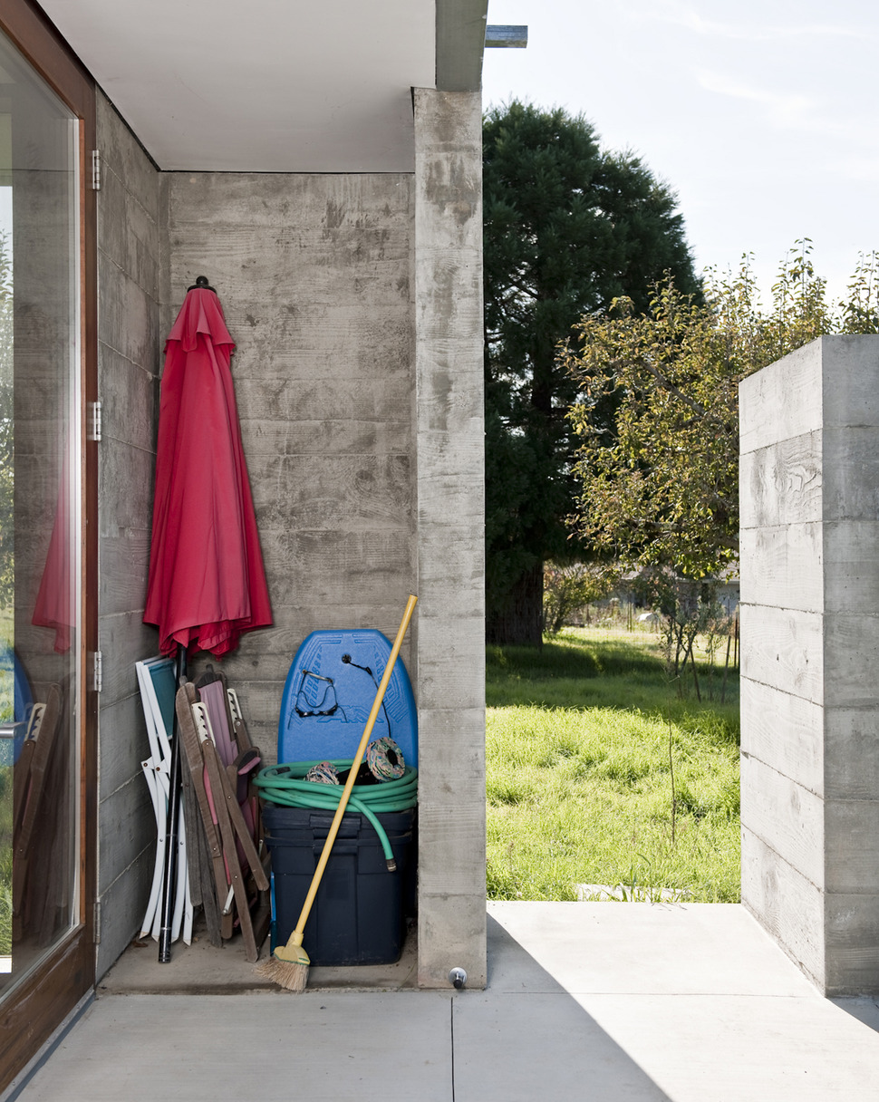
Another concrete module creates a small storage niche off of the deck where the family can store various portable items and aside from the main areas within the home, there is also a carport and covered walkway that leads to a separate wing for the grandmother. Smooth pavement connects all these areas to make it easier for a wheelchair to navigate from zone to zone whether indoors or out awesome.
Anderson Anderson Architecture
Photography by Dave Lauridsen
