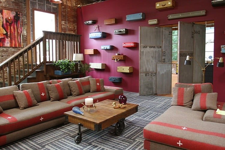
The Real World is an MTV show that focuses on a group of diverse strangers that live together for several months in different cities each season. This set is from the 28th season and was filmed in Portland, it aired earlier this year. While sets are not real life, they offer the opportunity to explore out of the box design concepts that can easily be adapted to the lifestyles of you and me if we so choose. For this reason sets offer inspiration for concepts and ideas that might otherwise not be represented in a visual manner. This living space is an awesome example of what out of the box design can produce. All the elements together create a cohesive eclectic scheme. The wall of suspended suitcases offers global appeal while cement board doors add industrial chic. The exposed brick wall and weathered coffee table on wheels tosses in the rustic charm while the bold choice of magenta on the other wall drives the drama. The couches might look bold and colourful in any other setting, but here, they offer a restful place to both look at and of course sit on.
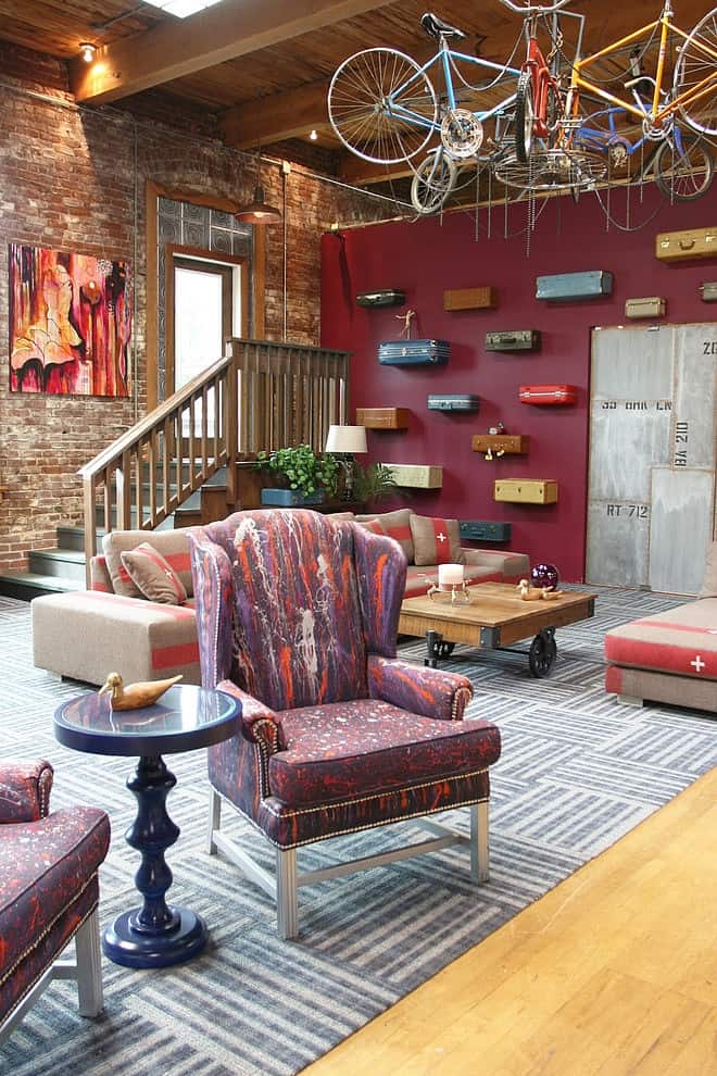
Just past the sectional is a pair of wing back chairs that have been reupholstered in a graffiti style fabric that plays off of the magenta wall and rose stripes in the sectional. The combination of these two wing backs, the bicycles hanging from the ceiling and the suitcases on the wall work together to create a story of youth and diversity while the brick wall, wood floor and striped carpet squares create the unity that ties them all together – not too different from the premise of the show.
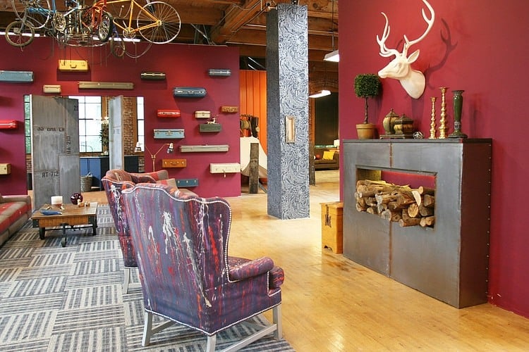
The wing backs are facing a faux fireplace that has wood stacked in its opening. Add in the white ceramic buck head, topiary and candlesticks and you can almost hear the crackling of the fire. It’s a fun tongue in cheek vignette that is not meant to be taken seriously and just to add to the rustic whimsy of the faux fireplace, a hammock is located just around the corner from the suitcases.
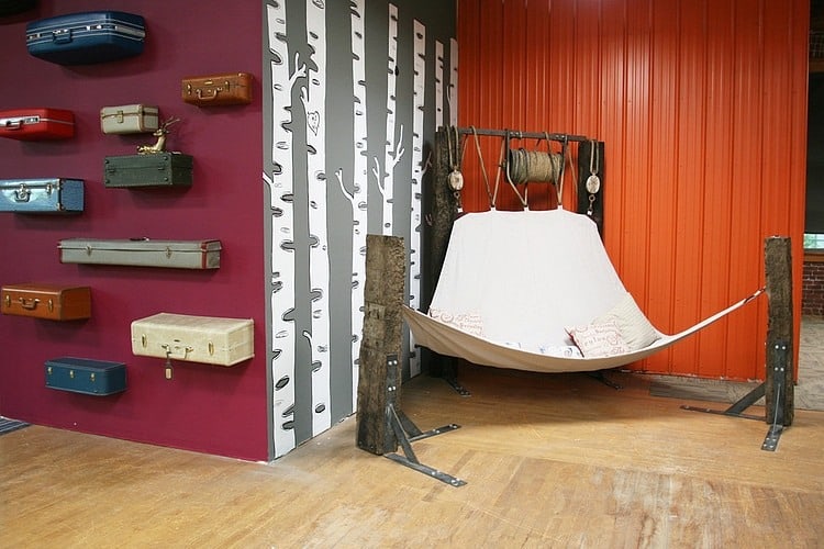
The hammock is held up by 4 chunks of dilapidated wood posts that are firmly held in place by the shelf supports screwed into their bases. Paper Birch wallpaper continues the faux fun while red sheet metal – normally used on roofs – acts as a privacy screen while at the same time adding in a punch of vibrant colour. The hammock is big enough for two to snuggle up in and discreet enough for the odd private moment.
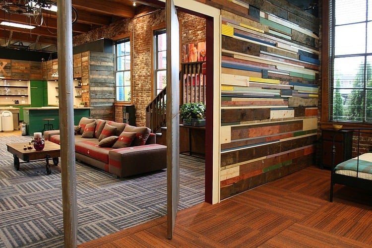
The living room is tucked between the kitchen and a bedroom. The bedroom has two cement board doors that are framed in a wall of reclaimed wood shorts that are fitted together for a colour story of geometric proportions. Carpet squares are again used on the floor in a striped pattern, but here, the pattern switches from a cool light on dark grey alternating stripe to a light on dark beige scheme. This carpet plays nicely off of the various stains found throughout the wall of wood. Looking through the door and past the living room, the wall treatment in the kitchen continues the concept of reclaimed wood, but in more neutral combinations.
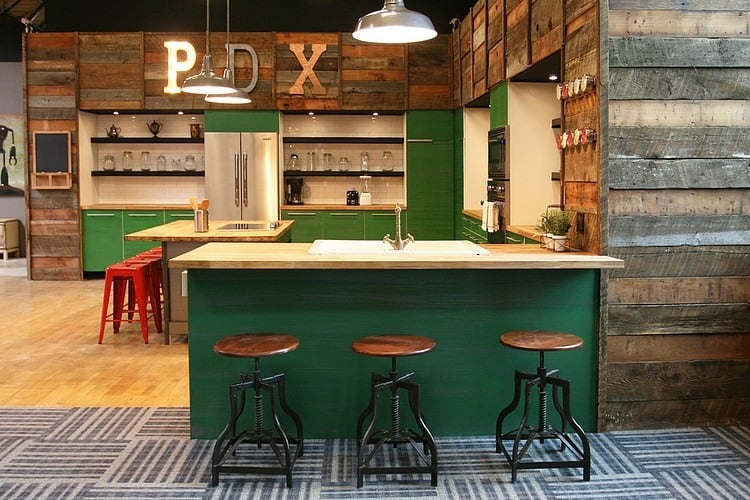
The kitchen is a standard U shape with a bar overhang on the peninsula. There is also an island with a second bar overhang. The reclaimed rough-hewn boards used on the walls are a nice foil to the sleek emerald green of the lower cabinets. Open shelving with a white subway tile back wall stops the wood from making the kitchen feel heavy. A chalk board, red bar stools on the island and large letters that light up bring in a youthful energy.
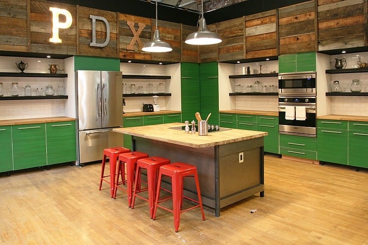
This kitchen is large, but the use of various materials and colours help break it up into smaller vignettes thereby reducing the overall size of the space visually. If you look at the cabinets, there is 6′ of counter on both sides of the stove and another 6′ on both sides of the wall ovens. The cook top is in the island and has an additional 18″ on either side of it.
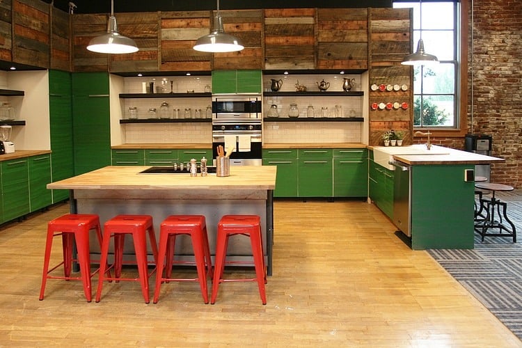
There is an additional 2′ of counter on either side of the farm sink located in the peninsula. While the overall working triangle of the kitchen is large, the uninterrupted expanses of counter make up for it.
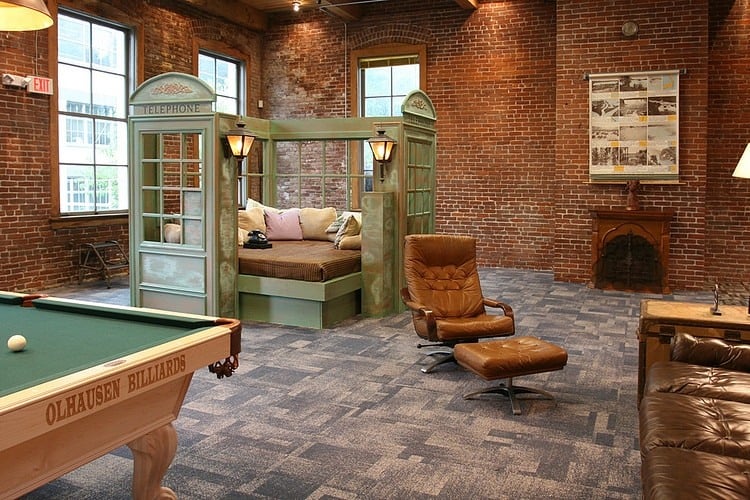
Aside from the living / kitchen area, there is also a large games room complete with pool table and telephone booth? Yup, that’s right, two telephone booth facades create a surround for a cozy lounge bed where all can hang out in style. Complete with two outdoor lanterns this one of a kind lounger is vintage, rustic, global, whimsical and of course comfortable.
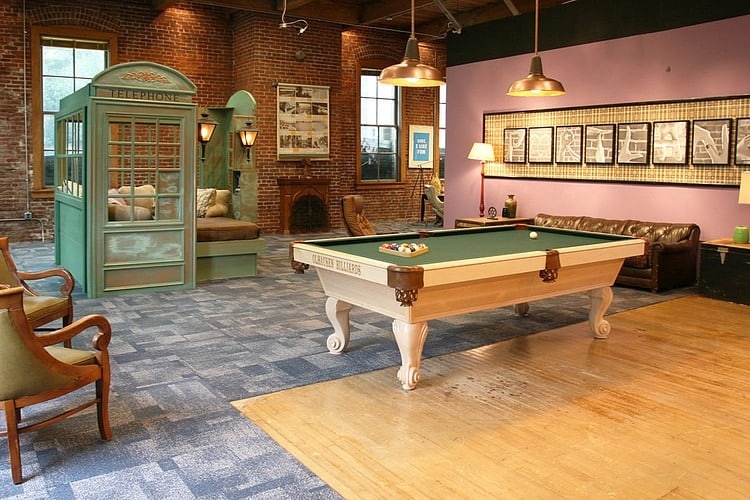
The pool table takes a country approach with its creamy white base, and that light base stops the table from overpowering the room and allowing the focus to continue past the table to the run of photographs.
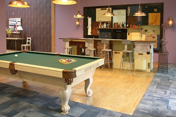
On the other side of the pool table is a small bar area complete with 4 barstools. On the far wall, sections of mismatched cabinet doors are fitted together to create a framed wall treatment of confusing proportion. The visual is so busy it is easy to miss the shelf of bottles mounted halfway up the wall. The front of the bar continues the same piecemeal pattern and this creates an interesting havoc with spatial perception. The overall effect, while confusing, is stunning. Since the treatment is kept to a small area it allows the eye room to rest on either side of it, making it a busy but spectacular composition.
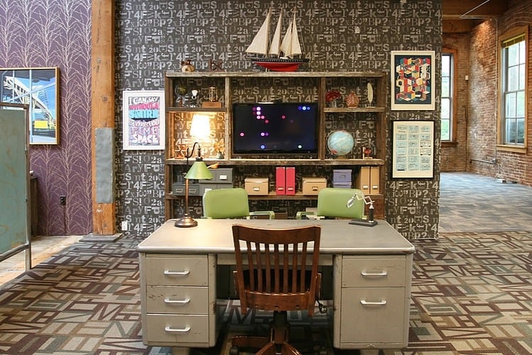
Its not all fun and games on the Real World set and just around the corner from the games room is an office, complete with vintage desk and chairs. Patterns abound in this space. Two different wallpapers come together at the post, while the carpeting in the office butts up to two different flooring treatments in both of its entry ways. Posters on the wall and items on the shelving add in additional pattern. There is so much to look at that the shelving unit is barely noticeable and the TV is almost invisible. The space is alive and busy but not overwhelming, as the colour palettes have carefully been selected in similar hues so as not to fight with each other.
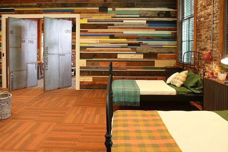
At the end of the day, the folks on Real World retire to their rooms. We already took a sneak peak at this bedroom with its wall of reclaimed wood shorts. I like the way the plaid blankets at the foot of the beds tie the wall of wood with the carpet squares. I also like the addition of vintage bed frames against the exposed brick wall, it really gives that global hostel feel to the space which is a nice tie in to the wall of suitcases in the next room.
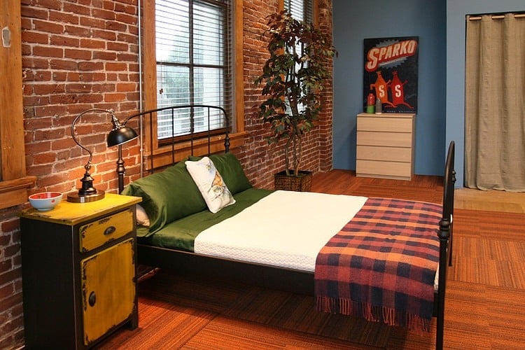
The bedside tables and dressers are a collection of mismatched second hand pieces that each has a story to tell.
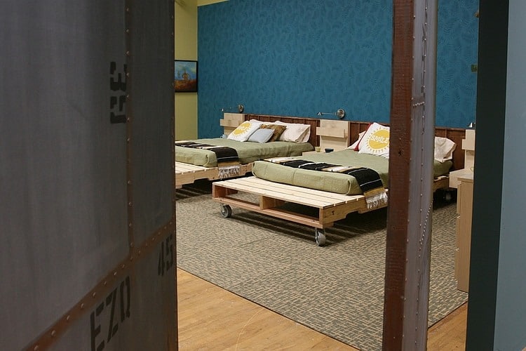
Another bedroom has a different tale to tell. Palettes have been upcycled into bed frames and wheels have been attached for ease of movement and to lift the frames off the floor for air circulation.
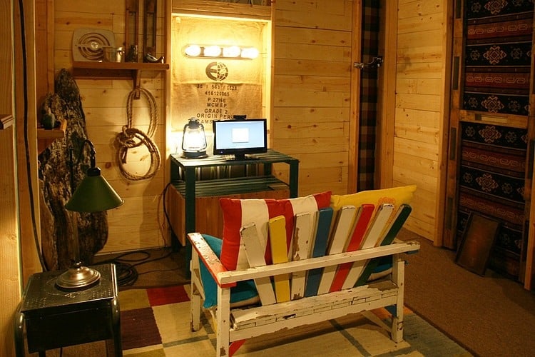
This bedroom has a small corner dedicated to a two seater arrow back chair and a small TV. All the elements from the rope hanging off of the shelf to the large chunks of bark leaning in the corner bring in an weathered outdoor feel to the space.
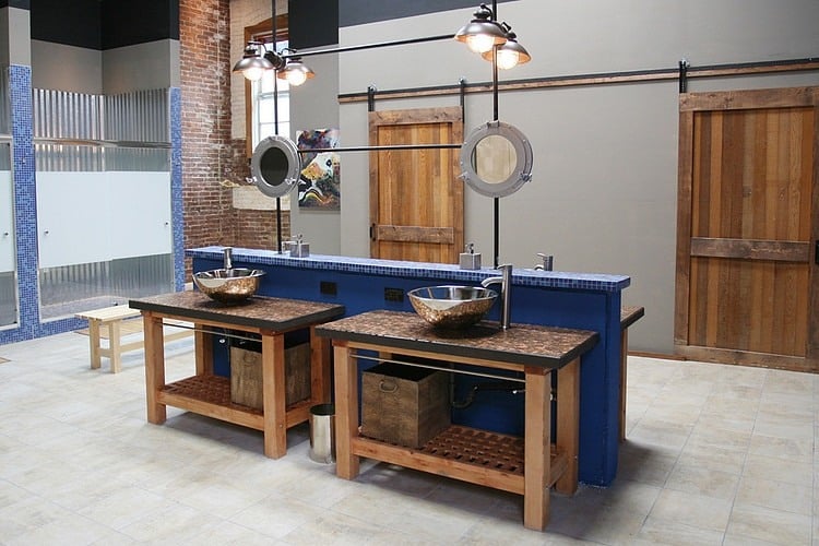
The bathroom is designed to accommodate several people at one time and includes a variety of interesting design details. First you enter the room via one of two doors that slide on a wall mounted track. Then, located in the centre of the room is an island that houses two vanities on either side of a pony wall, each decked out with stainless steel vessel sink and counter mounted faucet. A steel rod runs below the solid surface counters for towels and a storage box sits on each shelf. Pipes are configured to rise up from the pony wall and intersect round mirrors before continuing up to hold each of the four light fixtures. Blue mosaic tiles top the pony wall and frame the shower stalls, which are each clad in sheet metal. A privacy panel in the shower doors keeps the space modest. The complete effect of the room is one of industrial chic meets rustic farm house.
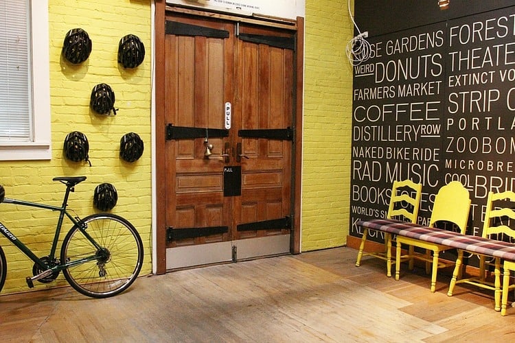
All the interesting details in the various rooms in this home are no match to the foyer itself. Here double doors open to a brick walled area painted citrus. The citrus shade continues on a selection of mismatched vintage wood chairs that all share a single plaid bench seat for a fun rethink in seating. The chairs are lined up against a wall of words in various sizes reminiscent of a blackboard but much neater and less messy. The black wall creates a dynamic composition that continues on the other side of the doors via a collection of black bicycle helmets. Neither the citrus nor the black fight with each other and this is partially due to the use of a soft, pale wood floor that seems to absorb the impact of the colours.
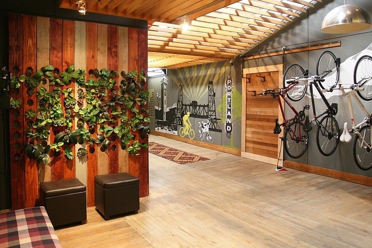
The short wall across from the entry doors is clad in vertical wood boards in a various stains. These boards all have round cutouts drilled through them for plants to grow out of. This living wall is a fun organic addition that is right on point with today’s design trends.
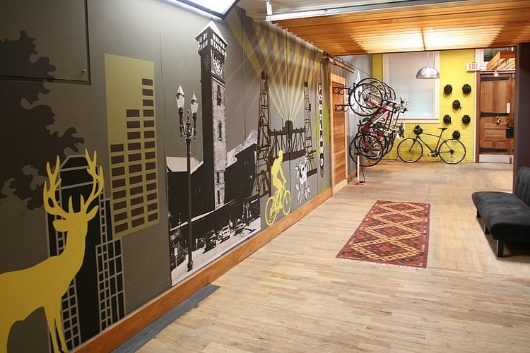
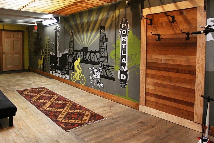
The hallway that leads off of the foyer is papered in a black and white metropolitan scene with splashes of the citrus hue used at the entry. The small area rug plays off of the plaid bench seat that straddles the foyer chairs.
Jen Chu Design
via HomeAdore
