Picture this condo as it was listed. Built in 1984. Vaulted ceiling. A real wood-burning fireplace. French doors on two sides, afternoon light pouring in. The listing almost certainly used the word “charming.”
Then you walk in and it feels flat. Washed out. Smaller than the floor plan said. None of that is the carpet’s fault, or even the popcorn ceiling’s.
It’s the mirror.
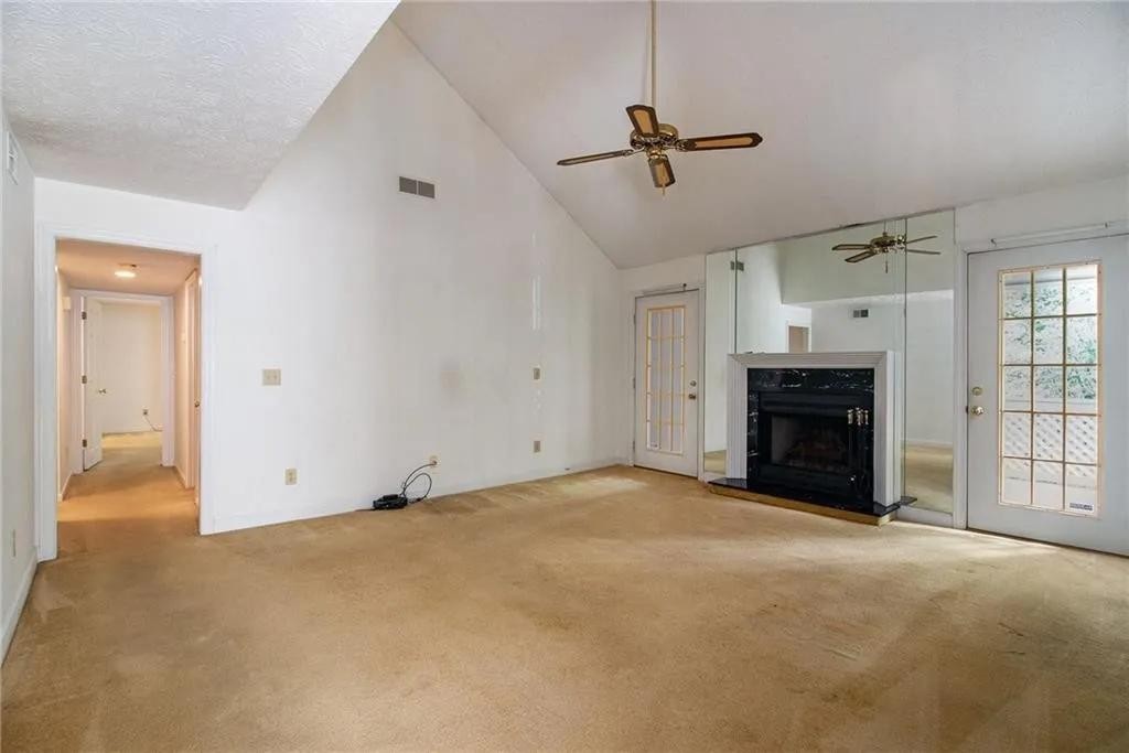
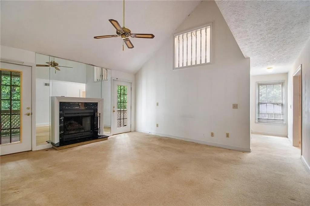
Floor-to-ceiling mirror panels wrapped around the fireplace, trying hard to convince you the room was bigger than it was.
The move nobody would have suggested
Ask any realtor, any friend, any design blog with “small space” in its URL. Same answer every time: keep the mirrors. They make rooms look bigger. Rule one.
Here, those mirrors were doing the opposite job. They bounced beige carpet back at off-white walls until the whole room read as one washed-out smear. They multiplied every awkward angle of the vault into visual noise. Worst of all, they stopped your eye dead at the fireplace wall, which meant the single most beautiful thing in the room, that soaring vault climbing up over everything, barely registered.
She took them down the first week. A friend did the actual labor while she was across the hall on a ladder, hands sticky with wallpaper paste.
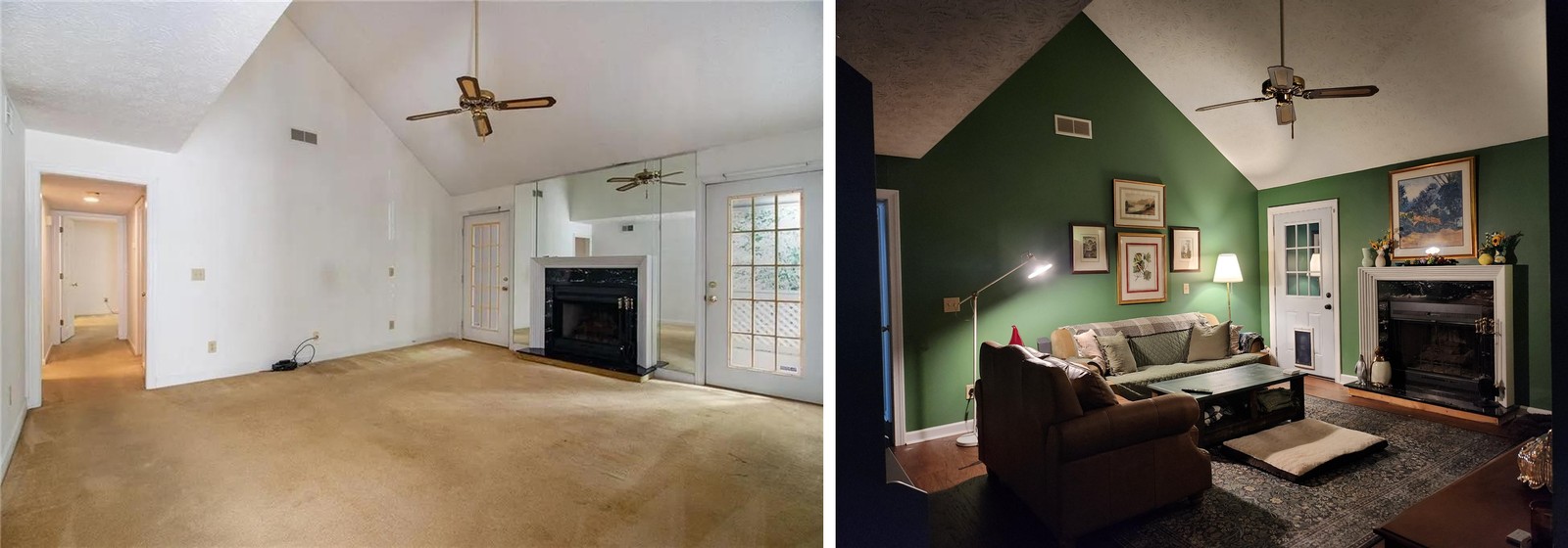
Something shifted the second those mirrors were gone. The vault became the main event. The fireplace stopped looking like a floating box glued to a mirrored panel and started looking like what it actually is: solid black marble with a clean white mantel.
The second move that should not have worked
Then she went further into rulebreaker territory. She painted every single wall deep forest green. Not an accent wall. Not just behind the fireplace. The whole room. Behr Tuscan Herbs, matched into Sherwin Williams because that’s what her painters stocked.
Half of design Twitter will tell you dark paint shrinks a space. The other half will tell you a vaulted ceiling needs white walls to feel open. Both are missing the trick, which lives in exactly where she chose to stop.
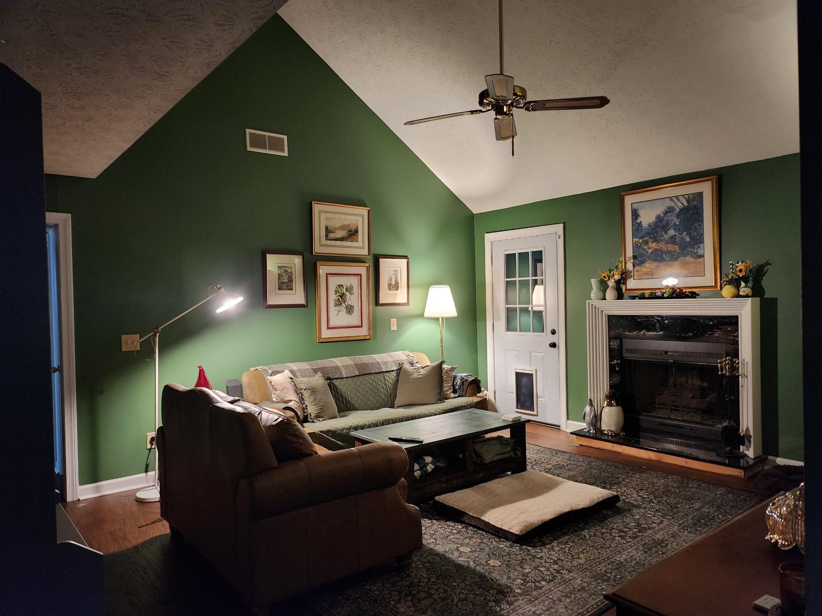
She stopped the paint right at the ceiling line. The green meets a crisp edge where the vault starts pitching up, and the ceiling itself stayed its original off-white popcorn. So now your eye climbs the green wall, hits that line, and launches into the bright vault above. The ceiling reads taller in dark green than it ever did when everything was pale and bleeding into itself.
The beige carpet came up. Dark hardwood went down. A William Morris style rug in muted greens and golds settles under the seating group without picking a fight with the paint.
About that weird spindle window
Yes, she knows. That cutout up in the gable with vertical rods instead of glass? Someone in 1984 called it elegant. It is not elegant. She’s planning to swap the spindles for stained glass eventually, but custom pieces at that size run into real money, so for now, there it stays.
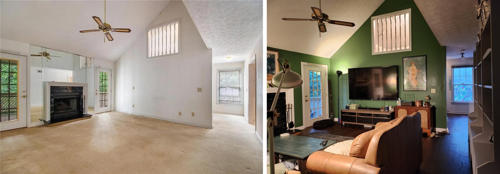
Here is the strange thing though. Inside the dark green shell, the spindle window stopped looking like a mistake. The paint around it recasts it as architecture. Still weird, sure, but weird on purpose instead of weird by accident.
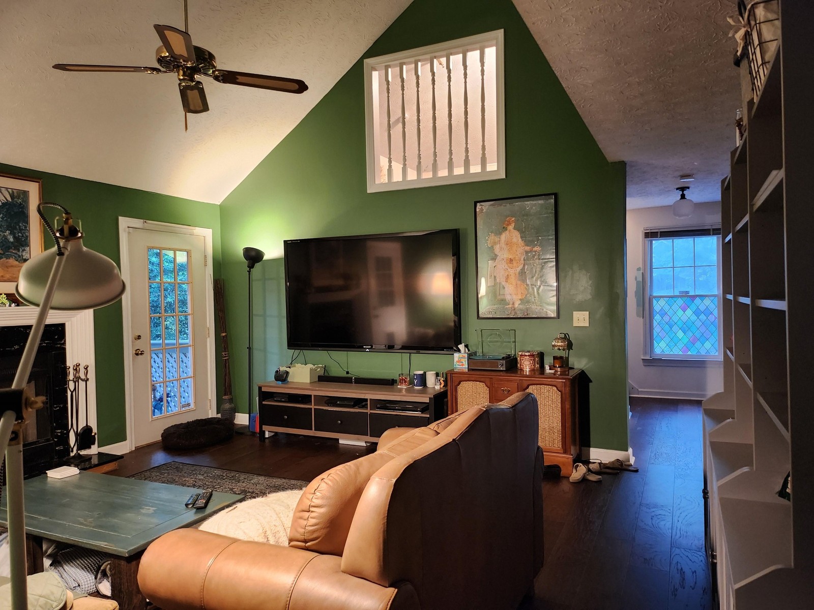
Mounting the TV directly under the spindle window turned that whole vertical stretch into one composition. Spindles up top letting daylight filter down, TV in the middle for actually watching things, console at the bottom catching the record player and the daily clutter.
None of this furniture was expensive
Worth saying, because it would be easy to look at the finished room and assume somebody wrote a check to a decorator. Nobody did.
The caramel leather loveseat with nailhead trim has clearly been loved on. The sage green quilted sofa is cozy, not showroom. The teal blue coffee table was built by a friend using a tabletop she thrifted years ago, and it holds every throw blanket she owns inside it. The bookshelves are IKEA Billys in grey, loaded with real books and ceramics instead of styled to within an inch of their lives.
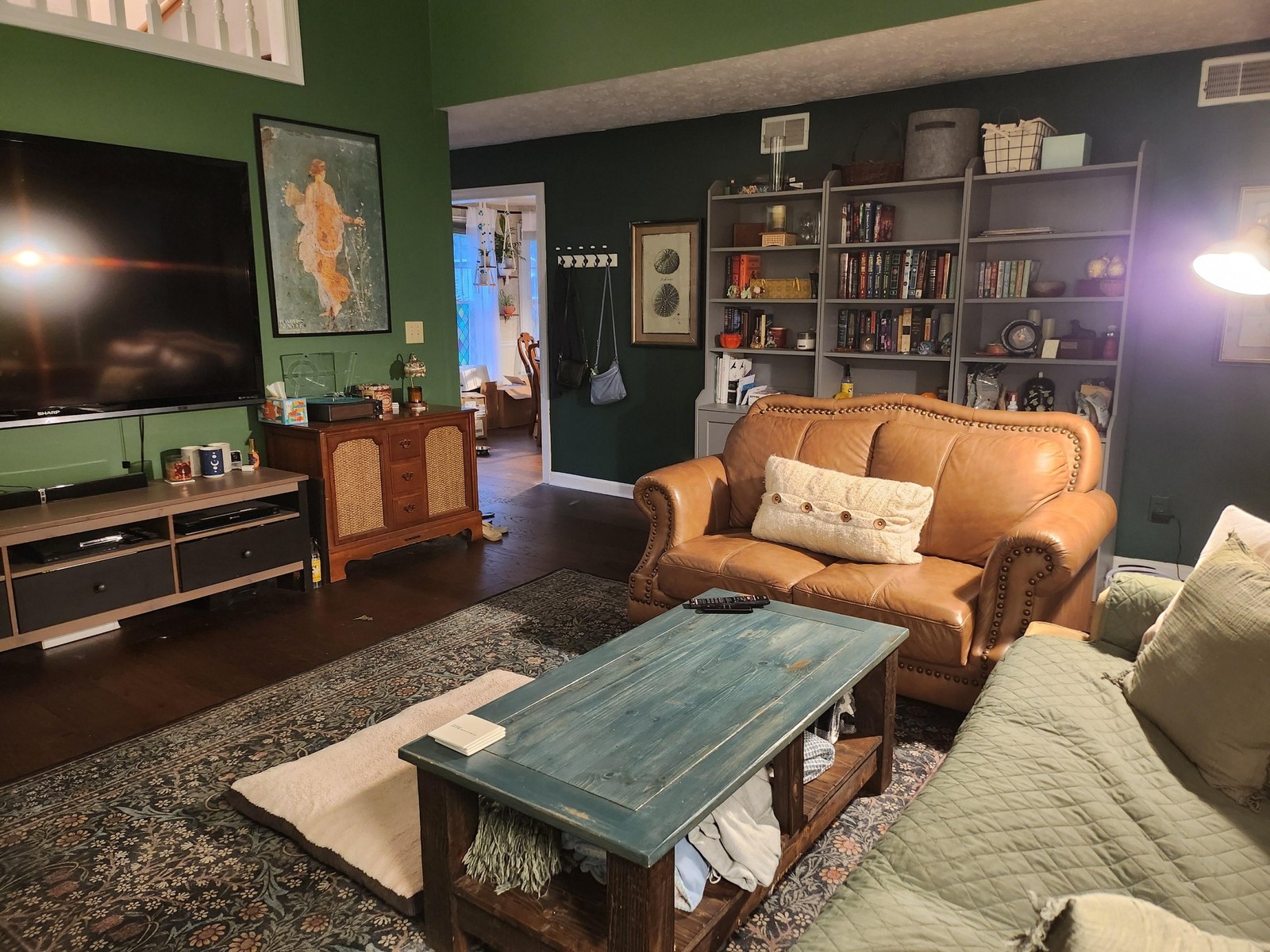
Over the fireplace, a tight gallery of landscape watercolors and a botanical print. Beside the TV, a framed Pompeii fresco poster that catches all the warm tones elsewhere in the room. Every piece was already hers.
What makes it hang together is the shell. Dark walls, dark floor, warm white ceiling. The furniture gets to be itself inside that shell and read as collected instead of mismatched.
Two rules worth stealing
Live in anything built between 1980 and 2000? Odds are you’ve been told the mirrored wall is a feature and the vaulted ceiling needs white paint to feel open. Both pieces of advice are keeping your living room from looking like this one.
Rule one: take the mirror down and see what’s actually behind it. Nine times out of ten, the real wall is better than a reflection of the one across from it.
Rule two: dark paint and a vaulted ceiling can get along, as long as the ceiling stays light. Stop the paint at the ceiling line and the vault will read taller, not shorter.
She pulled off both in a few weekends. The photos do the rest.